Thank God for the Smeg Master Blaster, because The Block 2025 kitchens reveal has left me needing a very chilled bottle of Savvy B to wash down the Bex before my Sunday night lie-down.
This is arguably The Block’s most talked about week, and boy do we have a lot to discuss. From layouts I simply can’t agree with to the scoreboard not reflecting the best rooms, I’ve gone there! I’ve mentioned it all! I’ve dropped all the truth bombs!
Scroll on as I cast my honest design eye over this week’s kitchens, and drop me a comment here or on Facebook or Instagram once you’ve digested all the critiques. You know I love to get your take on the zones even if you don’t agree.
Key Points from The Block Kitchen Reveals
Britt and Taz Tied for First Place
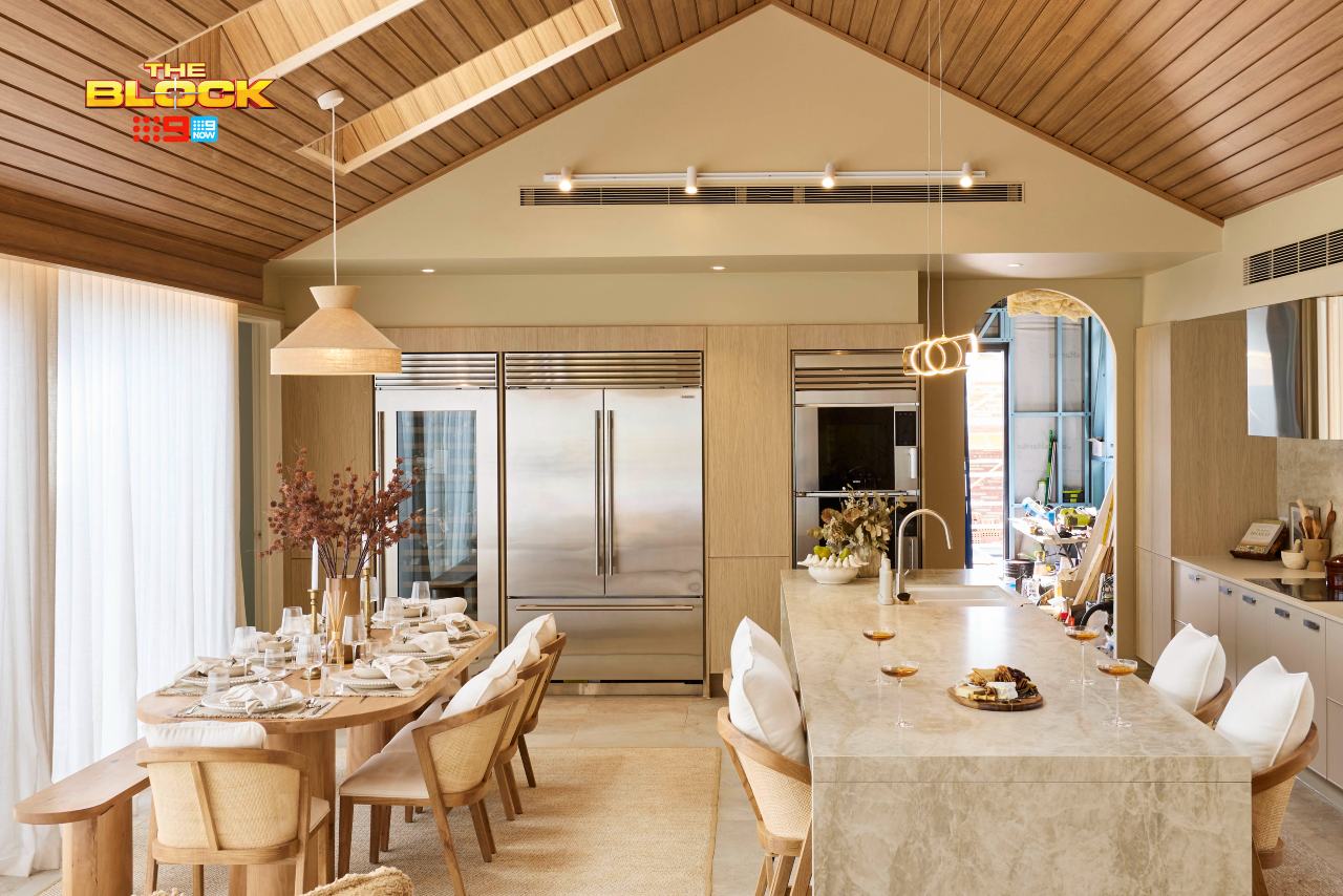
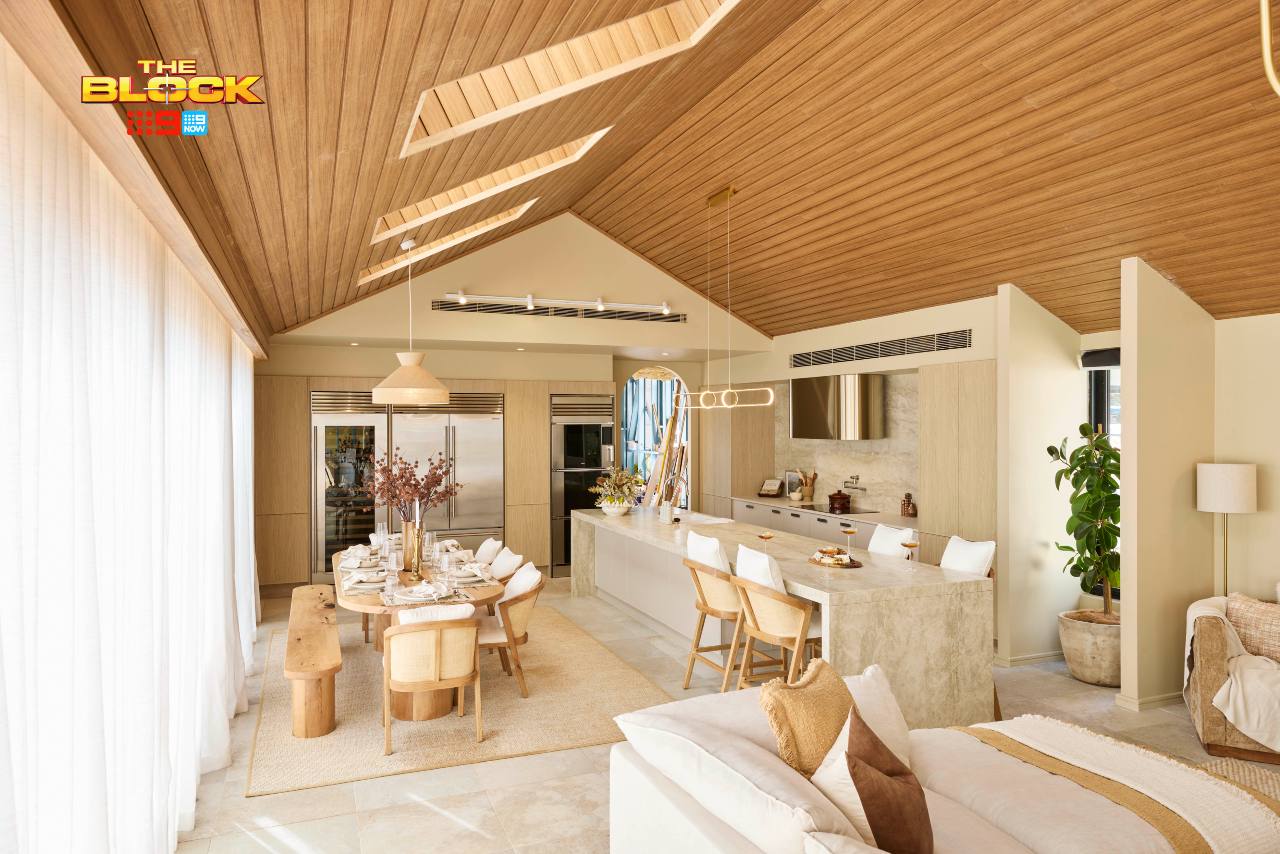
You know I love me some Britt and Taz design. And you know I was all-praise for their living room reveal a few weeks back. But this open plan zone now feels… buttery. As in margarine. As in Flora, Meadow Lea and Nuttelex Original. It could be the photography, but it reads very warm and overpowering, with a yellow tone to everything that feels a bit off.
The panelled ceiling I’m still in love with. It brings a cocooning feel to this area. But because it’s so dominant, everything else needs to be quite calm and subdued. Visually, they’ve packed so much into this room that there’s no place to rest your eyes. It’s busier than peak hour traffic, when it needs to feel soft and soothing.
There are some positives, though. The cabinetry, rangehood and tapware all work wonderfully in the room. The ovens are at a great height. I love the stone running up the splashback. It is a good room, but not a great one. And we need to talk about the layout…
The Layout Lets the Room Down
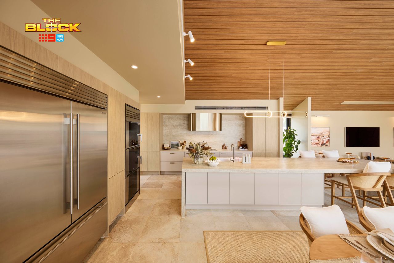
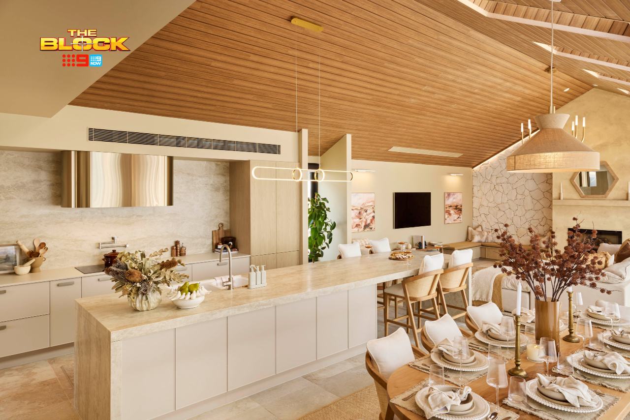
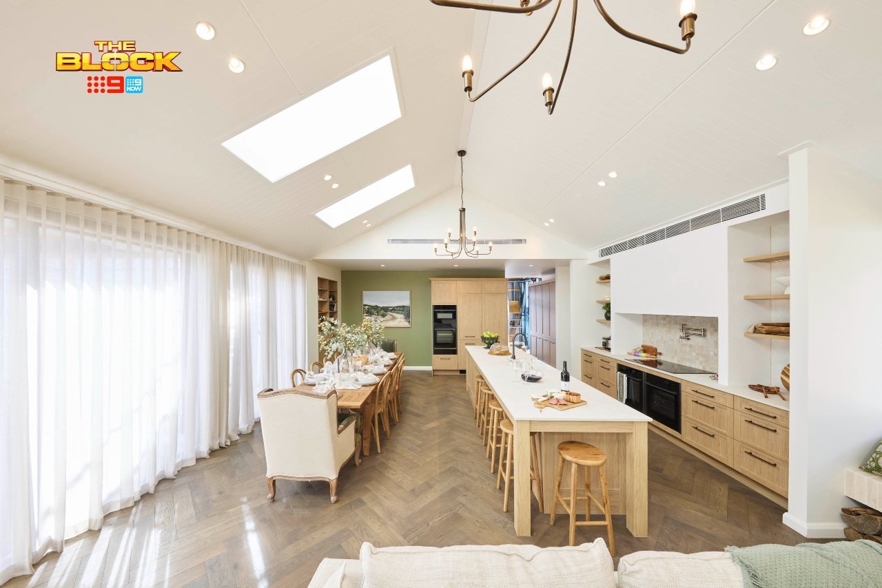
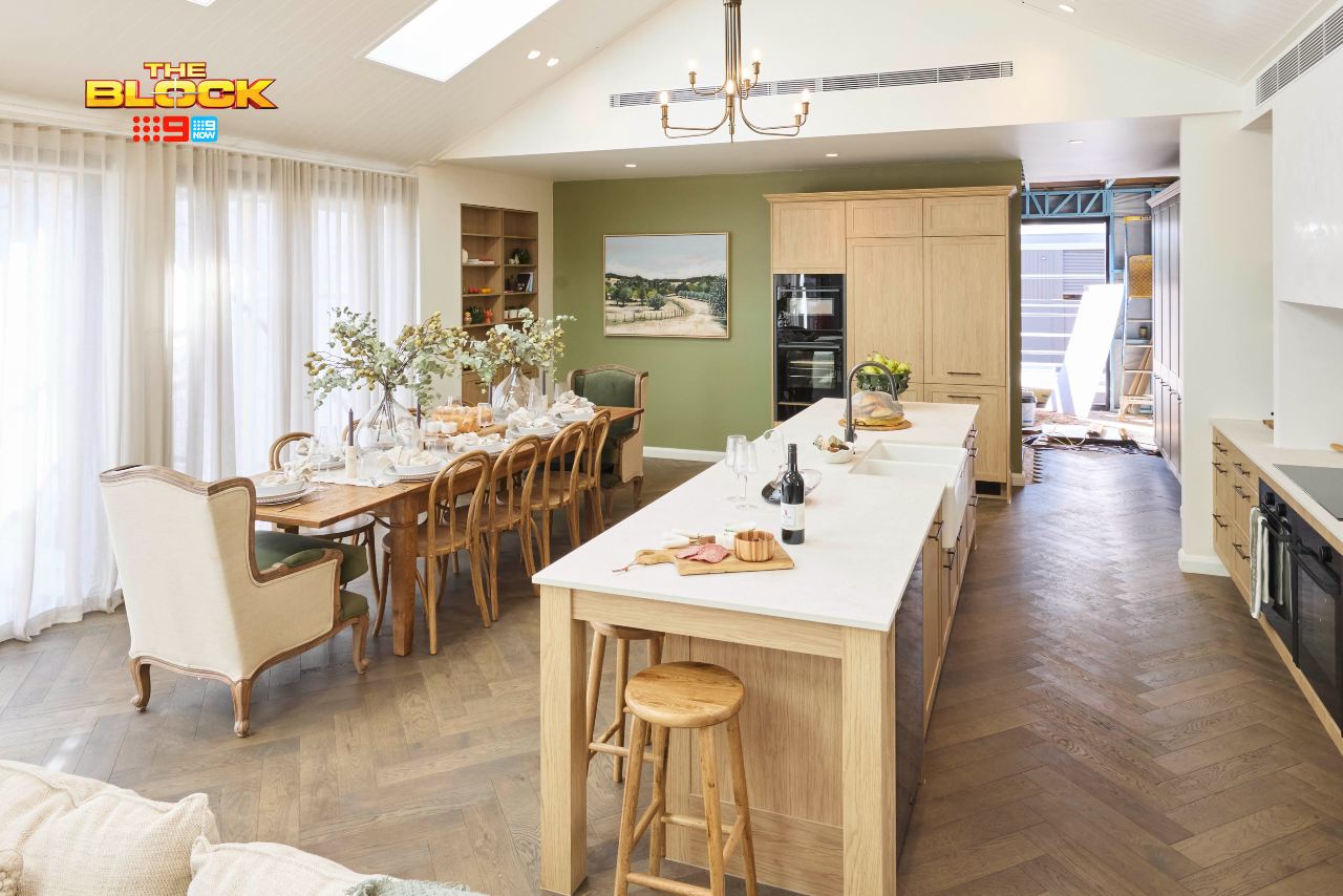
I disagree with the judges that this layout is the best orientation. Emma and Ben’s, as with Han and Can’s, is the best way to orient this open plan area. I don’t enjoy the long runway between the oven and island, nor the insane idea to put the fridges in the dining room. That is a decision more bonkers than Jonathan LaPaglia being fired from Survivor.
If there is a view outside, then one side of the dining table doesn’t get to see it during a meal. It also doesn’t feel like the three zones are as connected as they could be. I’ve written before about the ideal way to lay out a kitchen-dining-living space before, and sadly none of the teams got it completely right.
I understand the layout will not change. But to remedy the busy feel I’d pare back the dining table and countertop styling, having more minimal stools at the kitchen bench, and remove the rug under the dining table. Then, it’ll feel far more harmonious, and you can appreciate the true beauty of individual moments.
Robby and Mat Tied for First Place
I have to start with reiterating that I don’t enjoy the layout of this kitchen and dining room. It makes the zone feel long and narrow instead of intimate and cosy. Your eye also goes straight to that green wall, and it makes the thin run of joinery to the right feel almost like a mistake (go wider or abandon altogether).
The joinery also doesn’t run all the wall to the ceiling, nor have they brought a bulkhead down to meet it. This would twitch my design eye to no end. I’d be lying in bed at night thinking about the dust collecting on top. Yes, I have issues. No, I’ve not brought this one up to my therapist yet. We’re still working through my overindulgence in a Sunday Bex and Savvy B.
We also need to address one of the elephants in the room: oven placement. This is arguably worse that Britt and Taz placing their fridge in the same spot. Have they not had a hot tray in hand with a too-thin tea towel before, throwing it onto the benchtop like they’re competing in the frisbee national championships? It just doesn’t work in that spot.
We Must Discuss the Second Elephant in the Room
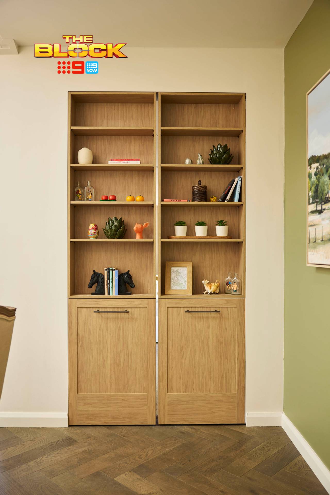
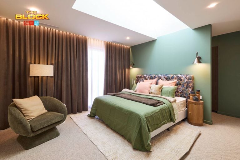
In case you didn’t watch the reveal, Robby and Mat created a secret door to the main bedroom (seen above). It reads as shelving on the outside. The problem is, it doesn’t seal properly when closed, and none of the items stuck down. Like the popularity of Nickelback, I don’t understand it and I’m not sure I ever will.
In some respects I admire the idea to do something out of the box, but it really didn’t work and feels quite gimmicky. No potential buyer is going to enjoy this idea in reality long-term.
There Are Many Positives, Though
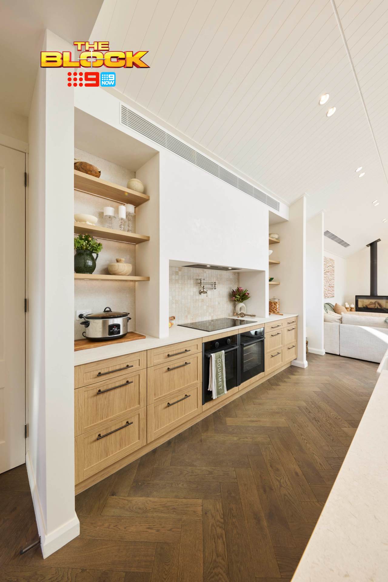
It’s not all bad in this kitchen, of course. For starters, as I’ve not addressed it before, the herringbone flooring is delicious in every possible way. I like that the cabinetry is calm and farmhouse-inspired, and is tonally different enough from the floor colour to create a nice sense of contrast.
The tiling behind the cooktop is also rather divine, and I enjoy the sense of symmetry created either side of it with the display shelving. Correct me if I’m wrong though; are they more ovens under the cooktop? How many ovens does one home need? Is this a Nigella Lawson and Gordon Ramsay holiday home share?
Again, I’d say this is a good room, but not a great one.
Sonny and Alicia Came Third
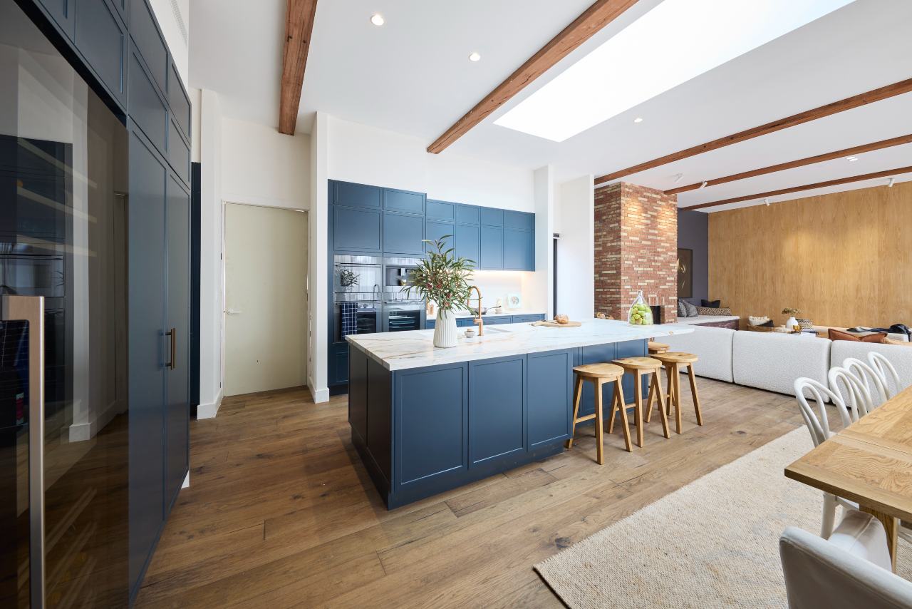
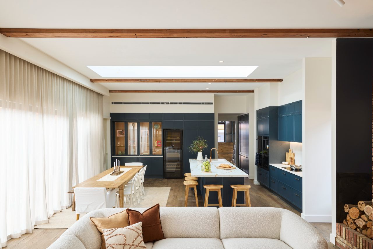
We’re continuing the streak of kitchens not oriented properly with Sonny and Alicia’s third-place space.
You can actually see in the images above how closed off the living room is in relation to the kitchen. Couch person has their back to the kitchen, and kitchen person has their face to the window. I won’t budge on this; it’s not the best way to lay out an open plan zone. It doesn’t bode well for connection.
That aside, I’m a little surprised this one came third. It’s nice, sure. It’s blue, sure. It’s not feeling particularly new or exciting, but rather just a Hamptons-style kitchen with a farmhouse influence. I have to agree with Marty on this one; it’s actually quite bland.
And don’t come at me Freedom Kitchens… but it looks a bit cheap…
There’s a Cheap Feel to This Kitchen
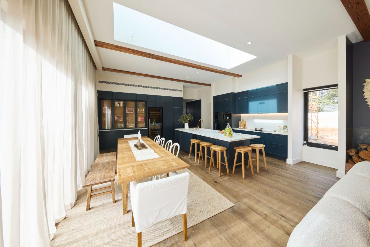
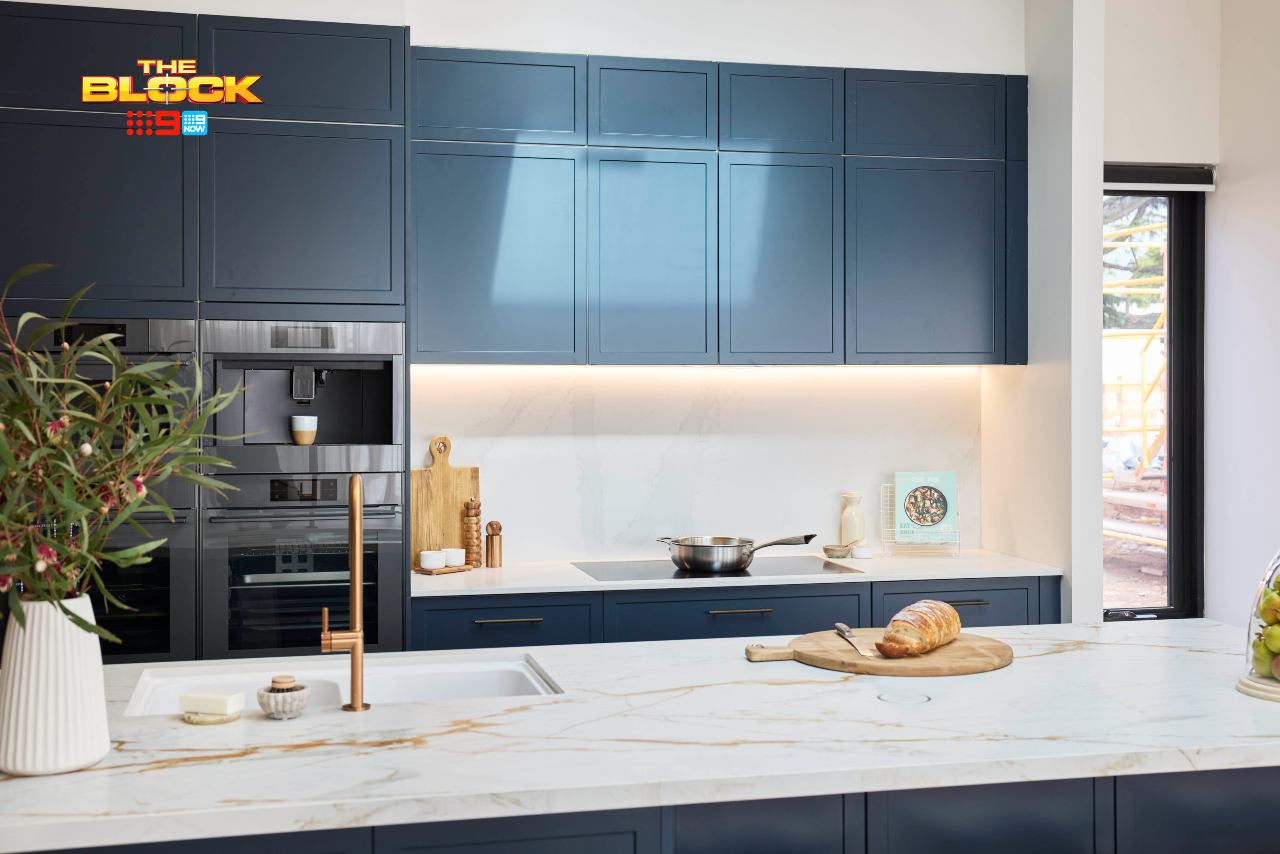
Kitchen renovators, please avoid high-gloss cabinetry when putting together your kitchen. It without a doubt cheapens the look at feel of the space. Matte finish, yes please. Satin finish, I’m down. Gloss finish: womp womp.
Truth bomb: that blue would look so much better without the reflective quality.
It, with the stone, does come off a little ‘flatpack’. It may look different in-person. It may have looked different on TV. But I can only go off the still photography. And here, it’s giving me a budget feel. And budget feel is fine (I’ve designed many budget homes), but not in a multi-million dollar property.
The tone of the flooring does compliment the cabinetry rather well, but the dining room setting and the bar stools at the bench do not. This doesn’t feel harmonious in any way for me. It reads as a bit confused, and I don’t like confused.
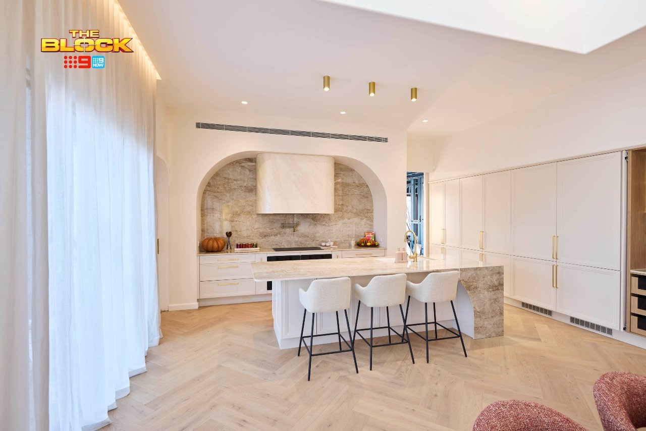
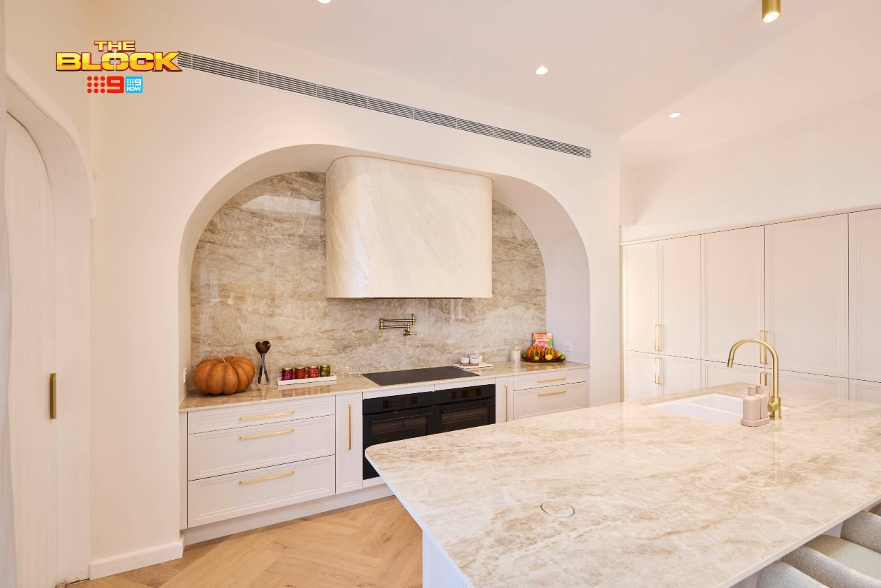
Han and Can Came Fourth
We’ve finally arrived at the first of two teams that actually got the orientation correct. Han and Can delivered a solid kitchen this week. I can’t believe I’m saying this, but they deserved a better score! The judges had mixed feelings about the aesthetic, and so I’d like to weigh in on that part first.
As mentioned last week, we need to move past the ‘Daylesford aesthetic’ argument. Having designed homes all over Melbourne, I understand that an interior often takes inspiration from its surroundings. But the suggestion that every home in this location needs to be visually ‘country’ or ‘farmhouse’ is absurd.
In fact, as a designer the goal is to avoid themes altogether and develop a style that blends a tonne of different influences to achieve a beautiful, layered look. So a home in this location can feel luxe. It can have a opulent kitchen. It doesn’t need to nurture you or feel earthy and rustic at every turn. Buyers exist who do not want these expected cliches.
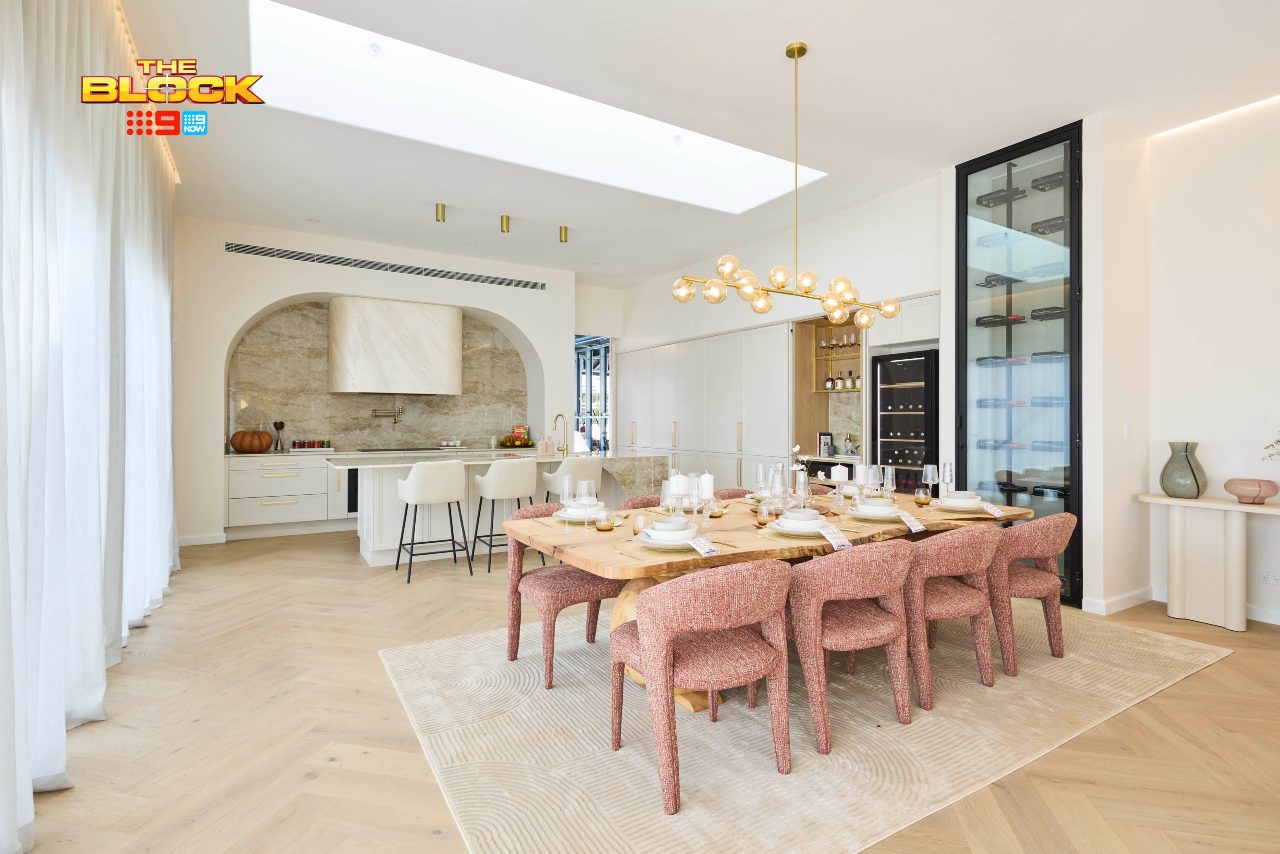
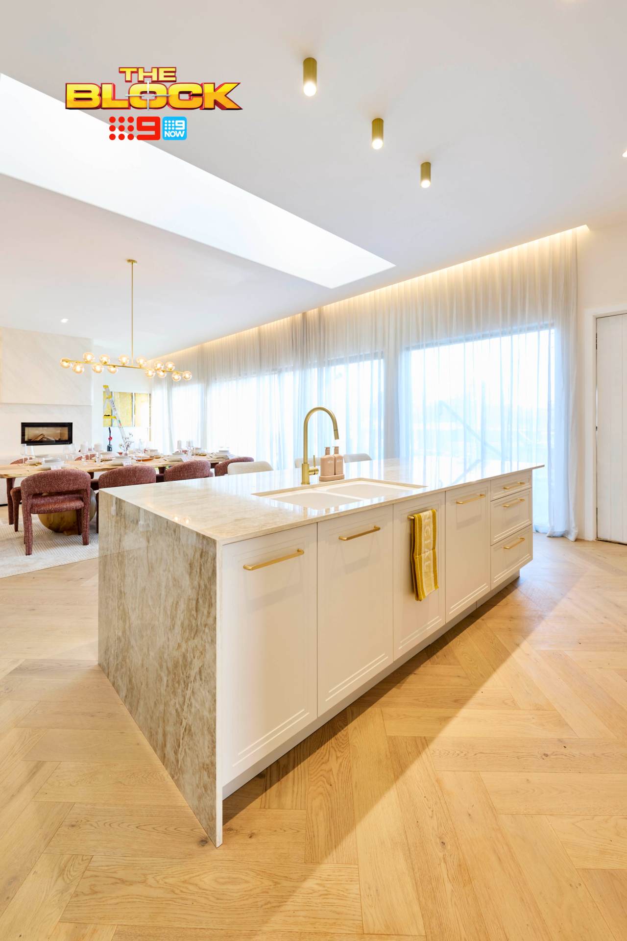
I Would Have Placed This Kitchen Second
The visual of this kitchen is rather appealing, and all of the elements work together quite well. That’s what the scoring should reflect. For me, it’s about form and function; does it read well visually, and does it have everything in the right place?
This kitchen ticks both boxes. Easy on the eye and easy to use. The stone is gorgeous. The cabinetry profile is charming. The tone of the flooring works perfectly. While I don’t love the brass myself, it does appear in other zones in the open plan space, so we have cohesion there.
I really only dislike the low rangehood (too dominant) and the bar stools (the black leg).
And while I’ve really loathed the obsession with arches in every other room Han and Can have delivered, in this kitchen it works a treat. This is hands-down the best space they’ve delivered.
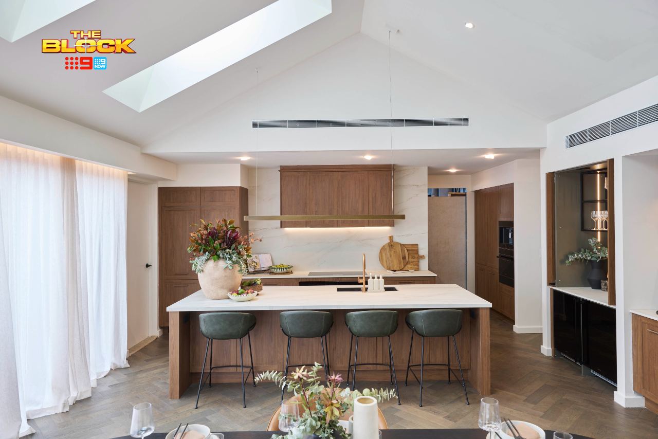
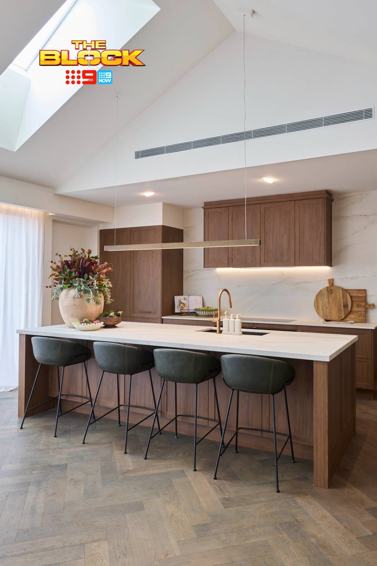
Emma and Ben Came Last
Visually I can’t fault this space. When the images hit my inbox there was a gasp. That is how a room should make you feel. For me, this kitchen delivers the emosh (the young ones are using this term, and I’ve permitted myself to apply it only in written form. If I ever say this aloud in a group, please call my aforementioned therapist to stage an intervention).
I honestly don’t think I’ve been this moved by imagery since 14-year-old me flipped through the Manpower Australia 1998 calendar (the golden Jamie Durie era). And trust and believe, the flip-through was done very discreetly at the local newsagent.
From the flooring to the cabinetry profile, the stone to the stools and pendant, I love every element here. It feels light and ambient, and yet earthy, moody and character-filled. It’s fresh, but gives a nod to the traditional. Truly (although we’ll discuss the faults) a winning room for me.
And the orientation is spot on; the kitchen looks over the dining and living in a wonderfully connected way.
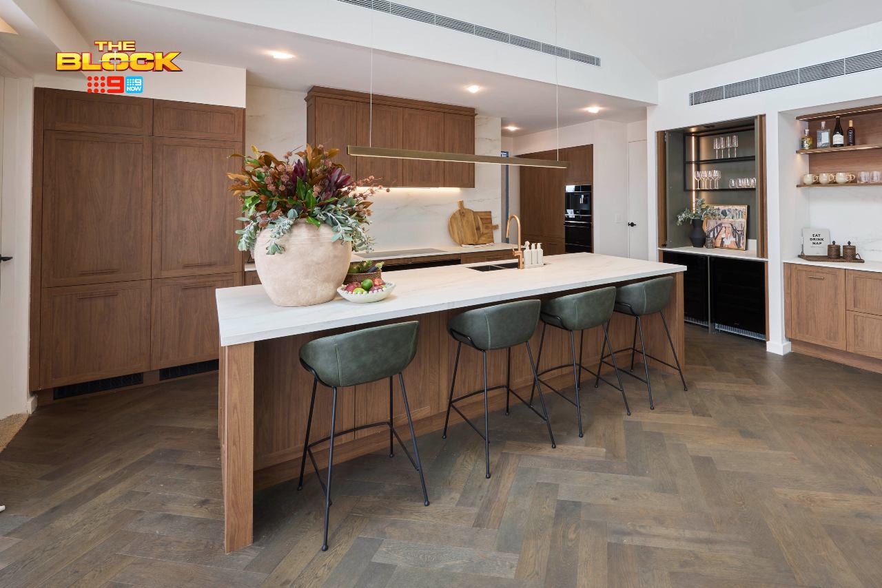
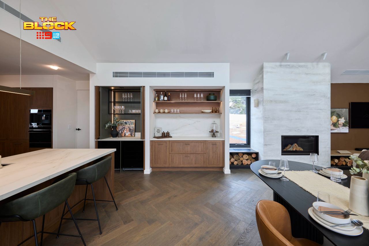
Of Course, There Were a Few Elephant In This Room Too
Yes, the fridges are directly outside the main bedroom door. It’s a clear issue that needs correcting. If you look at the image above, it’s obvious that too much space has been dedicated to the bar zone and the display zone beside it.
The fridges need to go where the bar is, and the bar needs to go where the display shelves are. It makes way more sense to do it this way, so the bar is closer to the dining and living room.
I know there are more elephants in these rooms than a David Attenborough doco, but there’s another I need to address: low ovens. I’ve said it before and I’ll say it again: if I’m dropping a cheeky few mill on a home, I’m not bending down to the oven. I refuse. The chook is cooking at eye level or it’s not cooking at all. Seriously though; all that space and no high ovens?
Outside of those issues, I still demand a recount because Emma and Ben should have won.
Love the look? Shop some of the pieces here.
Need An Interior Designer?
Chris and the team transform homes for clients on-the-daily!
What’s your take on The Block 2025 kitchens reveal? Drop me a comment below and let me know, or come visit on Facebook or Instagram and sound off there, or see more of what we do as interior designers in Melbourne.
Images by David Cook Photography, courtesy of The Block Shop. For more info on The Block 2025 kitchens reveal, check out NineNow.

I just wanted to say thank you for this honest and refreshing review. It was a joy to read.
The best room come last, I am left for words after 2 glasses of chenin blanc I feel a bit better. A fridge and freezer in the dining room makes no sense. Wonder how many buyers will want that. Can you imagen the smells in the main bedroom a book shelf is not going to stop it- again no words for this catastrophe.
Love Emma and Ben’s kitchen, why did it come last. Agree with everything you said Chris. It’s strange that the main bedroom is close to the kitchens. I’m sure there is a better design than that. All the houses will be overpriced on auction day.