The Block 2025 guest bedrooms reveal raises an interesting question: just what does a guest bedroom need in terms of design features? From robes to workstations, mini bars to microwaves – this week’s reveal had it all.
It also had a TV behind a sheer curtain (possibly the most unfortunate thing to hit our TV screens since the return of Talkin Bout Your Gen. For the love of Nicki Webster, why!?). It, along with many other design decisions this week, left me perplexed. Some were essential, but many were redundant.
Scroll on as we deep dive into the wins and sins from this week’s Block guest bedroom designs. And as always, drop me a comment at the end of the post or jump onto Facebook or Instagram to let me know your thoughts there.
Key Points from Block Guest Bedroom Week
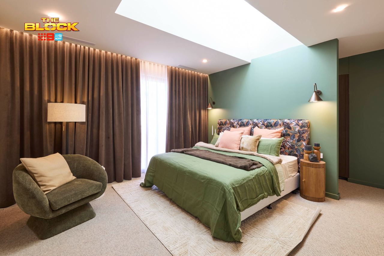
Emma and Ben Came First
After swooning hard over Emma and Ben’s kitchen last week, I have to admit that this winning guest bedroom has left me underwhelmed. It’s by no means bad, but I don’t feel as moved by it as I have some of their other spaces.
I can’t fault the layout, and many of the furniture choices are lovely. For me, it’s more of a colour issue; a battle of the greens. Like Spice Girls live, none of them are in perfect harmony. The feature walls, quilt cover, armchair and kitchenette tiles are all different shades, and it’s created some visual displeasure.
The room would have benefited from going a darker green on the walls to evoke more mood, and then pulling back on all the different shades of green in the other elements. The olive tone in that swivel armchair is pretty lush, for example; use that shade as your foundational colour.
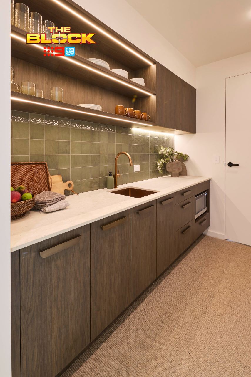
Let’s Discuss the Kitchenette as a Concept in General
If this guest bedroom was removed from the home entirely, as in an external dwelling, sign me up for a kitchenette. However this is down a hallway off the living area. It doesn’t need to be a self-contained unit with fridge, sink, microwave etc.
You do want the guests to come out of their room at some point, don’t you?
The design is delightful. Love the visual, love the functionality. The green tiles and the walnut cabinetry are a delicious marriage. But overall, a bedroom kitchenette in a home of this size really isn’t essential unless you’re staging a glamorous Flowers in the Attic situation and locking someone in here for a few years.
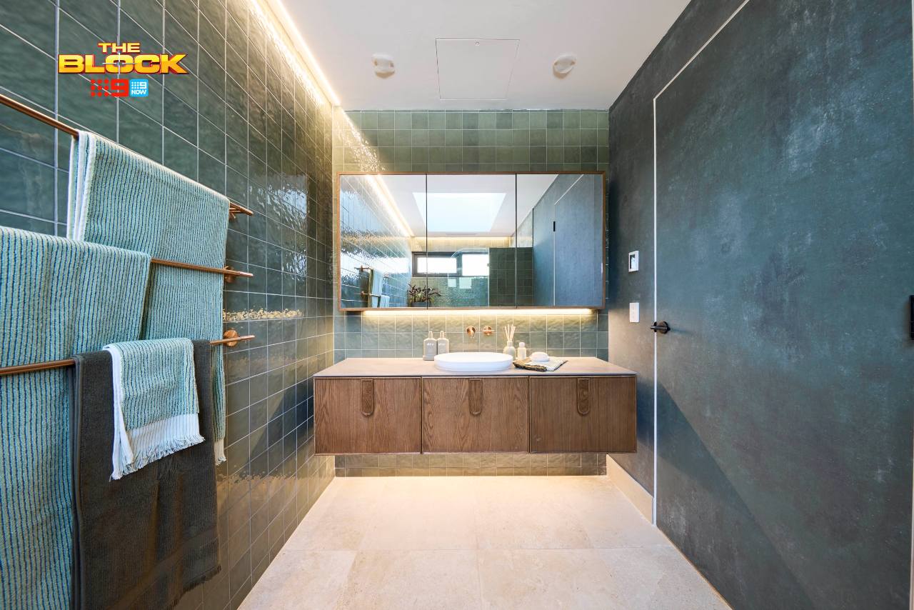
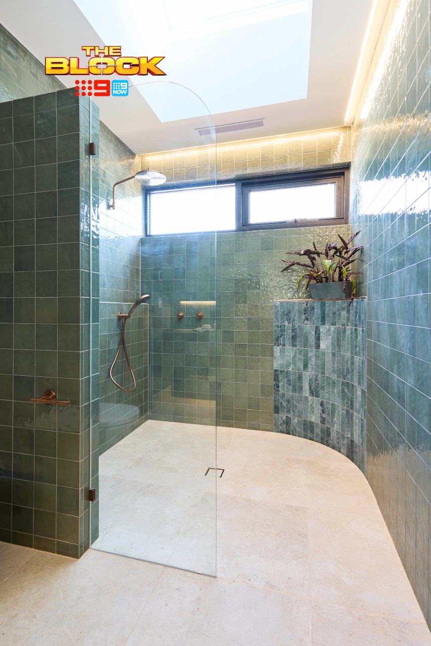
The Bathroom Brought In More Green
It looks as though they continued some of the kitchenette tiles into the guest bed ensuite, which I’m all for from a cohesion perspective. But then they applied wallpaper in a shade that’s reading as deep teal, which has made the overall colour issue worse, not better.
We also have the return of the curve in the shower. I didn’t like it in their main bathroom, and I don’t like it here. Although at least the tone of curve tile works far more successfully here than in the other zone, so it has that going for it, I suppose.
All in all the rooms are a solid, but the kitchenette in general feels like design for design’s sake, not something fundamentally required.
Sonny and Alicia Came Second
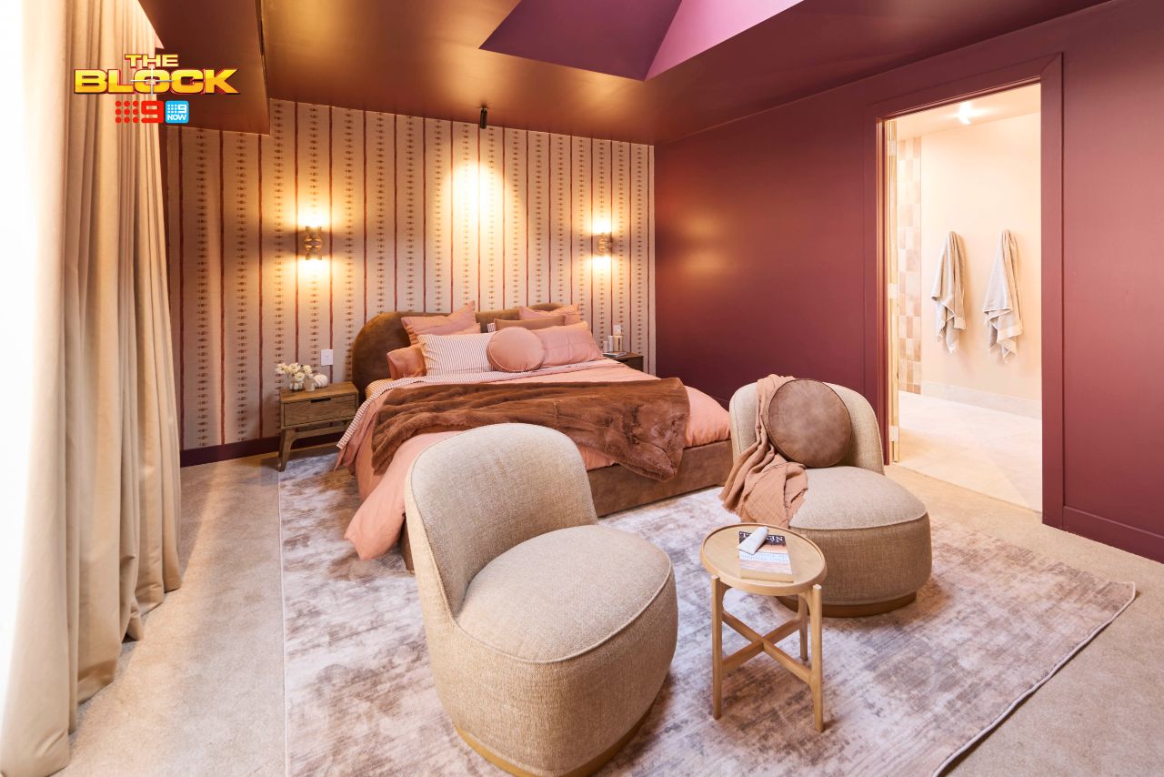
I’m impressed with the colour palette and how it was executed across Sonny and Alicia’s guest bedroom. It’s more successful than the winning room, actually, in terms of how they allocated the colour ratios across the space.
The burgundy and beige together are rather nice, and I appreciate the bold wallpaper choice (even if there’s a weird spotlight shining onto it like it’s a perp on an episode of Law and Order: SVU). The bed and soft furnishings are successful, as is the seating area in front of the bed.
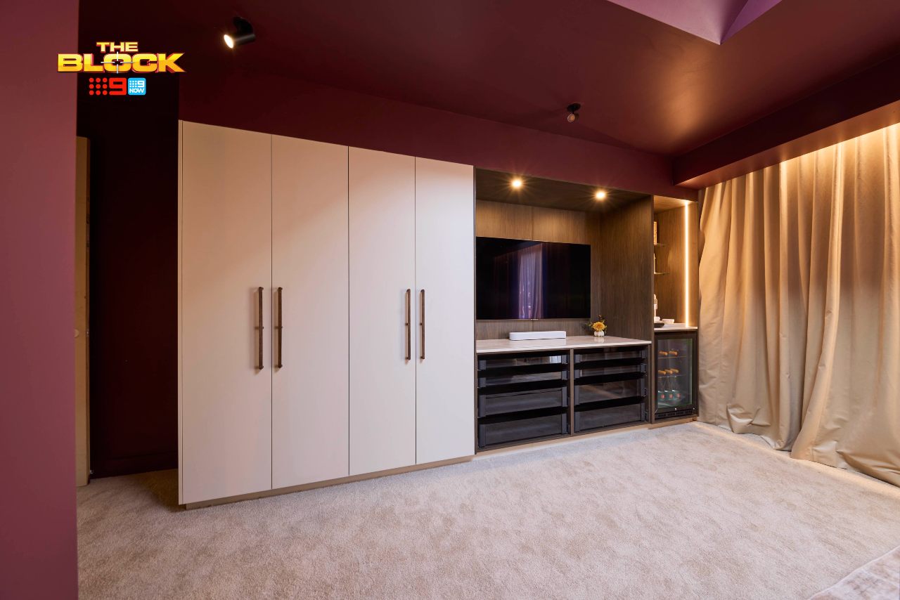
It’s not all good though. The entire wall across from the bed is a strange one. What’s with the clear drawers and wine fridge? The entire area looks more suited to a media room or garage. I also don’t understand the curtains. The pooling is crime one. Crime two: they look more like curtain backing than actual curtains.
It’s a case of ‘one side good, one side bad’ in this room.
The Guest Bathroom Lacks Cohesion with the Bedroom
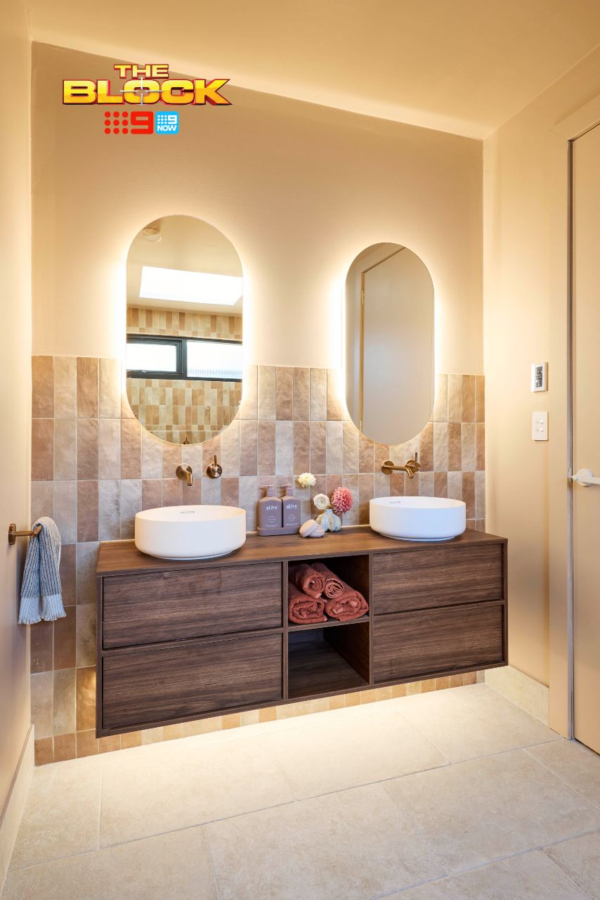
Sonny and Alicia’s guest bathroom has a lot going for it. I really enjoy the vanity area and love how all of the elements have come together. Great tiles, good mirrors, nice hardware, calming colour palette. It ticks more boxes than me on the ‘which varietals would you like to sample’ wine tasting leaflet.
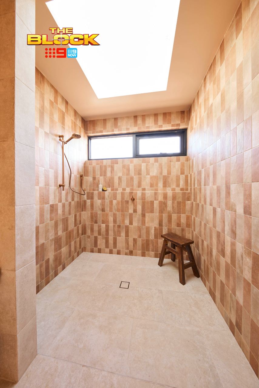
It, again, might be the colours in the still photography not being quite right, but the bedroom and bathroom don’t feel cohesive. The bedroom is rich and moody with burgundy tones, and the bathroom is giving off terracotta and yellow shades. I don’t see them working side by side.
Your bedroom and ensuite should be siblings; you don’t want them identical but there should be a visual likeness. Sonny and Alicia didn’t quite achieve that here. These rooms are like Charlie Sheen and Emilio Estevez; I’m told they’re related but I’m just not seeing it.
Han and Can Came Third
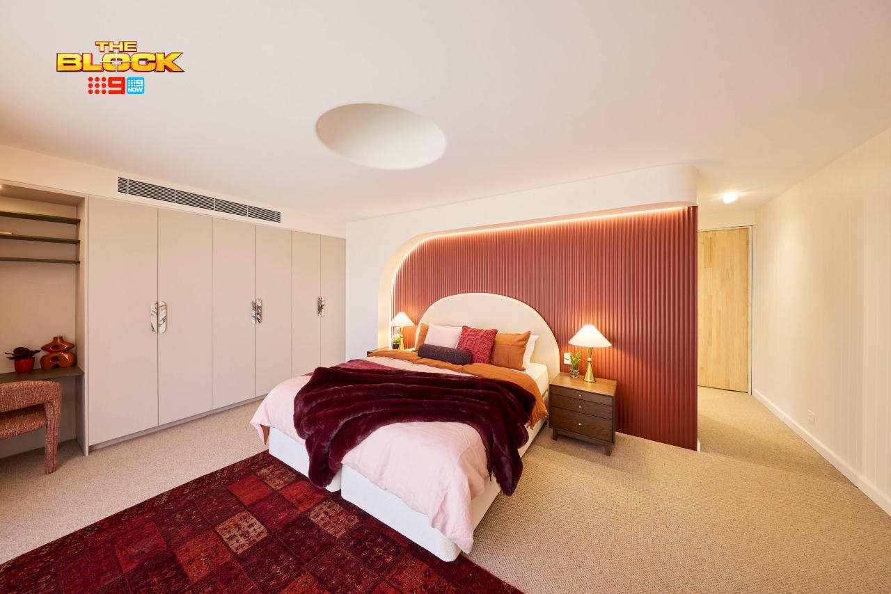
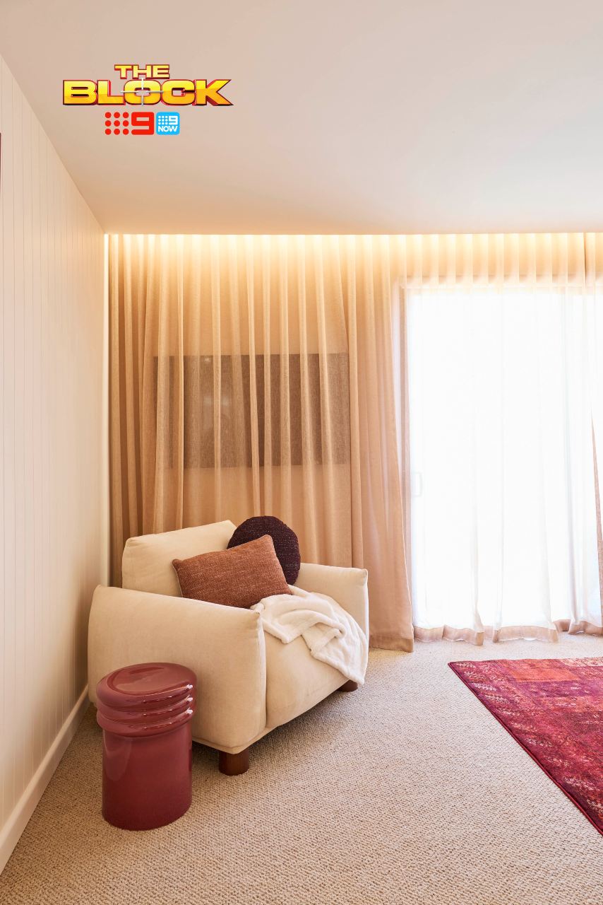
Now, you know I’ve been going on about The Block’s obsession with sheer curtains. They want them on all walls at all times. But this week Han and Can take the cake for something I’ve not witnessed in 12 years as an interior designer; the sheer-over-TV moment.
What is going on here? The only positive of this decision is that I could watch Talkin Bout Your Gen and not have to see the embarrassment on the faces of all parties involved (no, I’m not letting this go!). This has to be a mistake, right? Do let me know if you watched throughout the week because I’d love some background here.
Outside of that, I want to commend Han and Can for being the only team to deliver what a guest bedroom desperately needs – a desk! I’ve often been a guest at someone’s house and needed to pop away to do some work on my laptop. How did all the other teams miss this all-important inclusion?
The Bathroom Continued the Red from the Bedroom
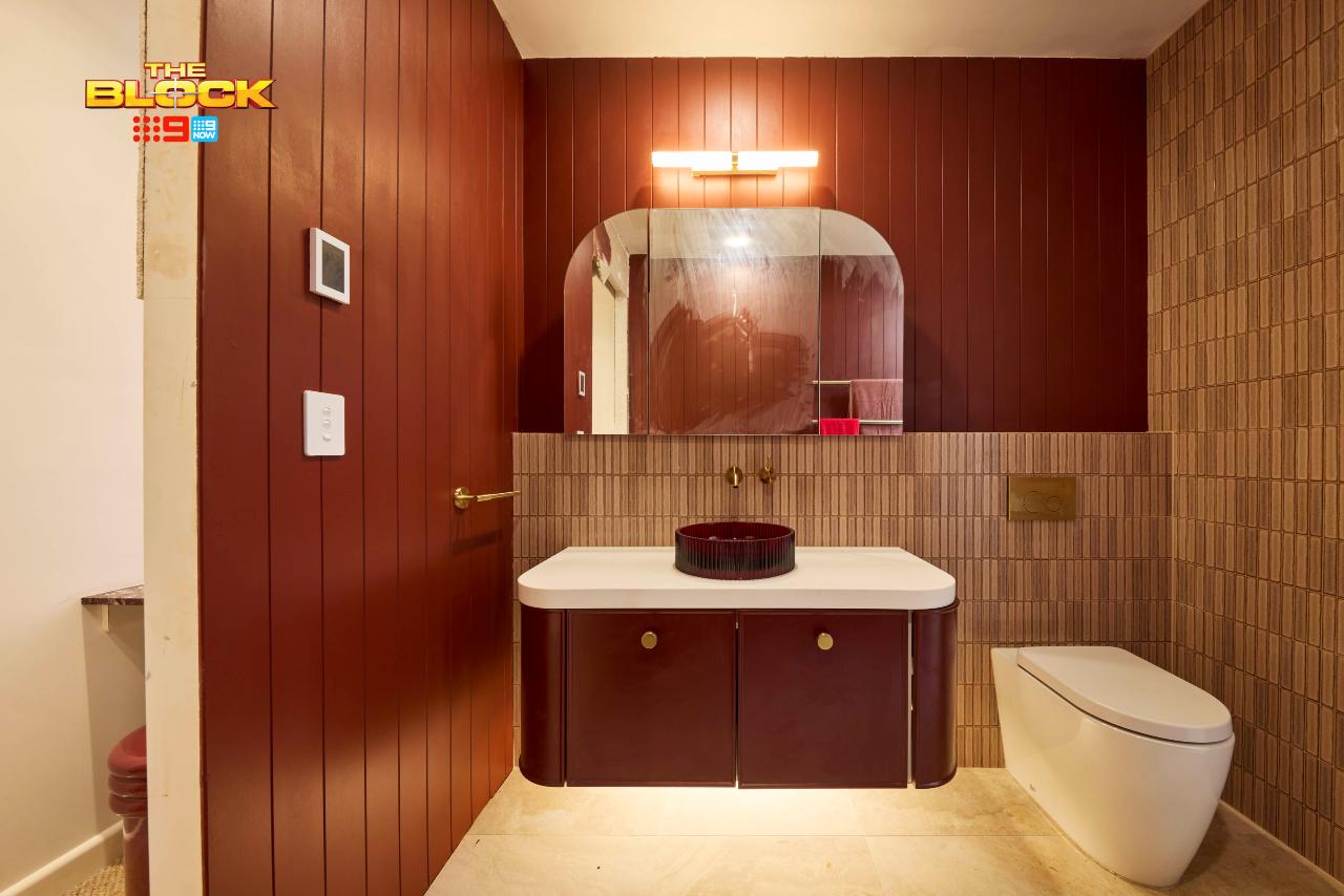
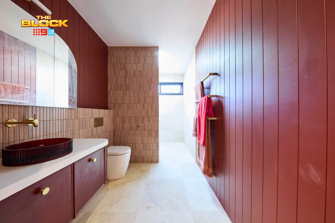
Although I find the red here – especially against the crisp white – quite visually jarring, at least they have cohesion between the two zones. These spaces are like post-surgery Kardashians; they’ve committed to a similar look and make sense side by side.
The red actually works better in the guest bathroom because there’s less white on the walls. The grey floor tile and brown/pink wall tiles help calm down the intensity. Overall though it’s still a bit overwhelming, especially with the brass details laid over the top.
I still take issue with the constant curves in every room. I’ve worked curves into some spaces in homes, but you have to pick your battles. You can’t literally arch every room within an inch of its life. Well, you can, but the result is going to be a home that feels gimmicky, which unfortunately this one does.
Robby and Mat Came Fourth
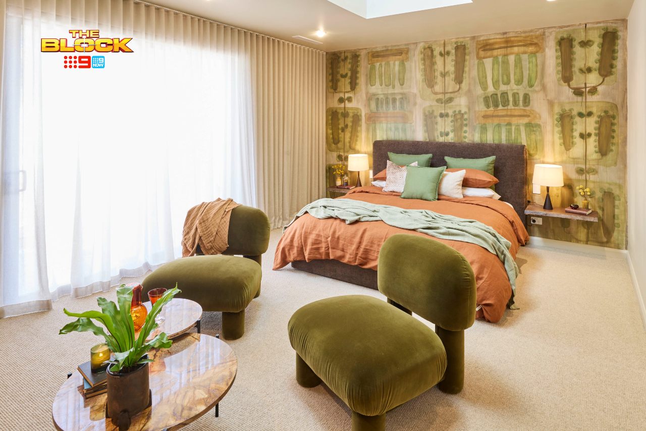
I always like to commend teams when they make bold design moves, but the wallpaper behind the bed in Robby and Mat’s guest bedroom is a risky choice.
Clients of a certain age are going to be undoubtably triggered. The PTSD created by wallpaper of the seventies and eighties is real, people, and I’m suggesting the government fund a program to support those who lived through it ASAP!
The tone is the main issue I have with it, to be fair. It’s an electric, acid green that doesn’t evoke calm and relaxation in the slightest. Like with Emma and Ben’s green, going deeper and darker would have helped. I feel they built the room around this one element, and for me not a lot of it feels harmonious.
The TV Wall is Too Bare
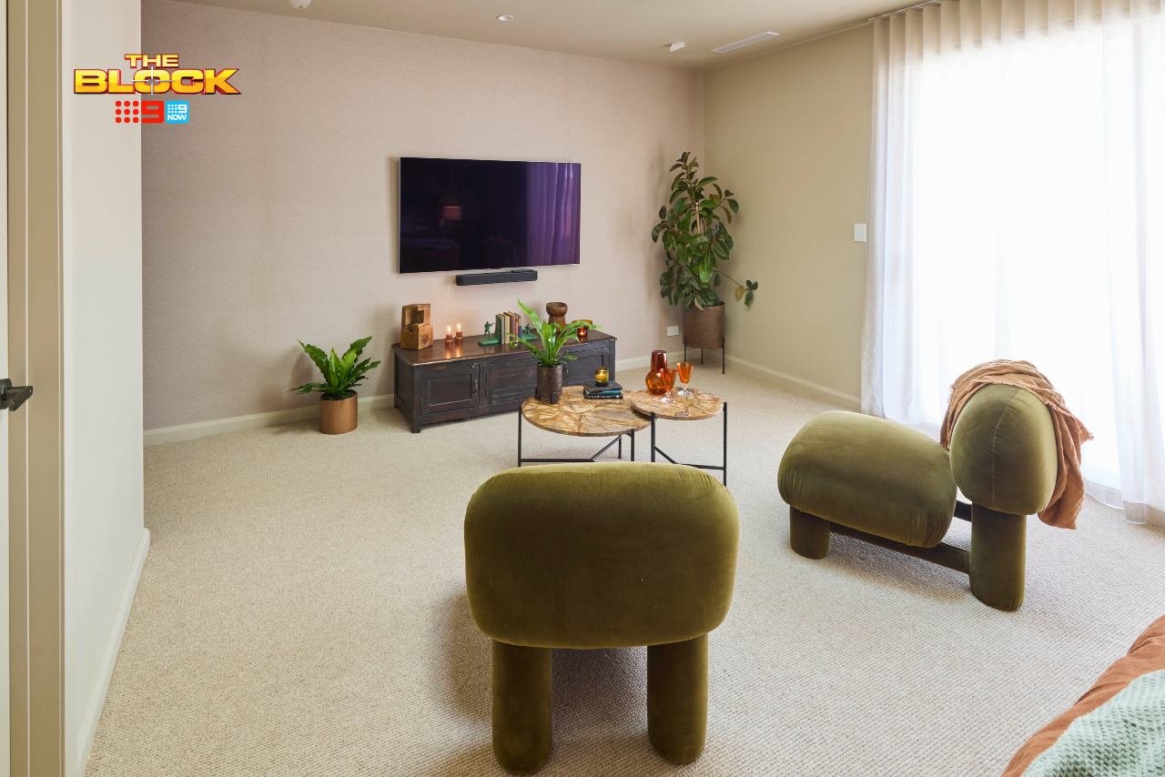
The bed side of the room is very heavy on features, while the other feels bare. The TV wall is crying out for something larger and more permanent. Build in a desk, please, and give that side of the room some more oomph.
They’ve tried to fill empty pockets with plants, which just illustrates how empty and unresolved the area is. The wallpaper on this wall is a nice one though, I’ll give them that.
I also can’t approve of the installed floating shelves as bedsides, where you can see the power points underneath. Those little overlooked details get my design eye twitching.
The Bathroom Wasn’t Finished
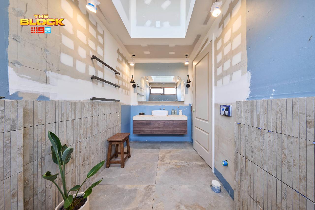
I’m not sure why the bathroom wasn’t completed, so I can’t comment on it, but I would assume the end result is going to be a successful one. Robby and Mat have been really good with wet rooms this season so I’ve no doubt this one will follow suit.
Britt and Taz Came Last
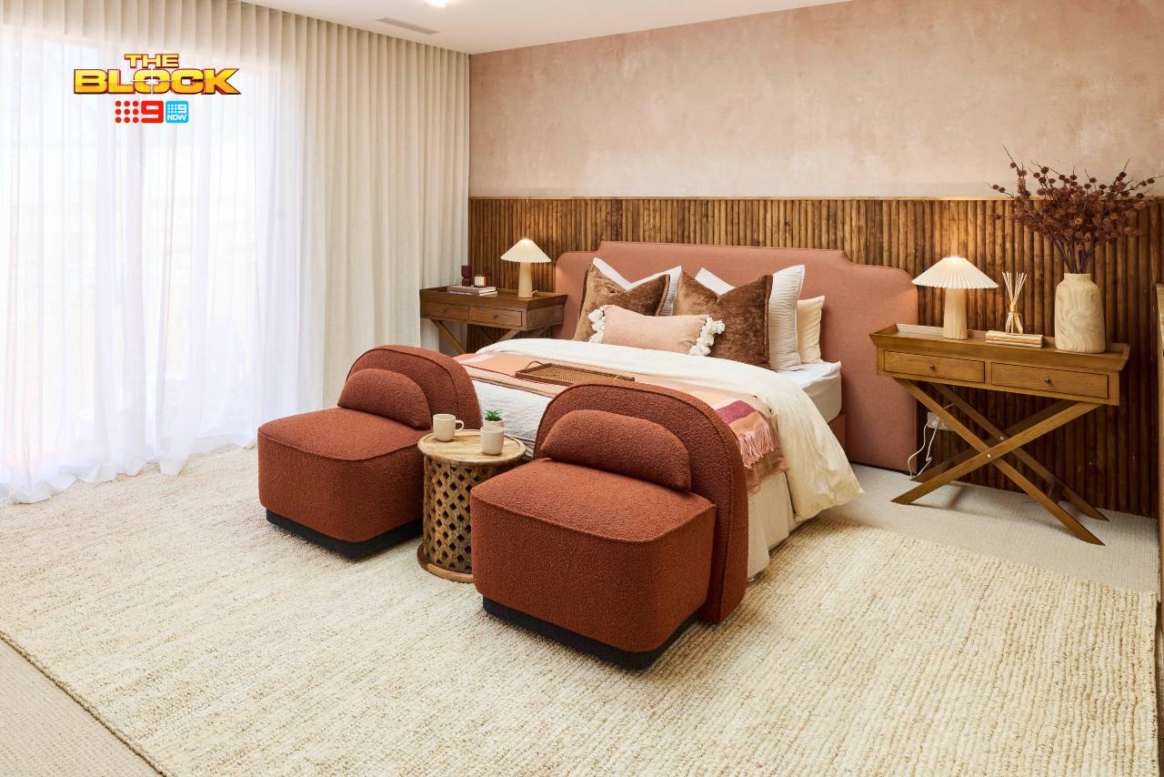
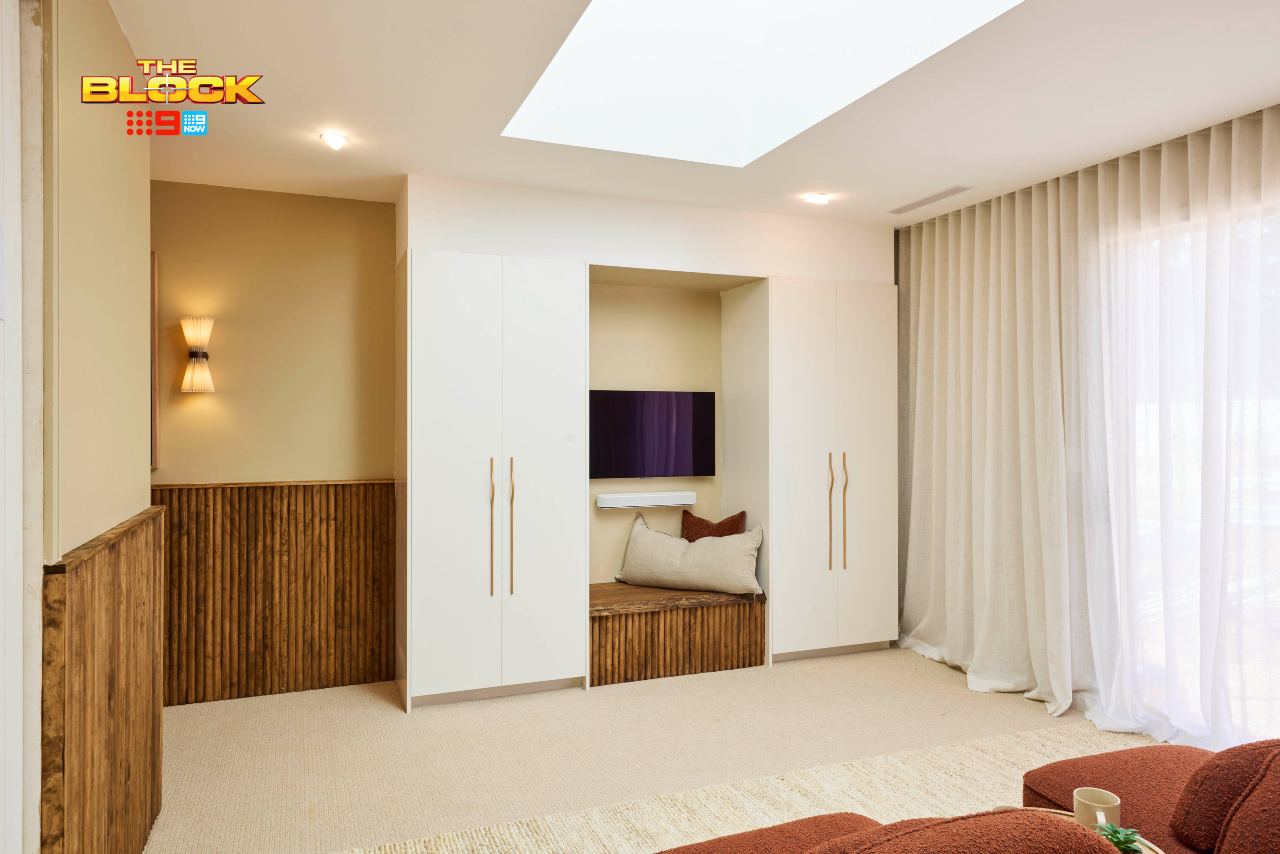
Britt and Taz’s guest bathroom wasn’t completed, so I assume that’s why they came last this week. It’s a shame, really, because there are some elements of their bedroom that are really pretty amazing.
If we judge the bed side of their space in isolation, it’s the strongest for me. The colour palette is delightfully rich and inviting. The tactility is there too; rustic textures that feel earthy and organic. There’s also a play with shape in furniture which I appreciate. It’s positive after positive.
And then we hit the other wall, with the worlds smallest TV wedged between two robes and panelling that has no place being carried across the entire room. Behind the bed – genius! Covering every wall – computer says no!
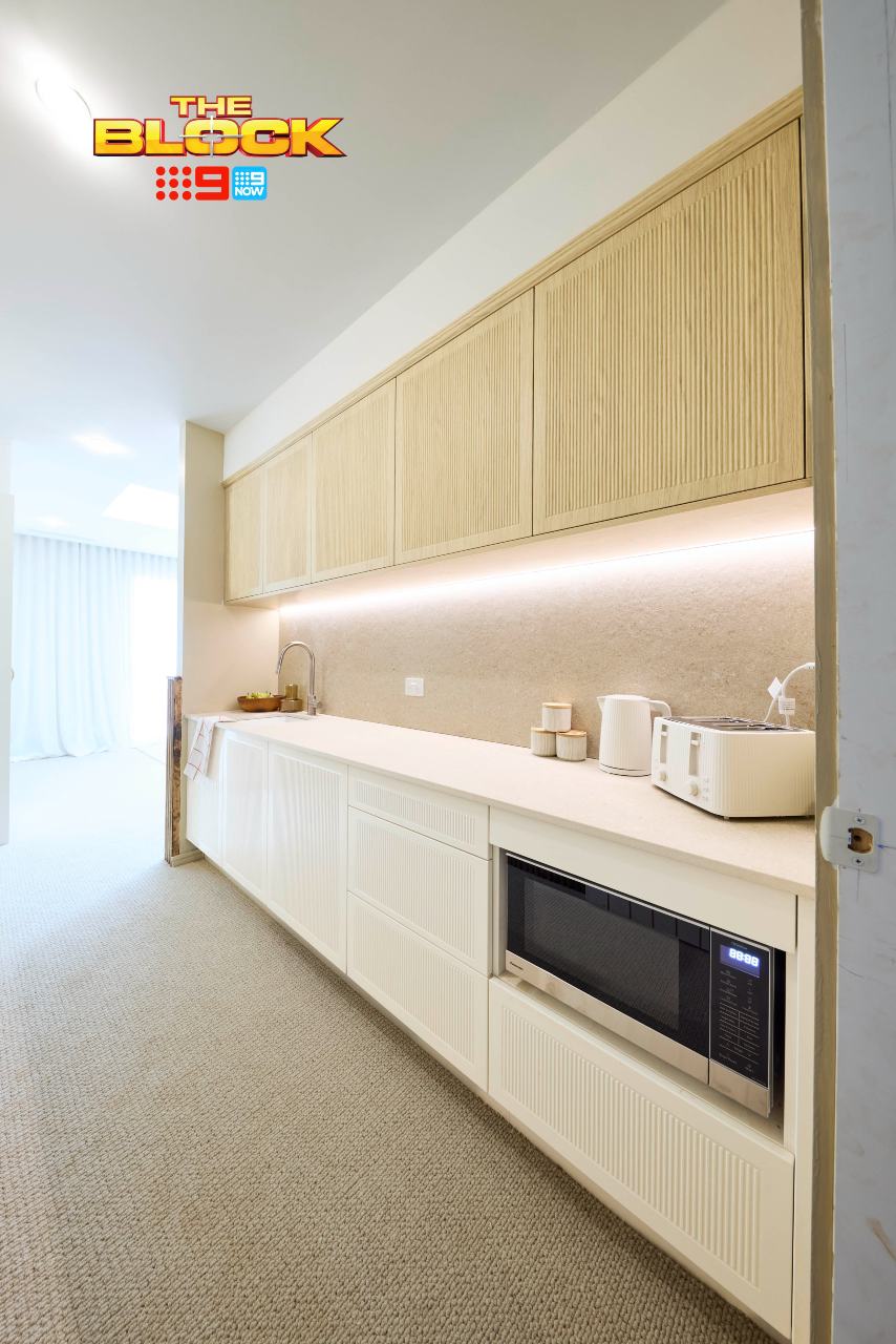
The Kitchenette Feels Unnecessary Here Too
Like with Emma and Ben’s, the kitchenette here feels like it was put in merely to score points. In this space it feels worse though because of how compromised the TV wall is.
It seems like so much time, thought and work was put into a kitchenette at the expense of a TV wall you need binoculars in bed to enjoy.
Robes and a desk in this walkway would have been a phenomenal choice. Then you could expand the TV wall and make more of it, even including a coffee machine and kettle if you wanted to. A cuppa in the morning I can understand. A full kitchenette I don’t. Who has guests over that they can’t bare to have breakfast with?
Not a great week for Britt and Taz.
Need help designing your dream home?
Have Chris and the team make over your space – it’s easy!
What’s your take on The Block 2025 guest bedrooms reveal? Drop me a comment below and let me know, or come visit on Facebook or Instagram and sound off there!
Images by David Cook Photography, courtesy of The Block Shop. For more info on The Block 2025 guest bedroom reveals, check out NineNow.

I think the difference between these suites, and other guest rooms is the external entrance. It can be rented out separately as a self contained weekender, and a kitchenette would be ideal if that’s how it is used. If actual guests are staying, they don’t have to use the kitchenette, and can wander down the hallway instead. But if paying guests are staying, they will likely have that hall door locked and will come and go via the external door. In Ben & Em’s design, I think they have got the layout right, and having the kitchenette doesn’t take away from the rest of the space.
If I’m going to my room and watching TV at least Han and Cam had the only decent comfortable looking chair. it’s unfortunate that the tv was behind a sheer curtain though, bit weird. The other chairs without arms look so uncomfortable.
I agree that a small area for tea/coffee and a small bar fridge for fresh milk would be great in a guest room. Hardly think I would need a microwave, is there crockery and cutlery too so I can heat up my takeaway and not mix with my guests altogether.