The Block 2025 back of house room reveals had so many zones to critique that I could barely keep up. I don’t know which demonic overlord decided to put novices through renovating five rooms in a week, but I do know that the designs and finishes suffered as a result.
That’s always been one of my issues with The Block; why are we letting the quality suffer for entertainment purposes? I want painting done well, I want skirting boards intact, I want a powder room basin I can reach the bottom of (we’ll get to that!).
You know what they say though; don’t hate the player, hate the game. So let’s review how the game went this week and apply some feedback accordingly. And you know the drill; drop me a comment at the end of the post or jump onto TLC’s Facebook or Instagram to unleash your thoughts there.
Key Points from Back-of-House Week
Britt and Taz Came First
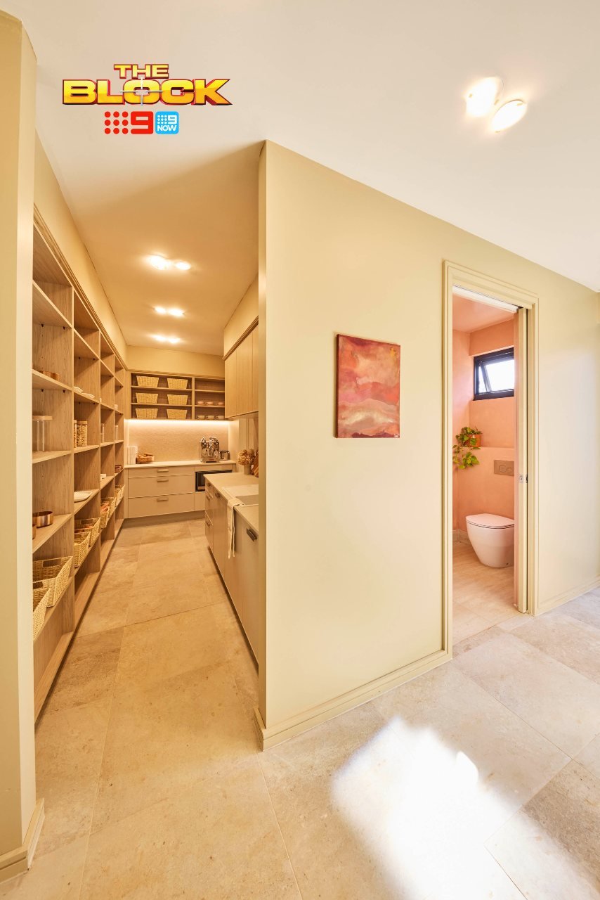
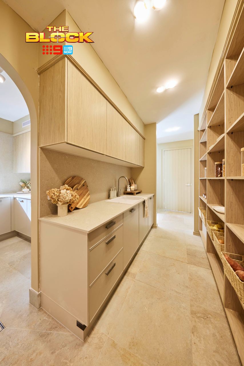
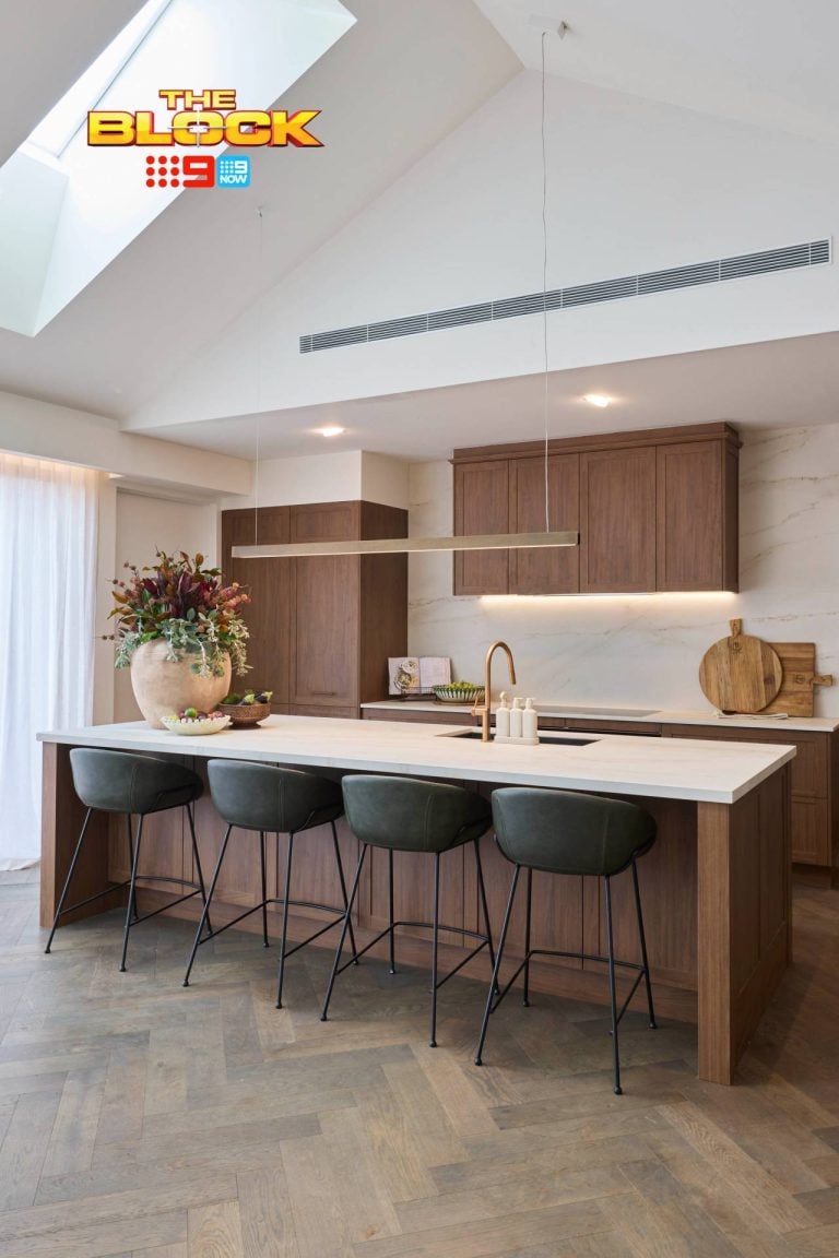
I must begin by commending Britt and Taz’s commitment to cohesion. Say what you will about the buttery walls (you know my thoughts), but to carry the same colour and style from the kitchen into the butlers pantry was a winning strategy. There’s a wonderful sense of connection between all of the zones at the back of the house.
The butlers pantry could use a door though. Considering there’s so much open shelving on display, and they have fruit and veg sitting steps away from a garage and powder room, I’d like some closure between zones.
These seem like minor details, I know, but it’s always the small things that bother you the most after you buy and move in. Those shelves are never going to be styled in reality, and I’d rather have the option to close off the plethora of cereal boxes staring at me.
Beautiful finishes though. The splashback stone and cabinetry is a quite beautiful. The handles and tapware are much the same.
Their Laundry and Garage Were Less Impressive
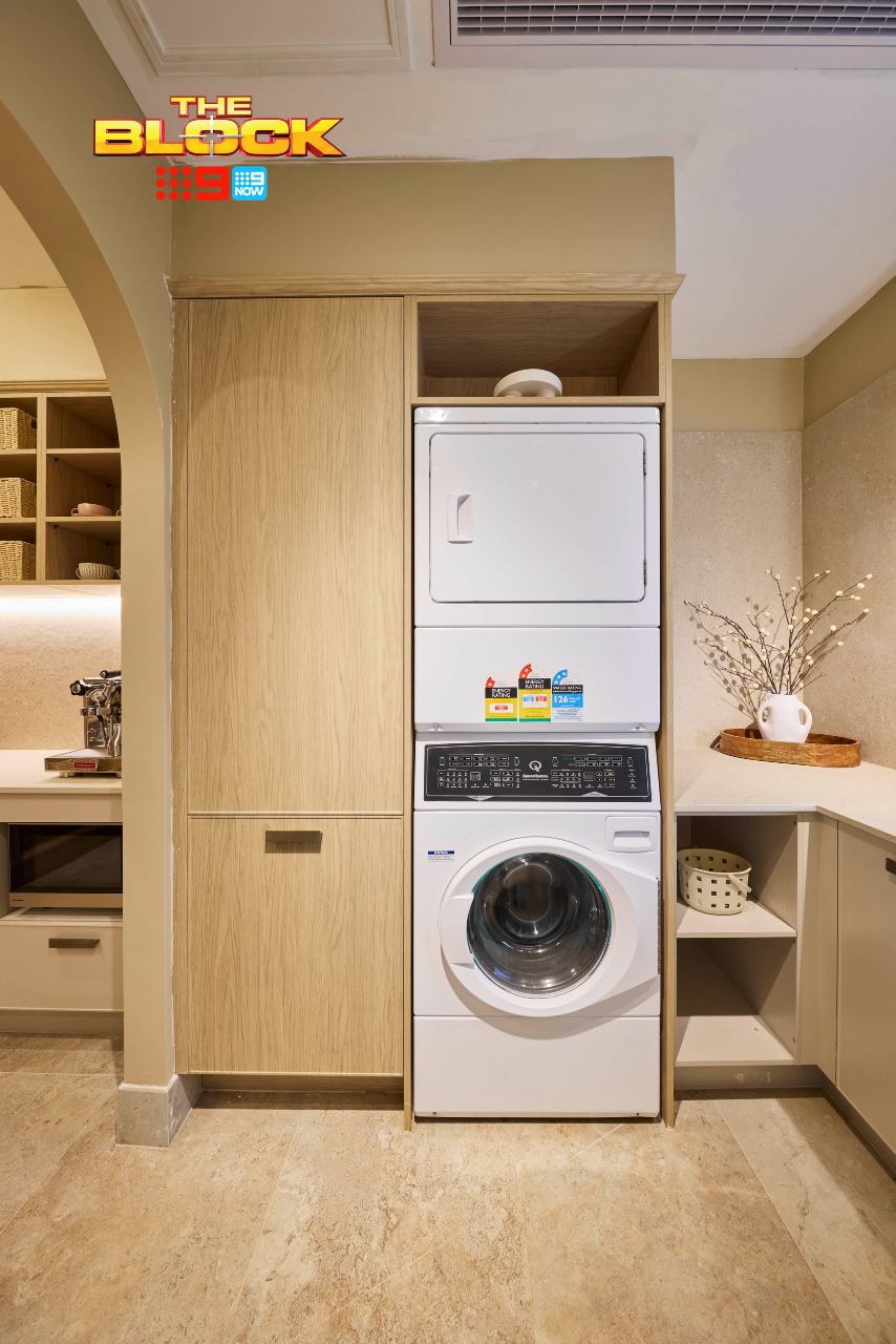
Guys, that dryer. Ooph. We need to talk about that dryer. I’m not normally one to call out specific products, but we can’t pretend it hasn’t come straight from an eighties laundromat in downtown Brooklyn.
What is the origin story of that dryer? Where is the coin slot? Where is the magazine for me to read while my load dries? This reminds me of the scene from Real Housewives of Atlanta where Nene is shocked to discover one of the ladies has a white fridge. I can’t approve, and I won’t approve.
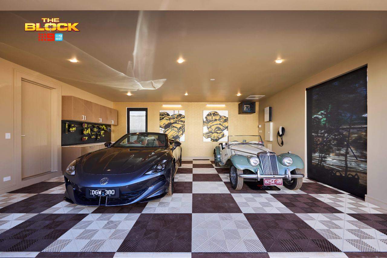
In the garage, it’s really just the gold wall I take issue with. It, paired with the checkerboard floor feels a bit OTT. I have come to enjoy the way The Block encourages design and decoration of a garage, so I’m all for it, but this one missed the mark for me. Less would have been more. A nice epoxy floor would have been more suitable.
Han and Can Came Second
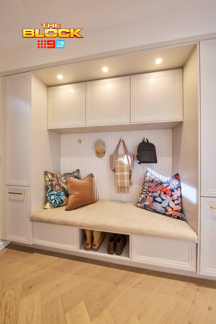
Han and Can’s mudroom was delightful, that can’t be denied. Entering the home this way gives you a great sense of what’s to come in the butlers, laundry and kitchen. Sadly it doesn’t warn you of the turquoise bedroom or the red bath, but for this part of the home we once again have cohesion. I’m all for it.
If I were designing the under section of the bench seat I’d suggest we go one or the other; all-drawers or all-open. As it stands you don’t really get enough of either. And you know your family; you’re committed to putting shoes in drawers, or you’re more of a ‘kick them off in the doorway’ and run kinda group.
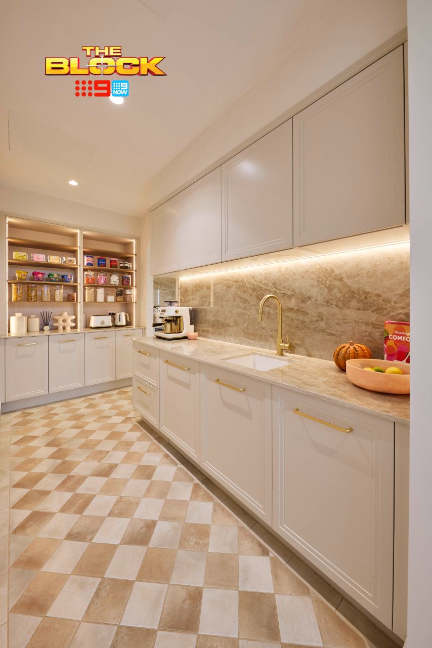
The butlers pantry does reflect the design of the kitchen and has all of the functionality there. I would question the floor tiles though. For me they don’t quite work with the high-gloss splashback. One is grounded and earthy, the other is bold and blingy. They’re clashing like Cherry and Laura in The Girlfriend.
A Question for the Teams (Or Architect, Really)
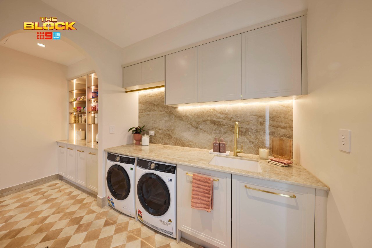
Why didn’t we do a completely separate butler’s pantry and laundry, with a small powder room sat within the laundry?
I would much rather walk through the laundry to a toilet at the end (closed off), than walk the washing through the butler’s pantry. There has been some odd orientation choices with these houses, it must be said. This is another one.
The visual of the laundry I quite enjoy. However, I’ll say the same thing about it as I said about ovens in the kitchen; if I’m dropping millions of dollars on a home I don’t want to bend down to fish out my briefs. I’m paying a luxe price, I want my washer and dryer above-counter. A solid design outside of that bug bear.
The Garage is Where it All Fell Apart
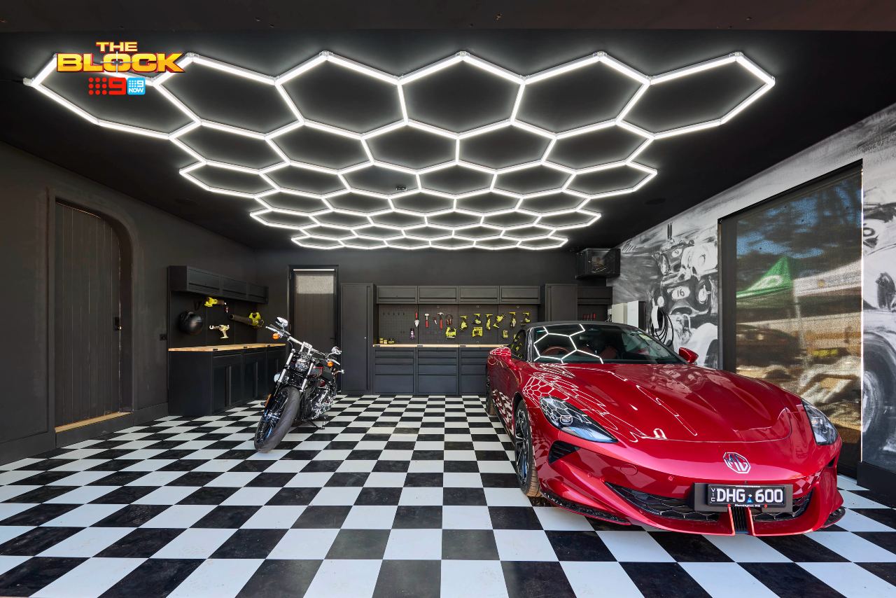
Han and Can were finally onto a cohesive design across multiple zones, and then we got this dark and moody garage?
Your garage (yard and facade) should give you a hint of what’s to come when you walk inside. There needs to be a connection. This garage is at complete odds with everything else they’ve delivered. It makes no sense stylistically and feels confused.
The curved door though; yes. This is one of the first curves they’ve delivered this season that actually works. I’m into it.
Sonny and Alicia Came Third
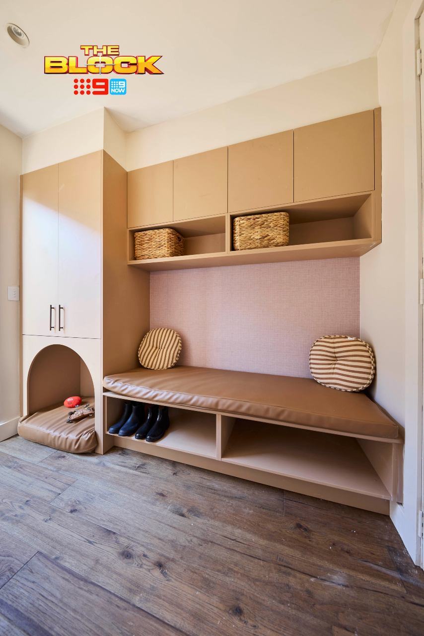
In the mudroom, Sonny and Alicia were smart to leave the under-section open. It makes it easier to kick off your shoes. The dog bed was also a cute idea, although I have to say, my future pooch is not sleeping by the back door. I’ve not met her yet, but I already know she’s one glamorous bitch who would be inside by the fireplace at all times.
The mudroom overall feels a bit lacklustre. The cabinetry and the colour, the wallpaper, the cushions; it all feels a bit rushed (which to be fair, it probably was) and the elements aren’t working together. It doesn’t say ‘welcome home’ by any means. There’s also nowhere to hang coats from what I can see. I don’t want rainy jackets in the cupboard. I want them out so they can dry.
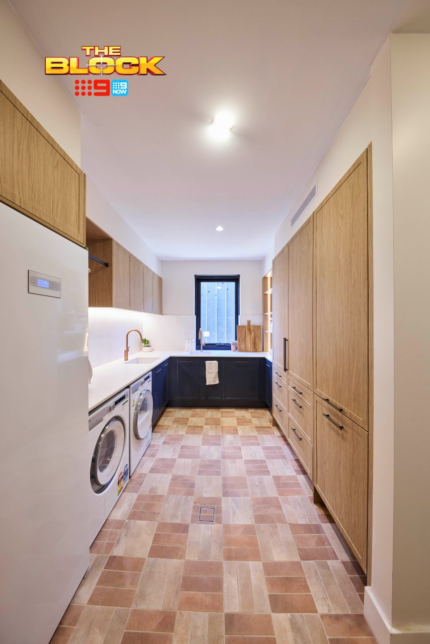
In the laundry, things felt equally underwhelming. A great size, sure, and all the functionality is there, however the introduction of timber cabinetry is an odd choice. And sadly it, the blue cabinetry and floor tiles don’t work as a trio. Two basins so close to one another also feels a bit strange.
The Garage and Powder Room Had Some Issues
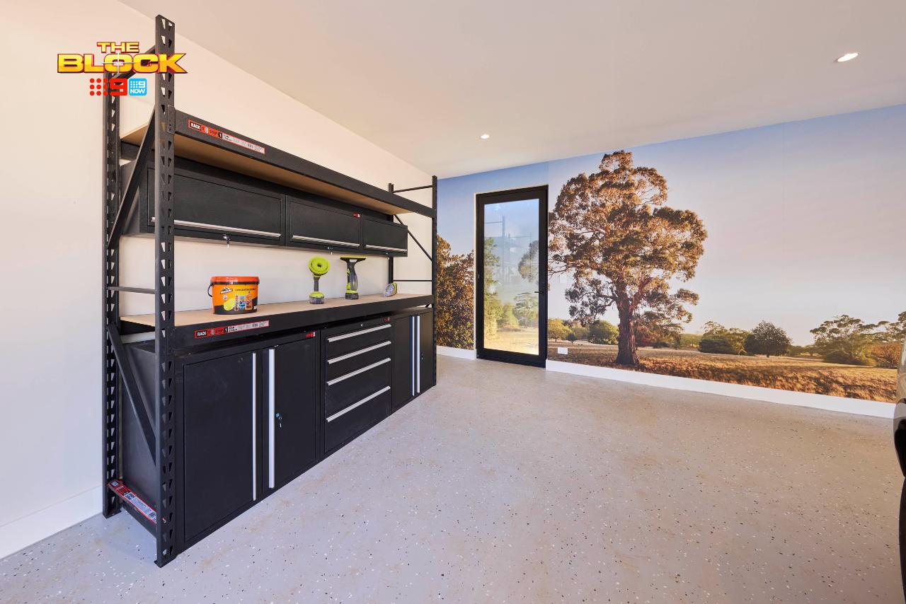
The positive in the garage is that they did go for a less-is-more approach. The flooring is great, the mural works really well, and it doesn’t feel like a gimmicky space overall. I could definitely have used some more wow-factor, but it’s still a decent zone.
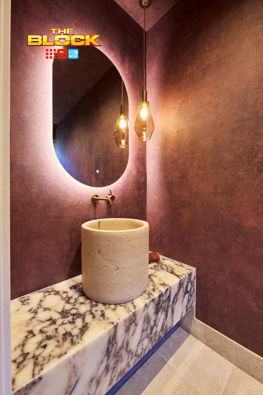
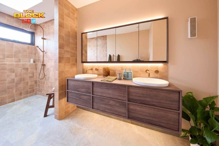
The powder room is my main concern. What is going on with that basin? If you dropped the hand soap inside you’d need to call in the SES to abseil down on a rescue mission. Kiss your family just in case, guys, you may not make it back up! I’ve truly never seen anything like it before. I need answers.
The tall basin means that the vanity sits incredibly low in the room, which looks odd, while the pendant light is at a level that hits you right in the eye. Everything in terms of height setting in this powder room is unsuccessful. The colour palette is a yes, but mostly everything else is a no.
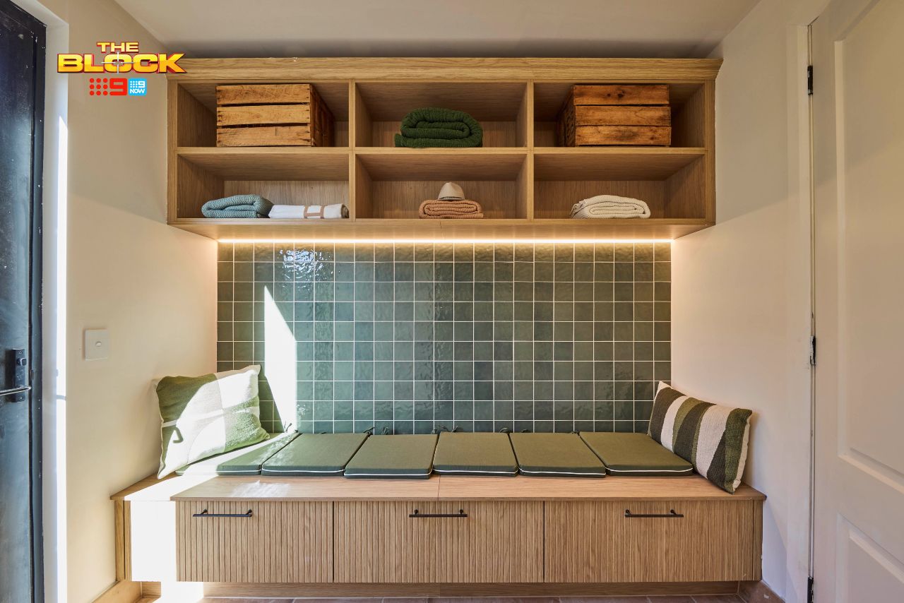
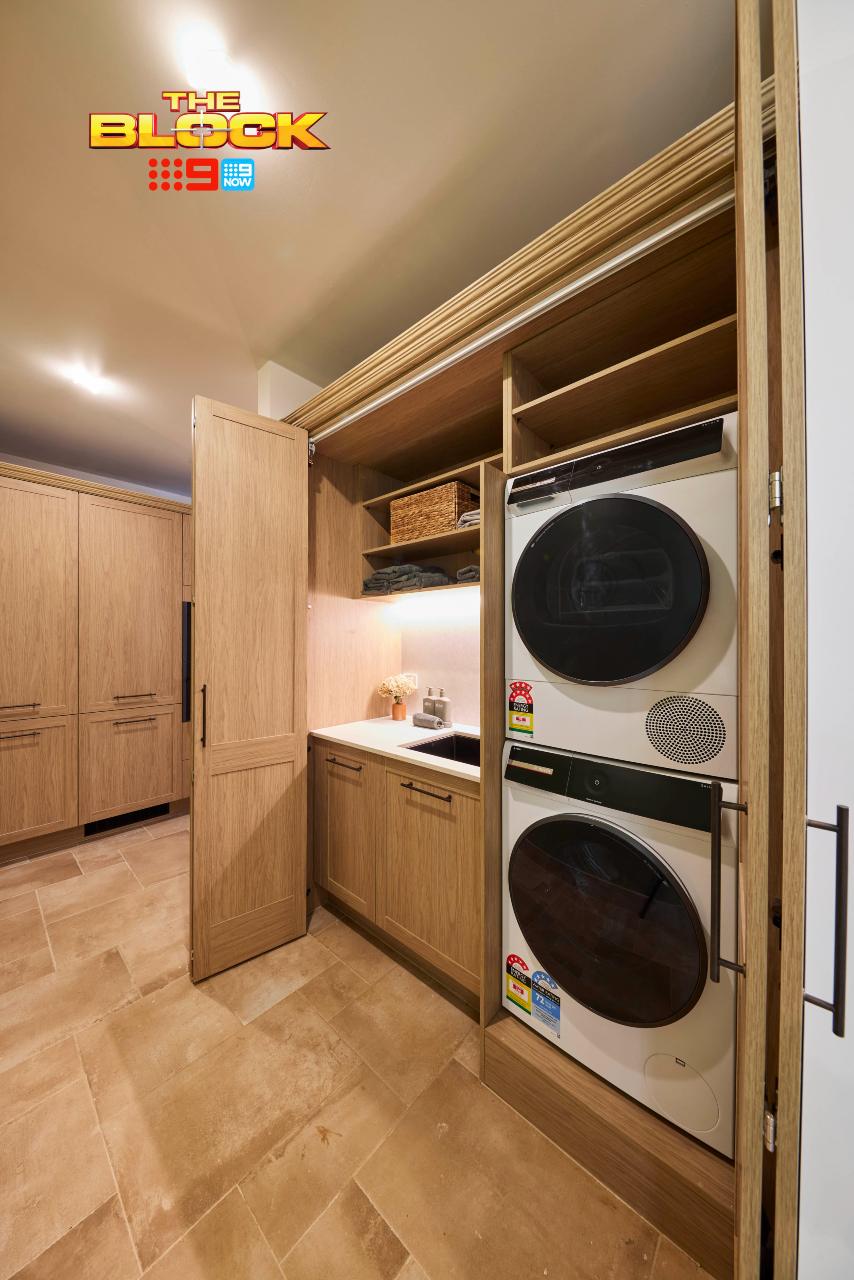
Robby and Mat Came Fourth
I’m going to say the same thing about the Euro laundry as I do about wine pours at expensive restaurants: for this price, I’m gonna need that to be bigger. You’d be hard-pressed to find anyone who’d be happy to drop a few million on a property with a laundry of this size. I’m really surprised Robby and Mat did this.
As I’ve said before, they really do excel at designing wet rooms, but here the boys lost their way. The entire zone feels cramped and compromised, even though the fitting, fixtures and sense of cohesion from the kitchen are completely there. It’s such a shame because it’s not an easy fix to correct. If space had to be taken away from somewhere, I’d sacrifice some butlers pantry before I would the laundry.
In the mudroom, the hectic week the teams were put through is reflected in the design. This doesn’t really feel like them or make much sense. From the tiled back wall to the unsuitable seat cushions on top, the lack of hooks to haphazard styling… it’s all a bit thrown together.
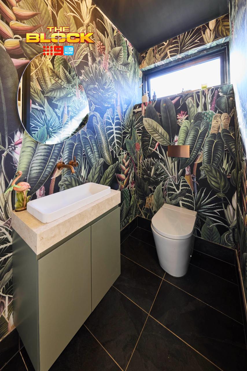
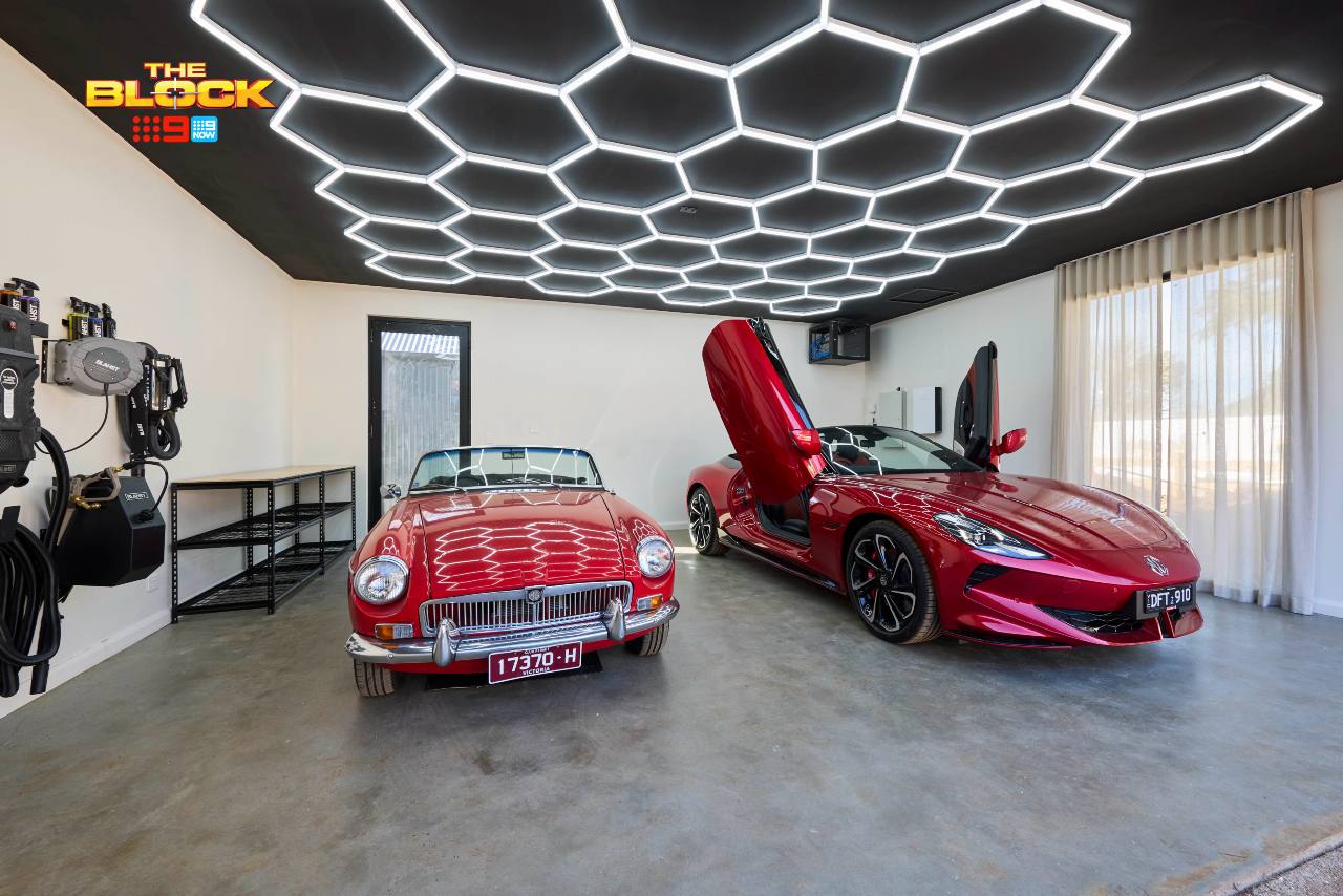
The Garage and Powder Room Feel Rushed
I could be wrong, maybe the boys weren’t as rushed as I’m suggesting, but the rooms feel it. The powder room is a perfect example. Given the serene nature of the rest of their home, the wallpaper choice feels completely out of place.
I can’t think of another zone in their home that feels tropical in style (maybe the rumpus wallpaper?). I’m all for a dramatic moment in a powder room, but it still needs to feel in-keeping with the overarching style of the home. They also haven’t used copper accents anywhere else, so the choices continue to baffle me. This powder room belongs in another home altogether.
The garage is much the same. At this stage of the competition you should be able to look at a garage and know which team did it based on the internal scheme. No team got this right. In this garage, things are particularly undercooked. And the sheers on the window? That’s like wearing a gown to a Tough Mudder challenge. Not great.
Emma and Ben Came Last
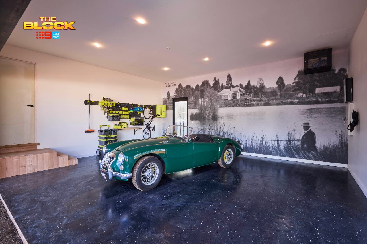
Emma and Ben’s garage could have used the green and walnut tones they splashed across some of their other spaces. A green wall and ceiling would have given this room some personality and connected it to the spaces inside.
The wall mural is great though; the best of the lot this week. It’s interesting, has a sense of charm, and speaks quite literally to the location of the home. That I give them credit for. The room as a whole though needed to be pushed so much further.
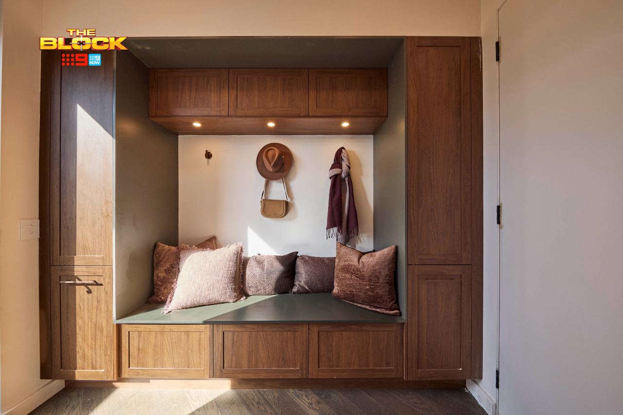
The mudroom was almost there. It really only needed a proper bench seat cushion and it was home and hosed. Everything else about it is lovely; the colour palette reflects what’s happening in the kitchen. The storage is all there. We have hooks on the wall. There really is a lot to love.
The Laundry and Butlers Combined?
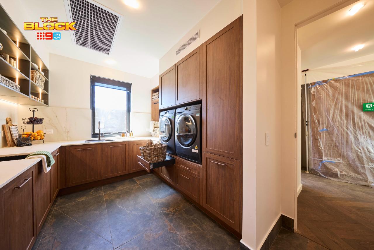
Let’s start by congratulating Emma and Ben for being the only team that gave us a washer and dryer above-counter. That in itself should have gotten them higher up the scoreboard. Trust and believe that whoever does the laundry in your home would greatly appreciate this touch.
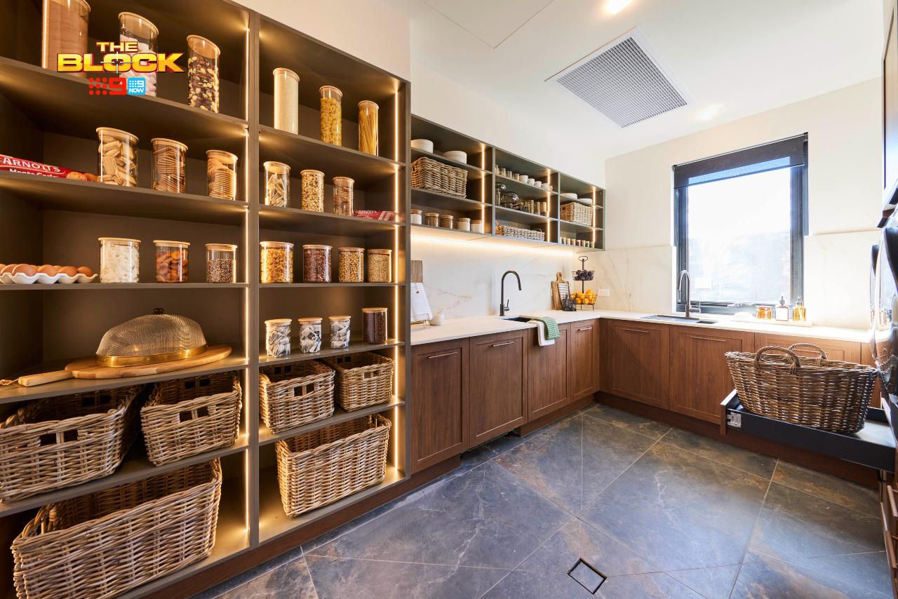
I get the concern about the laundry and butlers essentially being combined into one room. As I said earlier, you want them to be separate entities altogether. The laundry zone doesn’t deliver on much bench space to fold clothes and towels etc. There is bench space, but it’s going to be covered in dirty dishes as most of it surrounded the butlers sink.
All in all, I can’t get behind this two-in-one moment. I don’t like it in shampoo and conditioner, and I don’t like it here. But, it bears repeating: this is what happens when you make teams deliver five rooms in one week.
Have TLC Interiors Transform Your Space
We make interior design easy for our trusting clients on-the-daily
What’s your take on The Block 2025 back of house room reveals? Drop me a comment below and let me know, or come visit on Facebook or Instagram and sound off there!
Images by David Cook Photography, courtesy of The Block Shop. For more info on The Block 2025 back of house reveals, check out NineNow.

This is the ugliest effing block I have ever seen. An absolute cliff face drop in quality, from previous seasons (not last year obvi). It’s a famine of beauty, honey! My eyes are starving for beauty!
Love the show room garages, great spaces to highlight beautiful cars………but those lights should have been an octagon shapes not hexagons. MG logo is an octagon shape. Taz and Britt, I know you were rushed but the painting job is horrid, stick to styling.
Great read! Britt and Taz’s back-of-house spaces were the clear winners for me. I loved how their butler’s pantry carried through the same buttery tones and materials from the kitchen it made the whole rear of the home feel unified and intentional. I do agree though that the open shelving could benefit from a door to conceal the mess of real life storage, other than that the cabinetry, and hardware choices were still elegant.
As for the Flexspec garage tiles and the overall garage itself, yes — I think the gold wall and checkerboard floor were bold choices, but I actually appreciate that they took a risk. It’s easy to play it safe in a garage, but they injected personality and creativity. I’d rather see a slightly OTT design that can be toned down later than a lifeless, purely functional space. Feel like bare concrete or epoxy just feels cold to me. Overall, Britt and Taz were the only team whose zones felt truly connected — visually, materially, and emotionally, that’s why I think they won.
Agree with everything you said Chris. I’m not keen on their layouts, but Ben and Emma did it best for me. Overall I don’t like the Blocks styling this season, too much brown, timber and dark colours. I do like Ben and Emma’s soft greens in some of their rooms. Apart from the curved arches I liked the kitchens this year. Looking forward to see the outside areas.
These houses are such a strange layout. For the size of them it seems strange. From a main suite off the kitchen to the 2nd living down the hallway past the bedrooms a guest suite with the wardrobe/kitchenette space in the entry. Then this week with the pantry in the laundry/mudroom area. Totally agree that the powder room suits more to be in the laundry.