The Block 2025 kids bedrooms reveal delivered a shock even I wasn’t expecting. This week I actually agreed with the scoring. Like a census, it only happens once every five years, and this was not the week I expected it to occur.
Kids room reveals on The Block are always tough. And I get it, there’s so much to take into account. The teams are often confused by the brief, and I don’t blame them.
A great kids bedroom, when staging for sale is an exercise in three things:
- Carving out a style that ties into the rest of the home to appeal to parents.
- Creating a space that feels childlike enough to appeal to a kid.
- Ensuring the design isn’t so permanent that the buyer can’t easily remove the kid theme
To get all of that into a Block kids room is more challenging than sitting through Ed Kavalee in those Youi insurance commercials. This week, some of the teams nailed it, while others fell apart. Let’s explore…
Key Points from Kids Room Week

Britt and Taz Came First
I had many critiques of their bathroom last week, but this week Britt and Taz’s kids rooms were solid. One was clearly better than the other, but overall they deserved the win.
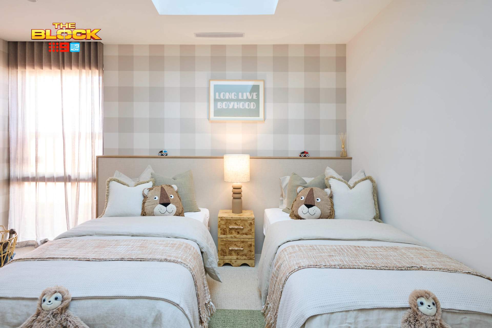
The first is one of the most charming kids bedrooms The Block has produced in recent years. For it alone, award them first place. It ticks every box in the checklist above. Style: tick. Kid-appropriate: tick. Remove a few elements and it becomes an adult space: tick.

The wallpaper in this room is beautiful (unlike the ones we’ll get to shortly). The fact that it’s a carpeted room is another huge bonus (always carpet your bedrooms, people!). The muted colour palette is super-versatile, and if you took away the ‘Long Live Boyhood’ artwork it’s a pretty unisex space.
I’m not sure I have anything negative to say about this room. I know, I’m more surprised than you are. I just hope those skylights have a window covering on them. Nobody wants a child awake at the crack of dawn.


The Second Bedroom Was Less Impressive
Many teams this week seemed to pour energy into one room to make it amazing, with the second space a touch neglected. It’s like the parenting style of Lynne and Jamie Spears. This second kids bedroom is a little undercooked, with much less layers, style, or sense of whimsy.
There’s nothing childlike about it at all, in fact. Perhaps that was the intention; to carve out more of a guest space for visitors. It that’s the case, it still fails to deliver on a few fronts.
This room feels more like a furnished room than a designed one. Sure, it has a bed. Sure, it has a desk. Sure, it has curtains. But there’s no story being told, and it bears no resemblance to the other kids room, or to their bathroom last week. Like And Just Like That, it might be wrapped up but I wanted a lot more.
If you’re keen to shop pieces from Britt and Taz’s rooms, check out The Block Shop.

Emma and Ben Came Second
One thing I will say about both of Emma and Ben’s kids bedrooms is that they look like they were given the same amount of time and energy. This time, like the parenting style of Carol and Ronald Minogue (don’t ask me choose my fave Minogue – I won’t do it and you can’t make me!).
The blue bedroom I appreciate from an ideas perspective. They didn’t just furnish a space. They really considered how to design some custom elements that would appeal to a teenager. When you walk into this room, it’s very clear who it’s for, which is positive.

Sadly, the combination of blue wall, floor rug, quilt cover set and wall cutout is quite visually overwhelming. They’d be wise to calm this room down a bit. A case of too many ideas, not enough editing. The good news is that it could easily convert to an adult guest bedroom, which I appreciate.
I do have to ask, though: what on earth are those creepy old chairs doing in the corner of the room? I’ve watched enough horror films to know that if you put out chairs for poltergeist, they will take it as an invitation to come haunt you at night. A rim of salt around the edge of the bed will not save you. Be warned.


The Second Bedroom Was More Successful
This bedroom feels far more refined. A story is being told, there’s a sense of charm and character. It doesn’t lean too heavily in a particular direction; remove the teepee and wall decals and you have a zone an adult would be equally happy to spend time in.
I know I’m repeating myself, but enough with the skylights. I know every room on The Block gets forty of them whether they like it or not, but I don’t need one over my bed. At night you’re looking at a black rectangle, and then at 6am you awaken to a brightness that rivals Turkey teeth implants. For me, it’s a lose-lose.
I love the paint colour, wallpaper, panelling and bed styling in this kids bedroom. Am I changing my mind about agreeing with the scores? Maybe Emma and Ben deserved the win. Like Natalie Imbruglia, I’m torn.

Sonny and Alicia Came Third
Pink tartan wallpaper. Three words have never triggered my PTSD more. I thought the 2022 redo room decked out in this paper was the last I’d see or hear of it, but it’s come back to haunt me like Dean Wells from MAFS. Will that thumb of a man please just go away?
I’m able to take my own opinion out of it for a moment and allow Sonny and Alicia their choices. However, I just don’t understand why they chose a wallpaper that replicated what a previous team did in seasons’ past. It feels too soon, and too similar.
And to be fair, the pink wallpaper isn’t the only reason this room isn’t reaching its full potential.

I’ll give them the fact that the room is well layered. Curtains, carpet, rug, wallpaper, bedding; plenty of tactile materials. The issue is there’s just a lot of weight in the room. It feels heavy. And of course, too pink. There’s a sense of suffocation for me. It doesn’t feel ambient and inviting, but rather oppressive.
Furniture with a lighter profile, neutral curtains, less velvet and leather; it would all helped create some calm and balance. A little too sickly sweet for me, I’m afraid.


The Second Bedroom Was Too Safe
I know, it sounds odd to say that a bedroom with blue tartan wallpaper is safe. But really, if you remove that one feature wall you’re left with a pretty basic space. It seems they put all the attention on one wall, and across the room there’s a beanbag, table and chairs.
The pink room had too much going on, whereas this doesn’t have enough. It’s definitely the more successful of the two spaces, it must be said, but it seems they ran out of steam.
Are the bed frames second hand? Honest question. Either way I feel they let the room down. It doesn’t feel aspirational, but a little worn, a little recycled. And don’t come at me: I’m all for repurposing and reusing in design where possible. But here some fabric bed framed would have worked better.
Han and Can Came Fourth
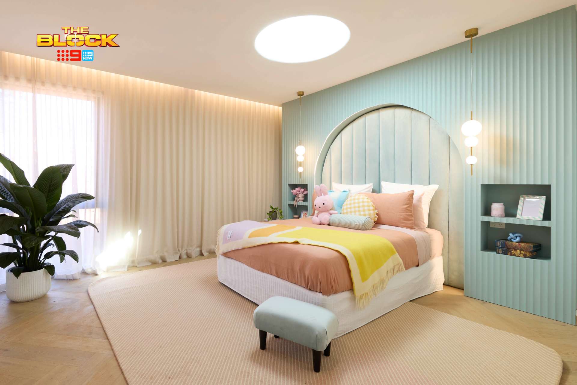
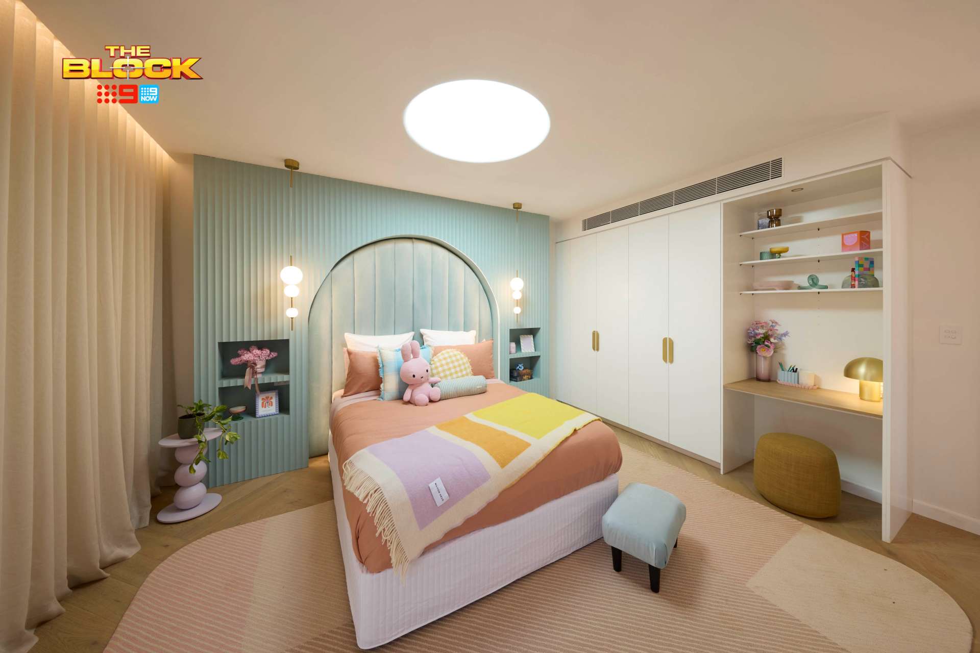
For Han and Can, it was a case of how many ideas can be packed into one room. The first kids bedroom, seen above, is a prime example of this. Why settle for one focal point when you can have five? All the ideas are nice on their own, but cool your jets guys, it’s doing too much.
Curve a giant headboard, have vertical lines on it, recess it into the wall, install joinery around it and have vertical lines on it too, cut out four niches, have a circular skylight above the bed, lay down a patterned rug, install luxe-vibe pendant lights. Are you overwhelmed yet? Like Parker Posy in White Lotus, I need my lorazepam.
I truthfully like everything in this room independently. But all meshed together, no. It also feels cold somehow, like a staged movie set instead of a warm and inviting bedroom. The lack of bedside tables here are an obvious functional mistake too. Amazing ideas, but you have to edit, edit, edit them down.
The Second Bedroom Suffered the Same Fate
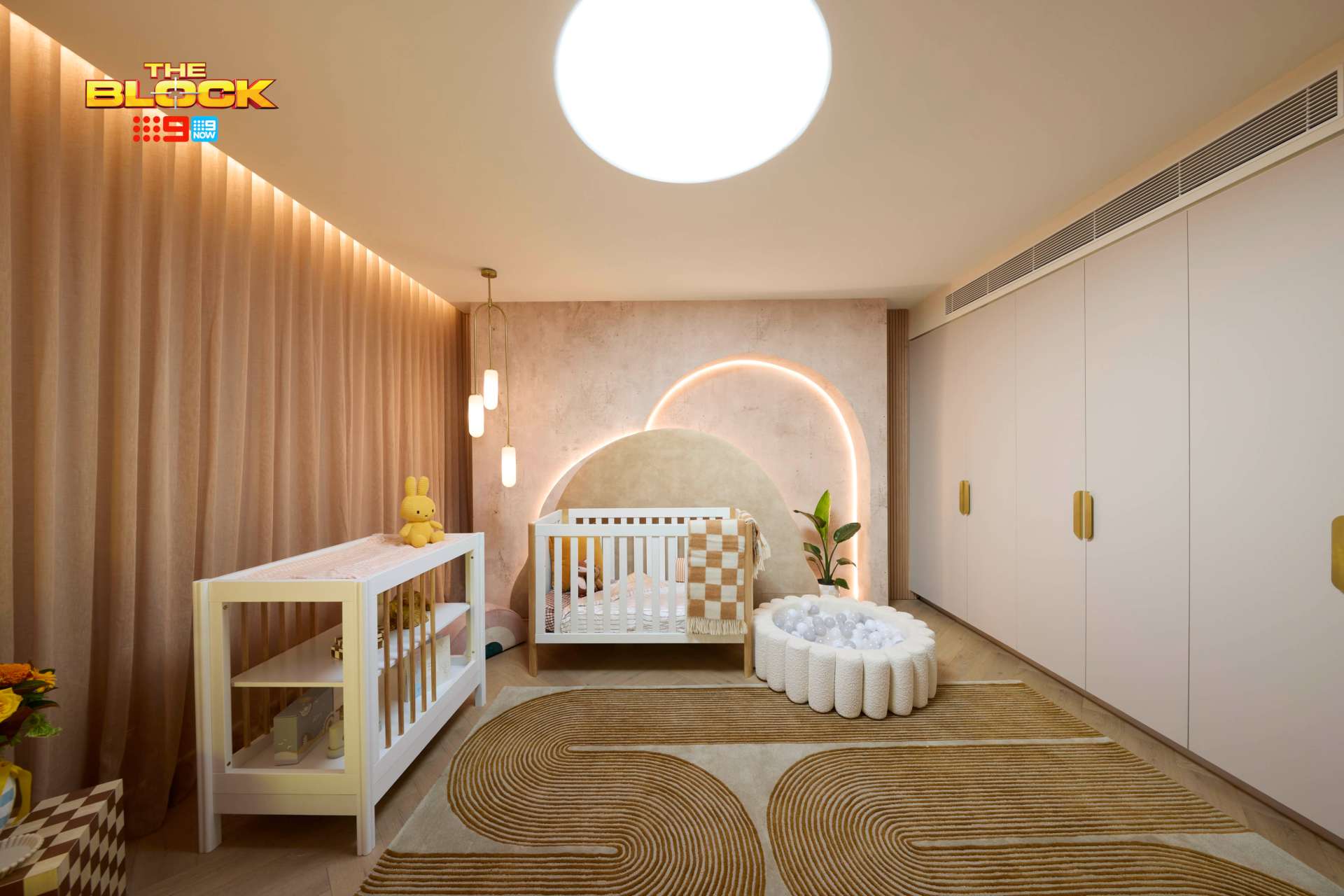
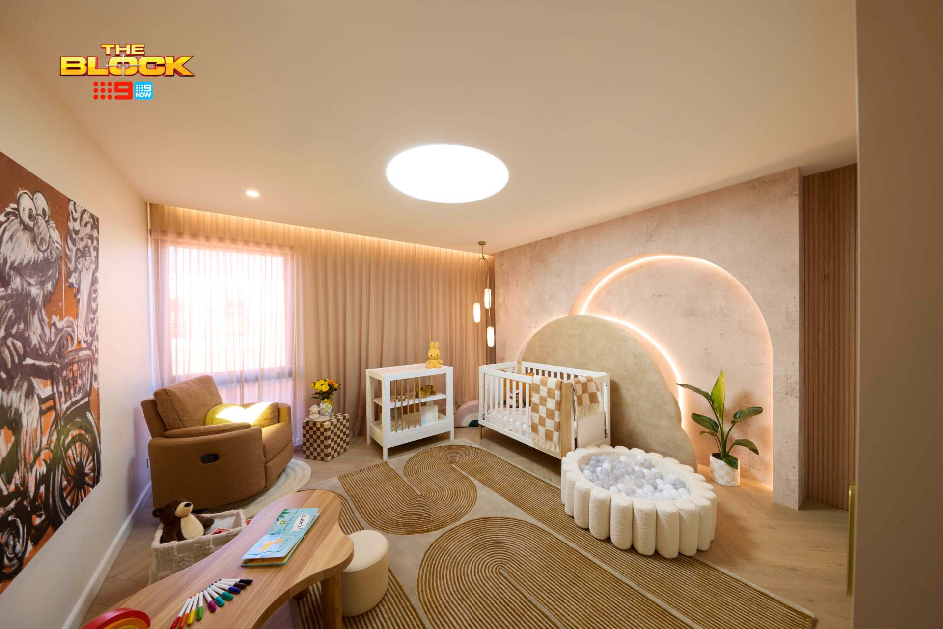
Perhaps it was less about the amount of ideas in this nursery and more about the meshing of styles that feel completely at odds with one another. I don’t understand this space as a room, and again it has a cold, movie-set-like quality to it.
I don’t understand the concrete-look feature wall paired with a luxe, brass light fitting. Do we need a three-tier pendant light over a cot? Do we need a ball pit beside a cot? Do we need a change table in front of a window where the baby can yank at sheer curtains? The questions go on but no answers arrive.
Again, I enjoy every item in here (including the oddly placed plant), but so much of it doesn’t work. Two rugs in one zone, the wall-to-wall sheers, the round skylight for a nursery. I think it’s best we move on.
Robby and Mat Came Last
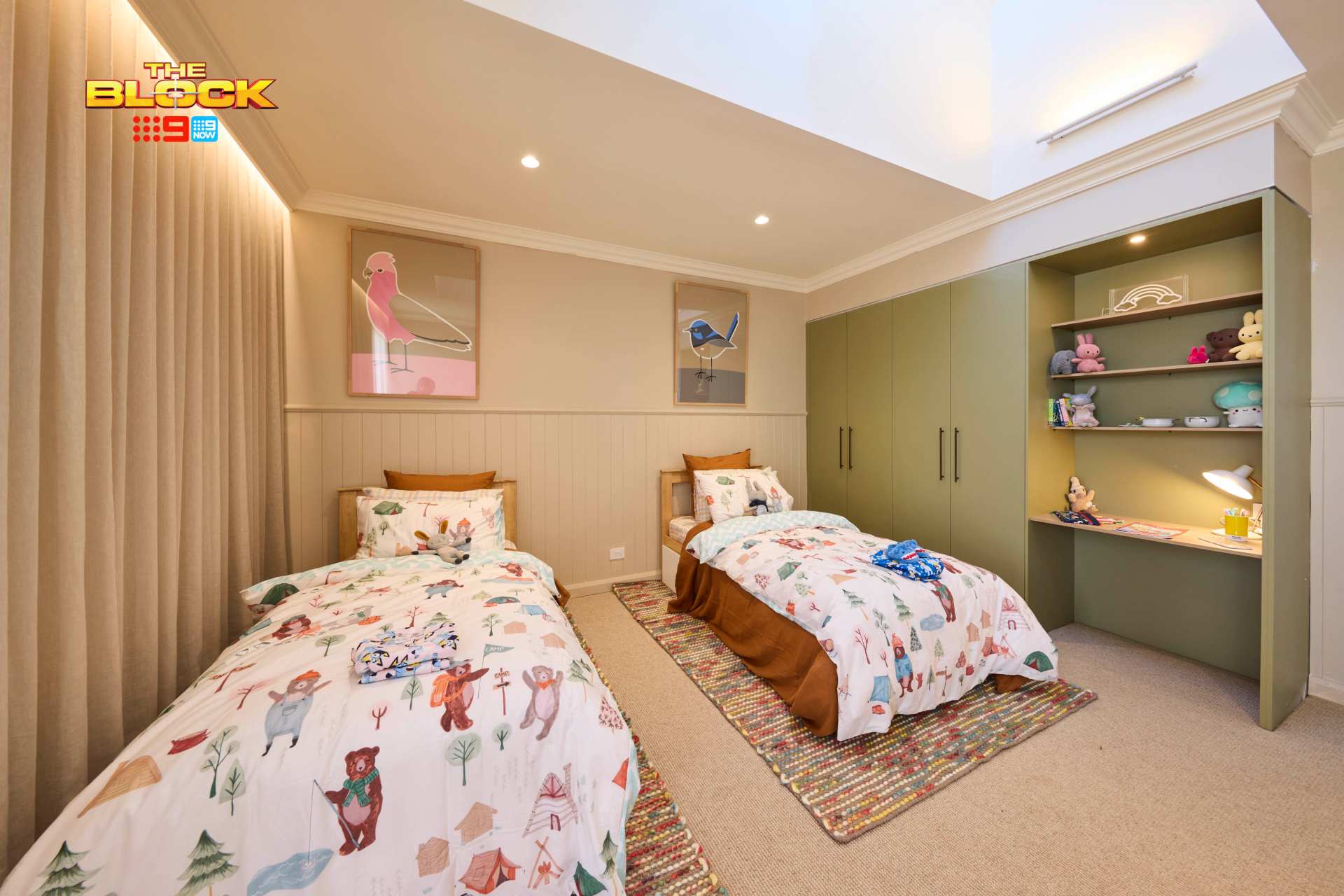
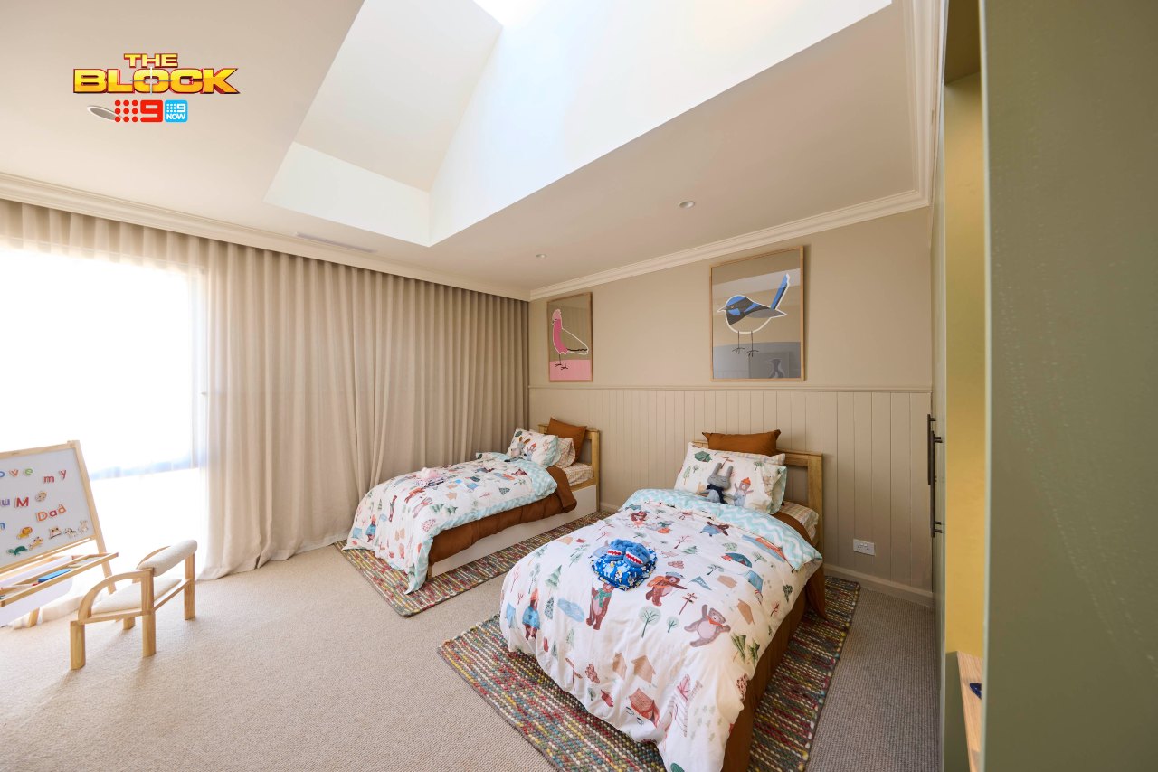
Robby and Mat have had quite the fall from grace. A great bathroom was delivered last week, but then we get two kids bedrooms that really have almost no redeeming qualities this week.
Regarding the first room, seen above, I must begin with a public service announcement: please stop letting your sheer curtains pool on the floor. I say it every year, and yet the universe still allows it to occur. I need to leave some crystals out in a full moon or cast a sacred circle – this must be stopped!
Outside of that, there’s little to comment on. Two small beds with small rugs beneath, with artworks that are way too big above them; it’s all so underwhelming. Even the styling of the shelves feels messy.
What Happened in The Second Room?
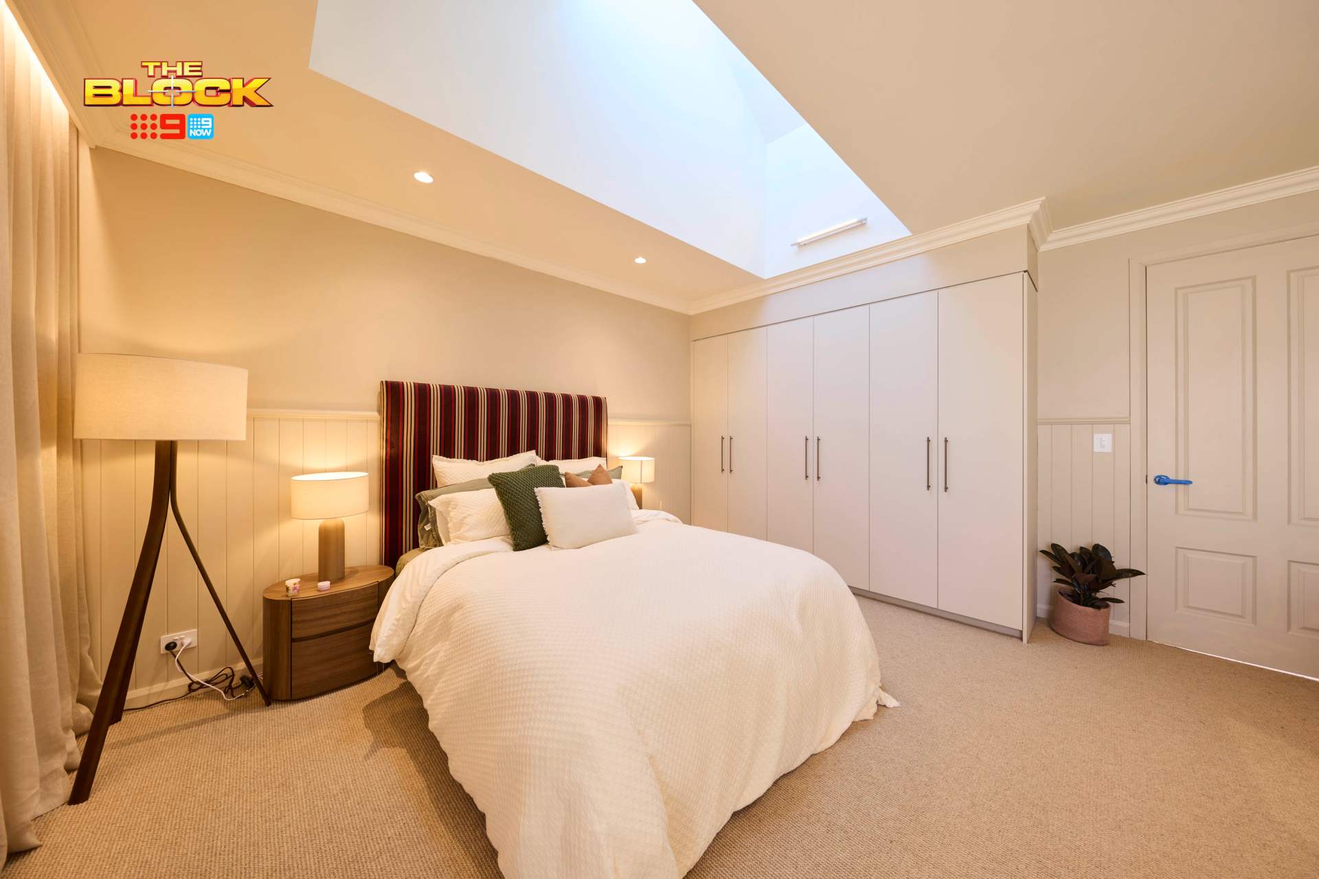
I really hope this isn’t a taste of things to come from Robby and Mat, because this bedroom is pretty dire. All white and bland with a slightest hint of red underneath; it’s like the brief for all of Geri Halliwell-Horner’s outfits since she married the Red Bull racing guy (Ginger, we miss you!).
I have to assume something happened this week (budget, timing, some catastrophe), or is this just a case of poor design judgement? This room isn’t childlike in any way, nor is it a room an adult would feel remotely wowed by.
It’s like a lot of the rooms I go into as an interior designer, but the clients are asking me to make something of it. Kinda a ‘before’ image, I must say. Cross your fingers they turn things around in next week’s reveal.
What did you make of The Block 2025 kids bedrooms reveal? Drop a comment below and share your thoughts.
Images by David Cook Photography, courtesy of The Block Shop. For more info on The Block 2025 kids bedroom reveals, check out NineNow.

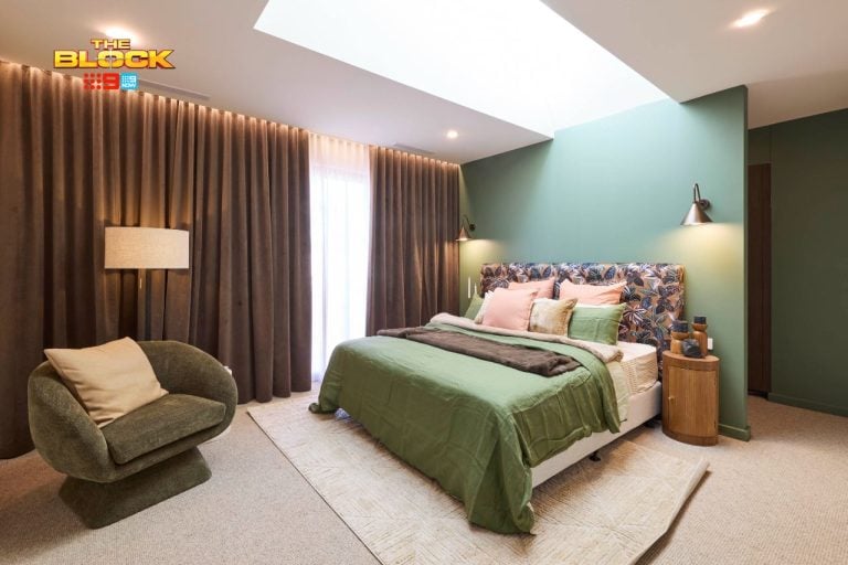

I total agree with you Chris with regards to skylights in every room. Sure Velux is a sponsor but it is getting ridiculous.
I don’t agree with you with regards to carpet in bedrooms. It depends on what climate you live in. I agree Daylesford bedrooms do need carpet but not where I live in Qld.
Love having you back with your reviews Chris! Spot on with your comments. So many very average rooms this week
You’re so right here. Why have skylights in bedrooms? Totally unnecessary.
And why is boucle still a thing? I’m over the tartan wallpapers too. I’ll wait for next weeks rooms.
I’m going to be a bit controversial here and say that my preference would be Robby and Matt’s room. Less crap to change in the room if I was spending $3 million +. Could easily be guest bedrooms for any age without having to renovate.
Great blog Chris
Cheers Yvette