The Block 2025 living and dining room reveals has left me feeling… meh. It’s like watching this season of The Voice. Sure, I’m being told there’s talent galore, but I’m just not seeing it (and you know I pray at the altar of Melanie C). Is it just me, or were the rooms (bar one) completely boring?
Living and dining rooms are some of my favourite spaces to design, so I came expecting a lot this week. But, like Kyle and Jackie O’s Melbourne radio ratings, things were beyond disappointing. From bad layouts, terrible fireplaces, and tired furnishings… it wasn’t one of The Block’s better weeks.
Scroll on as we talk through what sunk, what soared, and which team deserved first place…
Key Points from Living & Dining Week
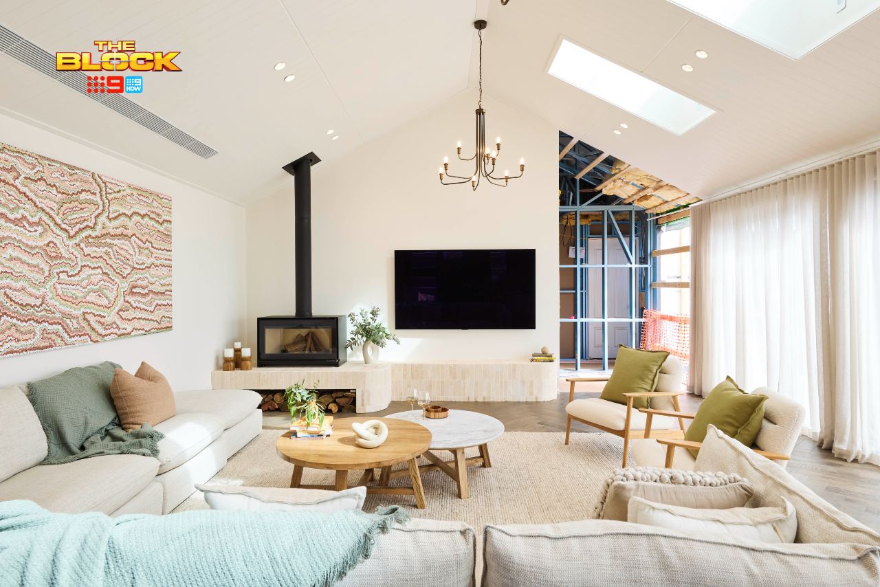
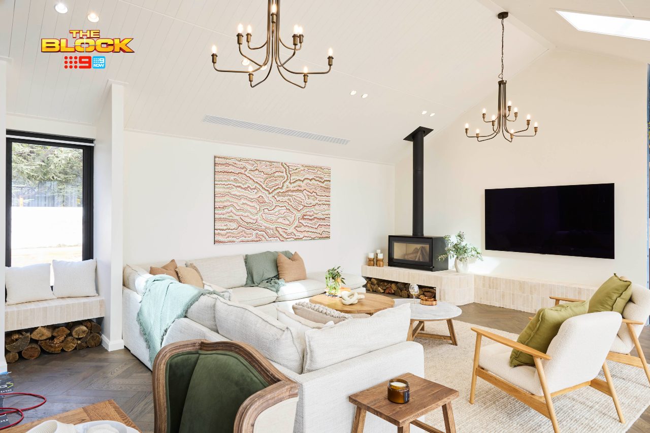
Robby and Mat Came First
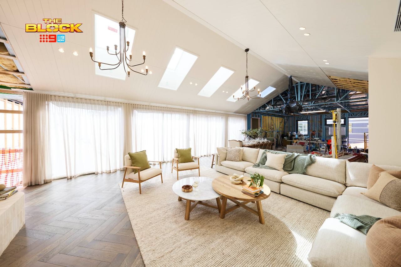
The issue I take with Robby and Mat’s living room is how ordinary it is. There, I said it.
A white space with light, contemporary furniture in it isn’t anything new or interesting. Accessories in sage green and soft rust tones aren’t exactly groundbreaking. Armchairs in a Scandinavian profile and a round marble coffee table are moments we’ve seen a million times before.
Truth be told, this living room is straight out of a showroom at your local Homemaker Centre. I would have been far more impressed if they brought the colour from the walls of their bedroom last week and splashed it across their living room. Because as it stands, it’s all rather safe.
There are no oohs or ahhs to be had. And if we’re not oohing and ahhing, what are we doing here? The one saving grace is the spatial planning. They certainly made it feel as large as possible, I’ll give them that.
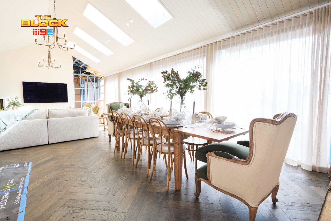
In the Dining Room, Things Were Much the Same
Going to Provincial Home Living (which I love, btw) and getting everything in the window isn’t designing. It’s taking the easy way out, in all honesty. A wow-factor room is the coming together of many elements from a tonne of different suppliers. Again, it’s straight from your local Homemaker Centre.
Also, the dining table running this way seems odd. Is it just me? Perhaps when then kitchens are unveiled it’ll all make sense. But as it stands, I want to swing the entire setting around (and put a rug underneath it).
I adore Robby and Mat’s wet rooms (and the kitchen will likely be a stunner), but for me their two zones didn’t cut it this week. The bad news: some teams did way worse…
Britt and Taz Came Second
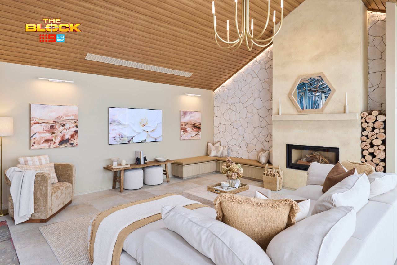
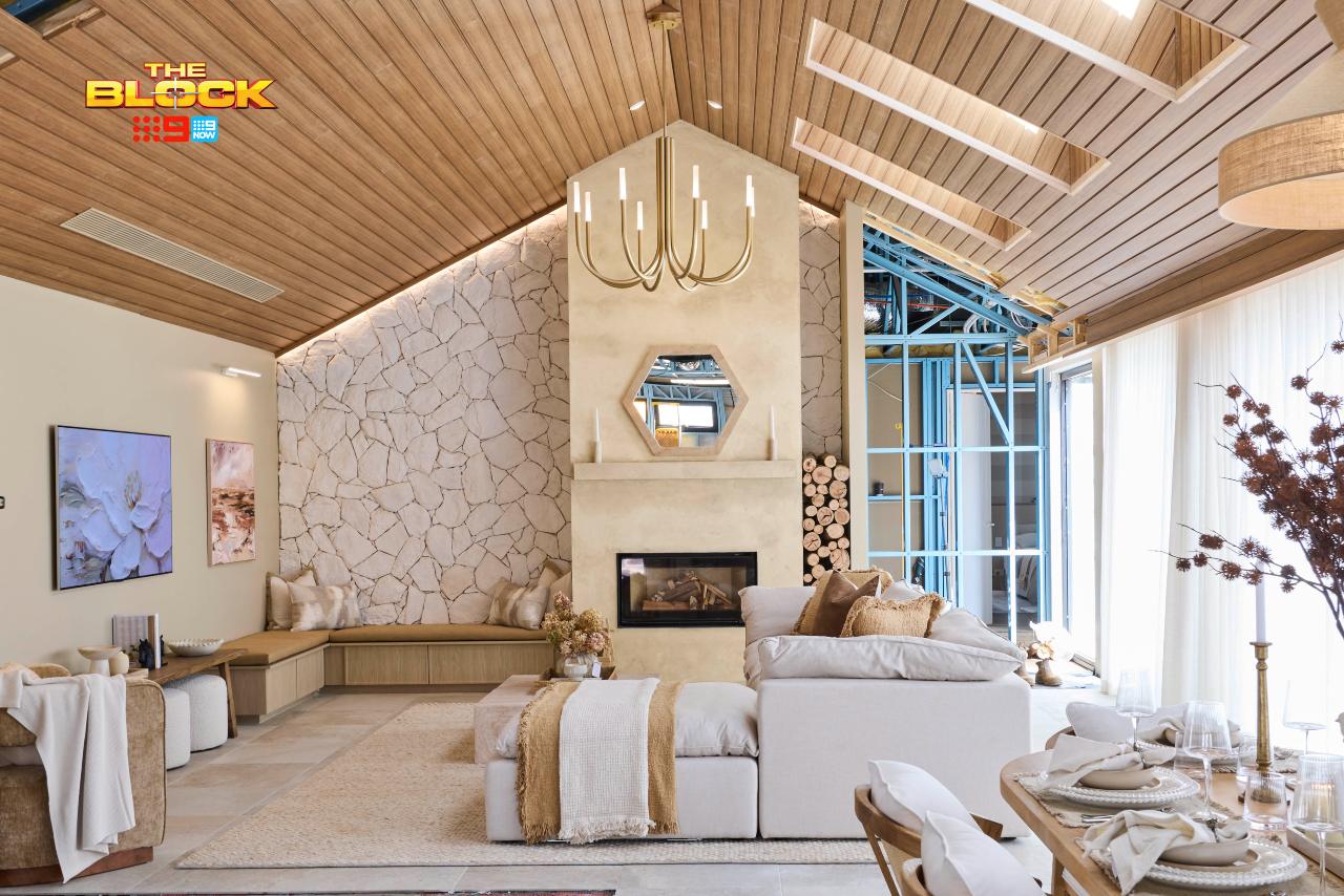
I’m going to drive to Daylesford this very minute and literally stop, drop and roll around on the floor of this living room until I’ve fully soaked up all of the design magic.
Britt and Taz delivered this week. They delivered bigly. They delivered like they were DHL couriers, except they actually knocked on the door and didn’t just throw the calling card out the window of a speeding van.
Is it perfection? Almost. Do I want to live here, become an old country gay who runs the local homewares store and wears an apron with a pencil behind my ear, Prue and Trude style, regardless? Absolutely. Glasses on the end of the nose and a grande skinny latte in-hand are non-negotiables, of course!
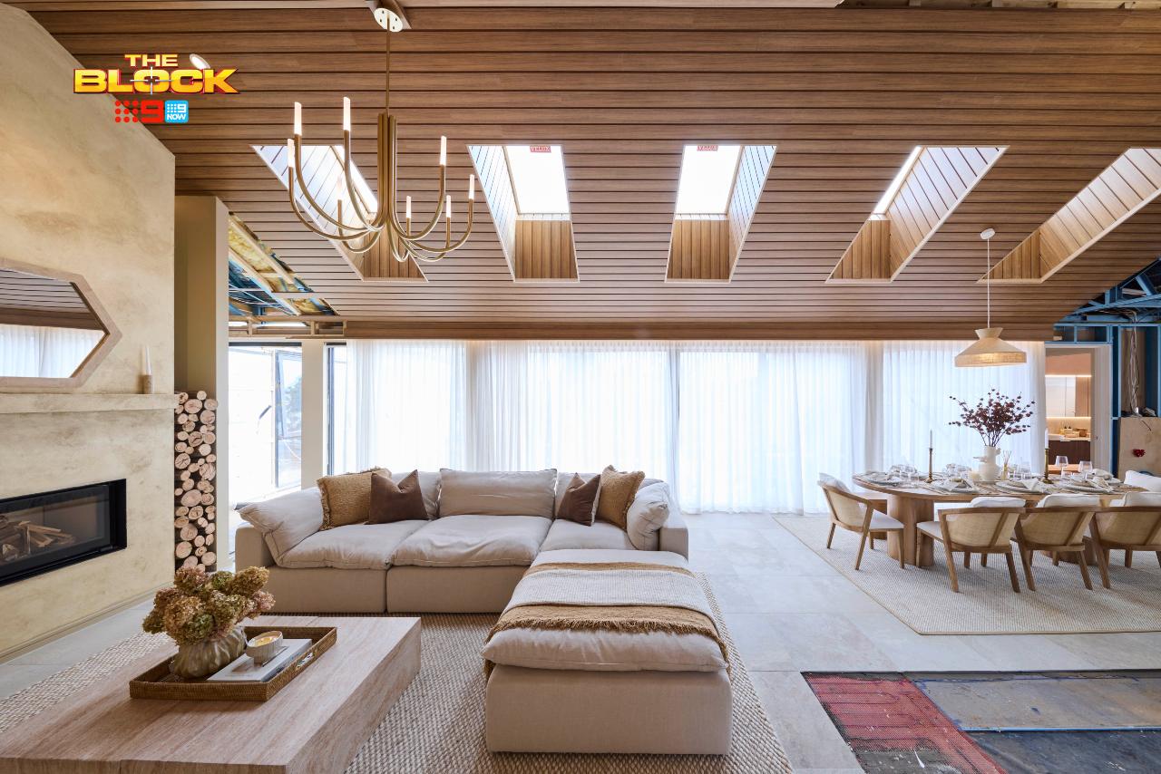
I’m going to say it: this is one of the best living rooms I’ve seen on The Block in recent memory. The panelled ceiling, the sandstone, the bench seat, the fireplace, the colour palette, the furniture and styling. Change the wall colour to something less yellow and I’m telling you… it’s magazine-shoot worthy.
It’s Cohesion at Every Turn
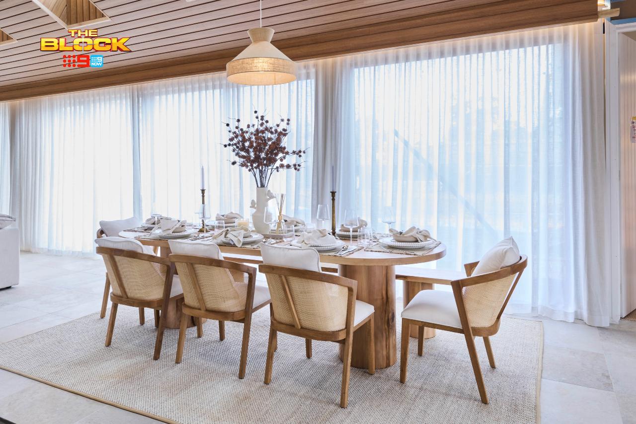
Although I still feel the urge to rotate the dining setting, I’m loving everything else about this zone. The connection to the style of the living room is on point. The earthy, organic nature of the furniture selections are chef’s kiss. The size and scale of it all is truly delightful as well.
After I’m done rolling around in the living room, I’m pushing the contents of the tabletop onto the rug and rolling around on top of it, too. I won’t leave and no amount of security can make me. I’m chaining myself to the Beacon pendant light and claiming squatters rights.
Although there are some small issues (I would have chosen a different pendant in the living room, for example), I can’t get enough of these two zones. Shockingly bad rooms on The Block have been given 30 points before, but this one doesn’t cut it? Make it make sense.
Love the look too? Shop the pieces from Britt and Taz’s room this week at The Block Shop.
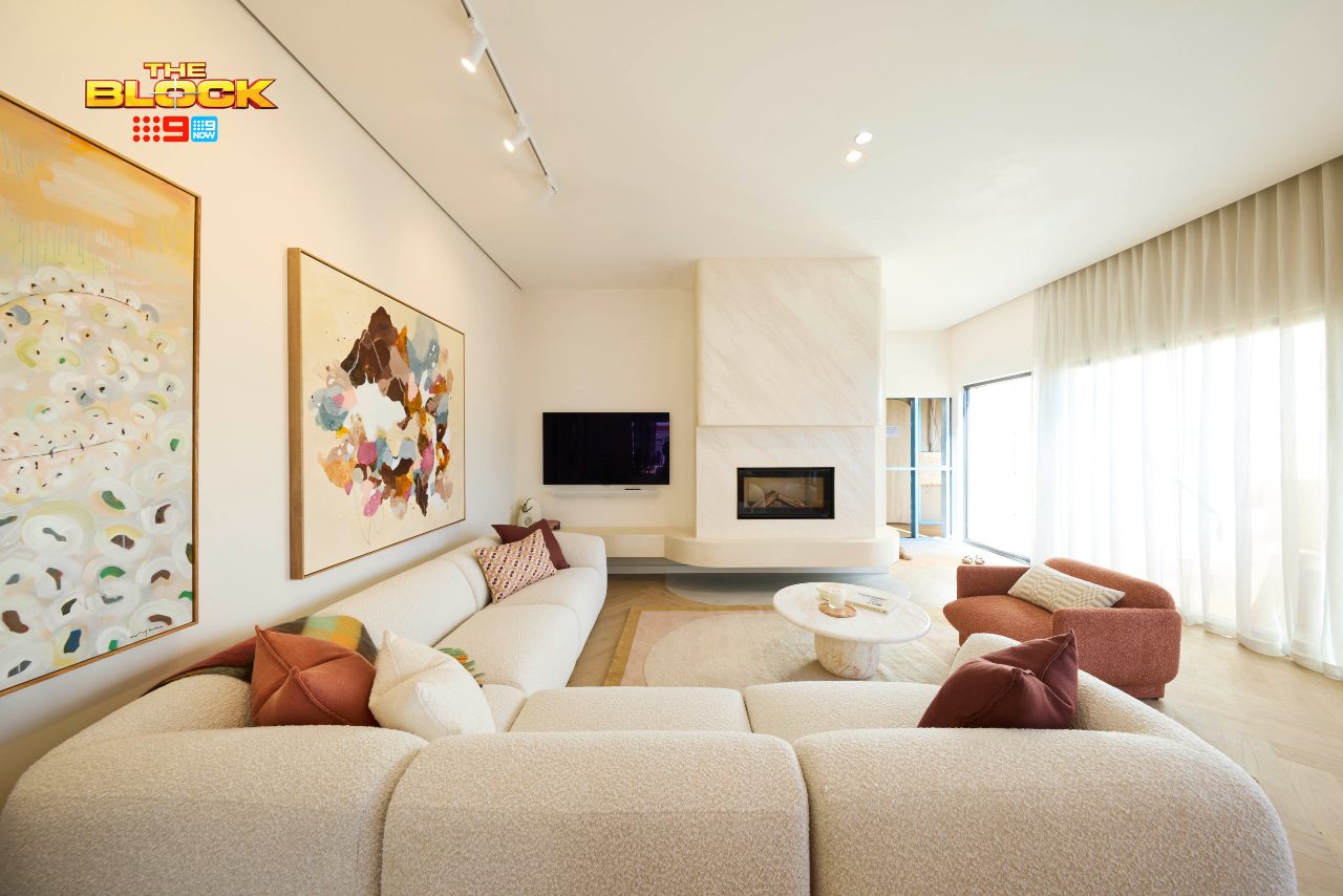
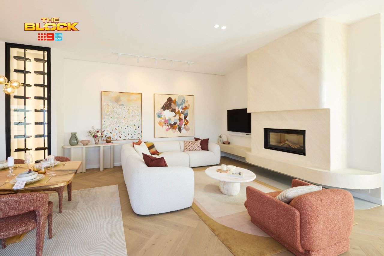
Han and Can Came Third
The fact that this zone scored ONE point less than Britt and Taz’s Vogue Living masterpiece would be laughable if it wasn’t so infuriating. I’ve not been this upset on a Sunday night since Cosima De Vito announced her departure from Australian Idol due to those throat nodules back in 2003.
This room, like Robby and Mat’s, is a white space with modern furniture in it. To quote the 21st-century poet and champion of high ponytails at any age, Ariana Grande; thank you, next. And it’s not just the expected furniture that’s the issue. The layout is a shocker as well.
Who is watching TV on that sofa? Why is it pushed so far forward? Why is there a shrine to vases sitting behind it? I don’t understand the layout choices here. The sofa with its back running along the window is a far better orientation for these spaces.
At present, you’d need to book a chiro appointment for the day after movie night, unless you’re the little girl from The Exorcist and your head can perform a 360 degree rotation.
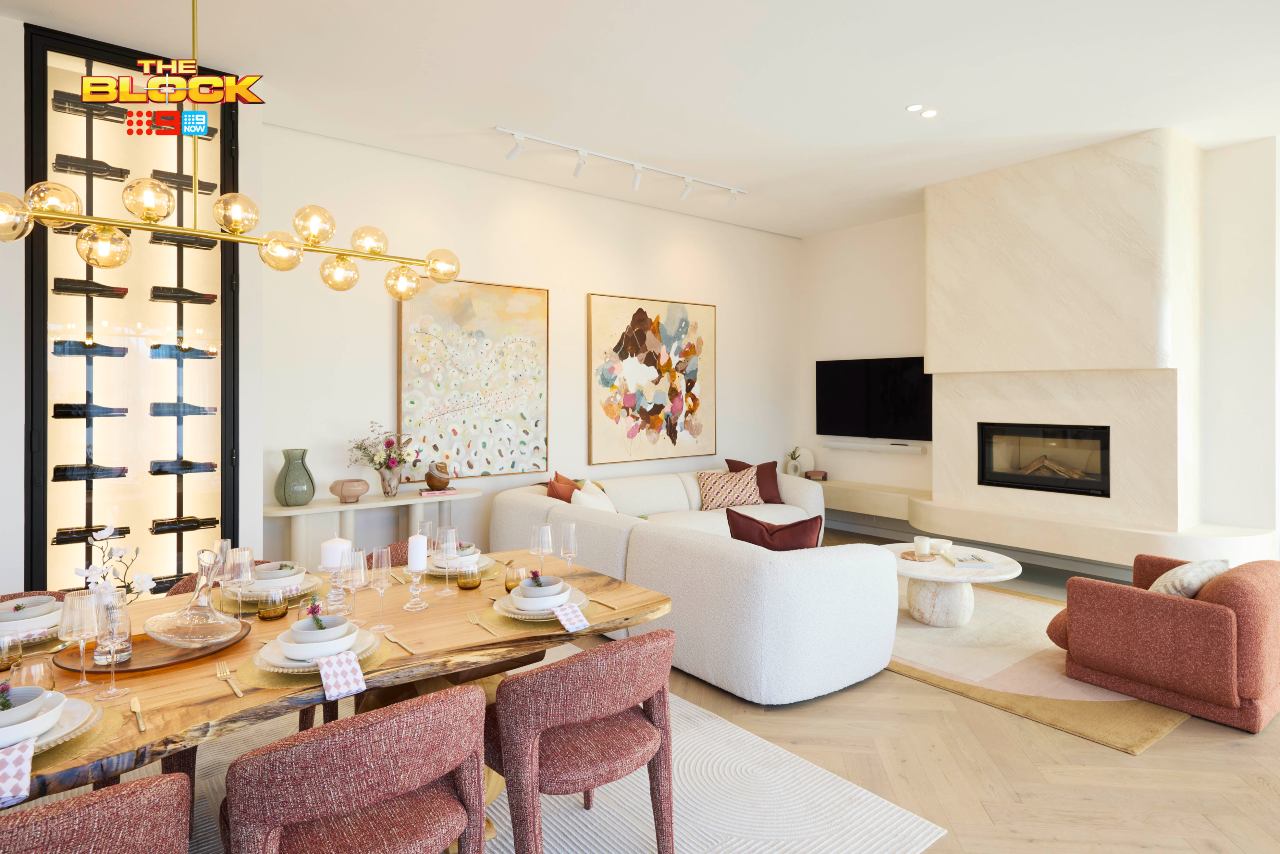
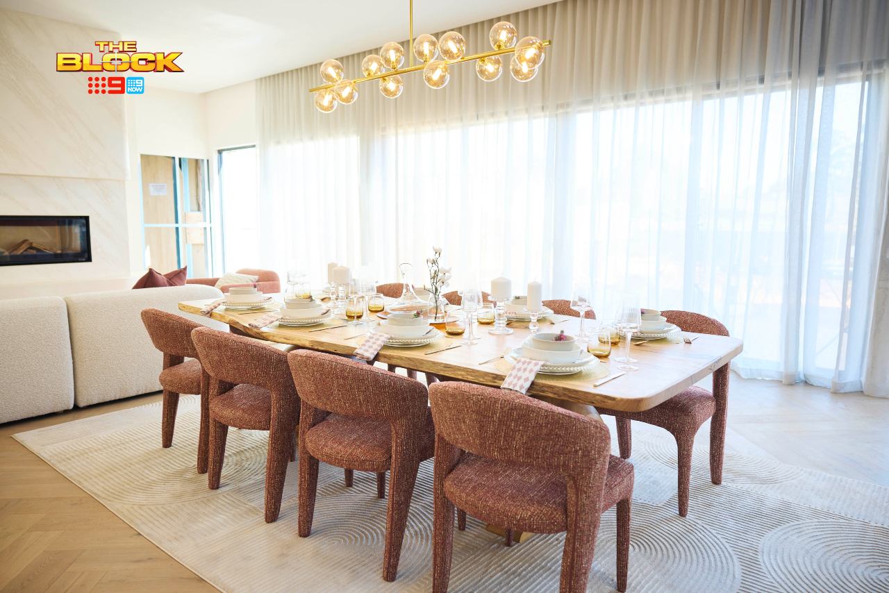
The Dining Room Was Less Problematic
The dining room is less criminal, though it faces the same issue I’ve already mentioned in the other two spaces about orientation. The lighting choice, as I’ve said a million times this season, is odd and makes no sense in the space, but outside of that the other pieces are successful.
I do enjoy the chairs. A nice warm accent in the space is welcome. Although it does raise a point I again keep banging on about: cohesion. Imagine walking from this white-and-red zone, into the turquoise main bedroom, then into the apricot bathroom, and then into the teal and gold bathroom from week one.
These zones gel as a group about as successfully as Scandal’Us from early-2000s Popstars (hey, I’m an early forties millennial and all of my pop culture references are from 25 years ago, I won’t apologise).
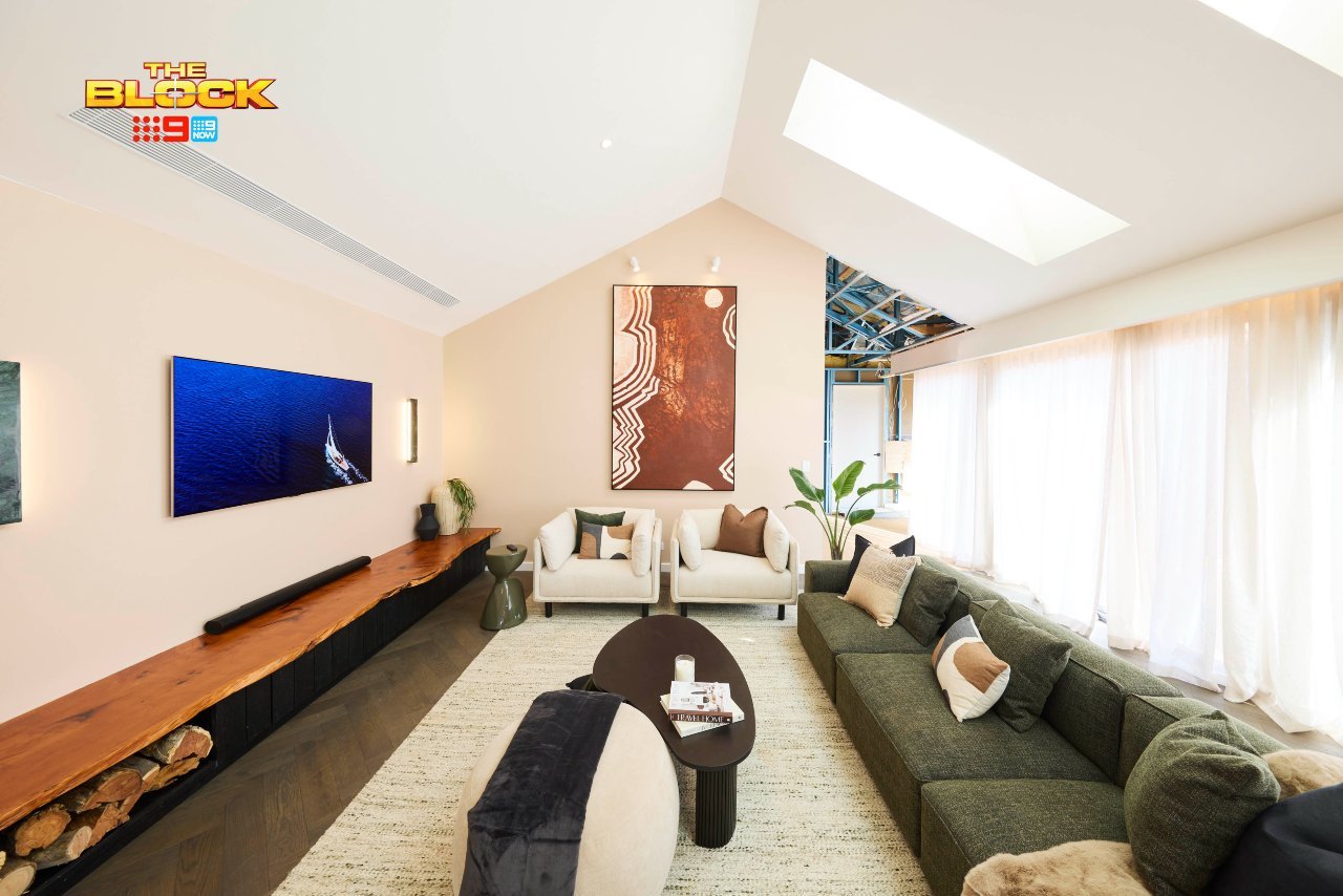
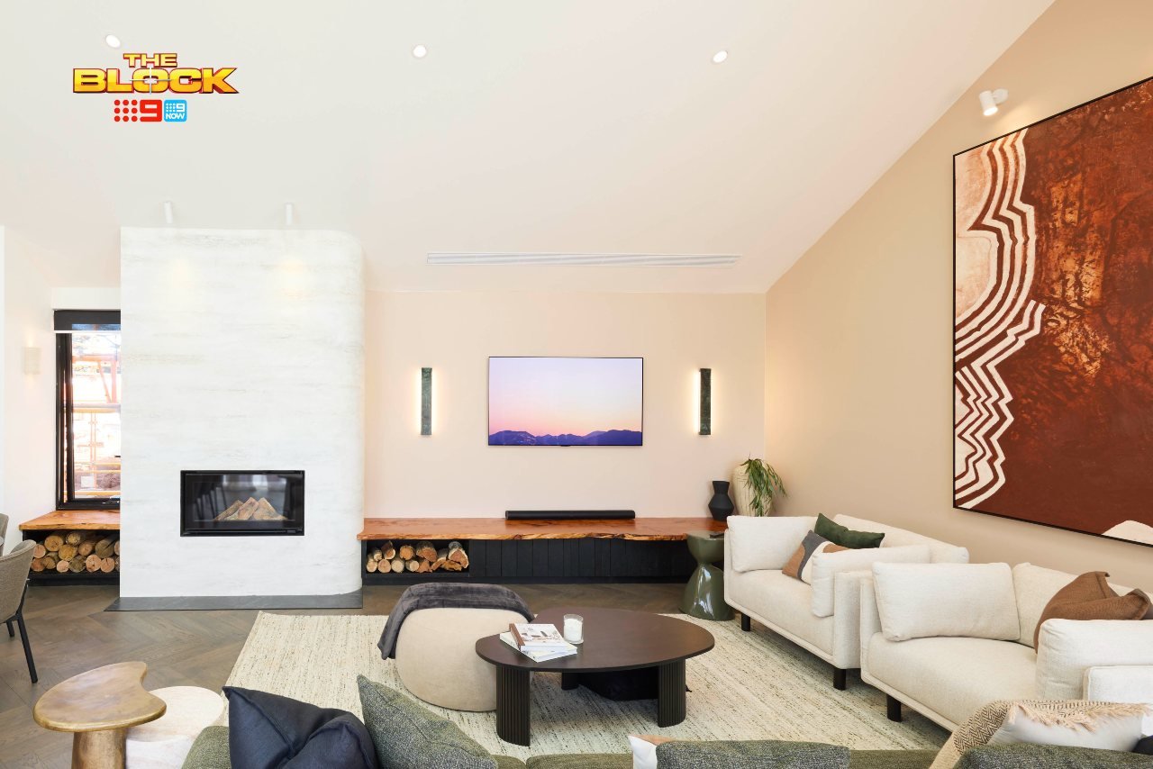
Emma and Ben Came Fourth
While this room is more successful than Han and Can’s, it’s far from great. It is, again (say it with me, gang) a white room with modern furniture in it. And hey, I’m not one to shy away from designing a modern room with white walls for clients, but there are ways to get it feeling warm and cosy. This room missed the mark.
That tall artwork is the first issue. It’s a great piece, but it’s in the wrong place at the wrong time. It’s (literally) shining a light on the odd angle of the wall/ceiling, and not in a good way. A landscape orientation was the way to go here. The two lights above it like that are unnecessary, too.
The placement of furniture isn’t bad, but something is missing. Doesn’t it feel like a retail showroom? A grand lighting moment, some wallpaper, a larger rug, a plush sectional; all of these things would have created more layers, more warmth, an invitation to come in and sit down.
The fireplace also feels like it’s in no-man’s land. Why did nobody do a TV over the fireplace? It’s the perfect way to do it and yet not one team attempted it?
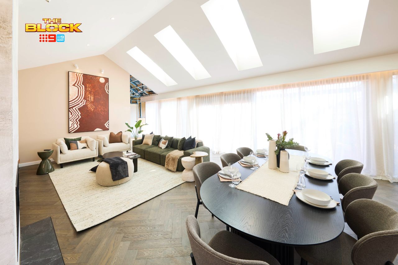
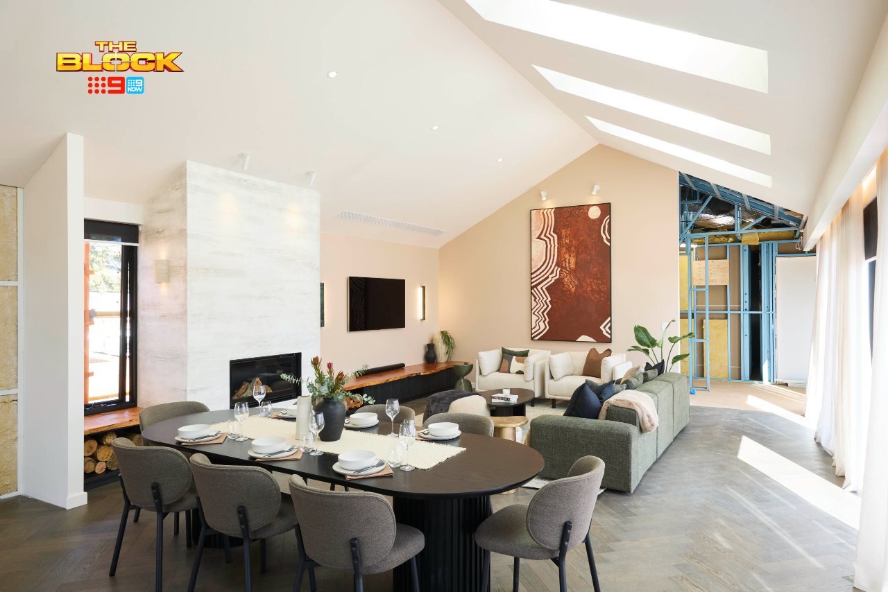
The Dining Room Raises Questions
I have to ask, why are we suddenly introducing black into this home? Emma and Ben have executed some beautiful spaces, full of colour. And now they’ve decided to bring in a black dining table and grey chairs?
Again, I love me this combo (and have done it many times for clients), but this isn’t the scheme for it. Black and grey is lovely in a chic apartment, a moody-luxe interior, a hotel-suite vibe. Here, it’s more out of place than Mel Tracina hosting Big Brother (if it’s not Gretel I’m not interested). A mid-toned timber table and lighter chairs would have been much, much better.
I’m wondering why they didn’t carry the palette from their main bedroom into this space, actually. Or the lush green and burgundy kids room colours they delivered week two. That would have been a real design moment, and much appreciated.
Sonny and Alicia Came Last
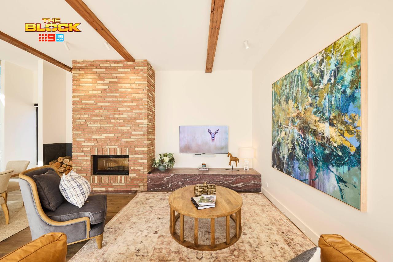
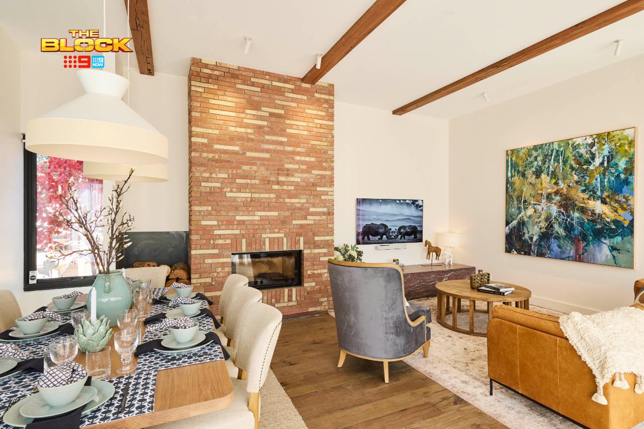
The fireplace column is the first thing that stands out in Sonny and Alicia’s living room. It looks somehow artificial. Is it a wallpaper, is it a faux brick? It doesn’t appear authentic to me, and it somehow cheapens the space. It, combined with the slab of stone to the right, is one of the biggest crimes in this zone.
The spatial planning is the baffling, too. So much room is given to the fireplace that there’s barely any left for an ample living room footprint. They have what looks to be a two-seater sofa and an armchair in the room, which isn’t enough seating, plus the two styles fight with one another.
Side note: find me a heterosexual man in Australia that’s happy with that TV size, btw.
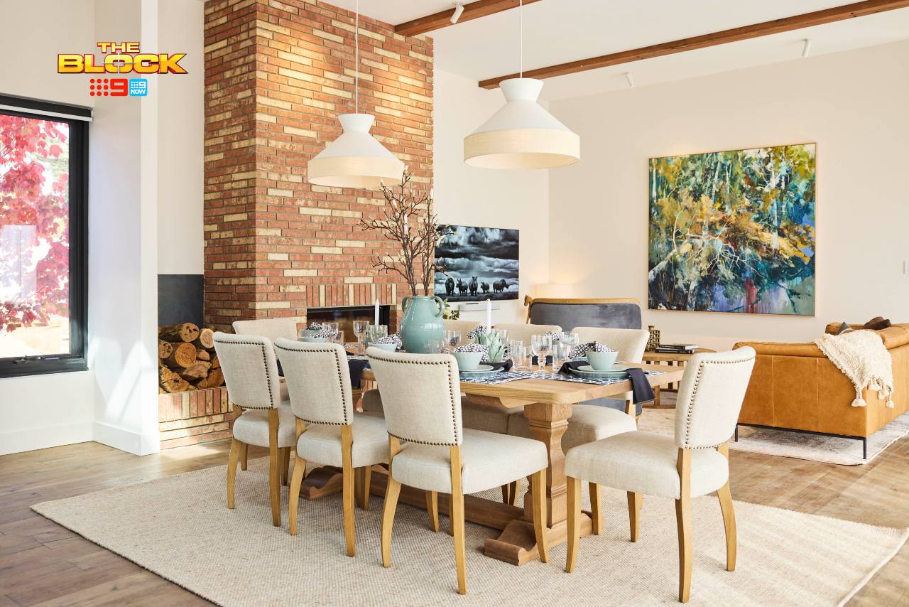
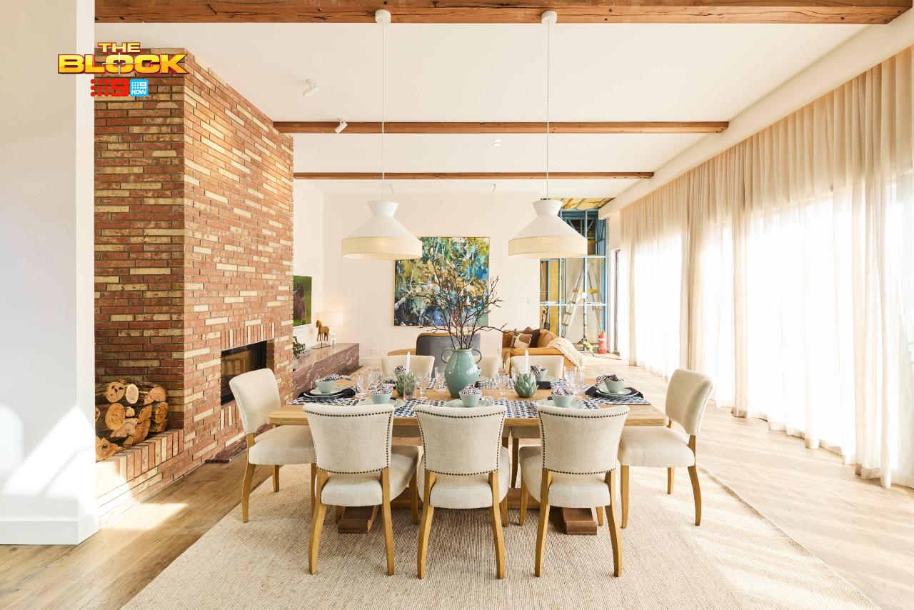
Can we change the entire layout of the room, place the TV where the giant artwork is, and bring in a comfy sectional to face it? That’s the cheapest fix. The more expensive one is ripping out the fireplace and stone to get some space back. I can’t say I like anything in this space outside of the artwork and pendant lights, sadly.
I Have Questions I Need Answers To
The teams all have the same size homes, right? Same layout, same dimensions? Why do some rooms have big sectionals in them, with the area feeling rather large and spacious, while some look miniature with compromised furniture?
I have to assume some teams pushed a lot of furniture toward the back wall, leaving loads of space up the kitchen end. I can’t explain how the zones look and feel so vastly different otherwise, but they do.
Overall, pretty disappointing living and dining room reveals this week. I wanted so much more, and got so much less.
What did you make of The Block 2025 living and dining rooms reveal? Drop me a comment below or come visit on Facebook or Instagram and talk it through there, or check out how we bring ideas like these to life as interior designers in Melbourne.
At TLC Interiors, we make great design easy for our clients
Need Our Help?
Images by David Cook Photography, courtesy of The Block Shop. For more info on The Block 2025 living and dining room reveals, check out NineNow.

Beige everywhere, awarding mediocrity. So disappointed.
Beyond boring! No style, no thought, no contrast, no vibrancy, no dynamism, no tension! Every room is a complete disaster #eyeroll It’s embarrassing
Sonny & Alicia need help. That room is a mess! Too much going on, that fireplace dates back to the 1970’s the only way to fix it would be cover it with stone or timber. That stone bench.. it just doesn’t work!
As I scrolled the images I cringed more & more with each one, most areas look too small for a large home and awkward furniture placement.
Yay I’m back to agreeing with you. Thought I liked the girls on TV but in pictures makes no sense. Have none of these contestants ever watched TV in their lives?!
I agree with you Chris. Completely boring? The rooms look like what Real Estates ask you to do when you sell your house, “depersonalise”.
I hate the brick fireplace too. It makes the house looks older than it is.
OMG I hate that brick fireplace. We used those bricks in the 70’s. Awful awful