I’m positive that directly after The Block 2025 main bathrooms reveal aired, Ashton Kutcher’s lawyers sent a cease and desist to Channel 9. After all, Sunday’s episode completely Punk’d us, and yet he didn’t receive a cent in royalties.
The best part is that I don’t even need to say what we’re being Punk’d over, do I? You know, I know, it almost goes without saying. If you missed the episode, it won’t take you much scrolling to figure it out.
Let’s delve right into this week’s main bathroom reveals because I have so much to say (and welcome your comments at the end of the post, on Instagram or on Facebook). The red bathtub is just the beginning.
Key Points from Main Bathroom Week
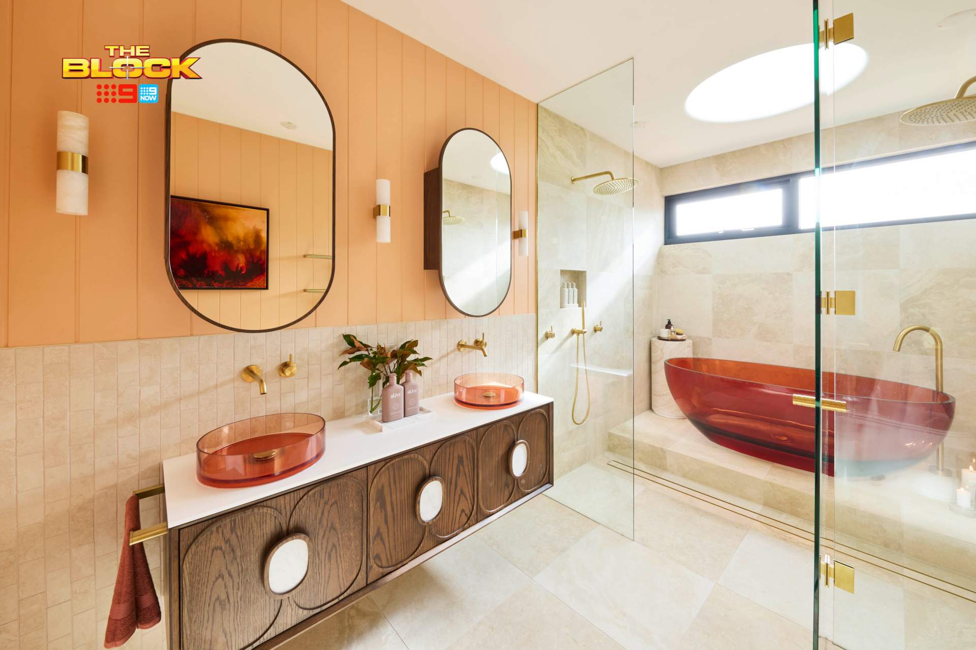
Han and Can Came First
Unless there’s a giant Greek salad in that bath with enormous plastic servers stuck in it, I’m not on board and never will be. Huge chunks of feta cheese are the only thing that’d convince me to go anywhere near that tub (and even then I’d still close my eyes and follow the scent).
I can almost deal with the basins in Han and Can’s main bathroom design, but even then they don’t work with what’s going on in the rest of the space. A winning bathroom this is not, but you know The Block; it loves to get me into a flurry that only several Bex, a bottle of Savvy B and a good lie down can cure.
I’m going to give them one thing; the layout is successful. I personally don’t like the shower-and-bath wet zone in a bathroom, but they did well to fit a lot of stuff in. The skylight is another positive I can spot in this space; it does work well here.
We Need to Talk About The Lack of Harmony
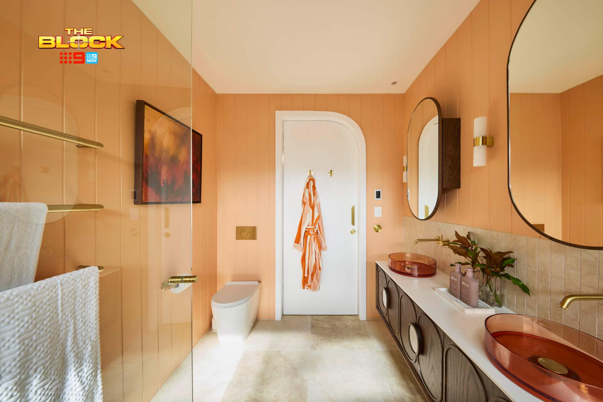
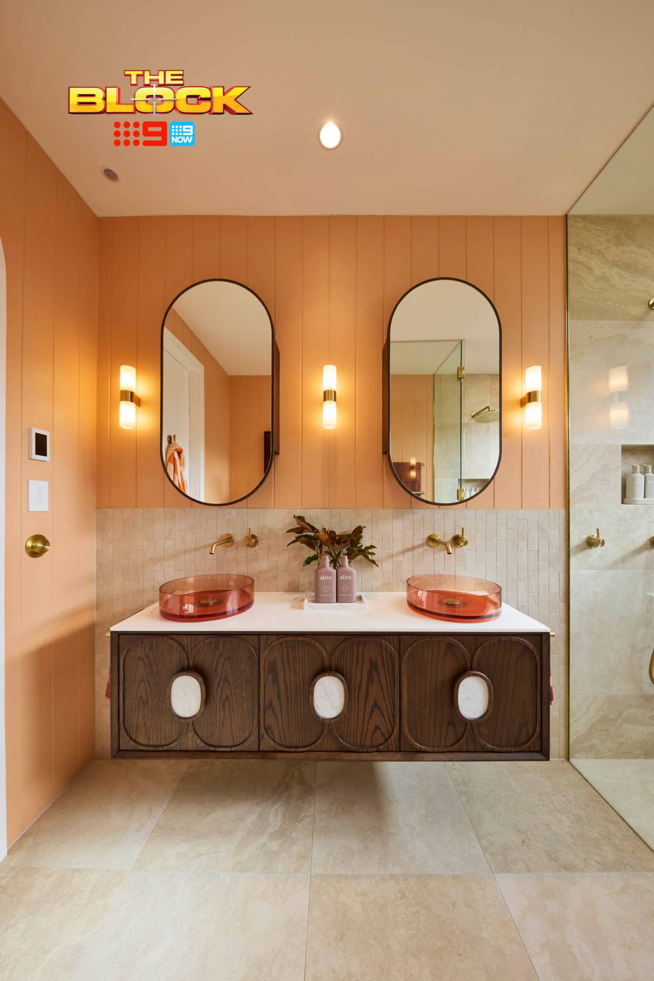
I won’t go into a Ted Talk, don’t worry, but I do want to address harmony in design; that clever coming together of elements in a room that make it feel ‘right’. That was not achieved here. In fact, the opposite has occurred. To quote the 1990s Stainmaster commercial: ‘Oh Mr Hart, what a mess!’
Many items on their own are lovely. The tile behind the vanity, for example, I adore. The floor tile is also great. The shower screen going all the way to the ceiling is much appreciated.
But the red, brass and apricot colour combination is killing me. The VJ panelling makes no sense in the room. There are way too many focal points fighting for attention. I can count at least 30 gold items in this main bathroom. It’s the antithesis of a relaxing sanctuary. To me, it’s completely garish. Honestly a last-place space for me.
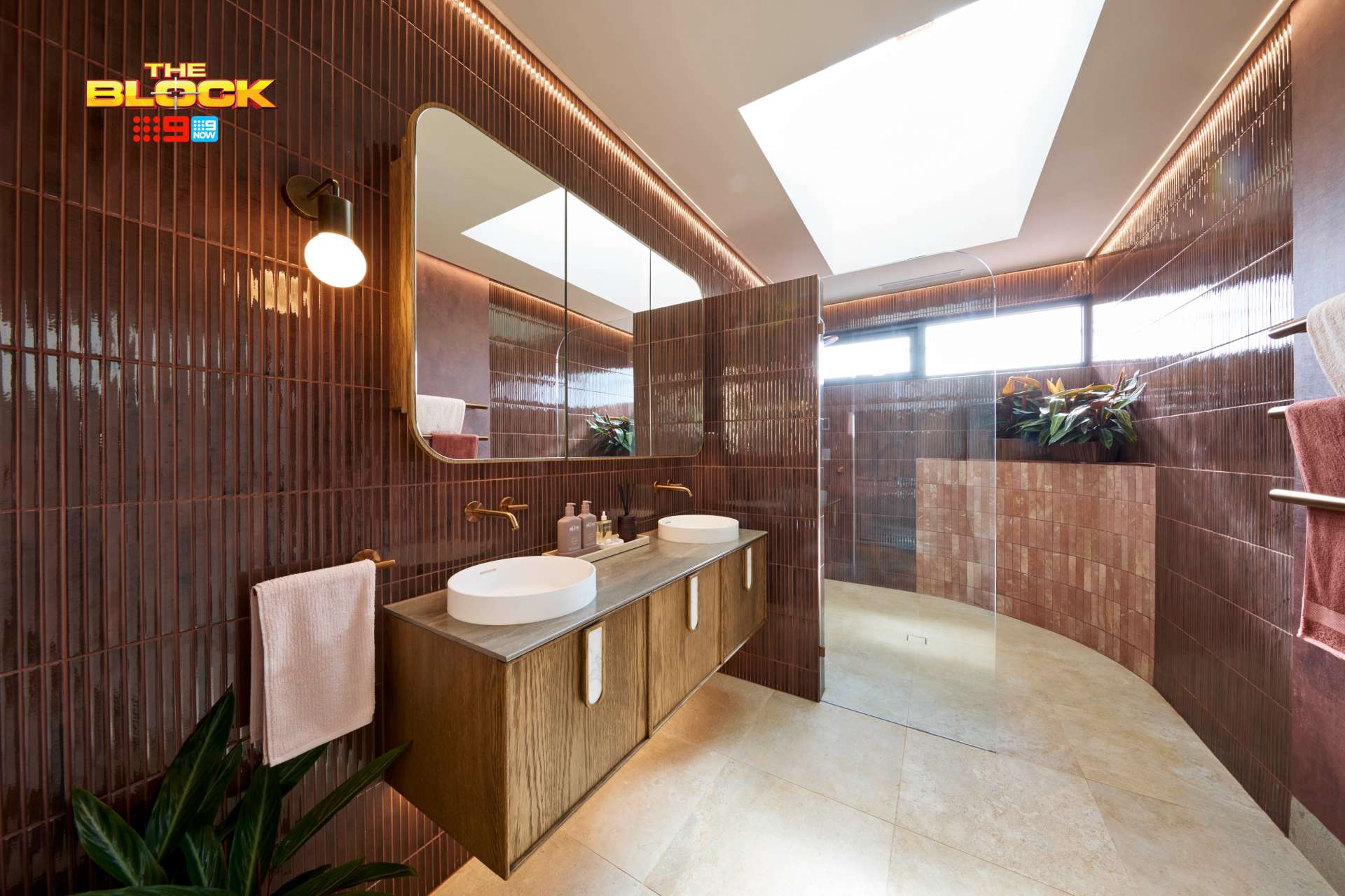
Emma and Ben Came Second
I’ve been a champion of Emma and Ben so far. Their kids bedrooms last week were solid, as was their other bathroom from week one. They’ve been quite consistent on the design-front, but here things fell apart.
My biggest bug bear is that bathrooms in a home should have a connection. In fact, all of the wet zones should have a connection. That’s not to say they can’t all look different, but there needs to be some element, some through-line, that holds it all together stylistically.
Their week one bathroom was a fresh faced twenty-something stepping off the bus to make it in the big smoke. This bathroom feels like the weathered madam who runs the local burlesque house. They are completely different people who will never cross paths. I don’t get the design choices here.
Some Significant Tweaks Would Have Helped
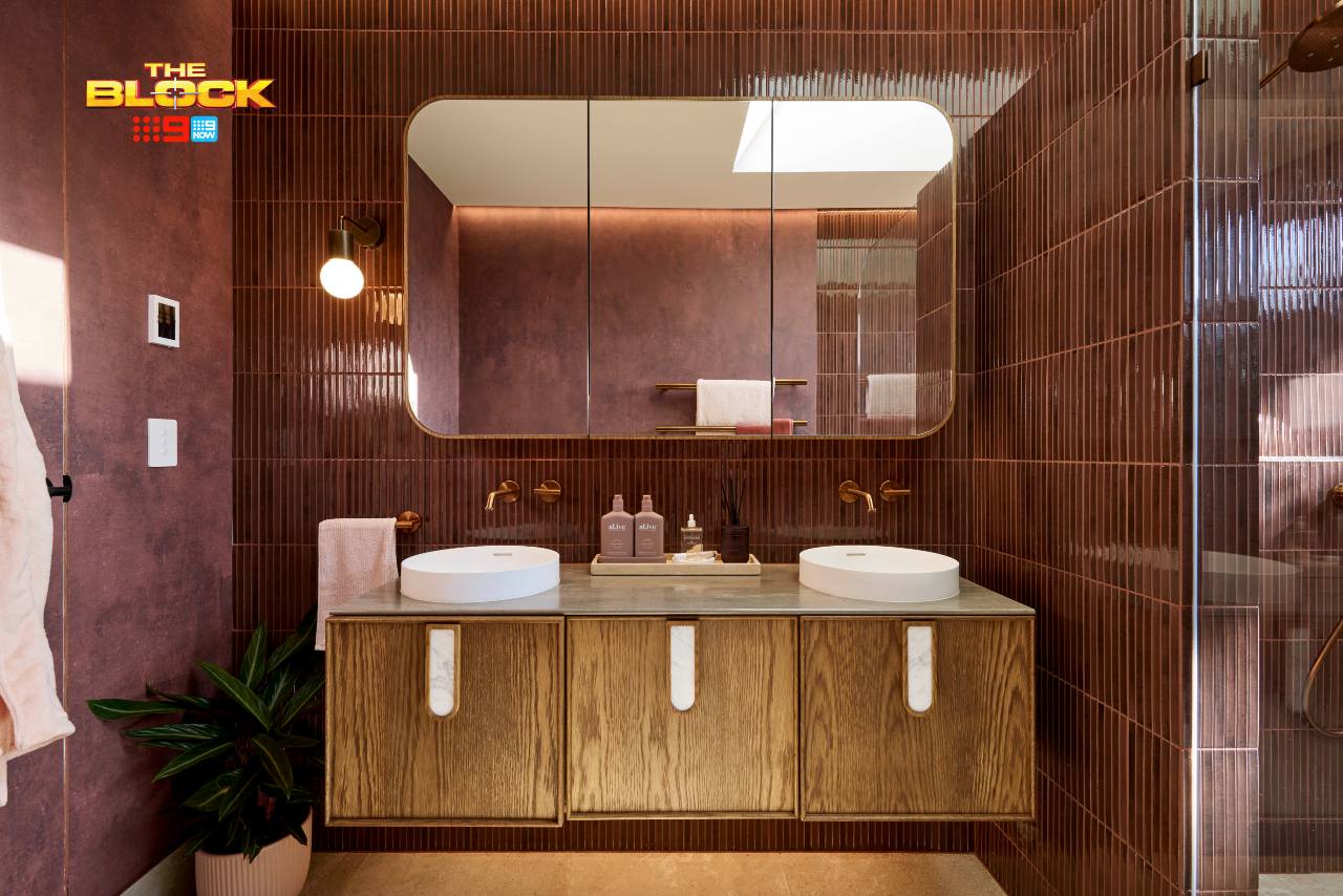
I rather enjoy the main feature tile. But as I’ve said before, too much feature tile stops it from being a feature tile. In this space it was overused. To then bring in a different feature tile on curved section in the shower was bonkers. Like Justin Timberlake in concert, it feels like a mistake.
The shower screen feels out of place, too. I would have brought the nib wall out further and done away with the glass altogether. Or, commit to the sultry vibe and go fluted glass instead. As it stands, the shower zone feels too open.
There’s a harshness to the space that needs to be addressed. Less tiles are the solution. It almost feels like a commercial or hospitality space, not a residential one. The vibe is a bathroom in a lavish nightclub or hotel. I truly don’t understand the vision or how it fits in with the rest of the home.
Robby and Mat Came Third
You know I’ll tell it like it is – good or bad. Last week I was honest about how unsuccessful their kids rooms were, but this week, it has to be said: this was the winning bathroom. These guys know how to do wet zones. We’re yet to see their kitchen and laundry, but based on this week’s reveal I’m betting they’re going to be stellar.
And here’s the thing: you’d rather get the wet rooms right than you would a kids room. It’s much easier to swap out a bed than it is to rip up floor tiles. So, I wouldn’t be sweating it if I were Robby and Mat (unless their living, dining and other bedrooms turn out bad, then it’s time to crack out the Cool Kick Nivea Men).
There aren’t really any negatives to call out in this main bathroom design, truth be told. But there are plenty of positives. Shall we list them out? I think we shall!
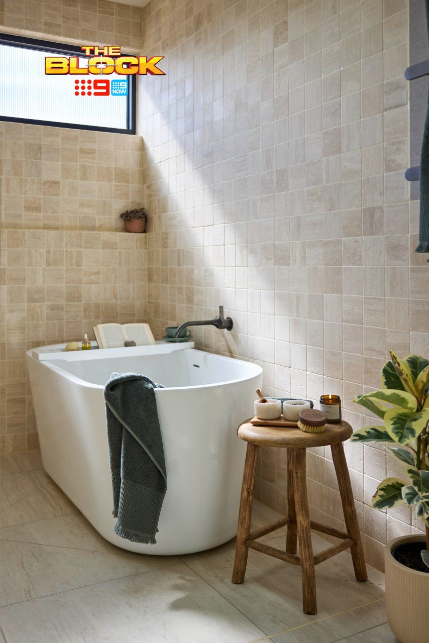
So Much is Working in This Main Bathroom Design
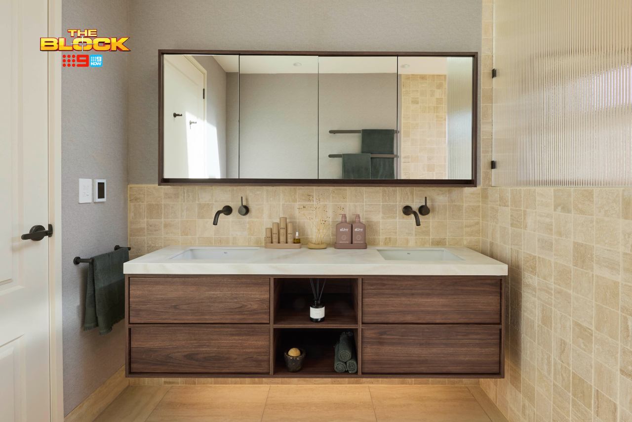
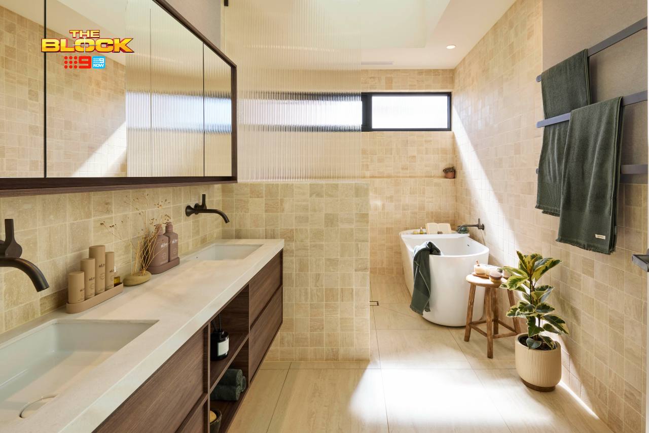
The colour palette is soft and soothing. The feature tile has been used appropriately. The vanity material ties in perfectly with the earthy, organic vibe of the room. The layout is perfection. The scale of everything is chef’s kiss. Nothing feels too big or too dwarfed in the space. The list really does go on.
The shower zone feels enclosed enough. There’s a sense of privacy, of cocooning. The bath is right at home in that location. The tapware finish feels beautiful also. The small detail of the fluted glass screen matching the fluted window – it’s everything!
The only two things I would tweak: the wallpaper to the left of the vanity feels a touch cold for the space and doesn’t entirely tie in with everything else. And the bath mixer I would have loved floor-mounted, purely from a functional perspective (nobody likes searing hot water hitting their legs in the bath).
Browse the best products from Robby and Mat’s main bathroom at The Block Shop.
Sonny and Alicia Came Fourth
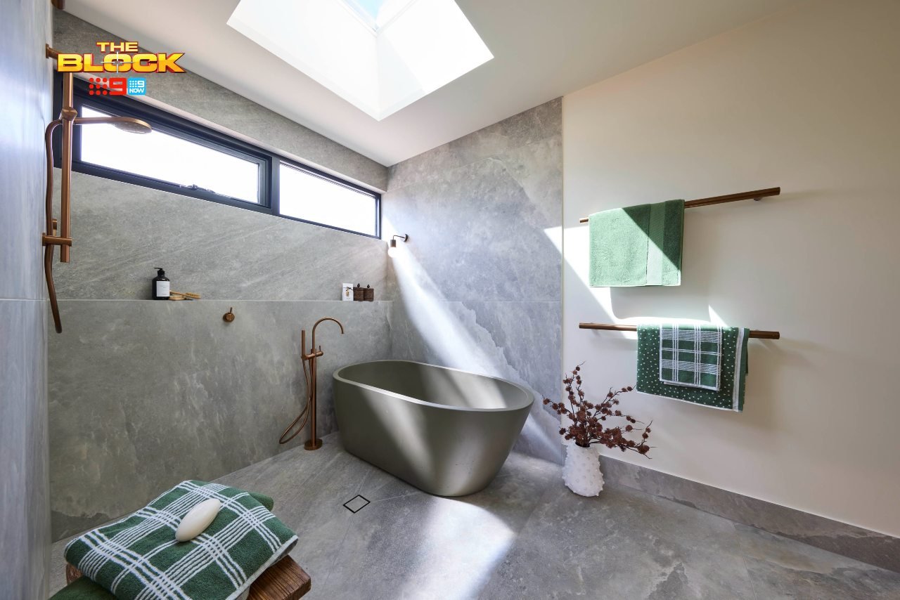
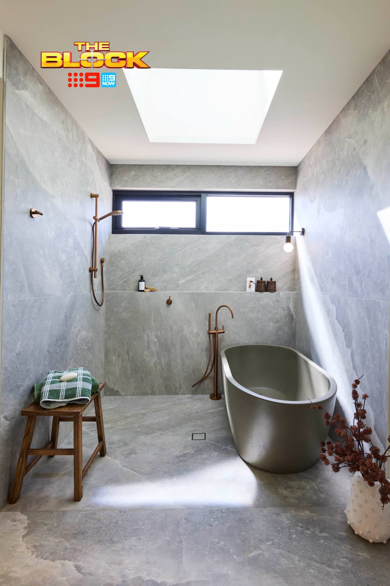
Did Sonny and Alicia get everything right in their main bathroom? No. Does it still deserve a higher score? Absolutely. I’m a bit baffled as to why this team came in fourth, because this design has so many positives. What am I missing?
The colour palette and material combinations are pretty sublime. This is a room where using all the one tile was hugely successful. It, paired with the copper tapware and brown accents, is all kinds of joy and rapture. The green accessories are also spot on, and that sun coming through the skylight is delightful.
Things feel right here; there’s a refinement and harmony at play. Like when you get Maccas after a big night out and it’s actually good quality; the stars have aligned to create something quite satisfying.
There Are Some Tweaks Needed
My eyes aren’t deceiving me, right? There’s no shower screen in this bathroom? That’s the glaringly obvious fix that needs to happen immediately. Outside of that, the vanity needs addressing.
Are the basins still following 2020’s social distancing guidelines? They’re a bit far apart, and the left one feels squashed against the wall.
It reminds me of the time I was 17, working at KFC, and a knife wielding robber locked us in the coolroom. True story, btw: myself and three other team members were all wedged up against the wall, cowering in fear in case he came back. I was that left basin, except its not staring at frozen chicken wings contemplating which team member to sacrifice first.
But I digress. The moral of the story is: you don’t always have to have two basins in a vanity if there’s not enough space to do it well. And also, no good can come from working at a KFC in the western suburbs of Sydney as a gay teenager in the late 90s.
Britt and Taz Came Last
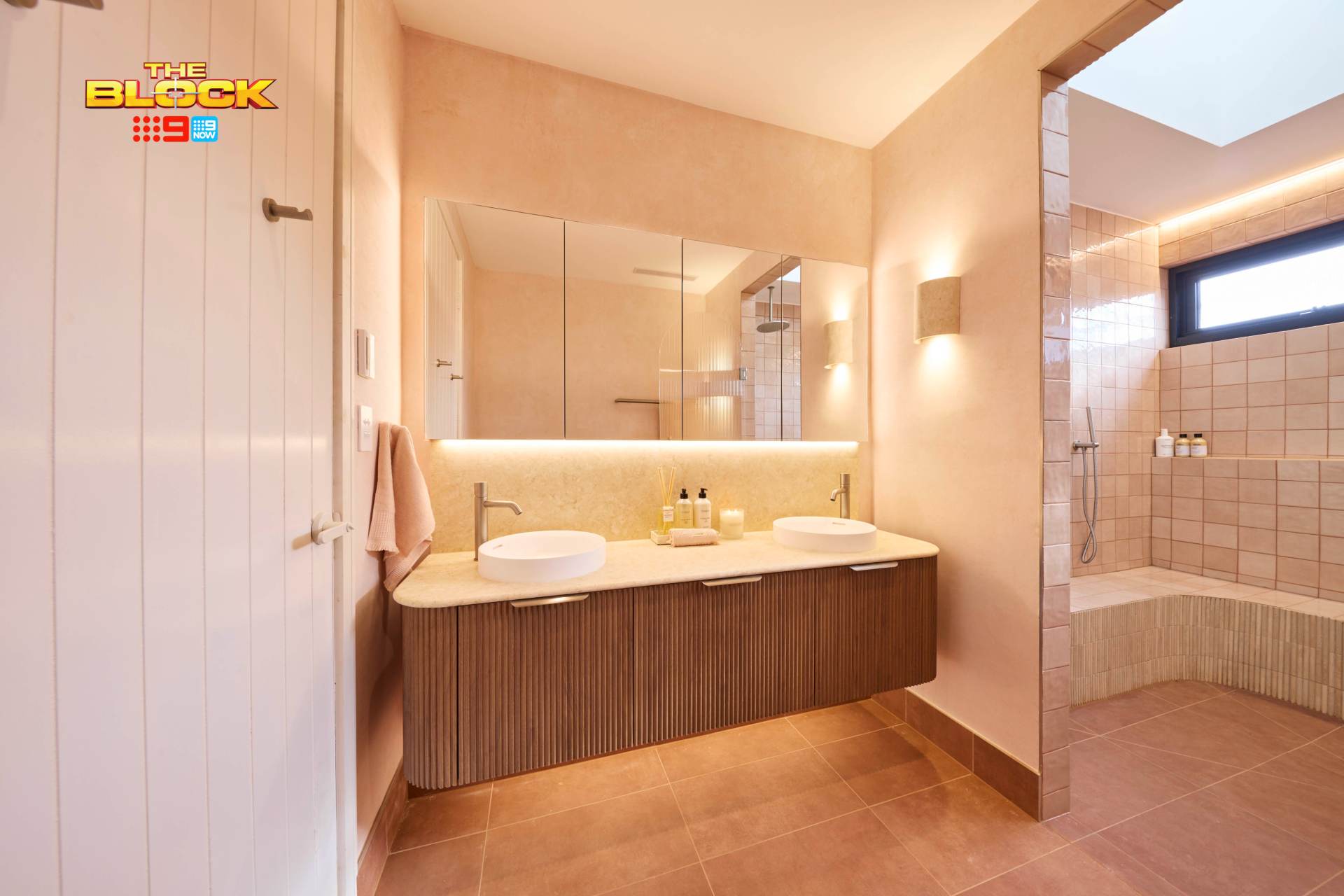
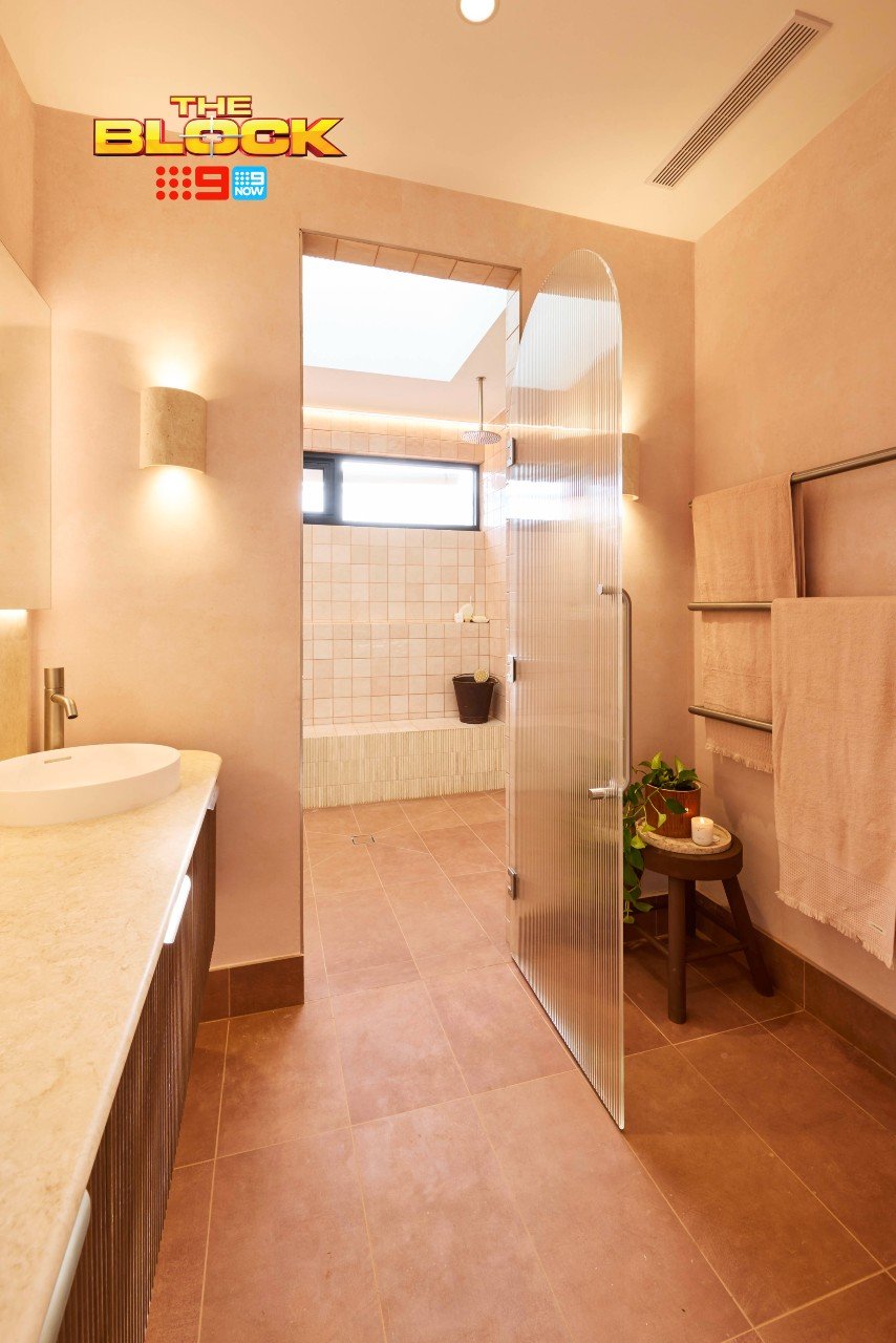
It’s a tale of two worlds in Britt and Taz’s main bathroom this week. I still don’t think they deserved to come last (red salad bowl room, I’m looking at you), but there were some issues.
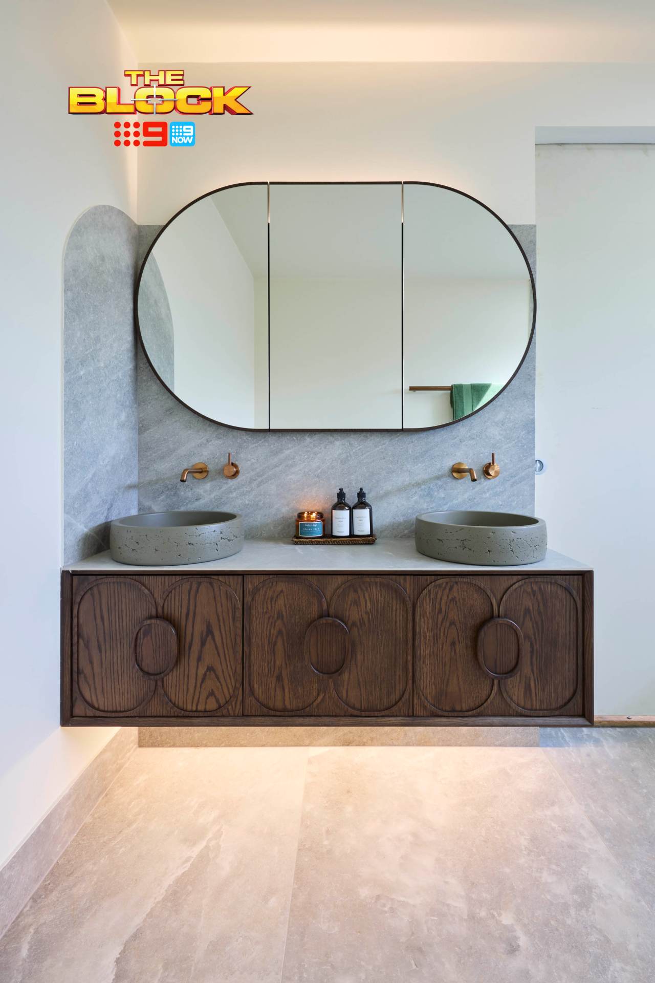
Let’s begin with the vanity area. It, I have to declare, is charming. I’m smitten. I want to stand in front of that mirror and imagine all of the surgeries I could get done to my face if only I had the guts to actually follow through with them (you go in for the Henry Cavill but come out with the Mickey Rourke – not ideal).
The colour palette in this area is soothing, the raised vanity is divine, the curved edges I am all for, and the basins and tapware are winning. It feels intimate, it feels cosy, I want in. But then you push open the arched door to the shower zone and enter somewhere completely different.
The Shower Zone is Confusing
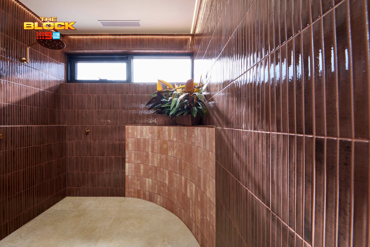
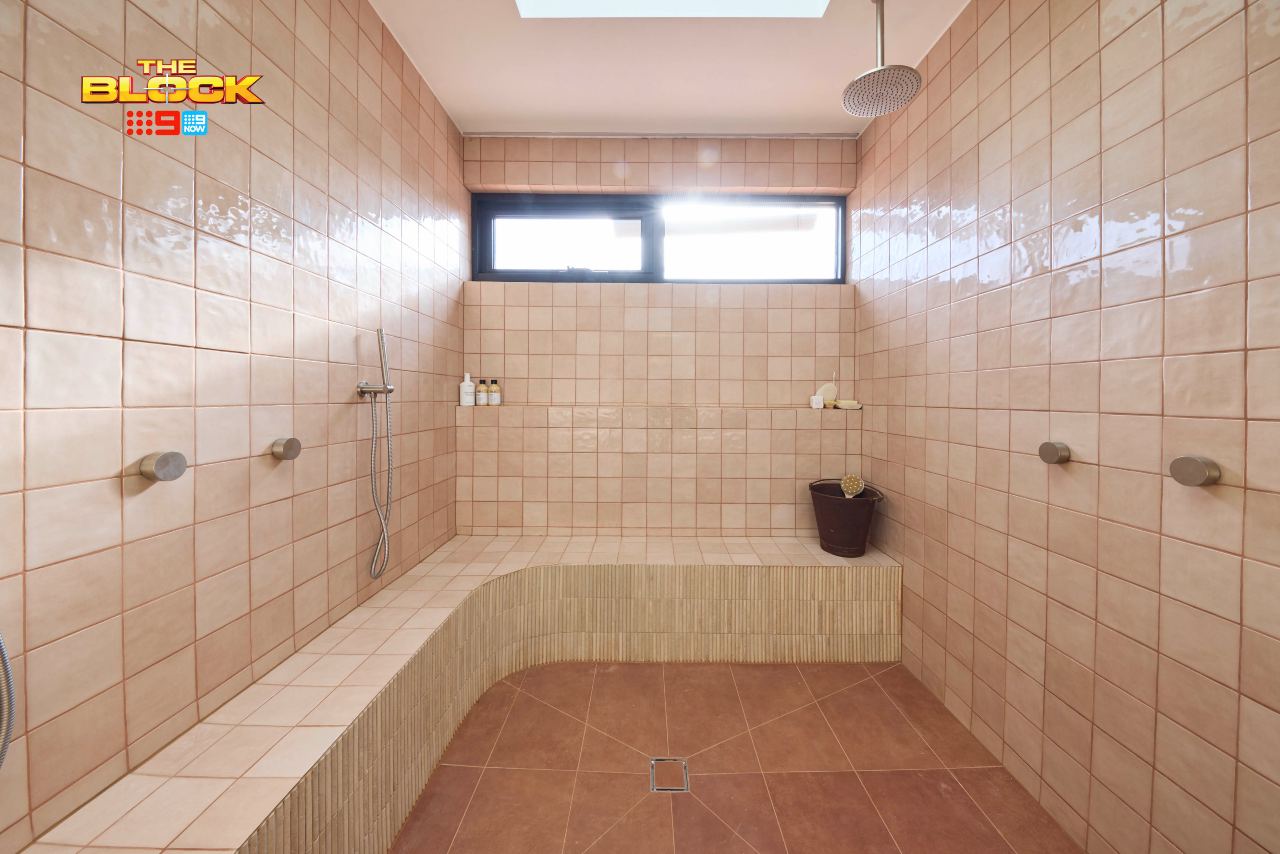
The shower area feels rather cold and uninviting. And it could be the camera lens in the image above, but why so much bench seating? How many people are we hosting in this shower? No judgement if you’re into dropping keys into the dish at the front door on a Saturday night, just tell me if drinks are supplied or if it’s BYO plonk.
In all seriousness, I don’t feel the idea of this fully enclosed shower area was carried out successfully. A different combination of tiles could have helped. The wall tiles being that glossy don’t make it feel like a soothing, spa-like zone.
And do my eyes deceive me or is there a tin bucket in the corner? Why is there a bucket in the corner? What are we using the bucket for? Is the party BYO bucket? I need answers, people.
What did you make of The Block 2025 main bathroom reveals? Drop me a comment below and let me know if you agree with my assessment – or see how we approach spaces like this as Melbourne interior designers.
At TLC Interiors, we make
great design easy
Need Our Help?
Images by David Cook Photography, courtesy of The Block Shop. For more info on The Block 2025 main bathroom reveals, check out NineNow.

I like the salad bowl. I would love it in an eccentric eclectic maximalist boudoir in front of a blazing fire, opposite a silk divan, and surrounded by modernist sculpture and antique erotica…perhaps not optimal choices when decorating a house to sell. It could work equally well in a minimalist design, with lots of space around it and lots of light coming through (none of these designers have thought much about light). My point is, the piece is bigger than its dimensions, and the designers have clearly fallen in love with it without a plan for how it will really make sense in the available space. It’s the apricot that troubles me more though. It reads to me like an apology for the redness: it’s not so much red as a darker shade of peach. And it all looks a little bit McDonald’s. So for all the wrong reasons, I agree it’s not quite convincing.
In fact, I don’t love any of these rooms. My pick is the grey one – and I don’t like grey. I do, however, like the soft patina finish of the materials and the tile treatment. It is a very serene space, albeit one which could do with a little more warmth. The skylight is nice, but what happens at night when you are soaking in the v expensive tub? I would like some more attention to the ceiling- possibly a lit grille on the skylight, casting another layer of soft patterning across the space…or a pressed tin surround, or an elegant pendant light. The design would be gorgeous if it had a large window looking out to a leafy courtyard…An earlier season of the block had a controversial moss wall in the bathroom. I was not a fan, but in this space a strip of nature, perhaps just under the window (moss comes in colours beyond bright green) could lift the space out of the box. it just feels unfinished and a tad soulless.
Your the only person who has picked up that the basin was too close to the wall …all your observations are 100 per cent on point and the criticism is justified … I thoroughly enjoyed your comments ..
God the grey wallpaper was so wrong for that beautiful travertine bathroom. It clashed, it was jarring. It was a no from me. Something warmer would have been the ticket. Agree about the Dinosaur Designs fruit bowl which matches the one I bought for my kitchen 15 years ago.