The Block 2025 main bedrooms reveal presented a challenge I often see people get wrong when designing large bedrooms: how do you adequately fill an ample footprint without overstuffing it?
It’s a first world problem many clients are lucky to have, and this week the teams had mixed success when it came to their approaches. Some got it right, some undercooked it, and some thought a turquoise and orange colour combination was the answer (expert tip: it never is!).
There was nothing quite as shocking as last week’s Imperial Leather soap tub turned salad bowl situation, but there are many things to say about the design of the main bedrooms and walk in robes delivered this week. Let’s explore…
Key Points from Main Bedroom Week
Britt and Taz Came First
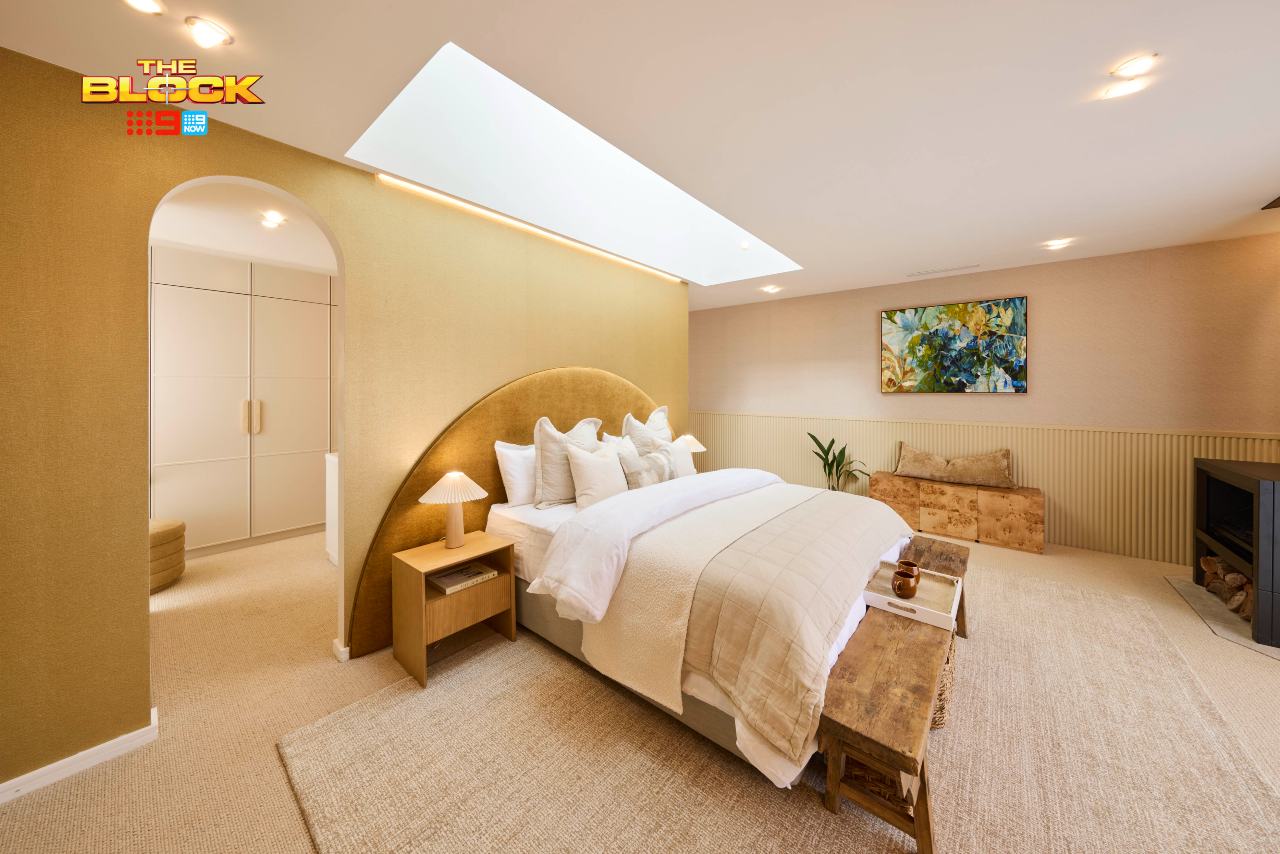
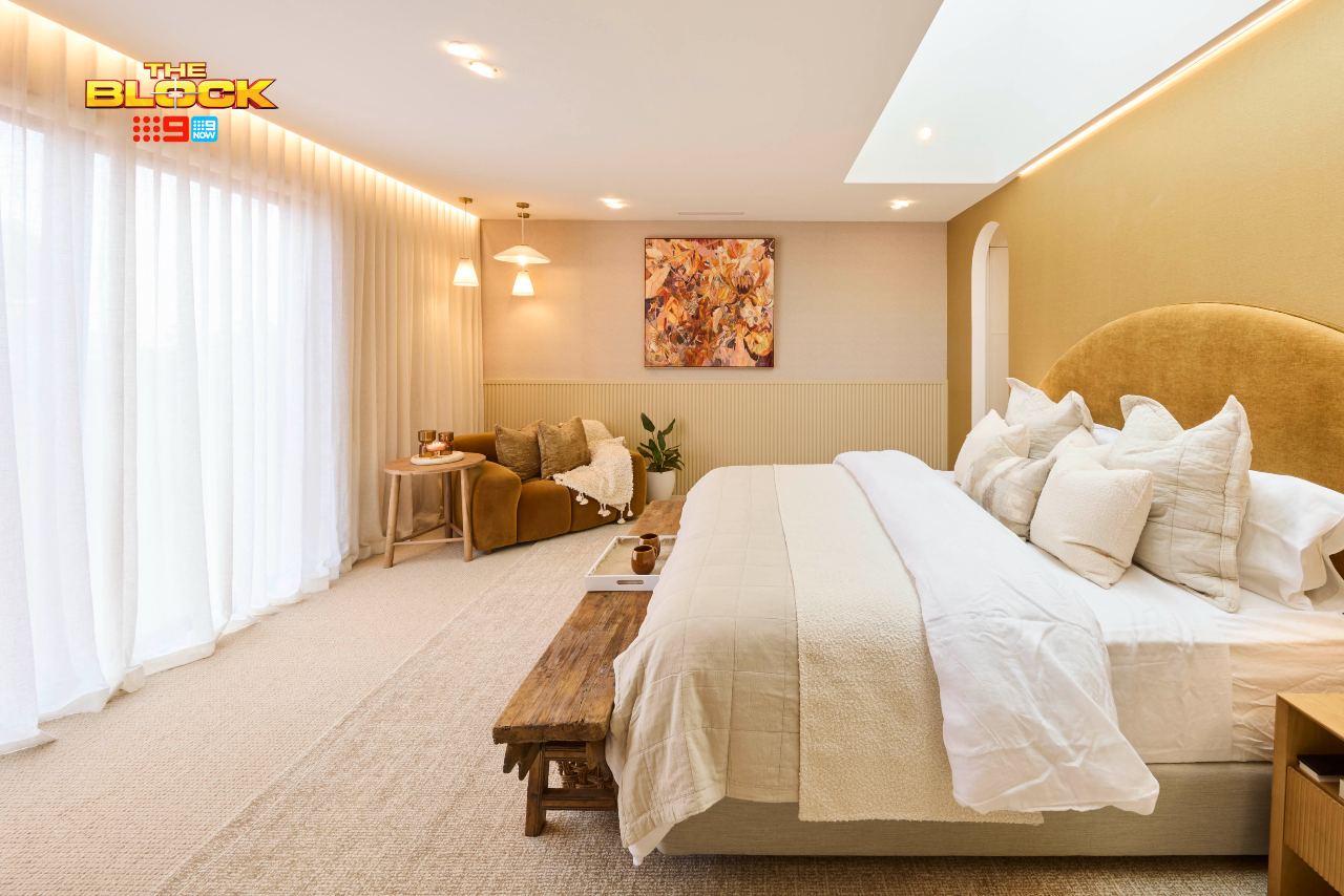
Britt and Taz deserved the win, no doubt about it. What is unfortunate, though, is that the main bathroom they delivered last week bears no resemblance to this bedroom whatsoever. Like Michael and Paris Jackson, the family resemblance is zero.
In fact, Robby and Mat’s main bathroom looks more in-keeping with the design of this bedroom. Lack of cohesion aside, there’s a lot to love about this design. As a space in isolation, we’re onto a good thing.
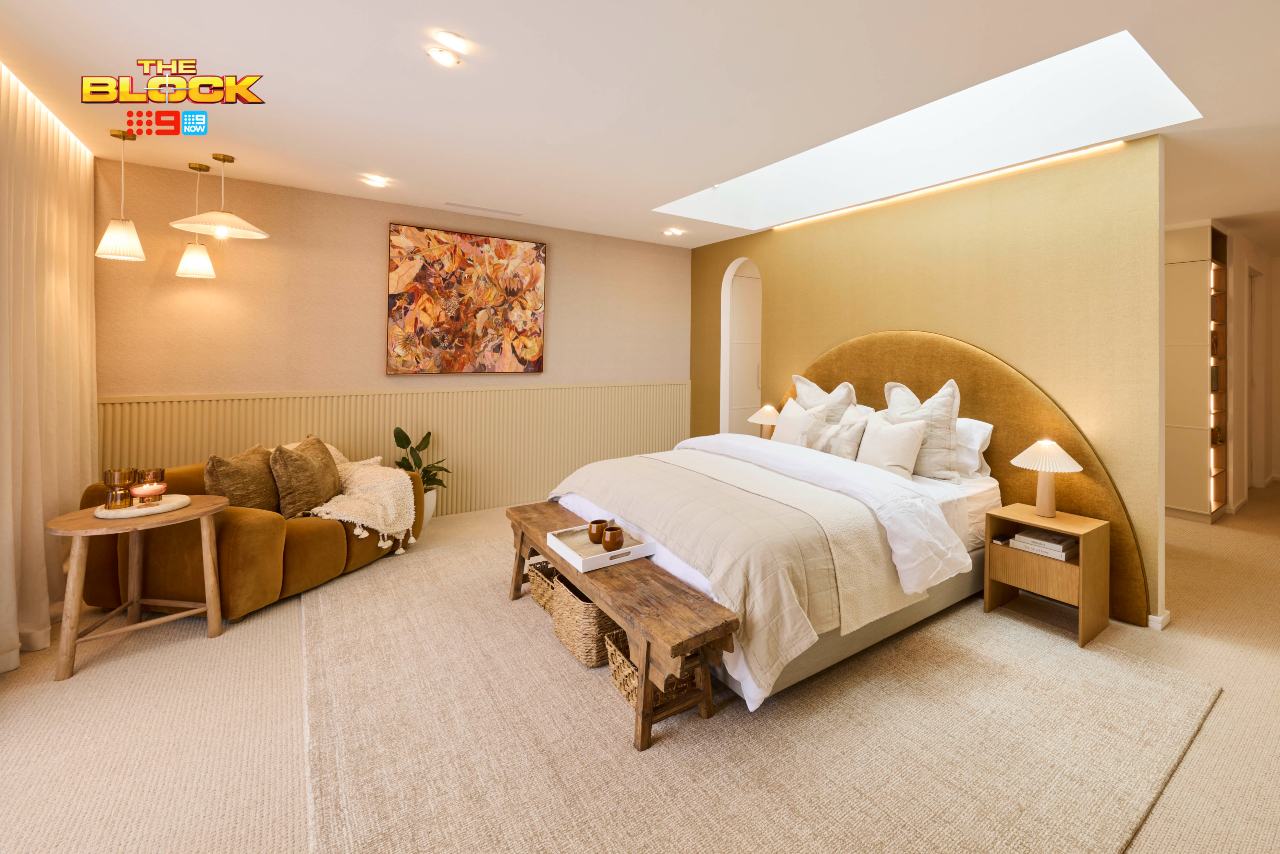
The monochromatic colour palette is delightfully calming. It’s like I’ve downed a few DHT gummies and gone to a dayspa. With the exception of the square artwork, the scale of the room is great too – everything fits nicely without being too minimal or overly heavy.
The furniture choices are also stunning, the wallpaper and paneling is a delightful marriage, and in a rare moment on The Block, the lighting style makes sense in the room!
There Are a Few Small Tweaks to be Made
Do we really need that fireplace? It’s bringing a different vibe altogether. Just give me ducted heating and call it a day. I also question the arch doorway beside the bed. You already have that delightful arched headboard, there’s no need to have a competing arch in the room.
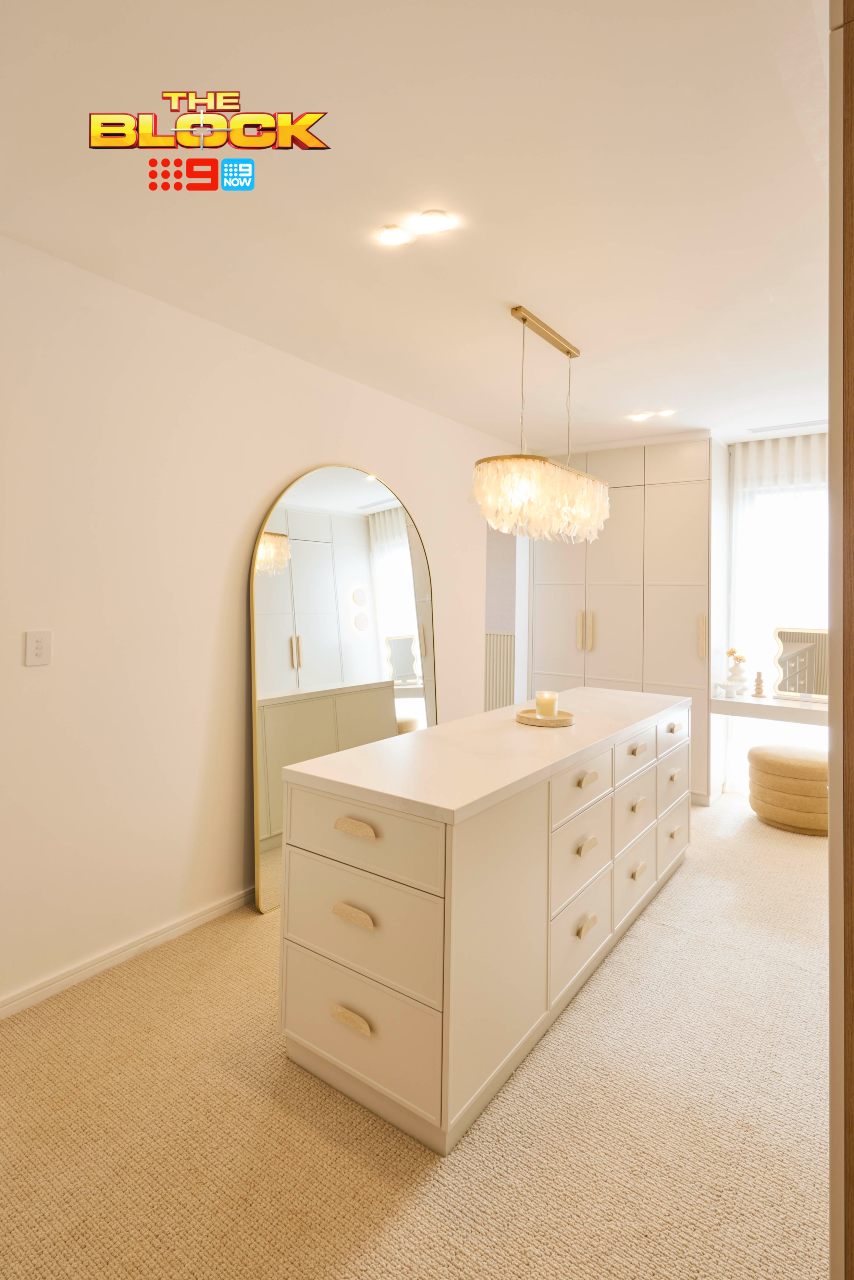
In the walk-in-robe, the inclusions are mostly successful, although the pendant and handles feel out of place. Is the approach brassy luxe or are we going earthy? The lighting choices this season are often confused, like me trying to remember my name after the fifth stop of an all-day wine tasting tour (have never used the spittoon and never will).
Overall, this main bedroom from Britt and Taz feels fresh. It’s not a space we’ve seen a million times on The Block before, and that makes me one very appreciative interior designer.
Love the look? Explore pieces from Britt and Taz’s main bedroom reveal at The Block Shop.
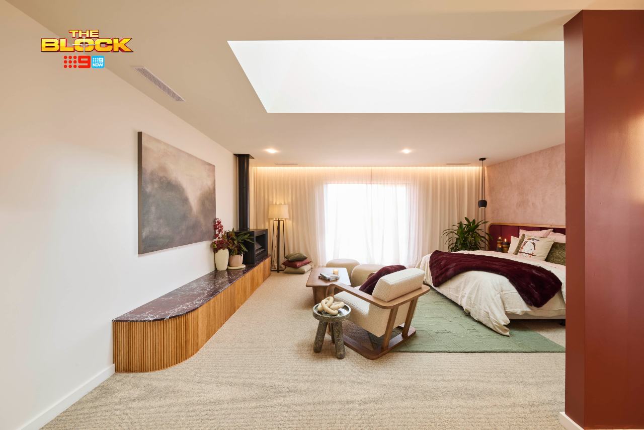
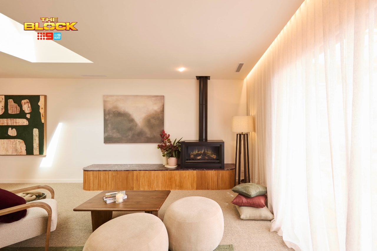
Emma and Ben Came Second
First things first, we have cohesion here. Even though I wasn’t a fan of all that burgundy in Emma and Ben’s main bathroom last week, I’m glad they carried it through to the main bedroom this week. The spaces are clearly related, like Angelina Jolie and her brother but without the creepy makeout vibes.
The bed zone is quaint, even if the bed and pendant lights appear off-centre. I don’t understand the choice there, or the decision to have the sheers going wall to wall (please make it stop). That said, the headboard, bedding, bedside tables and artworks are all winners.
The fireplace area I’m confused by, though. Why one chair and two ottomans? Why is the fireplace squeezed into the corner? Why is there joinery with a fluted profile in a rich colour that’s arguing with the joinery in the walk-in-robe?
While I love the concept of sitting in front of the fire in a bedroom, the whole area needs a rework. As it stands, the bed zone is giving Moulin Rouge and the fireplace is giving The Man From Snowy River.
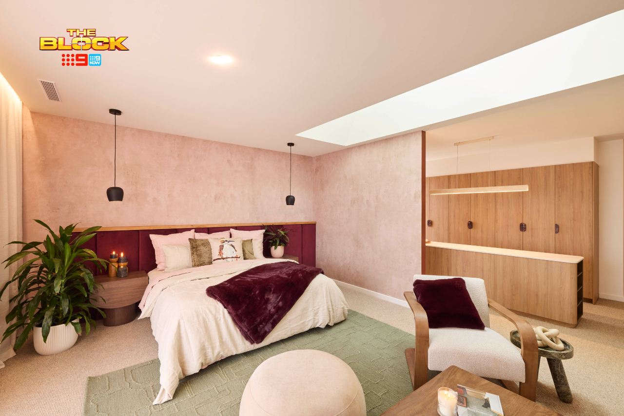
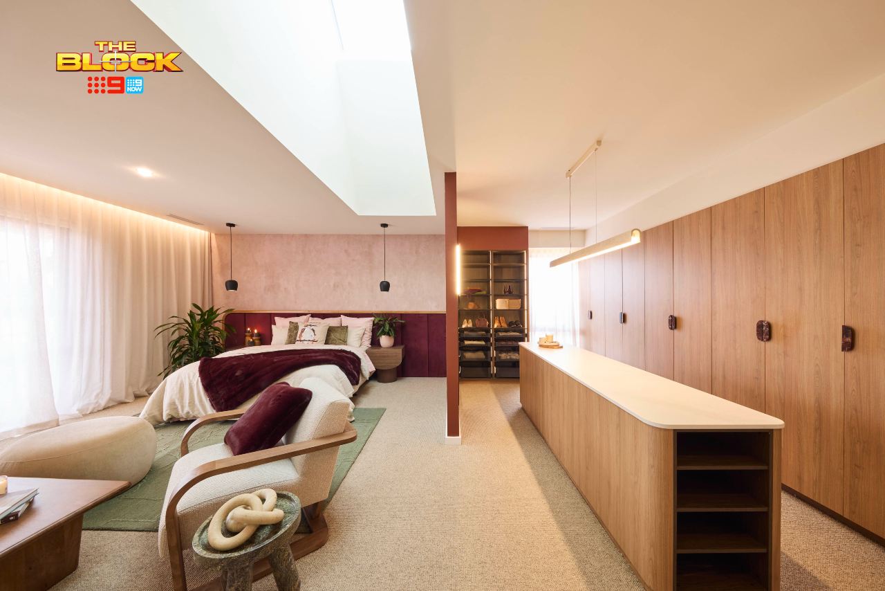
The Walk-in-Robe Has Many Issues
Riddle me this: is a walk-in-robe a walk-in-robe if you don’t have to walk into it? This one is just there, hanging out and exposed like a 2004 red carpet Tara Reid. While the tone of the joinery is nice, as is the stone, there are many issues to address and correct.
The centre island feels like a department store counter. What are you using all of that benchtop for? Is it Candy Spelling’s gift wrapping room? There’s no vanity to sit down and do makeup at either, which is a home of this calibre I very much expect.
The wall dividing the two rooms needed to be brought way out. It’s so strange they decided to construct it like this. It offers no privacy or noise barrier between the two zones. There’s no way someone could get ready while the other person is sleeping (unless it’s me in the bed after the aforementioned five-stop wine tour).
Robby and Mat Came Third
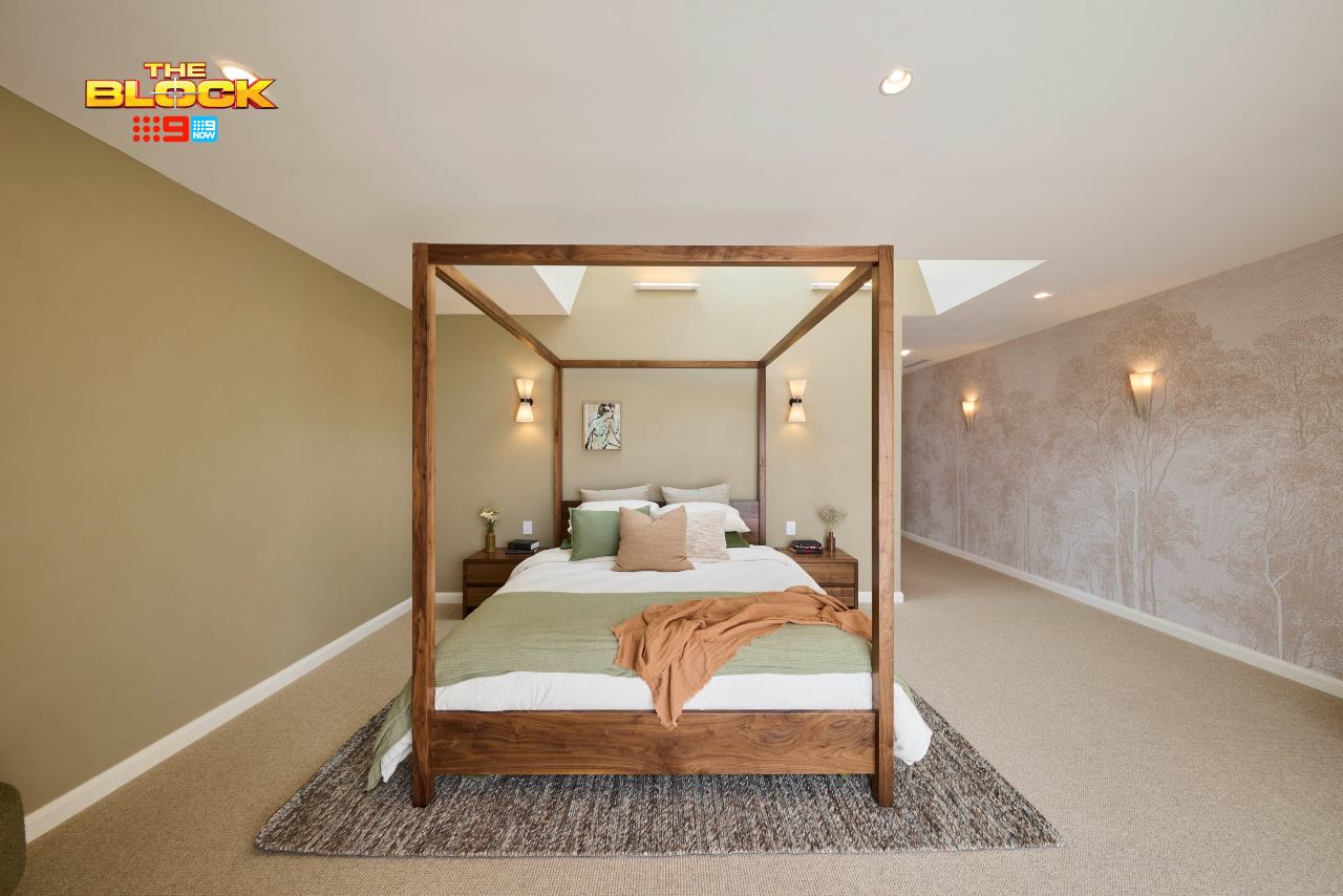
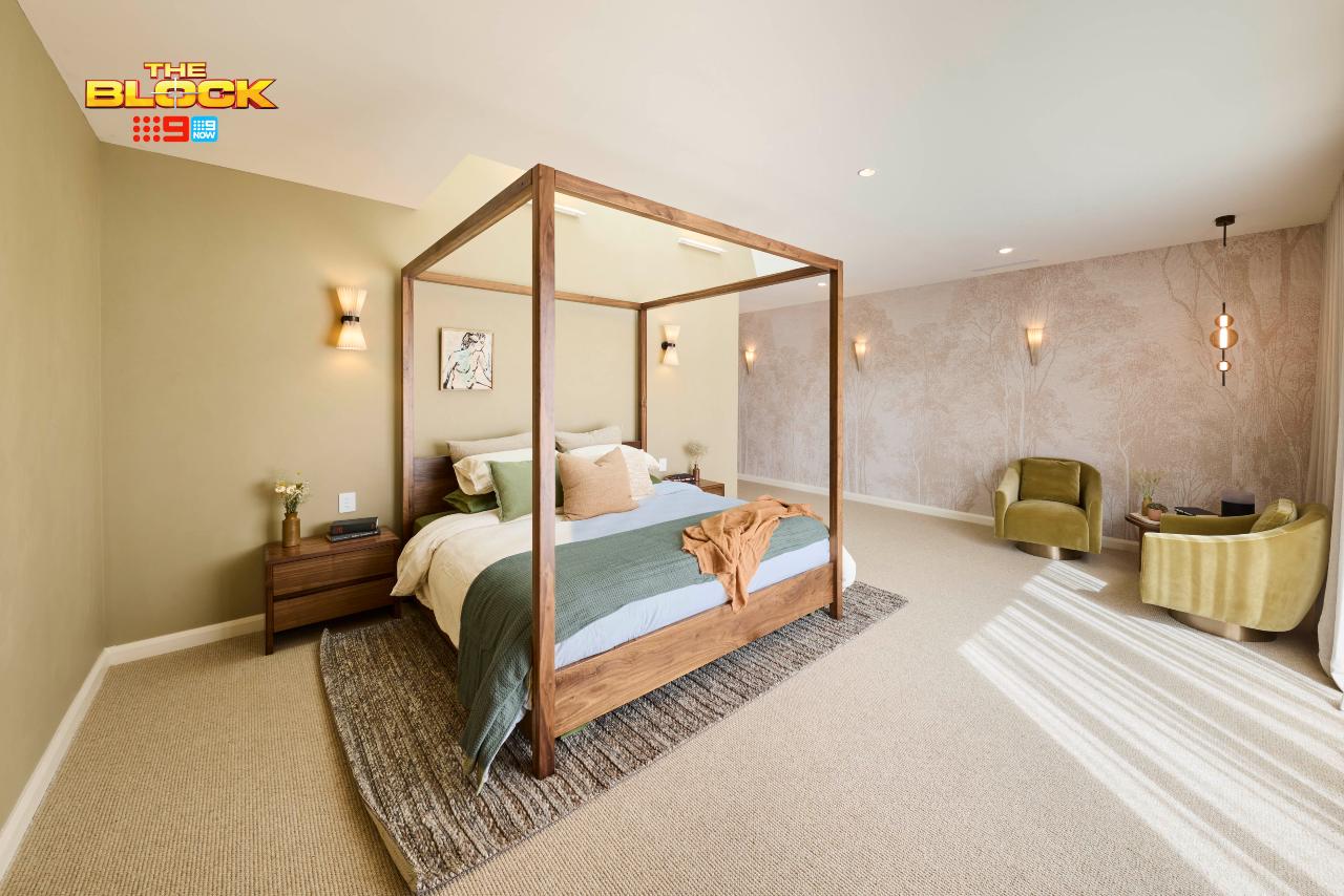
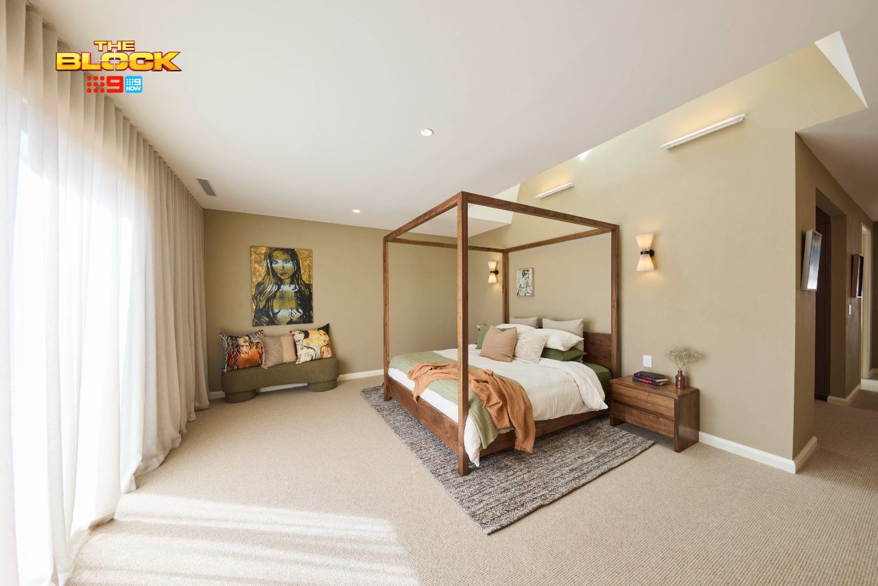
I’ll start by saying that the colour palette in this room is delightful. It’s just as soothing as Emma and Ben’s space. The artwork choices, also nice. That, sadly, is where the praise ends from me. There are many things that don’t work in this main bedroom design, and I’m a bit shocked they placed ahead of Sonny and Alicia this week.
The size and scale is completely off here. The four poster bed could have been larger. The bedsides could have been larger. The rug could have been larger. The surrounding furniture could have been larger. Like me ordering KFC the day after the five-stop cellar door tour, please upsize everything (and don’t go stingy on the sweet & sour sauce!).
The lighting is also at such odds with the organic, nature-inspired vibe they’re going for. And the fact that the four poster bed doesn’t line up with the cut of the ceiling above it would keep me and my designer OCD awake at night. Placing the bed on the other wall would instantly improve the room.
The Walk-in-Robe Is the Saving Grace
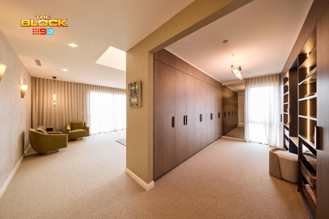
The walk-in-robe is hands-down the best of the week, so perhaps it is what got Robby and Mat a bit further up the leaderboard. It’s at a professional level, truth be told, and has everything you could want.
It features plenty of double hanging space, a full-length wall-mounted mirror (not merely leaning), a vanity area to do makeup at, lots of drawers, open storage, soft LED lighting, and natural light coming in from the window. And, lastly, joinery that works beautifully with the paint colour, bed frame and armchairs in the adjoining zone.
I think I’ll just move a small bed into the walk-in-robe and sleep in there. Truly delicious in every sense.
Sonny and Alicia Came Fourth
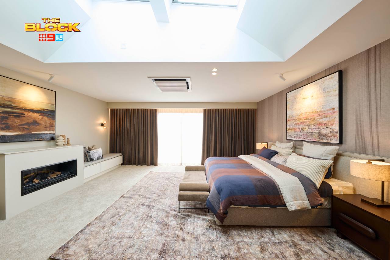
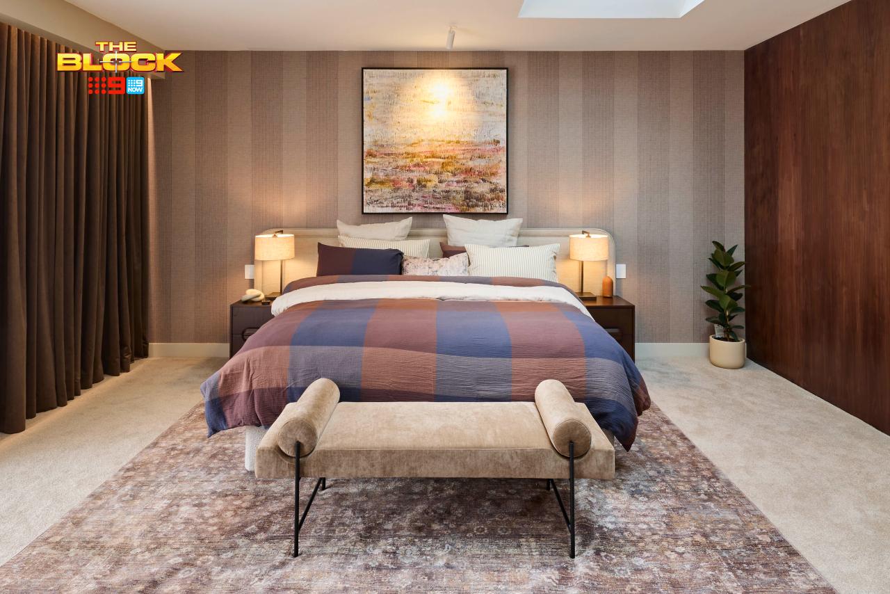
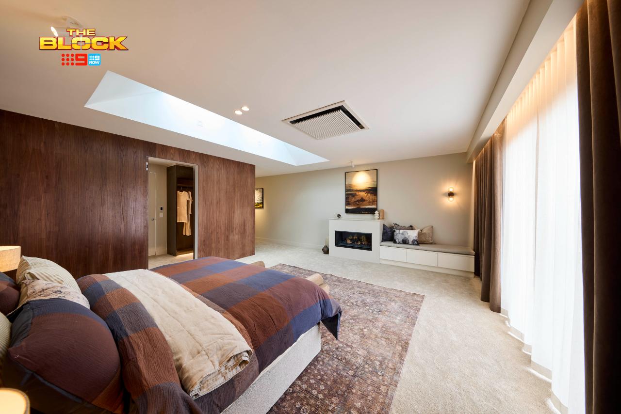
Truth bomb: if we were judging Sonny and Alicia’s bedroom without the walk-in-robe I would award it the clear winner of the week. It’s giving me Mad Men vibes in the best way possible, feels completely unlike anything else I’ve seen on The Block, and actually leaves me feeling a touch inspired.
I don’t think this has never happened before. Either I’m having an episode and need to book into a retreat to journal and work through my mental health issues, or this bedroom is actually really stunning. You tell me! I’m leaning toward it being glorious.
The only thing I would remove is the dark wall paneling. It’s taken things a touch too far and isn’t at all needed. But look at the wallpaper. Look at the quilt cover. Look at the bench seat and rug. Look at the artwork above the bed. Even the curtains are bliss (wall to wall works here). I kinda want to move in.
Sure, the Walk-In-Robe Let Them Down
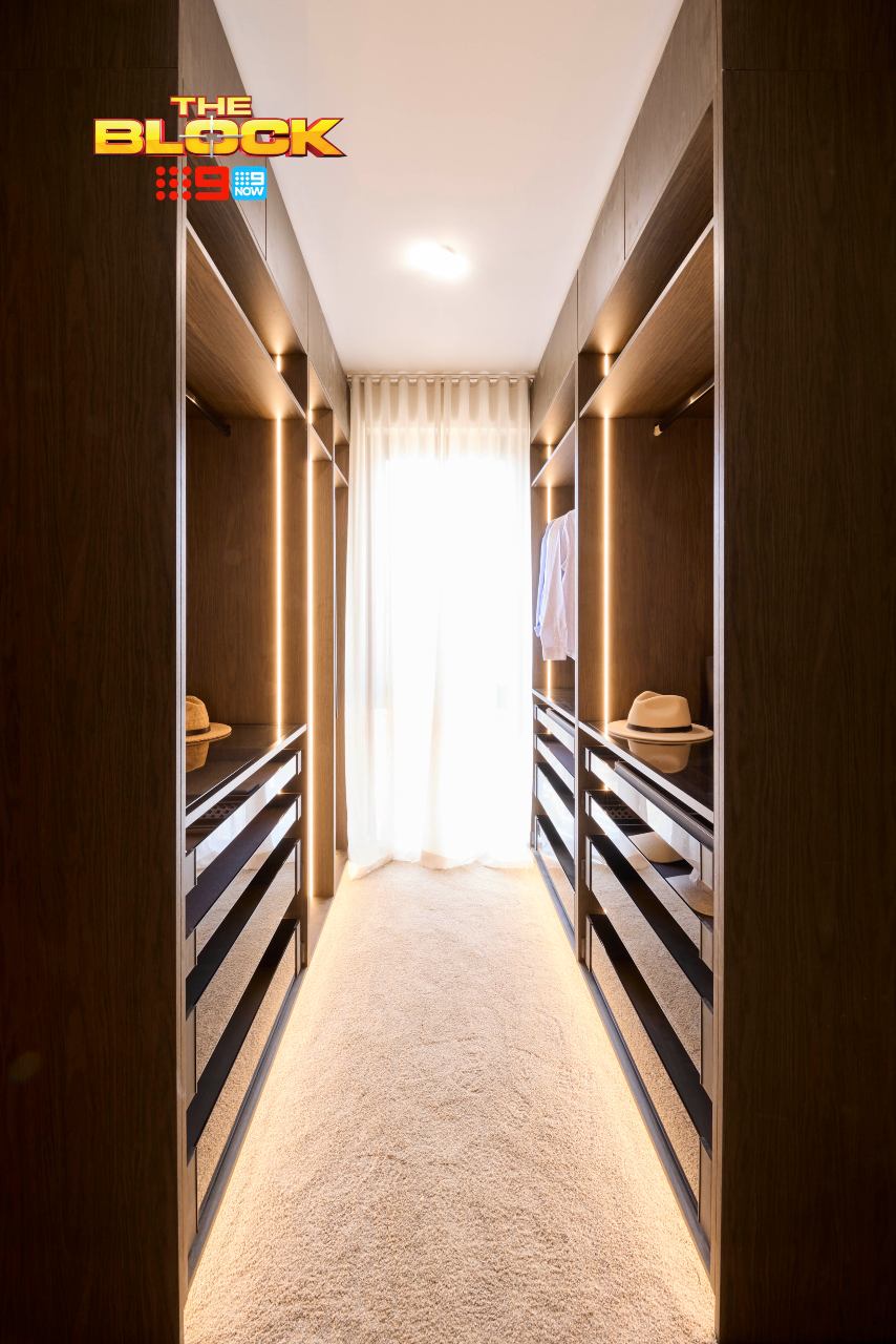
I do agree that this feels more like an apartment walk-in-robe than it does a robe you’d have in a main bedroom suite in a suburban home. It’s not really giving me any sense of ooh nor ahh. The narrow hallway feel is claustrophobic to me, and the sheer curtains on the window feel crammed in.
It’s such a disappointment because the main bedroom design is so good. I also don’t see a tonne of cohesion between the main bedroom and main bathroom. The bathroom was quite grey and the bedroom is quite brown. A style disconnect is at play, but I still like their space overall quite a lot.
Han and Can Came Last
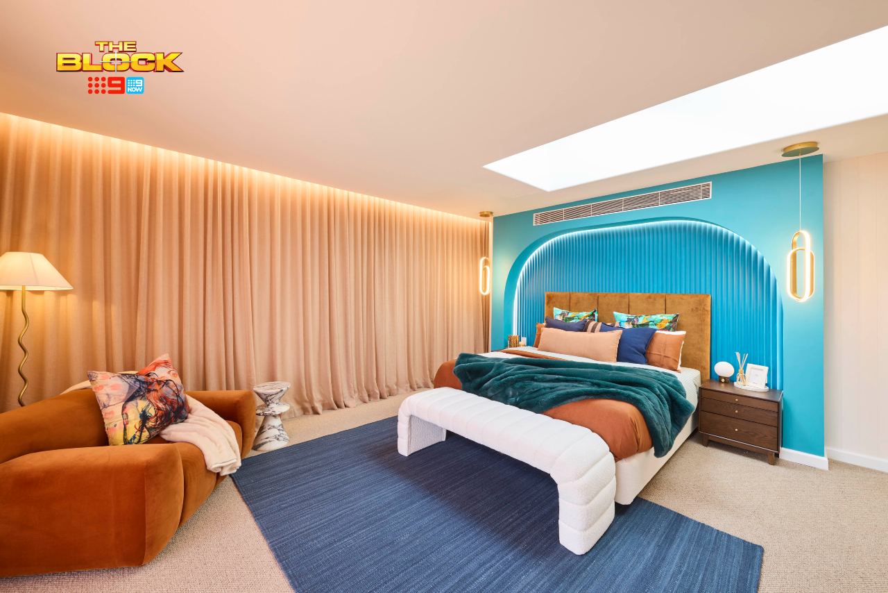
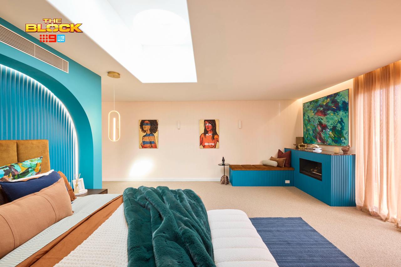
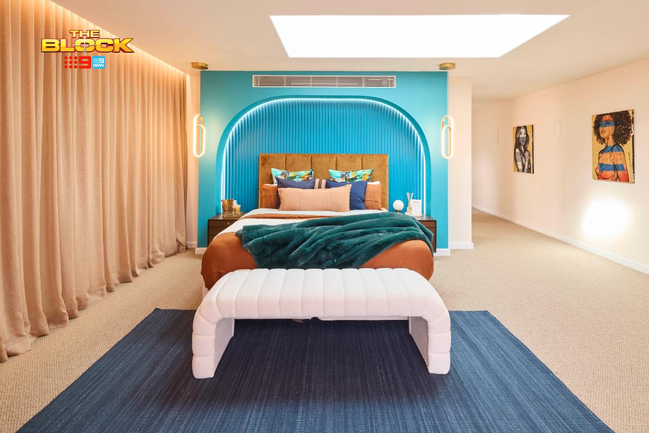
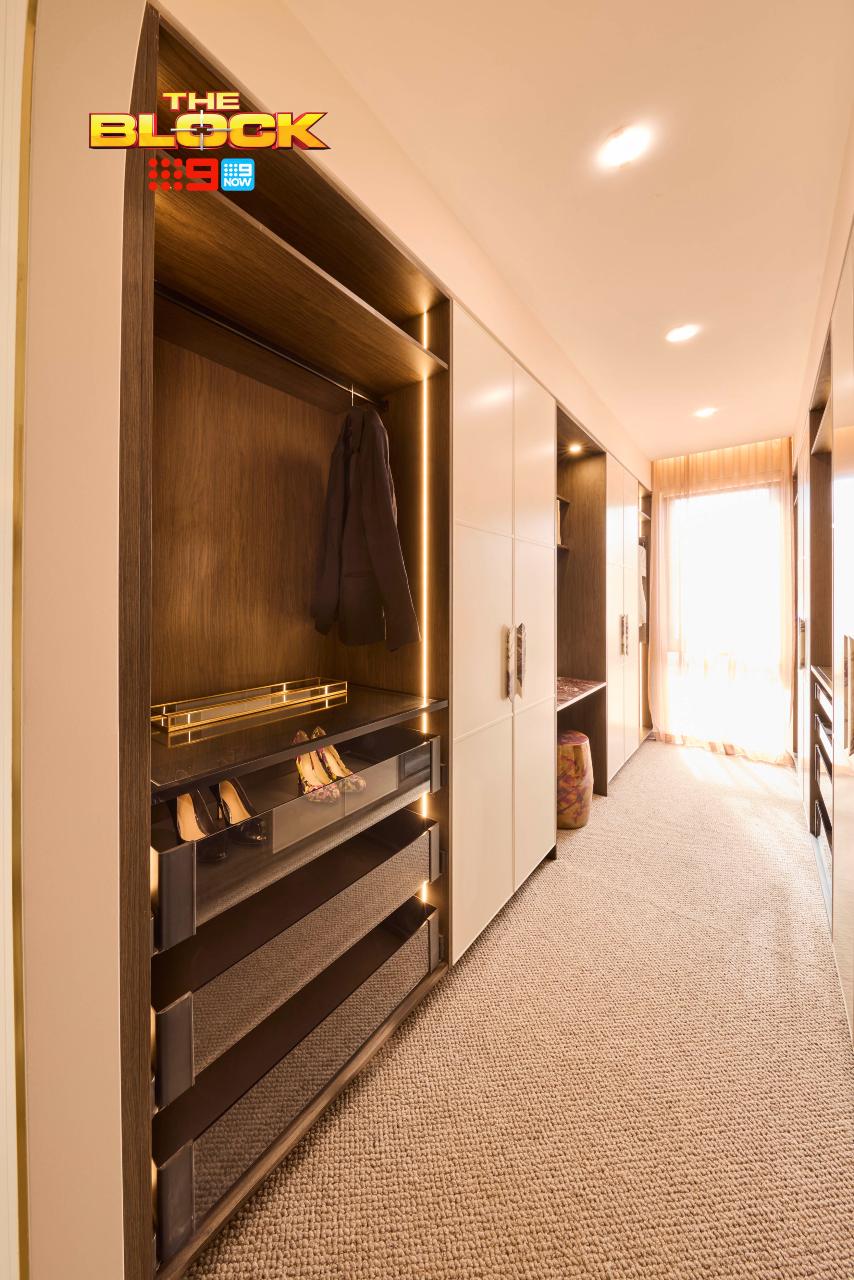
Why does this bedroom feel like the Big Brother set at Dreamworld on the Gold Coast in the early 2000s? It doesn’t look like a room in a home, but a TV studio in oversaturated colours. Get Gretel Killeen on the blower to evict someone immediately. It’s time to go…. fireplace.
Boy is there a lot going on here. That turquoise paint is so vibrant and juvenile in feel, that when paired with the bright oranges, it comes off as incredibly cheap. The pendants make no sense stylistically. All of the scalloped paneling feels unnecessary. And that aircon grate on the wall above the bed is killing me.
I hate being this negative (truly), but I can’t find one redeeming feature. Even the Bromley’s want out.
Can We Talk About Curtain Crimes?
I honestly must ask, why is The Block so against windows? Why does every window have to be smothered in a mass of curtain that pools all over the floor and extends wall to wall? It’s like I’m at a dinner-and-drag theatre show and Tess Tickle is about to bust out from behind them to perform an Abba medley.
It’s not just in this room, but all of them. I feel I’m left with no choice but to launch an official investigation.
It’s rare I ever do wall-to-wall curtains for clients. And they never pool on the floor. Let your curtains breathe a little. Let’s see some wall either side of them. And let’s have them just off the floor. A curtain should be a light blouse in a room, not one of those puffy sleeping bag jackets from Kathmandu.
What did you make of The Block 2025 main bedrooms reveal? Drop me a comment below or come visit on Facebook or Instagram and talk it through there.
Images by David Cook Photography, courtesy of The Block Shop. For more info on The Block 2025 main bedroom reveals, check out NineNow.

Emma and Ben’s was the one for me..even though I wouldn’t have decorated in the same way..there all so boring and bland in colour choice and design..seems to be screaming out for a “pop” of some colour in all of them..use some initiative..take a chance on change from what everyone else does.
I agree with everything you say!
Curtains everywhere, trailing on the ground, sometimes even in bathrooms. The dark panelling in one and the Long island where the wall needs to be extended seem to have gone unnoticed by the judges.
Agree on curtain-gate but I wonder if it’s because it’s a crazy ugly construction site on the other side of the glass – hard to envisage calm and tranquil when there’s a bulldozer parked up against the glass?! Doesn’t excuse the wall coverage but might be a reason the contestants are sheer/curtain obsessed??
You are so right in all of it! And the puddling curtains do my head in!