The 2021 Blockheads revealed their kitchens and butler’s pantries this week, and I have to say that it was, hands-down, the best Block reveal yet.
You’ll often hear words like “No”, “I can’t”, and “What the?” when I look over Block reveal photos some weeks. And while there were a few of those this time around, overall I almost slipped a disc from continuously picking my jaw up off the floor. There were so many stunning moments to take in.
While I didn’t agree with everything the judges said, the scoring was fair. And here’s a hot tip from me to some of the contestants (namely the ones who brand their initials into stone): you don’t have to agree with the judges, but you can be respectful about it. I do it here every week. But maybe I’m also not progressive and know nothing about design lol.
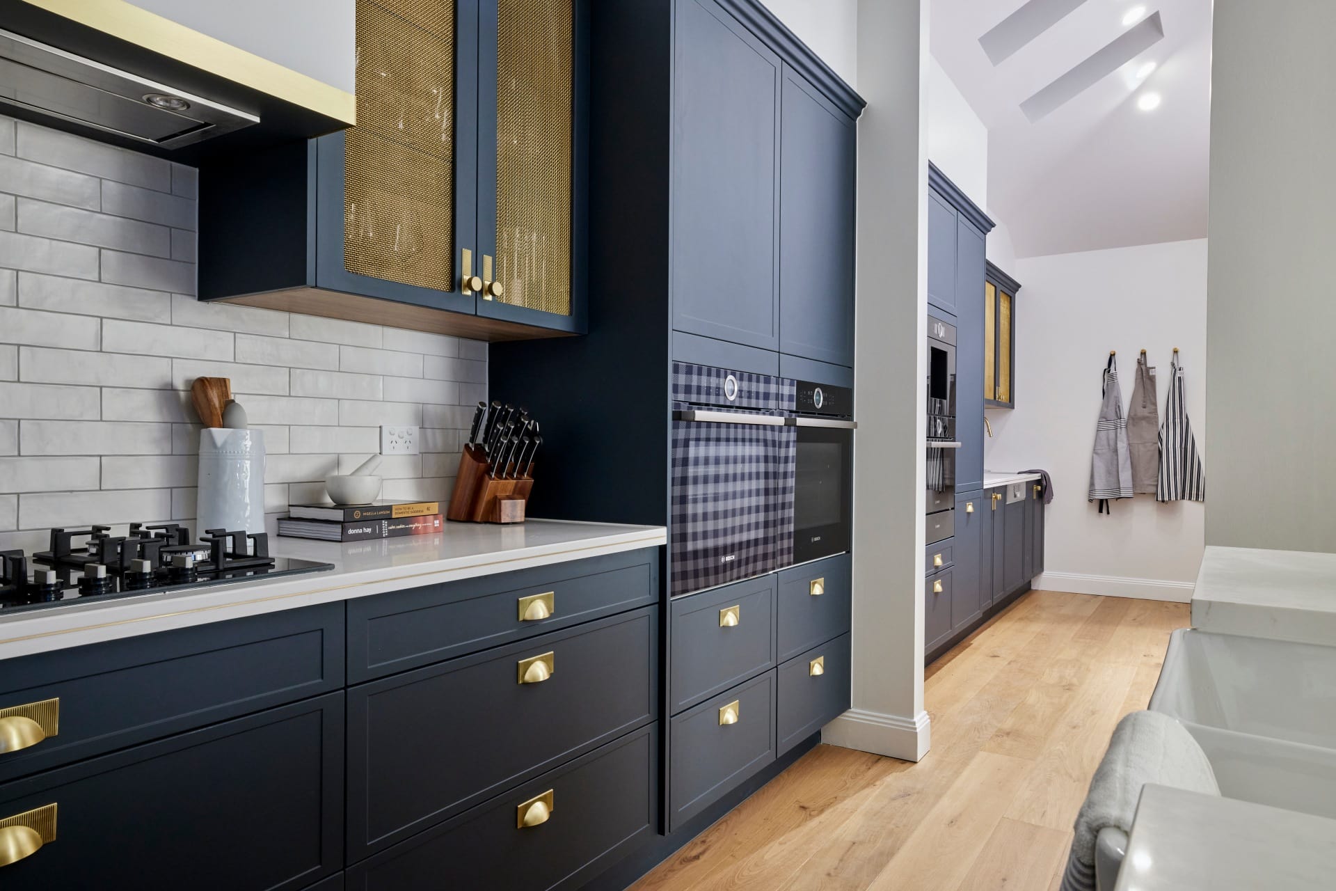
Kirsty and Jesse Came First
I really can’t with how good this kitchen is. I’m more moved by this than I was the Melbourne earthquake. And that’s saying something because my apartment shook like a shaggin’ wagon as I stood in a doorway cursing my pyjama choices in fear I’d have to run onto the streets in them!
Did I hear a collective, nation-wide, pants-wetting moment when they judges walked into this space, or is there an impending flood I’m not yet aware of (I swear Mother Nature is p*ssed right now!). I don’t know what I can say about this kitchen outside of ‘I love every minute of it’.
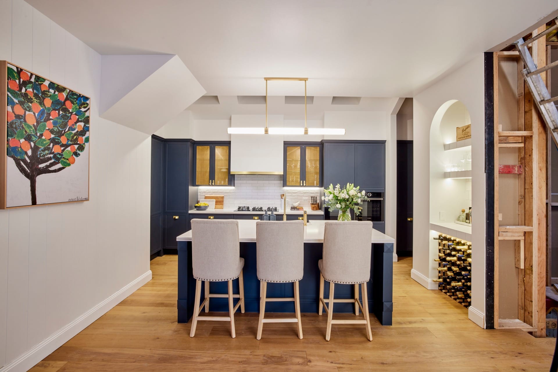
Every week I say how nice it would be to see design that pushes the limits a bit, impresses with something unexpected, but is still completely buyer-appropriate. And here we have it. This kitchen is charming, packed with a sense of nostalgia, and delivers the sort of finesse I’ve not seen on The Block in a long time.
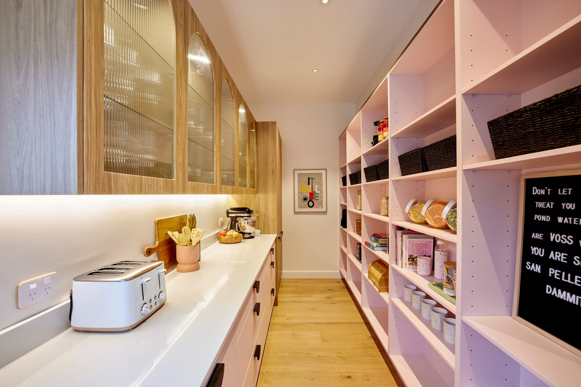
Standout moments for me include the wallpaper, the arched drinks zone, the pendant light, the colour of those cabinets, and the butler’s pantry – without a door! I swear all the other teams were way too obsessed with closing off their pantries, and it just wasn’t necessary.
This Style Needs to Cover the Entire Home
Now that I’ve seen how epic this kitchen is, I really want to go back to some of their other rooms and push them further. For example, I’d cover the master in a gingham wallpaper. Go full throttle with the Hamptons vibe. The charm that wallpaper brings to a room is everything. I would revisit and amp up the other spaces.
In terms of changes, they’re really quite minimal. The stools are too large in my opinion. There are so many beautiful details to appreciate here, and the stools detract from them with their size and scale.
I’m also finding my eye going to the section above the rangehood, or the section that conceals it I should say. Just plaster, right? I can’t help but feel some stone here would have been nice, so it speaks to the countertops. I’m willing to be challenged on this, but it feels a little bare to me.
Overall though, this will be a kitchen people will be admiring for years to come. I’m so impressed!
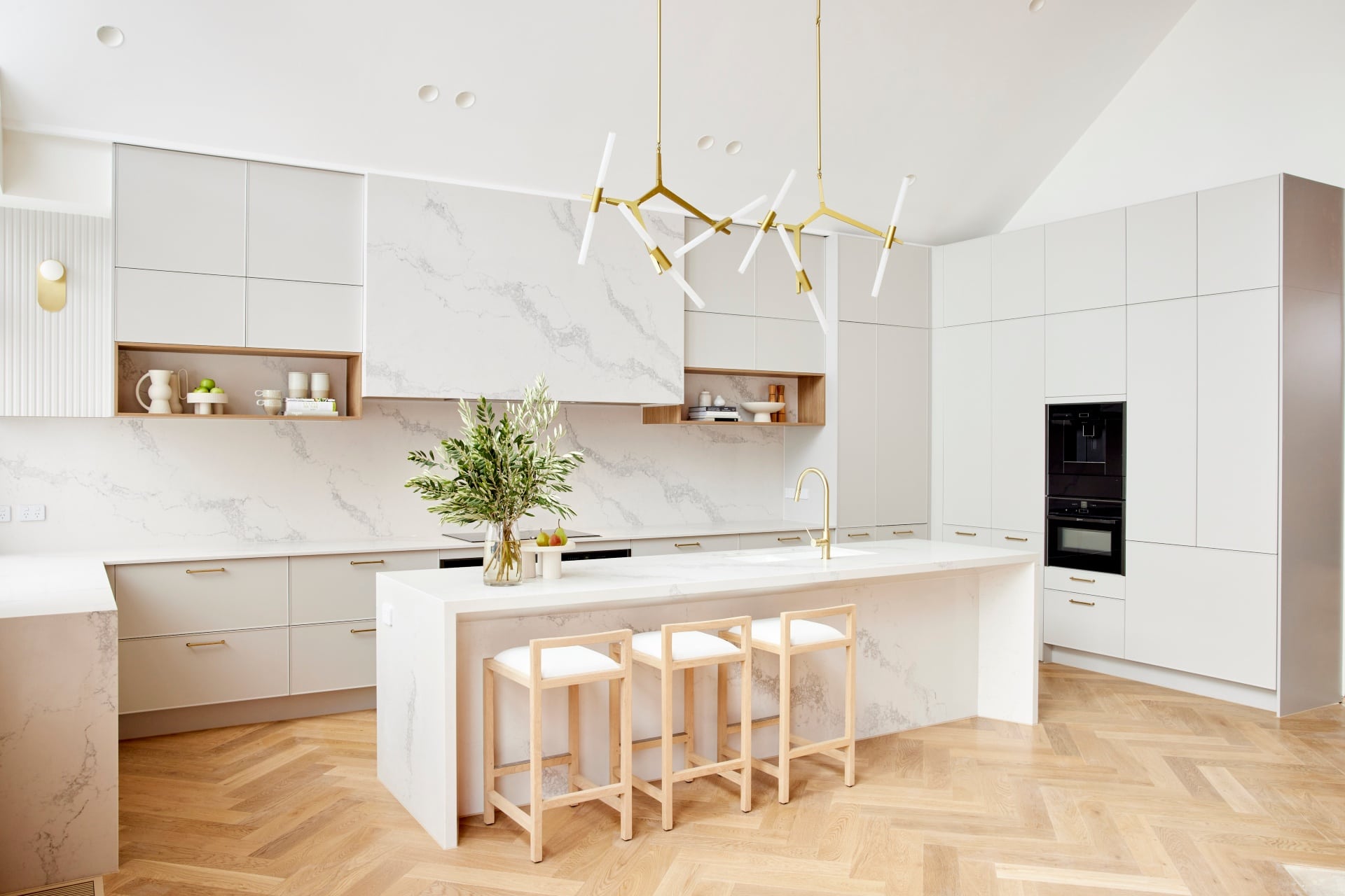
Ronnie and Georgia Came Second
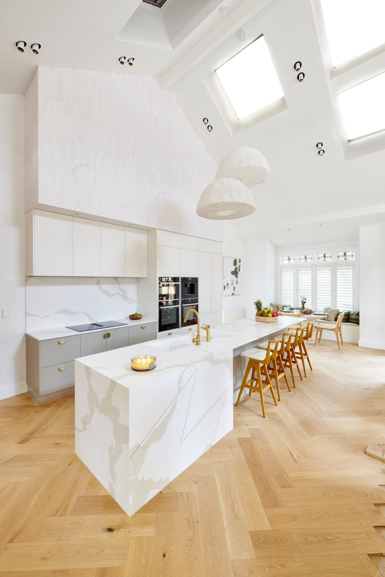
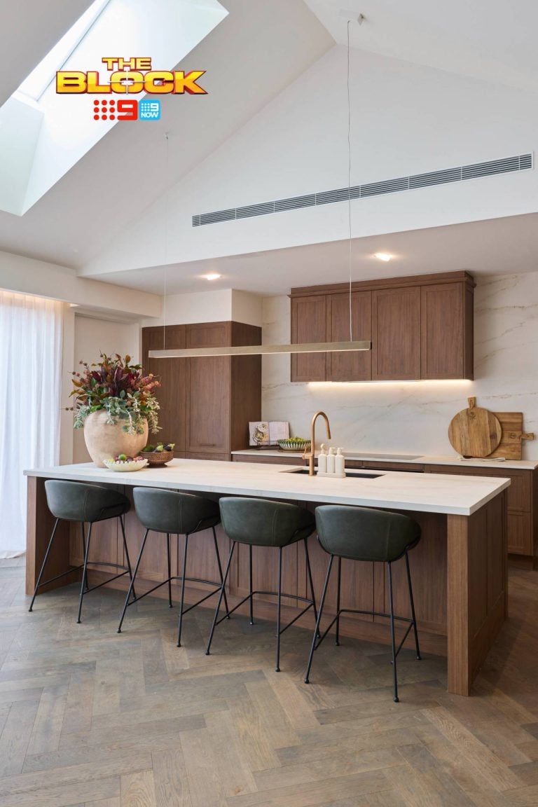
It must be said, from a visual perspective, this kitchen is the bomb dot com. Give me a ciggie because I am spent! There is (almost) nothing I would want to change in it from a looks perspective.
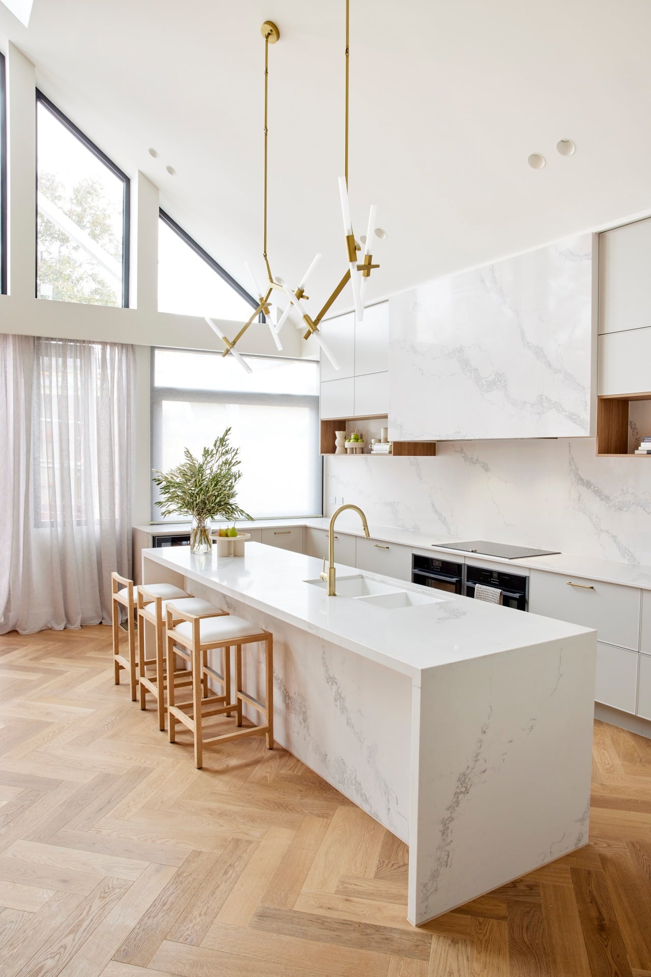
The stone running from benchtop to splashback is delectable, and a trend you would have seen in this recent kitchen reveal on the blog. It gives the space such a subdued sense of luxury. It doesn’t scream ‘money’, it whispers it like Charlize Theron in a perfume commercial.
The herringbone floor speaking to the timber accents in the upper cabinetry is so delicious. Those accents, even if they don’t marry up with the line/base of the stone over the range hood, add necessary warmth. And the stools, which I showcased in this bar stool roundup, are made for that island.
Yes, I’ve seen those pendant lights a lot, but they work here. They, the tapware and the cabinetry hardware are a brass symphony I want to hear more of. If those pendants were simpler the kitchen wouldn’t have that kapow moment it needs. The balance of elements is so right here.
This kitchen is giving me what some of Ronnie and Georgia’s other spaces haven’t; neutral but impressive, and offering a few gasp-worthy design-gasms.
Let’s Address the Functionality Issues
Firstly, the island bench doesn’t seem deep enough. It’s one of the first things I saw. They intentionally stepped it in so it didn’t line up with the outer edge of the kitchen where the fridge sits. Hard to say, given we haven’t seen living and dining yet, if that’s a fatal mistake, but it looks a bit off.
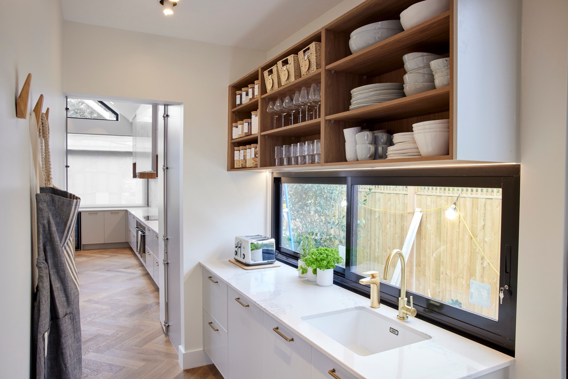
Also, I must declare my hatred for the butler’s pantry door. Personally I’m a ‘no door on the butler’s pantry’ kinda guy; let it be a continual flow from kitchen to butler’s. You’ll be going in and out of it all the time, so the door is going to becoming more annoying than the Instagram algorithm.
I also take issue with the placement of the ovens. Sorry, if I’m dropping a few mil on this home, I refuse to bend down to the oven. I simply refuse. If I’ve worked hard enough to earn the money to buy this home, you aint gonna see me bending to pull out the Sunday roast. These should have been stacked one above the other higher up.
I don’t have an issue with the size of the pantry though, and I also like a sink in an island. But the judges we’re right re the sinks; double in butler’s was required.
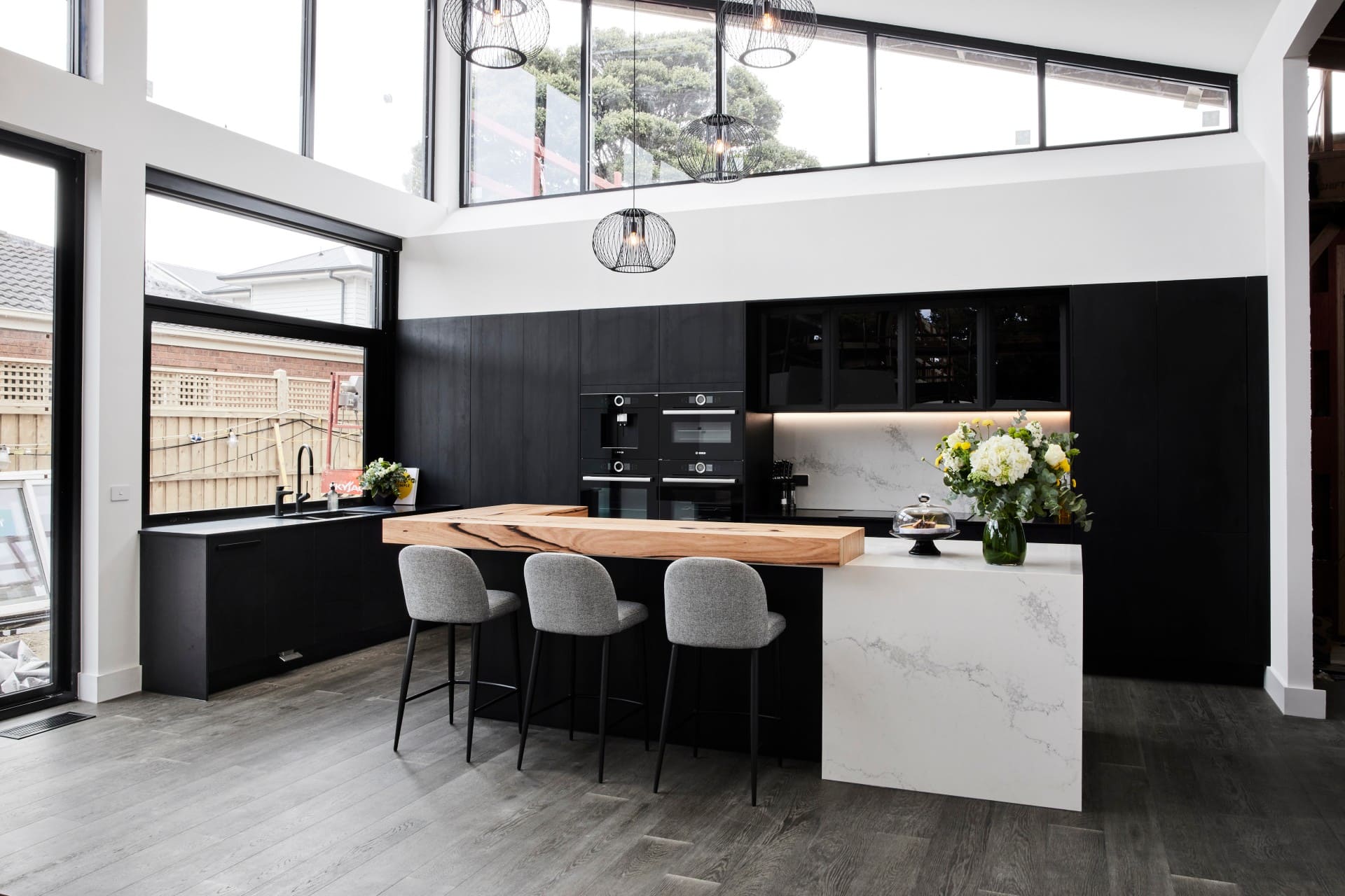
Josh and Luke Came Third
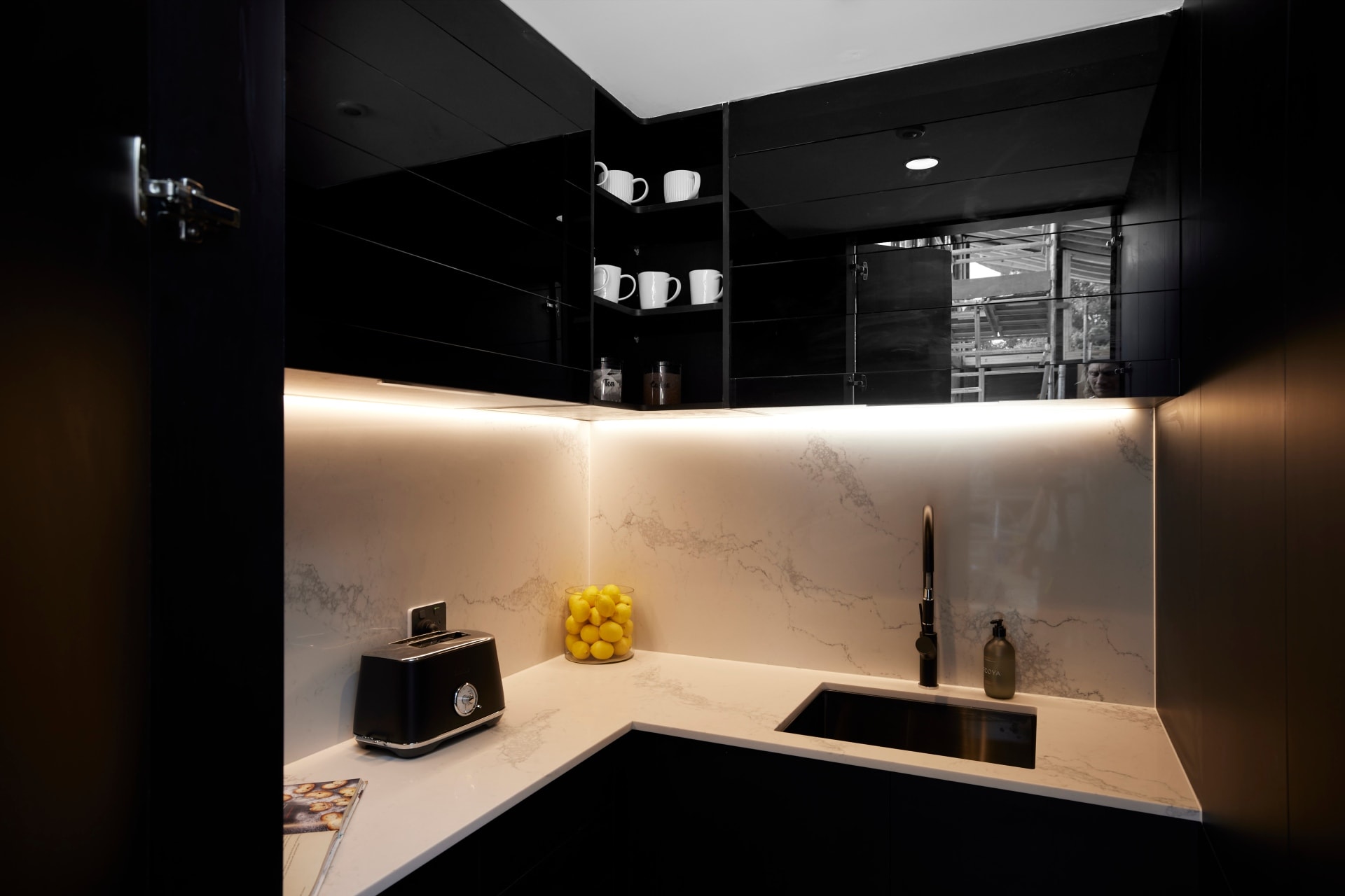
I love me a dark kitchen. I designed one for our Williamstown reno project a few years back. So you’ll not hear me say a bad word about black cabinetry. In this kitchen from Josh and Luke, it’s a stunner. Thank God we have a kitchen that’s not all-white!
This is the kinda vibe I wish they successfully took across the whole home. Keep it all black and white and grey and brown. This flavour, infused into bedrooms and bathrooms, would have been incredible. But I digress.
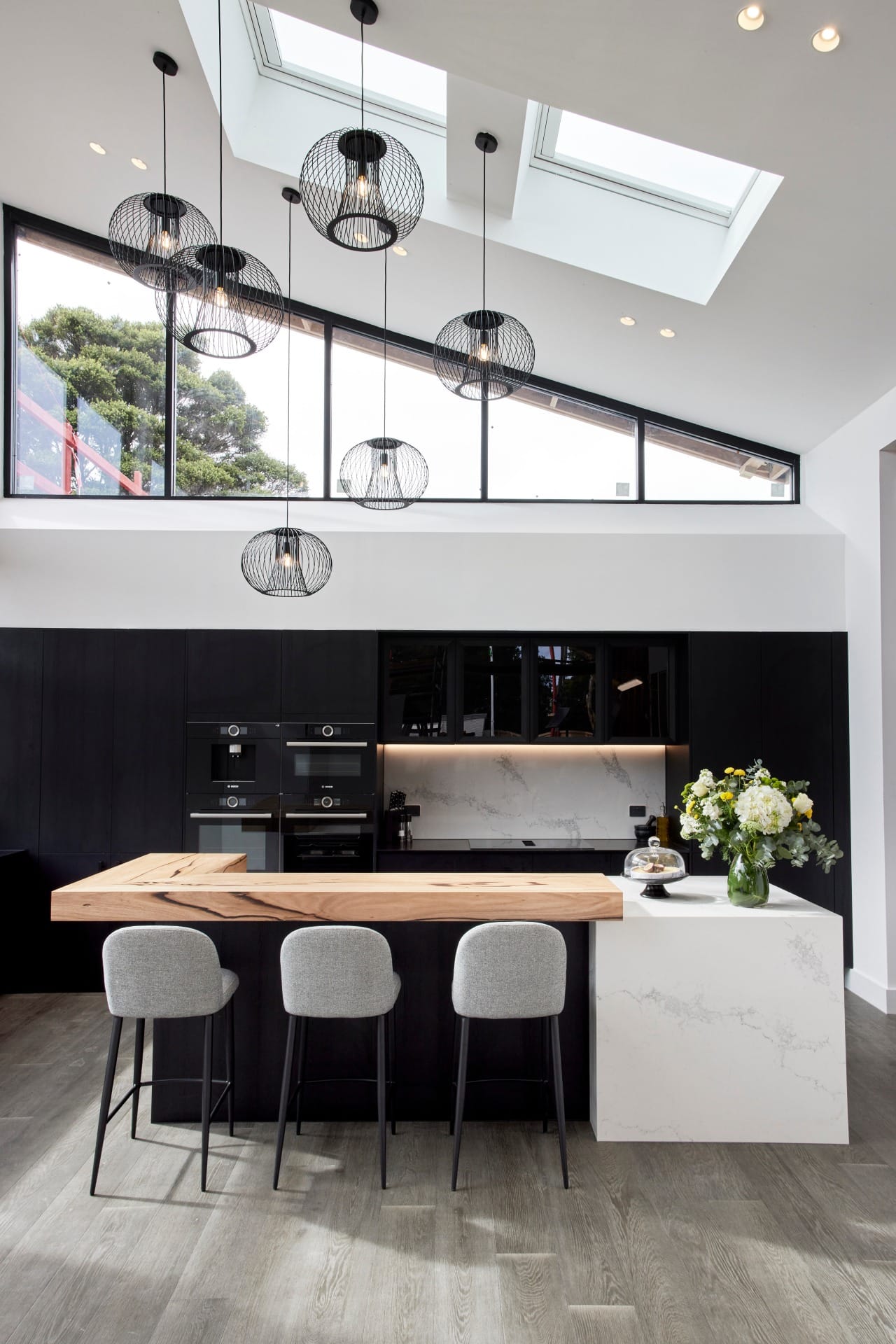
The angled window you see below is a standout moment, as are the skylights. I love the marble benchtop, and I love the stack of appliances on the wall. See Ronnie and Georgia, this is the height you expect appliances to be at when you drop a few mil on a home.
I also enjoy the black sink and tapware, and the stools they chose provide a nice sense of softness. I’m pretty impressed with the boys this week. But of course, you know I have a few issues to address…
Things That Aren’t Moving Me
From a look and feel perspective, just a few tweaks for me. Firstly, don’t hate me: I’m repelled by the pendants. They’re a bit ‘beam me up Scotty’, but I’m being beamed to an overpriced restaurant at Star Casino. The style doesn’t work in this contemporary, semi-industrial setting. They’re too retro.
I’d also appreciate the run of stone on the back wall to be wider. We need a bit more variation of colour and material against the black. I’d have moved the appliances along to the left so we had more white stone splashback to enjoy, and rethought the entry to the pantry. It is quite a divine stone moment; I just want more of it.
Also, don’t hate me again: the timber stuck on the island top doesn’t work for me. It’s too chunky, it’s too imposing, it raises the height of the island too much. Love the idea, but the execution needs work. I also agree about the butler’s pantry; it was lacking a bit in size, in functionality, in looks. Not amazing.
Tanya and Vito Came Fourth
This is indeed a bee-spoke kitchen (sorry, couldn’t resist!) and there are many things I appreciate about it.
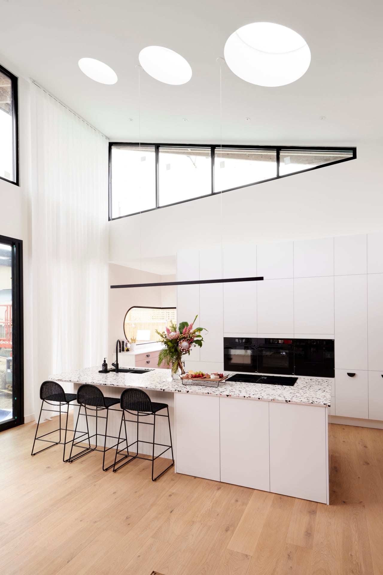
Let’s start with the size and scale of that sheer curtain. It, like $12 Aldi Prosecco, is a surprisingly good drop. It creates such a softness and contrast against my other fave moment in the space: that black framed, angular window up top. In fact, all of the black moments in this kitchen are great: stools, pendant light and cabinetry handles.
The grandeur of this space can’t be underplayed. It is really impressive spatially, and they did take architectural risks. However, the round skylights are too much. I appreciate the strong angles in this kitchen, they work for me. But I would have preferred no round skylights and no rounded windows in the butler’s pantry.
As the judges said, some great aesthetics to appreciate when you first walk in, but there are issues to discuss…
Let’s Discuss the Downsides
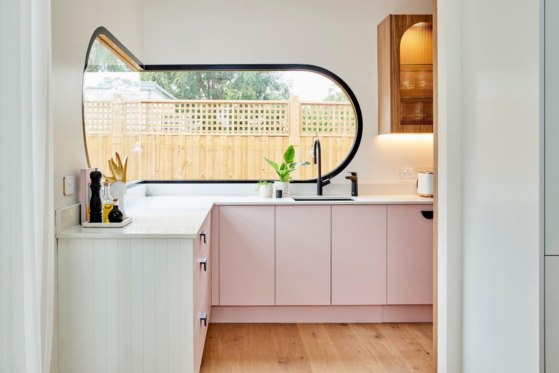
While I admire Tanya and Vito’s commitment to being bold, I dislike the terrazzo benchtop and am definitely not a fan of the pink cabinets. They’re just too divisive and potentially off-putting for a buyer.
People always say, “but you only need one buyer come auction day”, to which I dedicate the biggest eye roll of the century to. Sure you need one buyer, but you want loads of people bidding. And if these people hate pink, you aint gonna be getting loads of bids.
Neale said, “this is a kitchen that says love me, or hate me, just don’t ignore me”. That sounds like a Real Housewives tagline. And just like the housewives, I’m worried the drama in this kitchen will wear thin real quick.
When Shaynna said she was going to pop the balloon and pull this apart, good Lord did I get chills. She is a true master at creating reality TV moments and I’m living for every minute of it. Everything she said about the layout of appliances and lack of bin was accurate. A few tweaks are needed here.
The size of the butler’s pantry is lovely, as is all the storage. I just really dislike the pink, and the timber colour of those cabinets with the reeded glass fronts made no sense in the overall scheme of things.
Mitch and Mark Came Last
When I saw the photos of Mitch and Mark’s kitchen land in my inbox this week I was mighty impressed. At first glance it doesn’t just invite ooh-ing and ahh-ing, it demands it.
That gigantic chunk of stone is divine. I’ve not been this into a thick chunk since Chris Hemsworth’s Thor debut. The herringbone floor, like Ronnie and Georgia’s, is beautiful and makes the space feel quite light and ethereal. And can we talk about the pendant lights? I adore the long drop and the softness they bring to the room.
The cabinet fronts with the different profiles are quite successful too. Profile fronts like this are a big kitchen design trend of 2021 and I’d say they’ll be around for years to come. The colour palette on them is equally good, and I don’t mind the brass handles.
That artwork: delicious. Meals nook: Into it. Skylights: Gimme gimme. Overall this is a really successful kitchen. It’s not massive, and it doesn’t have a sense of grandeur. But that’s OK. It’s clearly one of those kitchens that are more for show, because you have a big butler’s pantry to do the work in.
Except the butler’s pantry was a fail.
What Possessed Them to Put the Pantry There?
I know there was a lot of talk from the judges around food storage. Or should I say, a lack of it. Now, that is a valid concern, sure. But can we move beyond that for a moment to talk about the placement and look of the pantry? Both, I have to say, are poorly executed.
Nobody wants to walk from the kitchen around the corner to the butler’s pantry all day every day. The location alone would put off a buyer before they even got to thinking about where the Rice Bubbles would go.
It’s insane, from a planning perspective, to design a smaller kitchen like this, with a pantry around the corner, all so you could include a meals zone. They had enough room to fit everything in, and create a kitchen that functioned as good as it looked (because it does look amazing), but they fell well short.
I also have to point out that the butler’s is at odds with the kitchen stylistically. The butler’s looks mid-Century and the kitchen is anything but. So odd. And yet they refuse to take any of this feedback on-board.
What did you make of The Block 2021 kitchen reveals this week? I’d love to know if you think the scoring was correct and a true reflection of the best kitchen. Drop me a comment below and let me know.
Want to see more goodness from The Block? Make sure you check out The Block Shop and nine now.



Once again i hate sitting opposite a sink to eat or have conversation. That is what i get with the winning kitchen although i like the kitchen as a winner overall.
M n M’s is nice but why does the stove top bench finish with nothing. i think it looks awful unless there are plans for it.
R n G’s is too white without character.
The rest of them are a bit hit and miss, there are some very nice features in all without being too picky.
Hello! I agree with you on most on your assessments. However, I don’t agree on the points awarded to the couples, I wouldn’t have put M&M last but T&V. I was just confused and overwhelmed with how many things were going on in that kitchen. Ovals, circles, triangles, pink, terrazzo plus cooking and cleaning on the island. Just too much going on the only plus I see is tremendous storage space that is easily accessible.
As for house 4, loved the contrast I couldn’t appreciate if the wooden slab was wide enough to hold the plates and glassware while eating (just imagine glasses falling toward all the time while eating! That is why normally I don’t like 2 heights on islands) the “butler’s pantry” it is something you either have or you don’t. That space I would convert into a food pantry or China/glassware storage and have more prep space up front. Cool look not terribly functional.
House 2, first issue, the storage drawers. I personally use them as I prefer to look at everything easily and on hand, that is not normally the case with full height storage, yes there are work arounds like having the full height storage be shallower or having the pull out pantry. But for me the drawers give me access and allow me more prep space. I am with you about the butler’s pantry not being coordinated with the kitchen. But I would have scored them between 2nd or 3rd place.
House 1, totally agree with you about the height of the oven. The kitchen is beautiful and elegant and I understand that some people don’t like looking at a set of ovens as it breaks from the elegance and dropping them behind the island does the trick. But it IS a kitchen so you either own that fact and display its functionality or you put it in your butler’s pantry at the right height to be comfortable. About the doors for the butler’s pantry a swinging door would be a better compromise if you want to close the space and it’s more practical too. Apart from that the kitchen is beautiful and so much prep space.
House 5, love the color! A bit much brass for me but I understand what they were going for. I don’t like the arches at all. The shelves and wine rack didn’t look quite part of that beautiful kitchen. The gingham wallpaper I could do without but that is a very easy fix. The chairs at way too big but that is another easy fix, I understand for the sake of simetry that they put the sink in the middle of the island but that also takes up prep space and the kitchen is not completely simetrical so they could have gotten away to putting it on the side.
Overall the least functional one is house 4, and the design fail would be house 3.