The Block 2018 kitchens have just been unveiled and I’m one confused judge. Yes, I consider myself the fourth, unpaid and unofficial judge of The Block. I might be judging from my sofa, in Cookie Monster pyjamas, with a glass of wine in hand and the cat in my lap, but I’m still the fourth judge. They just don’t know it yet.
I’m confused with the scores more than anything this week. They seem absolutely topsy-turvy to me. And it begs the question, what makes for an amazing kitchen design? Maybe I look at things differently to my three colleagues on the show, because I would have scored this week’s rooms very differently.
Functionality is important, of course, but what about the colours, the textures, the layout, the styling? Were all of these elements considered when scoring these kitchens? I’m not entirely sure.
Let’s explore more below. And don’t forget to scroll to the end of this post for your chance to WIN a $100 Block Shop voucher.


Jess and Norm were the Clear Winners
After roasting Jorm’s design last week (Jorm is Jess and Norm’s celebrity couple name), they completely turned things around with their kitchen. It even made me like their other zones more. Although nobody can convince me that their living and dining rooms don’t need rugs. That you’ll never change my mind on.
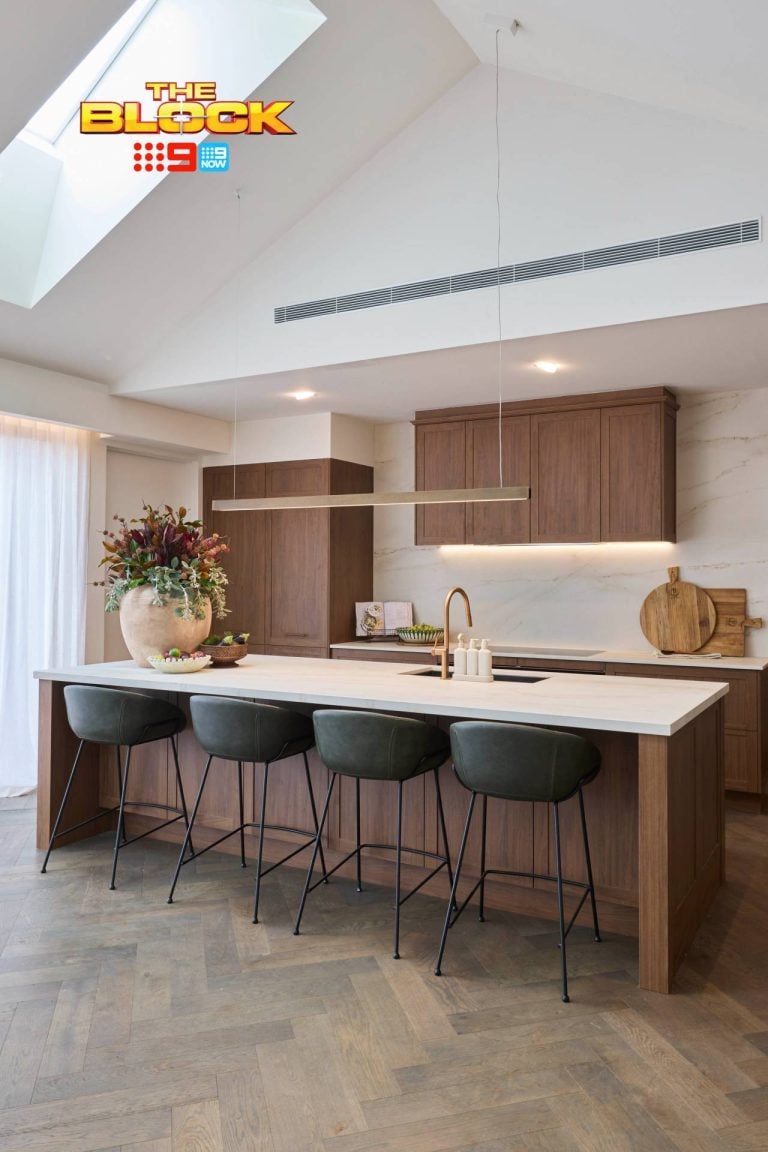
The colour palette here is breathtaking though, don’t you think? Those gorgeous mushroom-coloured cabinets are all that and (two quote everyone in the nineties) a bag of potato chips. And they were made even more beautiful by the shaker style details on the profile of the doors. Add to that the crisp white benchtop, the black and gold handles, and the matt black tapware and I’m spent! Pass me a cigarette.
Every Detail was Spot On
I’m even obsessed with the minimal styling here. Those stunning tan leather stools connect the kitchen to the other spaces in this massive zone. And the pop of pink in those flowers was a nicely pared-back inclusion.
The butler’s pantry is also quite delightful and I’m smitten with Jess and Norm’s tile choices for this zone. It’s a shame they couldn’t have been incorporated into the kitchen design somewhere, but we can’t have everything.
Jorm were even smart enough to include timber shelving in the butler’s pantry that spoke to the furniture they have in the living room. Clever cookie award goes to you, Jorm! You deserved to win.


Bianca and Carla, there’s a Lot to Appreciate here
My fave ladies produced a lovely kitchen this week. I’m by no means salivating over it the way I am Jess and Norm’s room, but there is a lot to admire.
I like that they’re staying true to their aesthetic. This kitchen ties in nicely with everything else they’re doing in the apartment. The floor to ceiling cabinets are great from a storage perspective, and I like that there was a mix of colour here. The study nook is probably my fave part of this kitchen, and the buyer is going to love it. No other teams included one, so the girls definitely set themselves apart there.
Kitchens are going in a darker direction for 2019 and beyond (as I showed you in this post) so this feels quite ahead of its time in that respect.
Here’s the issue I have though…
A kitchen needs a splashback. It’s an opportunity to have a mix of materials in the space. The problem I have with this kitchen, and a few others this week, is the fact that there’s a giant wall of cabinetry coming at you. It makes the zone feel quite unbalanced and heavy.
To have all of this cabinetry in a dark tone, and then three ovens built into that area, just feels quite dominant. I’m just not into this modern, stove-in-the-island approach to kitchen design. I like to see a splashback included so there’s some diversity of materials.
What I do bow down and pray to though, is that stellar set of pendant lights. I mean come on! Get a load of them. Bianca and Carla once again delivered a killer lighting moment and I am here for it.


Hayden and Sara’s Kitchen has Mass Appeal
This is the kitchen a lot of buyers will feel quite connected to. It has a lot going for it in terms of look and feel, and I can see people losing their minds over that built-in seating area. It was a very clever idea from Hayden and Sara. Have a rabies shot at-the-ready for when I get to tour this space in a few weeks time. I reckon I’m going to froth at the mouth over this zone.
This kitchen is a close second for me this week after Jess and Norm’s. It also feels really in-keeping with the style and design of the living and dining rooms. All three spaces feel very cohesive. What this kitchen has, which many didn’t this week, is a mix of materials. That’s my fave part of this design; the balance of textures.
I’m in love with the giant marble splashback. The dark timber cabinetry doesn’t feel heavy and dominant because they were smart enough to include white moments in the space. I’m really fond of those gorgeous round pendant lights, and I also really love the gold handles on the cabinets in the butler’s pantry.
I Take Issue with the Island Though
The layout of the kitchen island throws me off a bit. It needed to be turned the other way so it faced the living room. I understand that they probably thought it best to have it face the built-in seating, but it looks odd as it is.
From a functional point of view it doesn’t work like this. If you have people over and some are sitting at the bench on those beautiful stools, anyone who sits on the seats behind them will be talking to their back. It doesn’t work.


Get Out your Boxing Gloves Judges
I am ready to duke it out, fellow judges. There’s no way to say this delicately, so I’ll just cut to the chase: this is not a 30-point, winning kitchen. It’s not the best of the bunch this week. In fact, I consider it one of the weaker rooms of the lot.
Gadgets do not make for a winning kitchen. I think there was too much focus on all the bells and whistles and not enough on the look and feel of the elements in the space and how they impact the apartment.
A hidden rangehood, Sub-Zero fridges and big-brand appliances don’t make up for the fact that this space feels quite dark. It doesn’t change the fact that there’s too much brown timber and not enough of a mix of materials. It doesn’t take away from the fact that those stools are the devil’s work, or that the wine fridge is the focal point in the room when it shouldn’t be.
I Just Don’t Get it. Am I Wrong?
Talk to me, talk me through this. I need some explanation as to what makes this space a perfect score. I’m just not seeing what the judges are seeing here. It feels dark and gloomy. There’s no glam factor. There’s no balance. It feels quite heavy to me and there’s way too much stainless steel in the space.
I welcome your comments below because I need someone to make sense of it all.


Courtney and Hans: Houston, we have a Problem
Ouch! This kitchen kinda hurts, doesn’t it? I can’t say there are many redeeming features here for me. The layout alone reminds me of kitchens in corporate offices. Pop in a water cooler, sandwiches covered in post-it-notes so nobody steals your lunch, and an IT department that tells you to restart your computer every time you raise an issue, and you have everyone’s Monday to Friday working life.
The choice to go bold with the metallic kitchen cabinets was a poor choice in my eyes. I just don’t get this as a trend. I don’t see it taking off. I’d like you to resist all urges to do this in your own home. Sorry Freedom Kitchens, but please take this out of production immediately if not sooner. I cannot. I just cannot.
The Butler doesn’t Want to Work in that Pantry
The butler’s pantry also feels like a bit of an apology; squeezed in behind the kitchen. It doesn’t feel grand enough and the layout is kinda sloppy. If the space wasn’t big enough for a grand butler’s pantry, don’t have one.
I know that sounds like blasphemy for kitchen week – to forgo a butler’s pantry – but this is a luxury Melbourne apartment. I assure you, the Brady Bunch won’t be living here. We aren’t catering for a family of nine. A large cabinet pantry will do. Or something similar to what Hayden and Sara went with, where it’s hidden away behind doors, would have worked.
The black cabinet handles also feel too large and heavy for the size of the doors, and that giant pylon/beam painted black is doing nothing to help the space either. This was not a good week for Cans (that’s Courtney and Hans’ celeb couple name).

WIN A $100 BLOCK SHOP VOUCHER
Every Sunday night I’ll be giving you the chance to win a $100 voucher for The Block Shop. The winner will be announced in next week’s Block recap (right here on the blog), where you can then enter again to win. Repeat each week until the end of the season. How exciting!
LAST WEEK’S WINNER: Isabel Boniface
TO ENTER TO WIN THIS WEEK’S VOUCHER:
Simply pop a comment below telling me what you thought of The Block 2018 kitchens. It’s that easy!
Comp open to Aus residents only. Comp closes 7pm Sunday September 23.This post contains affiliate links, meaning, at no additional cost to you, I will earn a commission (and you will help support TLC Interiors) if you click through and make a purchase.

Tots agree, they only won cause there was a trillion sponsored products in it. I instantly thought, why would you put a wine fridge there? If you brought it from Kmart would you put it in the centre of your kitchen, ah no, it would be in the butlers pantry. (Ps love Kmart ) Don’t get me wrong it was a nice kitchen albeit a little dark for my taste but Jess and norms was the only one that made me catch my breath for a second. I know which kitchen I shall be looking at for inspiration next time I’m renovating a kitchen.
I found them all ok except the travesty that was Cans. The word ‘Champagne’ should only be used in the same sentence as kitchen when you are pouring said drink in said room. Never as a colour choice for cabinetry. It’s also perplexing why they didnt have their kitchen in their main living area – it’s so disconnected across the hall which will deter many buyers. It felt flat. Like cheap bubbly.. the day after..
I thought Jess and Norms was absolutely stunning, the marble is gorgeous and feels very contemporary. It’s the obvious winner
I have never been a fan of dark kitchens and this week’s reveals have confirmed this! Kerry and Spence’s kitchen feel dark and depressing. And all the bright lighting coming from the wine fridge just makes it feel even more oppressive. Give me Jorm’s kitchen anyday! Light and bright with so many beautiful textures. Now that’s a kitchen I’d actually want to cook in (or at least lean against the island bench with a glass of wine).
Jess and norm should have won! I also loved Hayden and Sara’s kitchen too. I think their apartment will be the dark horse come auction day, I’m betting they’ll end up close to the top once all the apartments are sold
I agree with you entirely about the 30 point kitchen! That is my least favourite kitchen in terms of colour, feel and big, bulky, blinding appliances. Hayden and Sarah’s kitchen was my fave. It had the nicest feel and colour palette. Pity about the island bench. Hopefully their reason for that placement had to do with measurements rather than being their actual design plan.
Nope. Always agree with you but not this time. Think the judges got it just right. Winning kitchen a bit cold but great to cook in.
Loved the orientation of Sara & Hayden’s kitchen
Didn’t think the pent house kitchens were that functional but very pretty.
Do agree about the champagne cupboards. Great in a glass, leave of it off the cabinets.
the layout was just wrong. I don’t think these guys like to cook (or decorate).
Interesting series this year
Boring! Nothing I haven’t seen before, besides the Bianca and Carla’s pendents and the colour of the Jesz and Norms cabinetry. Agree all the kitchens felt really heavy with the big walls of cabinetry and appliances. I loved Carla and Bianca’s study nook as that is where you want to go your admin, but it looked out of place right next to the oven. I’m really angry at Hans and Courtney’s total stuff up of the floor plan, they could of had s 4th bedroom or a true 2nd living area. I do have to disagree on Sara and Hayden’s kitchen though, I though it looked odd with the dark heavy cabinets up top and the white floating cabinetry below. Generally disappointing as the rest of the rooms have been.
the butler doesn’t want to work in the pantry- best line!
The world has gone topsy-turvy this week in Block Land and I am not living it.
What I am loving is Jess and Norm’s kitchen. Ohhhh my god! I want to have kittens with this kitchen. The shaker profile cabinetry, that marble, the leather stools. Sorry, I’ll stop drooling! What is wrong with the world if this isn’t the top room of the evening?
S+K’s kitchen was dark, dark, dark, and uninviting. Maybe the judges saw something we didn’t, or maybe they are obligated to give the team with the flashy product placement the win?! Something tells me I’ve picked a winner.
And poor Courtney and Hans. What a monumental error of planning this week. That kitchen layout is a massive flop that will be a costly mistake to correct.
Jess & Norm for the win in my books too! Those stools – I need them
In my life!!!