The 2021 teams unveiled their master bedrooms this week on The Block, and I have to say it was a bit of a case of, have I seen you somewhere before?
Didn’t you feel like the ideas (for a few of the rooms, at least) were things you’d seen on the show numerous times across the 11 seasons? Or am I just getting far too judgemental in my old age? Is lockdown driving me so mad I can no longer see beauty in these spaces? Or am I just jealous some of the walk in robes are bigger than my own bedroom?
I don’t have all the answers, of course. I’m just doing what’s required as my job as fourth judge on the show (unpaid, in pyjamas, with a glass of wine in hand). As the fifth judge, I’d love for you to read this week’s master bedroom critiques and share your own thoughts in the comments section at the end of the post. I’m sure you have plenty of things to say!
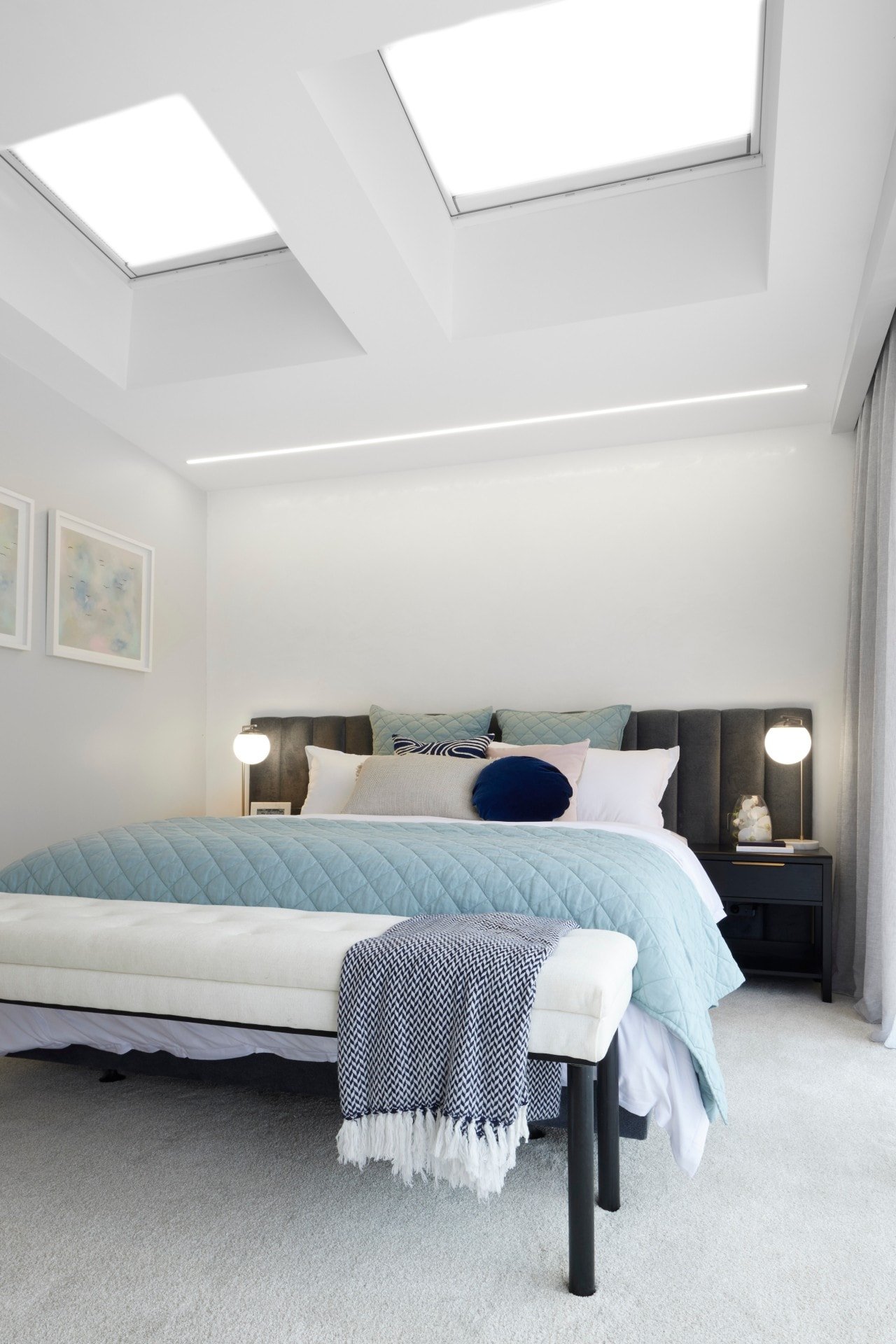
Josh and Luke Took out the Win
Last week Neale accused the boys of being generic and dated. This week I’m accusing them of being generic and dated.
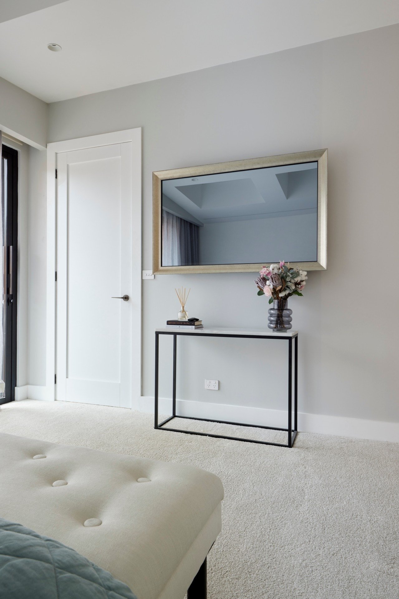
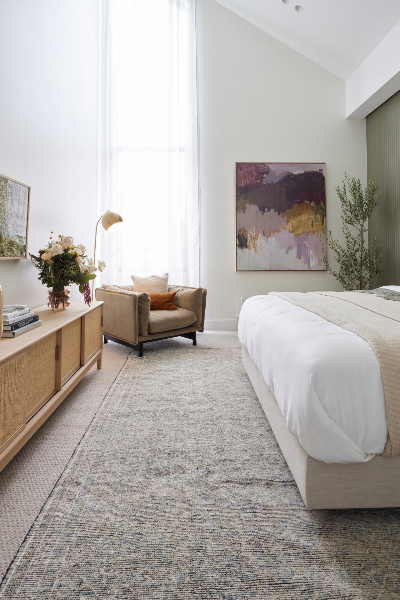
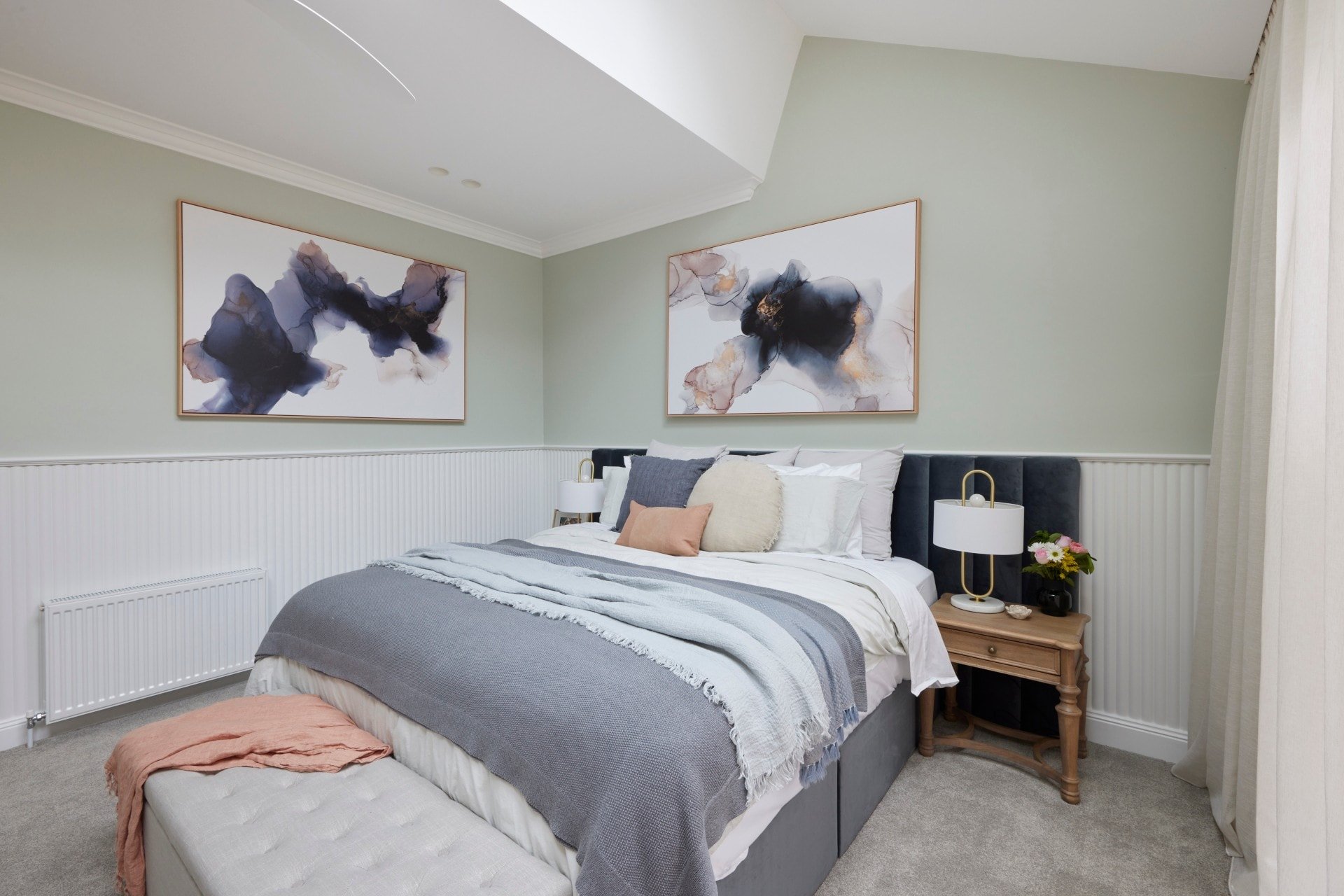
Don’t get me wrong (or send me emails); there are some really nice elements in this master room. But really, you could Google ‘modern luxe bedroom’ and find this exact scheme a thousand times over. It’s been done to death. The velvet bed, the luxe lamps, the console, the velvet chair. None of it takes me anywhere new. And I do want The Block, especially in 2021, to deliver me some new ideas.
That said, this room does deserve to win. But that’s only because the others weren’t great, not because it’s a stroke of design genius from Josh and Luke (or the girlfriend. Did she style parts of the room or didn’t she? Do I actually care? I’m confused and unsure).
To call out moments I adore, let’s talk about the large floral artwork below. It’s pretty divine. I also like the bench seat at the end of the bed. And I do like the layout and footprint of the room. I’ll give them that. Moving the master here was wise, from what I can see so far. But that’s where the love stops.
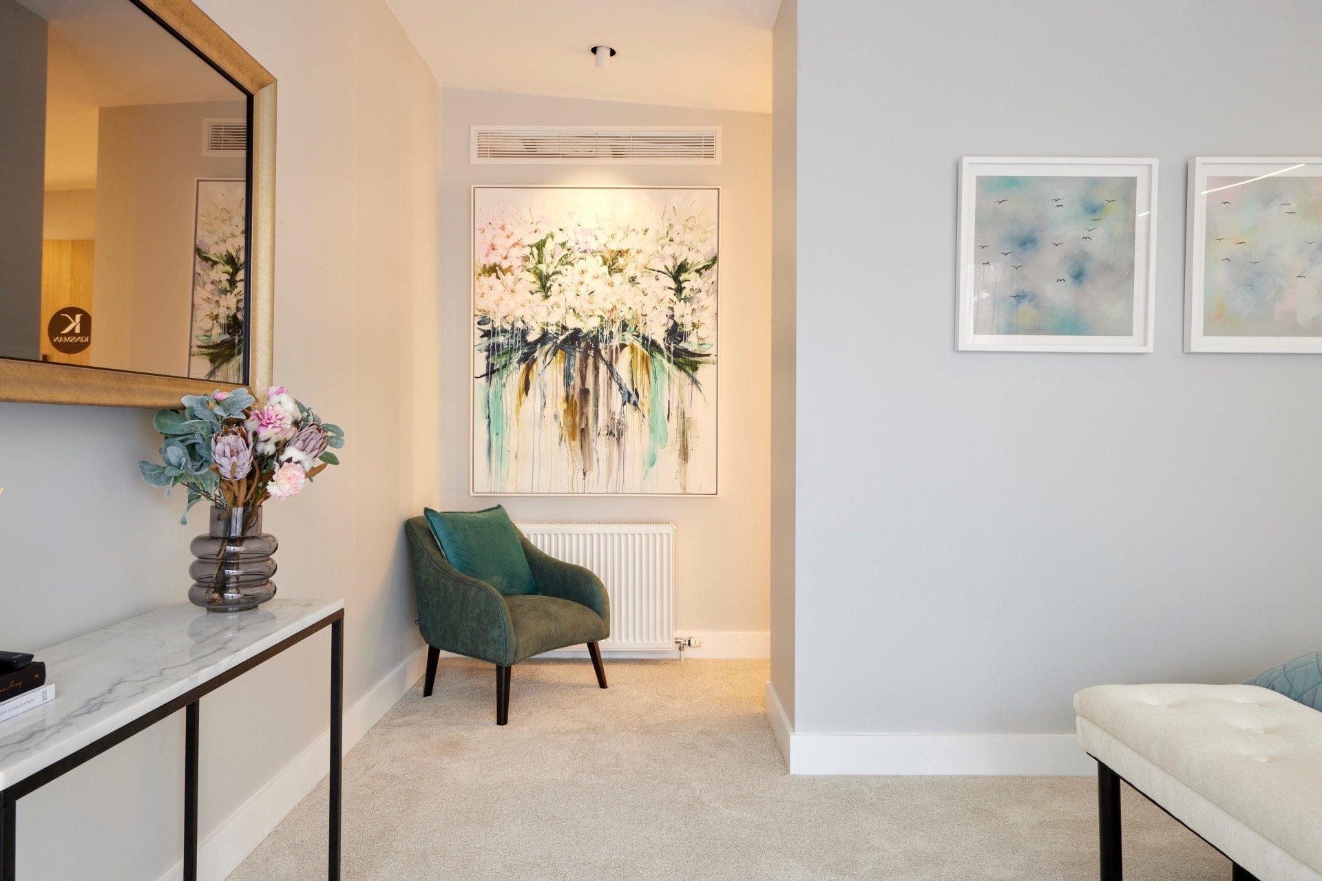
The Robe is a Winner, No Doubt About It
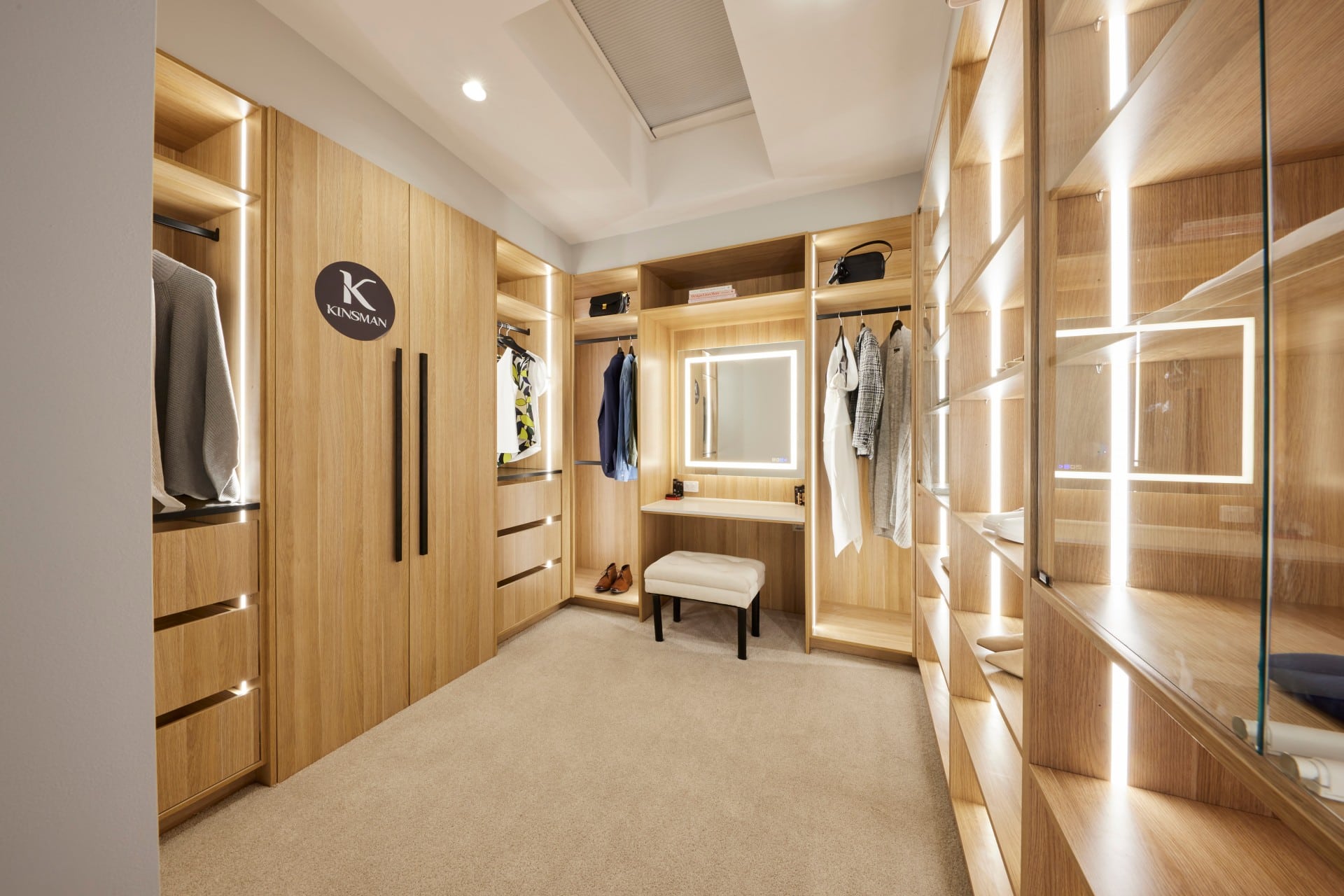
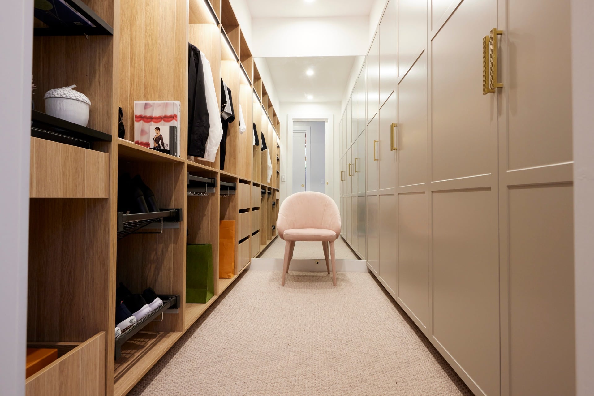
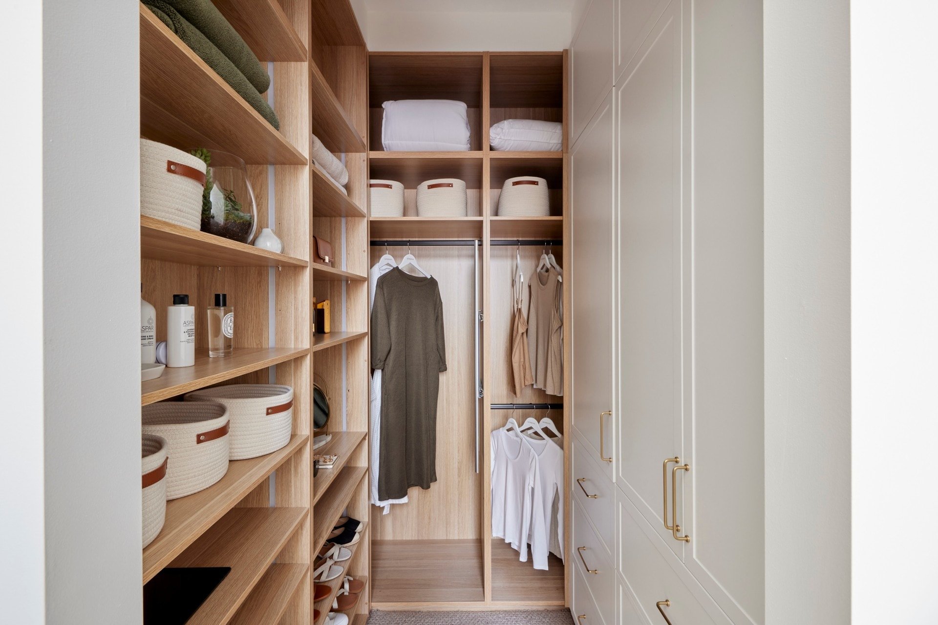
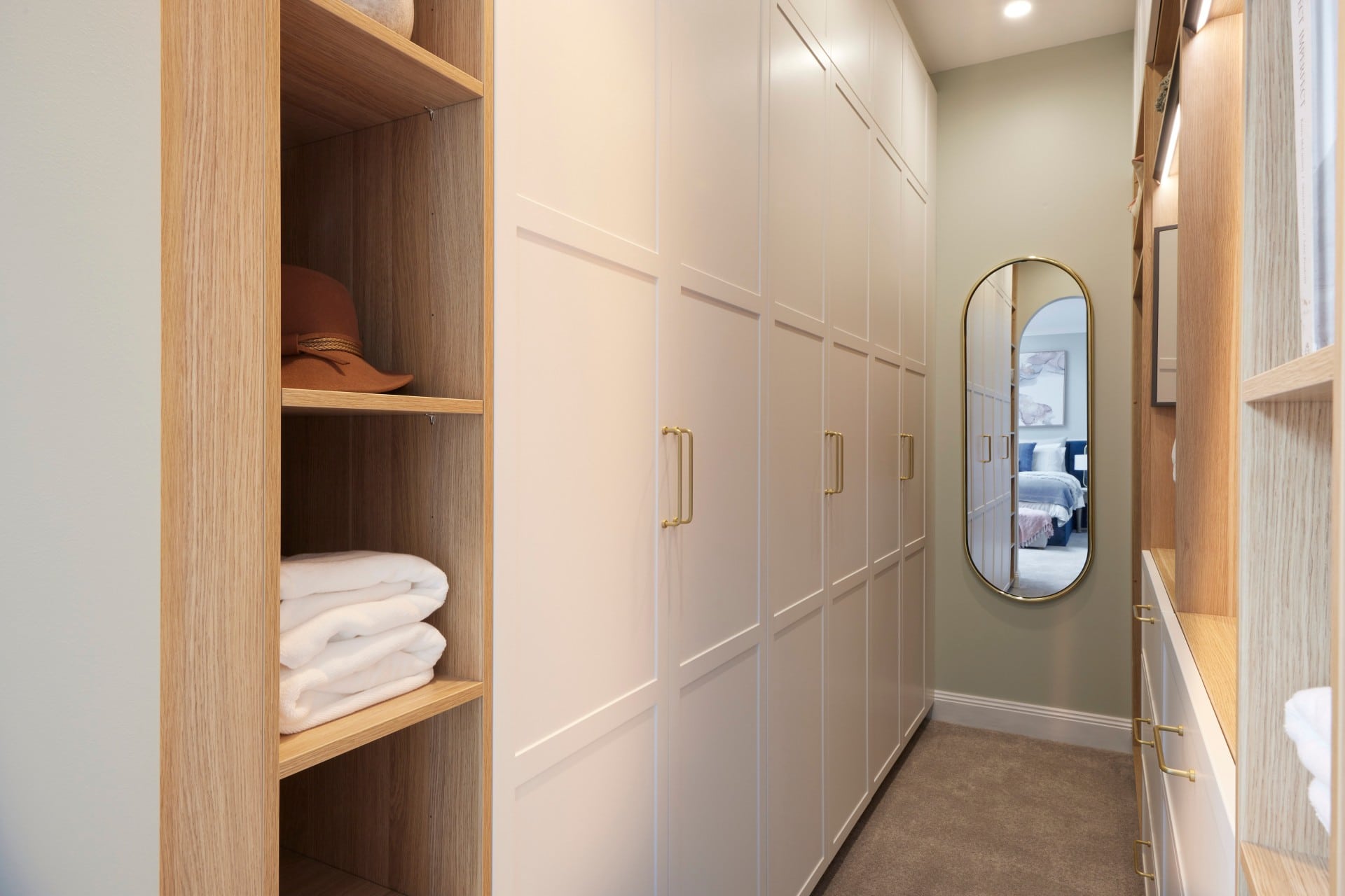
Pure divinity on the walk-in-robe front. It has almost everything you could want or need. And I love that there’s a skylight above, because getting ready in natural light is always preferred.
The one issue, which happened with a few of the walk-in-robes this week was the lack of full length mirror. You really have to work this into your design. At the very least you need a mirror you can see most of yourself in. The square mirror in the makeup zone isn’t enough.
The boys had such a large amount of space in the bedroom where the too-small console sits, they should have leant a large mirror there, or created a makeup zone in that section of the bedroom and left room for a whole panel of floor to ceiling mirror inside the robe. It seems like a small thing, but functionally it’s really not.
All in all though, a well-deserved win given what the other teams delivered this week.
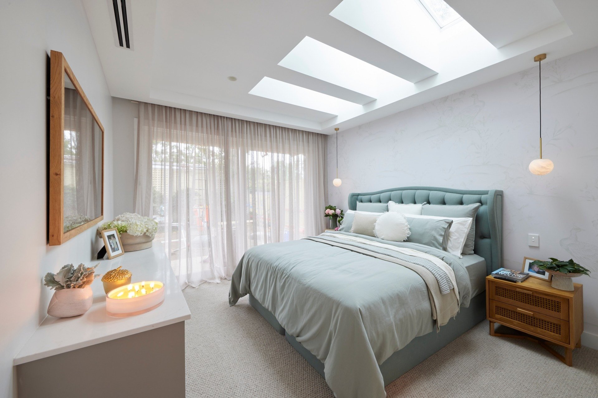
Mitch and Mark Came Second
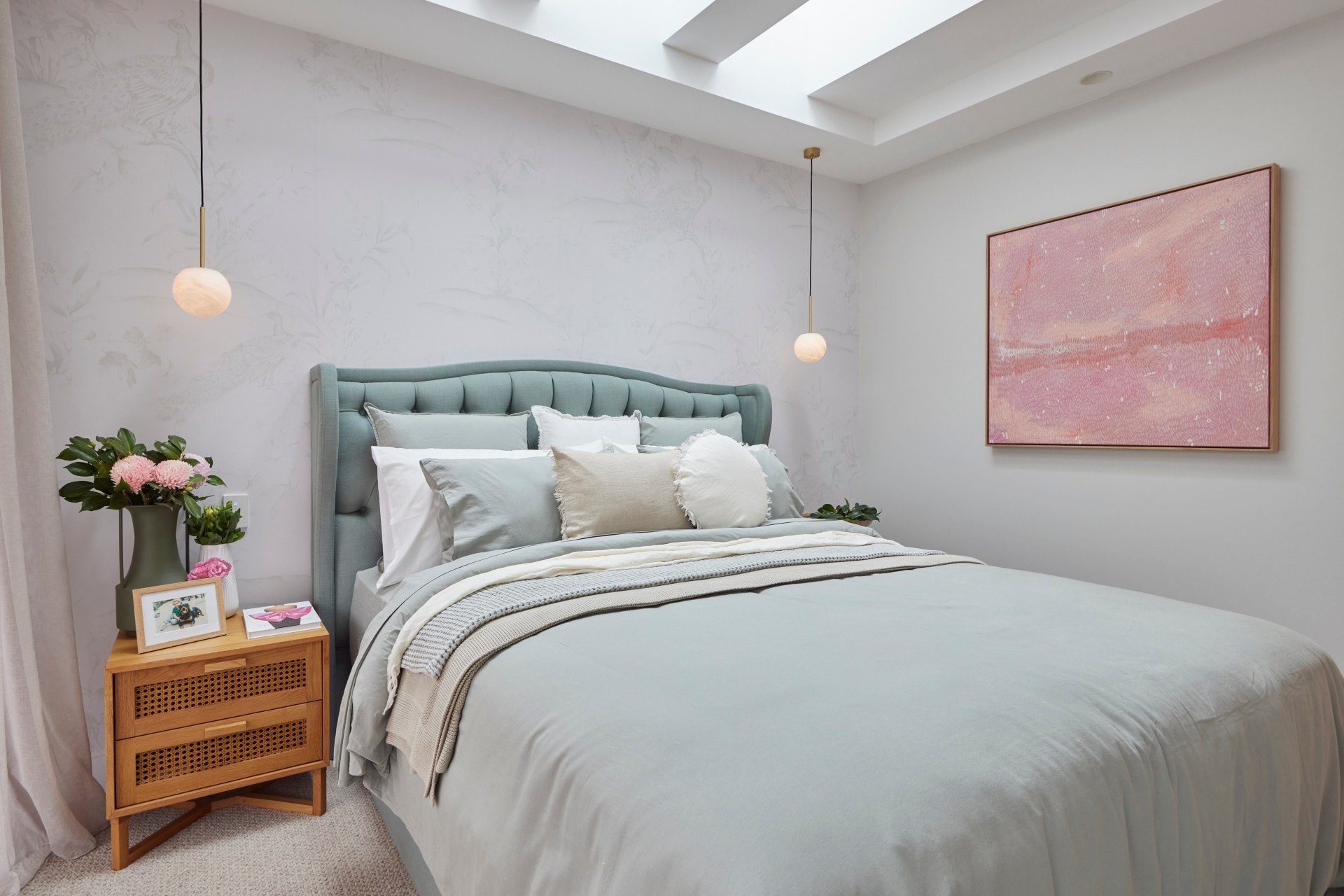
I find the palette in Mitch and Mark’s master bedroom very successful. It’s soothing, there’s a nice sense of calm at play, and it speaks stylistically to the guest bedroom they delivered in week one. So from a cohesion and consistency perspective they’ve done exceptionally well. I get this house. I get where they’re going with it. And that’s really important.
The feature wallpaper behind the bed is gorgeous. I love that it doesn’t contrast against the walls around it. So many teams on The Block do a loud wallpaper or other treatment (we’ll get to you, Ronnie and Georgia), and sit it next to stark white walls. It’s such a disconnect. But Mitch and Mark have approached the shell of this room with careful consideration. Even the carpet is soft and soothing.
Love the bedding, love the artwork, adore the built-in joinery across from the bed. Yes the room is a tad small for a master, but it is beautifully done. There are, of course, a few downsides that I’d tweak.
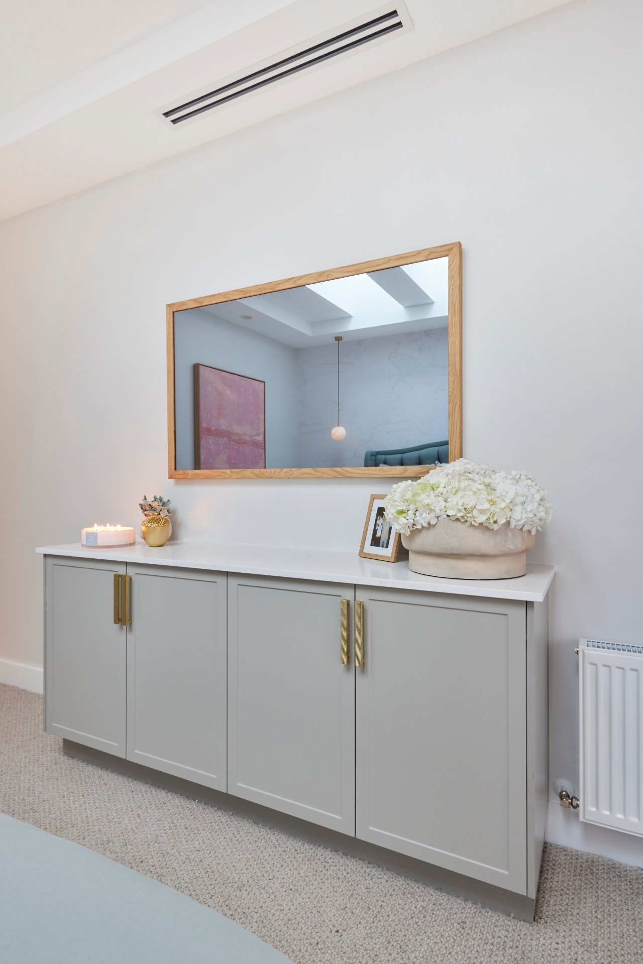
A Well Deserved Second Place, But a Few Issues
I just have to come out and say it: I loathe the bed. I’m sorry, I can’t, don’t hate me. The colour is beautiful but God the style is dated. The tufting, the curvature, the wings: grandma called and she wants to know what her bed is doing in a modern Melbourne bedroom. They needed a bed with cleaner lines here. Some subtle piping on the edge of a headboard would have been stacks better.
Also, I have to say, the ball pendants are too small. I want to see bigger balls in this bedroom (not the first time I’ve said that, truth be told!). The scale is just a bit off with the size of those balls. OK, enough of the word balls. Let’s just replace those pendant lights, as nice as they are, for something larger and we’re good to go.
The robe was nice in terms of continuity of joinery colour, so I do appreciate that. The mirror panel needed to go all the way to the ceiling, but that’s just a small issue that could and should be easily corrected.
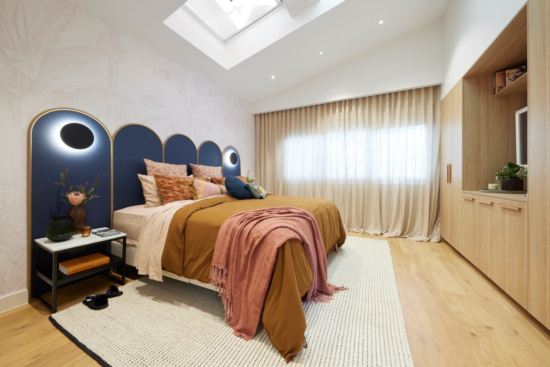
Tanya and Vito Came Third
There’s a lot of things to say about this master bedroom from Tanya and Vito. I almost don’t know where to start. I feel, in general, it’s quite all over the place. And that’s kind of how I would describe their progress on The Block this year. So many ideas, too many of them packed into one space, and the result feels confusing.
I have to start with the positives. Thank every God that exists (even the Scientology alien) that we’re seeing a bedhead that isn’t velvet. Seriously, velvet beds on The Block have been overdone more than my spray tans in the early 2000s (in my defence, the roast chook look was very hot back then). I don’t know that I like the headboard per say, because it and the hard flooring together are too much of the one thing, but I really appreciate the idea.
I adore the artwork that’s on the wall just inside the door. The colours are glorious and I need it for my own home. But outside of that I’m on struggle street when it comes to finding more to love about this bedroom. At every turn there are more issues than Woman’s Day. Let’s explore some of them…
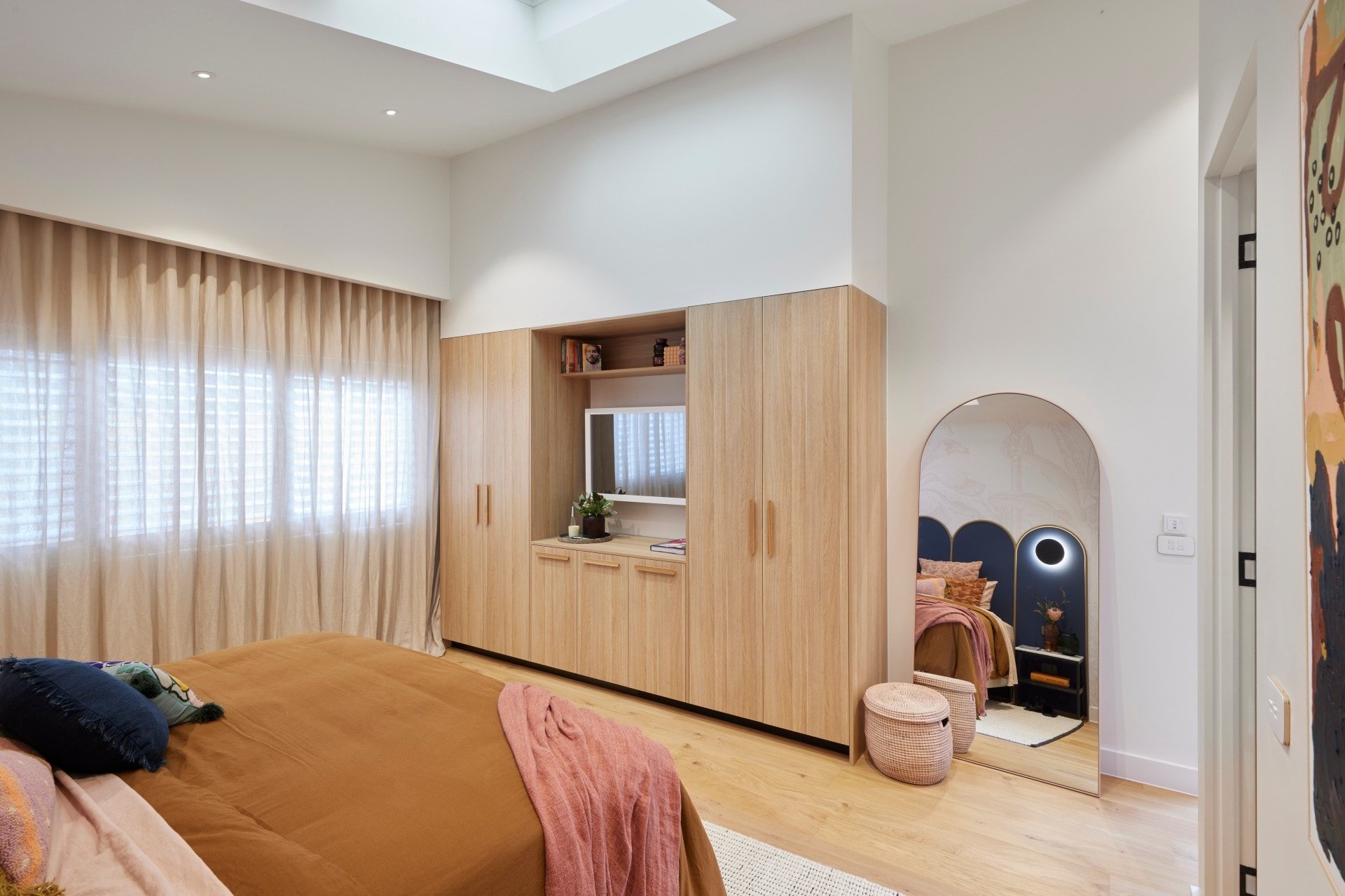
A Lot of Issues in this Master Bedroom
Before we even get to the robe, let’s discuss the hardness of the master. It feels hard (I’m not even going to make any word play here, I promise!). The flooring is such an error here. Nobody will convince me that hard flooring in the bedroom is a good thing.
It makes the whole space feel like a TV set or airbnb, not a sumptuous cosy bedroom you can retreat in. It paired with the headboard leaves the room yearning for softness. The sheers and bedding aren’t enough to do it.
The joinery that houses the TV is confused too. What is it, and why is it there? You have room to design a walk-in-robe; that’s where all your hanging space should be. Who wants half of their stuff in the walk-in and the rest of it either side of the TV? The joinery is shoved into the corner as well, against messy sheers that are way too warm for the space.
And then the walk-in. I think we’re all on the same page about the walk-in.
I honestly really like Tanya and Vito’s ideas, and their want to deliver something different. It just always needs heavy editing. Less is more.
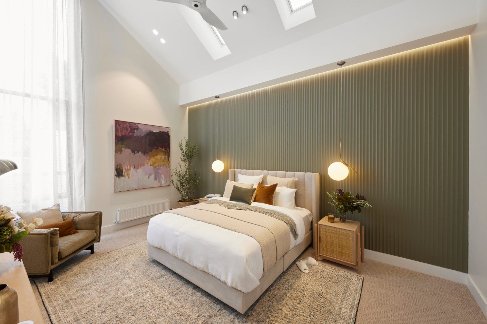
Ronnie and Georgie Came Fourth
I don’t know, you guys… the judges were praising this room as extraordinary but I’m just not seeing it. Ronnie and Georgia’s master bedroom is large, for sure. I love the feeling of space and size when you walk in. It’s what you want from a master bedroom; for it to feel like a suite. But outside of the Laminex feature wall (which I’m still on the fence about), I’ve seen it all before.
Let’s talk about the feature wall for a minute. Is it giving you external vibes? I’m not saying there’s not room for it indoors. I’m not saying it isn’t an update on VJ panelling. But I am saying that a bedroom isn’t the ideal place for it. I see this in a kitchen. Perhaps a farmhouse bathroom. But in a contemporary Melbourne master bedroom; computer says no.
And the colour; it’s giving me Colorbond roofing sheets. And they are not the kinda sheets I want in a bedroom.
I do love the art. I do love the pendant lights (even if they are luxe when the room is not). And the ceiling fan is a nice touch. I just feel this room is a little rehashed. You also have an entertainment unit in there when it needed to be a much taller buffet, and you have tiny bedsides that could have been double the width.

Their Walk in Robe was Tiny
I say tiny in relation to the master bedroom. I mean, if this was my walk-in-robe in my apartment right now, I’d hide from the cats in here with a bottle of wine and not come out for days. But in relation to the master bedroom, it’s just not appropriate. How gutted would you be if you dropped millions on this home and this is the walk-in-robe you ended up with?
There’s also no mirror in this robe or in the master bedroom. Shall I just get dressed and hope I look good, or do I have to walk to another room somewhere to find the full length mirror? Functionally they really missed the mark. There’s so much dead space in the master they could have borrowed to make this robe feel more expansive.
The best master bedroom on The Block in 11 years? I have to respectfully disagree.
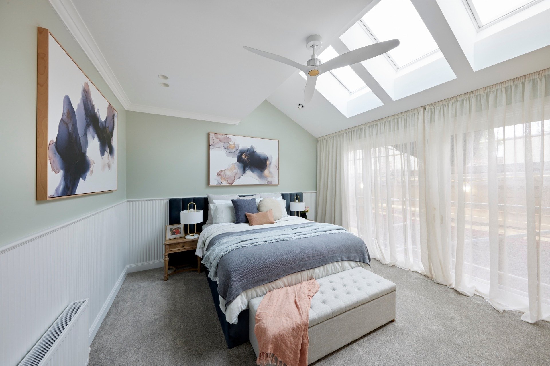
Kirsty and Jesse Came Last
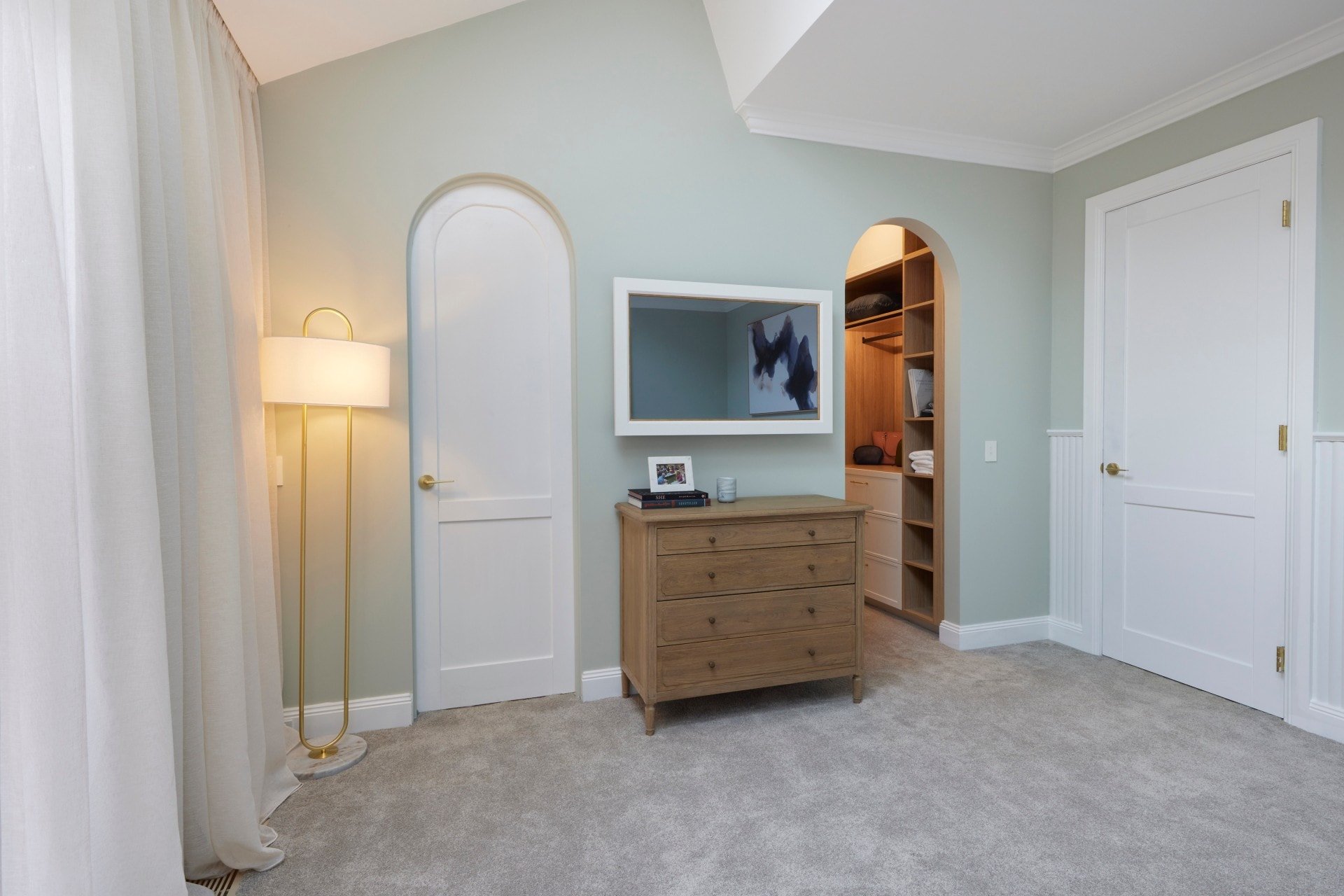
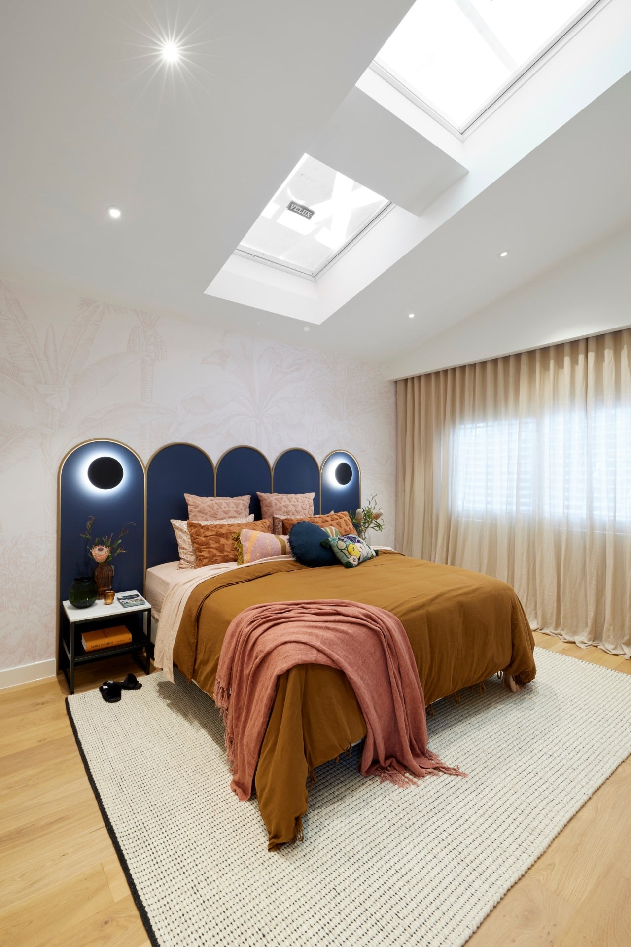
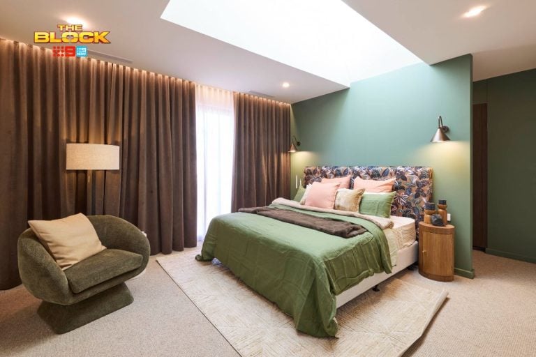
Let’s talk about the foundation of the room first, because the shell is rather delicious. The expanse of sheers, the skylights, the angled ceiling, the carpet; they’re all rather successful. I actually enjoy the odd angles present in the architecture of this bedroom. It certainly makes it feel quirkier and more memorable.
After that, everything falls apart. I have to agree with Neale’s assessment that the individual pieces are not successful.
The odd angles I just mentioned, they are your character. That means adding in the panelling around the lower half of the room is overkill. It makes the room feel busy and confused. Is it modern, is it traditional? The angles and the panelling are fighting one another. And then you add in two arched doors that are giving me Willy Wonka vibes; it’s really quite over the top.
The headboard; is it oversized or not? It needs to be either much wider or standard size. It’s giving off a glam vibe that the panelling is fighting too. The other issue I have is that this bedroom doesn’t seem like it’s in the same home as their guest bedroom or the bathroom they showed last week.
A Narrow Walk-in-Robe Result
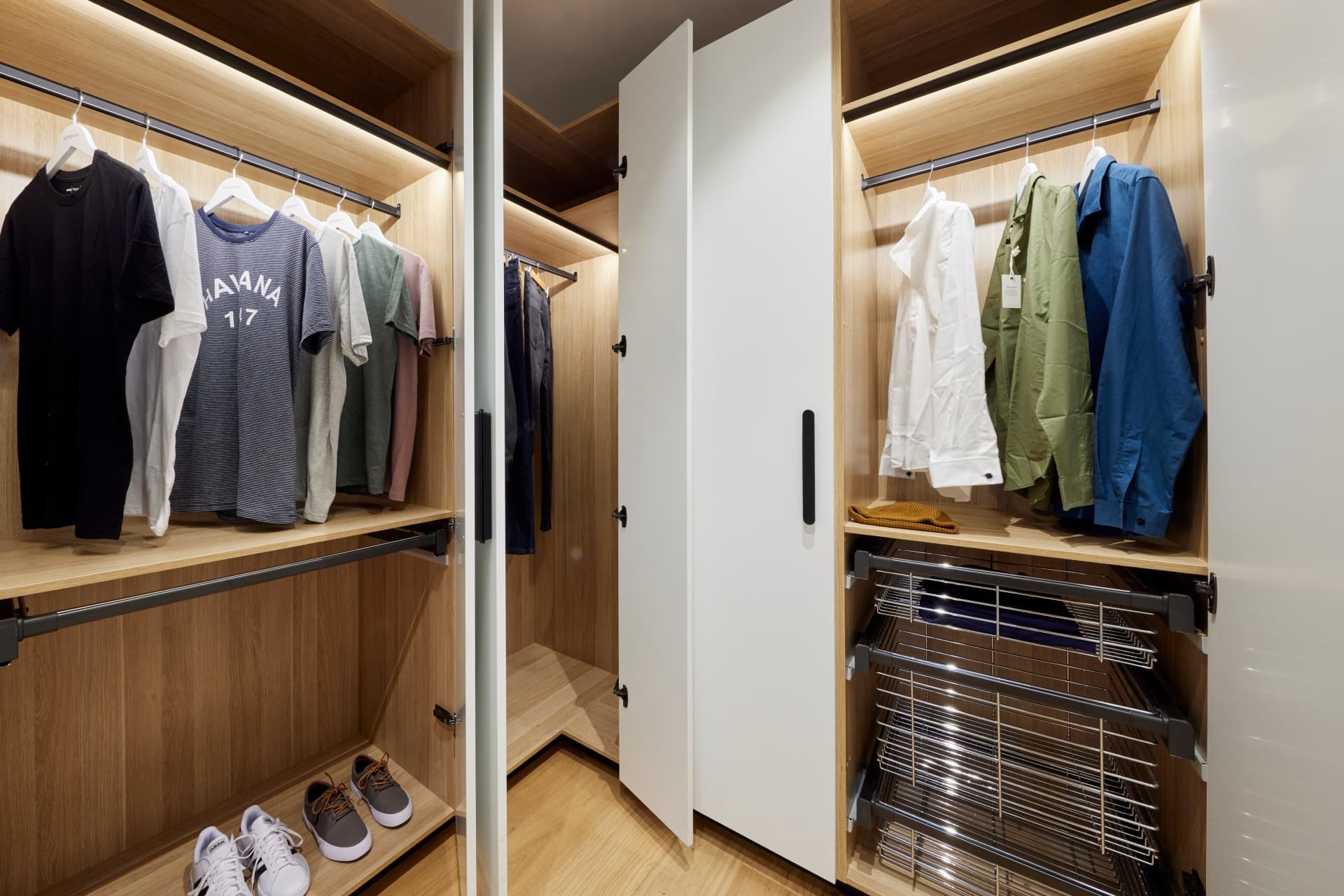
The judges said it all; way too narrow a zone that wouldn’t work day-to-day for a couple. They need to rework this entire thing.
What did you guys think of The Block 2021 master bedrooms reveal? I’d love to get your take in the comments below.
And if you’re eager for more Block goodness, check out The Block Shop and nine now. Photos from this post courtesy of David Cook Photography.


Why so many throw pillows? Of course the visual effect can be amazing, but from a practical perspective….what happens to all those cushions when it’s time to go to bed? I am waiting to see who can be brave enough to dress a bed without the generic look that has become so common. As for consoles, what is wrong with having bedroom furniture in a bedroom? Gives much needed storage and offers more practicality. Architecturally, skylights can be very effective, however, in a bedroom it seems rather unnecessary, and, again, impractical. Skylight in wardrobe though, that’s a winner!
I too agree and love your blog Chris. All so boring bedrooms, sad really. Like the space of R&G’s room but not the colorbond wall nor the sqeeze-in. Also agree with one of the fifth judges that T&V’s bedroom is simply horrible! The bedhead is kitch, ogly artwork and carpentary and flooring look cheap, don’t think the serenity rug under bed even works – their bathroom last week was hideous too…
I found the rooms presented by Mark & Mitch and the twins were boring (except the WIR in the twins’ room – and I agree a full length mirror is a big miss). Jesse & Kirsty’s room was OK, but the artworks were overwhelming. I think it’s the amount of dark in them. They might have been better on a dark wall. I did like Georgia and Ronnie’s, but that massive height was a bit too much. I don’t want to have to bring in scaffolding to change a light bulb or wipe dust off the top of the fan. I was torn on the colour of the laminex wall – I kind of really liked it, but it also made me feel a bit gloomy. I did love the overall feel of the room. Yes, the robe was too small, but they’ll fix it. Tanya and Vito’s room – well I hate floorboards in a bedroom – too utilitarian, and the wrong colour. I’m not against additional robe space in the room itself, but the doors should have lined up with the curtain pelmet. The thing I just couldn’t unsee though was those massive round lights on the bedhead. They looked like huge eyes and all I could see was a terrifying monster looming over the head of the bed. EEEEEK.
R & G’s art to low. Bedsides not high enough or proportionate to the room. The entertainment unit wrong could have been drawers. Never enough drawers.
M & M so over fake flowers in this house. Real flowers and plants for judging. Even in the bathroom they won.
K & J when do you ever walk into a room straight into a drawer, doors open into a room. The two arches are old hat. and that cheap set of drawers!!
The boys did quite a good job of design, the girl was not a part of that so i cant see a problem here.
Agree that the console is not placed properly on the wide wall, it should be on a narrower spot to do it justice.
K & V dislike that awful headboard that looks like a car in the room, imagine if only those two lights were on.
I like to move our beds around so dont like separate headboards attached to a wall.
Skylight are for living room areas not bedrooms, who can get a sleep in plus the let extra heat in.
Tania and Vito’s bedroom is horrible, sorry but I have never seen an uglier bedhead anywhere, I’m sure they are lovely people but I would never take any styling advice from someone with bright purple hair and….oh I had better stop there except that I hate mustard and brown, period!