The Block 2025 bathrooms reveal marks the return of my Honest Block recaps. It’s been a while between Bex’s and a good lie down, hasn’t it? After taking a break last year to secure my peace and sanity, this year I just couldn’t help myself. Like Big Brother, I keep coming back whether you like it or not.
I’ve really missed talking design with you! And you know how it works with The Block recaps; the focus is always on design, not getting into the drama that unfolds throughout the week. I like to think of it as a community service; we watch, critique, learn (and laugh along the way).
So let’s not waste another moment. Let’s jump straight into judging The Block 2025 bathrooms reveal! Drop me a comment at the end to let me know your thoughts.
Key Points From Bathroom Week
Robby and Mat Came First
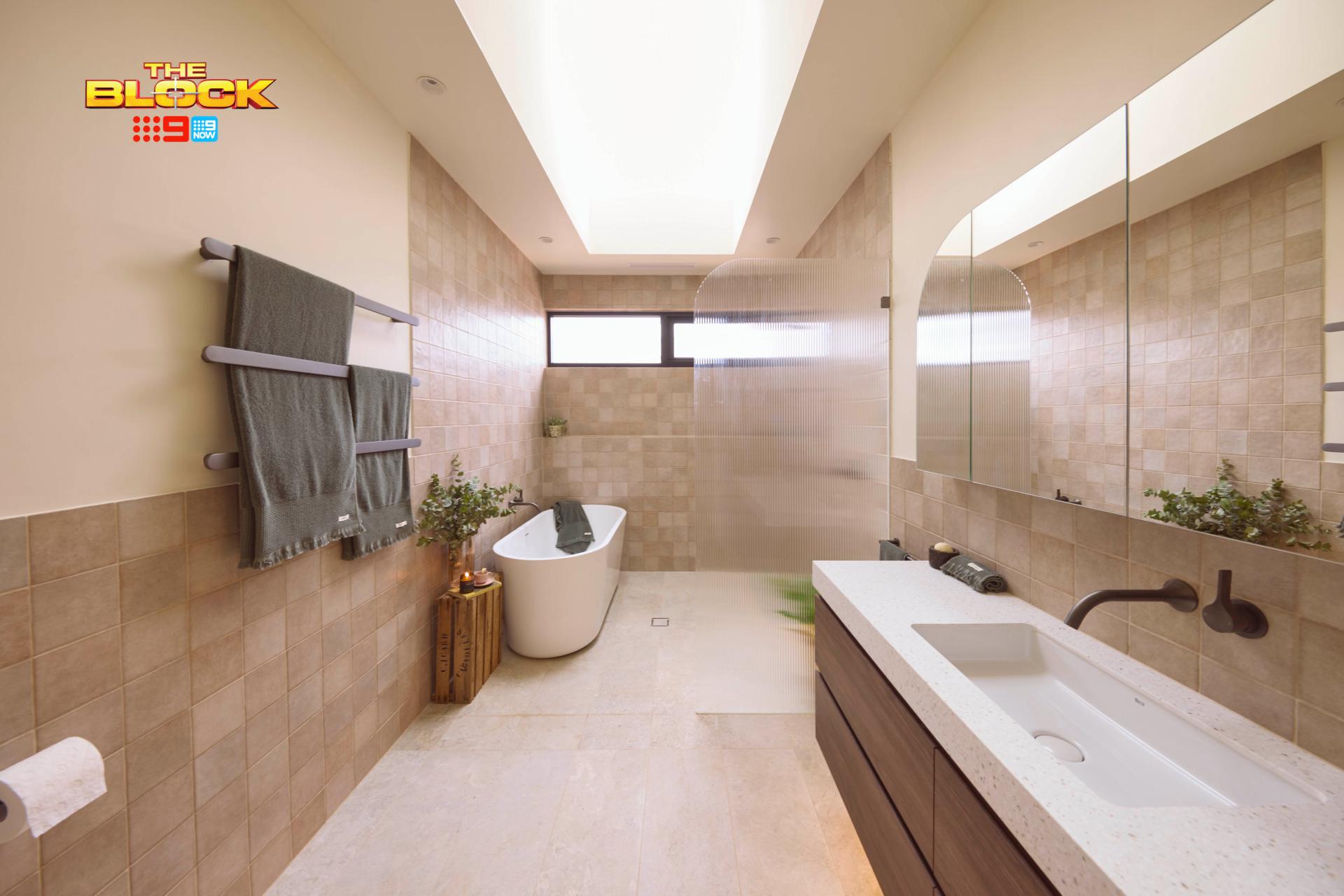
I want to kick off with the biggest truth bomb first: I really don’t like the layout of all five bathrooms. Was nobody allowed to change the footprint? With everyone following the exact same formula regarding placement, you really only have colours and materials to judge them on.
Robby and Mat delivered a solid bathroom. The tile choices were great, the joinery choice was great, and the vintage styling was a nice touch, too. Shoutout to the skylight, also. I know The Block likes to place 20 skylights in every room, but in a space like this with not much window, it’s much appreciated.
Of course, there are things I would change about this bathroom design…
There’s a Better Layout for All Five Bathrooms
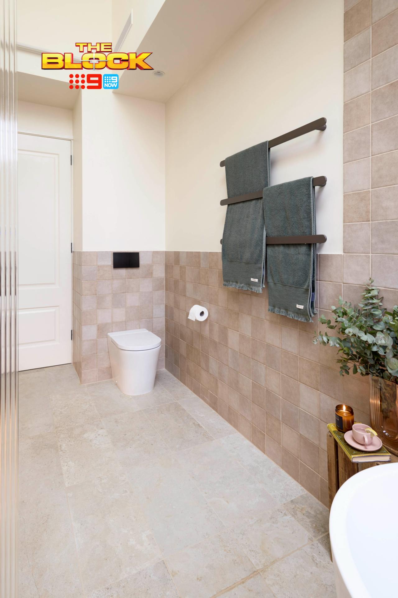
There’s something about the toilet placement in all five bathrooms that weirds me out. Stepping into a bathroom and sitting down with the door behind you feels odd. I don’t think I’ve ever been in a bathroom where the toilet is placed like this.
I would have preferred the toilet turn to face the vanity. Then, I’d have moved the vanity across to sit beside it, and then have the shower + bath zone flip in orientation. That way everything is all on the one wall and you have a clearer, unobstructed walkway.
That’s assuming they have the space to do it. I can’t find a room layout online nor can I get a true sense of how large these bathrooms really are (you know real estate photography!).
In Terms of Materials, I’d Make Some Changes
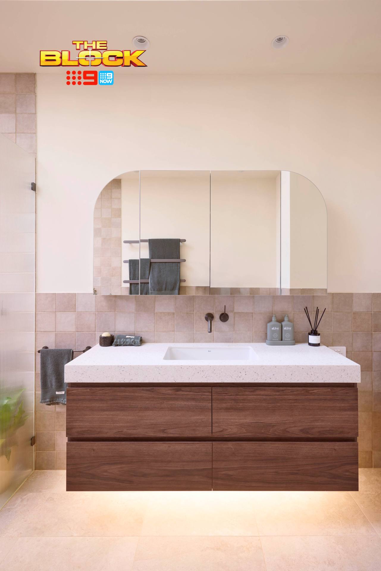
I’d have selected a brushed chrome over the gunmetal hardware. It would have better complemented the tiles and felt more harmonious.
The black flush plate above the toilet stands out for all the wrong reason, too. Because it’s not the same colour as the tapware it feels more out of place than me at the Formula One (the racing cars and the budget hotel chain).
The thickness of the vanity top feels a touch dated and too cold for the zone. A warmer stone in a thinner profile would have taken the vanity zone next-level. Overall (layout aside), it’s 80% there. I look forward to seeing what these two bring to The Block.
Sonny and Alicia Came Second
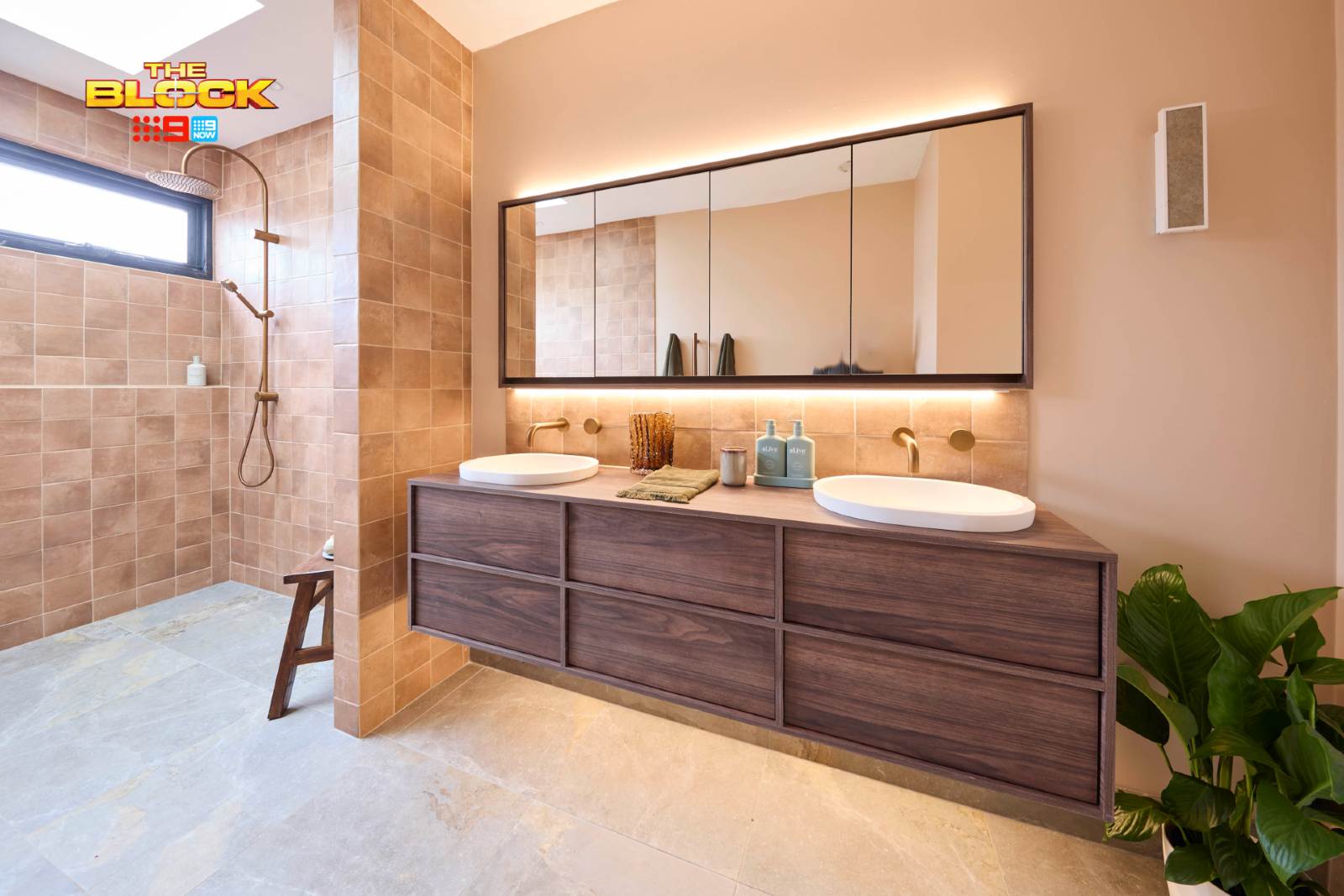
I’m going to drop the second big truth bomb now (and those of you traumatised by mission brown bathrooms of the eighties, cover your eyes and ears): brown bathrooms are back, and I couldn’t be happier. Hey, we listen and we don’t judge!
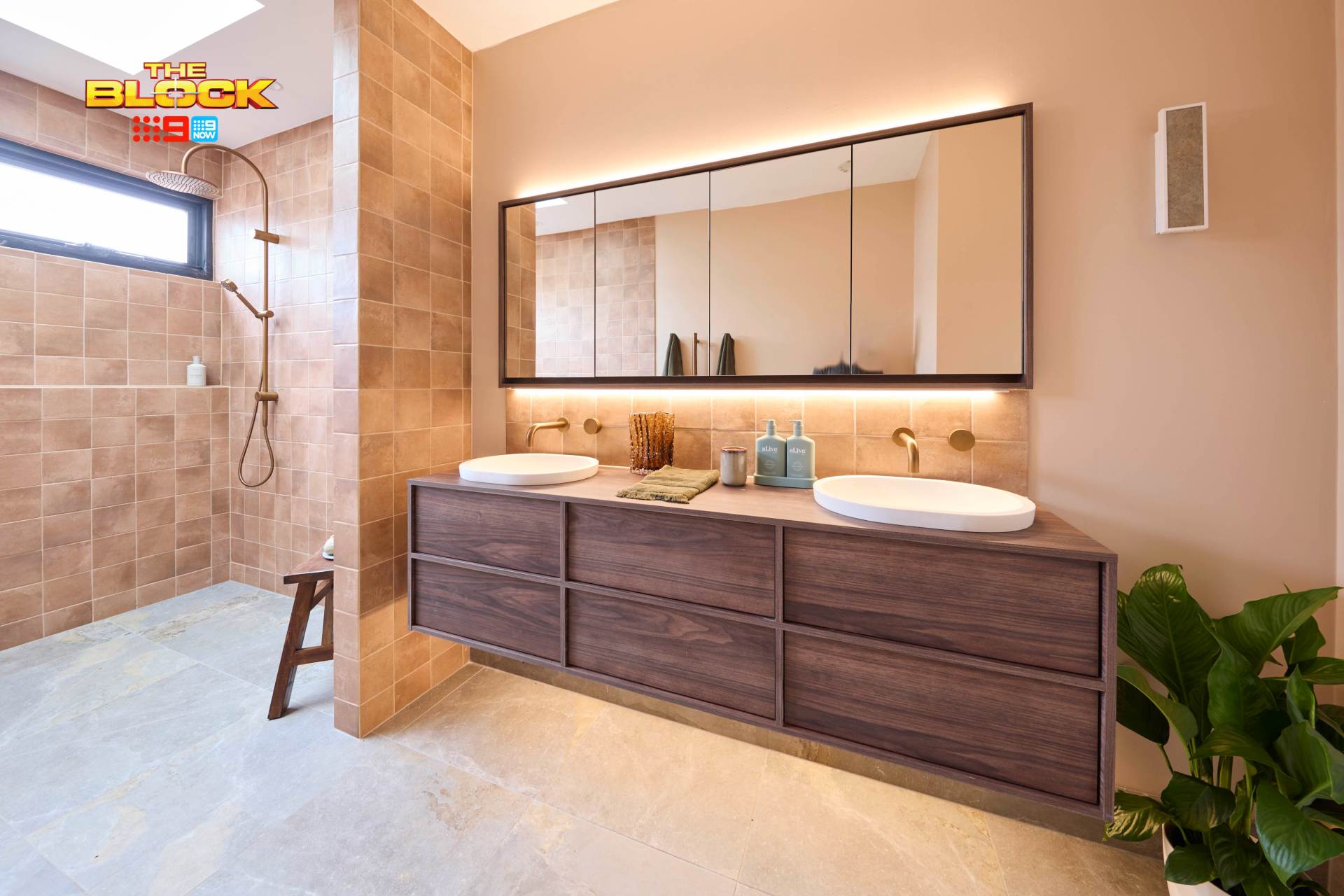
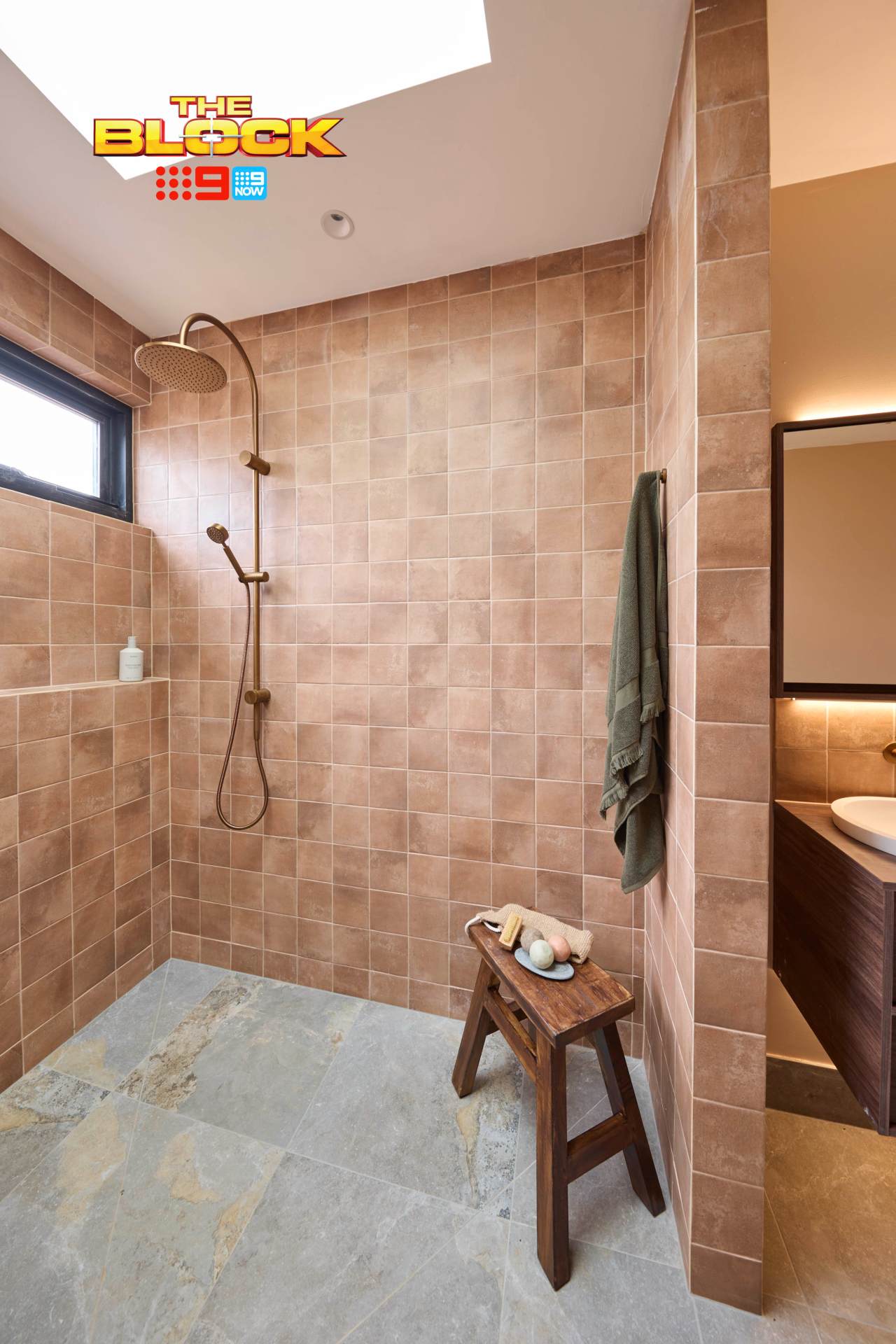
Sonny and Alicia’s bathroom is worthy of a high score, except there’s a major crime going on that needs the design police to make an immediate arrest. We’ll get to that in a moment, but let’s cover off the positives first.
The colour palette here is wonderfully muddy. I know, some of you are going to say that the tiles remind you of a public toilet, or a prison. If that’s the case, sign me up for weekend detention! Actually, don’t. Lord knows I’d not survive one hour in the clink unless I became jail wife to a 600-pound gang boss named Tiny.
Love the vanity profile, love the slightly sunken basins, love the back-lit shaving cabinet, and can’t get enough of the vertical towel rails (they are seriously the best – don’t doubt them for your own bathroom).
The Issue I Have With the Layouts
Before we get into the biggest crime in Sonny and Alicia’s bathroom, allow me to expand on my gripe about the layout in all five Block bathrooms.
It’s not just the toilet being oddly placed with its back to the door. It’s the openness of the shower and bath area. I know these wet zones are a nice solution in smaller spaces where you’re trying to get a bath in, but I can’t get on board with the way they’re designed here.
The worlds smallest nib wall doesn’t evoke any sense of warmth in the shower. There is no cocooning, no privacy, no steamy sense of luxury. You’re just there, shivering in the middle of a room with water spraying onto you. You’re Cold as Ice, as the Foreigner song goes. Sorry gang, I’m not into it.
The Big Issue in Sonny and Alicia’s Bathroom
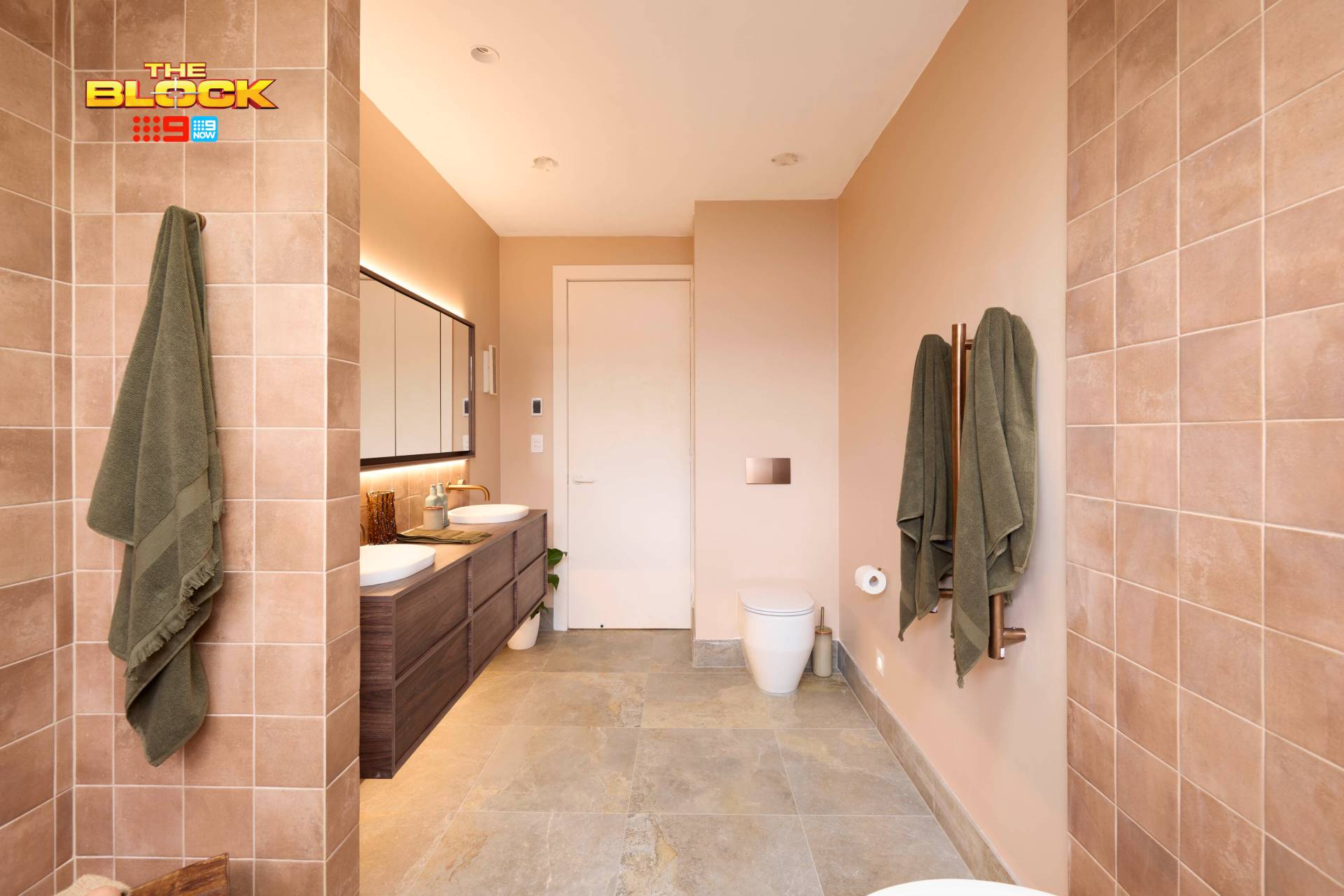
As I said earlier, I really do enjoy most of this bathroom. So many wise material choices were made, and there’s a nice feeling in the vanity area, in particular. But there is a major design choice that they got wrong here. And the more I look at it, the worst it gets.
It’s the floor tile.
You know me; I always say that every design moment can work in the right setting (except for Boomerang pillows and Live Love Laugh signs – those I won’t budge on). And I’m sure this floor tile works somewhere, but it’s most certainly not here.
The floor tile fights with the wall tile, sure. But for me its more about the patina. It looks eternally dirty – and not in the good, Christina Aguilera circa-2002 kinda way. I’d scrub and scrub and never get the look clean. These feel more of an outdoor tile to me, not in a bathroom where you want to evoke calm.
Emma and Ben Placed Equal Third
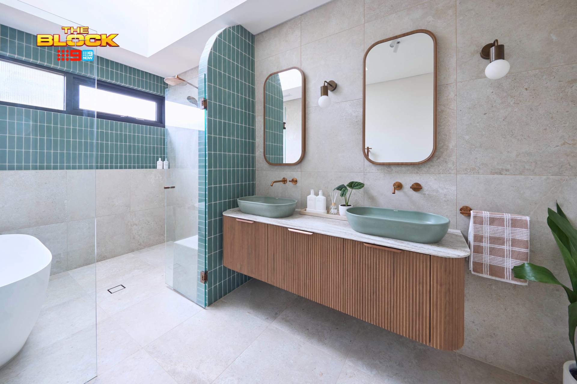
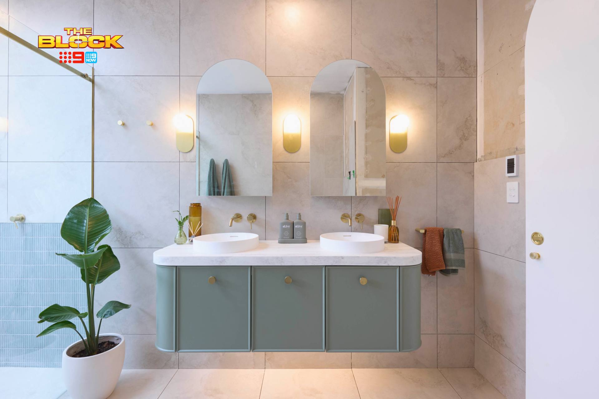
I’d like to start by saying that this is the best colour palette of the week. The combination of grey, bronze and turquoise tones are everything. This is a throuple I can get behind. It feels wonderfully fresh without feeling too bright, all while retaining a depth and earthiness.
I’d like to continue by saying: this room deserved the win! I love a brown bathroom, sure. And both the first and second place bathrooms did a lot of things right, but they also made some substantial material blunders. In Emma and Ben’s bathroom, I only really see two issues and they aren’t enough to knock them out of first place.
Can we talk about the vanity? Call a medic and get the smelling salts, because it is everything. The curved edges, the wafer thin top, the fluted profile with the minimal handles – bliss. I’ve never considered myself attracted to an inanimate object before, but I might need some time alone with it so I can paint it like one of my French girls like Leo did with Kate in Titanic.
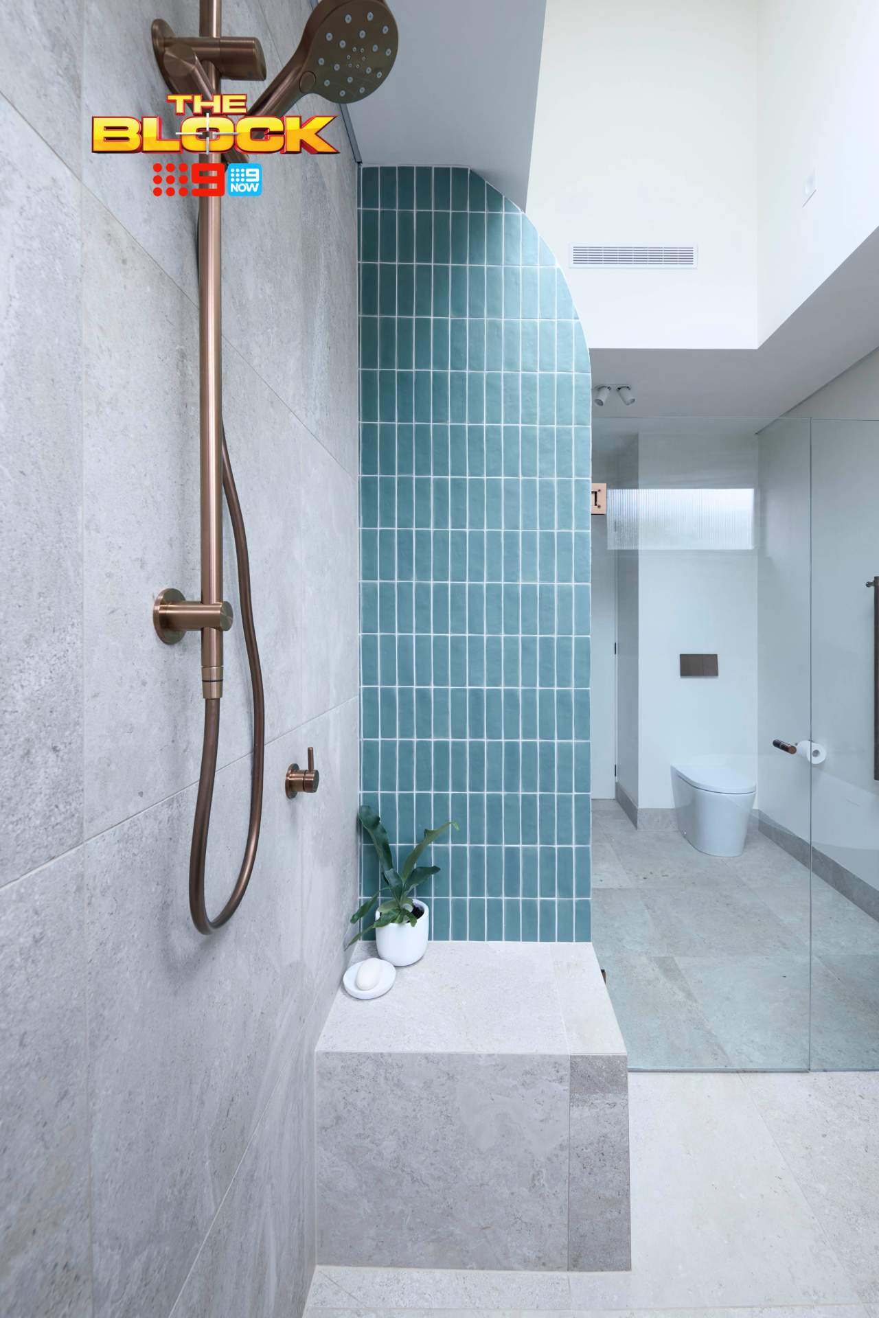
Issue One, Is That Curved Nib Wall
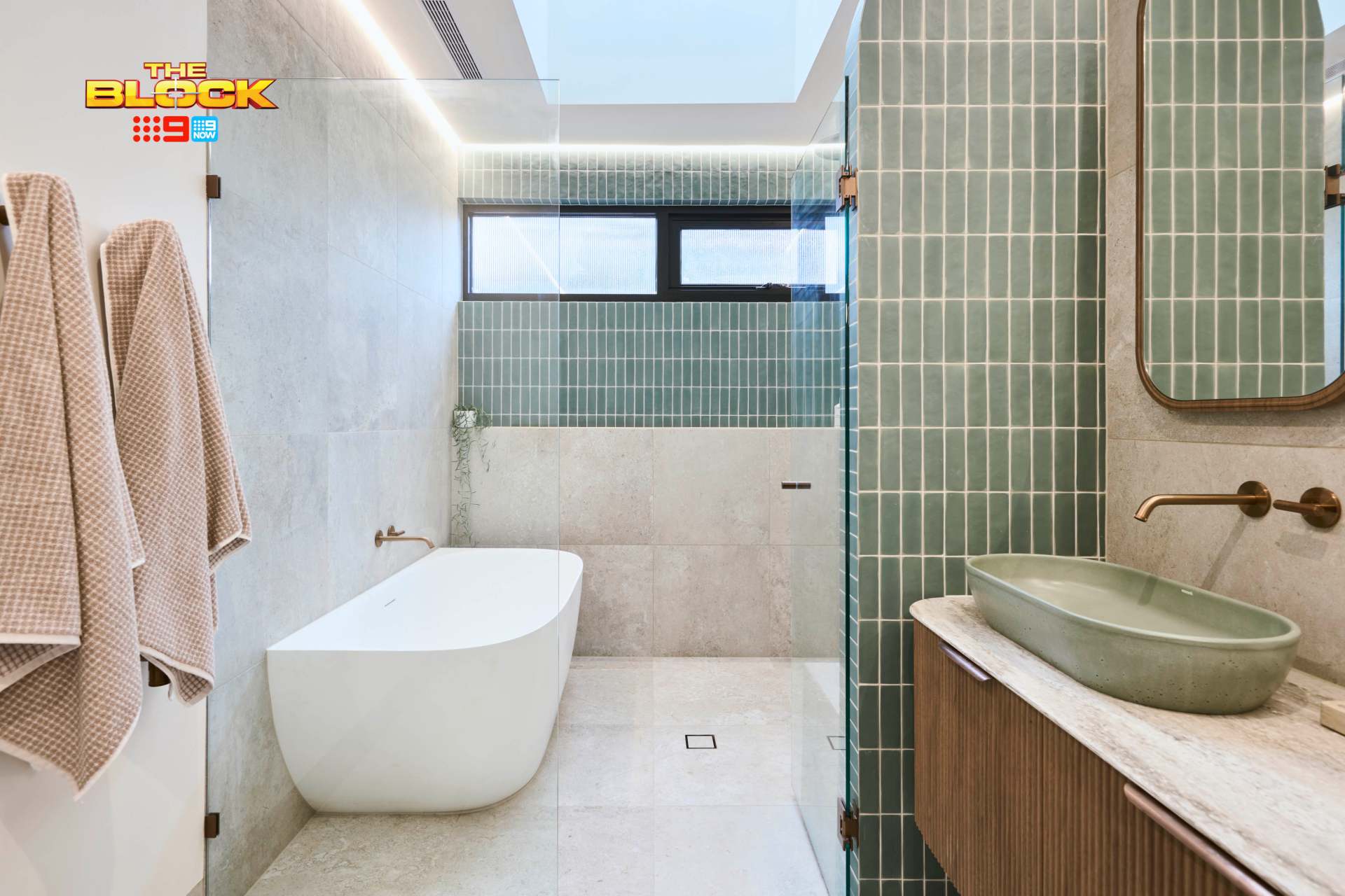
We love seeing new concepts on The Block. Sure, not all of them take off (remember the salad bowl bath from seasons’ past?), but I enjoy the effort all the same. I salute Emma and Ben for the idea of the curved nib wall, but it doesn’t entirely work.
And it’s not the curving that’s the issue. It’s the feature tile. If you use too much of a feature tile, it simply stops being a feature tile. The reason you’d opt for a feature tile on the back wall around the window is to draw the eye toward the back of the room. Covering the nib wall in the same tile deems the visual journey to the back of the room null and void.
In short, it’s too much of a good thing. The nib wall in the large format grey tile would have been far more successful.
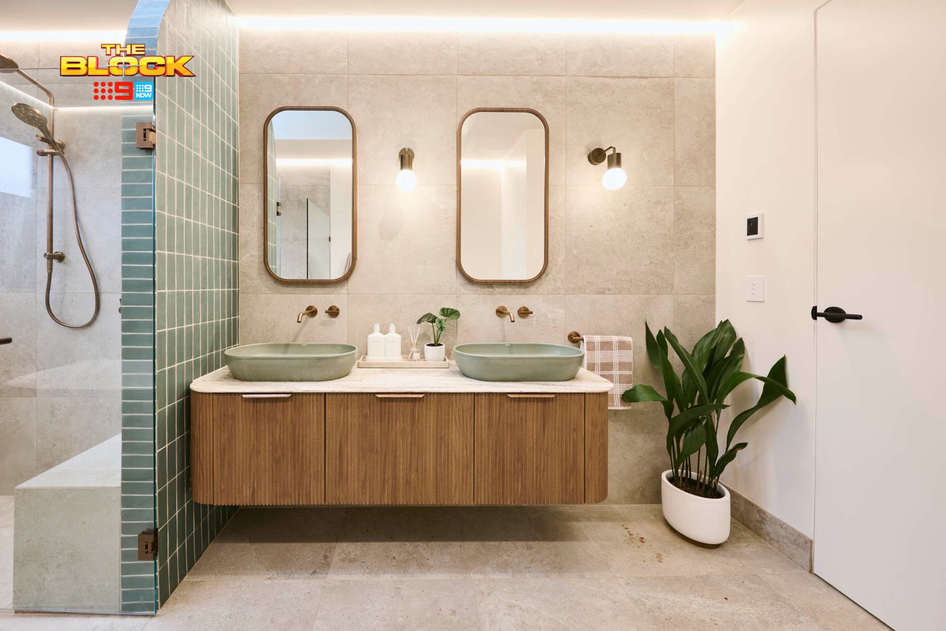
Issue Two is the Stuck-On Vanity
To the left to the left… the entire vanity area is squished to the left. I love the vanity in its entirety, don’t get me wrong, but it needed to be centred on the wall. I assume there was a structural issue that had them attaching it to the left wall, but it’s such a shame.
It being centred on the wall, with the wall lights either side of the mirrors, all with a wonderful sense of symmetry would have been truly beautiful.
With all of that said, it’s still a winning bathroom for me.
Check out key pieces from Emma and Ben’s bathroom at The Block Shop here.
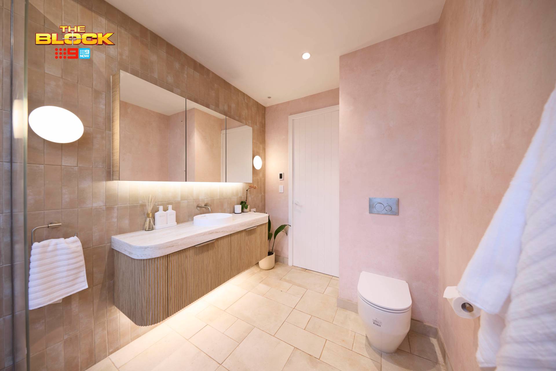
Britt and Taz Tied for Third Place
I can’t help but feel that this bathroom is like the Sex & The City reboot: great idea on paper but the end result fell apart somehow.
I’m not feeling joy, I’m not feeling calm, I’m not really feeling, well, anything. That’s the overarching issue with this bathroom. It feels a little… bland.
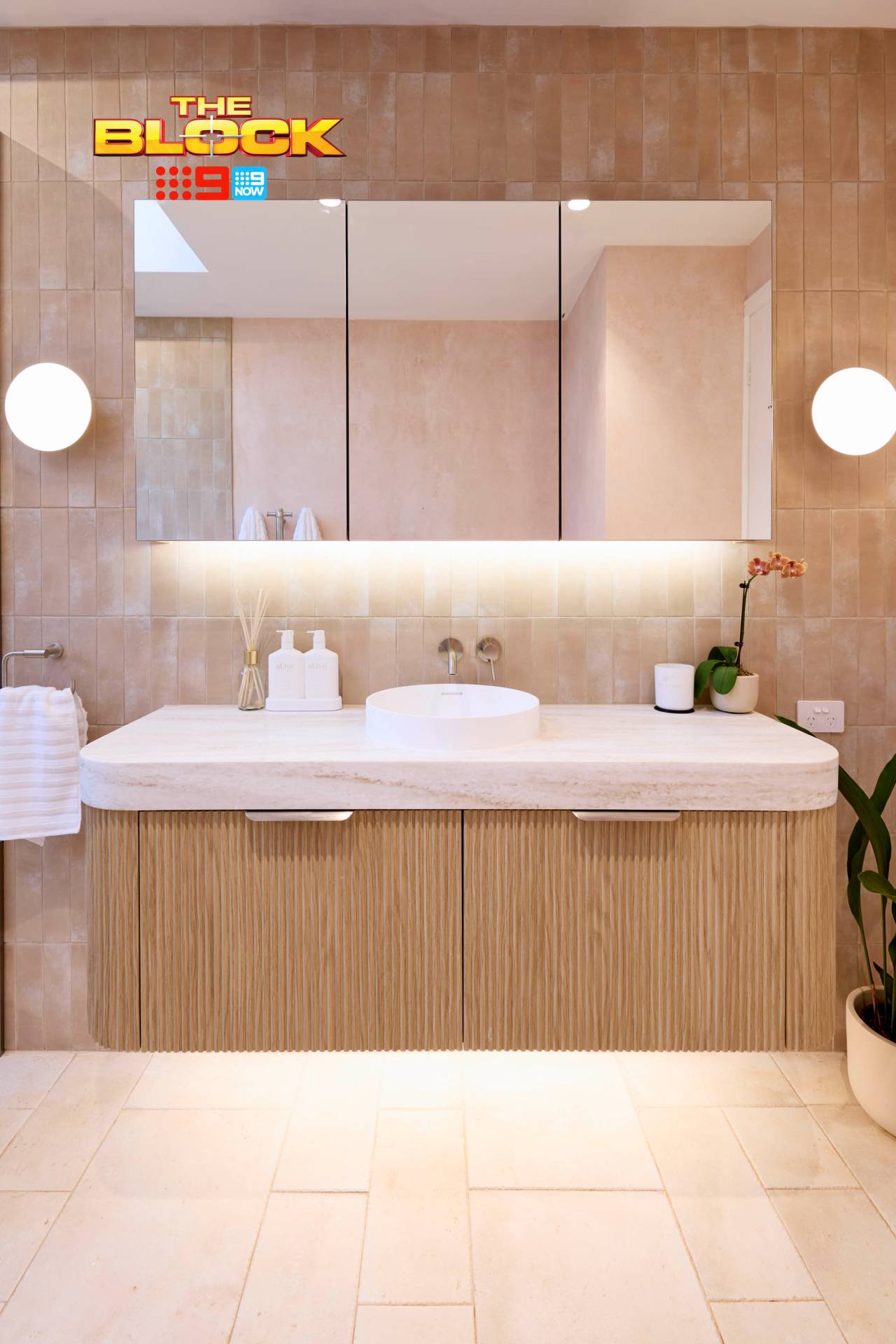
The other bathrooms managed a focal point or wow moment, whereas this one didn’t. All of the materials I quite enjoy, with an exception. The wall tiles are quite nice. The vanity is quite nice. The choice to do chrome hardware was the right one. But still… bland. Polite. Safe.
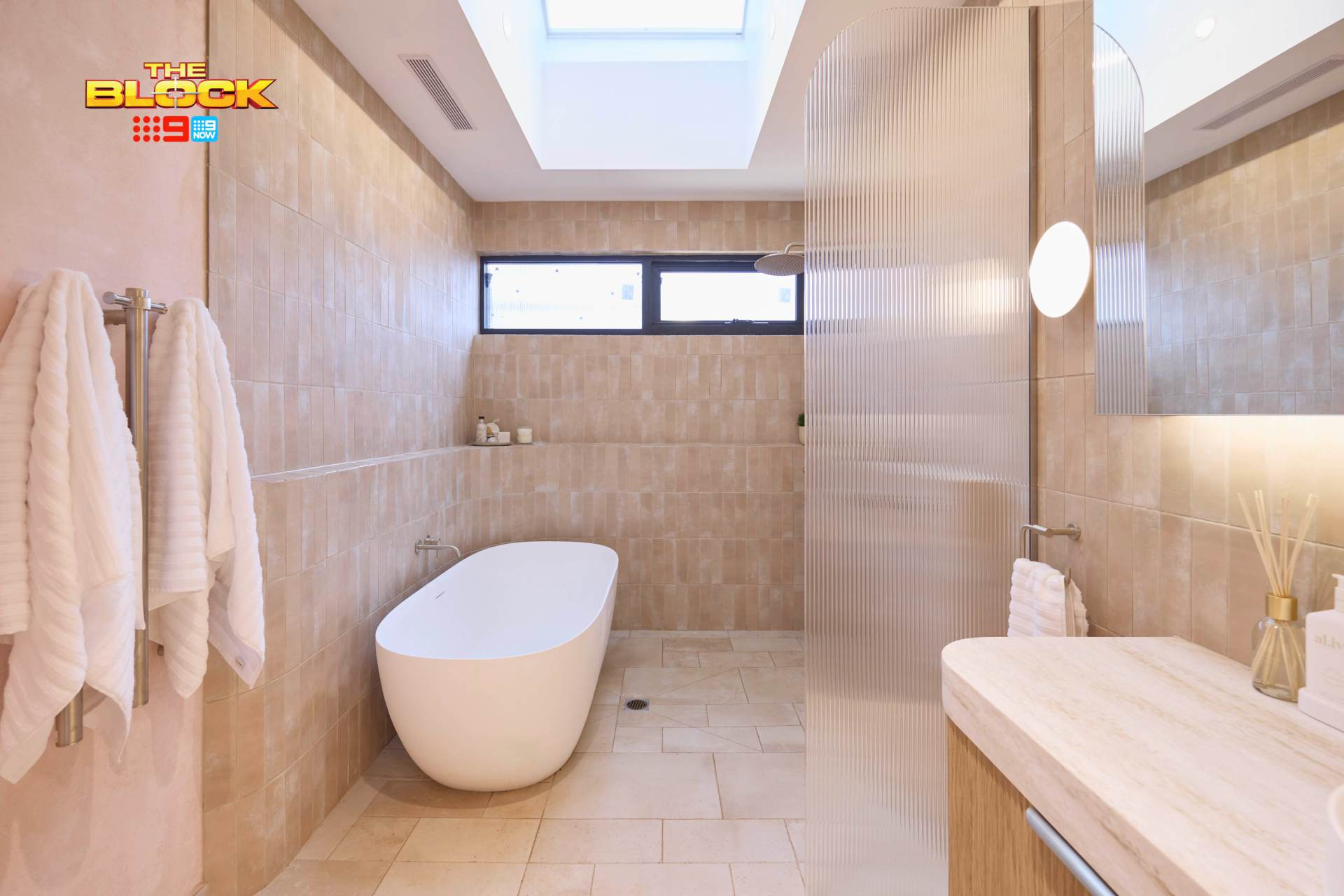
It’s Tonally All the Same, That’s The Issue
It’s all quite warm in its tone, this bathroom. From the floor to wall tile, wallpaper and beyond… it’s all this muted, diluted apricot and blush story. There’s nothing to break it up. No contrast or balance.
For this reason, the eye skims over everything and lands on the black window frame, which feels very out of place here. White plantation shutters are needed in this space, pronto.
I’m a huge advocate for wallpaper (I try to get it into every interior design project), but here the choice of sorbet pink wallpaper was unsuccessful. We needed something with a cooler undertone to help reduce all that warmth. A greige tone, or even a white wall, would have helped a lot.
The Floor Tile is My Other Concern
I can’t get on board with the French pattern tile on the floor. In an outdoor room, sure, but not in a bathroom where we already have a tile in a similar tone applied en masse. It feels a little chaotic, especially around the shower drain.
Less would have been more on the floor. Let those wall tiles be your moment and let the other selections be the supporting players in the room. Not a great start for Britt and Taz.
Han and Can Came Last
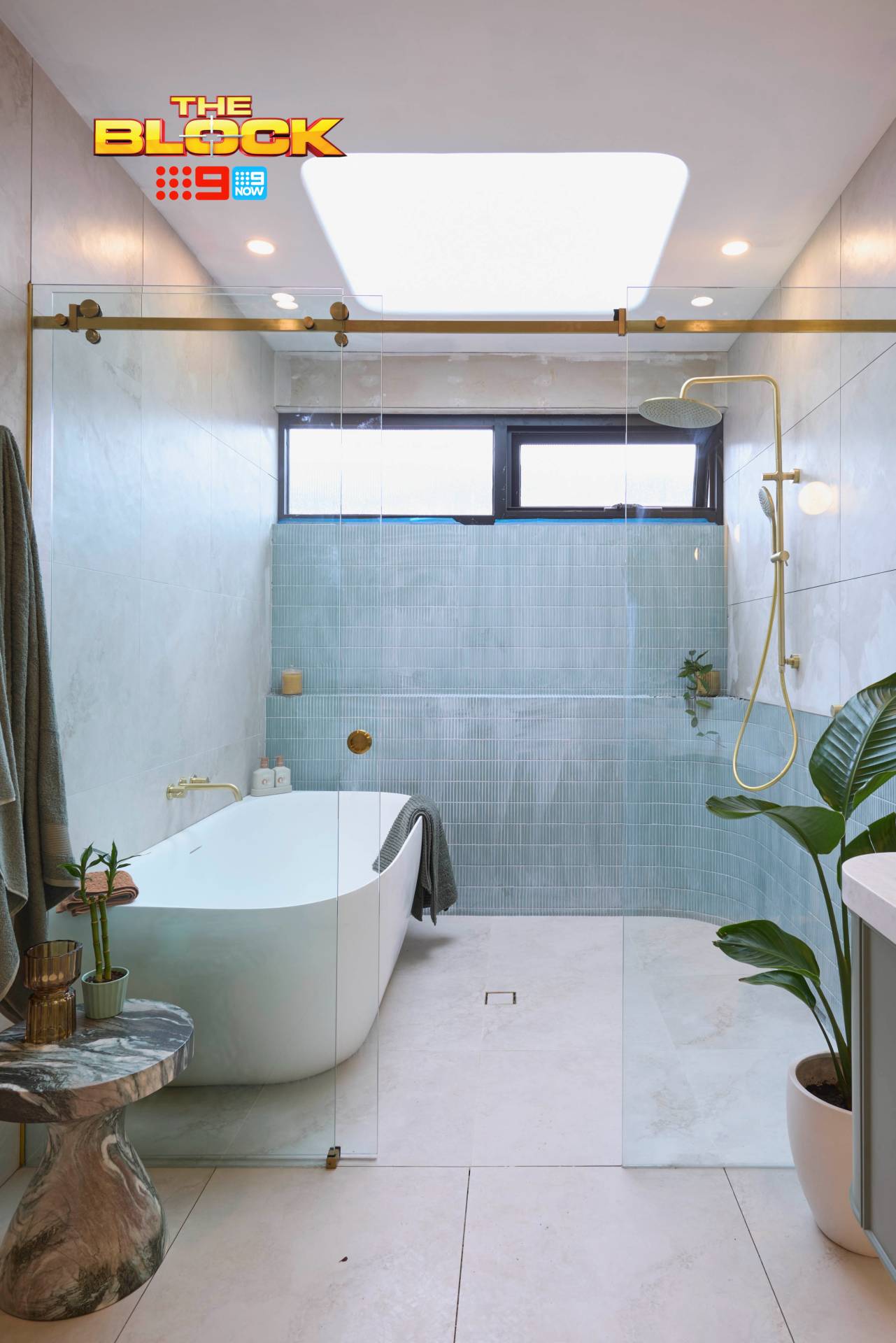
Where Emma and Ben delivered a fresh feel on a classic colour palette, Han and Can went down a path that feels ‘been there, done that’. This is a colour story we’ve seen on The Block a number of times. Didn’t love it then, don’t love it now.
I always have clients ask me, when building, whether certain material choices will date their home. “We don’t want it to be all ‘remember in 2025 when this was on trend’, but now it’s so dated,” they’ll say. And I don’t blame them. There are most certainly moments like this in interior design.
The blue-tile-brass-fixtures bathroom is, sadly, one of those moments. It’s a combination that’ll keep your bathroom firmly in the early 2020’s, years after you finish your renovation.
The Positive Moments in this Block Bathroom
Colour combination aside, there are some lovely moments to admire. The vanity is undoubtedly the best feature in the room. The profile, tone and hardware is all rather charming. The shaving cabinets above work rather well too. It all comes together nicely in that zone.
I also want to call out the back-to-wall bath. I swear, this style of bath is like Victoria Beckham’s music career; completely under-appreciated and something more people should embrace (I will defend Not Such An Innocent Girl ’til the day I die).
Back-to-wall baths are great for a small space, super easy to clean around, and they still give you the look and feel of a freestanding tub. Get on it, I say.

I’ve Said It Before and I’ll Say It Again
Please, under no circumstances, can I permit you to use brass trim on your shower screen, as a feature around your tiles, or as a frame around your bathroom window. Say no, now and forever amen.
If you’re looking for inspiration from leading Melbourne interior designers, this year’s reveals might have given you plenty to think about.
What did you make of The Block 2025 bathrooms reveal? Drop me a comment below and share your thoughts.
Images by David Cook Photography, courtesy of The Block Shop. For more info on The Block 2025 bathroom reveals, check out NineNow.

Hi, are we able to find the dimensions of these bathrooms anywhere?
I don’t think it’s publicly available at the moment.
Why do all vanities nowadays just hang from the wall and not reach to the floor? It would give much more storage space and save having to clean underneath them. Maybe not such a trendy look but more practical.
Also the nib walls stop natural light from reaching the vanities. Wonder why the windows are so small.
Your redesigns sound great.
I love your Honest Block Recaps Chris. I confirms my thoughts.
What I thought was surprising is that none of the Judges complained that some bathrooms had a single handbasin and some had two.
The Judges mentioned that this bathroom was to service the kids rooms. Really?
Glad you are back with your practical comments. I am not a brownie tile person either. We did our bathroom update some years ago. We pulled out the tile surrounds on existing bath and replaced with a back-to-wall bath. Music to my ears when you mentioned it. The space feels lighter, brighter and streamlined. It also gained some extra space for upgraded shower and easy clean.
Agree about the bathrooms being cold, I was in Daylesford in February once and it was absolutely freezing!!
Also I heard Scotty mention that to give them a head start the Block plumbers had pre-fitted all the bathrooms which meant they could not vary the layouts, but I think future bathrooms will have more flexibility – here’s hoping!
So glad you’re back as we so enjoy reading your comments. The only bathroom I liked was Emma and Ben’s. It was the nicest colour scheme. The muddy browns in the others reminded me of growing up in suburban Sydney in the seventies. And I don’t want to go back
Hi Chris- love your comments
The tile choices were uniformly blah- 5 star hotel bathrooms do drab much better!
Hate the focus on boring brown
As for the genetic fluted glass screens…cheap and nasty- agree that a larger nib wall would have been better
Daylesford is such a cold place in winter- the rooms needed much more “zing”-and lots of overhead heating to make me want to shower in such an exposed area- there can’t be infloor heating in the wet areas so super chilly in there- brrr
I love the brown Siggi, I won’t lie, but I know it’s not for everyone. Brings up too much trauma from childhood bathrooms lol. Thanks for coming here to read and comment, much appreciated!
You’re back!! I LOVE your posts!
Thanks Jenny! It’s good to be back. I’ve missed talking design each week with everyone. Thanks for coming back to read and respond.
Chris, we’re so glad to have you back and we absolutely love you—but those mission brown bathrooms really can’t make a comeback!
Thanks Maria, glad to be back and glad you’re back here reading and commenting. Don’t hate me but I love the brown lol. It’s muddy and moody. I’m enjoying it, but I know it’s a niche market 😉