The Block 2025 rumpus rooms reveal was such a mixed bag.
One room was beautiful and bold, if not a little divisive. Three rooms were nothing to write home about. And one room was a truly lazy, WTF moment that has me questioning everything I thought I knew about a couple I’ve never met and never will.
We have so much to discuss, the least of which is the constant references to rooms feeling ‘quintessentially Daylesford’ or ‘not very Daylesford’. This is a suburb 90 minutes out of Melbourne, people. It’s not a design style, nor does everyone in Daylesford style their home in the same, distinct aesthetic.
I need a Bex and a lie down and the recap has only just begun!
Key Points from Rumpus Room Week
Han and Can Came First
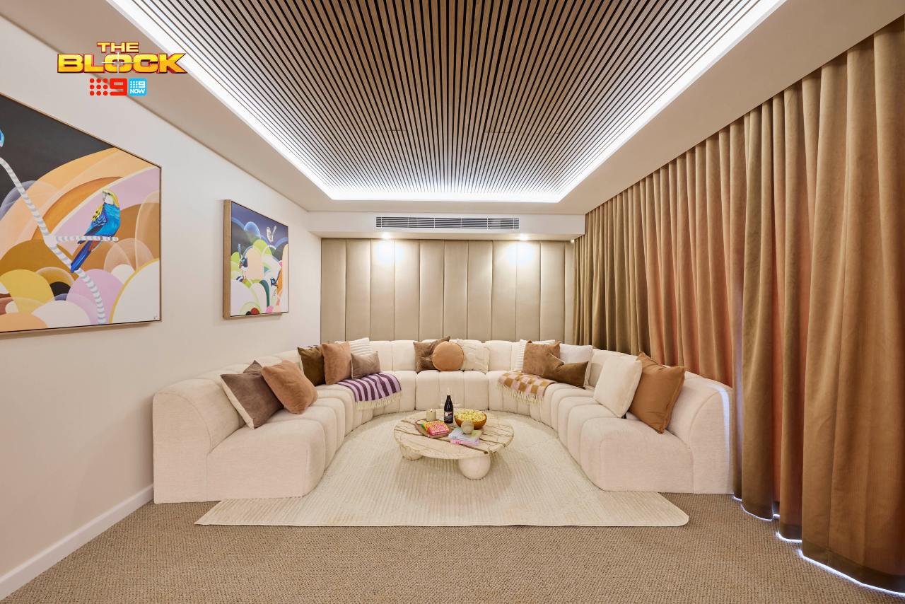
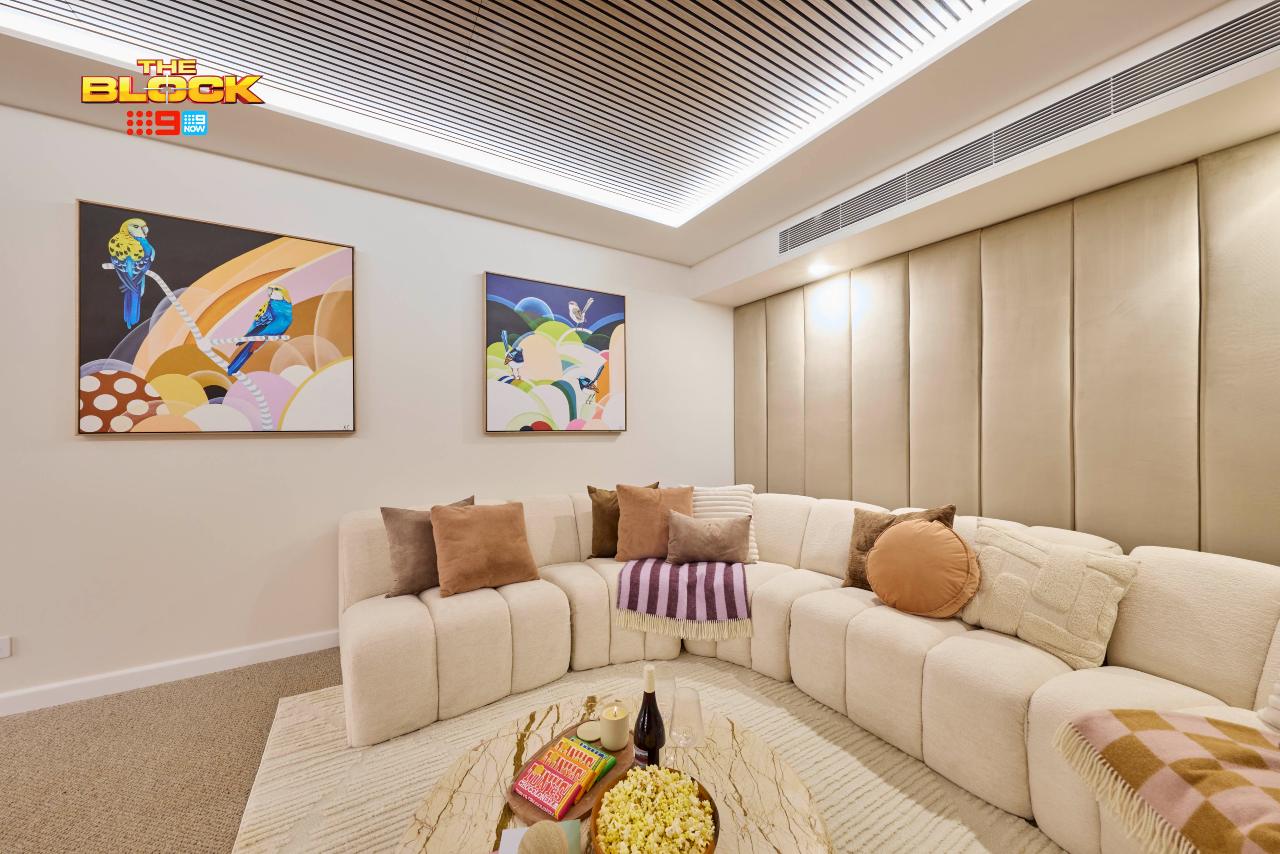
Given the size of their living room, and the fact that you can’t watch TV from most of the sofa, it was wise of Han and Can to make this rumpus a media room. You’d be hard-pressed to find anyone who wouldn’t want a cinema experience at home (myself included) so it was a smart concept indeed.
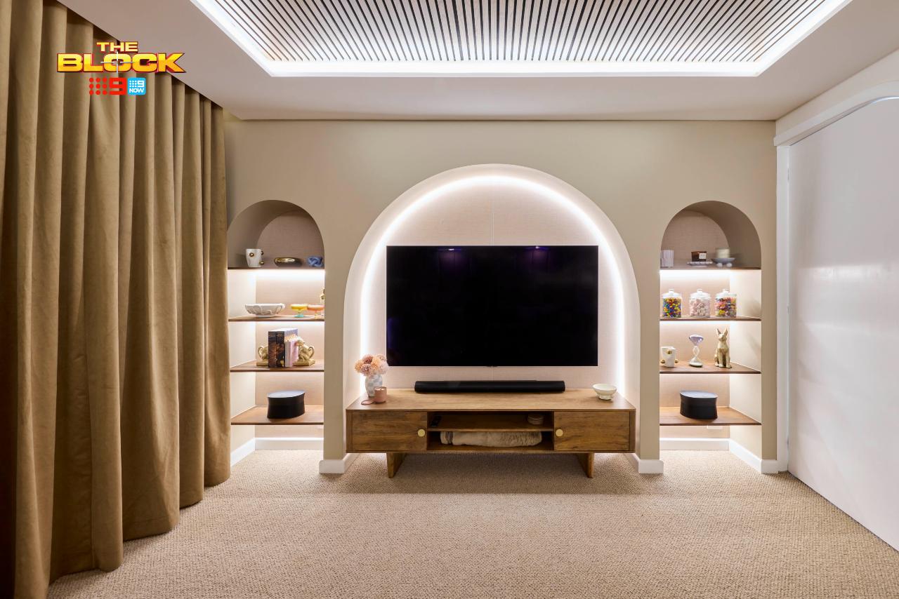
It did fall short though, and in a way many of the rooms did this week. They installed soundproof panels on the ceiling. Love that for them. They have an upholstered wall at the back. Love that idea too. But here’s the major issue: the TV size is more underwhelming than Irene’s sendoff on Home & Away (justice for the country’s favourite darlin’).
What’s worse is that every team made this blunder.
Why did they over-design the TV wall with arches – stuffed full of knick knacks nobody needs – when they could have installed a projector and screen, or hung a much larger TV on the wall? A proper media room this is not, which is such a shame because it has all the potential.
This Should Have Been a Proper Cinema Room
There was scope to not only amp up the TV wall in size and scale, but to deliver on proper seating, too. I would have tiered the floor; have it raised along the back wall with a large sofa across it. Then, place some armchairs on the lower tier in front – the full cinema experience (but without the $945 popcorn combo)!
They’ve done this in previous seasons of The Block to great effect, and it would have worked wonders here. As it stands, that curved sofa meets the same fate as the sectional in their living room: you can’t successfully watch the TV from most of it. The centre, sure, but not the sides.
Even beanbags would have helped here, and there are some great designer options on the market right now that I’ve told you about before.
This is a partially-realised room, truth be told. Like the Sex & The City reboot, it could have been something truly magical but it never got there and we can’t pretend it did. We Hannot and we Cannot.
Emma and Ben Came Second
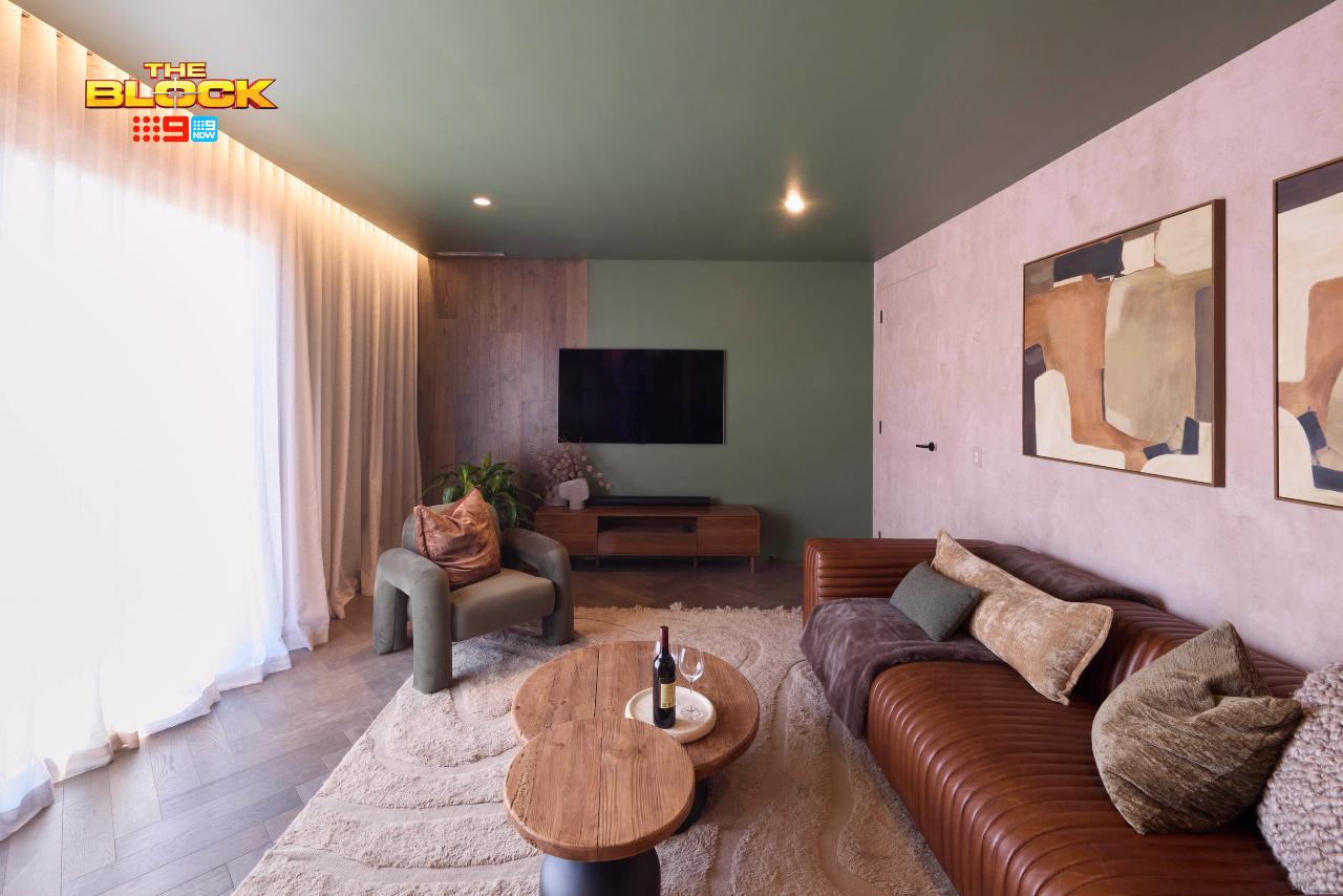
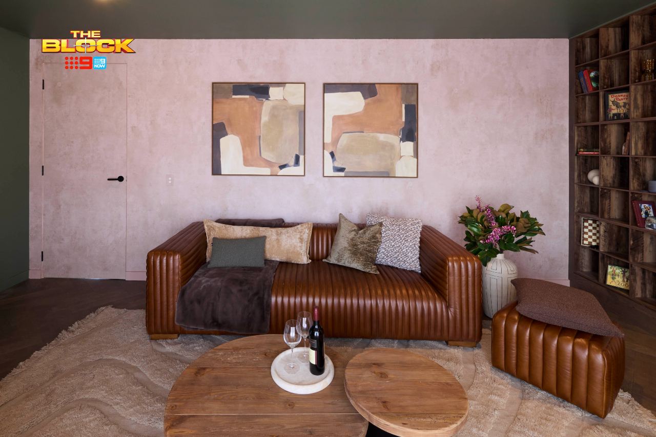
There’s a lot going on in Emma and Ben’s rumpus room, and unfortunately I can’t say it’s good. The ideas are flowing, but they’ve all been meshed together rather unsuccessfully. It’s made for a space that feels about as calm and harmonious as a Slipknot concert.
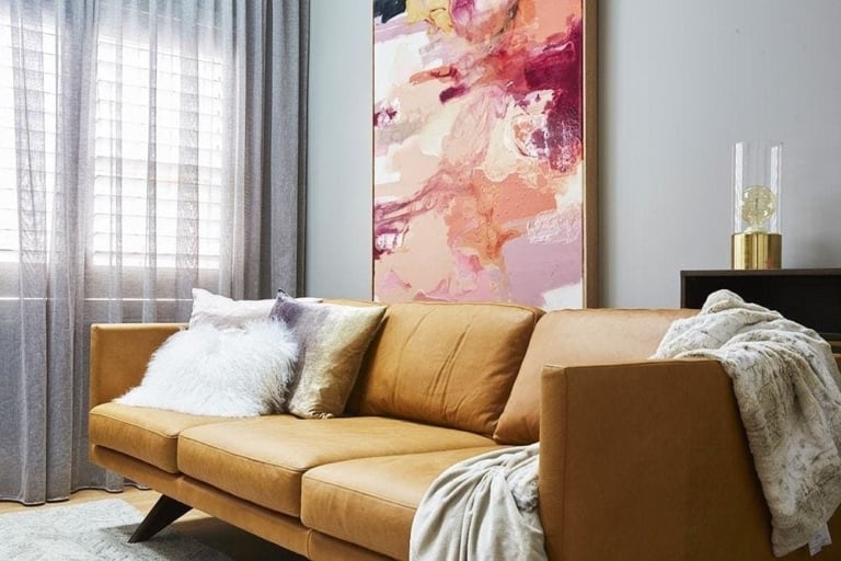
The room doesn’t know what it wants to be. Is it a den? Is it a living room? Are we chatting, watching TV, staring out the window, sliding off the leather sofa? I don’t know and it doesn’t either. It’s also masculine meets feminine in the most peculiar way. Brown leather and cabinetry paired with pink walls; it’s not working.
Also, the sponged walls. I need a moment to process the sponged walls. They’re taking me straight back to a Better Homes & Gardens segment circa 2006. Tara Dennis, I’m holding you personally responsible for this. The generational trauma is real and I need a public apology issued ASAP.
There Are Too Many Elements Competing
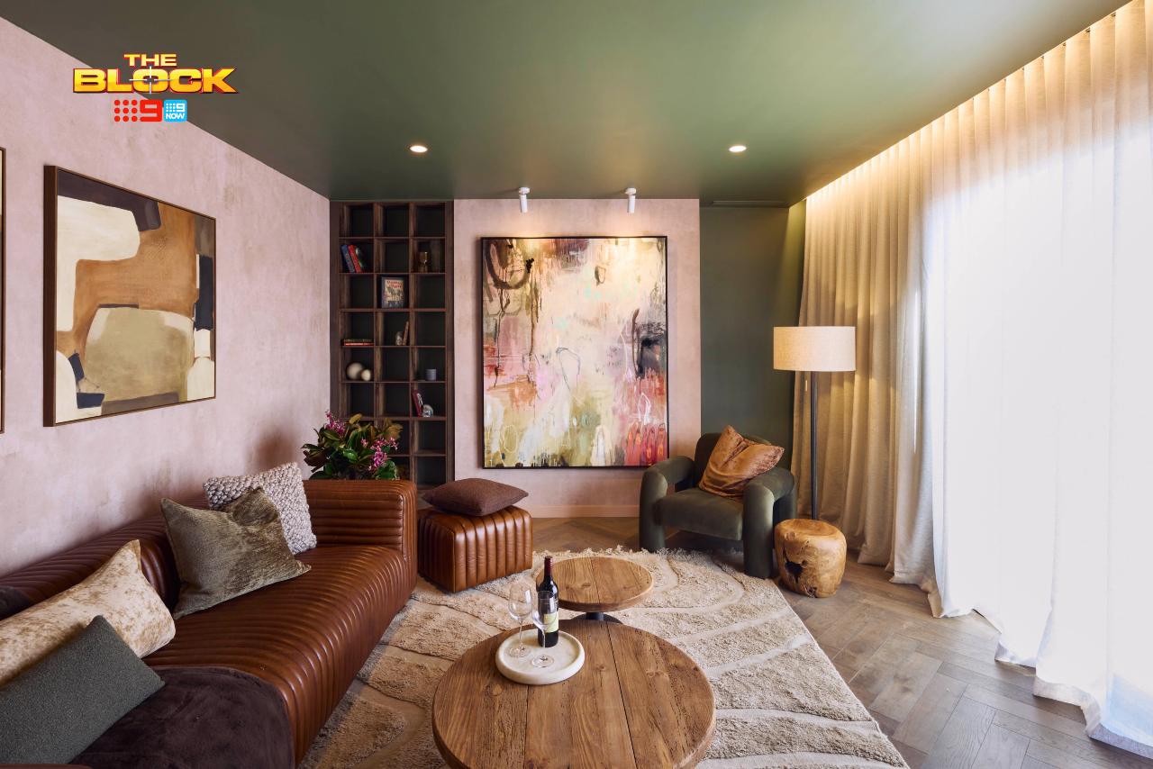
I know these rooms are long and somewhat narrow, which can make for a tough layout. But, putting the TV on one wall and then orienting the sofa toward to window is baffling. The room lacks a distinct purpose, and for a potential buyer that’s concerning.
Someone viewing this room during an open house doesn’t have the imagination or skill to know that you could even fit a sofa facing the TV. You have to show them these realities and paint a picture of what life in this room could be like for them. Emma and Ben haven’t done it, and that’s a big miss in my books.
I also find there to be way too many focal points. The sponged walls, the artwork, the green ceiling. Everything is fighting for my attention like I’m walking through the gauntlet of brochure handlers on election day. It doesn’t make for a room I want to spend time in.
I do enjoy the artwork though. That I could look at all day long.
Sonny and Alicia Came Third
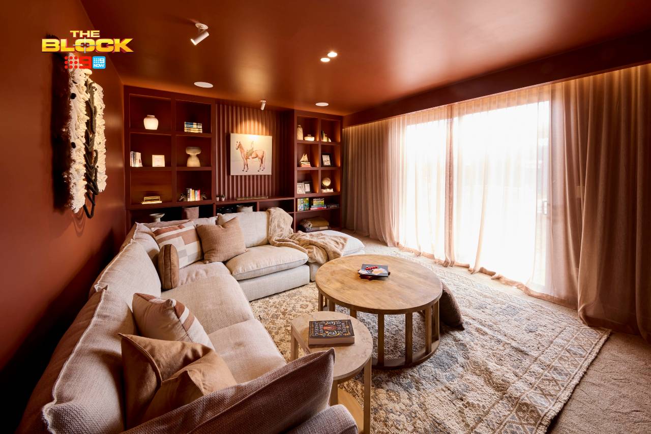
Everything I said about the layout in Emma and Ben’s rumpus can be applied to this one; it’s odd to have a TV on one wall but the sofa not facing it. I know it’s weird, you know it’s weird, a newborn baby was just delivered in Daylesford hospital and declared it’s weird.
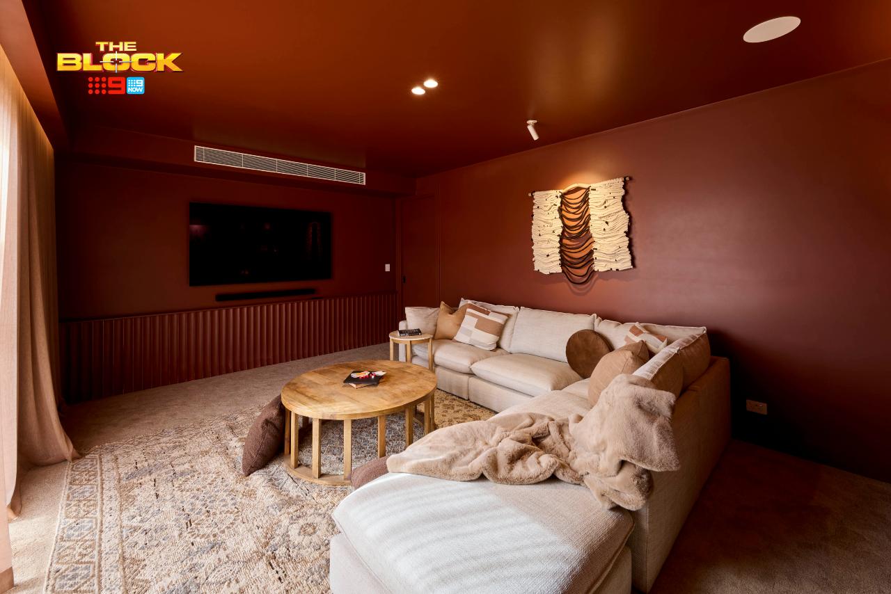
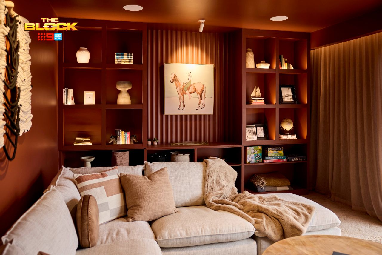
That aside, oh my Lord and I loving the red. I never thought I’d want to paint my walls and ceiling red, but Sonny and Alicia have inspired me. Their main bedroom inspired me, and this rumpus has too. It has zero cohesion to any other room in their home, sure, but as a standalone zone I’m crushing hard.
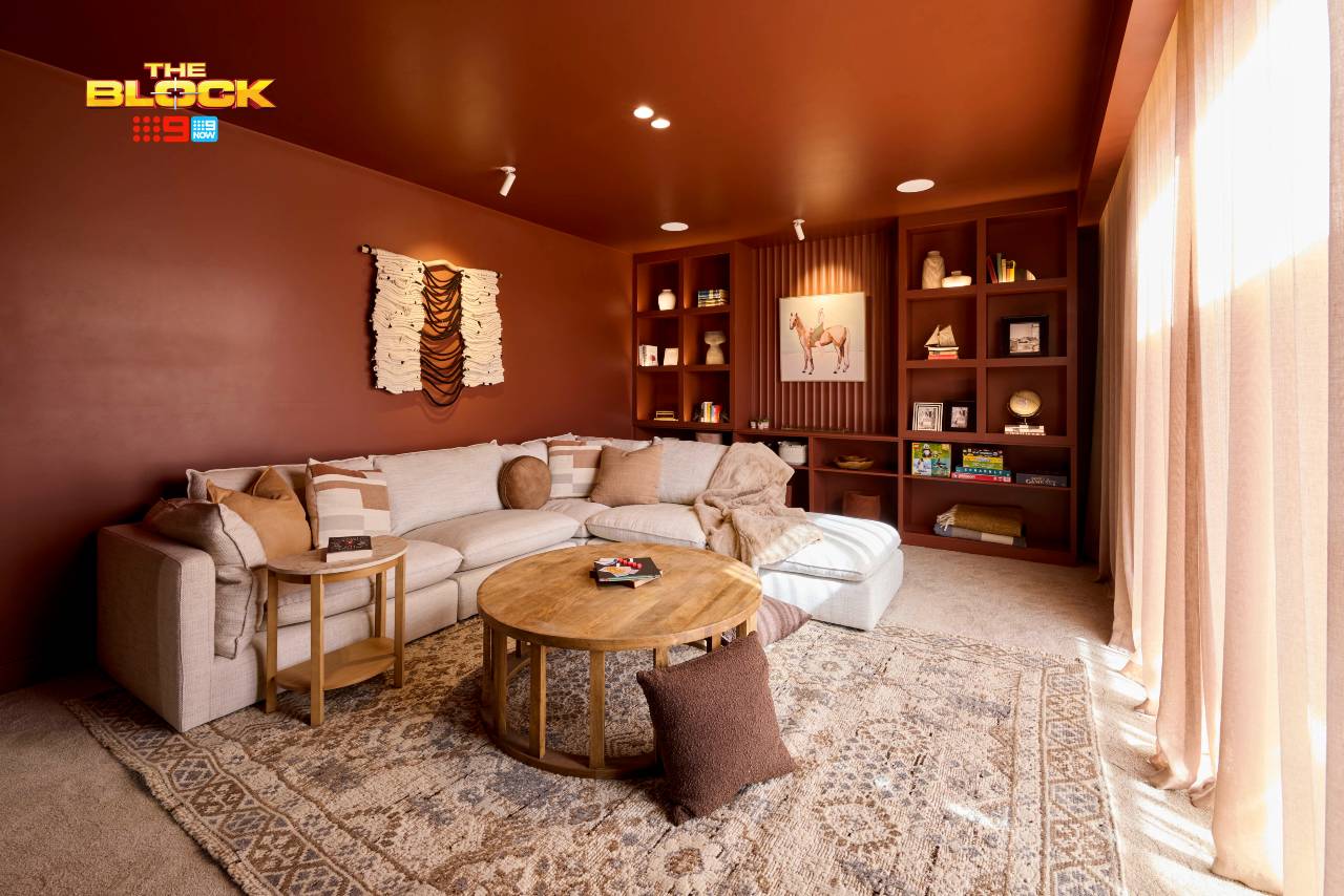
Say what you will about the colour (you either love it or hate it) but from a design perspective the colour drench is truly spectacular and really does work. It gives the room an enveloping, cosy feel that screams ‘curl up inside me’ like I’m Luke Skywalker and its a Tauntaun.
The white vent above the TV hurts me more than Vindaloo after-burn with no Gaviscon on-hand, but outside of that I’m loving the visual of this space.
A Few Improvements Could Be Made
This is actually one of the rooms where I’d love to see a fireplace. Image one under that TV. It would elevate the space massively and make it feel way more sumptuous and inviting.
An armchair across from the sofa, to the left of the TV, would created a nice sense of balance, too, so I’d be inclined to fill that area up with one.
And down the other end, where that wall of joinery is, the shelving seems a bit pointless. It looks nice but serves no purpose, like the entire cast of F-Boy Island.
A bar area would have been a genius idea for this wall. Then, this could have been a room to escape to that you don’t have to leave for hours. Movie nights with the fire going and a wine in hand from the bar – take me there immediately! A very gutsy effort though, which I admire.
Britt and Taz Came Fourth
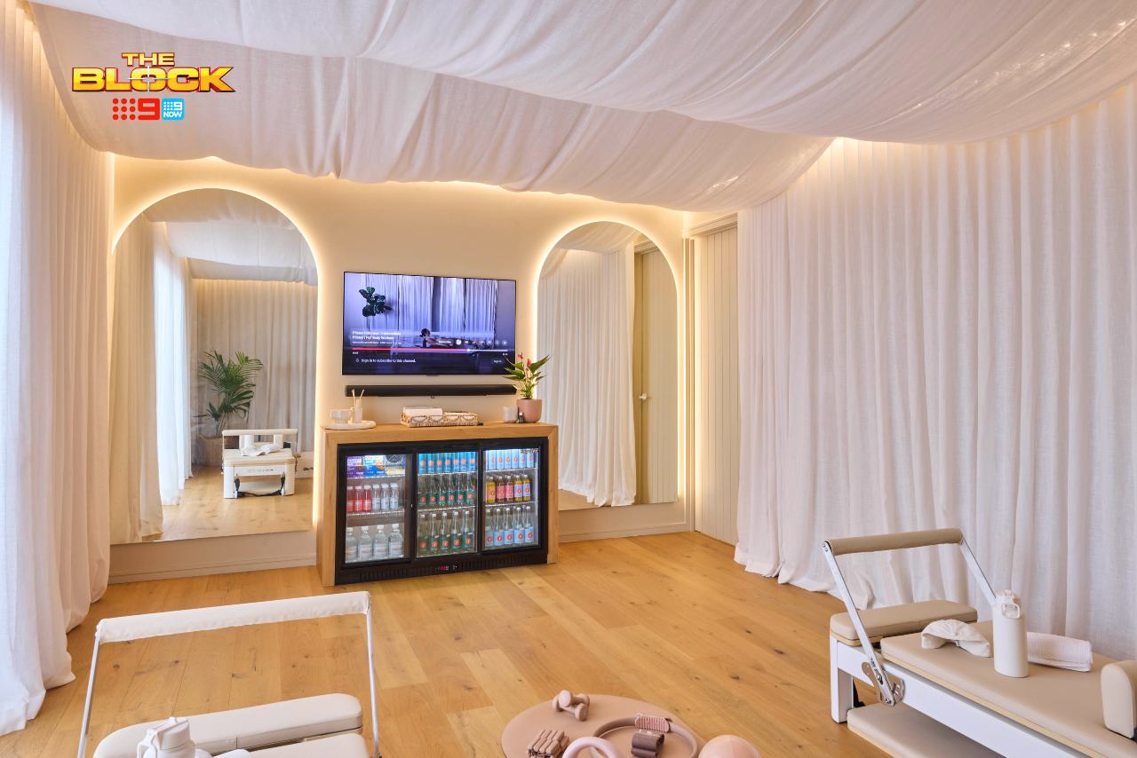
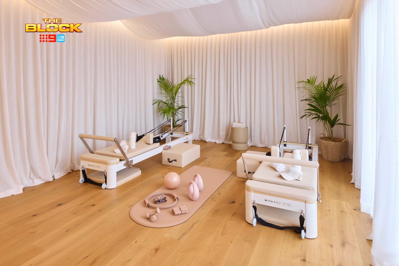
You know I love Britt and Taz’s work, but let’s be real: this room is a cop out. There, I said it. A rumpus room this is not, nor is it a space that seems very high-effort to execute.
This is an empty room covered in fabric with torture devices sat in the middle and a fridge against the wall. I don’t get it visually, I don’t get it functionally, and I don’t get it from a markability perspective. What buyer is going to want to forgo a second TV room so they can do pilates?
I don’t understand how this even passed Rumpus room week on The Block and didn’t come last. Once guest bedroom week comes are the teams allowed to make the space a pole-dancing studio or tattoo parlour?
I really don’t know what else to say, so it’s best we move on from this before I over-indulge in my usual Block stress-busting remedies (you know this by now: five Bex, a bottle of Savvy B and a good lie down).
Robby and Mat Came Last
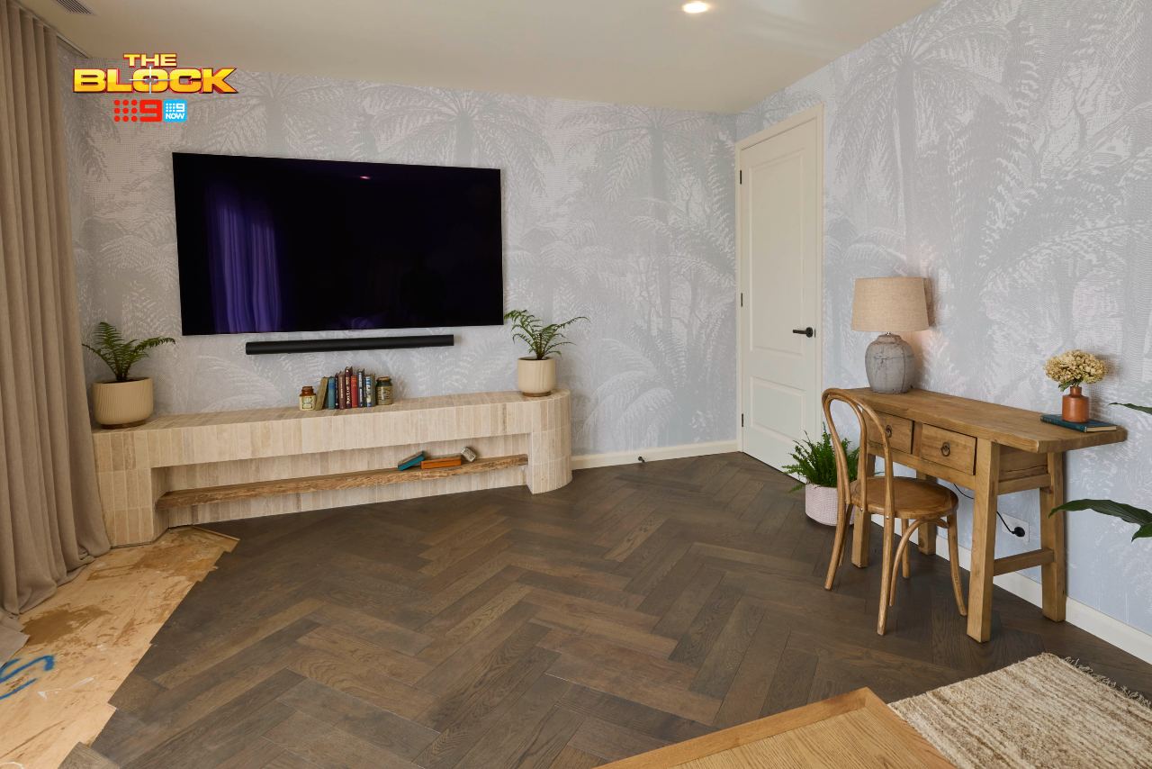
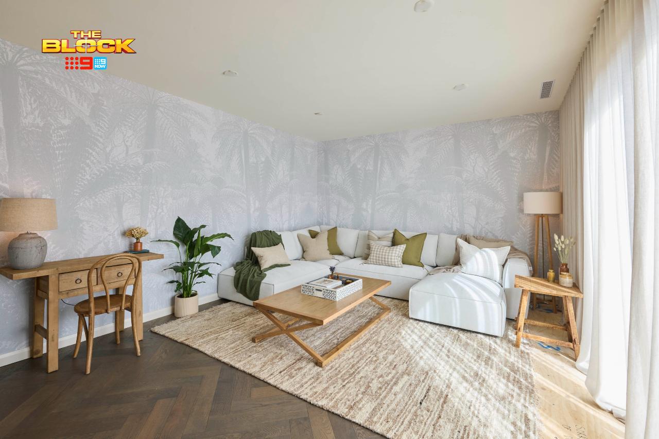
I would have placed Robby and Mat in third place this week, for this is a solid room that functions well and won’t put off a buyer. Sonny and Alicia for first, Han and Can second, and these guys third. In fact, the layout is very on-par with Han and Can’s, so I can’t fault it from that perspective.
Is it a bit bland, a bit dated, and a touch unimaginative? Yes. The wallpaper alone I’ve seen season after season on this series. But overall it’s still a welcoming room that a potential buyer can see the vision for. It makes sense. You know how to use it. No buyer is left trying to imagine how to best orient the furniture.
It’s also a space you can easily make your own. It’s nowhere near as cluttered and chaotic as Emma and Ben’s, not as polarising as Sonny and Alicia’s, and definitely more marketable than Britt and Taz’s. So why last-place positioning? To quote the nations most-hated redhead: I don’t like it.
What’s your take on The Block 2025 rumpus room reveals? Drop me a comment below and let me know, or come visit on Facebook or Instagram and sound off there! – and if you’re after advice from Melbourne interior designers like us, you’re in the right place!
At TLC, we design beautiful,
timeless homes that tell
your unique story.
Images by David Cook Photography, courtesy of The Block Shop. For more info on The Block 2025 rumpus room reveals, check out NineNow.

Your Bock recaps have become the highlight of my week!
Daylesford is a beautiful, picturesque town. I have stayed there several times.
So far, The Block 2025 has been underwhelming for the most part. I’m usually a huge fan of this show but I am becoming bored this year.
The teams seem to be lacking cohesiveness of design and appealing style in their individual houses.
I guess they will do well as Air BnB’s. They just don’t appeal as family homes.