Just when you think The Blocktagon is complete and the series is ready to wrap, a spanner is thrown in the works and a mystery apartment challenge is unveiled!
On a sidenote: Can they never move the Sunday night show in favour of the cricket? Total snoozefest if you ask me!
Some of the teams did marvellously this week and others floundered. I also wondered what the point of the mystery apartment was. Is the intention to sell this apartment too? It’s an odd move considering the teams all have completely different and individual design styles. It seemed to work OK this week but I’m concerned for the next round where they’ll have to create a living room, dining room and kitchen that all make sense beside one another.
Want to know more about The Block? Read our ultimate guide to every season!
Let’s take a look at how it all went down this week. Oh, and the best part; click on the hyperlinks in this post to shop the looks from each room!
Dean and Shay’s Winning Bathroom
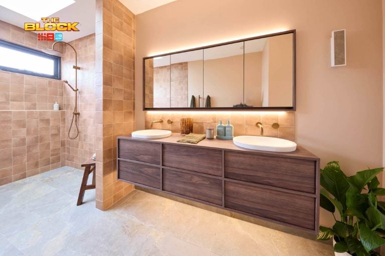
There’s a lot to love in this bathroom and for me the wall tiles are by far the nicest component. They set a really luxurious mood in the space without being too pretentious, and I like the moment of contrast Dean and Shay created in the shower recess by using different tiles.
The brass taps were also a gift from the decor gods and further added to the sense of luxe, as did that gorgeous marble soap dish on the basin.
The white bath towels added some softness to the space, but the judges were right; they needed a proper towel rail.
This room should have come third place if you ask me, but I will give them bonus points for tying their design in nicely to Kingi and Caro’s bedroom. There’s a great sense of unity and flow between the two spaces.
Total Score: 29
Kingi and Caro’s Second Place Bedroom
I always love a team who experiment with colour, so Kingi and Caro get top marks in my books for the palette alone. It’s colourful but grounded, and definitely not too juvenile. It’s a really casual and comfy space, which is how a guest bedroom should be.
Love the rendered wall and that blue bedhead against it really becomes a wonderful focal point. The Fantasy Dreaming artwork above the bed is also pretty spectacular, as were the bedside tables, which give a nice nod to K&C’s industrial aesthetic. They were a bit too small for the space, but they’re bold, bright and beautiful so I’ll forgive them this time around.
One issue I did have was that open wardrobe. There is no universe I want to live in where a wardrobe with no doors is a thing. Tsk tsk.
Total Score: 28.5
Luke and Ebony’s Third Place Bedroom
I am eating my words right now! At the start of the season I recall dissing Luke and Ebony bigtime and not understanding what they were doing with their rooms. But halfway through the series they pulled their fingers out and became my favourite team.
They should have won this week. They took the timber bedhead concept from Andy and Whitney’s master bedroom and made it better, as well as introducing that stunning Vibrant Feathers artwork into the mix. They also carried the cool colour palette from other rooms across into this one through scatter cushions and using stunning pendant lights to make the space feel complete.
There’s nothing I don’t like about this room. This is the sort of space I’d like to create for a client (and for myself); striking, relaxed, colourful, yet slightly aspirational. I’ll also have those side tables for my home ASAP please.
Total Score: 25.5
Fourth Place: Andy and Whitney’s Bathroom
I don’t have huge issues with this space nor do I have any positive feeling toward it. It’s just a nice bathroom that ticks the boxes. Certainly no wow moments, but certainly not a bathroom that would offend a potential buyer. I guess that’s why it came fourth; it was neither here nor there, was it?
I actually loved some of the accessories moreso than the fixtures and fittings! That round planter was a really cute touch in what was a pretty ordinary space.
I think they actually drew the short straw on this one, because bathrooms are harder to create wow moments in than a bedroom.
Total Score: 24
Suzi and Vonny’s Last-Place Bathroom
Although this space is larger and grander in scale than Whitney and Andy’s, I feel the same way about this space as I did theirs; a bit blah, really.
I do like the bath tub, but in a space that large I think you could afford to go even grander with the tub and make more of a moment of it. It feels a bit small and sorry for itself in the middle of the room like that. Perhaps if there was a gorgeous timber stool next to it with a vignette on top it might make more sense.
I think the vanity is lovely, but I do take issue with the sinks, because I think they come up too high around the edges and the tap would knock you out when you tried to wash your. The vanity was also a bit cluttered. Loved the look of the Handwash and Lotion Set (an everyday essential) but there was a lot going on around it.
Total Score: 22.5
>>> Which room do you think should have won this week? I’d love to hear your thoughts below!


Agree….oh & please…the whole concept of having an open wardrobe?? I would hate people to see the way I hang things on a bad day or what I throw in there when I have unexpected company!! Loved Luke & Ebony’s room…winner in my eyes.
I agree with you Jane. I could never do an open cupboard. Way too much junk shoved into them at my house for it to work lol. And yes – Luke and Ebony for the win! 🙂