Is it just me you guys, or are we a bit fatigued with The Block this season? Maybe it’s 2020 in general, maybe it’s lockdown, or maybe it’s the eras brief, but I feel a little unenthused.
You know when you were a kid and you’d be in the pool screaming “Mum, Mum, watch me do a handstand”? And when you came back up from under the water your mum wasn’t really even looking but said something mildly encouraging like, “that’s nice dear”. That’s how I feel about The Block this week: that’s nice dear.
And that’s not to say that some of the teams didn’t pull together nice spaces, I just feel like I want the season to be over. Can we get on with the rest of the rooms and get to auction? It might just be me. This week not a lot of spaces inspired me, and of course we’ll talk it out below as we always do. But let me know in the comments at the end; are you a bit over it too?

Sarah and George Came First
This was a deserving win for Sarah and George. Both spaces were pretty divine and I only have one real criticism (which we’ll get to in a moment). Overall though, a stunning job all round. This week was a bit of a return to form for the couple, after last week’s less than impressive living and dining room.
Let’s Start with the Kids Room
First of all, can I just point out the ridiculousness of (and I’m paraphrasing here) the “you designed a great kids space and you don’t even have kids”. Where is this notion coming from that parents suddenly have more design prowess in a kids room because they have children? I have a car but I don’t know how to replace the engine. I have hair but as lockdown has proven… I don’t know how to cut it.
Anyway, that aside this kids room was successful in its colour palette. The wallpaper was delicious, the furniture was divine, and as Neale rightly pointed out, it could be converted to a guest room in a second. That’s a winning strategy for me; you want the room to evoke an emotion but be easily changed if the estate agent recommended it.
Loved the bed, loved the teepee, loved it all.
I posted last week on amazing baby nursery inspo if you need some styling help on this front.


The Office was Also Lush
Sarah and Geroge’s first attempt at an office at the start of the season wasn’t really doing it for me or for the judges, but this time around they got it right. I adored the overall look and feel of it; sleek, moody, contemporary. It’s really the sort of design vibe I’m most drawn to.
The only criticism I have is in regard to those artworks. What is going on there? I do not want to come into a luxury home and see an artwork of Kris Jenner on the wall. Seriously; remove all of them at once. I generally don’t like to say negative things about a product like this, and by all means they have their place somewhere (kids room perhaps), but not in a home office. It really killed my buzz.

Harry and Tash Came Second
I have a lot of mixed feelings about Harry and Tash coming second this week. After praying on it and meditating on it, I’ve decided I don’t agree with the scores. Luke and Jasmin deserved second place in my opinion. Don’t you think?
The Study Zone was Confusing
I don’t dispute how glorious the ambience would be in this zone. I saw that dappled sunlight dancing across it and thought, let me in! That said, functionally I don’t really get it.
Are you working here or relaxing here? I feel it needed to be one or the other. I mean, this is a family home, right? This level is likely to be a kids space, right? They certainly staged the bedroom near this zone for a child. So why can only one kid do their homework here? Where do the other kids sit?
They needed to commit to one of the other; desk or reading nook. Or at the very least remove the bulky storage and leave room for two people at the desk. I was also not keen on the thin desktop. To me it reads as cheap.


The Bedroom Was Troubling
Like with so many rooms on The Block 2020, I like every individual piece. The furniture in this space was great; I could use it ten times over. The wallpaper was also really soft and soothing. I loved that as well.
But, here’s the issue. The wall is an odd shape. We know that, and we have to work around it. What we don’t do is draw attention to the fact that the room gets smaller in one corner by putting wallpaper on the wall. It really throws off the scale and dimension of the room. The furniture in that corner looks like kids furniture. It’s like a scene out of Willy Wonka.
With those two major issues at play, I am confused by the scores, because these are issues with these zones that could affect a sale. A weird-shaped room and a desk for one kid; I’d be thinking it odd if I were a buyer.

Daniel and Jade Came Third
I have to be honest; I’ve not found many of Daniel and Jade’s spaces to be successful in the overall scheme of things. One week it’s a retro master bedroom, the next it’s a muddy living room, and then the next it’s a modern red and white guest space. I just don’t understand what their house is. I don’t see a style. I don’t see consistency. There are a lot of nice ideas, but it feels like they’ve thrown everything at the wall to see what sticks.
This week there was more of that approach.
The Guest Room is Nice
It’s a white room with a bed and bedside sat in the middle of it with one bedside table. It’s home staging 101. So in many respects, good on them, but there’s no design at play so it’s not really worth talking about.


The Living/Study Zone was Odd
Like me trying to get into my old pants after lockdown, they tried to squeeze in too much here and it didn’t fit. The zone has a two-person workspace that’s too dominant, with a giant black block in the middle and over-styled shelves. Honestly, they should have just left it as a workspace. Create a really awesome study zone and go with a less-is-more approach to the room.
But then they added in a sofa that’s too big, a TV unit that’s too big, and artwork that’s too big. It had to be one or the other here. There’s just not enough space for everything. It’s not only an unsuccessful laying out of furniture and an unfortunate sizing issue, but the colours are all over the place.
Once again, what other room in the home does this zone speak to? It’s another reveal from Daniel and Jade that bears no resemblance to anything else in the property. I feel like a buyer would be very confused as they walked through this home. I’m confused just looking at the images.


Luke and Jasmin Came Fourth
Justice for Luke and Jasmin! I think fourth place is a really rough one considering what they delivered this week. Was it perfect? No. Was there room for improvement? Yes. But the issues with their spaces are easy-fix style ones; problems with the look of the room that could be corrected without too much drama. They’re not functional issues, nor would they confuse a buyer.
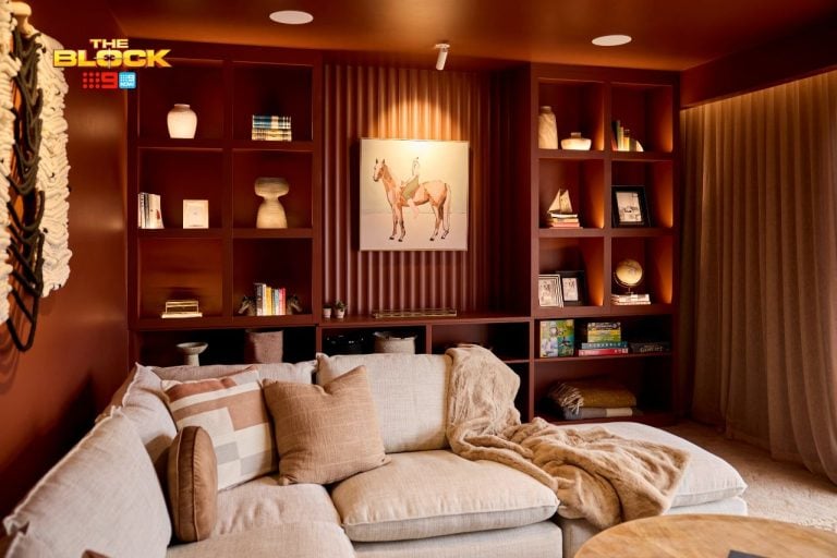
The Media Room was A Beauty
It’s everything I expected from Luke and Jasmin; it has that easy, bright and effortless sense of luxury that their other rooms possess. It was quite full but it didn’t feel too stuffed. It was a nice multi-purpose zone that felt calm and inviting. I’d say pass me a wine and let’s put on a movie, but you know nobody’s allowed to eat on that furniture! Best diet ever.
The sofa was beautiful, the art was lovely, and the styling was on-point. Sure, the drawer was an issue (not that a drawer affects a sale), and I agree plantation shutters would have looked way better. But really, we’re clutching at straws here. I can guarantee you that a buyer would open the sliding barn door to this space and feel emotionally drawn to it; chequebook at the ready!

The Bedroom Was Less Impressive
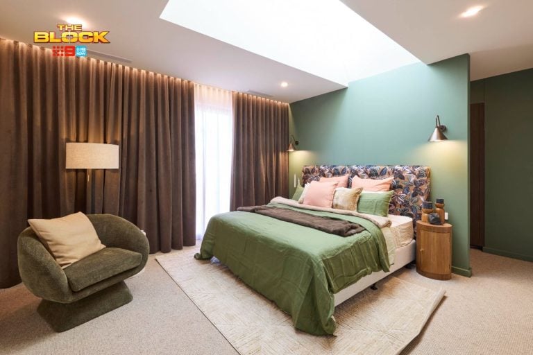
What caught me off guard was the sage green walls. Now don’t get me wrong, sage green is the colour of summer 2021 – you heard it here first! I’m not mad at the colour, I just feel it strays from the white-oak-brass colour palette Luke and Jasmin have become known for this season.
The VJ panelling was glorious, but a different colour would have been better, just for consistency’s sake. I also would have liked to see a larger, upholstered headboard and beefier bedside tables. It all feels a bit small and a bit shy. I wanted pendant lights, I wanted more drama. I don’t think this rooms emotes like the media room does.
I’m just not blown away, but I know Luke and Jasmin have it in them because they’ve done it several times before.

Jimmy and Tam Came Last
I know I’ve been hard on Jimmy and Tam this season, but I always come at it from a buyer perspective mixed with a design perspective. I work as an interior designer in Melbourne, so trust me when I say that clients do not ask me for some of the wacky things they have delivered.
This week, they stayed true to form in delivering spaces that I don’t believe a buyer will want. I say this from both aspects I just mentioned above, but let me explain why.
The Media Nook Was a Bad Idea
There’s just not enough room in this space to even call it a media room. It is indeed a nook at best. Even if the TV was hung lower, you’re still too close to it. It doesn’t feel luxurious for that very reason; it’s all too cramped.
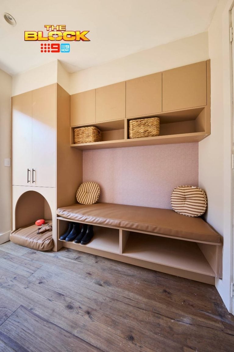
A study zone here would have been far more appropriate. There are two kids bedrooms on this level, so an ample homework space would have been smart. The bedrooms themselves aren’t large; remove the single desks from them to free up space and give the kids a dedicated area to study in.
Even if Jimmy and Tam plan on creating a study zone in their studio space, I would still have a homework zone for kids where the media nook is, and let the studio be a workspace for adults. They’re not thinking about the buyer at all, it seems.
I mean, their living room downstairs is miniature, and then you come upstairs to this even tinier version. It’s just not a smart approach.


The Bedroom Was Better
I don’t particularly like the wallpaper on that wall behind the bed. It only draws your attention to the narrow nature of the room. This is another space that, like Luke and Jasmin’s room, felt too small and shy. The bed, bedsides and lighting could really be amped up here so it exudes more luxury. It’s a bit basic.
That said, at least the two rooms on this level speak to one another stylistically. The wallpaper in both bedrooms connects them, it creates cohesion. It’s an aspect I can appreciate even if the styling isn’t my kinda vibe.
Also, thank you to the amazing Neale Whitaker for the best insult ever about those dead flowers on the bedside table. What was the saying again? “Funerial in its ugliness”? I’m obsessed.
What did you make of The Block 2020 remaining upstairs room reveals? I’d love to get your thoughts on all of the spaces in the comments section below.


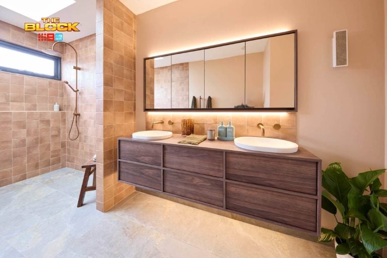
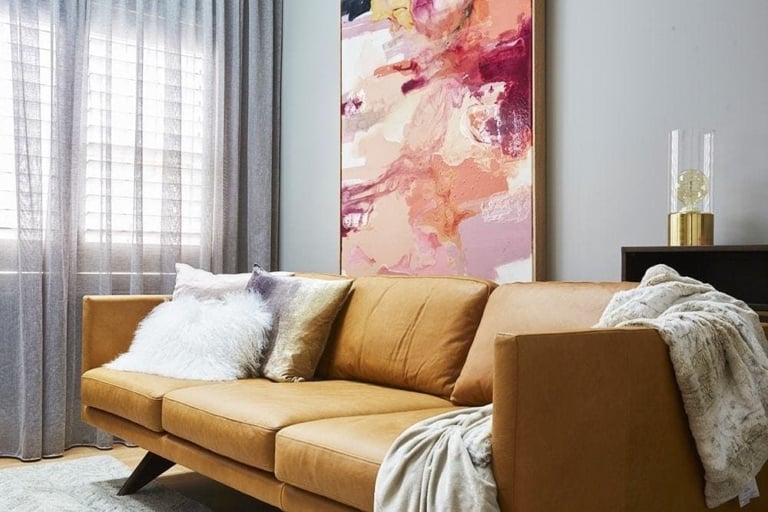
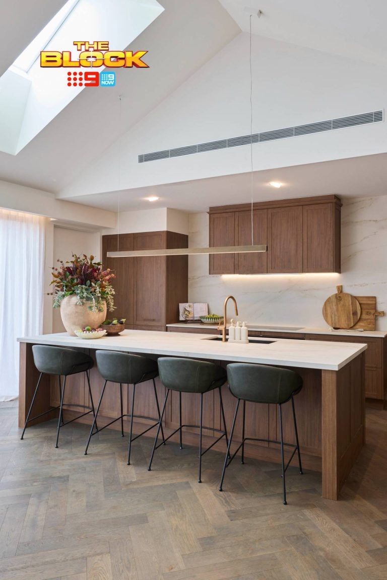
It’s probably just me but I wish they would talk more about design, colour, products, trends – something I can learn from, use myself, get excited about – so far this season I’m a bit meh and I am pretty sick of the manufactured drama – more good stuff required! And I totally agree with a comment above – I usually have a very long list of must haves after watching the Block – this year my wallet remains safe!
I live in regional Queensland in a town who’s water supply is just holding at 12% capacity and with tight water restrictions that have been in place for over 12 months. I shudder when I see the huge baths and enormous shower heads that have been installed in these homes.
Does Melbourne think it will be exempt from climate change. We all need to adjust our lifestyles now to help the planet. How much electricity will be required to keep these open spaces cool in summer and warm in winter.
Just saying.
I was so happy Neale Whitaker put the kybosh on those ugly dried flower arrangements, just awful
ISO uninspiring. Your wrap-ups are far more entertaining and insightful than the show !! Thanks for keeping it real Chris 🙂
Luke & Jasmine media room was best for me however totally agree I’m fatigued by this season. With next year being 17th season… I feel they need a little break or show new inspiring spaces!
Totally agree Chris
This years Block rooms need more colour. They seem safe, nice and neutral without any real wow factor. I like them but I don’t love them. Sarah and George deserved the win, but it wasn’t my favourite this week.
Agree with everything you said Chris……it’s still showing here in Qld and I’m bored!! Not even that concerned I know whose won!! Kinda obvious that would happen. I liked “parts” of each space, but not a whole space of any house. If that makes sense. I thought this whole series as been “meh”….I’ve not connected with any house or contestants. And I normally love The Block!!
These contestants are amateurs with no design experience, and it shows. Apart from Luke & Jasmine, there is no continuity in these homes with odd pieces of furniture thrown in to fill up spaces. I can’t imagine buyers wanting to part with such large sums of money only to have to redo rooms. Unfortunately, I don’t feel a connection to any of this year’s contestants or houses. Maybe Filming in a different state would add some interest to the program.
The block this year is underwhelming, no omg or even I like that moments. I cant imagine who would want to buy one with their two bed flat sized living areas. Most of the bedrooms look like an Adairs showroom. Disappointing.
This whole season of the block is SO uninspiring. I usually have a Wishlist as long as my arm after room reveals but this brief has provided a lot of mis matched ugly rooms.