[tps_header]The Block 2016 is back in full swing. And as with all seasons of the show, you know I avoid all the drama throughout the week. For me, the Sunday room reveals is where it’s at, and this week the focus was on bathrooms.
The one general piece of feedback I have here, after seeing all of the spaces, is that so many of the teams were trying way too hard. There were so many ideas packed into the one room (in three out of four bathrooms, at least) that the good elements in the space were almost lost.
There were some divine design moments and some truly diabolical ones this week. You know I give the sugar just as much as I do the medicine, so let’s take a closer look at each space, in order of scores from the judges.
Want to know more about The Block? Read our ultimate guide to every season!
The Block 2016, Week 1 Bathroom Reveals
Julia and Sasha’s Bathroom
It’s nice to start off the season agreeing with the judges. Because Lord knows it won’t stay that way for long!
As you cast your eyes over the imagery above, you’ll have to agree that Julia and Sasha approached their bathroom design with great restraint. There’s a fair few luxurious elements here but they’ve executed them carefully, so it doesn’t feel gaudy.
The choice of dark cabinetry for the vanity makes it the focal point of the space, and the brass handles were stunners. The brass is continued throughout the room to make the whole space feel cohesive, and they were also very wise to carry the floor tiles all the way up the wall. It makes the entire shell of the room a supporting player in the space.
Both the recess in the wall beside the bath and in the shower are giving me heart palpitations in the best way possible.
This bathroom is a showstopper if I ever saw one. The coloured towels are out of place, but I’m sure they had little choice considering they were supplied to the show.
Karlie and Will’s Bathroom
The biggest problem I had with this space was the styling, so I guess that’s not a major issue because you could easily strip it all out.
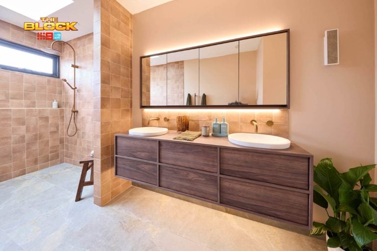
Karlie and Will chose wisely with the vanity top. The wood gives the space a grounded, organic feel. The wall and floor tiles continue that vibe, so they get a thumbs up for that. The pendant lights were also pretty divine, albeit they started to break away from the organic nature of the space.
The brass tapware was unnecessary here. They needed to decide if they wanted to go earthy or glam, not both. The combination of rose gold tapware and then black tapware in the shower was an odd choice. Not sure what happened there, but the room feels a little confused.
Too many ideas in the one space here for me. They needed to strip it back a bit. The room was styled within an inch of its life, too, making it feel cluttered.
Ben and Andy’s Bathroom
I actually thought Ben and Andy should have come second, because their concept was far more realised. They looked to be going for a subdued and organic bathroom and they nailed it, avoiding all of the many bells and whistles Karlie and Will packed into their room.
This bathroom, for some, will be accused of being boring. But I think this is tranquility as its best and feels somewhat effortless. The floor tiles and the vanity were winners for me, and I loved that they kept the styling simple too. The pendant lights were also divine.
The major pet peeve I have here is the windows above the basin. I know they can’t control where the windows are, but they needed to lay the room out differently. Nobody wants to shave without a mirror in front of them. It’s just a basic functionality issue that they needed to better consider.
Kim and Chris’ Bathroom
There were some nice design moments here but sorry – THOSE HEXAGONAL TILES! They are hurting my eyes in ways I’m not sure they’ll recover from. Nobody will be able to convince me that this is a hot-to-trot bathroom trend. It’s an eyesore and needs to be removed immediately.
With that gone, it’s not a bad bathroom. That’s not exactly how you want your room described, I’m sure, so they needed to push themselves a little further here.
The mirror seems quite humongous in the space and there’s not much going on in the way of styling. The turquoise is out of place, but again… they were probably slim pickings for towel options.
Dan and Carlene’s Bathroom
Oh Lord. What on earth is going on here? This perfectly illustrates my point at the start of this post about trying to cram too many ideas into the one space. Where do your eyes go first? Mine are darting around everywhere. This space reminds me of an old train station. If Liza Minelli designed it.
The floor tiles are sublime. I think we can all agree on that. If they allowed them to be the focal point of the space and stripped everything else back, we’d be heading in a good direction. But they then raised the floor. They then put in a black gloss tub. They then decided to put a black feature tile scenario in the shower, teamed with brass accents. And then, they threw in a dark brown cabinet for good measure.
My word. The whole thing is just too much.
The Block 2016 Week 1 Slideshow
[/tps_header]


