Crack out the Kleenex and cue the Adele; The Block 2021 front yard reveals marks the last of my judging this season. Next week I’ll be doing a ‘best and worst moments’ from this year’s room designs, but after that it’s adios for another year of critiques.
Seeing the show’s front yards each year is actually quite the eye opener. It’s not until you see the first impression of the homes that things either make sense, or they solidify some of the WTF moments you questioned inside the properties. There was a little from both categories this week.
I have to say, the team I expected would blow me away did the complete opposite, so at least as we reach the home stretch there are still surprises to be had. That said, at least none of the front yards were as bad a last year’s effort from Jimmy and Tam. That zone will continue to give me night terrors.

Mitch and Mark Came First
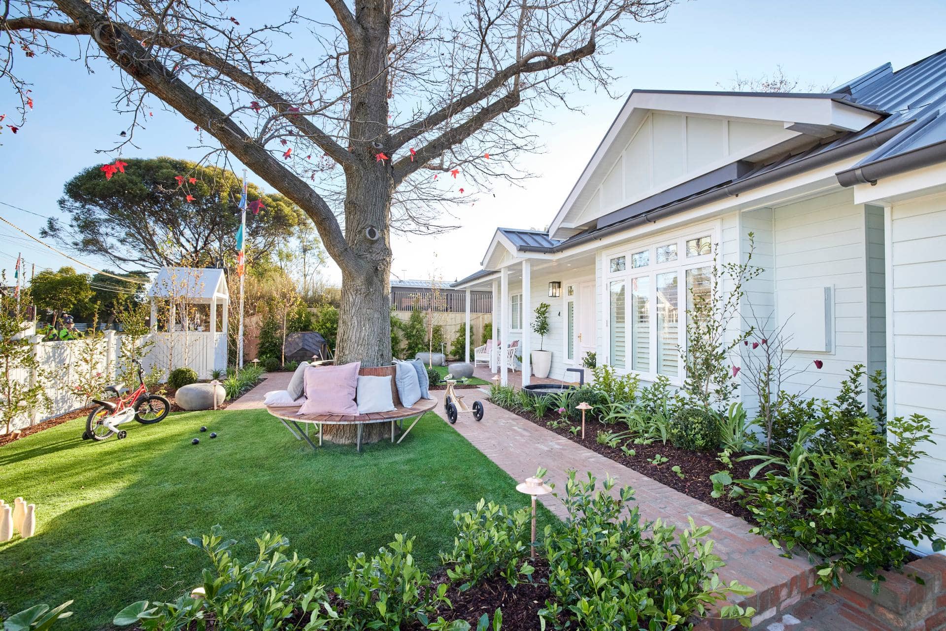
I have to admit, I feel a similar level of enthusiasm as Shaynna about this charming front yard from Mitch and Mark. I don’t have kids, so I’d be chasing the Uber Eats driver around the tree (“gimme my pizza, b*tch”), but it is very worthy of the praise the judges awarded them.
The zoning is quite lovely here, and you want that in a yard of this size. You have a pocket for sitting, a pocket for play, enough grass to roll around on, and a path that takes you on a journey toward the front door. Mitch and Mark have made a few blunders this season, but this yard isn’t one of them.
The tree is a genius move and does ground the scene. I also love the idea of a place for kids to play, but to be fair that trampoline is way too close to the faux rock seat. You’d need to have a first aid kit stored behind it at all times, ready to deal with impending concussions.
It Isn’t All Good Though
While there is a tonne to gasp over in this yard, the artificial grass is a killer. You know I love me some fake plants, but there’s a cheapness to this variety of greenery. It’s too bright. In a yard that feels like it’s been there for years, the grass stands out.
And if it’s not fake (I don’t have all the details), I’d say it’s the wrong variety. The entire exterior of this property is so soothing and charming and nostalgic. Neale is right about the heritage feel. But then you have this bright green hit you, and it’s cheapening the entire vibe for me.
I also have to disagree with Shaynna re the front door placement. Seeing the yard only makes me even more convinced the front door should have been closer to the garage door (near the internal staircase, behind the kitchen).
All in all though, a well-deserved win and definitely the best facade of the five.
Kirsty and Jesse Came Second
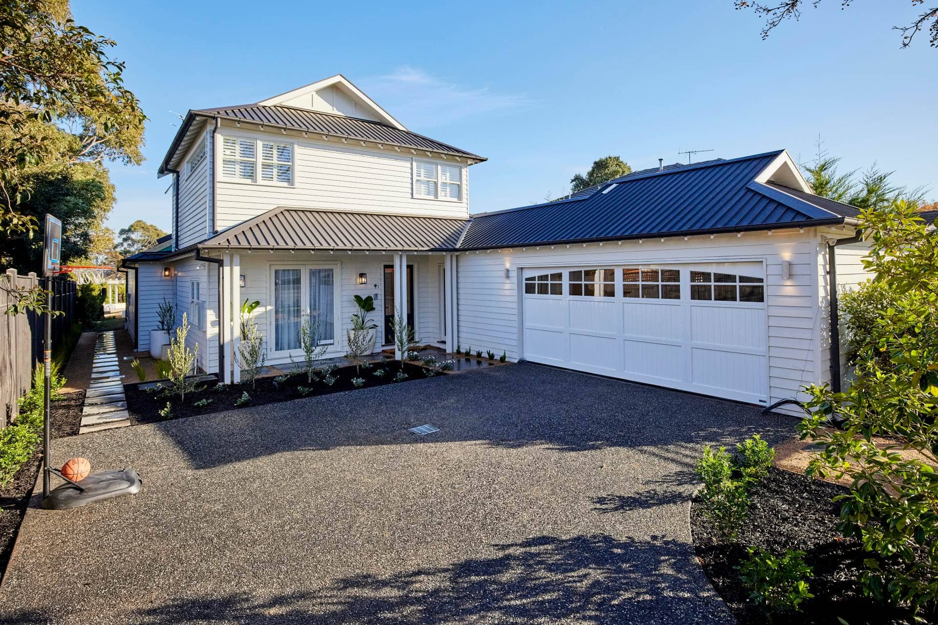
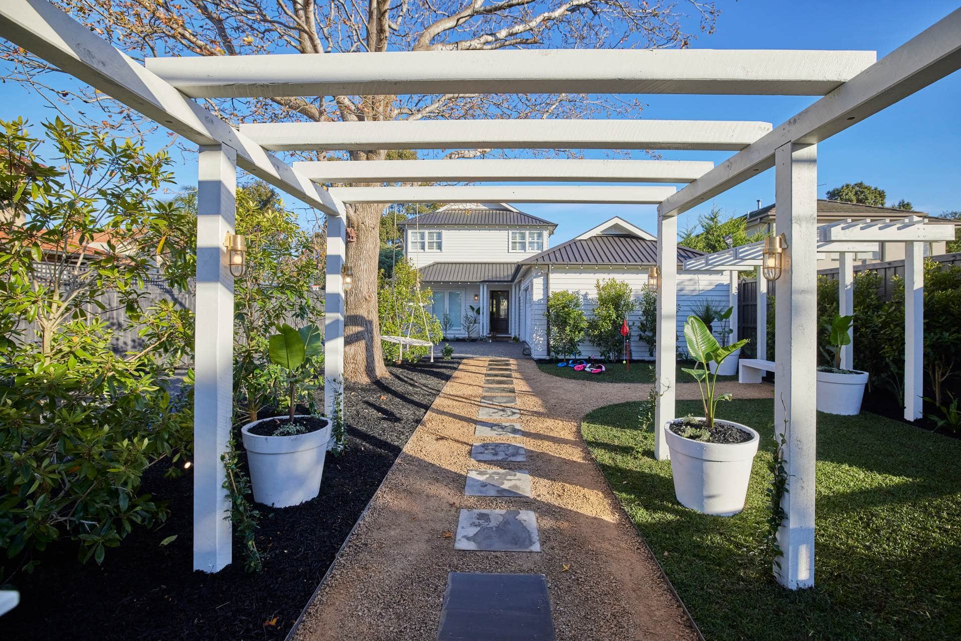
Kirsty and Jesse had a mammoth front yard to work with, so they did well to create pockets using paths, arbours and greenery. It certainly has a charm to it, don’t get me wrong. And like with Mitch and Mark’s, I love that it feels like it’s been there for years.
You know there’s a but coming though. And it’s a big butt. A Kardashian variety, if you will. I sadly must admit that I don’t fee like the exterior matches the interior, and that’s a problem.
These two came into the competition with a Hamptons intention for the home, and I have loved seeing that play out in the kitchen, the bathrooms, even the bedrooms and living zones. There are subtle nods to it, there are obvious nods to it, and it’s all come together quite beautifully.
In this yard though, I get none of that. Apart from the roller door, this facade has no distinct style, and that’s disappointing for me. Some soft greys and some moody blues would have been amazing on the facade of this home to have it read as more Hamptons.
It Also Feels Quite Hard and Dry
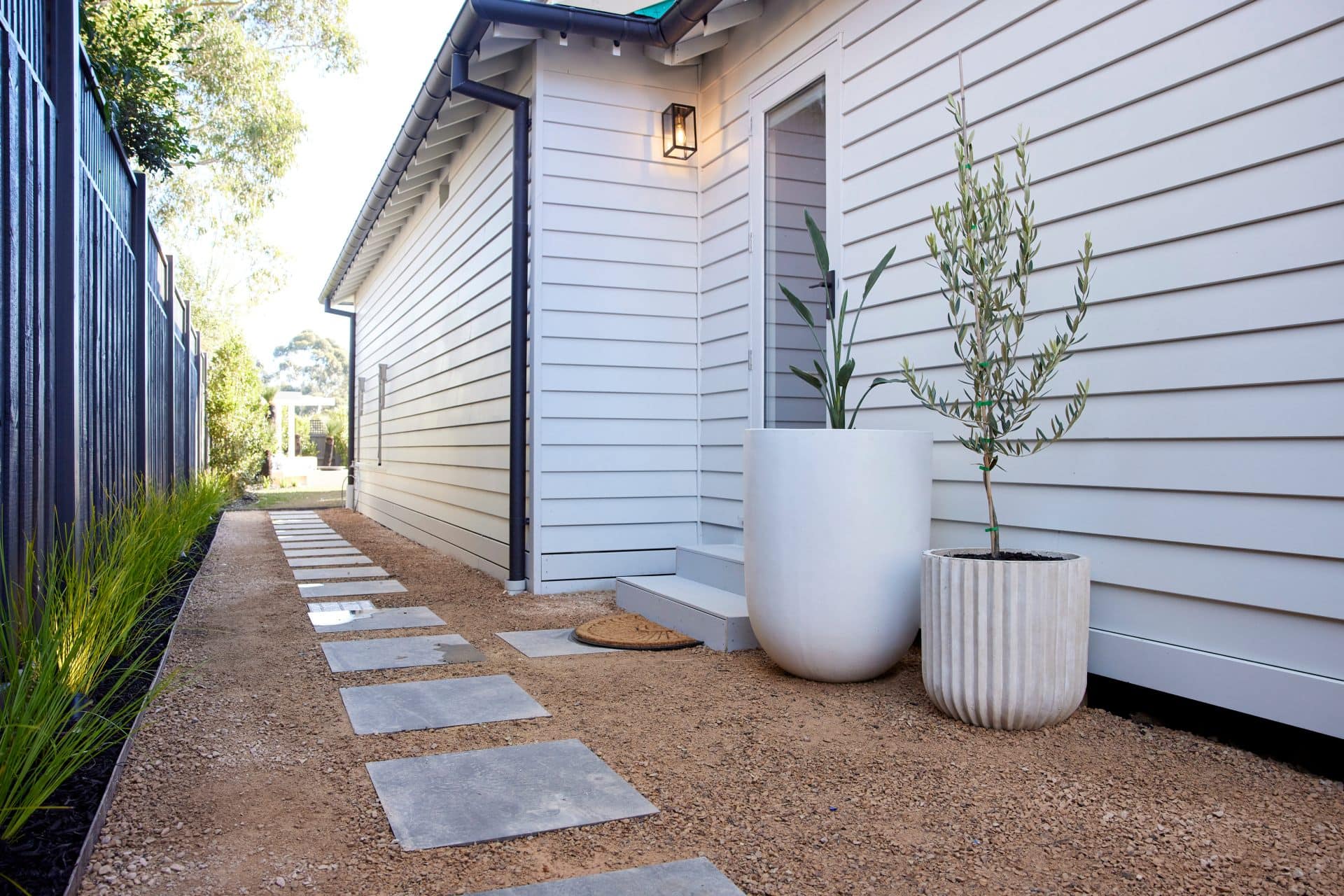
The other issue I have with this yard is that I get no softness or comfort from it. There’s so much space to work with, that it seems almost criminal not to have some soft seating, some layers, a level of comfort that you could curl up and relax in.
As it stands you have a rock path leading you to a metal bench. I’m almost 40 and I already want a cushion to sit on and some back support. There’s nowhere for adults to comfortably sit. It’s such a contrast to Mitch and Mark’s, where you have multiple spots to unwind in.
Sorry, but to call this the greatest house ever on The Block is a stretch for me. A yoga size stretch. A downward dog of a stretch. The yard has gravel and grey pavers as one of its main features. I’m dry and dehydrated just looking at those paths.
Sorry guys: love the internal of this home like I love cheese and wine, but the facade is not giving me chills and thrills.
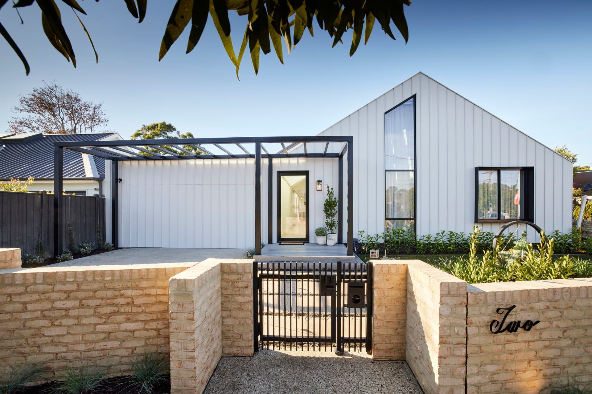
Ronnie and Georgia Came Third
My internal dialogue is whispering, soften your feedback, don’t go in hard here, don’t make major declarations that might offend. But I can’t find any other way to say how unappealing this front yard is. I’m truly, truly shocked Ronnie and Georgia delivered it.
There’s a lot to unpack here.
Firstly, the connection between indoor and out is non-existent. There’s nothing in this front yard that gives you a hint of what’s to come when you walk in the front door. The beauty of Ronnie and Georgia’s bathroom, living and dining, or even kitchen, is not reflected anywhere in this zone.
It’s more brutal that Gordon Ramsay, let’s go there. The Colorbond cladding around the entire facade; imagine the glare that would come off of it on a sunny day. You’d need SPF 50+ just to walk near it. Not to mention how hard it makes the home appear.

A Lack of Material Mix is the Issue
A successful facade needs a mix of materials, and this has one. The garage door could have been a moment to mix up the material, or at the very least the colours. Stark black and white here is just too much.
The brickwork around the front gate is thankfully giving your eye one safe place to rest, but it’s not enough. In fact, because it’s not reflected anywhere closer to the front foor, it doesn’t look at ease with the Colorbond at all.
It’s like a shiny and new thing sat beside an old weathered one. This zone is the Leila George and Sean Penn of the street. And it pains me more than impending bee stings to say it because the inside is so good.
Can I also point out what putting 465 skylights in your ceiling does to the exterior of your home? Take a look at the image above. The skylights viewed from the outside only make the property even more brutal. And the entire front door made of transparent glass? I can’t.
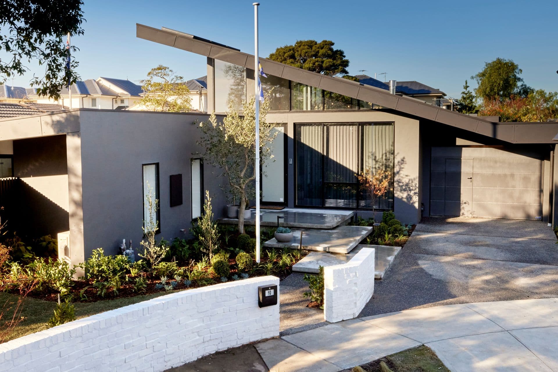
Josh and Luke Came Fourth
Josh and Luke did a really solid job here. I think they should have scored more than Ronnie and Georgia, that’s for sure. In fact, I see both home facades as having a similar vibe, with strong angles, monochromatic palettes and some harshness. But Josh and Luke did it better.
There’s a softness and contrast here that I like. It feels quite moody but lush. The steps going up to the front door make an impressive statement, and I love that they look like they’re floating. However, when you get to the door itself, like with R&G, there’s no coverage overhead.
There’s an issue for me around the front door and window that needs resolving. It feels too bare and unfinished. Perhaps a flat line of horizontal roofing over that section is the answer.

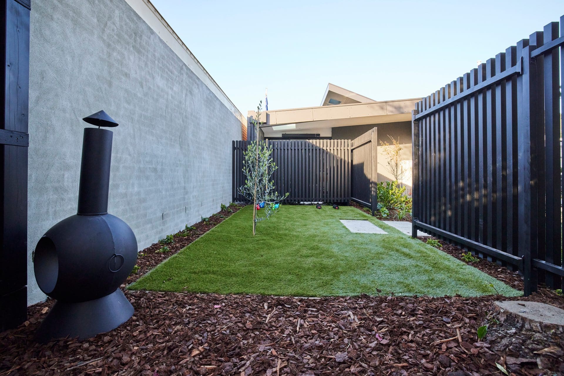
Let’s Talk Bricks and the Side Section
The white bricks are an issue, I have to agree with the judges there. I just want them to be grey, a few shades lighter than the home is painted. Then it would be a nice colour story of black, charcoal and light grey with green softening it.
The outside of this home does connect to the inside. It’s something that two other teams failed to create, so I have to give them props there. Colours, materials and vibe in this yard all tell me what I’m going to get when I walk inside. So that’s a win.
There is something off about the side part of the yard, there’s no denying it. But all it’s crying out for is a fire pit and some built-in seating around it. They had a fire pit in the backyard, but I see this green patch in the front yard where you go for an intimate gathering.
Let the backyard be pool zone and fun summer vibes, and make the side part of the front yard the intimate escape where you sit around the fire and have some wine.
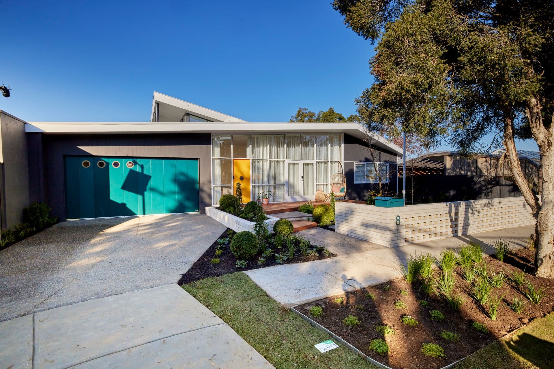
Tanya and Vito Came Last
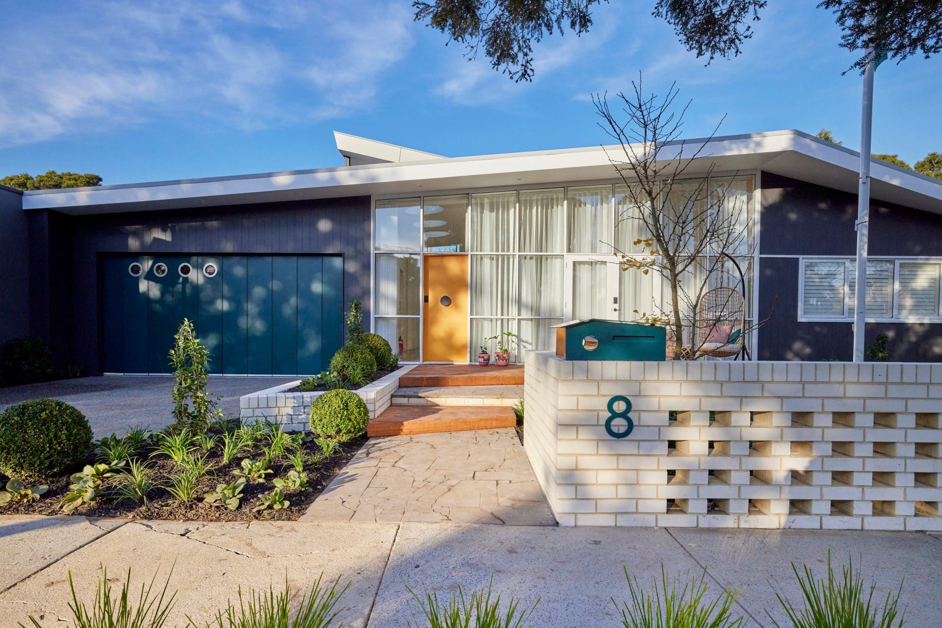
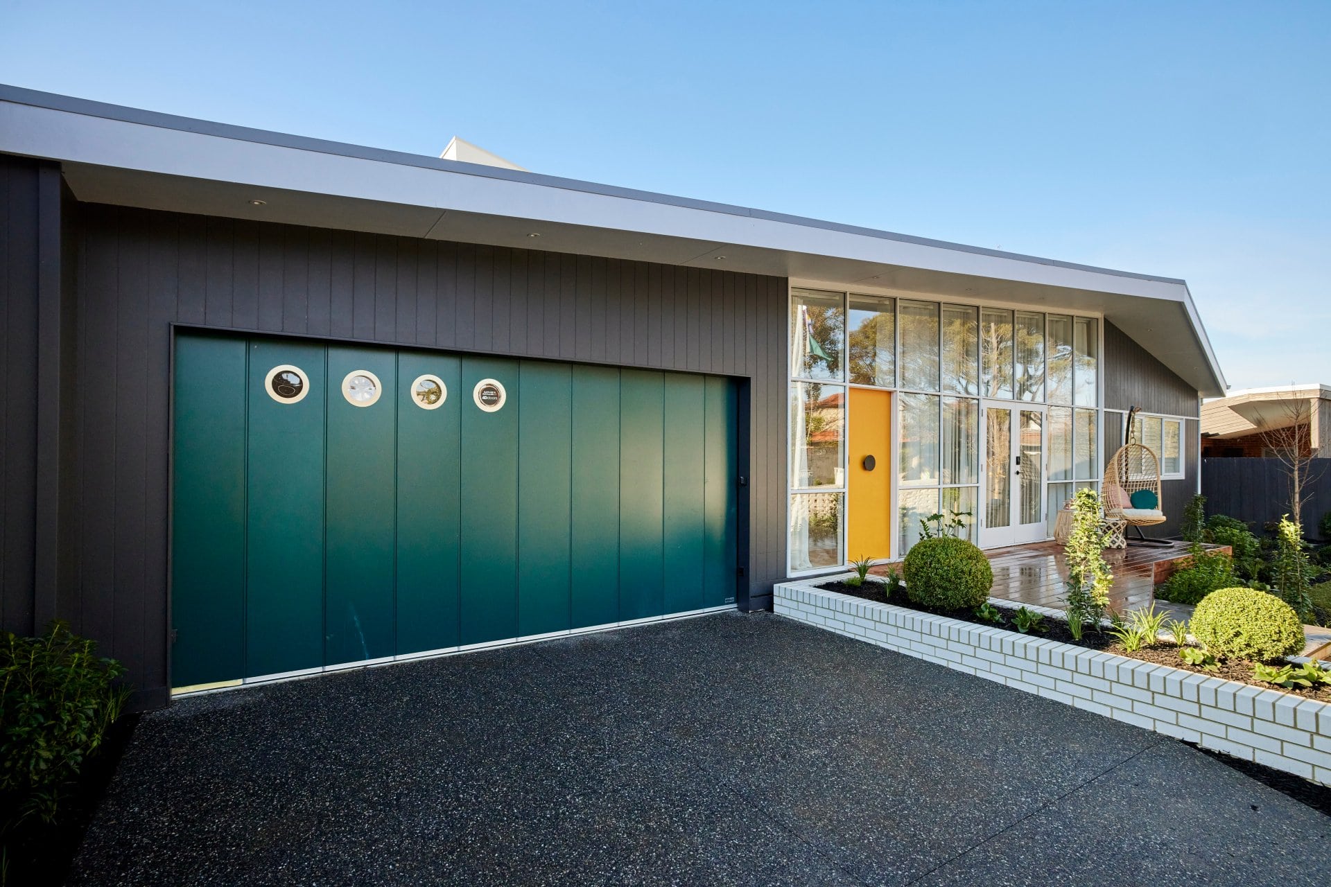
OK, so let’s ease into this one. I’m going to start with some positives. And that, without a doubt, is that you know what you’re getting when you walk in the front door of this home. It screams at you from four streets away that it’s unapologetically mid-Century.
And that’s a good thing. If you happen to love this vibe, at least you get consistency and cohesion. It’s not like Ronnie and Georgia’s where you think you’re entering a tin shed and actually walk into a soft indulgent design dream. So for that, I say, good on you T&V.
Now, real talk. To play opposites with Neale, ‘over the top kitsch’ is indeed how I would describe this facade. It reads like a TV set. There’s a faux feel about it, a lack of authenticity. Is it giving me The Brady Bunch set? It’s something like that anyway.
It doesn’t feel at all at home in a suburb like Hampton. In fact, your neighbours, who I imagine are Prue and Trude from Kath & Kim, would be petitioning to the local council to have you paint the doors of this property. And paint would indeed help the situation.
Some Tweaks Would Help It
If you painted the front door and the garage door in more neutral tones, it would be a huge help in having this home feel more like a nod to a style as opposed to an over the top reference. It’s how I feel about a lot of the design choices in this home, actually. Less would be so much more.
The shapes and angles are nice here. The brickwork is nice too. There are some good features to admire, but you don’t get a chance to take them in because of the colour choices. The cracked paths, and the fact that the front path has a break in it is also odd.
The amount of glass around the front of the home doesn’t feel resolved to me, and I have to agree with the judges around the lack of seating and comfort. But all is not lost. They just need to tone it down a bit.
What did you make of The Block 2021 front yard reveals? It’s your second last chance to tell me what you thought this season. Drop me a comment below and share your thoughts and feelings.
See more goodness from The Block via The Block Shop and nine now.


I love the block watch it every year. Didn’t like the bitching all the time but I suppose that’s what they think sells the show. Found too much favouritism which I didn’t like and treat everyone equal i thought josh and Luke did well even though messy at times they put their heart in it. Good luck guys on the night.
Mitch and Mark’s front yard was a absolute standout. Very soft and homely and deserved the win, way above any other property.
The remaining properties were nothing special.
Come on Ronnie and Geogia house looks like a shed, hang on I have seen sheds that at 10 times better.
Your right fake grass what a joke.
I didn’t agree with judges on Luke &Josh’s front yard, I genuinely love the boys home I don’t find it masculine at all. Ronnie & Georgia needs something over that entrance. Love Mitch & Mark’s . Don’t get me started on Kirsty & Jess they wanted that home all they have done is winge about how big it is , state the obvious, also how much free help did they get
Ok, so I’ve not watched even a second of this year’s Block as I usually have more entertaining things to do with my time – cleaning tile grout, or poking sharp objects in to my eyes – but, as a gardener, I tuned in to see the front garden reveals. What a disappointment!
Mitch and Mark’s : Shayna ooohed and aaahed over the aluminium fence like she’s never seen one before, and Neale gushed over how it’s never need painting – Wow!, let’s just line our interior walls with it, and throw away paint brushes forever! Sorry, but aluminium fence’s are great for prison yards and that’s about it.
Kirsty and Jesse’s : If that’s the best house that has ever been presented on The Block then I’ve obviously been missing nothing up until now.
Ronnie and Georgia : I love tin sheds – out in the country where they belong,, down the back of the garden and well hidden from view, but right next door to me? Nup…
Josh and Luke’s: : Three concrete slabs does not a garden make…
Tanya and Vito : The original house on the site was mid century, and while they’ve stayed true enough to what was always there, other than dad’s great front fence, the garden style has no relevance to the house.
I give them all top marks for giving back something more to the street than a 6 foot high brick fence – but I’m left wondering what all this seating and play space is actually for. People aren’t seen in their front gardens anymore – the remote controlled garage door lifts, the car goes in, and the door closes behind them. End of story…
Worst block ever. Not sure l can describe it any other way. The twins should have won front yard. I’ve been saying for years now why don’t landscape designers judge the landscape weeks? Also if they can get landscape help in their design then why can’t they get interior design help.. dumb rule. Need new judges for the whole thing.
How have I missed your commentary all season? Finally someone who is writing what I’ve been thinking. Thank you for not holding back on R&G’s sad attempt at an outside (were they just tired from last week?) and your landscaping ideas are spot on. Keep them coming!
I agree with your comments about Ronnie and Georgia’s Facade. It looks like an aircraft hanger to me. Timber would have softened it and made it much more appealing. As for the beehive. All I keep thinking is anaphylaxis. I would be too scared to walk in the front yard. The neighbours will also be warning their kids to stay away.
Loved Mitch and Mark’s, good win.
Did the twins need to be quite so rude and petulant? Appearing on two reality shows does not give you better credentials than three experienced designers. Suck it up and grow up boys!
I agree with.most of your comments- but there is nothing at all that I like about Tanya and Vitos house- I absolutely h a te the house, the decor and the styling