The Block 2021 laundry and hallway reveal just went down, after seven days of what the teams call ‘hell week’. If they thought it was hell week, wait until they read my critiques! And yes, the teams read my critiques because they contact me about them. If these walls could talk 😉
We have so much to discuss. From spaces that had me salivating to rooms that looked like dog grooming parlours, it was an absolute mixed bag of triumph and terror. I’ve put fresh drops of Visine Revive in my design eye and cast it across each zone, with no stone left unturned.
Read on I tell you the truth about each of The Block rooms from a design perspective, and let me know what you thought in the comments at the end of the read.
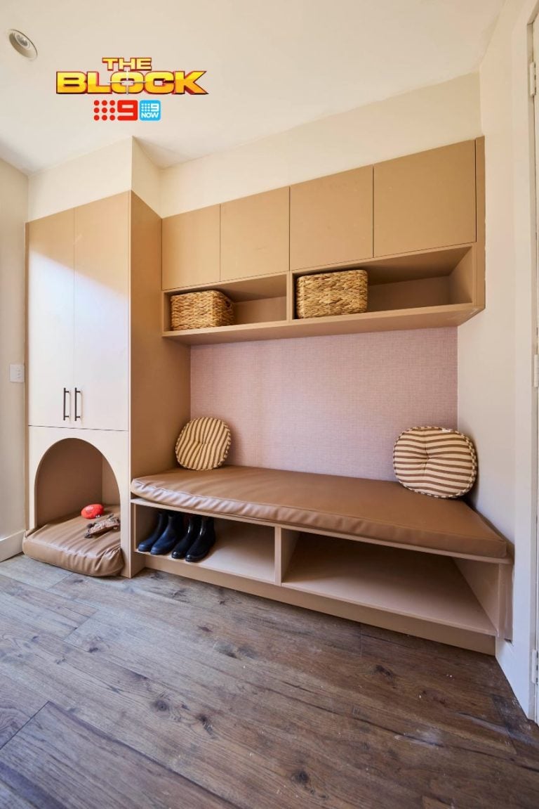
Kirsty and Jesse Came First
The Hallway Won’t Return My Calls
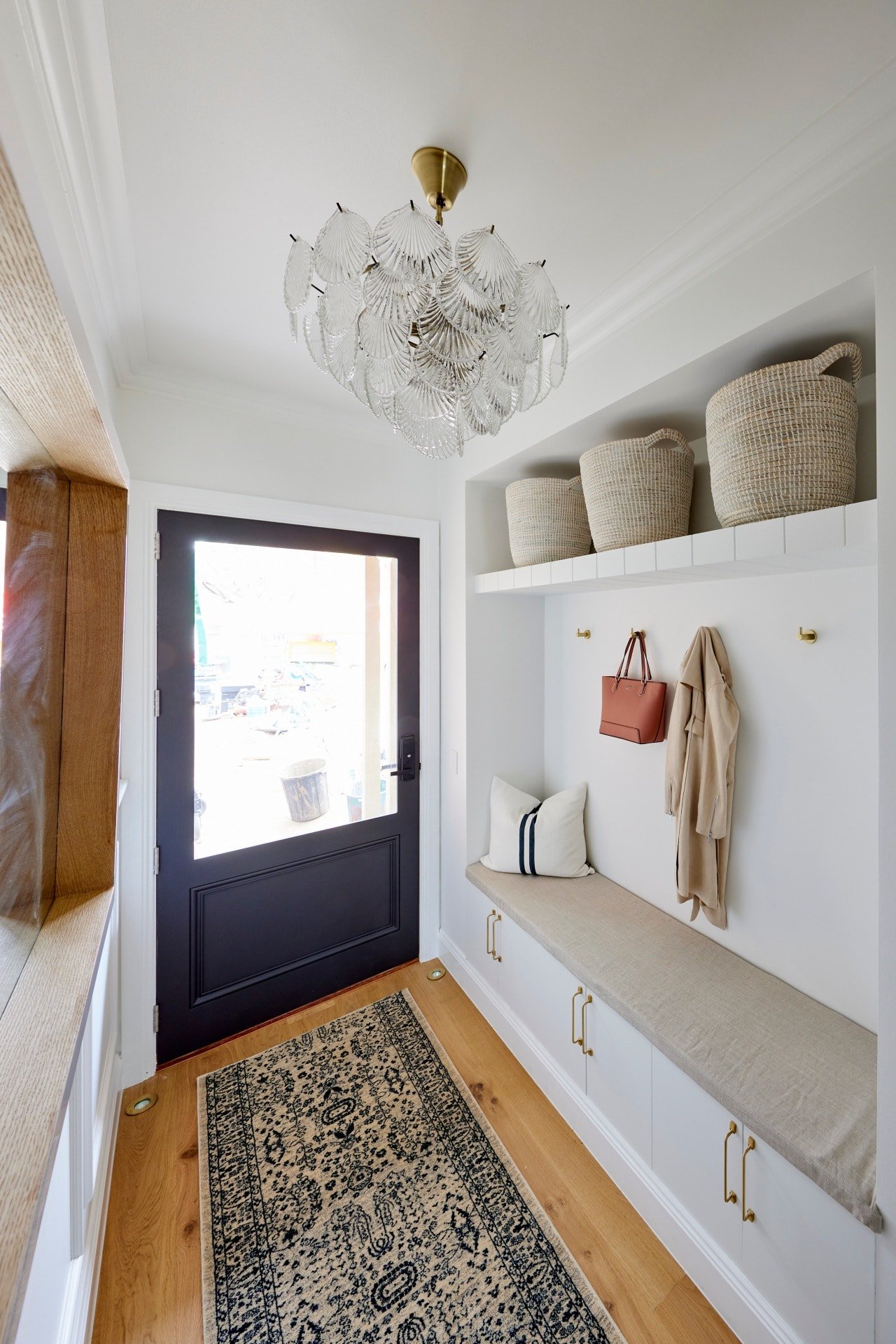
There must have been a stocktake sale at Runners-R-Us this week because almost every team went bananas on them. The truth though, is that Kirsty and Jesse’s floor runner is the only one that works. It features a delicious pattern that will hide dirt, and it works beautifully with the vibe of their home.
The entry zone in this hallway is everything. The sun, moon and stars. It is the whole enchilada, the bag of potato chips, and the bomb.com. It delivers everything you could functionally wish for, and is packed with charm and warmth. Even the pendant light, which I wouldn’t ordinarily like, is a stunner.
Their bedrooms aside (didn’t love those), these two are indeed on the best trajectory the show has seen in years. Neale is right there. I said early on, once they revealed their bathrooms, that they were onto something, and they’ve proved it. Room after room is delivering the unexpected.

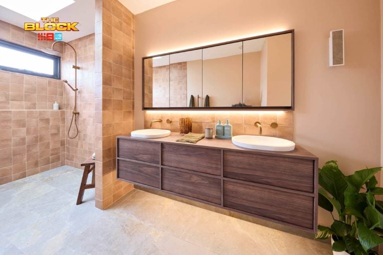
The Powder Room Has Me Baffled
I spent a long time looking at this powder room, like the meme of that woman with the mathematical equations roaming around in her head. Like 14 year old me seeing a Manpower Australia poster for the first time; I shouldn’t be aroused, but I am!
Something about the combination of the brass and the dark grey shouldn’t work, but I feel like it does. That’s why I’m so conflicted and confused. My mind is telling me that the tiles in the shower zone are too much on all three walls, but then the other half of me feels like this is some level of newness I truly appreciate.
To quote Kath Day Knight, I am on confused tramp. Help me out here. Is it stunning or is the grey too heavy? Maybe if the VJ panels were tiles, I would have taken the grey tile just halfway up the wall in the shower. It feels a little off-balance. But I could be wrong.
I’m also amazed that they got all of this done in one week, and to such a high standard.
The Laundry is a Gorgeous Sister to the Kitchen
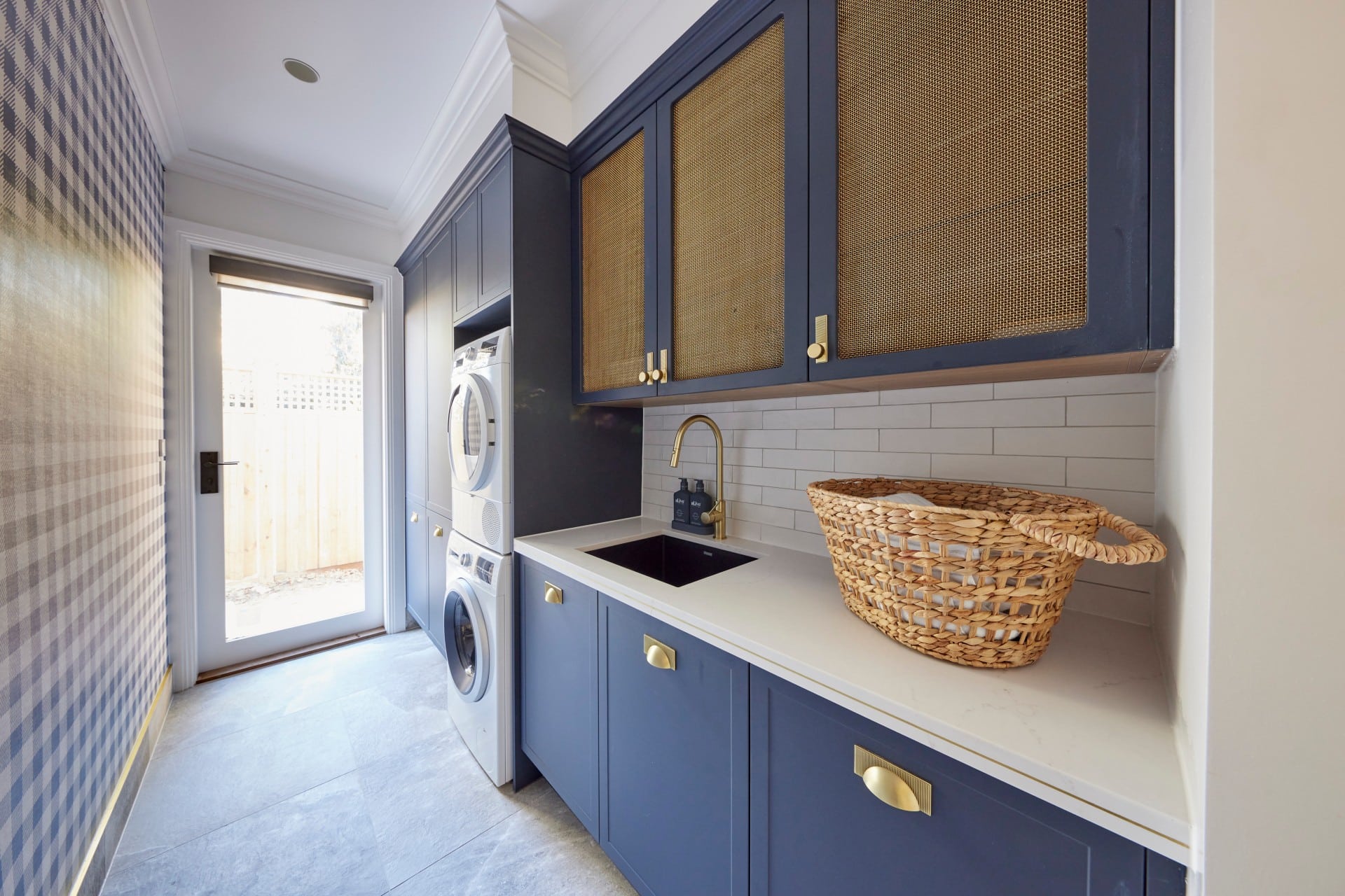
The laundry is lickable from top to bottom, there’s no doubt about it. I always say that kitchens and laundries should speak to one another stylistically, so they get points for cohesion. I do fear they are a little too same-same though. You want the rooms to be sisters, not twins.
A different wallpaper would have helped. The gingham was a show-stopper in the kitchen, but doing it here means you see laundry first and then by the time you hit the kitchen it feels like there’s no element of surprise. I want the laundry to be the supporting player; a quieter version of the kitchen.
Outside of that, I personally hate washer and dryers stacked one on top of the other, but it’s quite a common approach so they lose no respect there. Everything else in this zone is just pure joy and rapture. They deserved the win this week for sure.


Ronnie and Georgia Came Second
The Hallway Was Not Giving Me Wow
I must admit, I didn’t gasp like the judges when I saw this space. I actually thought, “Good God that’s a long hallway”. It’s reminds me of the gauntlet on Gladiators where Vulcan or Tsunami (or whatever their names were) tried to stop you getting to the other end. This challenger is not ready!
The different-sized art I did not enjoy. I want the uniform feel of a cohesive collection in the same size leading me down the hall. And while I’m utterly obsessed with the first artwork above, I feel the style of the second one depicting the female has been overdone a little.
The console overlapping the 45-metre hall runner is triggering my designer OCD. A runner isn’t even needed in this hallway, and will get dirrtier than Christina Aguilera circa 2002. Ladies: move. Gentlemen: move, I need to roll up the runner before the kids drag in the mud.
On the plus side, this is actually a space where I fully welcome the skylight overdose. An entry and hallway is a transient space that can take lashings of heat and sun without effecting your comfort or needing to be closed off. So here, they work and give the zone an ethereal feel.

The Laundry Turned Things Around, For the Most Part
When I first saw the images of this laundry from Ronnie and Georgia I thought, oh no they didn’t with regard to a missing broom cupboard. But then the judges walked in and revealed it and everything was good in the world again. This is a space that not only looks impressive but will function well too.
There’s a beautiful sense of cohesion as you move from kitchen to butler’s pantry to laundry. It’s seamless in terms of its appearance and all three spaced feel like one delicious zone. While I didn’t love a few spaces in this home, I adore the living zones immensely, and so will buyers.
One issue comes into play for me though, and it’s an issue they can’t fix now: laundry placement. I don’t understand the decision to put it where they have, so you have to walk through the kitchen and butler’s pantry to access it. It’s a fundamental layout fail I can’t wrap my head around.
In a luxury Hampton home, of this size and price, I don’t want a Lord of the Rings journey from bedroom to laundry every time I want to dump my dirty clothes.

Mitch and Mark Came Third
The Hallway Was a Quieter Moment
Judging hallways can a bit blah on The Block. It’s all too often just a white space with some art in it, and that’s pretty much what we have in Mitch and Mark’s zone. Unless you’re going to commit to textured or patterned wallpaper, along with feature lighting to really create some mood, it’s always going to fall a bit flat.
They tried to make something of it with the floor runner, but it’s too long and doesn’t really work here. It already looks filthy in the images above. Wait until the buyer walk-through.
I’m intrigued to see what comes of the glass floor though. I’m not going to form an opinion on it just yet. OK, so maybe it feels a bit gimmicky, but we’ll see. I don’t think I need a glass floor in my home. It feels a bit pointless. But I’m absolutely willing to be proven wrong. Let’s stay tuned.

The Laundry was a Delicious Moment of Divinity
Mitch and Mark deserve the win for no other reason other than the fact that they raised their washer and dryer off the floor. If I’m dropping millions on this home I certainly don’t intend to bend down to pull out my smalls. This is a genius move from a functional perspective and is very much appreciated. It’s these small things that make a big difference.
In terms of placement in the floor plan of the home, it ticks a box that Ronnie and Georgia’s didn’t. I love that it’s near the garage and back door and not far from the bedrooms. It just makes sense in this spot and gives the whole zone a mudroom feel.
I do hear what the judges are saying about the storage near the garage being in a different finish to the laundry cabinets, and have to agree. It feels like a bit of an afterthought and definitely isn’t as nice. It’s as though the laundry cabinets are Gladys and the other ones are Dominic (yep, I dish out political zingers now! See you on the next episode of Q&A).
All in all though, my fave laundry of the week.


Tanya and Vito Came Fourth
The Hallway Feels Rather Juvenile
I actually love the idea of a study nook in this zone. But sometimes, like when your relatives give you a cheap gift at Christmas, you realise it’s actually not the thought that counts, but the end result.
Let’s start with the doors, because they too are a great idea but they way they open is problematic. Sitting here with your kids coming in and out all the time will grate on you like the over-reacting on The Masked Singer. It also restricts where you can sit because you have to be mindful of the swing.
Glass cavity slider doors would have been better here, or make it a barn door so you have full privacy, and install a skylight above. This home has 84 skylights in nine different shapes and sizes, so one above the work zone would have been genius.
I also find the desk and shelving quite messy and impractical. Custom joinery with proper shelves and drawers would have been more successful. There’s something very juvenile about this zone. It needs to feel more sophisticated and adult.

The Laundry Is Giving Me Dog Groomer Vibes
I know Tanya and Vito wanted to ensure some continuity here. It does makes sense in that respect, that the hallway matches the butler’s pantry in terms of look and feel. But it is, much like their study zone, quite juvenile in vibe.
There is no sophistication in this room. And that doesn’t mean it’s bad design, per se. I don’t want to bag out their colour choices, because by all means everyone’s entitled to like pink cabinets with black accents. But the reality is, it’s not luxurious or up-market in look and feel. And that’s an issue.
In fact (and it pains me to say this), the space is giving me dog groomer vibes. I can see a puppy being washed in that sink. It’s the combination of the pink in that rather vibrant tone, with the black handles, and then the speckled terrazzo flooring. I can’t un-see the pooch parlour.
Sorry guys. Like I said, not bad design, but just not appropriate for this home in this suburb.

The Powder Room Raised a Bigger Issue
The powder room is 80% beautiful. The flooring works here, the wall tiles work here, I do enjoy the black toilet, and the basin colour is actually quite charming. I’m on board until the eyes hit the worst thing to happen to interiors since 60 Minute Makeover: that mirror!
It is the devil’s work. Pass me the holy water because we need to conduct a design exorcism. It’s really not cute, and has raised a much broader issue I have with Tanya and Vito’s home overall.
I feel like a potential buyer would walk through, and at first glance, love the quirk. But as you spend more time in each room the list of amendments and polarisation would just grow and grow.
Pink kitchen cabinets: need to change those. All the skylights: Can’t fix them. Powder room mirror: change that. Study nook: install new joinery. Bedrooms: carpet those. The list is getting longer and it’s really unfortunate because there are some good ideas, but overall it’s quite confused.

Josh and Luke Came Last
The Powder Room and Layout Flips Weren’t Ideal
It was hell week indeed for Josh and Luke, and it started the moment they flipped their living and dining room. This was based on advice from the judges, but this judge (the fourth and unpaid one) disagrees with this approach. The layout was not the issue, the size and scale of furniture was.
As it stands, you’ll walk in the front door and hit a dining room. A dining room that’s so concealed you can’t talk to anyone in the living room or kitchen. I feel bad for them because they don’t know what they’re doing and so they’re following advice in an attempt to make it right. But I don’t think the advice is right. I think they’re going from bad to worse.
The powder room is indeed too small. The vibe is nice, but it does remind me of Home and Away in the early nineties when Morag locked Sophie under the stairs. In other words (for those of you younger than me), it’s a zone you get sent to for punishment. A punishment poo is the only variety you’ll drop here.

The Laundry was Spectacular Though
This zone from Josh and Luke is the best room in their house, hands down! I love a dark vibe in a home, so much like their kitchen, the colour palette is a winner for me. Outside of looks, it was also functionally awesome and ticked all the boxes.
There’s oodles of bench space, loads of storage, a broom cupboard and open shelving. One thing I would have put in here, given it’s so large, is a second sink. The other laundries didn’t have them, but to be fair they were way smaller. This one would benefit from a second sink.
If you’re soaking something in one sink it would be nice to have another you could use right beside it. That’s the only criticism I have. Everything else is *chef’s kiss*
What was your fave hallway and laundry on The Block 2021 this season? Do you think the judges got it right? As always I love to read your feedback so drop all your thoughts in the comments below!
See more goodness from The Block via The Block Shop and nine now.


I totally agree with what you are saying. I don’t like the grey tiles in the shower of Kirsty and Jesse’s powder room, they’re a bit busy for a Hamptons style. A continuation of the blue theme tile would have been nicer.
I’m also wondering if you are wearing a dress and walk on that glass floor can the people below see up? Eekk!
I totally don’t understand that “study nook” thingie. OK, so…mini home office…OK. But at the end of the hall like that? So this means every Zoom call is going to have people moving around in the background, the TV echoing down the hallway, kids beating each other up over the remote control from their sunken living room etc. Meanwhile, flip it the other way – if that’s your mini-study…papers start piling up on it, laptops are left running, wires get involved…and suddenly the hallway has an ugly mess as its “feature wall” at the end.
Meanwhile, over R&G’s way…I find it just a bit weird. That “45 metre” hallway that provides no access to the bedrooms etc. Sooo….end of the day, I have to walk those 45, then make a U turn…and walk 40 of those meters back to get changed at the end of the day. That seems, I dunno…annoying?
I feel for the boys
They are trying hard and have had harsh comments
I think the producers have got this season really wrong
The cheating bs has gone in far too long
In a time when we should support people not bag them constantly
Don’t like it at all
Loved the Winning Hallway so glad the Nasty Pasties didn’t win .
Spot on yet again. Loved Kirsty and Jesse’s rooms, especially the bathroom and hallway. I did like the laundry, but not that wallpaper. The hall pendant light is beautiful.
Agree with all your comments about Ronnie and Georgia’s reveal; the hall was too long and narrow, the artworks were individually beautiful but not necessarily together.
Their laundry was good and functional, wrong location.
Mitch and Mark’s spaces were great, they would have benefited by planning an entrance hall as well. Loved their laundry, especially the raised appliances.
I like the idea of a study nook in Tanya and Vito’s hallway, but not sure if they pulled it off.
Hated the mirror in the powder room. It needs to go, before buyers come to inspect.
The twins laundry was good, didn’t like the dark cabinets.
I’m looking forward to see all the interior rooms when they are done.
Gold. Pure gold.
I think you’ve brought up the main issue with this season of the Block (which I’ve been trying to get my head around all season): making the contestant’s design their own floorplans has hands-down failed. Hard.
Not one team has an ideal, workable floorplan. The thing with all previous seasons of the Block is that despite furniture choice, paint colour, cabinetry choices etc, one thing is guaranteed, and that’s a floorplan that has been designed by professionals. As a result, the floorplans inherently work. None of these do.
Kirsty and Jesse’s upstairs bedroom is an awkward shape with awkward windows and the bed in the wrong spot. Ronnie and Georgia’s 7,000m long hallway is ridiculous, and a laundry through a kitchen cabinet (which you have to open and close each time you go through it) and a butler’s pantry away from bedrooms and the garage is awful. Josh and Luke’s master suite will always look like a garage conversion when you view the floorplan. Mitch and Mark’s lack of entry foyer and hugely wide waste of space between kitchen and living/dining. There are so many more examples of poor layouts.
It’s not that the contestants didn’t do their best, they just had a couple of days to do it all for this season’s ‘twist’ and the result is an architecturally designed home, with floorplans that don’t work. Hopefully it doesn’t stuff anyone around too much on auction day.
100% nailed it Andrew!
Totally agree. There’s a reason you need to study 4 years at university to become an architect!
Your recaps are the highlight of The Block for me!! I think you could get a second job as a writer (in case you weren’t busy enough ).
You do make laugh. Read your results blog rather than watch the results at the end of the week.
Usually agree except on the below.
I have a laundry you get to through kitchen butlers pantry & it works just fine.
But I get that close to the bedrooms can be practical too
I feel Kirsty and Jess entry was more like a back door entry with the bench seat. Everyone has there own style but I prefer Georgia and Ronnies overall their whole home just flows and if I was paying big dollars I would expect that. I thought also the hallways were a bit narrow.
Debbie, I agree with you. I think House 1 has a much more appealing entrance. I do wonder about the skylights fading the artworks though.
The bench seat in House 5 just looks out of place in an entrance to me.