The 2021 Block teams revealed their living and dining rooms to the judges this week, and it pains me to say this, but I’m pretty disappointed.
I was on such a design high last week when the amazing kitchens were unveiled, and I feel like I’m experiencing a rough comedown now. One of the teams did rather well (I’m sure you know which team that is) and the other four fell really flat for me.
Poor layout/floor plan choices were the main issues this week. But outside of things being in the wrong place, the size and scale of rooms and furniture was also a bit of a mess.
Scroll on as we take a look at the best and worst spaces from this week’s Block living and dining room reveals. And drop me a comment at the end of the post to let me know what you thought of the rooms as well.

Tanya and Vito Came Joint First
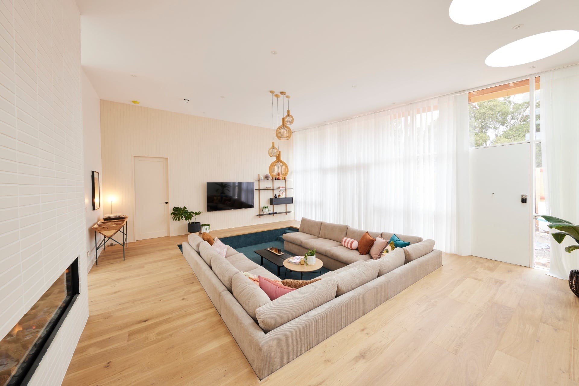
I hate to be a stick in the mud (not really), but I’m not sharing the judges enthusiasm for Tanya and Vito’s sunken living room. I don’t think it has wide buyer appeal, and a number of people will definitely be put off by it. So on saleability alone it gets a big ‘no deal’ from me.
Now, even if I put that aside and look at it purely from a design perspective, I still don’t feel that wowed by the room. I admire their wanting to change it up and bring an element of surprise to the competition (I was a fan of those brown bathroom tiles, remember?), but this isn’t bringing the sense of luxury I want in a Hampton home.
The blue carpet doesn’t give me the kind of relaxation I want in a living room. Anyone not sitting right at the back of the sofa won’t be able to watch TV properly unless they can spin their head 360 like the girl from The Exorcist. And the TV wall itself feels cluttered and unbalanced.
I do, however, really like the table that houses the record player. That is pretty bloody divine.
The Dining Room Fell Flat for Me Too
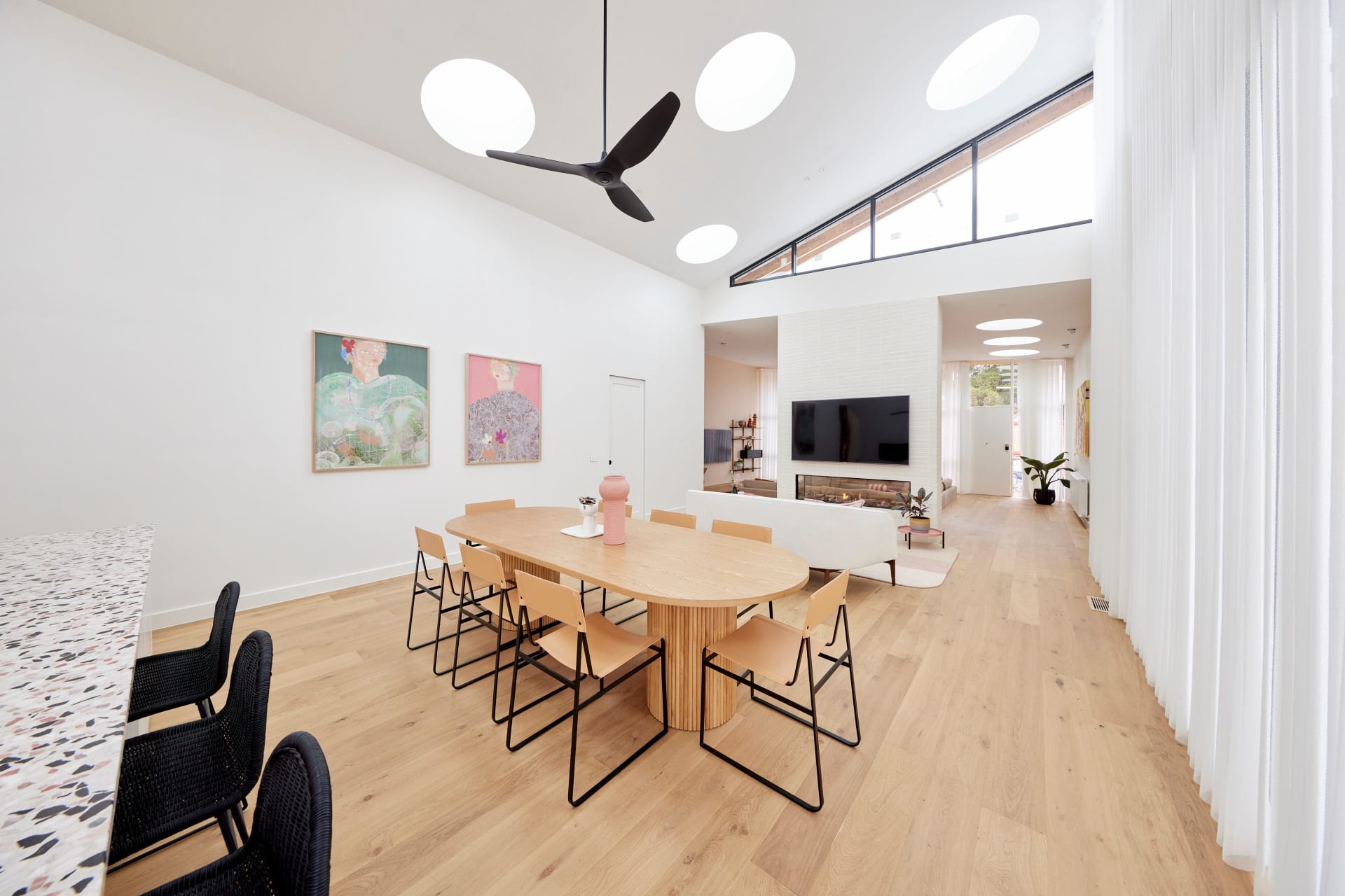
I don’t see the dining zone and feel wowed. I got those feels in some of the other spaces this week, but not this one.
The table and chairs feel pretty stock standard. I don’t mean stock standard in design (I love both pieces), but together, and on that floor, it’s just a little basic, a little expected. I don’t get any focal point in this space that feels impressive. Perhaps a feature pendant over the dining table would have corrected this issue.
While the fireplace is a lovely idea, and indeed looks rather impressive, the TV mounted above it with what feels like a cramped sitting zone in front is underwhelming. If they were sold on this concept I feel two armchairs would have been a more successful solution. As it stands there are no armchairs in this home. Surely someone wants one.
I’m not a fan of the round skylights. Or that many skylights. I swear these houses would be murder if you had a hangover.
Ronnie and Georgia Came Joint First
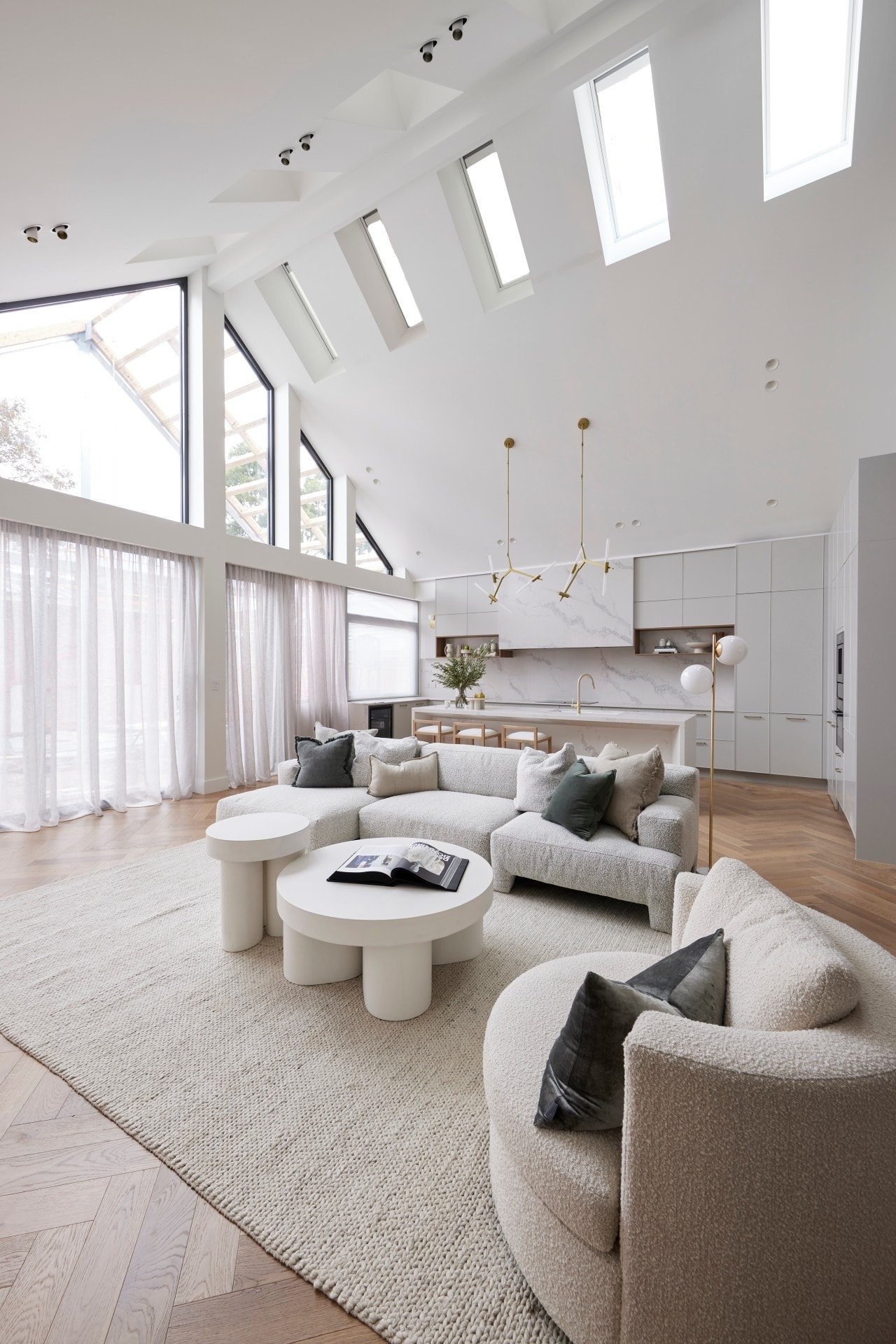
When the judges walked through Ronnie and Georgia’s living room and the sun was pouring in through those skylights, it did create a pretty magical moment. The ethereal feeling this space evokes is truly beautiful.
All three zones (kitchen, living and dining) do feel wonderfully cohesive. It takes a lot of work to make a design like this feel so effortless, so Ronnie and Georgia should be commended for the execution. The pops of green atop a neutral palette like this is definitely of-the-moment and feels wonderfully nature-inspired.
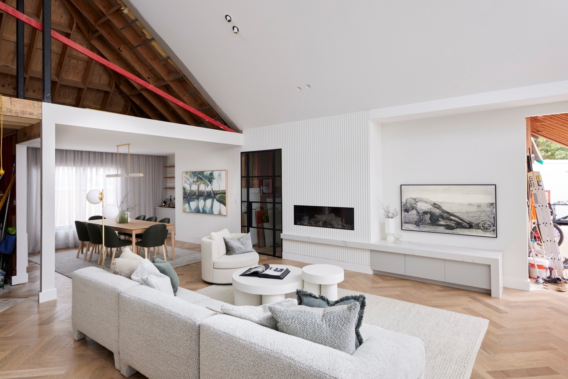
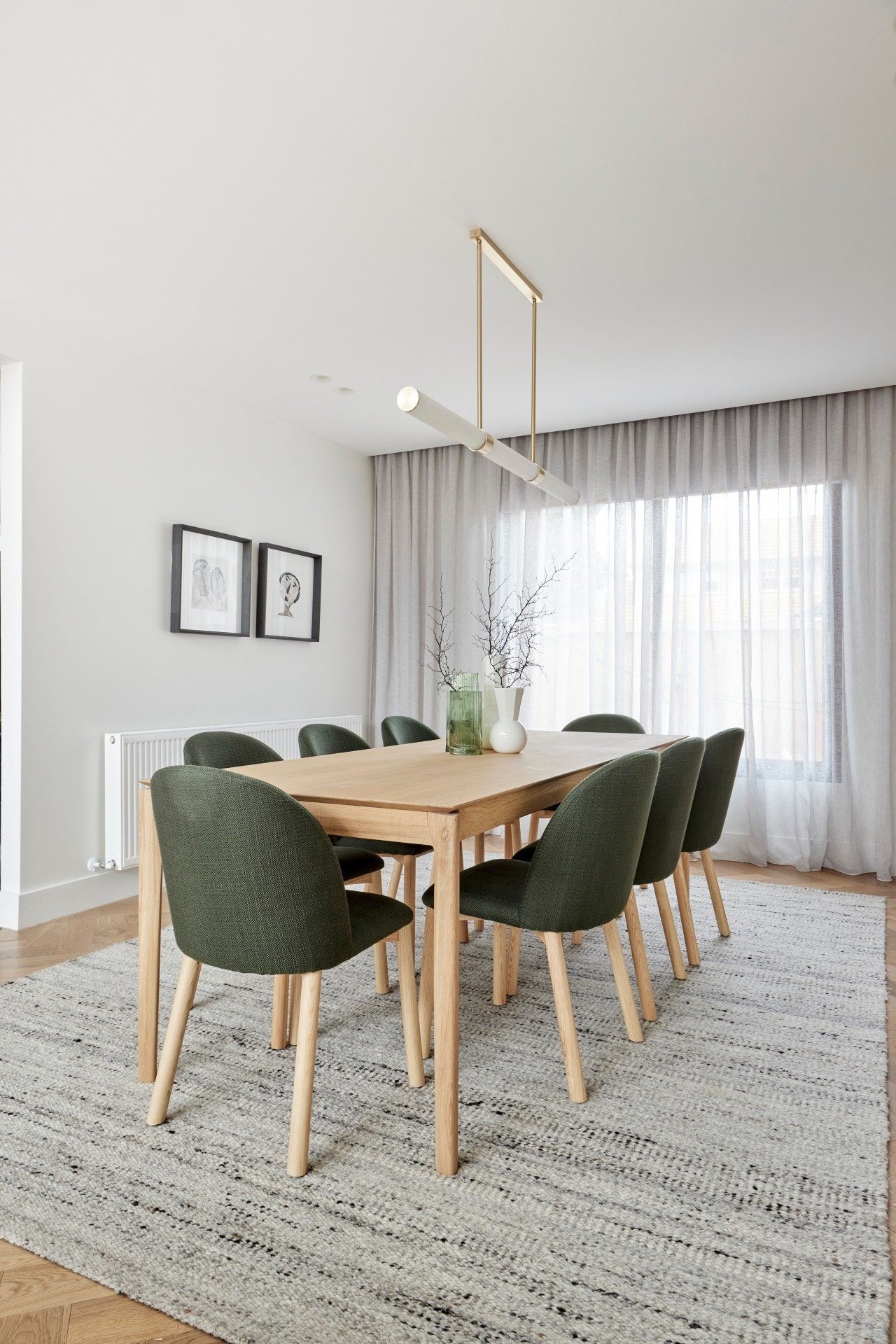
Of all the living and dining rooms revealed this week, I want to stop, drop and roll around in this one the most. That painting in the dining room is also doing things to me and I need it in my life ASAP if not sooner. The pendant light above the table is delicious, as is the boucle sofa (see my roundup of boucle furniture and decor here if you’re loving this trend).
The built-in bar zone is a genius idea too, and the rug under the dining table is well proportioned. There’s a lot to love here, and it slays every other room this week.
There Are Some Issues to Address Though
While I am loving both zones, I do have a few small issues to address. The first is the styling. It does feel a step too far in the minimal direction. When I take a step back and view all three zones, it looks like more decorative elements need to be on tabletops, benchtops etc, to bring some more personality to the home.
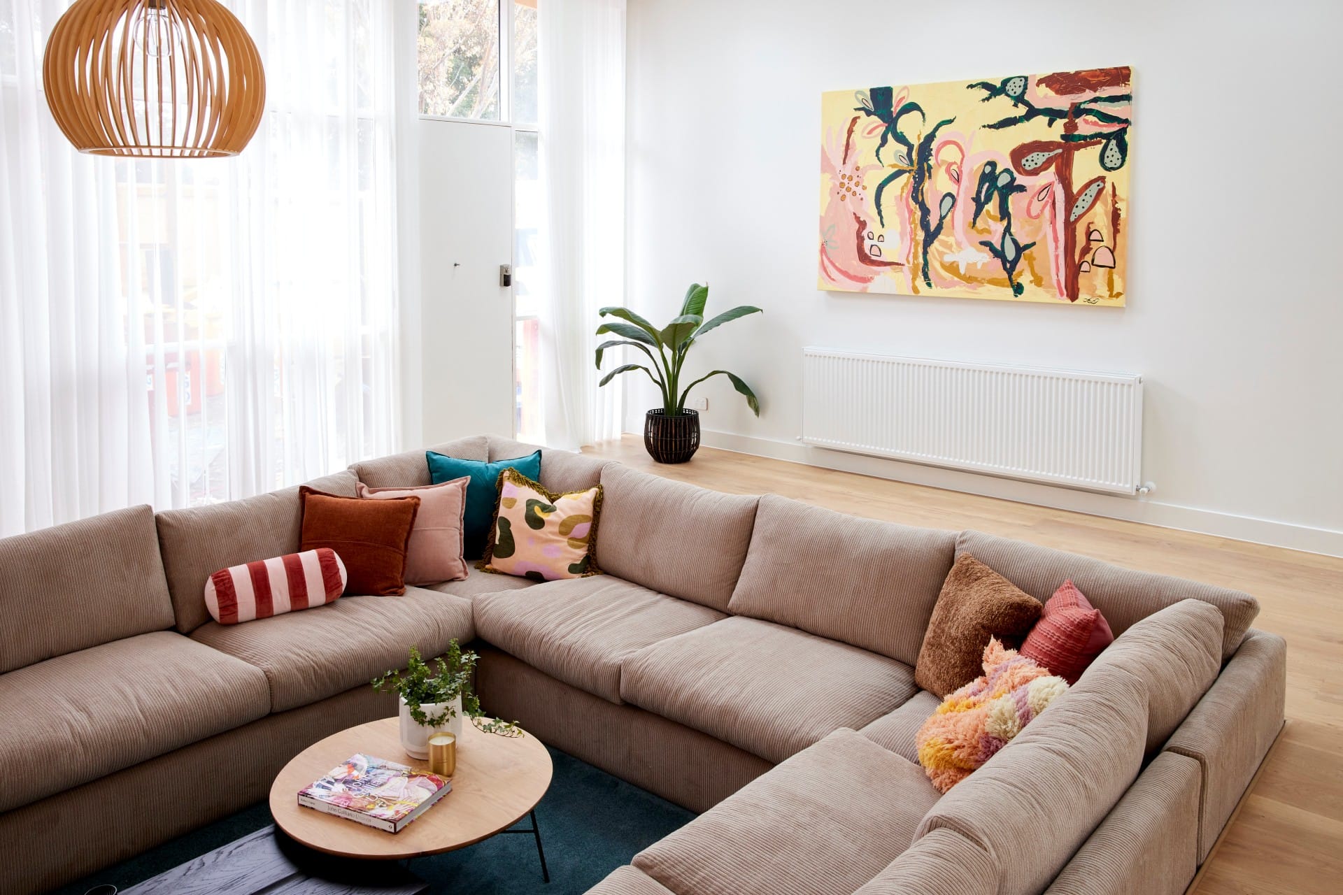
The second issue is the living room furniture. It’s not big enough. This is a sizeable space and I worry a potential buyer won’t envision just how many people you could have around in that room. I would have opted for a much grander sectional sofa here to show people how a family could exist in this zone.
Lastly, I’m not a fan of the black steel door. That long panel of wall has a lot of hard shapes going on and the door is the worst of them. In a zone with loads of white and soothing neutrals, the black really does stand out for all the wrong reasons.
Kirsty and Jesse Came Third
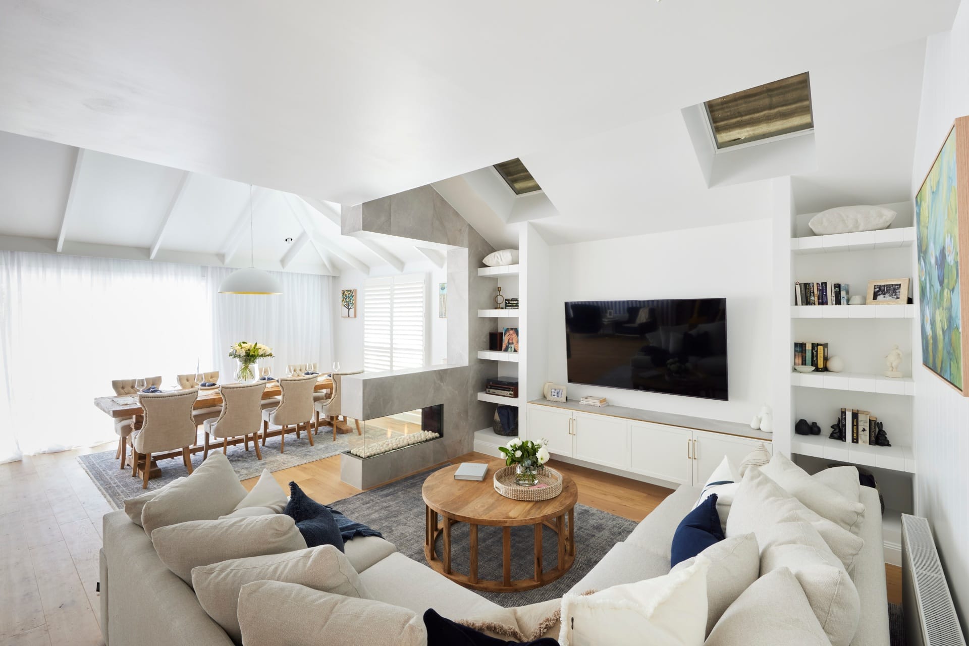
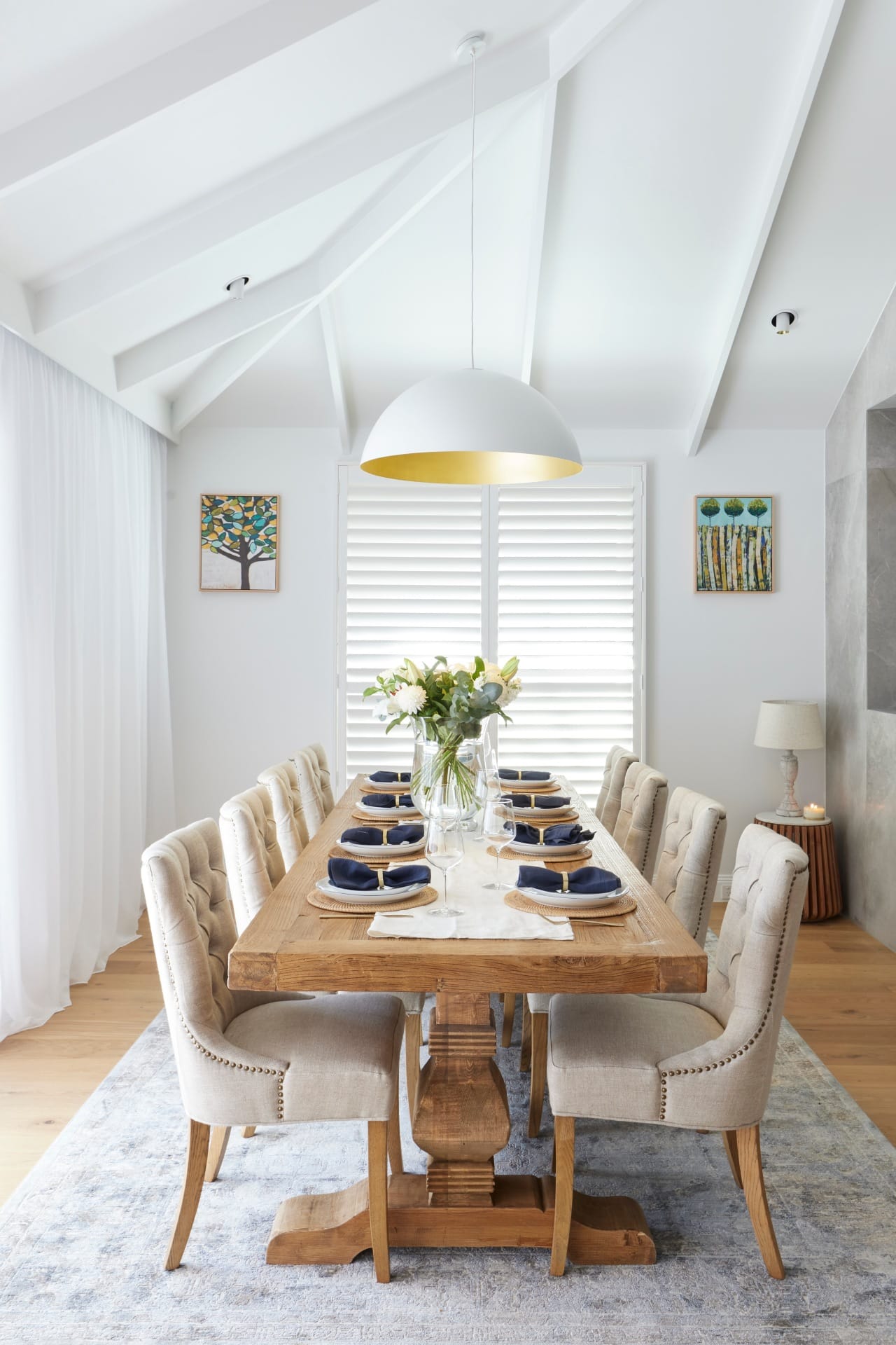
I’m conflicted over Kristy and Jesse’s living and dining room. On the one hand, almost every single piece of furniture and decor is delicious. And on the other hand, they didn’t make good decisions in terms of how and where they put them. It’s beyond charming, but poorly mapped out.
That sofa, for example, is everything. Perfect shape, colour, fabric and size. The issue is the space it’s sitting in – it’s tiny! Well, perhaps not tiny compared to other homes, but in this home, it’s a really small footprint to dedicate to your living room.
It stands out as too small even more because you have a huge section of nothing between it and the kitchen. You could honestly install a bowling alley in the dead space, it’s that big. A family home of this size needs a larger living room.
And then you move over to the dining space, which is also beautiful stylistically, and it too feels squashed into the corner of the room. I can’t help but feel there were some bad floor plan and layout choices made here in terms of how you enter this open plan space. The flow feels a bit wrong.

I’m Not Enjoying the Seating Nook
Last week I loved the wallpaper that Kristy and Jesse used in their kitchen. It was stellar. I said I wanted to do more of it across the home, and I still do, but not like this. The stripes are a fine idea, but the colour is too intense. The blue needs to be far softer. The wallpaper doesn’t work against the kitchen, living or dining room.
The velvet chairs with brass accents are only making matters worse. The whole thing feels luxey, but luxey from a few years ago. It’s not in-keeping with the style of kitchen (the blue velvet it too bold), nor does it have the same feeling as the living and dining rooms.
I feel some floating, fixed joinery would have been better here. A large mirror over the top of it would have made this more of a design moment. If they’re set on keeping this as a sitting zone, the chairs should be a soft linen, in an oatmeal tone, the brass needs to be removed, and we need a round rug on the floor to ground the furniture.


Mitch and Mark Came Fourth
What can I say about Mitch and Mark’s living and dining room? It just doesn’t work. At all. In any way.
I usually like the first section of my room critiques to start off with some positives, but I’m struggling. While I love so many individual pieces here, so much of it doesn’t work. From colours to styles, sizes and shapes, it’s so discombobulated. Like me watching an AFL game, it’s very confused.
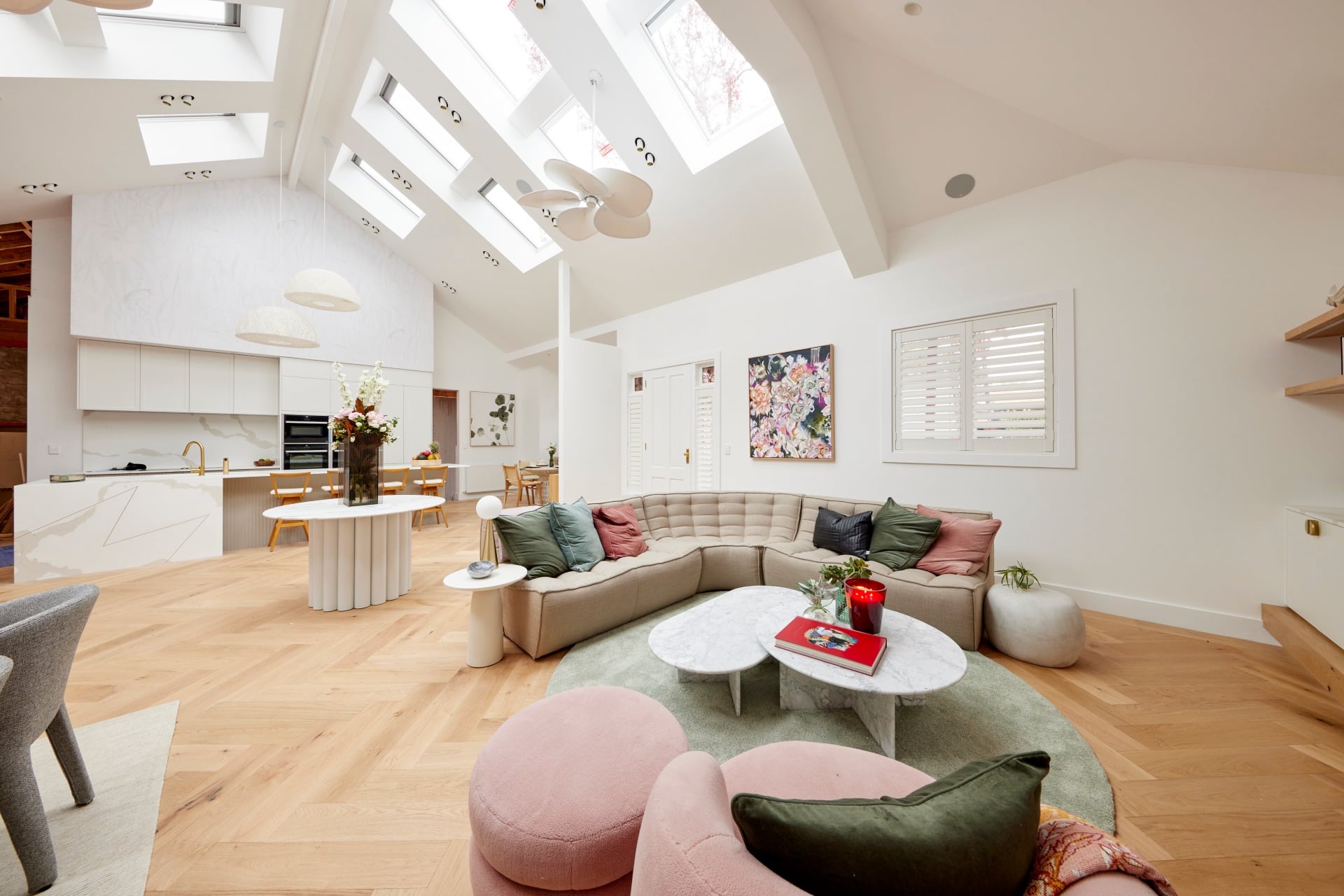
I actually really dislike the amount of skylights. At some point we just have to stop with the skylights. They, alongside all of the lighting and those retro fans, creates a ceiling that feels visually chaotic, not luxurious. It also removes the homely feel. It’s like you’re in a retail showroom. And their styling doesn’t help matters either.
The layout of this zone is problematic. It’s really quite large and yet they’ve not made use of it. The entry table needs to be removed, a long dining table needs to go in its place, and the living room can then be reoriented so it’s more open to the rest of the home, as opposed to be squished in a corner.
I’d even go so far as to say that the door is in the wrong place. The whole floor plan is a shambles.
Great Individual Pieces, But They Don’t Work Together
Let’s start with the sofa. Cute, cool, quirky. I love it for a kids room or an upstairs rumpus, but not the main living room. It has no polish or sophistication. Like Britney’s conservatorship, it needs to be removed immediately. The round rug makes the room look smaller, and the pink armchair feels juvenile. None of it works.
That entry table is a gift from the design gods. But again, what is it doing here? It doesn’t create an entrance feel at all. An entrance is what creates an entrance feel. If you don’t have a proper entry, either create one of abandon ship on the idea.
The marble nest coffee tables I also adore, but you don’t even get to appreciate them with all of the crazy that surrounds them. I also love the artwork between the front door and the window, but you lose its beauty with everything else in the room screaming for your attention.
The dining zone, in its entirety, is the saving grace here. Love the table, dining chairs, rug and all the styling. Just drag it over to where the round entry table is please.

Josh and Luke Came Last
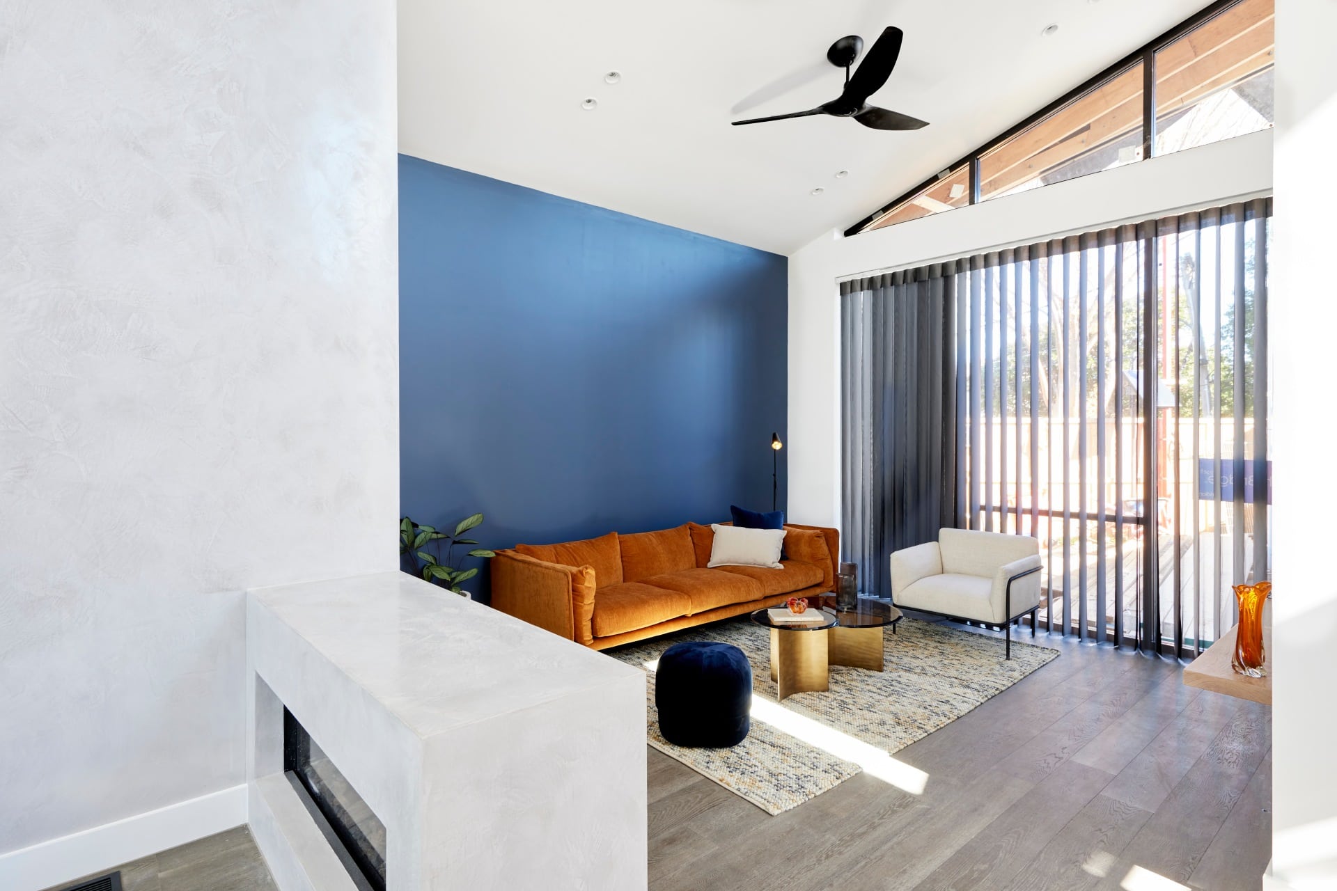
I can see where Josh and Luke wanted to go with their living and dining room. And I think it’s great that they want to create this moody-masculine, nod to industrial interior design scheme. But they’re getting a lot of things wrong and wheeling out a lot of outdated style cliches in the process.
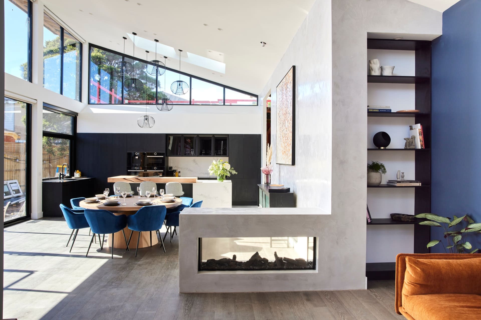
Let’s start with the feedback regarding the dining and living needing to be switched around. I don’t actually agree with this. I do feel it would be odd, as the home owner, to carry dinner from the kitchen all the way over to the dining room every night if it was where the living currently is.
The issue is less about what is where, and more to do with size and scale of furniture. The dining table they have in the dining room is just way too small. And the wrong shape. This zone needed a large rectangular table in it. A massive rug underneath wouldn’t have hurt either.
The blue chairs (that’s where the outdated style choices come into play) make this zone feel like a place where lads play poker. I think Josh and Luke need to invent an imaginary set of clients for this home, because it feels like they keep designing for themselves.
Major Issues in the Living Room Too
That fireplace. Can we start there? It needs to be removed sooner rather than later. Like a bachelorette party walking into a gay nightclub, it has no business being there. It doesn’t keep anyone warm where it is, nor does it actually look good there. It just juts out from the wall and gets in the way.
Everything in the living room needs steroids. The sofa, rug, armchair and coffee table need beefing up. The blue feature wall feels outdated too, and doesn’t have any art on it. What happened there? I’m surprised this wasn’t mentioned. The orange sofa against the blue wall is a bad combo as well.
This zone needed a big sectional sofa in it, some impressive art, a feature light, more cushions, a different rug. So I guess what I’m saying is, everything needs to be replaced.
What did you think of The Block 2021 living and dining room reveals? Drop me a comment below and share your take!
Want to see more goodness from The Block? Make sure you check out The Block Shop and nine now.



I thought Kirsty n Jesse had way bigger blank space at the entrance than Mark n Mitch, yet Mark n Mitch got grilled for it. And no do not move Josh n Lukes dining area as you do not carry meals to a table that far away
Shayna is an idiot to have so fallen in love with Tanya & Vito’s room..A JOKE, it was such a stitch up to give them a win….The room is a JOKE just like them. Lets see if Shayna puts one in her home she is renovating. Tanya & Vito’s whole home is a JOKE & will always be refered to as exactly that.
I totally agree. How could this zone score two 10s? The kids aren’t going to walk to the stairs to sit on the lounge, they are going to jump over the top to sit down. I wouldn’t like to sit in the dining room chairs for any length of time, they don’t look very comfortable. How do people watch both televisions at the same time? They are way too close to each other. I totally agree about the skylights too. The three over the kitchen looked good but add them to the five in this zone it looks ridiculous. No symmetry. There are way too many skylights in all of the houses. It’s judging like this that makes me not want to watch the show anymore.
I think you have one team on your mind and only that team.We don’t need to name them.They are everybody’s favourite and I for one will not be watching what was my favourite show until they go back to the original format.Tired of seeing same old faces.I thought the sunken lounge looks fantastic and I really like the different colour being the blue.
All awful I agree, the use of all the skylights in these homes is mad. Bedrooms with large windows don’t need skylights. A mistake to have no floor plans because rooms are disproportional. That’s why you end up with a front door opening into a living dining room.
Agree with everything you have said ..the sunken lounge was a disaster ..the blue striped wallpaper hit you in the face ..the twins have no concept of balance and space and the other 2 rooms were beautiful and mundane ..as for all the skylights what a nightmare ..
Hi, I’d like to know what is the brand of the table , the heavy one with two sculptured legs?
Spot on! I agree with you on everything but the door in Ronnie and Georgias.
I agree with you 100 per cent Chris.
The amount of skylights in the houses are too over the top!!
I’d need to wear sunglasses most of the day, to have more daylight is one thing but with the ridiculously high ceilings there would be no escape.
Why did the contestants raise the ceilings to that height??
It’s becoming a bit boring this season, at least that’s my opinion.
I wish you would apply to be a contestant, that would be fun.
Tanya and Vito should never have scored so high. Mitch and Mark appear to have upset the judges as their space was far better ( not suggesting they would of won).
Love your eye for detail! I agree with absolutely everything you’ve said about all these zones.
None of these homes are screaming luxury to me at all. The floor plan layout of most of them is appalling as they are not functional at all for a family to live and feel connected or at home.
The styling is wrong on so many levels too. Scaling of furniture in sizes of spaces is one of the biggest flaws.
I am going to go out on a limb and say that this block series is producing the worst set of homes since the block started.
I sooo agree with you!