The Block 2022 living and dining rooms have been revealed, you guys. And I’ve gotta admit, much like Adam Levine’s wife going through his phone… I was not impressed.
To be fair, I didn’t find any of the rooms to be particularly awe-inspiring. Unlike some of last week’s kitchens, which delivered some truly magical design moments, the living and dining rooms were pretty ho-hum.
The major issue plaguing almost all rooms: furniture that was either too small for the space, or too crammed in.
It took me a while, but I’ve finally arrived at a decision as to who did the best to the worst this week:
- Rachel and Ryan
- Omar and Oz
- Ankur and Sharon
- Dylan and Jenny
- Tom and Sarah Jane
Have a read of The Block 2022 living and dining room reveals recap below, then let me know what you thought in the comments at the end of the post.
Rachel and Ryan Came First
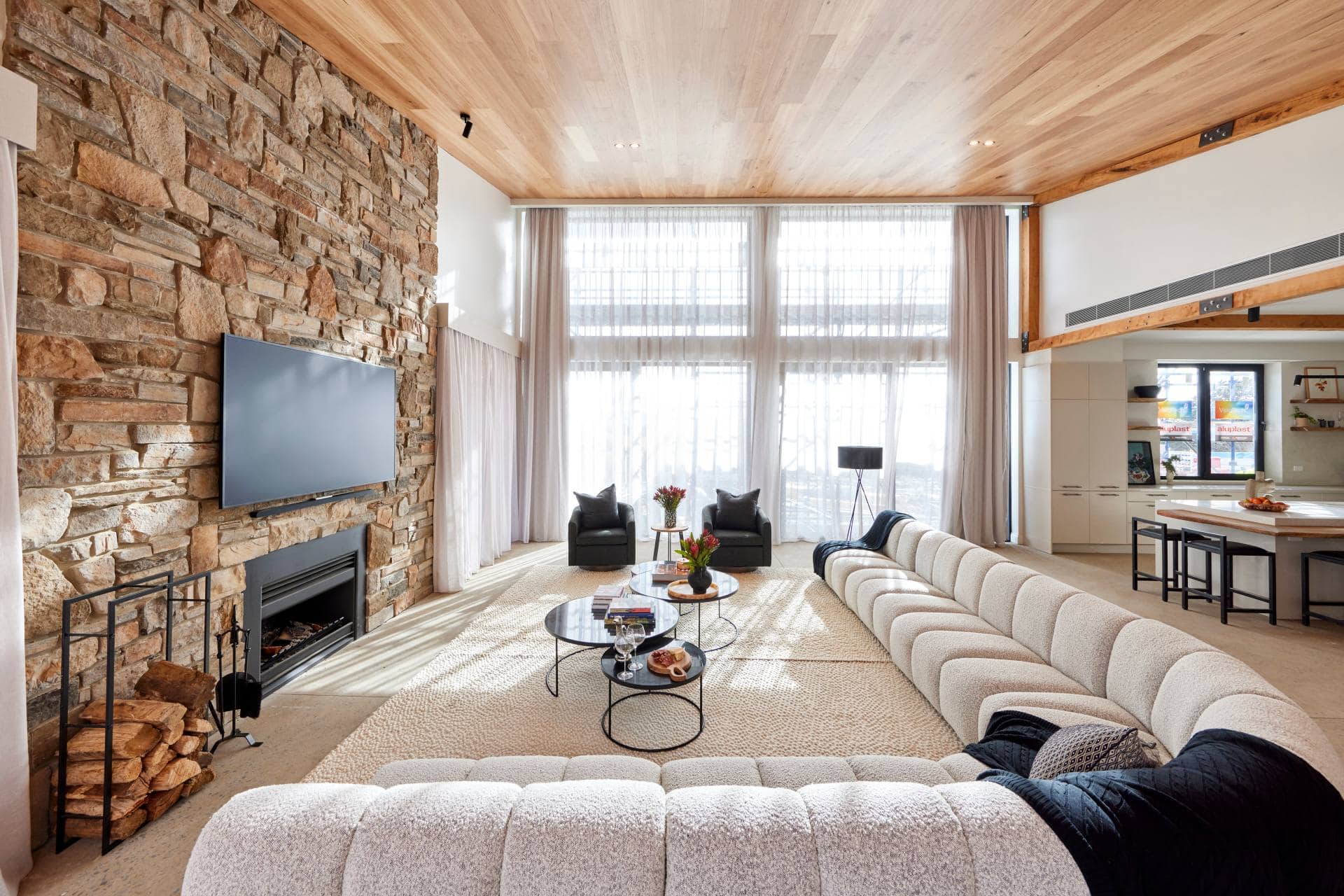
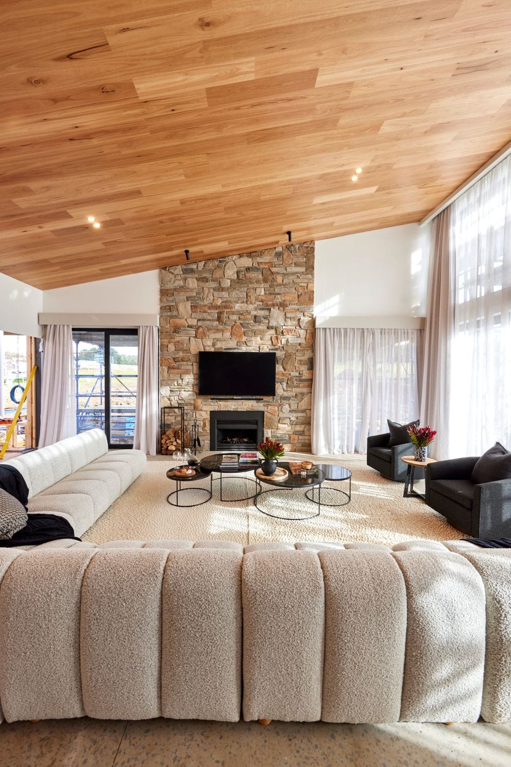
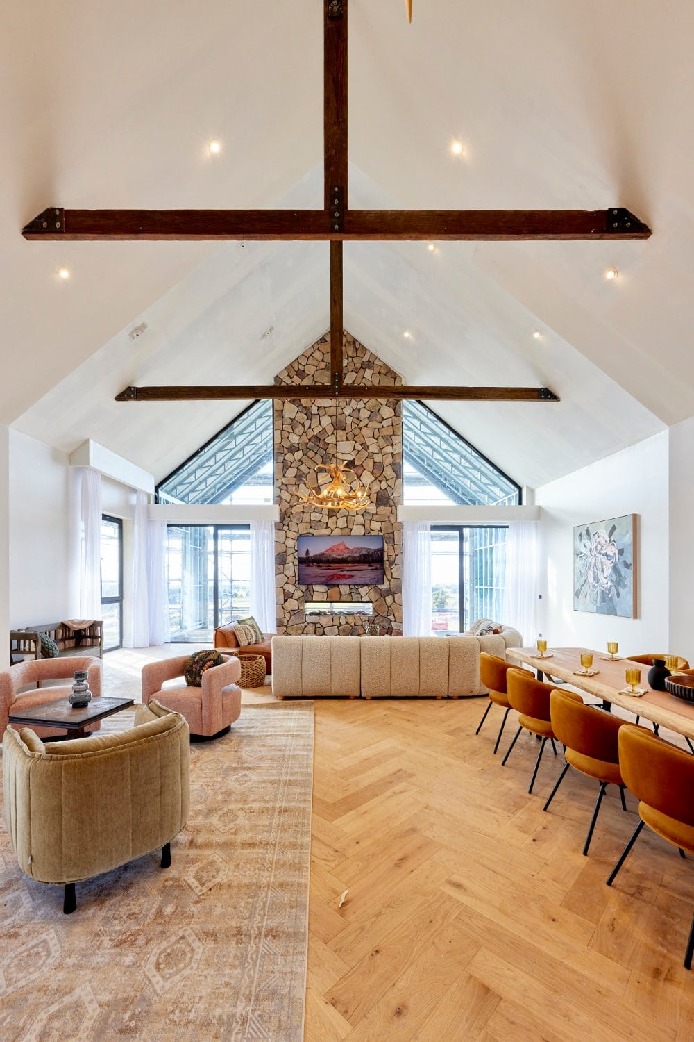
It’s by no means perfect, but Rachel and Ryan’s living and dining room is definitely the best of the lot presented this week. They deserved the win. We’ll get to the ways it can be improved, but let’s take a moment to appreciate the positives.
Firstly, this room layout is on-point. Everything is where it needs to be. And unlike the rooms revealed by the other teams, the furniture is actually to-scale for the most part.
The sofa wrapping around the room is all sorts of deliciousness. The dining zone is perfectly proportioned (obsessed with the chairs). And although the line of those two rugs pushed together is causing my designer OCD a little grief, at least they came up with a solution to fill such a large space.
Some Elements Took Me Outta the Country
The cluster of black coffee tables reads as ‘city apartment’ moreso than country home. But at least the colour speaks to other accents in the dining room and kitchen. The armchairs also give me metropolitan vibes, but from the perspective of selling the home to a potential buyer, they’re doing the job.
I do hear a lot of you who live in the country when you say that you don’t need the expected ‘country’ cliches, but you do want visual harmony. And the coffee tables and armchairs aren’t giving me visual harmony in this space. I don’t see them alongside some of the other elements.
It’s a solid effort from Rachel and Ryan though, and it is a space many a prospective buyer will talk into and feel captivated by.
Changes That Could Have Made it Better
I’ve banged on about rooms with too many focal points before (remember that headache-inducing tartan bedroom?), and I’m going to do it again here. Because while the living room is gorgeous, the stone around the fireplace is at odds with the timber ceiling.
It’s a one of the other situation for me, and the clear keeper is the stone around the fireplace. The sheen of that ceiling feels overwhelming and is doing nothing for the room. If they wanted to panel the ceiling (which I’m all for), it should have been white, or at least more matte.
There’s also a lot of timber beams. Way too many. I’ve not seen this much wood in the one room since Speedo night on the P&O Pride Cruise. Those beams draw your eye too much and feel a little overbearing with the stone around the fireplace and the timber ceiling.
Omar and Oz Came Joint Second
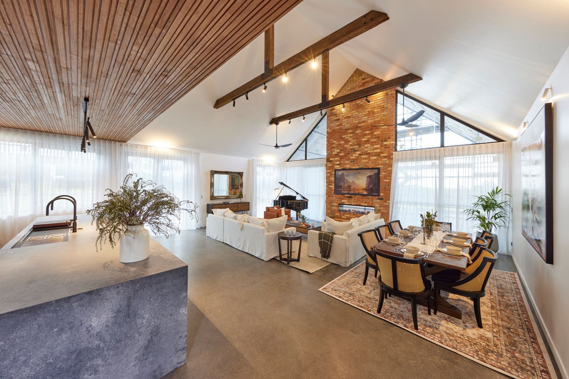
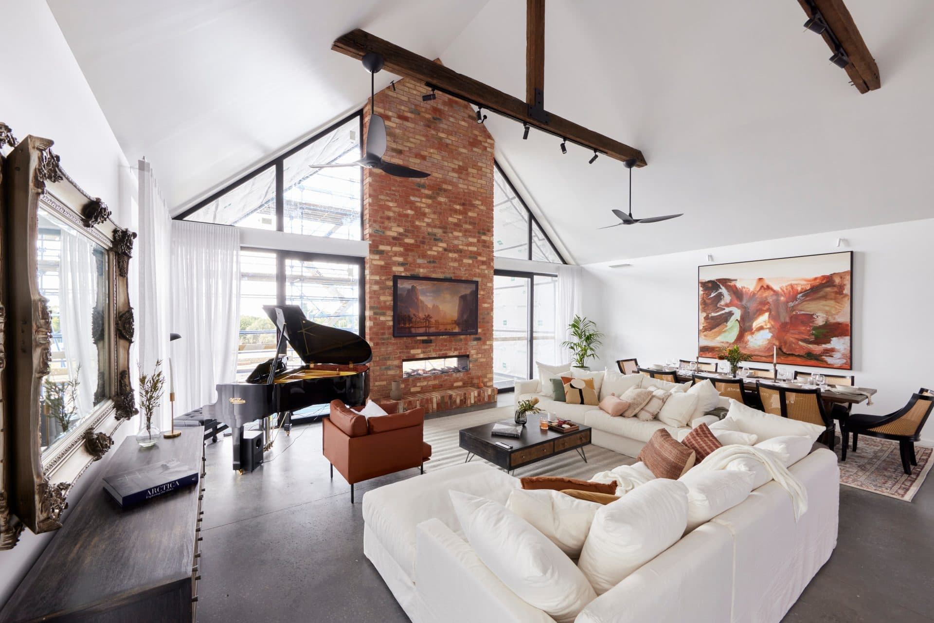
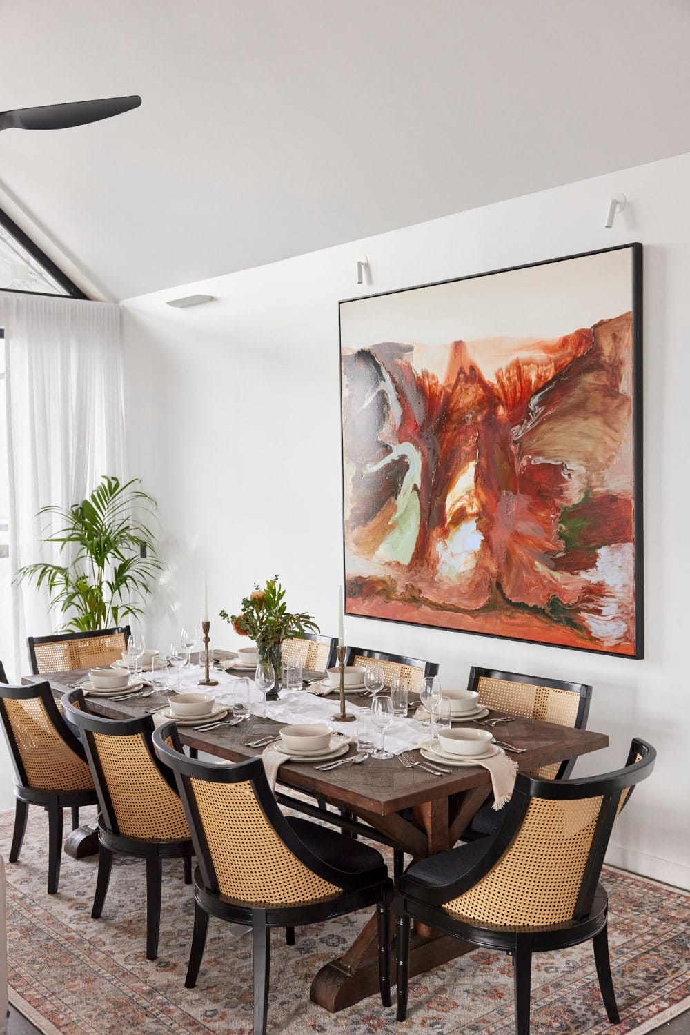
I’m going to come right out and say it: the piano is doing this zone no favours. Unless Rhonda Burchmore is living inside of it and comes with the home, who needs a show-tune moment in the corner of their living room? Not only does it not look amazing, its engulfs the space.
While this zone deserved second place, it’s not without issue. And the main issue really is just how much they crammed into the room.
We love the concrete flooring, we love the heigh ceilings, and we love the considered use of timber beams (thankfully they pulled back on the beam count unlike some of the other rooms this week). We also enjoy the white sofa (as filthy as it’ll get after I bring a block of choccy near it).
Omar and Oz also did well with the lighting installed across said beams. It creates a nice seamless moment. Sure it was interrupted by the black ceiling fans, which look about as at home as me at a grand final viewing party, but at least the lighting is on-point.
Things Are Just Too Crammed In Here
The major downside, as mentioned already, is the bad spatial planning.
The kitchen, dining and living zone are one large open-plan space, but boy was too much footprint given to the kitchen. It’s so dominant. And then you’re left with a smaller footprint to dedicate sofas and a dining table to.
All of those amazing appliances in the kitchen mean nothing if you can’t even pull out a dining chair to sit at the table.
That’s why the piano was a crazy idea in the first place. Remove it, place the white sofa that’s near the dining table where the sideboard is, and you’ll have instantly opened up the space and created a zone that feels less cramped.
As it stands, they’re making the room look smaller and busier than it needs to be. It’s missing a sense of calm and refinement. That artwork is everything though!

Tom and Sarah Jane Came Joint Second
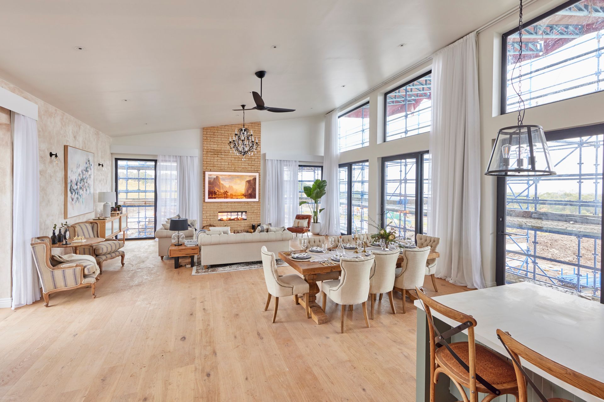
Tom and Sarah Jane’s living and dining room landed them in second place, but I would have put them last, because there are so many fundamental design considerations they haven’t addressed.
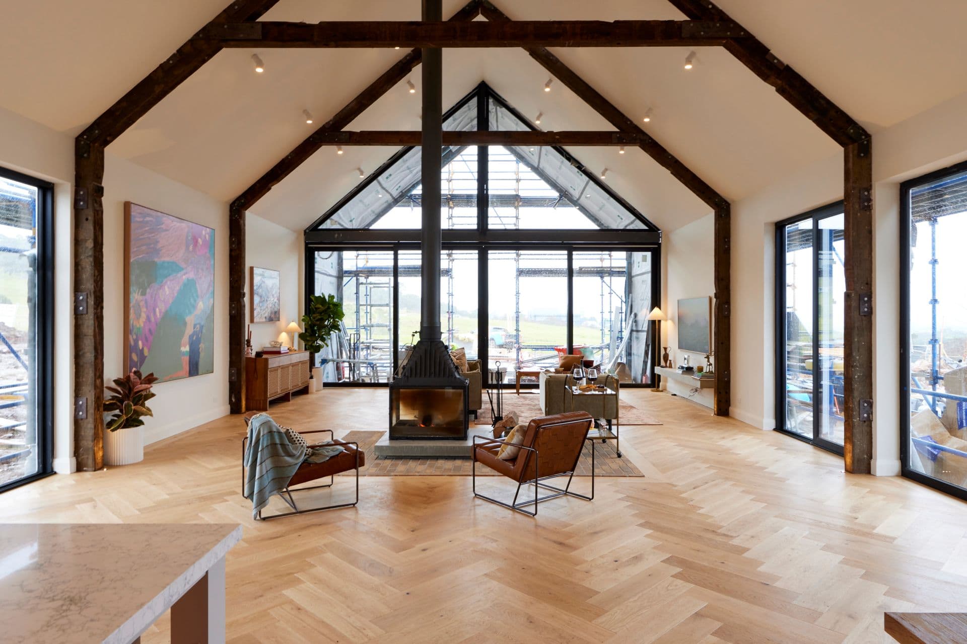
The shell of this open plan living and dining room might be rather grand, but baby is she under-filled. If this is the cover of a magazine it must be Equestrian Weekly, because it reads more as outdoor barn to me than it does internal living space.
The living room needs to be filled with twice the amount of furniture at double the size. That’s just one of the issues plaguing this room, but it’s definitely the biggest of the lot. Big rooms are great and all, but you have to find furniture that’s large enough to fill it.
Outside of the large artwork on the wall, and the sideboard that sits near it, every other item is miles too tiny for the room.

Let’s Talk About the Fireplace
The fact that it doesn’t sit in the centre of the room to line up with the point at which the ceiling beams meet really throws off the eye. As you stand in the kitchen and look at the view past the living room, your eye is so interrupted by the fireplace, the beams, and then the door framing.
The fireplace itself is giving me pizza oven vibes (I’ll take mine with pineapple!) and the brickwork around it further adds to the external barn feel I mentioned earlier.
What could have made this work (maybe) is some appropriately-sized furniture anchored toward it (like a large curved sofa) but instead we have lonely mid-century armchairs. The zone feels so unfinished, not at all well-layered, and without a touch of homeliness.
And we haven’t even spoken about the dining room yet.
The Dining Room: Poor Vibe, Poor Placement
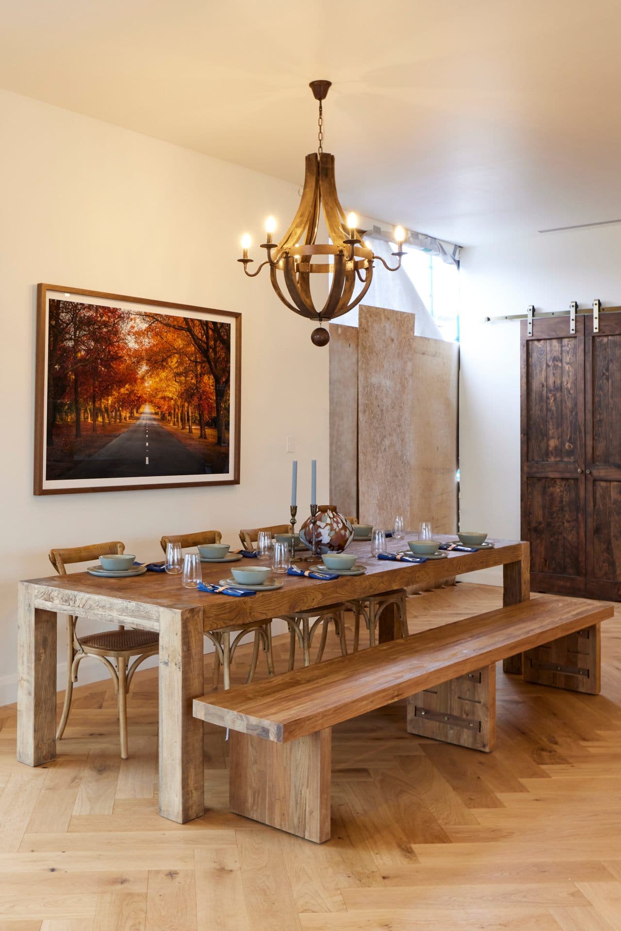
To resolve this whole zone immediately, the spot where the two lonely leather armchairs are needs to be where the dining table lives. And where the dining table is currently placed, you can dedicate to a sideboard with some artwork above it, or place two cosy armchairs there instead.
The dining setting they do have is too small, in the wrong spot, and without any sense of softness and comfort. This is a home they want people to sink millions of dollars into. I’m not spending that much cash to get rickets over ravioli.
In a living and dining room of this size, I would expect a 10-seater table. The space can certainly accommodate one, without the House Of The Dragon pendant light above it.
Everything in this living and dining room just feels hard and uncomfortable. The lack of window treatments – not mentioned at all by the judges – further adds to that.
Dylan and Jenny Came Fourth
There’s a lot going on in this room, and yet not much going on at all, if that makes sense. The room has loads of stuff in it, but nothing is the focal point. Nothing is grounded as the wow-moment, with supporting design elements around it. There’s no story being told.
Dylan and Jenny came fourth this week and I have to say it’s accurate scoring this time around.
Everything is the one colour in this living and dining room. They even sponged the walls to get them the same tone of beige that’s seeping across this space. The brickwork follows suit too, and definitely makes the fireplace the least successful outside of Tom and Sarah Jane’s.
The room almost reads like a Provincial Living showroom floor, not a home. Cookie cutter is the right way to describe this zone. It feels so staged. And that pendant light: I cannot.

There Are Many Ways to Improve the Room
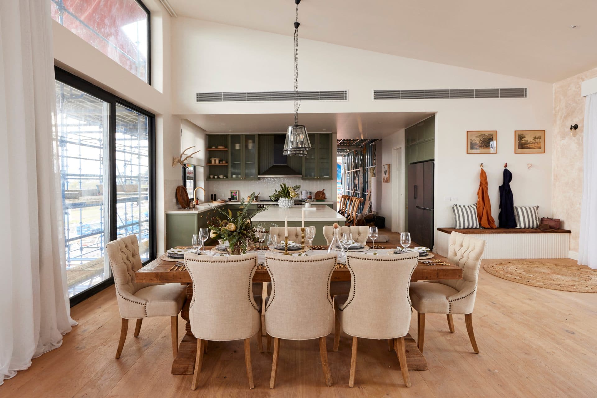
It’s such a shame that this living and dining room has no relationship to the kitchen, which I called out last week as the best zone of the lot. To improve it, an injection of lush green in artwork or an armchair is needed, to tie the zones together and have them make sense.
The dining table should be bigger and pulled into the centre of the room. The sponged walls need to be banished like a pilar cyst on Doctor Pimple Popper. The armchairs and sofa can go to make way for a big, plush sectional sofa. And the pelmets need removing too.
Decorative black curtain rods would be right at home here. What’s with all the pelmets this week? Almost every team used them and they look so dated.
We do, however, love the built-in bench seat Dylan and Jenny created near the kitchen. The off-centre artworks are a choice, but I appreciate the idea.
Ankur and Sharon Came Last
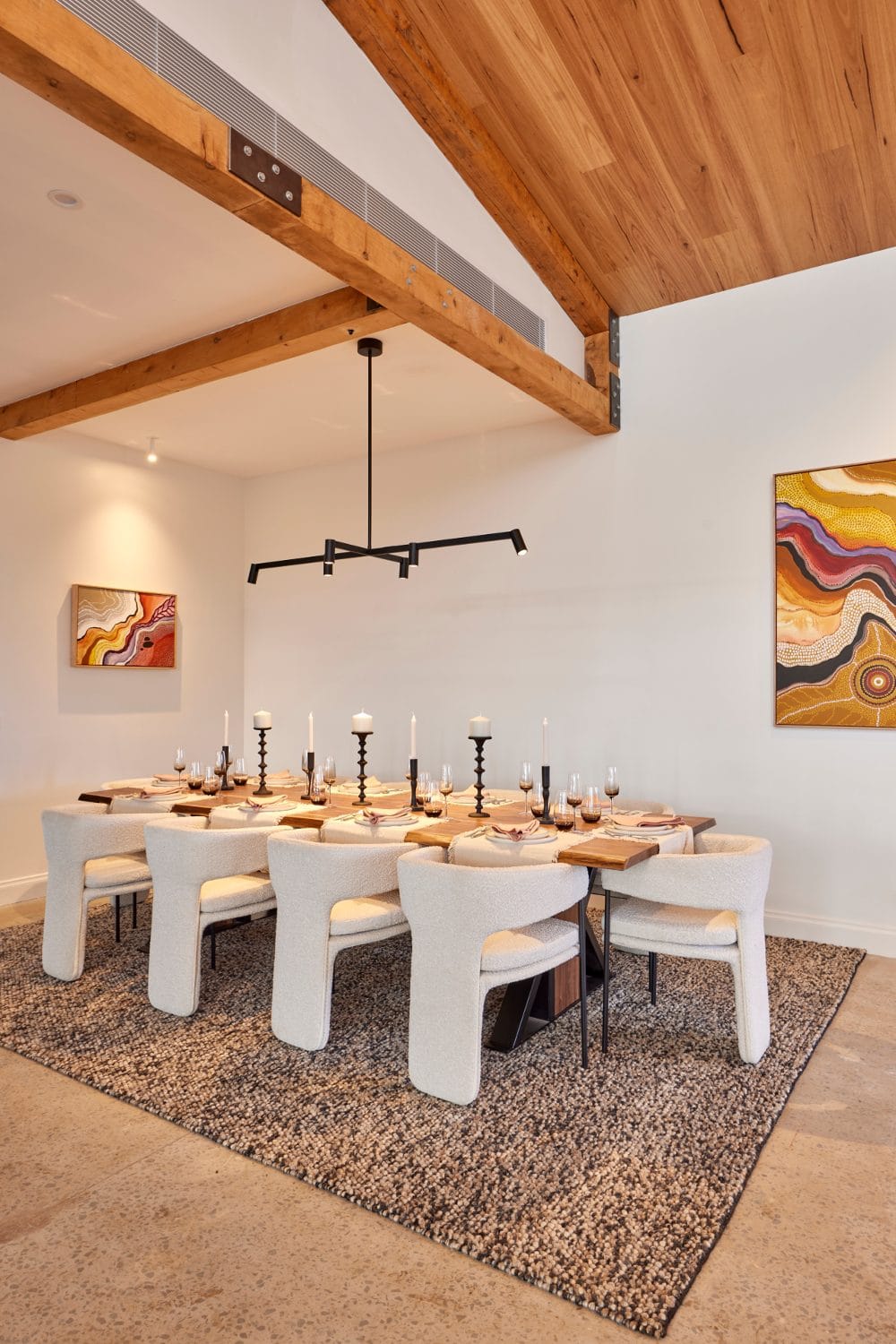
It’s rare you’ll hear me say this, and it may never happen again (so feel free to screenshot this historical moment), but JUSTICE FOR ANKUR AND SHARON! Last place, really?
The shell of their room was miles better than Tom and Sarah Jane’s, the scale of their dining room furniture was way more appropriate than Omar and Oz’s, and they made some better style choices than Dylan and Jenny.
They got a lot wrong in this room, there’s no denying that. To place them last though is rougher than the treatment of Meghan Markle by any and every news outlet globally.
Ankur and Sharon may have been marked down for some poor finishes and attention to detail, I get it. But there are some real wins in this room that need to be called out. And I’m going to be the one to take on this thankless task.
The Positives Are Many In This Zone
If you look and Tom and Sarah Jane’s beam work you’ll see what I mean when I say it’s quite overbearing. In this living and dining room, Ankur and Sharon showed restraint on the beam front, injecting some character without taking focus away from the fireplace.
The stonework around the fireplace, though unfinished, is a winner. And while the pelmets are giving me grief, the sheers in this space add much-needed softness and give layers of warmth missing in some of the other teams’ zones.
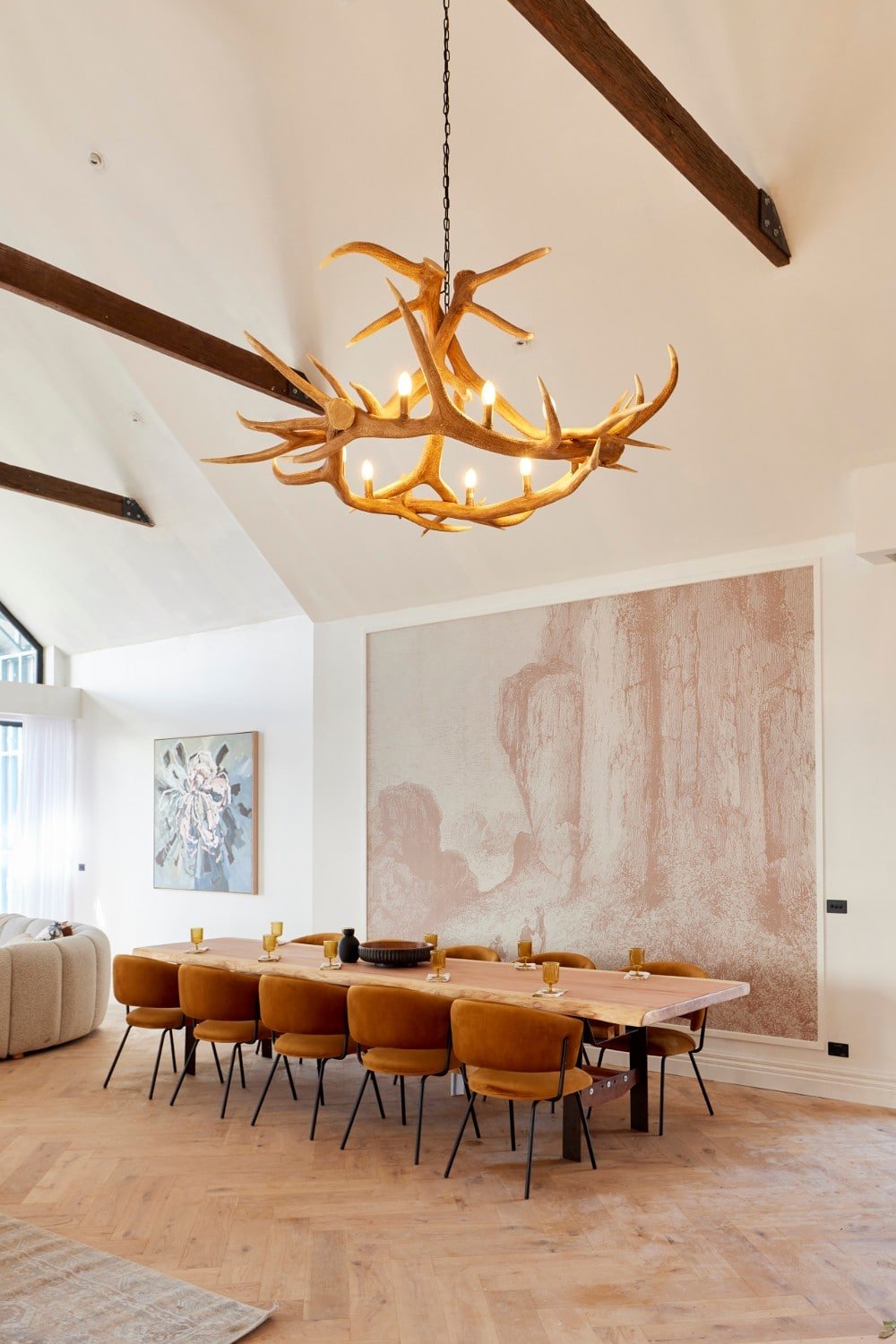
Personally I don’t need the antler pendants, but the placement of two statement lights here is a smart one. I also find the framing of the wallpaper, even if the design isn’t amazing, a smart way to give a wall impact when you’re on budget and can’t afford a grand painting.
This room just needs a few tweaks to take it next level.

A Few Tweaks And This Room Would Soar
The dining table above is the only one this week outside of Rachel and Ryan’s that’s appropriate in scale for the size of the room. It just needs to be brought into the space, and turned to mirror the run of the kitchen island, to resolve the room spatially.
The waiting room chairs are bizarre and need to go. And to be fair I’d replace the dining chairs with something in a less ‘luxe’ colour and material too. Once that’s done you then have scope to make the living zone larger, with more armchairs and a bigger rug.
There’s nothing to clutch our pearls over in this space, honestly, and I think the scores were too harsh here. I’d take this living and dining room over two of the others this week in a heartbeat.
What did you make of The Block 2022 living and dining rooms reveal? Drop me a comment below and share your thoughts!
Images for this post were supplied by The Block Shop. Check out Nine Now for more of The Block 2022 living and dining rooms reveal.





Agree with your comments, in particular about the lack of functionality with the bad placement in thoroughfares. Also, in my opinion, one needs bench space next to the fridge (and an oven). And OMG: What’s it with those daggy pelmets everywhere? Trending, I should hope not..
Love your review Chris. I dont like the floor board ceiling in the winning room making me want to walk it. Also, Good luck with the cream rugs too close to wood fire and fireplace oddly low – and TV above fireplace noooo too many of those. Agree, stone around A&S’s fireplace is a winner and far better with glass above windows next to fireplace. A couple of no light over dining and why the set dining tables..
I’m so sick of seeing cheap rugs with turned-up corners on this show!
It’s time for a new judging panel…. Chris you should be one of them.
Again disappointing…..didn’t any of them study interior design principles before entering an interior design competition. Where do they get their ideas? Antlers, grand piano, waiting room chairs, uncomfortable dining chairs…..none of it speaks to me about wanting to live there.
I love the look of that huge white sofa, but I don’t love the practicality/usability of it–and that’s without worrying about keeping it clean. I suppose if you can afford this kind of house then keeping it clean and making it last don’t figure into your everyday considerations. But consider the traffic jam and mess resulting from your 10 person dinner party – You can only enter the “lounge” at either end of the looonnnnggg sofa, and no one in the middle has anywhere to put a drink down without moving the coffee tables. Also don’t like the two swivelling chairs – pointless. Need chairs for a contrast but those are awful.
Agree with your positioning of winners to 5 place. Only one I might have changed was Omar’s. Yes turn the tables around in house 3 and 4 and get rid of the waiting room changes in house 3. Might get rid of the antler lights. Pelmets yes they have to go, I’ve be living with them in our house for 30 years and can not wait for them to be gone! House 4 boring, house 5 too much stuff and house 1, not enough and I wouldn’t have the fire there either.
Hi l dont get why with such huge rooms the contestants all focused on blocking in their fire places!! Spread the furniture to capture the whole room and its warmth. And the herringbone design floor…loose the mats in dining areas…show off the awsome floors. Cheers
Hi l dont get why with such huge rooms the contestants all focused on blocking in their fire places!! Spread the furniture to capture the whole room and its warmth. Nd the herringbone design floor…loose the mats in sining areas…show off the awsome floors. Cheers