It feels like forever ago that our clients asked us to give their home the contemporary luxe interior design treatment. Covid lockdowns will do that to you! But boy was it good to finally photograph (and show you) one of our completed design projects again.
This family home, nestled in the suburban streets of Hampton here in Melbourne, was a new-build by Metricon. The clients chosen the Sovereign 46 design; a customised 380-sqm home with four bedrooms, three living spaces, two home offices and an impressive entertainer’s kitchen.
The husband and wife duo reached out before the build commenced, to get our help with material selections and floor planning. Once they were locked in and the build was underway, we began work on the design concept to fully furnish the interior of the property.
Scroll on as I show you some of the best bits from the project below.

Contemporary Luxe Design Was the Brief
It’s safe to say that the contemporary luxe style is the main look and feel we’re executing here at TLC Interiors of late. Don’t get me wrong, we’ve transformed homes in Hampton’s styles and Art Deco vibes before, but we love a modern makeover (and so do our clients).
The couple for this project had differing tastes too, so part of the challenge was to execute a contemporary look and feel but also fuse together his love of industrial, somewhat brutalist design with her love of luxury and femininity.
The result was an interior that gives a nod to industrial (with exposed timber grains, slabs of stone and a darker palette in some rooms) while retaining the sense of effortless sophistication, softness and luxury you’d expect in a modern new-build home.
We really wanted to balance the masculine and feminine, light and dark, and hard and soft in this design. And if we do say so ourselves, we think we nailed it.

Fine Form But Family-Friendly at the Back of the Home
The design approach at the back of the property was to keep things chic but comfortable. The couple have three kids after all, so we wanted this everyday-living area to be pretty but practical, cool but cosy. It’s the hub of the home where all the action happens; there was no room for it to be precious.
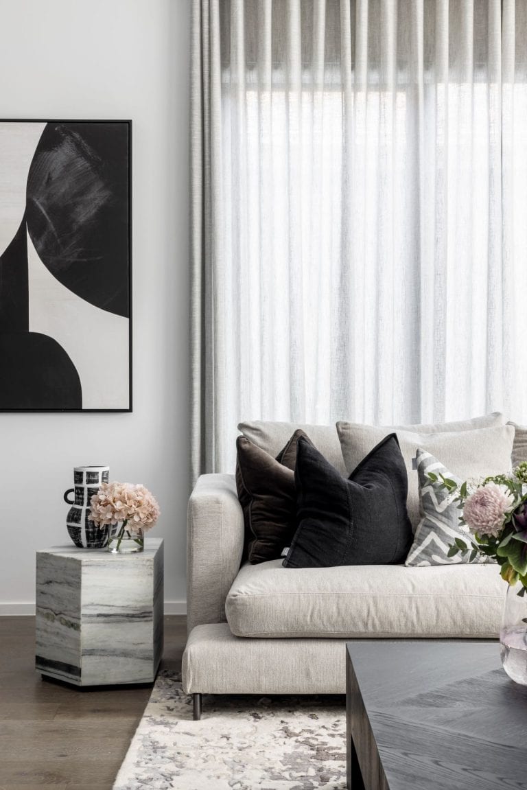
The large grey sectional sofa from Camerich offers up comfort in spades. We grounded this living zone with a patterned floor rug from The Rug Collection, added in a coffee table from Coco Republic, and punctuated the space with a blush velvet armchair (an absolute fave of mine) to add in some colour.
The walls were painted a crisp white, expect for the wall the fireplace and TV sits on, which was splashed in a moodier tone, Dulux Oolong. Grey sheers covering all the windows and doors in this room added additional mood and softness.

Pared-Back Design in the Dining Room
The thing about contemporary luxe interior design is that it can go blingy quite quickly. You have to make sure there aren’t too many bells and whistles, and ensure the approach is restrained.
In the dining room, we opted to go pendant-free over the dining table. Given it’s directly next to the kitchen, which already features the stunning UV Fold Pendant, we refrained from going OTT with the lighting. Instead, we installed a hand-blown glass pendant in the corner of the room, which gives just enough drama without being dominant.
The two mirrors installed side-by-side above the Graphic Sideboard bounce light around the room, while the dining chairs are a nice supporting player to the dining table, which the client made from scratch himself.
Above: How good are the Cable Bar Stools against the crisp white kitchen island?


Mixing Tapware Colours – It Can Be Done!
I do get asked from time to time about mixing tapware colours across a home. And in some instances, like if the home in question is on the smaller side, I’d say it’s best to keep things consistent to avoid visual chaos.
But in this home, which is undeniably sizeable, we opted to mix matte black and brass taps across the property. This really came down to one half of the couple wanting to inject some obvious luxury into the laundry and main bedroom ensuite (which is where the brass was used, with black everywhere else).
As these two rooms are pretty standalone spaces, not communal zones, the leaning into luxury works. The rooms are so far apart that it doesn’t feel odd to have brass in one area and black in another as you walk through. So if you’re in a similar boat, don’t be afraid to mix your materials.


A Dapper First Impression in the Formal Living
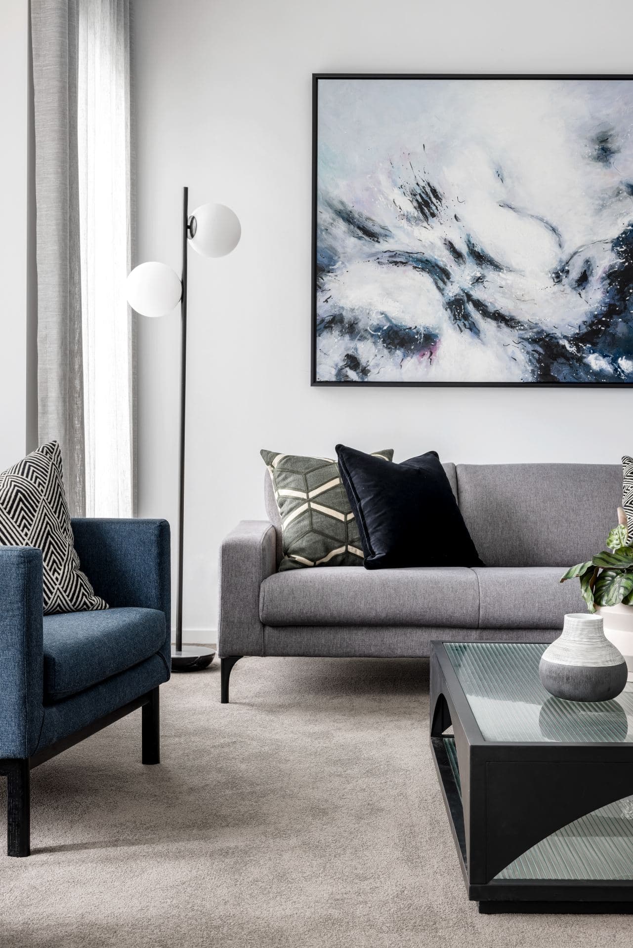
I think the formal living room, which is the first room you see as you walk into the home, is my fave of the lot. It’s moody and sophisticated, yet doesn’t feel stuffy or precious. There’s definitely a sense of formality here, but it’s comfortable too.
We painted the fireplace wall in the same Dulux Oolong we used in the living room at the back of the property. I wanted to ensure the different rooms were connected by an element like colour so they felt related even though they were far apart.
The navy blue Bolton Armchairs team so well with the Opera Sofa and deliver some much-needed colour. And to keep things playful, as I often tend to do in at least one of the rooms of the homes I design, I added in some Billie Justin Thomson cocktail prints on the wall (who doesn’t love a G&T?).


Things Got Moodier in the Ground Floor Study
The ground floor study was designed for the husband of the house in mind. It was a completely custom-designed and built joinery solution that addressed both form and function. We wanted it to look moody and amazing, of course, but ultimately work really well too.
We installed a long run of upper and lower cabinetry along the right wall of this study, separated by a tinted mirror that breaks up the timber. It not only adds mood but it also bounces light around the space. Some open shelving on the upper run of joinery breaks up any potential monotony and allows styling to take place.
The shoes and bags you see on the shelves of this study were made by the client, so I felt it necessary we showcase them in a meaningful way. I always tell clients that every room we design should ultimately reflect the people who live in the home, so we’re all about personalisation when it comes to styling.


Leaning into the Luxury in the Main Bedroom
Your main bedroom really should feel like a place you’re excited to go and unwind in at the end of the day, so that’s how we approached the design here. We wanted to turn up the luxury a little more than in some of the other spaces too, but still keep it grounded and moody.
While there are brass accents here, replicated in the ensuite you’ll see further down, the base colours were kept brown, charcoal and black to ensure it didn’t feel too glitzy. The Oslo Headboard from Heatherly Design is a stunner and sets the tone in the room, while the black bedside tables add depth.
We opted to wallpaper the feature wall behind the bed rather than paint it. Paint just won’t give you the same warmth and layering that a soft wallpaper will. The pendant lights – which I’m rather obsessed with – sit so nicely against it.


Joinery Goals in the Walk-in-Robe and Study Nook
The walk-in-robe and main bedroom study nook was another custom-designed solution. We worked in conjunction with our amazing joiner to turn these spaces into impressive zones that speak to the joinery in the study downstairs but don’t mirror it exactly.
In the walk-in-robe, we broke up any potential dominance from the doors by placing a built-in bench seat at the back of the robe with a panel of mirror installed above. Vertical open shelving also helped keep this space from feeling too heavy, while sensor LED lights were installed that turn on when you enter the zone.
Directly above you’ll notice that the main bedroom study nook features the same Polytec joinery colour as the WIR. We did this intentionally to ensure the entire main bedroom felt cohesive.

Last But Not Least, an Elegant Ensuite
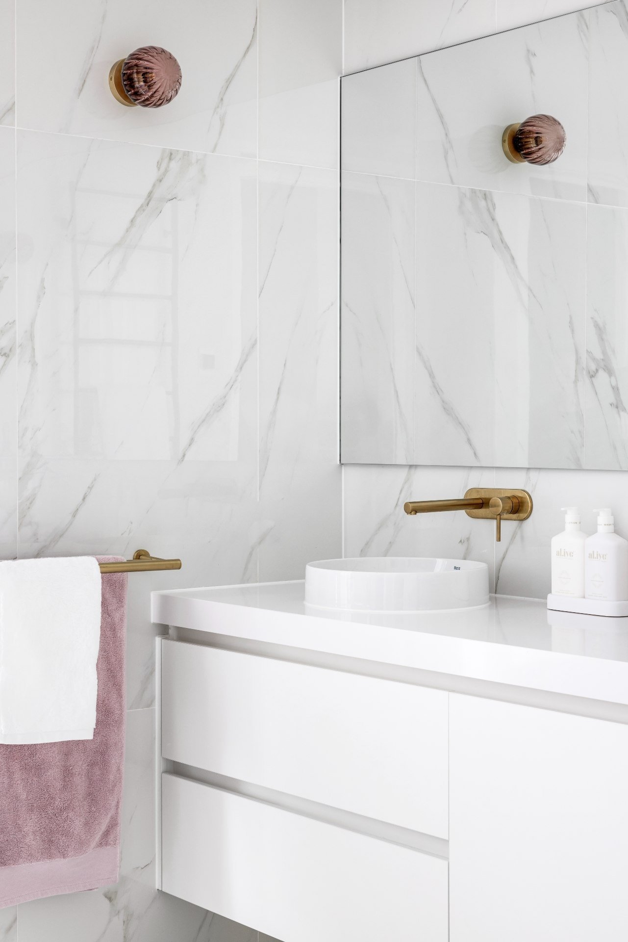
This is the other zone outside of the laundry where we decided to let brass fittings and fixtures run wild. The ensuite is the client’s own personal oasis; why not rock brass if that’s going to make your heart sing in the shower every morning?
The wall lights are stunners from Mark Douglass. The Classic Vintage Wall Light features the most beautiful aubergine glass and adds a delicate touch of class to the ensuite. Adding in the soft grey sheers behind the freestanding bath makes the space feel soft and ethereal; just how you want an ensuite to look.
Are you keen to have TLC Interiors make over your home in a contemporary luxe interior design style, or another aesthetic that reflects you and your family? Find out more and book in a consult here.


Hi Chris,
I am about do my first ever reno and am starting in the laundry. The first and most loved pic in my mood board was the laundry pic for ‘THE HAMPTON PROJECT: CONTEMPORARY DESIGN FOR A NEW FAMILY HOME’. Its the tiles that got me!. Are you able to share where you got those from?
Much appreciated,
Kellie
Hi Kellie, Metricon handled that part of the design but you should be able to find something similar at your local tile supplier. You can also search for “hexagonal marble mosaic tile”
Absolutely stunning!!! I love everything about the home. Can you tell where the bedside tables are from and also the cushions in the living room.
Love everything about this design! All the white accents are perfect and it makes the space looks really bright and clean!
Chris, I love your work! Everything is so well balanced…Beautiful!
Could I please ask…
What colour Polytec did you use in the Walk-In Robe?
What fabric is used for the sheers in the main room?
Where do you get the lovely cushions on the main bed?
Hey Mary-Ann,
Thanks for your kind words!
Walk-in: Polytec Havana Oak Woodmatt
Sheers: Warwick Burano Frost
Cushions: The green are from Living By Design (Madras Link are the supplier I believe), the lambswool are from West Elm.
Hi the pendant lights in the luxury bedroom are amazing do you know where I can find them please
The whole room looks luxurious but so inviting
Hi Carolyn. Thank you. I got them from The Lighting Collective. They’re called the Coral Pendant Light: https://lightingcollective.com.au/collections/interior-pendant-lights/products/copy-of-small-elegant-hand-blown-glass-pendant?variant=31445642150001
That oolong colour is soooooo good!
Thanks so much. You know I’m a big fan of a darker palette! 😉
Beautiful! I love the masculine and feminine elements blending together to create harmony