We won’t even go into the fact that The Block room reveals were shafted on Sunday, scheduled for Tuesday night, then shown on Monday because the cricket finished early.
We won’t even go into that. But I’m frowning in your direction, Channel Nine.
This week the final room reveals on The Block 2016 went down, proving that the most successful teams of the season still have this competition in the bag.
Want to know more about The Block? Read our ultimate guide to every season!
Let’s take a closer look…
Julia and Sasha’s Kitchen
Let’s kick off with the best room of the week. True to form, J&S created a room that felt luxurious and sophisticated, not to mention packed with designer wow moments.
The room has the Julia and Sasha signature style all over it.
The gorgeous dark cabinetry was punctuated by a white island, in all its lit glory. The tinted mirror splashback only made the space feel larger, and the pantry – with that ladder and rail – was the icing on the cake.
I think this is possibly my fave room in the competition. It was a great mix of traditional and contemporary – and I adore it.
Dan and Carleen’s Living/Dining Room
The colour palette in Dan and Carleen’s rooms was quite nice. I like the interplay of tan and blue hues. The furniture choices were also good, although I don’t think they were tied together very well – and the room was missing a few final layers. It felt as though the furniture was just plonked there.
I was also surprised by the choice to conceal the TV the way they did. I was mainly concerned because when the TV went away, there was nothing on the wall behind it, so you’re left looking at a blank wall. I’d argue that a blank white white is just as unappealing as a TV.
PS: I didn’t like that rug when Andy and Ben used it in their entryway, and I still don’t like it for this space; quite imposing.
Andy and Ben’s Master Bedroom
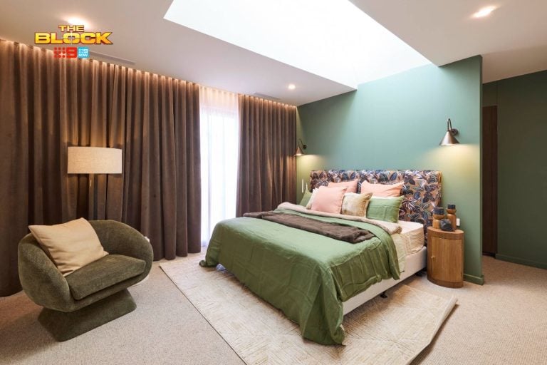
I’ll say the same thing I said about Andy and Ben’s last master bedroom: it doesn’t feel like a master bedroom.
The styling on the bed was a major letdown. This just goes to show (and I say this all the time, because people underestimate it) that styling is SO important in finishing off a room and setting the mood of the space.
The styling on the bedsides was also non-existent. The actual furniture choices were good, but they failed to complete the space and the result was really disappointing.
The rug felt a bit pedestrian to me too. The entire room just isn’t sophisticated enough for The Block.

Kim and Chris’ Laundry and Powder Room
Kim and Chris did a solid job in their laundry and powder room. This is probably how I would describe their journey in the competition actually; it’s always solid.
It’s never mind-blowing and it’s never bad; they have a sense of consistency about them, and they continued that trend in their spaces this week.
I will agree with Neale about the tiling in the powder room though. It was quite chaotic and visually overpowering. I would also hate to sit in there. Imagine a hangover in that bathroom. Ouch.
The laundry was very simple. Some styling would have helped to make this space feel more welcoming.
Karlie and Will’s Outdoor Area
I don’t know how you feel about this zone, but it all feels a bit hard and cold and unappealing to me.
The large, rusty, industrial panels set the tone of the entire zone, and they are quite hard and solid. Karlie and Will needed to create some softness in this space, but sadly they didn’t do enough of it and the zone feels quite flat.
If there was more cushioning on the bench seating and perhaps some large-scale outdoor cushions on the floor it would have made the area feel more relaxed and comfy.
What did you think about the room reveals this week on The Block 2016? I’d love to know your thoughts in the comments below.


