There was only one room on The Blocktagon this week that made me literally gasp, and that was Shay and Dean’s.
You’ll see the killer photo further down, but it truly gave me an out-loud OMG moment. I think they were robbed of the win and totally deserved every bit of the ten grand.
After a diabolical week last week – not finishing off the living room – it would have been so good for them to take out first place.
Want to know more about The Block? Read our ultimate guide to every season!
Anyway, let’s take a look at the rooms, what worked and where you can buy some of the loot from!
King and Caro’s Kitchen Reveal
I could happily take or leave this kitchen, if I’m being completely honest. I’ve come to realise, on a personal level, that I don’t like black cabinetry in a kitchen. I think a kitchen should be light and bright and give a sense of hygiene and cleanliness. A bathroom can be a dark, luxury oasis, but I like my kitchens airy.
My feelings aside (because it’s not all about me), the judges loved the space. They were wowed by the touchscreen splashback, adored the dishwasher and Neale thought the USB power point outlet was a winner. All three liked the size of the space too.
I also think the artwork on the island is a miss. I think rooms in a home should be linked stylistically, but his felt too obvious. I did adore the stools though – and that marble tray was divine!
Total Score: 29
Iron Bar Stools | Black Dinner Plate | Marble Serving Board
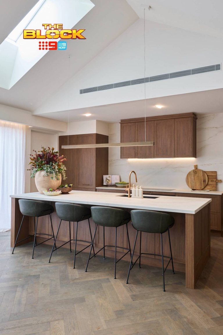
Shay and Dean’s Kitchen Reveal

As I said above, I literally gasped when I saw the first imagine of Shay and Dean’s kitchen. That view, good Lord! I don’t think it gets better than that, does it? They were right to move the kitchen and living room around – and the judges agreed.
Shaynna did make a mention of the kitchen island being to small. She might have a point. In a space that large they could certainly go bigger with the island. Though it’s not a deal breaker by any means. The stools were so so divine and I adored the other metallic touches in the space. Shay and Dean have a great eye for detail.
And how good was the vertical garden? They were so deserving of the win. Best design moment of the season!
Total Score: 28.5
Bar Stools | Large Copper Pitcher | Framed Twiggy Print
Luke and Ebony’s Kitchen Reveal
I’m loving the consistency these guys have as each space is revealed. Every room feels connected to the others stylistically, but the connection is not a really obvious one like with Kingi and Caro’s.
Shaynna loved how light and bright it was, and praised all the detail in the kitchen and adored the cupboard door profile. Now, as I said above, I love a light and bright kitchen, but I think this one went a little too far with the finishes all running into one another. It feels a bit bland, don’t you think? Don’t get me wrong, it’s gorgeous, but the finishing touches bring it to life; it doesn’t have a lot of punch on its own.
And speaking of finishing touches, how amazing was the artwork? These guys have a great eye for art this season.
Total Score: 27

Whitney and Andy’s Kitchen Reveal
I feel a bit sorry for these two coming second-last. I thought their space was really good from a colour and materials perspective. Where they did go horribly wrong, though, was in the positioning and layout.
I’m glad that was picked up on actually, because the sink was way too far away from the other important zones – fridge and cooktop. Every good kitchen floor plan has those three elements closely positioned, so they failed bigtime there.
I love how light and bright the space feels (and I love how they tied in the artwork to the wooden elements in the kitchen), but that herb garden was a no-no for me. It is great in theory, but what happens when you realise you’re not good and growing herbs and there’s a great gaping hole in your island?
Total Score: 25.5
White Clock | Tree Ring Print | Round Wooden Cheese Paddle
Suzi and Vonny’s Kitchen Reveal
You know how I feel about black kitchens by now, so it’ll come as no surprise that I think this Suzi and Vonny’s space left a lot to be desired.
Suzi and Vonni’s kitchen island bench got a big tick though, and rightfully so. Neale thought it was a great focal point, and they all loved the large scale of the space. That’s probably where the love ends for me though. Except for the styling. I did like the stools and the mortar and pestle.
Neal did comment that the whole room felt very black. As a kitchen is the hub of the home, I ask you this: would you want to hang out in there all the time? What a depressing space to spend your morning in. This space feels more like a hotel suite to me.
Total Score: 25
Hand Wash | Candle | Tolix Stool
>>> Which was your fave kitchen on The Block this week? Drop a comment below and let me know your thoughts!



I am finding a lot of “dark” rooms in this series and wonder if this styling will date very quickly. I like the use of some darker colours but not such an extensive use such as Suzi and Vonni and even Caro and Kingi have used.. Actually (for me), I would find some of these rooms very depressing to live in.
We have a dark wood kitchen and we really like it. However we have a rammed earth wall in white quartz and we felt a white kitchen on that would not work. Also, hubby is a builder and he is so over white kitchens – too safe! That being said I definitely loved the timber look in Shay & Dean. Keeping it light, but not boring 🙂
I bet if you saw white kitchens all day, every day – as your hubby has – you’d definitely be over them. I thought Shay and Dean’s was a happy medium. Something different, but still warm and inviting. I still can’t get over that view though. So stunning! See you next Monday for the next recap Chon 🙂
Agreed 100%. Shay and Deans was the best. I wonder if they all get to fix their (rather expensive) mistakes before the auction or if that’s it?
I think they do Karen. I’m pretty sure they did that on previous seasons. Some of Luke and Ebony’s first rooms, for example, need major re-working, so I hope they get a chance to fix them!