The Block 2016 finally unleashed kitchen week and its much-anticipated room reveals. But were all of the spaces up to par?
For the most part – if you take note of the judges scores, anyway – it seems as though the spaces were all pretty amazing. And granted, elements of them were.
Four of the five teams scored over 27 points, with Kim and Chris coming last place on 24. Two teams scored 10’s all round, which is a little surprising.
Want to know more about The Block? Read our ultimate guide to every season!
Let’s examine The Block kitchen reveals and see how it all went down.
Karlie and Will’s Kitchen
Karlie and Will’s kitchen is quite lovely at first glance. From a functionality point of view, it ticks all the boxes.
I’m a fan of the built-in bar area especially (Espresso Martini, thanks!), and I also like the niche under the bench; a great place to display stylish vignettes or cookbooks.
The biggest issue I have is the choice of cabinetry colour. Paired with a similar colour paint in this zone, it all feels a too dark and gloomy.
As you can see above, the photo is taken during the day and it’s still quite a heavy looking space. I’d hate to think how dark it would feel on a cloudy day.
More light-coloured timbers would have helped here.
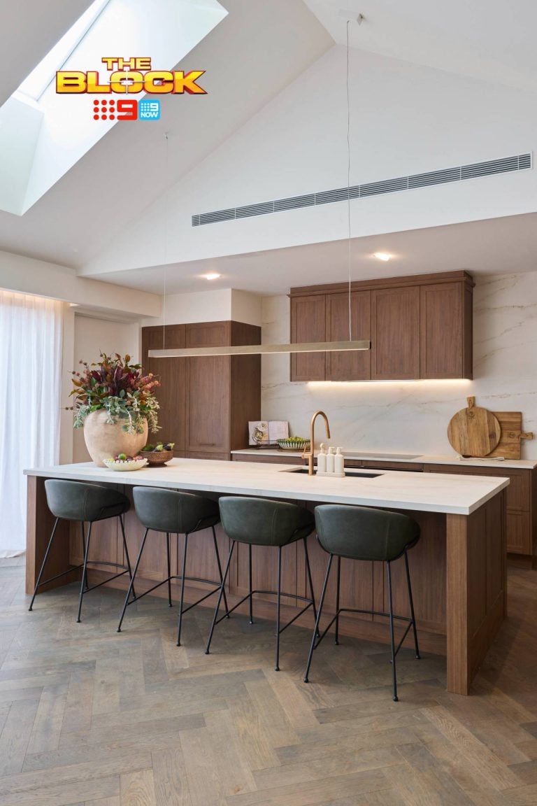
Dan and Carleen’s Kitchen
I have to say, I’m surprised this kitchen scored 30. When I took a look at all of the kitchens side by side earlier in the week (before I knew what the judges said about it) I had assumed Dan and Carleen came last.
The cabinetry is the biggest issue for me here once again. It’s actually far worse than Karlie and Will’s in terms of how dominant and overbearing it is in the space.
It is such a warm tone, and there’s just too much of it. It needed to be broken up with some other textures and materials.
I also loathe the handles on the cupboards and drawers. They remind me of the handles on old wardrobes from the 80s.
In the slideshow below, you’ll see how the kitchen looks with the open plan dining and living room beside it. To me, the balance in these rooms is off. One side is light and bright, the other too warm and heavy.
Julia and Sasha’s Kitchen
Julia and Sasha did what D&C and K&W didn’t; they used different textures in their kitchen to make the space visually interesting.
The white cabinets are broken up with pops of black in the island bench, as well as glass cupboard doors and a marble splashback.
I’ve said it before about the girls, but here they have done it again; created a space that speaks stylistically to the rest of the house. You’d know right away that this kitchen belongs to them, and in an open plan living space continuity is key.
The space feels elegant and sophisticated, and for me it’s the winning space. I can’t fault it.
Andy and Ben’s Kitchen
What I do love about this kitchen is that I think out of all four, it fits in with the living and dining room beside it the most. Regardless of the style of the kitchen or if you love their approach to the overall design, this kitchen feels like it belongs.
I have praise for the boys’ use of different cabinetry colours. Like Julia and Sasha’s kitchen, it makes for a more visually interesting experience when you mix up the materials. I don’t like the overdose of small cupboards up top in that configuration (it looks too busy), but overall the room has variety.
If Shaynna was yearning for a longer bench from Julia and Sasha, she certainly got it here. I also like the double sink. Dan and Carleen has only one sink in their kitchen and it seemed odd in such a high-end apartment.
Kim and Chris’ Kitchen
I don’t have a heap to say about Kim and Chris’ space, which is an issue that I’ve had when examining their other rooms. They create nice spaces, without a doubt. But they never tend to be wow moments, nor are they overly offensive.
I think they’ll probably get the lowest price on auction day, next to Andy and Ben. The apartment isn’t high end enough. This isn’t a bad thing stylistically (I personally don’t gravitate toward a high end look and prefer the approachable), but they are in the competition to rake in cash. And I don’t think this kitchen gets them that.
I didn’t like the wooden bench. The colour was too warm and felt out of place in the room. There was nothing in the kitchen, living or dining room to speak to it and have it make sense. An odd choice from Kim and Chris.
I think these guys would do well styling apartments and homes that don’t demand a sense of grandeur.
I was most wowed by Julia and Sasha’s kitchen this week, and the other four were just OK. What did you think? I’d love to get your take in the comments below. [/tps_footer]



I do not get the mixed metals in the kitchens…. A gold sink sticks out like a pimple on a … when appliances still continue to be the typical brushed stainless. I could’ve got it if the appliances were integrated/black. I also don’t understand the monstrosity that is the pop-up range in the Girl’s kitchen. I get the concept of cooking on the island so you can still be involved in the goings-on in the apartment, but that range totally kills that idea because it acts as a wall between the island and anything beyond it. Was a little bit underwhelmed by all of the kitchens and feel the Butlers “Pantries” (the size of an apartment kitchen) was such a waste of space and money. Just think it’ll be more wasted space in reality, despite its beauty in person and on paper.
I love your Monday morning recaps, and once again I think you nailed it. I sometimes don’t understand quite what the judges are looking for. Couldn’t understand Dan & Carleen getting three 10’s. My mother put this exact same kitchen colour scheme in, cherry or walnut and black granite, in the late 80’s, and it feels that dated to me. The rest were good if not fabulous.
I don’t understand why you would have a double sink in the main kitchen and then a sink in the butlers pantry. To me the butlers pantry is where you do the proper washing up, all you need in the main kitchen is a prep bowl.
I also don’t understand the obsession with ovens. More than 2 ovens seems way way over the top. We have two ovens and entertain a lot, and the second oven is barely ever used. I would never even turn on a third.
Overall I think Julia and Sasha have created the most cohesive most high end apartment, Will and Karlie a close second, and I think that is how it will probably pan out on auction day.