The Block 2018 terraces have been unleashed on us. And the good news for me (and you) this week is that I got to see each space in-the-flesh.
What that means is this: my truth bombs are truer than ever, because I’ve seen these spaces warts-and-all. And I’m here to serve up the real deal about which terraces were great and which ones flopped.
If you missed my tour of The Block apartments, click here to check that post out. In it, I reveal what’s different about the rooms when you see them in-person, as well as what I changed my mind about. And yes, I did change my mind about quite a few things.
When the judges terrace scores were delivered this week, I thought I had taken LSD and gone on a trip into a parallel universe. Needless to say, I did not agree with the scores. And below I’m going to B.I.D: Break it Down! So pull up a chair and let me serve you the tea.
And don’t forget to scroll to the end of this post to enter to win a $100 Block Shop Voucher.
Best & Worst from The Block 2018 Terraces


Let’s Start with Hayden and Sara’s Dreamy Terrace
This was probably the terrace that felt the nicest to be in. It’s really hard to describe a feeling in words, but when I walked from the dining room out into this terrace, the flow just made sense.
The link between indoor and out is effortless here. The lines feel quite blurred, in a really good way. You get to take in the views all while being cocooned by the roof and walls. And I loved the fact that the gorgeous green marble and gold accessories on the terrace spoke to the vibe the two created indoors.
I also really liked the mix of materials. It’s something I praised Hayden and Sara for in their kitchen and they did it again out here. The matt floor tiles are a nice contrast to the steel ceiling panels above. And their plant choices are wonderful too.
The padded bench seat in the corner of the terrace is a nice idea. Love that there’s storage underneath too. But this is where my criticism kicks in. While I do love the feeling in this space, and while I do believe their zone speaks the most to the style of the space indoors, there are issues.
Now Let’s Discuss the Downsides
The main issue I have is that there aren’t two distinct zones. In a luxury apartment like this one, with a terrace this size, I’d appreciate a lounge zone and a table area. We have the table area, which is fine (a rectangle table to seat six would have been more appropriate). But we’re missing the zone to chill out in. Layout is the issue here.
I’d have placed a lounge where the current table sits, and then placed a long narrow table where Hayden and Sara have the bar with stools. Nobody wants a bar with stools on their balcony. Think about it: when you go to a venue for food and drinks the last seats taken are the ones at the bar.
They get points for style, colour, vibe, the mix of materials and more. But if I’m paying big bucks for an apartment like this, I want two distinct zones. The way they’ve styled it here makes it seem smaller than it is. A buyer would like to feel their outdoor area is big enough for a table and a lounge.

Kerrie and Spence’s had a Few Issues
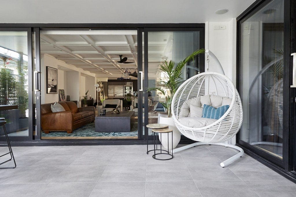
Kerrie and Spence’s apartment was the one I saw first on my tour this week, and it was really rather impressive inside. The joy and rapture didn’t necessarily continue as I stepped my tootsies out onto the terrace. But it wasn’t all bad.
The first thing I thought when I stepped out into this area is how good it was that there were two zones. One for chilling, one for eating. So I’ll give them a few points for that alone. They even managed to get a hanging chair in there as well, so you actually have three zones to play in.
Yes, things are fairly simple here. I will say that. There isn’t a wow moment that captures your attention, or a focal point that draws your eye when you step out onto the terrace. If they had of painted the window trims black perhaps that would have connected the indoor and outdoor zones stylistically. Or at least given you a focal point in the space.
More Issues than Vogue, Actually
The other issue is that the terrace (especially the lounge setting) doesn’t speak to the style of the apartment. The apartment is quite dark and moody inside, and this terrace feels quite light and coastal. It’s an odd contrast in terms of look and feel. So they do get some points deducted for lack of cohesion.
Functionally, the terrace is missing a cooking area. What’s with that? No barbie to sizzle a snag on? If I’m forking out the cash to buy this place I want a divine built-in cooking area with all the mod cons. I don’t understand having people over and having them sit on your terrace, and then going all the way into the kitchen all the time to get food. It’s odd.
I also would have chosen a table that was lower, but that’s just me. I hate eating at a tall table with tall stools. It’s not relaxing or comfortable. And after seven flutes of bubbly the chances of falling off your stool are just far too high (been there, done that) 😉


Hans and Courtney: I’m Sorry I’m Not Sorry
Hans and Courtney definitely deserved to land on the bottom of the ladder this week. Their terrace was disappointing on all fronts.
Similarly to Kerrie and Spence, the style choices out here are no reflection of what’s going on inside. Nothing about Hans and Courtney’s space says cool and coastal, so I have no idea why they selected furniture with that vibe in mind. Not only is the furniture style off, but the lack of furniture is too. Seating for four only is just plain odd in a space this large.
I see that they were going for a ‘watch movies on the terrace’ vibe, but even this concept is flawed. They already have a dedicated TV zone right inside the door bedside the terrace. Why do you need a cinema screen mounted just steps away? Given that the apartment has one dining table at the other end of it, it would have made sense to create an outdoor table area you could sit at in summer.
The only thing I like about this space is the built-in bench seat. It would be a great place to curl up and read in. Outside of that though, they need to start again.
That palm tree light is also just not OK.

Bianca and Carla, It Pains me to Say This
You know I love me a good dose of Bianca and Carla, but I don’t love much about their terrace.
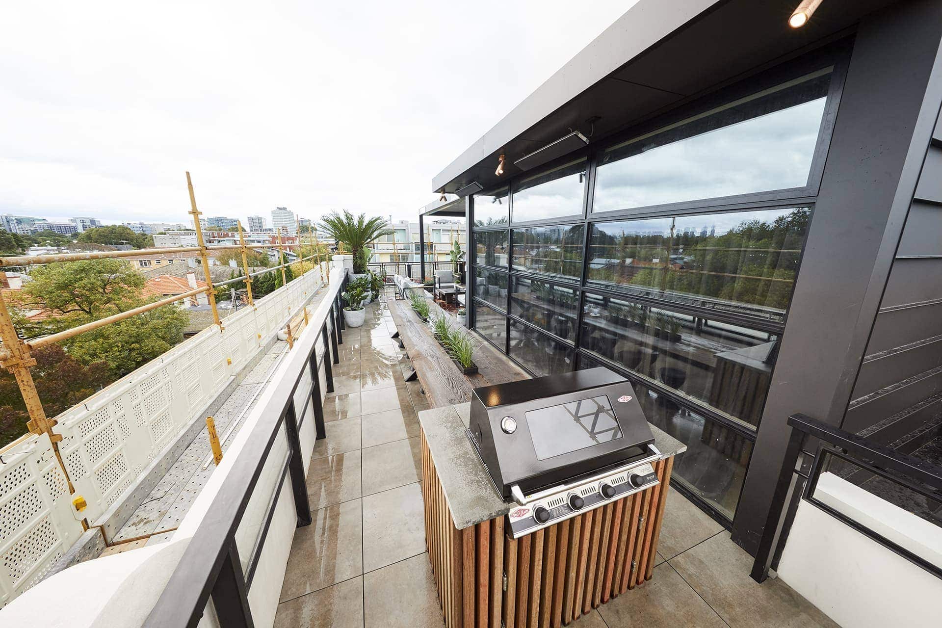
Let’s start with what’s working. I love the long table and BBQ zone. Who doesn’t want a zone like that on their terrace? It’s going to get people over the line from a practicality perspective when buying this apartment. I quite like the weathered nature of the timber paired with the clean, contemporary vibe of the egg stools underneath it.
The one thing I picked up on from a practical point of view is the lack of bench around the BBQ. When you’re cooking, where are you placing trays or meat and all your cooking utensils? There’s nowhere for them to go.
Like Natalie Imbruglia, I’m Torn
Outside of the long table, I don’t enjoy much else here. I don’t understand the choice of furniture. It feels old. It’s not modern, it’s not chic, it’s not designer. It just feels very run-of-the-mill. I’m not even smitten with the red herringbone timber floor they installed here. It feels too visually jarring.
I also don’t see anything cool on the one wall in this zone. Imagine if there had of been a graffiti mural, or something else painted on the wall. Something to give it some oomph. There is no focal point here. And we can’t just say “the view is the focal point”. Because I don’t buy that. Even the plant choices and their pots feel a bit blah. Sorry ladies!
I’m also not keen on bar stools facing outward. I’d never use them. If I had guests over I can’t imagine them using them either.
I’m so Torn, my glorious ladies. I love so many things about your apartment but this terrace isn’t one of them.

I Kinda Don’t Get Jorm’s Space as a Win
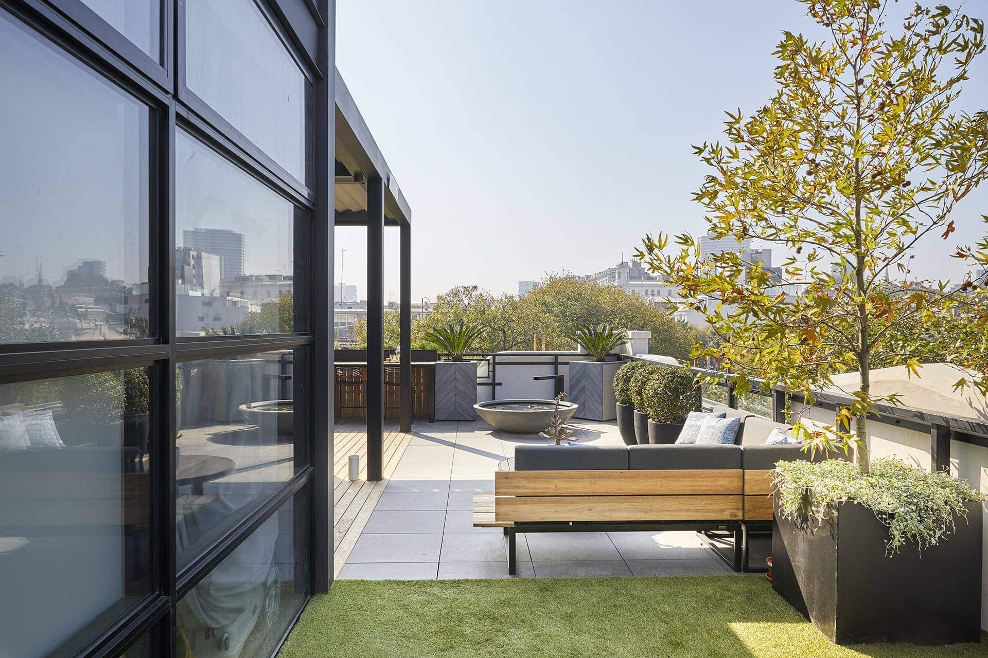
I most definitely must have taken the LSD and entered another realm, because I don’t get this terrace as a show-stopper. Of course there are some nice moments, but overall, it’s OK. It’s not presenting anything I haven’t seen before in magazines or TV Shows. In fact, it’s pretty subdued in terms of design. No colour, little pattern, certainly no focal point. Nothing I’d walk out into and think OH MY LORD LET ME TAKE A PHOTO OF THAT!
The vibe here mirrors what a lot of the teams did inside their apartments: keep it simple, keep it safe, don’t offend. Where is the risk? Where is the moment of genius? Maybe I need to call Specsavers because I’m just not seeing the magic here.
This is a large terrace. They zoned it into a few areas, which I fully appreciate. But they could have taken things further. Why not a jacuzzi or hot tub instead of a water feature? I don’t really get the point of a round tub continually filling up with water on the corner of a penthouse terrace. I’d rather have one I could sit in with a cocktail and enjoy the sunshine.
Have I officially gone mad? I need you to give it to me straight.
I’d have also put a rectangle dining table instead of a round one. As it is, the round one looks quite cramped. Six people around that table is going to be tight. And if you did have six people over for dinner, they couldn’t all then go and sit on the lounge because it’s built for five. They needed an armchair with the lounge setting.

WIN A $100 BLOCK SHOP VOUCHER
Every week I’ll be giving you the chance to win a $100 voucher for The Block Shop. The winner will be announced in next week’s Block recap (right here on the blog), where you can then enter again to win. Repeat each week until the end of the season. How exciting!
Last week’s winner: ANGELICA CATEMAXCA
TO ENTER TO WIN THIS WEEK:
Simply pop a comment below telling me what you thought of The Block 2018 terraces. It’s that easy!
Comp open to Aus residents only. Comp closes 7pm Sunday October 14.


Chris, your articles and reviews are the best!!
This terrace one is no different. Thanks for keeping a sense of humor, even when when dismayed etc. Thanks for the Lols.
A hot tub in Jorms space is an awesome idea! Is anyone else surprised no one did this?
When you consider some employed a designer for these areas I definitely expected more, more WOW, more cutting edge design… just more! Maybe the terraces should be done first so they can blow some money and get that wow factor!
Yes Chris I definitely agree with you. I also think the contestants were running out of money.
The penthouses in particular should have more luxe about them, considering the amount of money they will sell for.
I’ve been underwhelmed this season, which is a shame considering they had the Gatwick to renovate.
Time to find you your own show Chris ie: before and after styling techniques, I’d prefer to watch you instead of this season’s Block.
Completely agree with your comments. The penthouses were just so boring. Nothing exciting. And I feel like you’ve hit the nail on the head, it seems the whole building has a mandate to be super safe. Dave Franklin is clearly capable of better work…
The challenge apartment’s floor plan is not anything exciting either…
I agree with all your thoughts. The thing I absolutely loved was the outdoor fire place. Maybe the block contestants should be given a keep-your-head-up bonus at the end to so they could deck out their decks!
The Penthouse terraces look way more impressive than the sunrooms of the other apartments which to me feel kind of unnecessary. I’d rather have a study, a proper movie room or another bedroom in my apartment than a sunroom with uncomfortable furniture. However I agree with you that Sara and Hayden’s was the nicest of those. I liked Jess and Norm’s terrace best of all. Not sure if they could’ve had a hot tub, they wanted a pool but it was voted no by the body corporate.
Some good calls! Most ran out of money so it would have been interesting to see what they would have done if they had the cash to splash.
Well finally someone ( Shayna ) has declared white walls in the ‘sick off this category ‘. Why do we have colour referred to as pops or accents? Take a leaf from some stylish Italian , French or NYC dwellings. Colour and layering are so much more engaging. When you go for consensus bland is the result!
Just wondering… if you don’t get Norm and Jess’s as a win.. (which I can understand from your comments) then who would you have chosen for a terrace win?
I agree with most of your comments – Hayden and Sara’s was gorgeous in terms of the mix of materials and really felt luxurious, but I agree – they need a comfy lounge out there to enjoy the space. And I just don’t get the “bar” concept – it isn’t great for socialising. These are easy fixes though. Bianca & Carla – just didn’t feel functional. I would take your comment about the bench tops needed for the BBQ further – if are seating 20 people at a massive table, you are going to need a BBQ bigger than a 4-burner to feed them all. Yes, Norm and Jess – safe and nothing “wow”, but it still felt quite functional and the separate “zones” were well defined. Clever to add the grassed area to differentiate as well.Have loved following your comments this season – always a different perspective or something the judges didn’t pick up.