We need to talk about The Block 2018 challenge apartment reveal you guys. Because good Lord… someone needs to tell it like it is.
I mean, you know I’ve been yearning for wallpaper all season, but holy hell… what happened? I feel like I somehow went back in time, accidentally changed channels, and found myself watching a 2017 House Rules reveal. Yes, I just went there (and you know it’s true). Some of the rooms this week were absolutely sub par, and yet buckets of praise were given to some of the most diabolical design moments! What the actual?
I’ve officially gone bonkers and need to be committed. But before you strap on the straight jacket, let me get out all my thoughts and constructive feedback below. Because you know we need to BID: Break it down!
And of course, at the end of the post you’ll have a chance to tell me what you thought to go in the draw to win a $100 Block Shop voucher. Almost the last one of the season actually. Let’s do this!
The Block 2018 Challenge Apartment Reveal 1

Let’s Start with Hayden and Sara’s Bathroom
There were a few exceptions to the “OMG what happened here?” shock and horror, and this bathroom was one of them. Hayden and Sara delivered a space that felt contemporary, sophisticated, chic and interesting.
I love the floating vanity, I adore the way it speaks stylistically to the bathtub, and I enjoy the choice of black tapware too. The dual basins were a nice touch. And I like the fact that they kept the mirror fairly streamlined and simple so that the bath could be the focal point in the space.
In terms of function and usability, it also works. Towel rails near the bath and shower: check. Towel rail for a hand towel attached to the vanity: check. And can we take a moment to appreciate how far these two have come regarding bath selections? I mean, from the gold monster we all know and hate in their first bathroom to this chic situation is a dramatic improvement. If you love the look of this black bath you can see more of it here.
What I would have liked to have seen here is something to give the room a bit of earthiness. I know they’re going for chic apartment vibes. And I know a round timber stool beside the bath might be considered quite expected, but the room needs less gold accessories and more timber ones. Though I do love that gold croc.
Going back to functionality for a moment, I’d hate that when I was taking a bath there is nowhere to put anything; shampoo, soap, loofa, goblet of red wine and cheese platter containing 15 wheels of triple cream bree. A recess in the wall beside the bath would have been appreciated.

Let’s Discuss This Jorm Master Bedroom
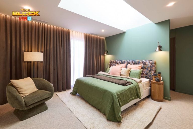
Here’s the thing you guys: Jess and Norm’s master is not the things nightmares are made of. It’s not the design version of the clown from IT. But let’s be honest, it’s not great. It’s not Block worthy. I mean, sure they get points for showcasing a wall that wasn’t just doused in white paint, but by usual Block standards of years gone by, it’s a bit of a dud.
This is a master. Where is the grandeur? A headboard is one of the things that creates a sense of grandeur and yet they neglected to include one. To make matters worse, they used those too-small-for-the-room round marble bedsides that TWO other teams have used this year. I feel like there was a flash sale on these tables and everyone grabbed some. I used to like the look of these tables and now I’m turned off. Probably the opposite effect of what products on this show are meant to do.
Also, cute that there’s a fireplace but kinda nowhere to sit in front of it. Can I also point out that those pendants are an odd choice? I reckon they’d work great in a living room corner with three of them clustered together at different levels. But here, they look odd. And again, for a master that’s meant to evoke grandeur, they’re too small. The rug I really quite like, but it’s just thrown down at the end of the bed with no sense of purpose.
Can I also mention (and I don’t mean to get personal here), but what’s with the gallery wall of photos of The Block contestants? Whose idea was this? It is so self indulgent. Can you imagine me decorating a client’s home and they walk into their bedroom and there’s a gallery wall of me having a beer in their back garden? A snap of me and the tradie who installed their pendants? It’s so bizarre.
And outside of that, the gallery wall itself looks horrible. This is how you do a gallery wall.

Bianca and Carla have just Two Issues
I quite like this bathroom from Bianca and Carla. The colour palette is rather delightful. Love the way the soothing blush tones pop against the black vanity. And I love the light streaming through those shutters.
I’m also a big fan of the double shower and the double basins. It certainly feels like an indulgent space. And it’s a yes, yes, and yes to those round mirrors. I understand that the tile choices were kept fairly subdued because the wallpaper was the star of the show here, but that’s where I have my first issue: that wallpaper is not the best choice for this space.
It might be more a personal preference than a design crime, as such. But to me the wallpaper is something I’d expect to see on the walls of an upmarket beachside restaurant. I see wicker chairs against it. It would feel right at home in that sort of setting. But in this bathroom, I don’t get it.
I can appreciate how B&C have accessorised with colours pulled from the wallpaper, so they get points for that. But I still don’t enjoy the wallpaper itself in this setting. If they were absolutely devoted to using it, then the bathroom needed some blonde timbers in it to have the wallpaper make more sense. There are two different vibes happening in this space and it doesn’t feel cohesive as it is.
The only other issue I have here is the pendant light. It’s kind of unnecessary in the room and the brass colour story is an odd one considering I don’t see it anywhere else in the space. The sizing is also a bit small. I’m all for a statement pendant that is just for show, but you gotta go all out and commit to the statement. This one feels like a bit of an apology.

What the Actual Happened Here?
We’ve come to the part of the post where I unveil the two most horrendous rooms of the week and demand a Bex and a good lie down. Because for real: what the actual is with this room?
Nothing is going to convince me – not even the judges – that this wallpaper is a good option for this space. It is absolutely bonkers. Not only is the pattern itself rather hectic and way too over-the-top for a bedroom, but the scale of it is too big for a room of this size.
And you know me; never met a piece of decor I didn’t like (except these 10 no-no’s). So I can see this wallpaper working somewhere like an underground bar. I’ve been to underground bars where bizarre wallpaper like this looks phenomenal. But not in a bedroom in what’s meant to be a luxe Melbourne apartment. It is just not on. I can’t even work out what animals are on it and I don’t want to.
The worst thing is, outside of the crazy wallpaper, this is just the same bedroom design recipe we’ve seen every week: white walls, grey carpet, upholstered velvet bed. And we still have white walls in this room. The space delivered nothing new except a wallpaper that was inappropriate for the space, and yet it got oodles of praise.
The other thing: you can’t just keep bright white walls and assume they’ll work with any wallpaper you apply. That’s just a side tip from me to you. You still have to consider how the white wall will work against the adjacent wallpapered wall. And here it’s quite a clash. Way too high-contrast a space.

And Things Only Got Worse in This Room
If it’s one thing I want to think about when I hop into bed, it’s the stench of urine that comes from the graffiti laneways in Melbourne’s CBD lol. Now don’t get me wrong, I love graffiti. I’m actually rather obsessed with street art. I have been to the graffiti laneways of Melbourne before, and they are divine. But that doesn’t mean it’s appropriate to apply a blurry-looking image of one on the wall you face when you climb into bed for the night.
This wallpaper is just so overbearing. And there are actual stains on the ground in the photo, which I can only assume (having been to these laneways and inhaled) are urine. It’s such an unattractive image and the scale of it is so large. Golden rule when it comes to dramatic wallpaper (or art): put it on the wall behind the bed. That way, when you’re lying in bed trying to relax, it’s not too stimulating. Kerrie and Spence did the opposite and it did not bode well for them.
I’m so gutted that in a week where the teams finally used wallpaper, they made such bad choices. This is honestly something I’d expect to see in a teen boys room on House Rules with some skateboards on the wall. And I know that stings to hear, but it’s true. The bedrooms this week were just not Block worthy and we can’t keep pretending otherwise.
Outside of the wallpaper, which swallows almost the entire room, I’m not much of a fan of the rest of it. I really appreciate that they tried to do interesting things with the built in desk and headboard, but they are too dominant for a small room like this. It feels really tight. And made even tighter with that wallpaper in the room too.
I also don’t get the low exposed power point. Some poor planning there to pop it there and then leave it uncovered.
WIN A $100 BLOCK SHOP VOUCHER
Every week I’ll be giving you the chance to win a $100 voucher for The Block Shop. The winner will be announced in next week’s Block recap (right here on the blog), where you can then enter again to win. Repeat each week until the end of the season. How exciting!
Last week’s winner: ROBYN CATALANO
TO ENTER TO WIN THIS WEEK:
Simply pop a comment below telling me what you thought of The Block 2018 challenge apartment rooms. It’s that easy!
Comp open to Aus residents only. Comp closes 7pm Sunday October 21.


You are the only recap I can find that is actually honest. Thank you. I couldn’t believe Shaynna saying a teenager would call dibs on the room with wallpaper featuring drunken animals. I imagine they would have received 10/10 if they styles the room with a feature bong to ‘really capture the essence of St Kilda’. The only room I liked was Sarah’s bathroom. To my untrained eye something seemed off but when you pointed out the lack of shelf cavity behind the bath it solved my mystery. And I’m honestly happier to never a see the gratuitous use of a wooden stool next to a bath again. I loved the bathtub she used and if I wasn’t a renter it would be mine! I
Agree agree agree. This apartment is supposed to be a marketing pitch but its actually deterred me from buying said Monopoly game. Hopefully the rest of the reveal will bring it up to par with expectations.
Great recap as always! I’m really curious as to why no one has used wallpaper for the entire season (despite the fact it would have been great in some rooms) & now several have used it in this apartment? Maybe the wallpaper master hasn’t been available until now? The lack of cohesion between the rooms is disappointing & will require fixing by the new owners I think.
Underwhelmed by the design and styling seen on this years block. Same old, same old! The contestants had an opportunity to step out side the box this week and bring textures and materials to a new level. White walls? Boring! Bring in St Kilda with some bold wall colours and offset with velvets, timber, leather and bold artwork!.
Liked the bathrooms, perplexed at the bat-shit crazy guest bedrooms and disappointed with Jorm’s master The sofa/bed sides looked like they’d been shrunk and the electric fire looked tacky. I can only assume that the judges stopped off for a couple of drinks before judging, to all give 9.5/10 for H&Cs room. Other than the wallpaper (which was was hideous) it was a duplicate room. No innovation or design at all.
Hi Chris,
Love your re-caps each week. And I’m not a fan of either of the wallpapers used either. Too much in a room which is supposed to be about relaxing. However I would have loved Spence and Kerrie’s graffiti wallpaper if it was smaller and in a black frame. I’m curious as well – what are your 10 decor no-no’s?
Linda
The biggest thing I can’t get over in this ep, is that this is one apartment! Did they not discuss anything together, like textures, styles, colours etc?? I like S+H’s bathroom, but yes needs a bit of warmth, not hard to fix. Surely was an ep of House Rules. And on a completely random note, something I have issue with in hotels and short stay accomm, why are mirrors hung so high?? I’m 5ft2, and I’m pretty sure all I’d see in B+C’s mirror would be the ceiling. Just sayin…
I’ve actually got to the point in this year’s The Block – that rather than watching every night, I watch *some* of the recap until I’m over the ads, and then I just wait to read your recap the next day. So much more entertaining! I agree with you – hate the wallpaper this week, ALL of it! EEP!
Each room went from bad to worse. Nothing is cohesive. What was with the wallpaper? The massive graffiti one was so wrong in a bedroom. I definitely needed a bex and a good lie down but not in any of these bedrooms
Both the bathrooms were lovely, and I’m not really a fan of the pink wallpaper but it did work I thought. The brass pendant does look odd now that you’ve pointed it out though. The bedrooms were all pretty ordinary I thought, but if I win the apartment, I’d rather have bedrooms to fix that bathrooms. Let’s hope they do a good job of my kitchen and living areas next week! As for the gallery wall, personally I’d love my very own wall with photos of you in them, Chris, in fact I may have one already! lol