The Block 2018 challenge apartment reveal marks the end of the reveals for this year. What will we talk about until House Rules lands in 2019?
It feels like just yesterday the first reveals went down and I all too quickly started going on about wallpaper. Or lack thereof. I’m clearly still holding a grudge over it. I love wallpaper, in case you didn’t get the memo. And not the awful stuff in the bedrooms of this challenge apartment either. I’m talking the sophisticated designs that make a room feel warm and inviting.
Anyway, as we prepare ourselves for auction day (think I need an auction day viewing party) let’s not bid farewell to my critiques just yet. We have a whole one to go below that should quench your thirst for honest feedback about interior design.
Oh, and don’t forget that further down it’s your last chance to win a $100 Block Shop Voucher. Your last opportunity of the season to be precise!
The Block 2018 Challenge Apartment Reveal Part 2

Hans and Courtney Delivered their Best Room Ever
Oh my word. I need a lie down alright, but this time it’s not because a team delivered a diabolical room that the judges deemed delightful. It’s because I’m overcome with such surges of internal joy that I don’t think I can stand up a minute longer.
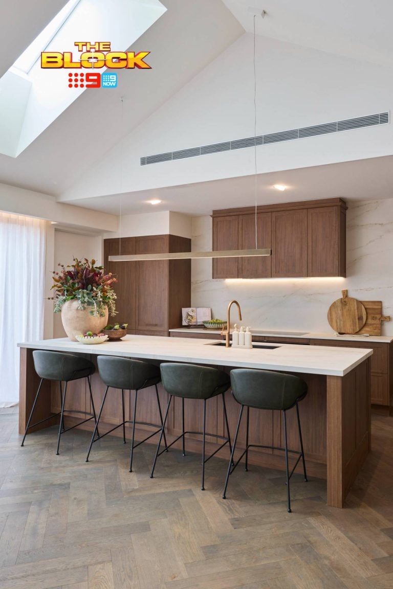
This kitchen is the sun, the moon and the stars. It’s my universe. There are a few minor issues, which we’ll get to in a moment, but let’s talk about the sublime stuff first.
I’m living for the chic colour palette. This is what I think of when the term ‘luxe Melbourne apartment’ is thrown about. It’s striking, it’s bold, it’s unexpected, and it feels super expensive. I could roll around in this room for months. Imagine all of the Instagram photos you could take in this room. It kinda reminds me of a New York apartment. And that splashback is everything!
I can also say that despite them probably not being the most comfortable things to sit on, I adore those stools. Even just the little pop of pink with that 3182 neon sign is a stroke of genius. It’s a chic space, but it has a sense of play to it.
The layout is a really successful one too, and I love that you can stand at the sink and look out the window. But here’s the issue: The upper metal shelving above the sink and the island is too low. You couldn’t possibly stand at the sink without it obstructing your view. Nor could you have a conversation over the island and actually see your guests.
If Hans and Courtney removed those two elements I can successfully call this the best kitchen in the history of The Block. Yes, I said it!!!!! We’re ending the season with some major praise. This is not a drill.

It is Really All Good for Jorm?
The sign in this room doesn’t necessarily sum up how I feel about this space. I mean, props for doing a few good things in this dining room. But I feel they got one of the easiest spaces this week.
This zone is so ripe for major design moments and yet they did so little with it. Plonk in a table and chairs, throw up a neon sign and you’re done. I don’t see a whole lot of design here, so it’s tough to really go deep with this critique. There feels like a lot of open space here. And I don’t think less is more.
What they did in the room I do enjoy, for the most part. I do love the table. Being beside a kitchen that’s so striking and with so many hard lines, it was wise to introduce a round table. It gives some softness and fluidity to the room.
But the chairs feel disappointing. For a season that was so full of velvet upholstery (and I am officially over velvet headboards right now now) this is the one space I feel needed some. There’s just not enough balance of materials. It’s all a bit hard. It definitely needs some softer moments to take the edge off.
I don’t know how I feel about the neon sign. I mean, I do love neon signs in general, but it does feel rather large. I know that was the point, but a sideboard would have been nice in that recess. I do feel this wall painted black with a sideboard in front of it and a large artwork would have been a better move.
I mean, it’s a dining room; give it some depth. Or imagine the entire wall filled with black floating shelving against a black wall. So many possibilities! The pendant lighting I do feel is rather phenomenal.

Bianca and Carla did not Fare Well
My fave gals in the competition did not score well this week. And it pains me to admit that I can see why.
Now, I’m not sure how much collaboration happens between the teams when designing this apartment. But the kitchen and dining room had a sense of flow. There was a relationship between the two. But as we travel down to Bianca and Carla’s living room, things fall apart a bit.
The main issue is that this space feels so relaxed and bohemian. I love so many of the elements but they don’t belong in this apartment. That sofa, for example, is gorgeous. It looks comfy and cosy. But it’s too casual for this room. Ditto to the red rug and all of the cushions. They just don’t make sense in the space.
There’s a lot going on in this room and yet nothing going on at all. I put it down to the styling, which clashes a lot of colours and patterns but gives you no distinct focal point. There’s no place your eye goes to when you walk into the room. No wow moment, and no hero. And yet it feels really busy.
Even the wall with the TV on it feels undercooked. Some cabinetry here would have been nice. Even a wall-mounted TV unit could have worked. Something to give it a feeling or permanence. It feels very home-staged for sale. Which I understand it actually is, but this is The Block. It needed to go further.


Hayden and Sara were a Mixed Bag
Maybe this was revealed during the week, but how did Hayden and Sara draw the short straw? I mean, Jess and Norm get to plonk a table and chairs in a room and call it a day, while Hayden and Sara had to design three zones. Not sure how that happened. Someone please explain if you know.
I loved Hayden and Sara’s laundry. It speaks so nicely to the look and feel of the kitchen. It’s nice in a home to have the hard zones like the kitchen, bathroom and laundry all speak to one another stylistically. So I fully appreciate the consistency there. The laundry feels chic and striking. Again, how a luxe apartment in Melbourne should feel.
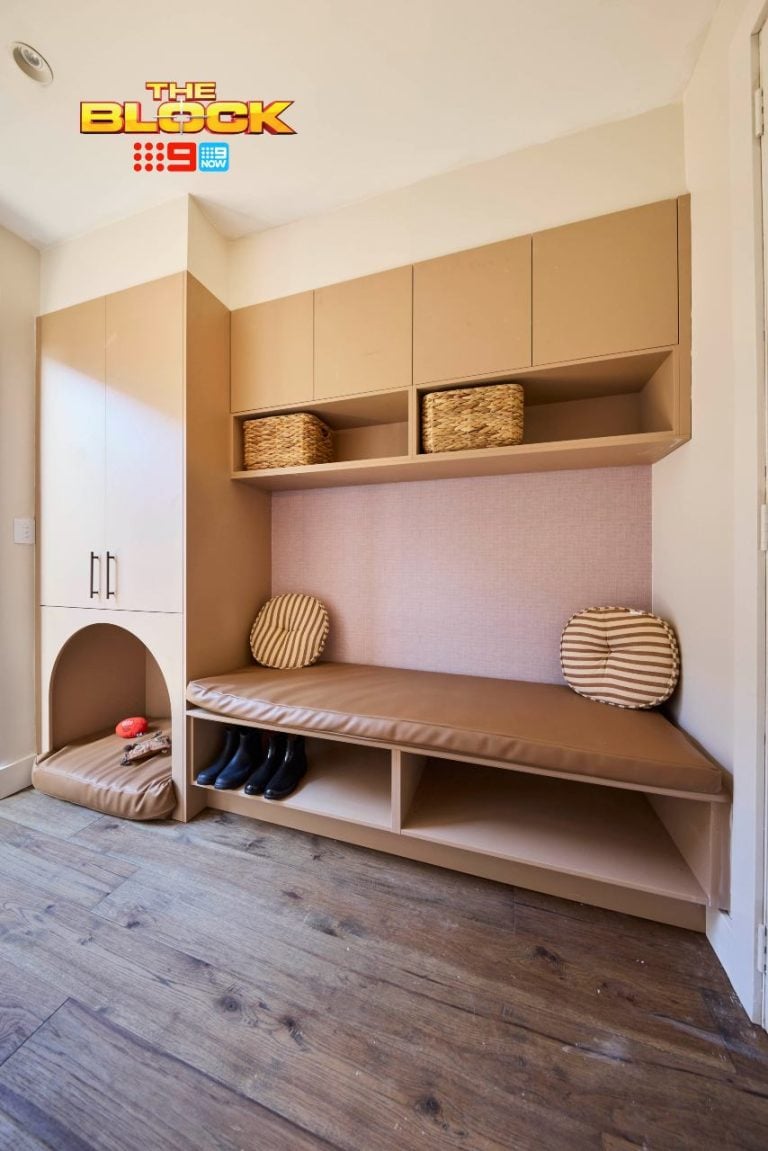
I will say that things fell apart in the entry/hallway. I’m not sure what happened there. I loathe the large wall mural of the woman in glasses. It feels tacky in this zone. And that’s not to say it’s tacky in general. There is a space for every piece of decor (for the most part). And I could see this working on the wall of an inner city cafe. But not in the hallway of a luxe apartment.
Having that large decal on the wall also made placing furniture around it an obvious challenge. As it stands, the whole zone feels a bit thrown together.
The study is quite nice. I love the idea of a built-in study nook with loads of storage and shelving, so they get props for that. I also like the colour palette and I enjoy the rug on the floor. And I’m rather fond of the leather chair at the desk. This and the laundry elevated what was a poor hallway for H&S.

I Don’t Get the Terrace at All
Kerrie and Spence got a good score this week which confuses me to no end. This terrace feels rather all over the shop and I’m not sure what the judges saw in it.
Personally I want a terrace to feel like a terrace. I can appreciate that this is a fully enclosed room, but it’s still as close to an outdoor room as you’re going to get, so I’d have personally liked to see it staged this way. I don’t understand all the indoor furniture plonked in this room, and a lot of it doesn’t work in the space.
The sofa, rug and coffee table are all quite nice in their own right, but they feel out of place here. Where are you going to entertain guests in the middle of summer when they come around? This outdoor zone needed a killer set of table and chairs with a dramatic light over them. It needed some awesome tropical wallpaper on the wall and a few lounges you could lie down and have a cocktail on.
I just don’t understand this staged the way it is. It’s a white shell with some living room furniture put in it. I don’t see the any design vision or point of view. Not the way I do in the kitchen and dining room. Those two spaces make a statement about the style of apartment this is. The terrace does not.
That’s about all I have to say about this I’m afraid. Not loving, nor liking, any of it.

WIN A $100 BLOCK SHOP VOUCHER
Every week I’ll be giving you the chance to win a $100 voucher for The Block Shop. The winner will be announced in next week’s Block recap (right here on the blog), where you can then enter again to win. Repeat each week until the end of the season. How exciting!
Last week’s winner: Tracy Hartwell
TO ENTER TO WIN THIS WEEK:
Simply pop a comment below telling me what you thought of The Block 2018 challenge apartment rooms. It’s that easy!
Comp open to Aus residents only. Comp closes 7pm Sunday October 28.


This is the Gatwick, if they were going for the ‘rising damp look’, they could have saved themselves some serious $$ and done away with all those stone splash backs for a similar result. The open glass shelving (AKA dust bunny and dead insect storage) gives me conniptions when thinking about the practicalities of keeping all that open surface area clean. Same thing goes for those recessed window sills, in what world is this a normal kitchen design element? The neon lights are just NO, and they sure as shit don’t deserve their very own nook. On the positive side, Hayden and Sara gave all the critics the big ol’ middle finger in this challenge apartment by creating some quality spaces. Considering their room allocation, this was a pretty awesome achievement. I’m a reluctant Block viewer, needing inspo for my new house. These articles have helped me through a very troubling time.
Really disliked the functionality of the kitchen, shelves were far too low, did like the colour palette. Just dont think it was a fair competition of spaces in this challenge. So it lost my interest very quickly. Loved what Sara and Hayden achieved, maybe the girls should have been given a bigger zone. Really hated the pink neon sign in Jorms room. I am not a fan on any of the neon lights anywhere unless is a 5 year old bedroom.
Agreed again! You say the honest and comment what’s needed. I found the allocation of rooms/areas to be unfair. The girls had no chance of winning even if their living room was amazing. The same for Norm and Jess. I loved the kitchen but I’d go mad trying to keep all the exposed shelves clean. But I think they deserve red to win for sure. I also loved the laundry.
I’m going to miss your comments also Chris.
I didn’t get the terrace at all.
A grand piano?
I agree with you entirely Chris, a terrace in a luxury apartment needs to be just that. A gorgeous large table and chairs for entertaining ( mmmm, I suppose that’s why the piano).
It doesn’t fit in with the style of the other rooms, you have a gorgeous industrial style kitchen that you mentioned the overhead shelvings are too low. But then, the terrace is befitting a luxury hotel foyer with the piano not a terrace.
I don’t think the contestants were as interested in this apartment as their own, what they learned from building, styling and decorating seemed to be put together in a very half hearted fashion.
Also, for a “family show” the disgusting foul language from Sara was shameful, if I see her on a commercial on the tv, or anywhere then I would certainly not support the product. There’s no reason to use that language at all, she belonged on House Rules not The Block. Not even trades on building sites are permitted to speak that way and a huge thumbs down to the Editors of the show to give her filth any air time.
The Block has become tedious, boring and the only reason why I watched is to hear your opinions Chris.
Vote one for Chris to be a judge on a tv show!!!
The apartment had its highs and lows but it at least was more interesting than a lot of the rooms in the apartments upstairs. I will miss reading your recaps Chris as they were undoubtedly the highlights of the Block 2018 for me!
I’m going to miss your recaps! Loved the kitchen, what an improvement from Han’s and Courtney’s first kitchen. The laundry is also lovely. I didn’t get the furniture on the terrace. What were your thoughts on the piano?
The kitchen definitely my favourite space in the Challenge apartment but totally agree about the height of those gantry shelves!
I absolutely hate hate hate Jorms sign. Feels like that sign belongs in Kittens. I absolutely loved H&S hall I’m sure is really hard to stand out with just a hall. I did love Kerri and Spence terrace but also have mixed feelings because you do also want a terrace to feel like a terrace. Overall the appartment looks incredible and I’m sure will change a family’s live.