The Block 2020 kitchens have been unveiled. It’s always the week so many of us look forward to each season, and as I suspected there were some major wins and some unfortunate sins we need to discuss.
I love that there was an opportunity for the teams to get a bit more adventurous with their kitchen design this time around. I know the show has sponsors, I know that’s how it all works. But the ability to design and produce curved islands, for example, was a really welcome change to the show’s format.
What hasn’t changed about the show’s format is me not agreeing with the judges. The kitchen I wanted to win The Block this week didn’t land in first place, so I’m very eager to talk it out with you, and for you to let me know what you made of all The Block 2020 kitchen designs in the comments at the end of the post. Let’s dish!

Daniel and Jade Came First
A challenge win earlier in the week allowed Daniel and Jade to gain the extra point they needed to scrape into first place. It’s lucky they had it because this is honestly not the best kitchen of the five.
There were some daring design moments, which I fully appreciate, but overall the space feels a little ordinary. I say ordinary knowing full well that this is a kitchen about 16 times the size of my own and 100 times more expensive, but in comparison to some of the other kitchens on The Block this week, it falls a little flat for me.
There Were Some Good Moments
Of course there were some delicious design elements to nibble on. The first one being the benchtop and splashback material. Love the look of it and feel it gives the space the moody vibes it needs.
The black tapware and sink were also pretty luscious, while the open shelving in the butler’s pantry was successful too. I’m also a fan of the flooring.
Obviously the curve of the kitchen island is impressive. We can’t deny that. It does make for a nice fluid shape you could gather around for drinks and dinner.
That said, the beautiful timber detail on the front of the island was ruined by the hidden bar. Why would you go to all that trouble to produce such intricate joinery only to cut into it so you could create a gimmicky bar? it makes no sense to me. There is so much space in this kitchen; put the bar somewhere else.
But A Few Downsides Too
If you look at the image above, when you’d be standing in the kitchen, it looks incredibly washed out. Outside of the black accents in appliances and windows, everything reads as the same colour. I don’t get a sense of wow when I’m in the kitchen itself, only when you’re looking at the curved island from the living and dining room.
The handles blend right into the colour of the cabinets, which are quite similar to the colour of the benchtop. It’s a big mass of grey and there’s just not enough contrast in the space.
Also, those pendants; I’d remove all of them and start again. Darren’s advice was right here; create a lighting moment over the rounded end of the island where people will gather, and leave the rest.


Harry and Tash Came Joint Second
I know I’ve said this before but it bears repeating: so many teams are lacking consistency and cohesion with their spaces. While there was a lot to appreciate about this kitchen, I don’t see it sitting alongside the green bathroom they delivered recently. Nor does it sit alongside the blue bathroom from week two. I don’t see it reflecting what they did in the master bedroom either.
Hodge-podge interiors where spaces don’t connect stylistically is only going to cause issues when potential buyers start walking through the property. And Harry and Tash are big culprits when it comes to inconsistency.
The Kitchen Itself was Lacking Something
A few things sprung to mind the moment I saw The Block kitchen photos come through this week. In Harry and Tash’s kitchen, things feel incredibly warm. Warm flooring, warm cabinets, lots of warm strip lighting. It’s so overwhelmingly yellow. There’s not enough contrast in colour or materials for it to feel balanced and fully resolved.
Something about this zone also reminds me of a staff kitchen in a corporate office. They just need a TV mounted on the wall and the HR manager sticking up notices about cleaning up after yourself and the fantasy would be complete.
The lack of adequate pendant lights over the kitchen island was also a big issue for me. There’s no wow-factor focal point. I understand they may have wanted an understated feel, but this feels too minimal.
It Was Worthy of Some Praise
There were some delicious elements in this kitchen. The main one for me is the cabinet fronts. That gorgeous timber detail is nothing short of breathtaking and it reads as so rich and refined.
I also appreciate the thick island countertop. It’s probably just a me thing, but thin countertops always read as cheap to me. Many of the other teams included thin profiles on their islands and I’m not a fan. Thankfully Harry and Tash went nice and thick and I find it creates more impact (and feels more expensive).
Overall a nice space, though I still can’t quite put my finger on why it doesn’t fully work.

Jimmy and Tam Came Joint Second
I’m not going to lie, I was worried about Jimmy and Tam come kitchen week.
You know I’ve been hard on just about every room they’ve completed on The Block, especially their bathrooms. It’s nothing personal, it’s just that they keep creating spaces that’ll only appeal to a really limited market. They don’t feel modern or refined, and I believe their daring design experiments are better suited for a ‘forever home’ show like House Rules, where you don’t have to worry about selling the home at the end.
Surprisingly, it’s Actually Not Bad
To my absolute delight, I liked a lot of what Jimmy and Tam delivered. The zone feels light, bright and airy. It feels spacious. And there’s a really nice sense of symmetry along the back wall where the window is positioned.
The flooring colour is successful, the wine fridge is the things dreams are made of, and the detail on the front of the joinery above the range-hood brings a nice sense of interest to the room.
Am I feeling OK? The more I talk about this kitchen the more I like it. Even the butler’s pantry was gorgeous.
Let’s Not Get Carried Away Though
A buyer is still going to walk into this room and say, “What’s with the green?”. And therein lies the issue I’ve had with Jimmy and Tam the entire time.
Put your love of colour in a pendant light, in a stool, in a piece of art, in a decorative moment on the bench. It’s not wise to include it in something that’s more permanent like kitchen joinery. Way too much potential to alienate a buyer.
Also, the green paired with the gold did not work, despite what the judges kept saying. The small pendant lights looked off too. And we don’t even need to talk about the abomination that is those kitchen stools. Torch them immediately if not sooner!


Sarah and George Came Joint Third
Justice for Sarah and George! This was by far my fave space of the week and I do feel it deserved the win. Each week Sarah and George keep impressing me, delivering more and more spaces that feel cohesive. And their kitchen was just another example of this. It feels very in-keeping with a number of their other rooms.
They, alongside Luke and Jasmin, are delivering a property that has an overarching design style. Luke and Jasmin are going for the light and bright boho-luxe market, while Sarah and George are going more sleek, clean and moody. I love what both teams are presenting, but this week Sarah and George’s kitchen has my heart.
The Most Divine Island Ever
Darren, fresh from his audition to become the new Black Wiggle, was right to hug that stone island. It was everything I never knew I need in my life and then some.
Side note: I admire a man with enough guts to try a turtle neck sweater. And Mr Palmer, you totally pulled it off.
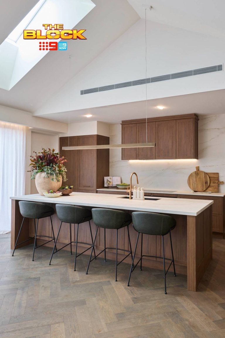
The work that went into that kitchen island is absolutely incredible. The rest of the space could have looked like a dumpster fire and I’d probably still want to award Sarah and George the win. Love the idea, love the execution, love what it does to the space. Paired with the dark timber cabinets it’s beyond breathtaking.
And it had a power point under the island. Who knew power points were going to be such a talking point this week? The judges were right to bring it up though. I don’t want to be running an extension cord to a power point three metres away just so I can work at the kitchen bench.
The One Thing I’d Change in this Kitchen
While I adored everything in this zone, the only thing I’d replace is the pendant light. I get that they were probably concerned about pulling focus away from the island, but a vintage-inspired light would have enhanced the stone, not detracted from it.
A nice metal and glass pendant with a mesh detail (or something along those lines) hung over one end of the island would have been divine. The simple strip pendant feels like an afterthought.

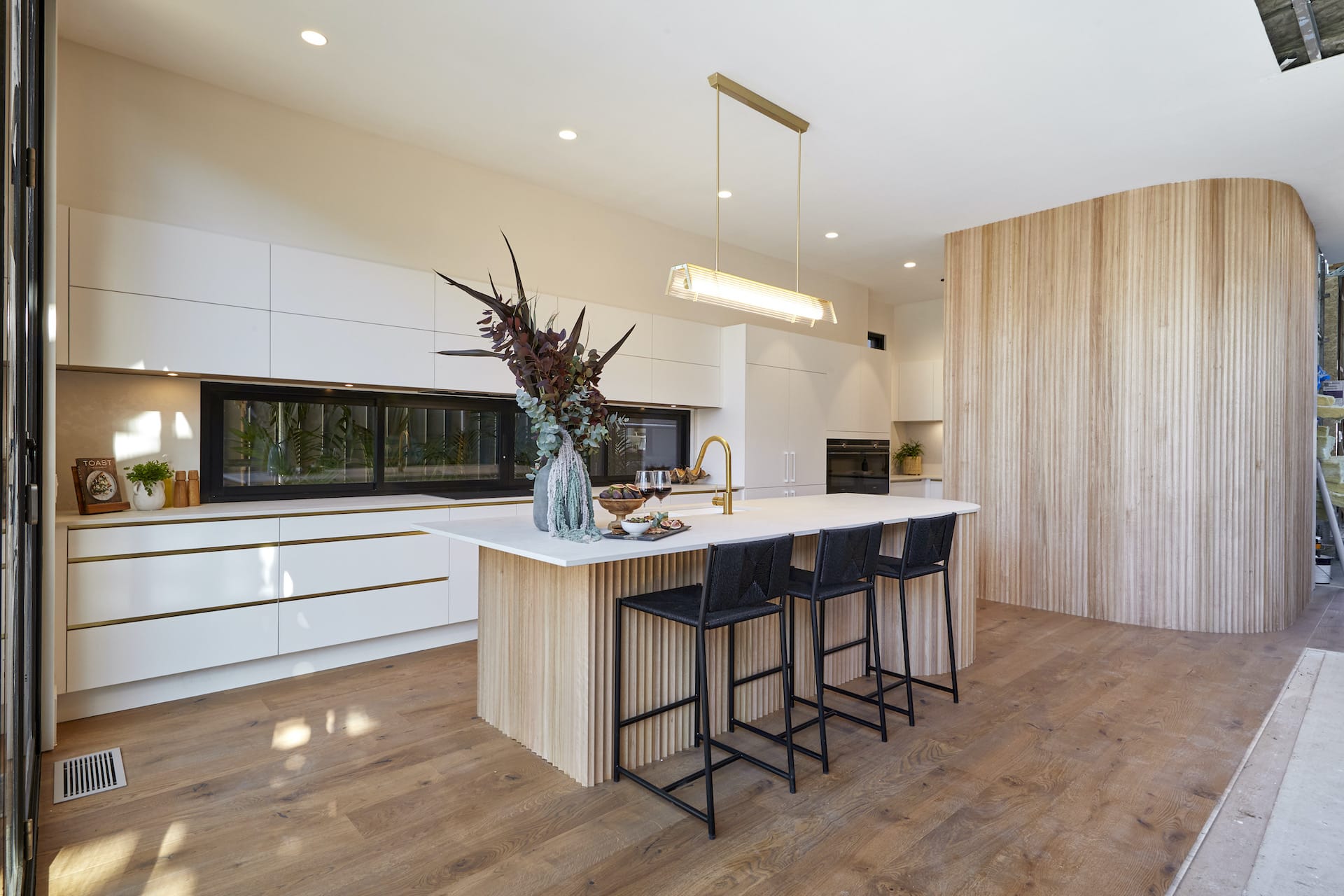
Luke and Jasmin Came Joint Third
It’s funny; when I saw the images come through this week I thought for a second that Harry and Tash’s kitchen was Luke and Jasmin’s. That’s not to say that the kitchen L&J delivered was bad, but H&T’s just looks more in-keeping with the warm boho vibe the WA team deliver each week.
That aside, I did like Luke and Jasmin’s kitchen. Though I will say (and you know they’ve been my faves throughout The Block 2020), I don’t feel enormous amounts of joy and rapture when I look at it. I do feel there are a few issues here, and I can see why they didn’t come out on top this week (even though it was a nicer space that Daniel and Jade’s, and Harry and Tash’s).
Let’s Talk About the Positives
What’s not to love about a curved corrugated timber kitchen island? It’s beyond stunning and I really appreciate the work that went into it. What buyer isn’t going to be wowed by this?
I also appreciate that the curved wall in the kitchen speaks stylistically to the curved wall in Luke and Jasmin’s bathroom. The corrugated timber also speaks to the reeded shower screens they’ve used in their ensuites. I’ve said it before and I’ll say it again; they’re the king and queen of cohesion.
Love the brass tapware, love the kitchen stools, and love the understated nature of this zone. The devil is in the detail and the elements don’t scream at you.
Sadly, There Are Issues
A feature or focal point fails to be a feature or focal point if it’s repeated too often in a space or if there’s just too much of it. That’s how I feel about the corrugated timber. I love it in the kitchen island, but I would have let that be the star of the show and removed it from the curved wall.
If that curved wall was plasterboard and painted white, there would have been an opportunity to hang a really nice, striking artwork there. Not one kitchen this week had any wall space for art and I think that’s unfortunate. This wall took away from the beauty of the island for me.
I also feel there’s a bit too much gold present. I would have removed the brass trims from the drawers and also installed a less eye-caching pendant. Hopefully my fave Block 2020 couple will bounce back next week. Can’t wait to see what they do with the living and dining room!
Which was Your Fave Block 2020 Kitchen?
Kitchen week is always such a big one, and it was no different for The Block 2020 kitchens. The question is, which one was your fave? I’d love to hear from you in the comments below.
Is your fave kitchen also one you think a potential buyer will like? And what do you make of Jimmy and Tam’s green joinery? So many questions I need you to answer.
Drop me a comment below and lemme know how you feel about this week’s rooms.


Yay Pippa and Glenda, i dislike sinks on a beautiful bench also. I really liked Sarah and Georges stunning center bench. Honestly do they need so many overhead cupboards when there is a butlers pantry and banks of beautiful full height cabinetry all around the walls? All of the spaces had a little something for me. I did enjoy your comments Chris.
So glad ch 10 caned that decorating show Chris… you have too many classy ideas for it judging by the first show. Just saying!!
Sarah & George’s kitchen is my fav. It is a forever kitchen. But Shaynna was right in saying the overhead cabinets are too high. Swapping the glass cabinets for the automatic shutter style cabinets which are in their Butler’s Pantry would have created a Wow factor, and they would be more accessible for the vertically challenged buyer. Glass cabinets or even open shelving in the Butler’s Pantry would be a cost effective and practical solution.
I love Harry and Tash’s kitchen with a very close second Sarah and George…they are classical with a little bit of punch! I’m not a fan of the vertical woodwork at all. I can appreciate the workmanship that has gone into designing and making them….but to me it looks dated and reminds me of corrugated cardboard you use to pack parcels. I’m not a fan of the vertical kitchen pendant, I prefer a grouping of pendants in the kitchen . This is where you can make a feature or statement. A vertical light just seems very pedestrian to me.
Harry and Tash is my winner with Sarah and George a very close 2nd. Classical. Won’t go out of style unlike the Green of Jimmy & Tam kitchen. As far as all the vertical woodwork goes, how much dusting will that need & what about the small spiders that would love living in those crevices.
Sarah and George’s kitchen fat outweighed the others & should have claimed the crown.
I like Harry and Tash and Luke and Jasmin’s the best but my pet hate is the sink in the island bench! Why go to all the trouble of designing a beautiful island bench then plonk the sink in it which is always a mess – well it is in my kitchen – Pippa
Ditto Pippa. I hate sinks in the island. It’s there to give you more bench space & sit up to.
My fav this week is the winner Dan & Jade to me it epitomizes luxury. The worst Jimmy & Tam. Who in their right mind would put green grey and gold together. And those wood crates in the Butler’s pantry – cheap.
Beautiful kitchens this week, the judges had a hard time picking a winner. As it turned out the bonus point was the decider. I didn’t like the mint green in Jimmy and Tam’s bench or butlers pantry, or the different colour on their island bench top. Their appliances and wine fridge were very impressive though.
I loved the dolomite island bench in Sarah and George’s kitchen, and the Christian Cole timber island in Daniel and Jade’s kitchen. As a buyer, I’d be happy in either of those two, and with Harry and Tash a very close third. Luke and Jasmine also delivered a good kitchen, but the island bench seemed a poorer imitation of the Christian Cole one.
Sarah and George without a doubt. Very sellable, very usable, very now and beautiful.
Colour and wood dates fast.