The Block 2020 has unveiled its master ensuites and I’ve gotta say, it’s revealed a major issue with this season that’s been bugging me from the start.
Have you entered this month’s giveaway to win a $500 Block Shop Voucher? Do that here.
Three of the rooms were outstanding and are spaces I’d be proud to call my own. One was OK but needed some tweaks to get it up to standard. And then one was so diabolical it needs to be gutted and redone. I’m sure you already know which one I’m referring to. But we’re going to break it down and examine which ensuites were winners and which were woeful below.
The issue that keeps coming up for me this season though is the issue of daring design versus saleability. We’ll delve into what I mean by this further below, and as always I’d love to know your thoughts. Drop me a comment at the end of this post once you’ve had a read of this week’s ensuite recap. I always love to get your take on the reveals too.

Luke and Jasmin came Joint First
This win was very deserved and I’m so happy that Luke and Jasmine finally got top scores. I feel they’ve been robbed the last two weeks so this win made me very happy.
I always believe that a bathroom should either be soothing and calm escape, or a rich and moody cocoon to retreat to. Here, Luke and Jasmin took the former approach and it was clearly stellar.
There are so many things to love about this ensuite, and I know many of you are going to be as obsessed with it as I am.
It’s Subtle but Still Interesting
Some of the bathrooms this week were about as calm as a rock concert, but here Luke and Jasmin managed to pull off a master ensuite that was visually calm but still packed with interest. The tiles on that curved wall are just beyond. They’re so simple and yet used en masse like this, on that curve, they’ve become a real focal point in the space without yelling at you. The brass accents are glorious, the layout works and it speaks to the style of the other bathroom in the home. Tick, tick, tick.
It’s Not Without its Issues Though
While I do love almost everything in this room, I do feel the black bath was a step too far. The tiles on the curved wall were the moment for me, but my attention is taken away from them by the large-scale black blob in the room. A white bath would have worked better here.
Neale was right to point out the vanity being squished against that (beautifully reeded) shower screen. If it was moved over to the left it would not only be more usable but more impactful as well. It would have given the room more sense of space.
Overall though I’m really pleased with this zone. It speaks to the master bedroom stylistically and is exactly what a buyer will want. Luke and Jasmine keep addressing the saleability factor, producing rooms buyers will adore. Which is the exact opposite of what some of the teams are doing.

Jimmy and Tam Came Joint First
I have to stop getting angry at the judges for praising a room like this. It’s really not their fault. It’s the brief they got this year; to judge the homes based on this baffling ‘five homes, five decades’ concept. I think the concept works against getting a good price for the properties come auction day, and that’s the major issue I have with this series.
I feel like some teams will keep pleasing the judges because they’re addressing the brief (but it won’t sell well), or they’re ignoring the judges somewhat and getting lower scores (but are going to rake it in come auction day). Which is the best approach? The latter, of course, though it’s not working for the teams week-to-week.
That said, even if we agree to judge this ensuite with the era brief in mind, there are still multiple issues with it that deem is worthy of last place, not first.
The Colour Palette is too Warm
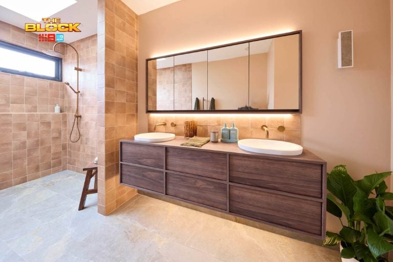
The pink tiles paired with the gold trim and accents are so garish and in-your-face. Not only does this ensuite feel overwhelming to be in, it reads as incredibly warm. The tiles and gold are one slap of warmth, and then the vanity with the pink basins are another huge slap.
There’s no restful moment in this room. No visual break. Every element is a focal point. There are way too many ideas packed into one small footprint. It absolutely doesn’t work and it absolutely didn’t deserve first place.
The different height of the pink tiles in the shower zone just draws your eye to it and makes matters worse.
This Isn’t a 2020 Melbourne Home
I know I keep banging on about it each week, but this is the Block 2020. By all means have a fun concept in mind to shake it up, but don’t encourage teams to create rooms in a home that ultimately needs to have mass appeal in order to rake in a good profit.
The amount of buyers who would appreciate an ensuite like this are so few and far between, it’s just bonkers to praise it and ask Jimmy and Tam to give them more of this. This isn’t House Rules, where you’re transforming someone’s forever home based on their individual brief. This is a show aiming to sell a luxury property in an expensive suburb. I’m just so baffled by this win.


Sarah and George Came Joint Second
I’m not angry that Sarah and George came joint second. I actually feel it’s quite deserved. Putting aside the fact that they had a rough week (because I always like to judge purely on the room design), this space is very successful.
This room is a perfect example of how you can do a somewhat divisive colour like pink but have it work. The tone of those wall tiles is so subtle that even if you were a potential buyer who wasn’t a fan of pink, it wouldn’t stop the sale.
The Colour Palette is Divine
This is a really soothing, easy-on-the-eye ensuite. It’s like I was saying earlier about a bathroom being either soothing or dramatic. This one is soothing and yet it doesn’t follow an expected, all-white organic approach. It just goes to show that you can have a colour like black in a room (the vanity is stunning btw), in quite a few pieces, and still have the bathroom feel calm. There’s really not anything to dislike here.
This is Perfect for the Melbourne Market
I always view The Block as half design show, half reno-for-sale show. So the rooms need to offer something new in the way of design but still appeal to the Melbourne market they’re selling in. I feel like this ensuite is the perfect coming together of those two elements. It is roomy, well laid out, spacious for two people to get ready in, plus it’s modern and designer.
To put Jimmy and Tam’s Barbi-glam bathroom ahead of Sarah and George’s in the scoring is just pure insanity.


Harry and Tash Came Joint Second
Harry and Tash are swinging from dire to divine and then back again when it comes to their spaces. After last week’s shock win for what was a really unsuccessful master bedroom, they go and deliver this ensuite which is all sorts of amazing. I would have tied them for first place with Luke & Jasmin and Sarah & George. Yep, all three spaces were stunners.
This is a bathroom that stands out because it moved away from trying to be calming and serene. Instead, it’s rather bold and alluring. I enjoy a luxe-feel ensuite with high-end vibes, and Harry and Tash delivered it in spades.
The Green Tiles Work
I’ve seen gloss green tiles used in bathrooms before and they’ve looked rather overbearing. But the shape of these ones is rather simple and they chose a grout colour that didn’t make all of the lines around the tiles pop too much. It’s a high-drama moment, for sure, but then it’s balanced out with the grey tiles on the opposite wall and floor.
This is what I was saying they failed do to in their master bedroom. That dark green wall paper against crisp white walls was too high-contrast. But in the bathroom they paired the green with an earthy grey tile and it’s worked wonders.
The Right Period Details
The bath and basins both give a nod to a period era without the ensuite feeling outdated. A 2020 buyer will walk into this space and feel that it’s moody and sophisticated without having taken the concept too far. Sure, you’ve gotta like green tiles, but if the rest of the home follows a similar dark-luxe approach I feel it’ll all work.
Can I also point out that they’re the only team who didn’t install arched mirrors? The mirror cabinet they did choose was wonderfully modern and provided a nice sense of balance to all of the period features.
The only thing I’d lose in this ensuite is the gold wall lights. There’s no gold anywhere else in the room so they feel a bit out of place.

Daniel and Jade Came Last
If you’ve read this far then you know that I feel Jimmy and Tam deserved last place. To deliver something so divisive and unsellable is just beyond my comprehension. The woman in the Slim Aarons painting is not buying the home! Karen from BRAHTON is and she does not want a hot pink ensuite.
Anyway, moving right along to Daniel and Jade’s space before I burst a blood vessel. Now, this did deserve a lower score than the others and there are a few small reasons why.
It’s not a Terrible Bathroom
It’s really not. It has a lot going for it in terms of the colour palette, layout, and the design inclusions themselves. The problem is that there are waaaay too many ideas here.
Every room needs a focal point. Choose what that one wow moment is going to be and then build the room around that. Sadly Daniel and Jade went full throttle in this master ensuite and packed in many eye-catching moments.
The white tiles were clearly the standout, but the black floor and wall tiles detracted from them. The vanity fronts and handles detract from them. The plant, the shutters, the lighting do as well. It was just a lot of good ideas that needed to be edited down.
The Black Gloss Tiles are the Issue
In examining what could be changed, it really is the black tiles, especially the choice to use gloss-finish ones on the walls. If you take a look at the photo below you’ll see that the plantation shutters don’t work with them. They’re also fighting with the white tiles. I also don’t see them in the same space as a shaker-profile vanity.
Still, in case I haven’t said it enough, Jimmy and Tam’s bathroom was worse.

What’s Your Take on the Master Ensuites?
Which of The Block 2020 master ensuites would you honestly love to live in? And is it the same bathroom that you believe a potential buyer would want? I’d love to hear from you in the comments below. Do you think daring design is more important that saleability? Let me know what you think about the ‘five homes, five eras’ brief this season. Is it working against the teams?
Have you entered this month’s giveaway to win a $500 Block Shop Voucher? Do that here.


CHRIS!
Below is fictional fun but my core belief is that the PINK BATHROOM has hidden promise.
………….
From top page
BATH 1. Fluted Shower Glass WINS
BEST USE OF A MATERIAL : FORM and FUNCTION THROUGH INTERIOR DESIGN
Winner Awarded Sole OWNERSHIP No Contest in the Category ‘Unsurpassable Excellence in Design’.
Recesses /Tiles /Lighting /Hardware /Porcelain & Accessories merge seamlessly Invoking a journey through ancient sands to a promised land and hidden wealth
NB:- The secondary plants in recess and the bricka brack on floor between vanity and shower should however be removed IMMEDIATELY!
BATH 2. Pink Bathroom WINS
BEST IN SHOW “EXEMPLARY ABILITY IN ECLECTIC DESIGN” –
Winning Entry Entitled “ITALIAN 50s – RETURN RETRO”
Winner Awarded ‘6 Week Sesh’ @ Italy’s Provocative World Renowned House of Design – MMED ©️ .
With All flights /accomodation /food /wine and Study in Design INCLUDED.
Chosen for Exemplary Excellence in Eclectic Design this years winner combined a myriad of design choices without a single item standing out – look closely – WHAT DON’T YOU SEE? WHAT LIES HIDDEN IN FULL VIEW? Lighting for example doesn’t stand out against tapware, nor tiles against the hardware. The garish eclectic combination of materials SHOULD HAVE BEEN A VISUAL DISASTER and yet it works! Elements hiding each other for the good of the group.
REWARDING the GIFTED in DESIGN 2020
B:- The SECTION of PINK TILES – SHOWER RECESS – Those TILES RAISED HIGH MID SECTION ABOVE ALL ELSE ARE TO BE REMOVED & REPLACED with similar material & colours as per the adjoining WALL. Failure to do so may incur penalties.
Sandra
I have to say that I wouldn’t really happy with any of these en-suite as I have my pet hates……loud colour, small tiles, too busy with all those features, small mirrors. I’m not a fan of period features in bathrooms or kitchens. These areas are expensive and can make or break a sale. Heritage architraves, skirting, cornices, etc are wonderful features with just a nod to the period for me and subtle colours. Love all the skylights…..