The 2021 Block crew just revealed their guest bathrooms and boy did they prompt some of the best burns ever from the judges. The Blaze, N-Dubz and D-Paz really had me cackling this week as they cast their eyes over week two’s spaces.
It was a really mixed bag this time around, don’t you think? I felt wowed, I felt woeful. There were even moments where I was more confused than I am trying to find Sweet Potatoes in the search list when using self-serve checkouts and Woolworths (they’re under ‘P’, so I was told). But boy did it all make for a pretty eventful Sunday night.
Here are my thoughts on this week’s spaces, and I’d love to know yours in the comments below too. Overall it was a case of one space amazing, one space bad, two spaces OK and one space quite boring. Let’s see how it all panned out…
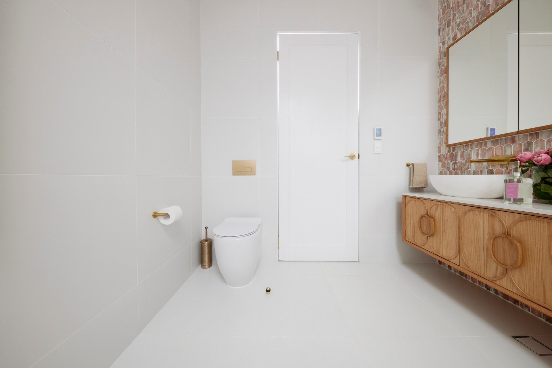
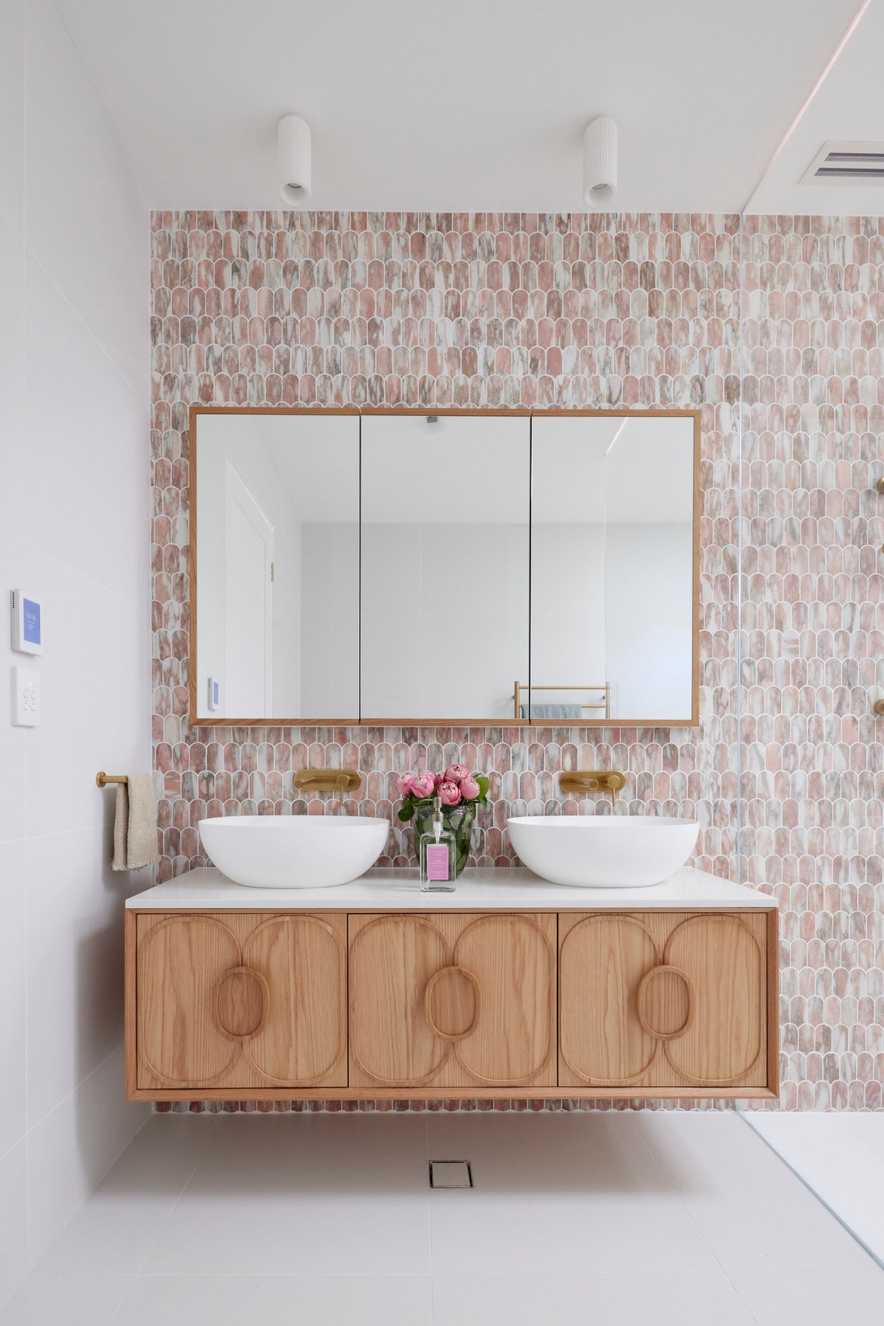
Mitch and Mark Came First
Last week I hoped that Mitch and Mark would stay committed to their more refined design direction, and this week they did. This is a true 180 compared to the bathrooms they executed the last time they were on the show. I’ve not seen a change this big since Selling Houses Australia lost two thirds of its hosts. And I do feel that this space has an obvious connection to their guest bedroom design, which is appreciated.
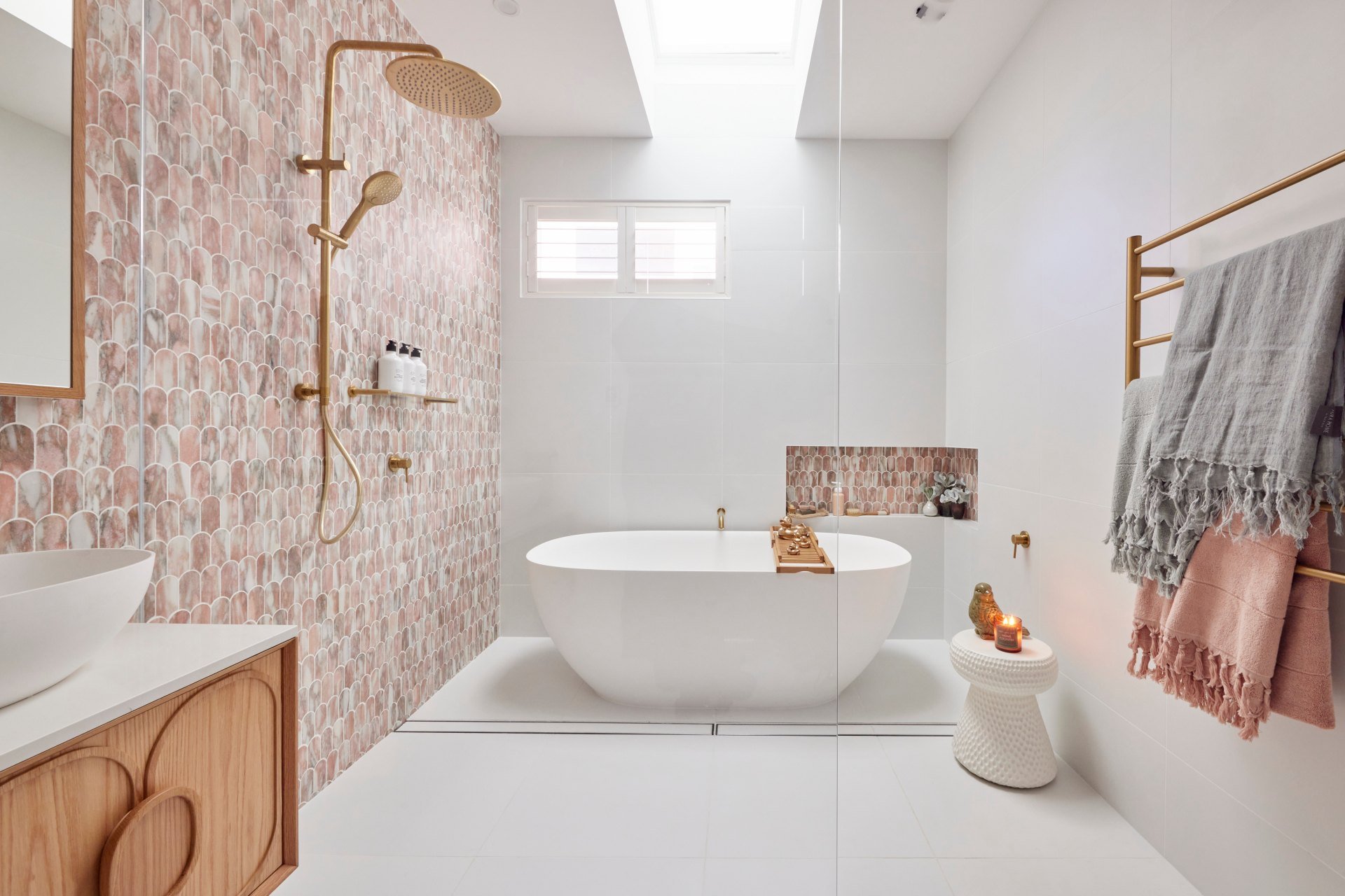
The tile alone is a winner. They could have just tiled an empty bathroom with no toilet, bath or vanity and I’d probably still declare them winners. The tile is Cascade Norwegian Rose for those of you playing at home, and boy is it a show-stopper. I wouldn’t have tiled the niche near the bath, truth be told, as it appears too intentionally matchy-matchy. But outside of that small tile blunder they’ve done exceptionally well with application.
I agree with Shaynna about the relationship between the profile on the vanity and the tiles too; a lovely connection there. It’s like they’re related but a few branches away from one another on the family tree. The sense of warmth brought by the tile and vanity combination is glorious. And then you have all that while tile to retain a sense of calm.
A Few Tweaks Would Be Appreciated
There are a few things that are making my design eye twitch a little, and it’s not even the horrible ducks styled on the bath caddy (potentially worse than a block of cheese, but we’ll get to that!). It’s the placement of and relationship between the bath niche and window.
I don’t know if they can make decisions about removing windows, or where they should be placed (let me know in the comments below, if you can). Perhaps decisions like this are out of their control. But for me, the window can go altogether and the niche can be centred on the wall above the bath. Please. Pretty please. Can they correct this for me so my eyeballs can stop pulsating?
If we’re nit-picking (which we always are), I would have also placed a timber stool bedside the bath, to connect this wet zone to the vanity zone. And I would have also selected lower basins for the vanity. I find those tall bowls and wall-mounted taps problematic together. I like to get my mug right into a bowl without taking out an eye.
But all in all, I’m so happy to see something new and refreshing in the way of bathrooms on The Block. Sadly I can’t say the same for the next zone…


Ronnie and Georgia Came Second
Simple, minimalistic and contemporary is how the judges summed up this guest bathroom from Ronnie and Georgia. And it is all of those things. That’s not a positive from where I’m sitting though. Granted, I’m sitting in day pyjamas in lockdown number 574, but I think that illustrates my point even further.
To not be wowed by this bathroom when we’re all kinda starved of stunning design right now is really rather disappointing.
The problem with this space is that it’s so regular. So vanilla. And don’t get me wrong, vanilla is my fave flavour in the tub of neapolitan. But I’ve seen different versions of this bathroom so many times over the past few years. In fact, it reminds me a lot of Luke and Jasmin’s bathroom from last season. Or this other one from Luke and Jasmin last season. I think you get my point.
I’m hope Ronnie and Georgia aren’t just going to deliver an expected, market-ready home to make some money out of this season. I mean, that that’s the whole point of the show, I know. But they’re capable of pushing it further and I personally would love to see it.

Next-Level Neutral is What We Needed
Every material in this space is beautiful, of course. The kit kat tiles are delicious, the brass fixtures are luxurious, the bath tub is a stunner. But it’s all just so white and bland. Like the cast of Neighbours, it needs more diversity. The feeling in this space is beautiful and light-filled thanks to that skylight, and the layout is successful, but it’s just not quite doing it for me overall.
The functionality issues Shaynna raised around the shower are valid, but don’t stop there. Where are the towel rails? You don’t have any for bath towels in the wet zone or hand towels near the vanity. A bit of an obvious miss from seasoned Blockheads.
I don’t have a lot more to say about this space, because it’s neither here nor there. Just your average, contemporary bathroom lifted right from the pages of every magazine on the shelves right now.


Tanya and Vito Came Third
I won’t lie; the first time I cast eyes on images of Tanya and Vito’s guest bathroom I was torn. Torn like Natalie Imbruglia in 1995. I truly couldn’t work out if this was one of the ugliest Block bathrooms in recent seasons, or if it was one of the best strokes of creative genius since Khloe Kardashian Facetuned her visage for Instagram.
I’ve come to the conclusion that elements of this bathroom are visually stunning. There, I said it. I don’t think I’ve seen a space on The Block in recent years that’s made me think so much. Normally I love it or I hate it. It’s good or it’s bad. To come across a space that’s a bit baffling is quite refreshing. And it only happens when a duo make choices that are anything but run of the mill.
The tiles are of course the main reason this bathroom feels so good. The Moroccan vibes are not lost on me. Pairing them with terrazzo flooring is a very successful combination. The shell here is a real winner, and there was so much scope for it to be one of the best bathrooms on the series. But then you look closer and there are oodles of issues.

Lots of Minor Changes Are Needed
The judges weren’t wrong. The closer you start to look at things, the more issues come up. Tanya and Vito need to edit, that’s one of their biggest issues. The vision is there. It was evident last week in their guest bedroom too. There’s certainly not a lack of ideas. It’s just that there are too many of them going on at once.
The black door frame needs to go. The oak trim on the power point needs to go. The towel hooks need to go. The lights above the bath need to go. The plant that’s more frail that The Olsen twins needs to go. I also have an issue with the coloured basins, as I feel they detract from the wall tiles. Just let the wall tiles be the one moment. And the mirrors are too high.
OK so the more I’m critiquing, the more problems I’m finding. I guess, all in all, what I’m saying is that the wall tiles are stunning. Maybe I just like the wall tiles? Help me make sense of this confusion before I have a designer meltdown.


Kirsty and Jesse Came Fourth
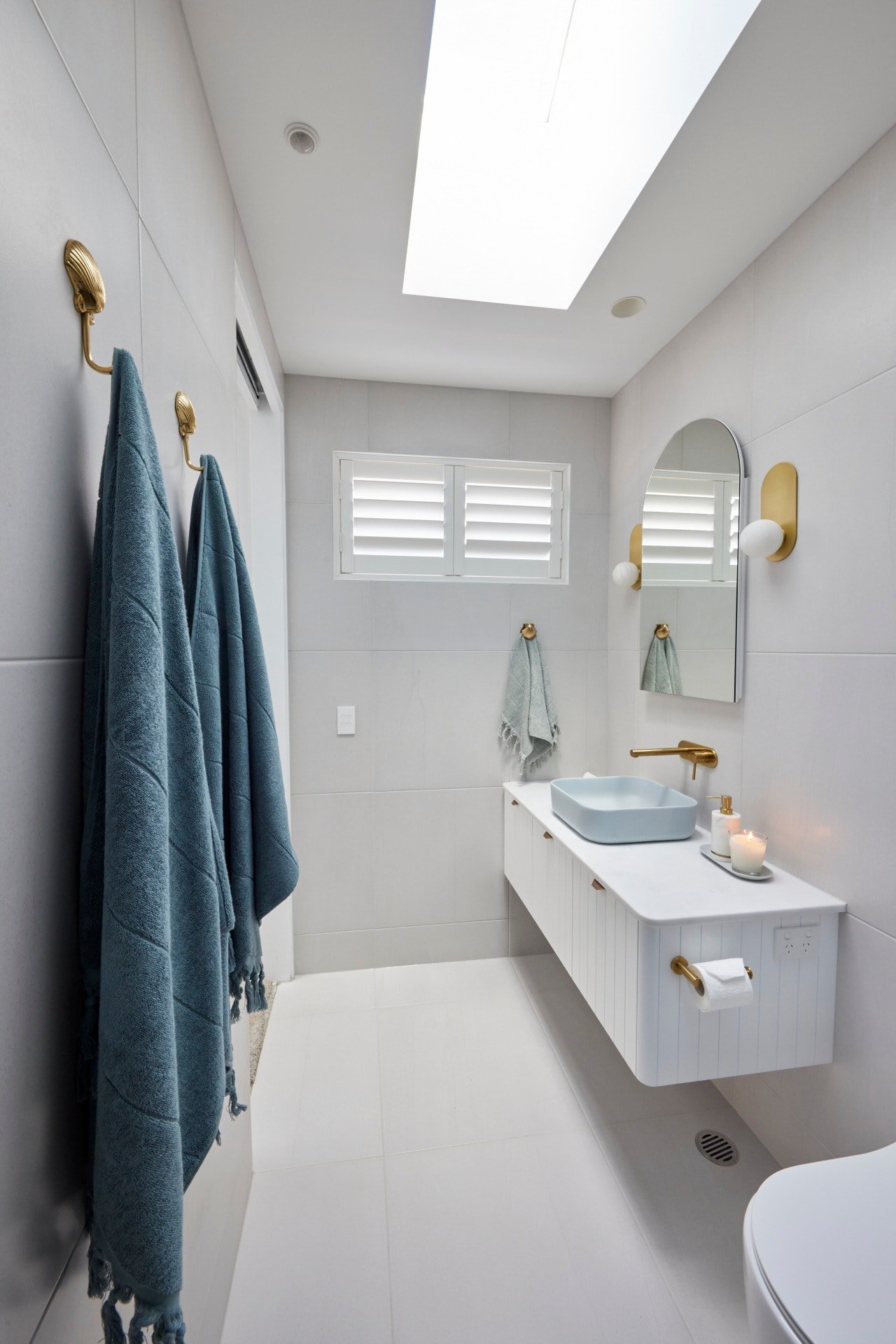
This room is pretty successful. I enjoy that Kirsty and Jesse are embracing the fact that a guest bedroom doesn’t need a bathroom you could fit 60 people in for a mid-lockdown engagement party (too soon?). It’s size-appropriate and it does have everything a guest needs when they’re staying over.
I really enjoy the colour palette. It’s soft and soothing, calm and clean. That blue basin is so powdery and delicious against the white vanity top, and the profile on the vanity front is very in-keeping with the vibe they’re clearly embracing for this season of The Block. I even love the tasselled towels. Their styling is quite beautiful.
There’s a nice connection to their guest bedroom in this bathroom too. I can see where they wanted to take the guest bed now. They just need to get rid of that blue strip around the outside of the room and the two spaces could look divine side-by-side.
I disagree with Shaynna about the nub wall. I like that sense of barrier between shower and toilet.
Speaking of Removing Blue from Walls…
Let’s talk about those shower tiles. Now, I’m having the same issue here as I had with Jimmy and Tam’s pink bathroom last year (even mentioning that bathroom is giving me PTSD). There are just too many moments in a small space fighting for your attention.
In a bathroom of this size, either your brass accents are the focal point, or your blue tiles are. Together they don’t have a sense of refinement to them. The bathroom quickly becomes a little tacky, which is a shame.
In deciding if the blue tiles come away of the brass accents do, I would vote for the brass accents. Chrome would have worked just as well here and actually made the room feel way calmer and less blingy. Then, the blue tiles would have been enough of a moment, and it could have been a winning room.
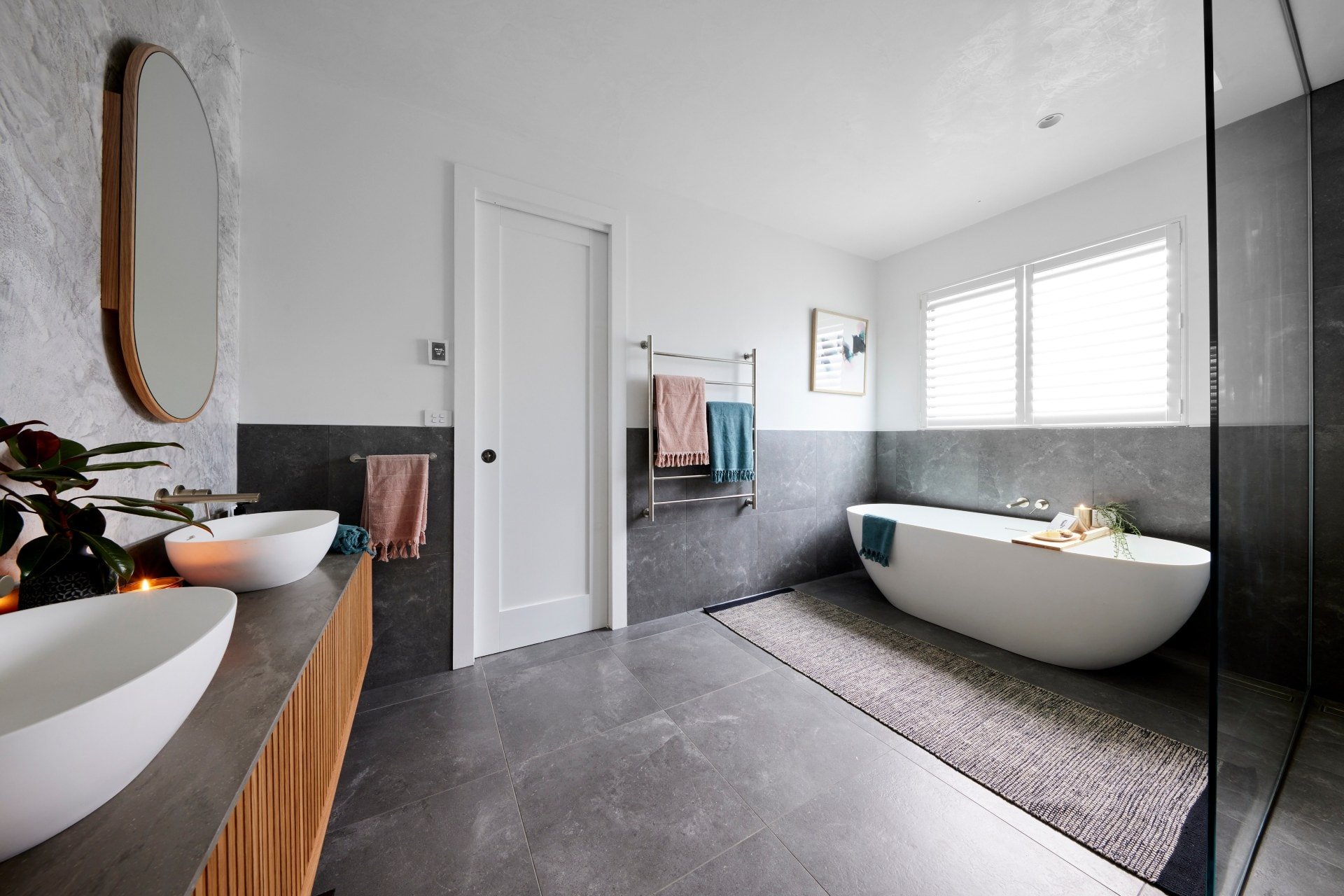

Josh and Luke Came Last
“Take it on the chin, your styling’s atrocious” is the best and biggest burn to come out of The Blaze in recent years and I’m LIVING for it. It’s almost as good as when Neale called a bunch of dried flowers last year “Funerial in its ugliness”. You just don’t get insults like this when you watch The Bachelor. Darren pointing out the spotlight on the cheese was also truly delicious. Thanks for the laugh you guys.
I have to agree with the judges on all of their comments here. I do find the bathroom to be dark and dated. I do find it to be too large. I do find the ceiling a bit odd. The shower feels really narrow considering the room is so large. And the styling is bad.
I will say though (because you know I call out what needs to be called out) you can’t call this bathroom something you’ve seen before if you’re not calling out Ronnie and Georgia for the same thing. Both are dated and generic. It’s just that one feels nicer to be in because it’s lighter and brighter. But both are nothing new.
Shoutout to the music team this week for playing sad music as the critiques were playing during Josh and Luke’s feedback. Comedy gold.

It’s Not All Bad Though
OK, we’ve had our fun, we’ve pointed out the bad parts. But honestly there are some good things in this bathroom and I do feel we should point them out. That cheese did look edible. I joke, I joke!
The feature wall behind the vanity was very successful. I love the industrial vibe it brings to the space, and even though I didn’t love their guest bedroom, the spaces feel connected. It was a welcome change in the way of bathroom feature walls on The Block too. So many of the spaces opt for an all-white approach that I’m really over.
The vanity, mirrors and tapware were also really lovely. The bath was ample and appropriate too. And I did enjoy the amount of towel rails (something the other teams failed to include). So yes, they’re rookies, and they can improve. That’s if they listen to the feedback, which I am concerned about.
What did you make of the 2021 Block guest bathrooms? Drop me a comment below and share your thoughts!
Photography in this post via David Cook Photography. See more Block goodness at The Block Shop and nine now.



A bathroom should look good without any of those cheap decorations and accessories.
Mine won 2 awards with only 1 statuette and plush beautiful patterned towels.
Enjoying your critique Chris. Hope you have nice groovy day jammies on around the unit.
Hi Chris
I love reading this blog. Thank you for your comments. I agree with them all, although I wasn’t particularly a fan of Tanya and Vitto – sorry, I just didn’t like the tile.
The other point that would worry me is the proximity of the shower to the bath. When you have a shower water would be in and all around the bath – that would do my head in trying to clean it up! LOL!
I’m finding the show a bit “corny” this year. What do other people think?
Take care everyone
Jo
I loved the simplicity and elegance of Ronnie and George’s bathroom. For me you can change up your accessories where as the other bathrooms the colors of tiles are with you forever.
Your post is far better than the show!
You have encouraged me to share my opinion 🙂
Mitch and Mark:
I actually like the relationship between bath niche and window, surprising for me as I am a stickler for symmetry. My pet peeve is the tap for the bath…. how would you reach it if you wanted to add more hot water? I agree about the stool being timber.
Ronnie and Georgia:
The marble needed to go to the ceiling or be removed. I love how you can turn on the shower without getting splashed with cold water.
Tanya and Vito:
I like the white tiles and the bath…
The 1980s are knocking and asking for their dog c#*k pink highlights back!
Kirsty and Jesse:
I like the rounded edges of the vanity and how they have hidden the power point. Not much else though.
Josh and Luke:
Love the feature behind the vanity and the bath.
Not much else though.
I hate bathrooms without parallel windows. I feel claustrophobic. Having just a skylight just doesn’t cut it. M&M’s window is way too small & I agree Chris it’s in the wrong location. Luv those tiles.
Ronnie & Georgia: meh. I agree ordinary.
Tanya and Vito: I actually like their bathroom. We don’t have a toilet in our bathroom so I couldn’t see the big deal. Sure a few tweeks but overall nice.
Kirsty and Jesse: I like it. Smart to start on renovating an ensuite so they get some practice on what is required before renovating their main bathroom & master ensuite. I think these arevthe couple to watch.
Josh and Luke: I loved the Venetian wall. Agreed way too big unless the connecting guest bedrooms are going to have bunk beds to show you can fit all the kids in this bathroom at the same time.
Keep critiquing Chris. I love hearing a Professional’s feedback that hasn’t been scripted for the TV ratings.
I think M&M deserved the win but I really appreciated the tile choice in house 3. Agree about the lights above the bath and the lack of toilet is an error – even if they personally don’t like a loo in the bathroom- haven’t they ever watched The Block? #thehouseisntactuallyyours
There has been at least one bathroom without a toilet in it.
I agree Tania and Vito’s bathroom just confuses me. I think if they’d had white basins, and a glass shower screen instead of the tiled wall, the bathroom would have really sung! You would’ve been drawn to the gorgeous tiles and not felt closed in by then.
I agree too that Kirsty and Jesse could have used brushed steel tapwear and the whole bathroom would’ve felt calmer.
I think you were spot on this week. As per usual.
With Mitch and Marks room I agree about the tiles over the bath. It looks werid.
The second bathroom was bland, actually getting over the use of white and grey I see it in every deco magazine lately.
I did love the tiles in the Moroccan bathroom, but too much black trimming.
And the boys bathroom was definitely a tradies bathroom, cold as tomb.
The tiles in the last bathroom were lovely, I liked what they did but your right less bling would have been better. And I definitely agree with you about the half wall between toilet and shower, less glass to clean and more privacy.
Tanya and Vito’s bathroom, because I had similar feelings, here are some thoughts:
The tiles and flooring Absolutely great.
Layout was lovely with the partition for the shower instead of glass. However, it would be better if the skylight took up the whole space in the shower so that it is filled with light as opposed to half there.
What I hated was the whole vanity situation. From the furniture, the choice of wood, the sinks to the lights. They were out of place with the mood of the tiles. I also have a general hate for hanging vanities when they don’t fit the style. Love them for practicality and looks, but the rest of the bathroom has to match and it seems to be a thing with The Block that everyone does them and end up making most bathrooms look the same.
The lack of toilet as well should really have landed them last or they should have been made to deliver that room too.
Love these blogs! Thanks for bringing them back. You absolutely nailed it with Ronnie & Georgia’s room. It’s like dejavu and I keep wanting to refer to Georgia as Jaz (also hair colour matching now?!)
Feel like the fans still need some help to get the balance right for them to compete – just seems a little too skewed as a competition right now… Love seeing some new and interesting ideas and woeful styling in the first few weeks is what you want to see – it’s blog fodder for sure