The Block 2020 upstairs bedrooms and bathrooms have been revealed. This time around though, the teams delivered more than one space. Did some of them bite off more than they could chew? Yes. And has it resulted in some major design indigestion? Absolutely. Pass me the Gaviscon and let’s dive into judging this week’s spaces.
Have you entered this month’s giveaway to win a $500 Block Shop Voucher? Do that here.
I always reserve my thoughts about who I think will win The Block come auction day until about half-way through the season. I figure we’re almost there, so now is the time to dish the dirt. Quite simply, and in no uncertain terms, I believe that Luke and Jasmin will rake in the most money. Closely followed by Sarah and George.
You see, both of these teams have a consistent design story going on. Luke and Jasmin in particular are executing a signature style that not only flows effortlessly from room to room (with the exception of their first guest bedroom), but it’s a scheme a buyer in 2020 will actually want.
Sarah and George are doing much the same, albeit not as well. But the other teams are quite inconsistent. Both Harry & Tash and Daniel and Jade’s rooms all look completely different. And Jimmy and Tam; sheesh, there’s not one space I feel is going to wow a Block buyer in 2020.
But enough of my predictions. Let’s take a look at the rooms they worked on this week. I’ll see you in the comments section at the end of the post!

Luke and Jasmine Came First
I mean, seriously, if I had ovaries they’d be aching right now. Call the surrogacy agency and book me in. This kids bedroom has me cluckier than I ever thought possible. At every turn and at every glance there’s something chic and adorable to look at.
Luke and Jasmin have once again delivered rooms that make sense against all of the other zones in this property. It’s a seamless transition from one space to the next. Not a striking contrast like in so many of the other teams’ homes, but a subtle design thread woven across the entire interior.
I want the polka dot wallpaper, I want the bunk beds, I want the genius little wall sconces and I want the animal head on the wall. The space oozes charm and sophistication, and yet it’s a space a kid will walk into and adore too. I would have given my right leg and possibly both arms to have a bedroom like this as a kid.
Need some wallpaper ideas for kids rooms? I have loads here for you.
Things Got Even Better in the Ensuite
Put all three of Luke and Jasmin’s bathrooms side by side and they look like sisters. Not twins, which is great. They’re not exact replicas. But they’re not cousins either. You can tell they’re related, but each one features something special.
The layout here is good, the light and airy feeling is great. The brass accessories look divine against the crisp white backdrop, and the black stool they placed beside the bath makes the black window frame feel more at home in this scene.
I also love that there’s a relationship between the bedroom and the ensuite. There’s a colour connection going on and it’s resulted in a zone that is truly worthy of a perfect score.
If you’re considering brass taps for your bathroom, consider reading my guide to tap colours first.

Jimmy and Tam Came Joint Second
I know I’m always hard on Jimmy and Tam’s rooms. But can I point out that I am hard on Jimmy and Tam’s rooms. Not them. I don’t know them, and I don’t watch the show throughout the week. I’m here purely to worship amazing design, or point out some of the flaws that let the spaces down.
In the upstairs bedroom, they once again delivered a loud space that bare no resemblance to any of the others. Your common design thread connecting the rooms can’t simply be wallpaper. Or bright colours. There needs to be more of a relationship between each space.
In this room, there was a sense of visual chaos. Loud wallpaper, then bright bedding, then all that joinery. The bench seat across the window in particular was not soft, thick or wide enough to act as a true window seat. It just looks like a mistake.
Each week I know which room is Jimmy and Tam’s, but it’s not because it’s successful. It’s because it’s always the one that looks too loud and feels likely to turn buyers away.
On the Topic of Turning Buyers Away…
I feel Shaynna’s comments about them being careful not to alienate a potential buyer are at least four weeks too late. I don’t know how this bathroom went too far (the paint can be easily changed), but hot pink tiles in an ensuite are absolutely fine. I’m baffled, aren’t you?
I also feel like this upstairs bathroom didn’t connect to the hot pink or turquoise one. I don’t think either of those ensuites were successful, but they’re too far in now to deliver a third bathroom that doesn’t match the others. They’re hoping to find a buyer who wants that sort of retro, in-your-face design. So, sorry, you gotta keep going with it.
I honestly feel this team is better suited to a show like House Rules. They have design courage, no doubt about it. And I can put my own feelings about their rooms aside to recognise that they do have a signature style going on. And some people will adore that style. But this is The Block 2020. And not enough buyers will feel drawn to their rooms.

Sarah and George Came Joint Second
The upstairs bedroom Sarah and George delivered was OK. I don’t feel it was spectacular or dreamy or anything to write home about. But it will neither wow a buyer or turn them off. So there’s that.
The wallpaper did the trick in terms of showcasing just how high the ceiling was. I was happy about the design. It was soft and soothing and minimal enough that even a wallpaper loather wouldn’t be turned away. It has laidback teenage boys room vibes, and that’s fine.
The bed styling was delicious. You know I need my cushions and pillows to be covering the bed so much you could fall in and never make it back out alive. So, that made me happy.
I did feel the wardrobe doors were too heavy. It made that entire side of the room feel rather dominant. I also needed some art on the wall. The space felt a bit undercooked, with bedsides and table lamps that needed to be way bigger.
The Bathroom was The Bomb dot Com!
Good Lord. My heart is racing. Call a medic. Check I have my affairs in order.
I don’t think I’ve encountered a bathroom that speaks to me more than this one does. The colour palette, the patterns, the materials. It’s like my very essence has been taken removed and injected into a Block bathroom. There are so many things to love about this space and it just further proves to me that Sarah and George are going to do well at auction.
The quilted tiles are by far the most stunning thing to hit bathrooms since rimless toilets. I want them, I need them, I’ll put them everywhere. Those teamed with the black shower frame and entire vanity situation was nothing short of spectacular.
Yes, Shaynna was right about not being able to turn the shower on easily. That does need to be corrected. But outside of that I pretty much salivated over everything.
The one thing I will say about the vanity is that one element needed to not be black. I could have taken round grey basins instead. But now we’re just picking on the nitty gritty. I genuinely will take it as it is. Even if I have to run a marathon to adjust the water temperature.


Daniel and Jade Came Fourth
Ah, Daniel and Jade. I don’t love your rooms, I don’t hate your rooms. I suppose I just don’t really get them. Like trying to understand Melbourne’s lockdown rules, I’m always left confused.
They did three rooms this week, which is huge. I don’t take that epic undertaking away from them. It’s a lot of work. That said, and while the bedrooms were fine, they’re again connected in no way to the other spaces in this property.
Sure one was more ‘boy’ and one was more ‘girl’, so they’re trying to appeal to a family market, which is great. But I just imagine the potential buyer walking through the home thinking… the master bedroom is retro blue and gold, the kids room is grey and masculine, the other one is colourful Scandi, the guest bedroom downstairs is muted sage green with period references.
Get where I’m going here? It’s just all over the place. Every week seems like a new idea. It’s a lucky dip of design. And while I love an Allen’s party mix, Sometimes you just want a consistent block of dairy milk.
I Agree with Darren About the Bathroom
It’s not good you guys. I was really pleased that Darren pretty much summed up everything I was thinking about this space.
The glossy white tiles felt a bit cheap. The mint green basins were an odd colour choice given that there’s none of it anywhere else on this level. The shaker vanity felt a bit out of place. And overall it just felt unimpressive.
There needed to be a focal point here, like a set of tiles, or an interesting light fixture, or a dazzling mirror moment. There is genuinely no focal point, apart from the basins which as we’ve already stated kinda came out of left field.
Two amazing spaces would have been better than three ordinary ones.

Harry and Tash Came Last
Last in our judging of The Block 2020 upstairs bedrooms and bathrooms are Harry and Tash’s spaces. And can I just say, I feel they didn’t really deserve last place. I mean, it seems like they landed here purely because of the crooked bathroom wall. But if we’re looking at the spaces purely from a form and function perspective, I was rather impressed.
I will say though, as I’ve said enough times that you’re probably really annoyed about it, consistency is an issue. I enjoyed their rooms but again they don’t sit well alongside the other zones they’ve created so far.
The bedroom was, again, fine. It kind of looks like any room in any home that’s been put together by a property stylist. So, it’s all good. It’s basic, but it’s fine. The one issue I had was that they decided to install swing-door cupboards and leave out the other bedside table. Sliding door wardrobes in a room of that size would have been a smarter choice.
The Bathroom Looked Legitimately Delicious
Crooked wall aside, I love everything about Harry and Tash’s bathroom. It’s very 2020. It’s subdued but interesting, chic and sophisticated, and exactly what a contemporary buyer wants. I wish their other bathrooms had of gone in this direction, but we can’t undo that first ensuite.
The large-scale grey floor tiles that ran up half the wall in the shower were breathtaking. I need a ventolin just looking at them. This is a simple bathroom done well, which is something Daniel and Jade’s couldn’t pull off.
What’s your take on The Block 2020 upstairs bedroom and bathroom reveal? You know I always love to get your take. Drop me a comment below and let ‘er rip!
Have you entered this month’s giveaway to win a $500 Block Shop Voucher? Do that here.


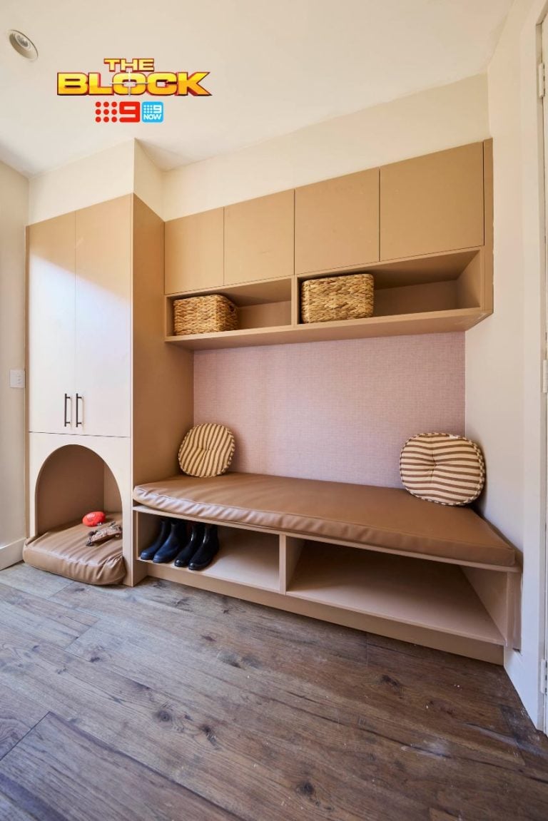
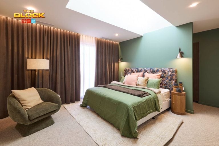
I know you don’t watch during the week, but would be interested in your take on Luke & Jasmin’s room now that you have seen the inspiration picture? I thought their room was beautiful, they are not competing as professional stylists so I personally don’t have an issue with any of it. I would imagine there is much inspiration taken from socials for all of the rooms…
Looking at these bedrooms, there are only sheer curtains. How are they going to block the light?
Notice how the judges aren’t going on about the rooms being done in the 20’s 30’s etc now.
I only watch Sunday night. I tend to agree with you Chris with your comments. Well done
I think Luke and Jasmin’s kid’s room is too white. The bunk bed part that’s white looks like it needs to be darker, a dark charcoal or something. Also seems unfair that Harry and Tash got scored lower for the error in their wall and yet Luke and Jasmin get full points for a bathroom which wasn’t completed. I did like their bathroom.
I didn’t like the fuzzy peach colour, but at least it was only paint which can be easily changed. The bright coloured tiles Jimmy and Tam put in the other bathrooms will have to be completely re-done if someone wants something more neutral.
I liked Sarah and George’s bedroom but it seemed like it was missing something. Harry and Tash’s bathroom was nice. I found Daniel and Jade’s bathroom hard to look at but didn’t mind their bedrooms. I agree with you about the cohesion between the different spaces though – there is none.
My thoughts similar to you once again Chris.
My order would be 1st Luke and Jasmin, equal 2nd Harry and Tash and Sarah and George, 3rd Daniel and Jade, 4th Jimmy and Tam.
I agree….loved Sarah & George’s bathroom! I think they’re the dark horses in this competition….and it as so consistent with their other rooms. The green basins certainly didn’t relate to anything in Jade and Daniel’s, but I didnt mind the overall look of it. Luke & Jasmin’s kid’s room was inspirational for my grandchildren’s coming room renovation.
Love Sarah and George’s bathroom. Just gorgeous and I would have that one any day. I also loved Tash and Harry’s bathroom. Not sure why they came last, but the judges have their opinions and that’s fine. I also liked Jade and Daniel’s bathroom, but I would have matched the towels with the basins. None of the bedrooms really wowed me, they were nice not great.
I’m over the judges giving Jimmy & Tam top marks. They have shocking design taste yet the judges seem to be loving it. Auction results will show how wrong the judges have been. Flouro orange in a bathroom. Overpowering wallpaper in the bedroom. Worthy of 10. I think NOT
I agree Kerry. I don’ mind some wacky and loud design, but not in permanent fixtures like bathrooms. Not only is it narrowing the market of people who will want to buy the house, but it’s expensive to cover up if you don’t like it. Save the bright retro moments for furniture and decor, not tiles.