The 2021 Block teams revealed their redo rooms and their additional spaces this week. And in true Block style, it was a really mixed bag.
I find that I change my mind about these teams more than I change my grocery store during lockdown (sampling the cakes from different shops is the only joy I have right now). As soon as I think one team is the frontrunner, they unveil something truly shocking. Or, you know, they use brown tiles in their bathroom (I still say they were good!).
This week was no different. There were rooms I need to stay in immediately, spaces I want no child to enter, and redo bathrooms with timber stink screens that made no sense at all. Grab your wine goblet as we dive into a mammoth week of room critiques. I’d love to know what you thought in the comments at the end too.
Ronnie and Georgia’s Redo Room Wardrobe
Ronnie and Georgia took out first place this week. And while I know it was necessary to make this walk-in-robe larger, it didn’t make for much of a reveal. I didn’t get a shocking before and after.
Like when the stars reveal themselves on The Masked Singer, I was left feeling nothing. Actually, when the stars reveal themselves on The Masked Singer I’m left Googling “who the hell is Vinnie Jones?” and “Who let George Calombaris back on TV?”. But that’s another story altogether.
Very happy they made this robe larger, but the green Colorbond roof panels I’m still not on-board with. It would have been nice to just panel the entire back wall in mirror instead. All in all, a very smart move that corrected functional issues from previous weeks; can’t be mad about that!
The Near-Perfect Guest Bedroom
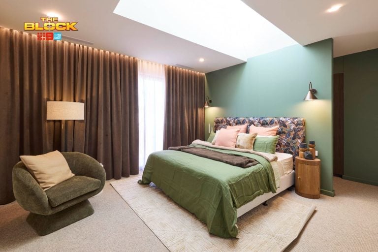
I have to say, this truly is a delectable guest bedroom from Ronnie and Georgia. It’s neutral without being boring, and it’s giving me what their bathroom last week didn’t; a little unexpected design to admire. It wasn’t perfect (we’ll get to that in a minute), but it was almost there.
The pattern play was pretty genius. The wallpaper, headboard and cushions were a trio of divinity. I’ve not experienced a threesome this great since – actually let’s not tell that joke! It’s definitely not like anything we’ve seen on The Block before and I commend them for offering up something new.
The bed frame I need immediately. And that’s the whole point of The Block isn’t it? It’s meant to make us want products from these rooms. And holy heavens above do I want that bed frame. I also really like the artwork above the desk, but have to agree with Neale about the lamps being too small. Like my post-covid clothing, I need them at least two sizes larger.
I Would Make a Few Small Tweaks
I’m yearning for a mirror in this space. So many teams forget mirrors in bedrooms. This is a guest bedroom after all, and the guests don’t have a mirror.
After the shock revelation that the eventual buyers of these homes get all of the furniture and decor (I’m only 11 seasons behind with that news), I feel like they shouldn’t have to go out and buy a mirror.
Also, the bed and wallpaper is such a moment, and the ceiling is so high and impressive, I feel the wardrobe doors in a shaker style with brass handles is too much.
I would have gone for a simpler door profile that blended into the background more. Like a couple on Married at First Sight, theses ones are too desperate for attention. Less would have been more here, for me anyway. But really, a pretty perfect bedroom all things considered.
Kirsty and Jesse’s Redo Room Bedroom
Kirsty and Jesse scored second place this week, with their redo room tweaked in colour. Gone was the shocking baby blue around the lower half of the room, swapped out for a more subtle blue/grey tone. A smart move on their part, and the room looks a thousand times better for it. But there are still a few issues for me.
Swapping out the bed and bedside tables was appreciated. The room feels a lot warmer and more welcoming with some soothing grey tones and warm timbers. I’m actually in love with the bedside tales, and the lamps are stunners as well. This reflects the sort of modern Hamptons style I write about on this blog all the time.
I still say the bed needs to go on the opposite wall. As it stands, there’s just a big gap there with nothing to fill it apart from the weird milking stool they made during the week. Honestly, the jokes I could come up with regarding a milking stool in the bedroom are endless, but I’ll keep it PG.
Overall though it’s one of the better redo rooms on The Block this week.
Their Kids Bedroom Was Visually Delicious
It must be said that the vibe of this bedroom is the sun, the moon and the stars. It is the galaxy and the milky way. It is the universe and whatever lies beyond it. Like the Savage Garden song, I’m truly, madly, deeply in love with it. This is one of the best-looking rooms Kirsty and Jesse have delivered, and there’s a few reasons why.
Firstly, it’s versatile. All of the juvenile styling can be removed in an instant and the space will still look appropriate for a teen or guest. Secondly, I fully appreciate that they didn’t install 45 skylights in the ceiling like other teams did. And lastly, the feeling of light and ambience is delicious too.
I love the bed, I love the bedding, the wallpaper is great and the bench seat looks stellar as well. I just have a few functional concerns. Once I get past how great it looks, I get to thinking about the buyer long-term. And I do feel a little worried…
Is it Functionally Amazing Though?
You can’t do a lot with this room functionally. Sure, it would work as a short-stay guest bedroom, or a room for a small child. But I’m imagining a teenager with a lot of clothing, and I wonder if the wardrobe space is enough. And if it’s not enough, where else can you put more storage?
There’s a small section of wall as you walk in the door, but that’s about it. And what if they want a TV; where is that going? I’m beginning to wonder, from a planning and layout perspective, if it would have been smarter to have just the sliding door, or just the window with plantation shutters on it.
Sure the light would be reduced a little, but then you’d have an entire wall of wardrobes. Or desk. Or both. In fact, a wall with robes and a built-in desk would have been nice here. That’s the solution. The bench seat is beautiful, don’t get me wrong, but it’s quite long for one person to use in a room where other things are needed.
A good effort from Kirsty and Jesse though. I really do love the look of this space.
Mitch and Mark’s Redo Room Guest Bedroom
Mitch and Mark came third this week, with a room redo I thought was rather successful. Truth be told, the room to begin with wasn’t particularly bad and I thought the judges were a bit hard on them week one.
I do remember saying in my assessment of this space, “An upholstered bed would have been more successful than timber, in a soft grey and with some subtle piping”. I didn’t get my piping, but it’s a great improvement overall. The bedside tables also work in making the space feel fresher, and the smaller bed was a wise move.
The pink in the room was a bit much for me week one. The wardrobe fronts are a lot. So to see they went from white bedding to pink is an odd choice. Let the wallpaper and wardrobe doors be a moment. I would have kept bedding white with dusty pink accents. Still a great result though.
The Kids Bedroom Was Not My Fave
Sorry guys (not really), but this just isn’t doing it for me. Whimsical, playful and fun is how the judges described it. But I’m not so sure. To me it feels cluttered and chaotic.
They were also being very kind with the challenge piece Mitch and Mark included in this room. But it’s very crafty. Real crafty. It’s giving me ‘Ahoy Matey’ vibes in a room that’s anything but pirate-themed. I feel the same way about it as I do that new Making It show on Channel 10; lets leave the bad crafting to Tonia Todman.
There are some editing issues here as well. They’ve definitely over-styled the room. I’m not even a parent and I feel compelled to tidy this up before potential buyers walk through. Less is more when styling a kids space. We’ve seen some great examples of rooms for little ones over the years on The Block, but sadly this isn’t one of them.
The Colour Palette is a Bit Off Too
I do take issue with the colour palette here. Mitch and Mark said that this room could easily be converted to an adult space if need be. But what guest (or teenager) wants those green wardrobe fronts staring at them? I’d only want to experience them at night. You know, in darkness with the lights off.
To then bring in bedding and kids furniture that’s not exactly the same tone as the doors, but not far enough away from them, is unfortunate and throws off the room. Two single beds in this zone would have been a lot better too. Then we could have appreciated the wallpapered feature wall, because it is rather nice.
Two single beds would have made the room feel larger as well. As it stands it feels smaller than it actually is. I’m so glad my girl Shaynna Blaze raised the issue about the skylights. There’s waaay too much happening on the ceiling.
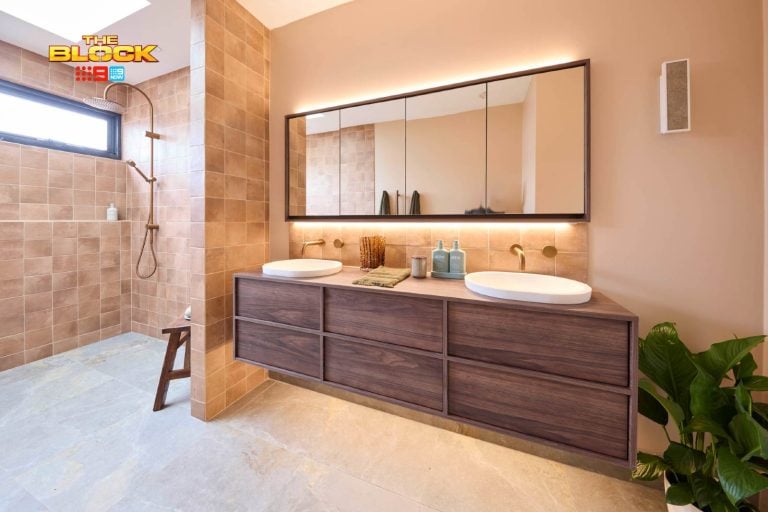
Tanya and Vito’s Redo Master Bathroom
I think the country let out a collective sigh of relief this week when fourth-placers Tanya and Vito removed the brown tiles from their shower. I know I was in the minority here in loving them, but the heart wants what the heart wants. And to be honest (I know I’m still in the minority here), I don’t think the white tiles are a better option.
But, what I think we can all agree on is that most buyers will appreciate this change. And they do still have some mood and character in the vanity and the black accents, so all is not lost.
I didn’t like the pendant light first time around, and I don’t like the replacement light either. The first felt too flea market, the new one feels too pedestrian. I think there’s a happy medium here that could be sourced and installed. Though I don’t think you get to redo room twice, right?
The Kids Room Was Almost There
I feel equal parts Neale and equal parts Shaynna this week when assessing Tanya and Vito’s kids bedroom. Like Neale, I do love the overall feel. I’m obsessed with the wallpaper, I really like the built-in bunk beds, I think the ladder is sublime and I appreciate the lighting.
Where we differ is around whatever that relic is from the mid-week challenge. It’s like something from a horror movie. Pick up the walky-talky and someone will tell you that you only have seven days to live. Spin the wheel five times clockwise and the Candyman will appear. The only thing missing is Annabel, that creepy doll from The Conjuring.
I actually wouldn’t change much here though, outside of removing the vintage play set that frees the souls of angry spirits to wreak havoc on your bedroom. There is one thing though (and this is where my equal parts Shaynna comes into play). The room is real cold and hard…
The Room Desperately Needs Carpet
Tanya and Vito are rather fixed on not having carpet in rooms and you can see how unwelcoming it makes a space like this feel. Shaynna said it perfectly; we need the softness for the soul to be in here. She’s right. As it stands it is an amazing space, but it reads a touch like a kids play centre, not a warm and inviting cocoon.
I also imagine the room would be quite loud and echoey when kids are playing in here. This isn’t ideal given it’s right next to the master bedroom.
And let’s be honest; in real estate it’s all about a feeling. It’s all about walking into a room and imagining yourself there. I’m not sure parents would walk in and feel warm and cuddly in this bedroom. Just add carpet and I think this whole zone would transform into something amazing.
Josh and Luke’s Redo Room Ensuite
Josh and Luke came last this week, delivering a redo room that wasn’t really a redo room.
They did nothing in this bathroom apart from put up a timber screen so that you could only smell and hear someone going to the toilet, not see them. Actually that’s a lie. You can still see them, it’s just more mysterious now. It’s like that scene in Chicago where the women are dancing behind bars. You could do your own version of that song while unleashing fury.
In all honesty though this was indeed an ‘up yours’ to the judges. What’s stupid though, is that their guest bedroom and home cinema totally needed tweaking, so I don’t understand why they didn’t choose one of those rooms to improve. Or were the rooms chosen for them? Let me know if I missed that part.
Josh and Luke Came Last
The boys said they were due for a grilling this week, and good Lord were they right. A grilling they truly deserved. Consider them burgers from the Hungry Jack’s Grill Master range. One can be the Pulled Beef & Angus, the other can be Double Angus Bacon & Cheese.
Shaynna delivered a third-degree burn by saying that, with this space, the boys actually created their redo room. And honestly, I couldn’t have said it better myself. I’m struggling to find one thing I like about it.
I’ve not seen a duo make so many nice furniture and decor items look so bad. But by melding them together like this, they’ve created the design version of Amazon Prime’s Nine Perfect Strangers (honestly, how could a show with so many good actors stink so much?).
Absolutely nothing works in this room. The weird feature wall needs correcting. The colour palette either needs darkening all over, with moodier blues, or lightening altogether by removing the dark timbers. The style, if you can call it that, is very confused too. Who is living here? They don’t seem to know who their buyer is.
What did you think about The Block 2021 redo rooms and new bedroom reveals? I’d love to hear your opinion in the comments below.
Want to see more goodness from The Block? Make sure you check out The Block Shop and nine now.


house no 5 i like as they put all hard work in, on the same amount of money and double the size compared to the other houses without winging like a couple of spoilted boys. they deserve to win as there house is amazing
i always enjoy watching the block for many reason as it create ideas into what you can do to improve your own place weather you own it or rent. the block show how you can make small areas look good and spacious just by colour and design. I like mitch & mark house the soft bedroom the judges dislike i really like it it gave a warm feeling. being a grandparent myself i understood the direction to what they were creating to there house. As far as the twins go as much as they have there own rules , they came across lazy calling in the girfriend to help design was wrong as you could tell its not the boys style. i like jessie and luke house and considering they have 2 levels they should have extra cash for the top level to make it more fair. Georgia & Ronnie staircase is amazing never seen anything like it well done. Tanya & Vito attitude came across childish the dramas was entertaining however caught on camera the truth will come out soon.the yellow front door not a good look but it dose set there house apart from the rest. the saying tayna likes to use in summary it is my truth to that i say all houses have some good design rooms /yards my favorites are mitch & mark house 2 also jessie & luke house 5