The Block 2026 terrace and pool reveals had it all. We had saunas shoved in where saunas don’t belong. We had furniture orientations that made little to no sense. And we had a drinking game where you take a shot every time Marty mentions ‘the campaign’ (I was in the ER within 15 minutes).
It also brought up a debate for me, which I’ll expand on below: does the kitchen/barbecue zone belong on the upper alfresco or on the lower one? I have thoughts of my own, and I wonder if we’re on the same page.
Scroll on as I drop my designer truth bombs on The Block’s outdoor terrace and pool reveals. And as always, drop me a comment at the end of the post or jump over to Facebook and Instagram to let me know your take.
Adam and Jolene’s Terrace Came First
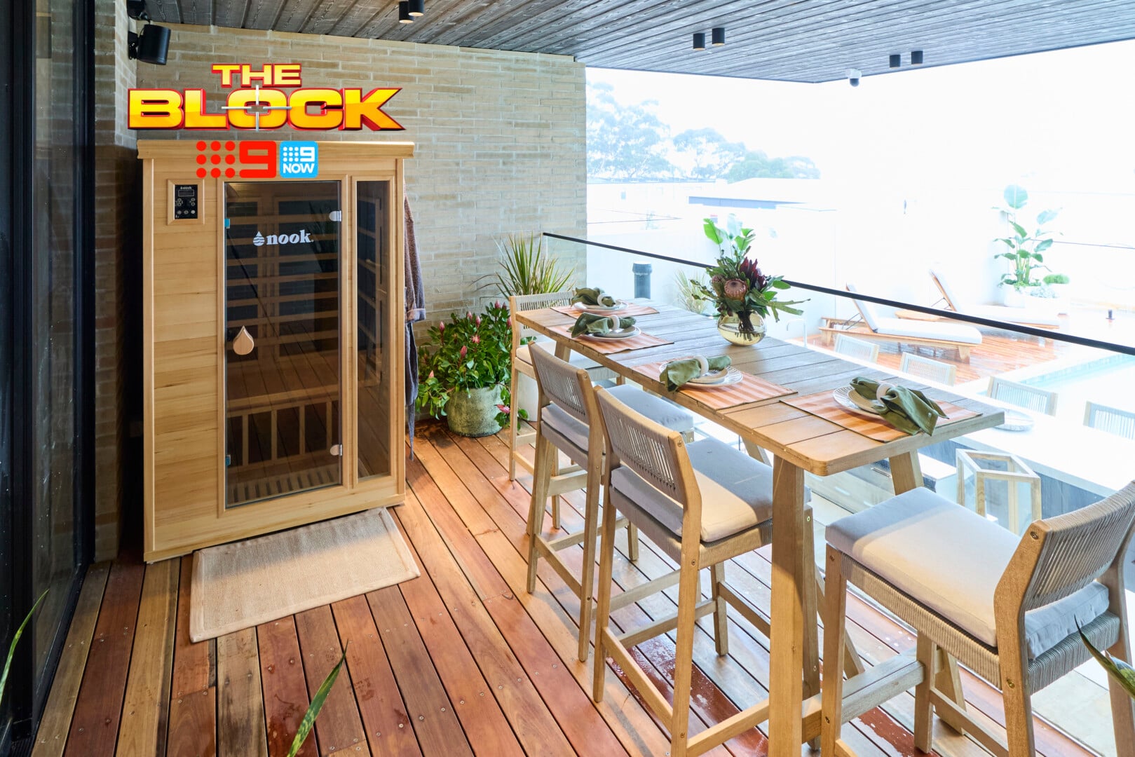
I’m a bit confused by Adam and Jolene’s outdoor design decisions. There is the alfresco zone upstairs, and this zone downstairs. Both should serve a different purposes. The one upstairs, if you recall, houses a small dining table and one large armchair. Now that I’ve seen their terrace area, I feel this approach was a mistake.
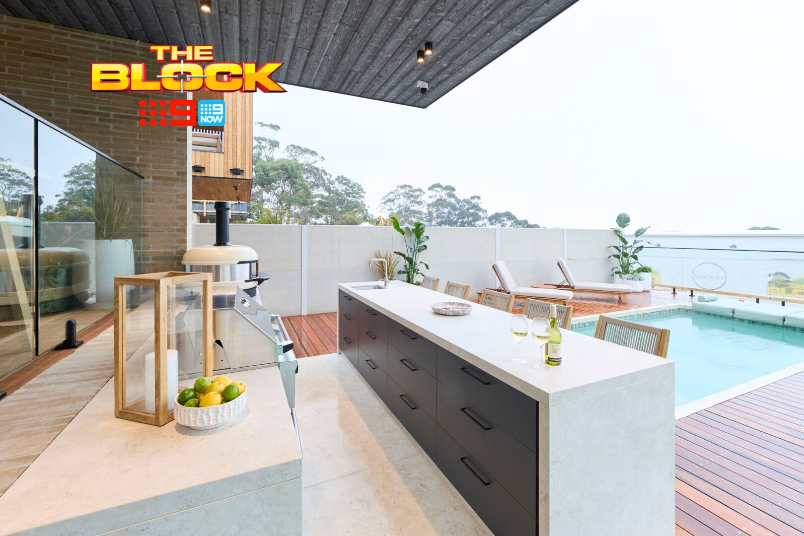
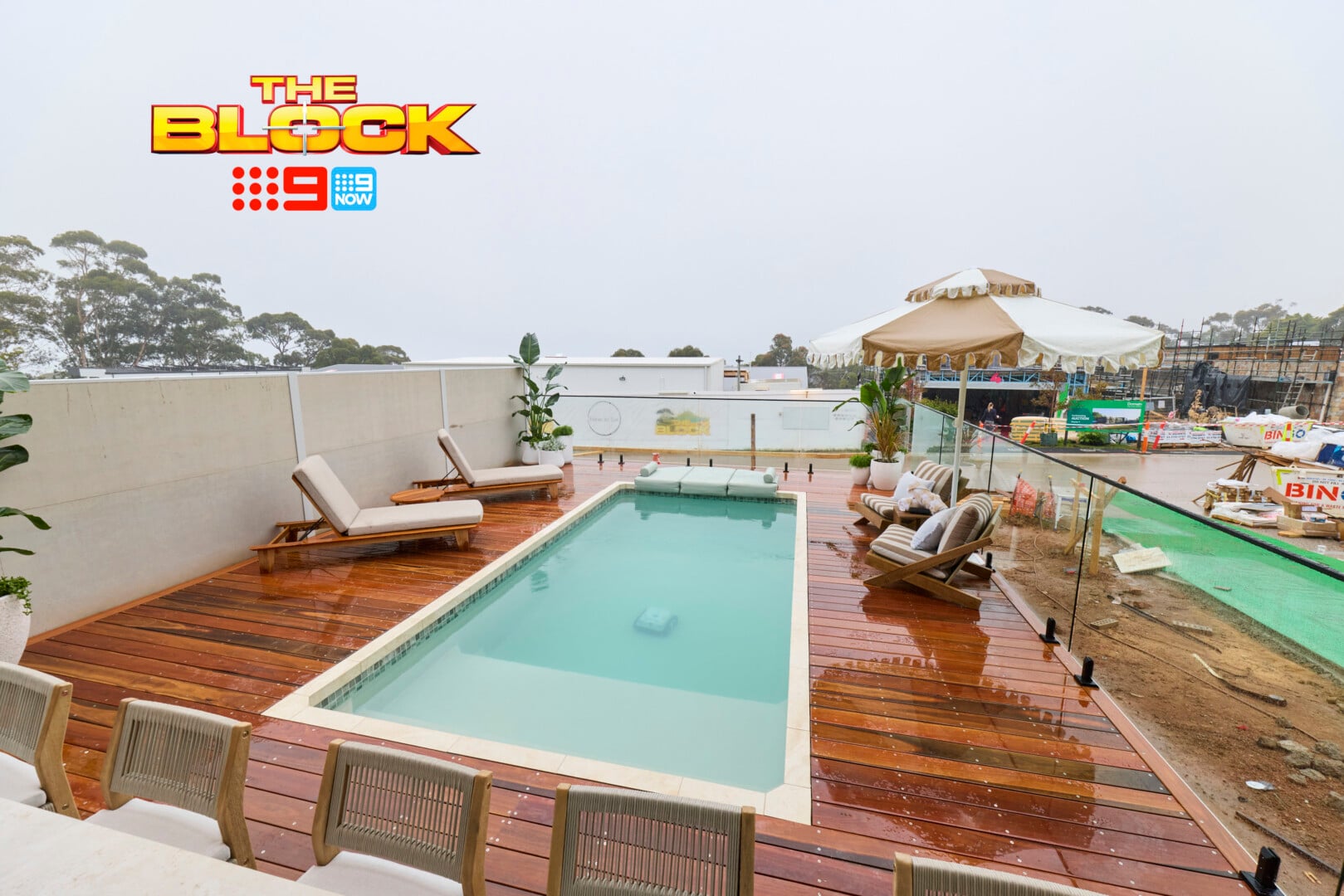
The upstairs alfresco should have been the outdoor dining zone, with built-in kitchen. When guests come over, you’re taking them out there to eat, to take in the view. When it comes time to chill out and party, you’re going downstairs to the rumpus, with an adjoining terrace that has a lounge area overlooking a pool (with a built-in bar, sure!).
For me the stocking of two kitchens (one up and one down) would be a royal paint in the butt. And to be fair, you would constantly be asking someone to go grab something you forgot from the upstairs kitchen when you’re cooking by the pool. I appreciate all the effort they went to, but for me it’s not successful.
There Were Many Functional Concerns
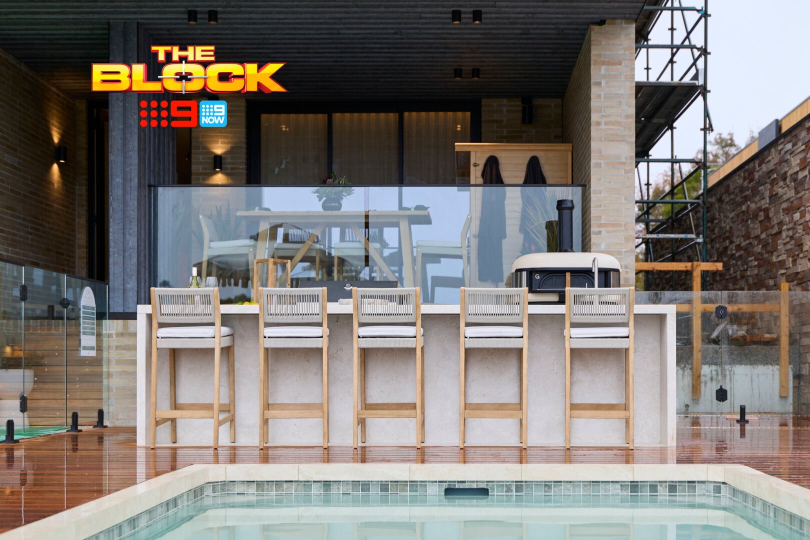
Given they’ve marked the downstairs zone as the place where you go to eat outside, it seems unfortunate they catered to four people on the terrace and five people at the pool bar.
Am I missing a large table somewhere that seats six or eight? You’re paying millions for this home but two guests of the six have to eat in the sauna? And when you’re down by the barbecue, you have to sit in a line and face the house, with your back to the pool and view? It doesn’t make for an easy conversation.
I also don’t understand why the sauna has been placed on the terrace right beside a dining zone. It most certainly does not belong there. The sauna is a place where you want solitude, relaxation, time away from the house. It would be better placed on the side of the home where it feels more isolated.
In case you haven’t picked up what I’m putting down, I’m baffled by this outdoor terrace and pool coming first.
Courtney and Sev’s Terrace Came Second
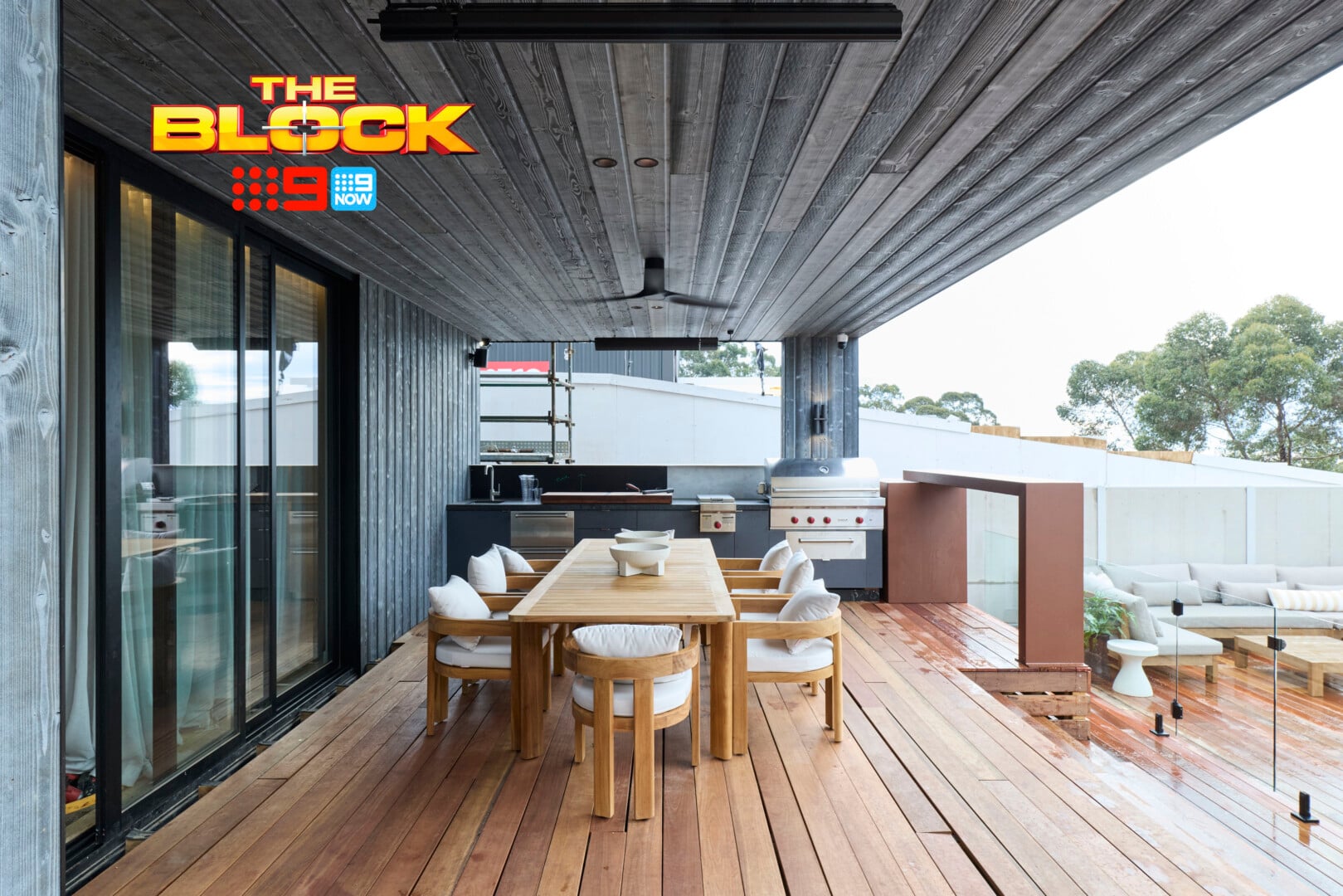
OK, so this outdoor terrace feels far more functionally correct. I still stand by the fact that outdoor kitchens should have gone upstairs, but at least here Courtney and Sev have zoned the two spaces exceptionally well.
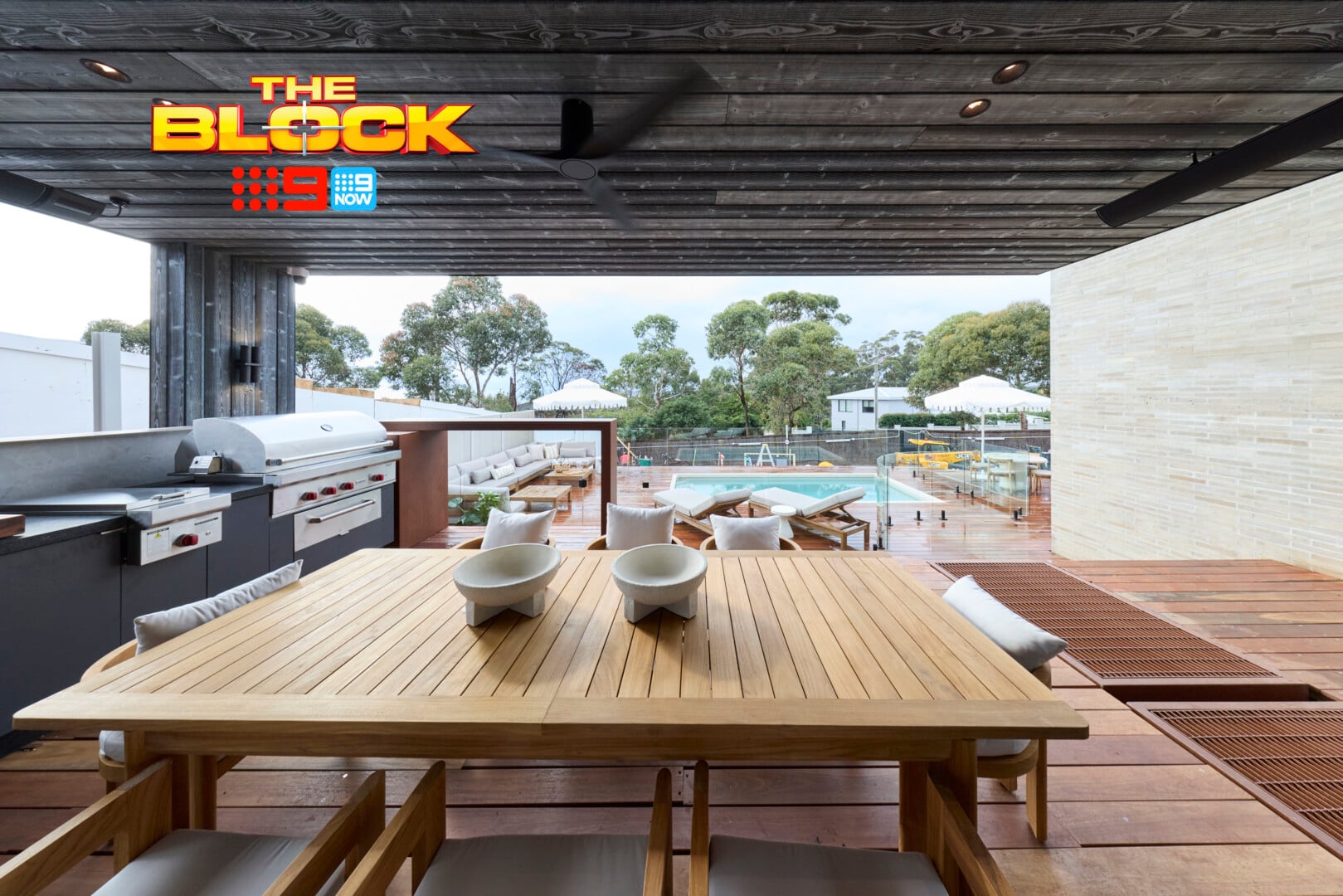
The first zone tells you immediately what is happening in it. You have an outdoor kitchen, you can seat up to eight people, and nobody is stuck having their steak in the sauna. This is where you begin your experience when people come over. And there’s ample footprint dedicated to it.
The only issue I have with it is the visual. It feels very under-cooked on the style front. We need some plants, some table styling, even an outdoor rug. These touches would have made the dining zone far more elevated. It’s a bit brutal at first glance, but I appreciate that once styled properly it’ll be very appealing.
The Pool Zone Was Pretty Stellar
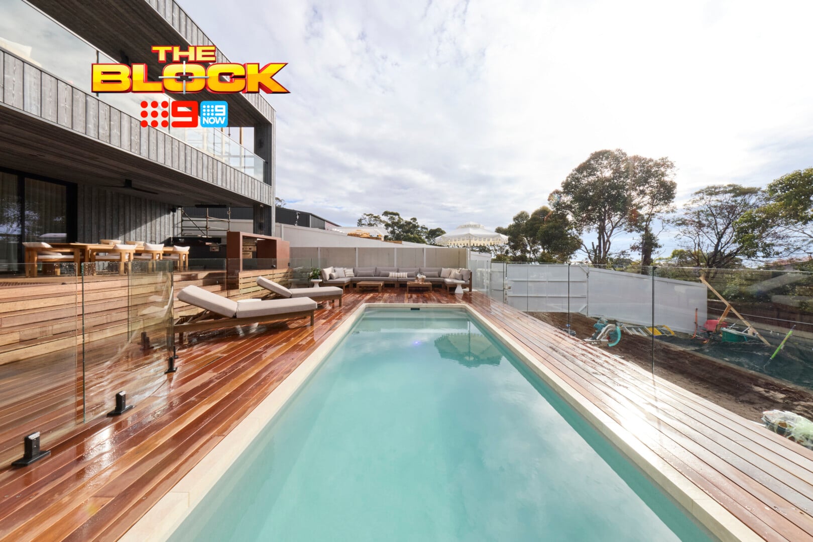
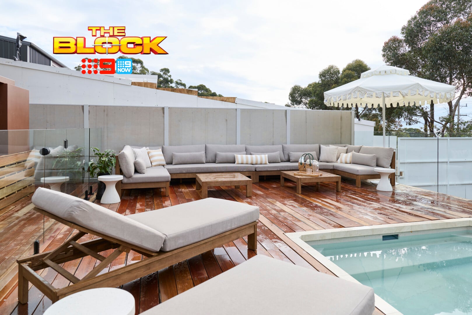
The curved glass on the pool fence was truly divine. It’s those small touches that make a big difference. From here on in I want every and all pool fence I encounter to feature a curve. I’m smitten.
The pool zone also works similarly to the terrace in that it tells you how to use the space. It’s selling a dream to the buyer. All of that lounge seating clearly deems this area a party destination. Courtney and Sev have designed a very successful outdoor set of spaces.
The area feels massive, too. I understand this was the largest yard of the lot and they have certainly made the most of it. Landscaping and greenery is to come next week, but so far they’re onto a winning strategy.
Chantel and Wyatt’s Terrace Came Third
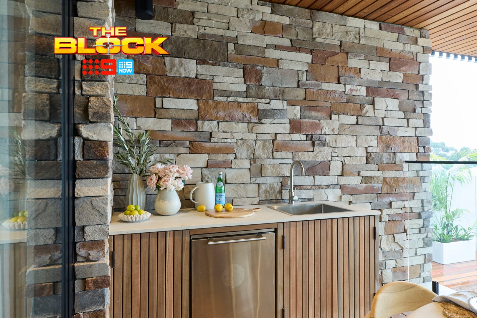
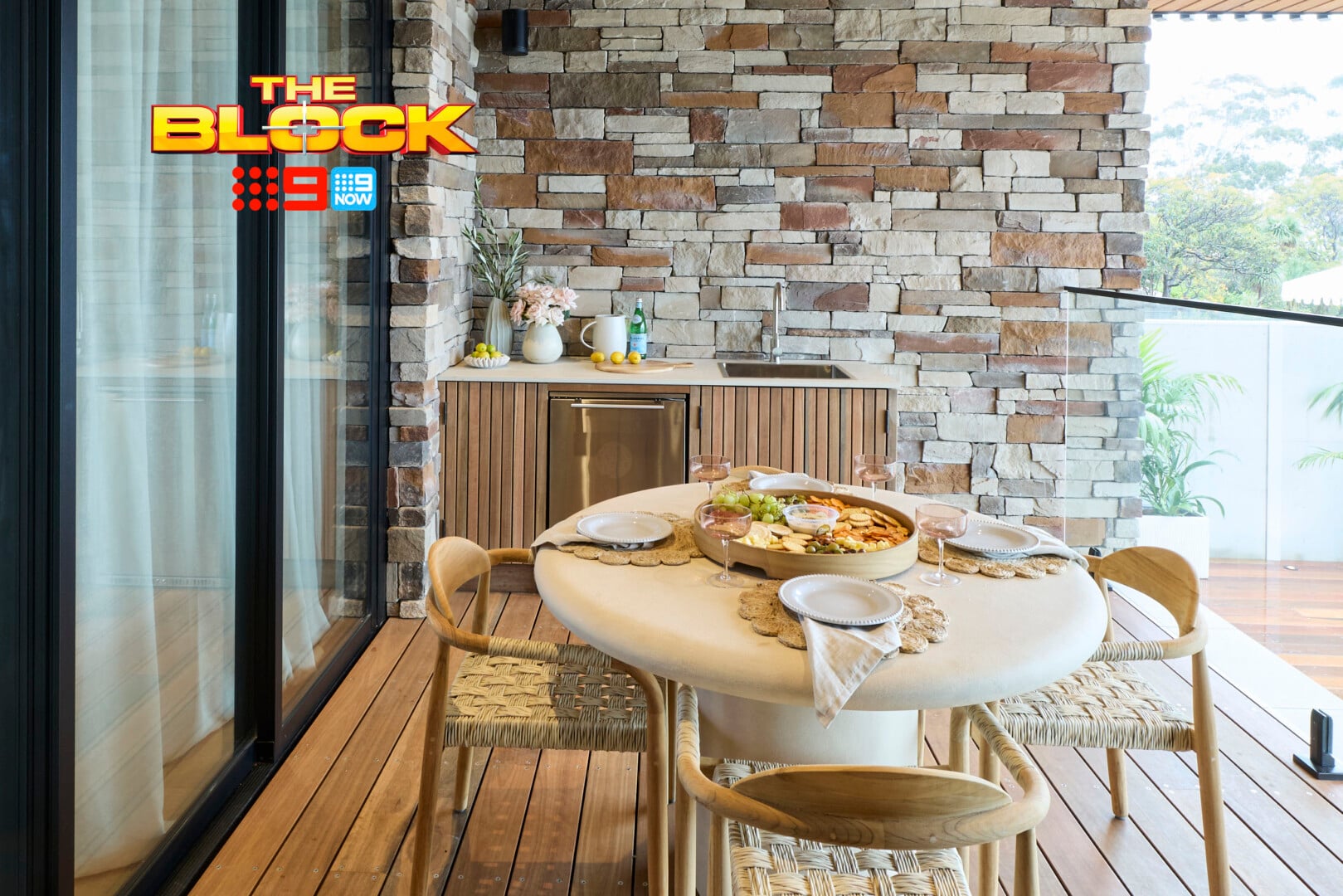
This is simply not enough of an outdoor terrace for a multi-million dollar home. Forget the idea that people might look at Courtney and Sev’s and compare them for a minute. Even if you saw just this property you’d feel very underwhelmed that you’ve walked outside to a four-seater table and small kitchenette.
If they had of made the upstairs alfresco a fully-fledged dining zone with built in kitchen I would have no issue with the terrace downstairs being so small. But here, neither box has been ticked. You have nowhere to successfully entertain; just two zones with some furniture in them and a barbecue you can apparently wheel downstairs if you need it.
This is the sort of outdoor room you’d expect from a luxury inner-city apartment (I have been in many, and it would work well there), but sadly in a property of this size it’s not cutting it. We’re left with some really unappealing external zones here.
The Pool Area Was Also Lacking
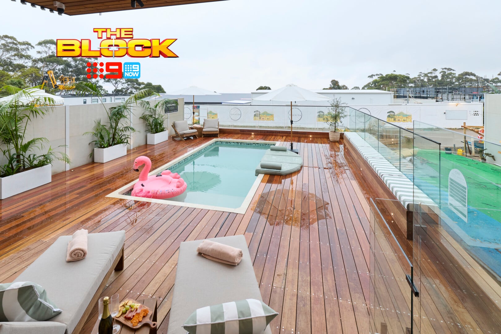
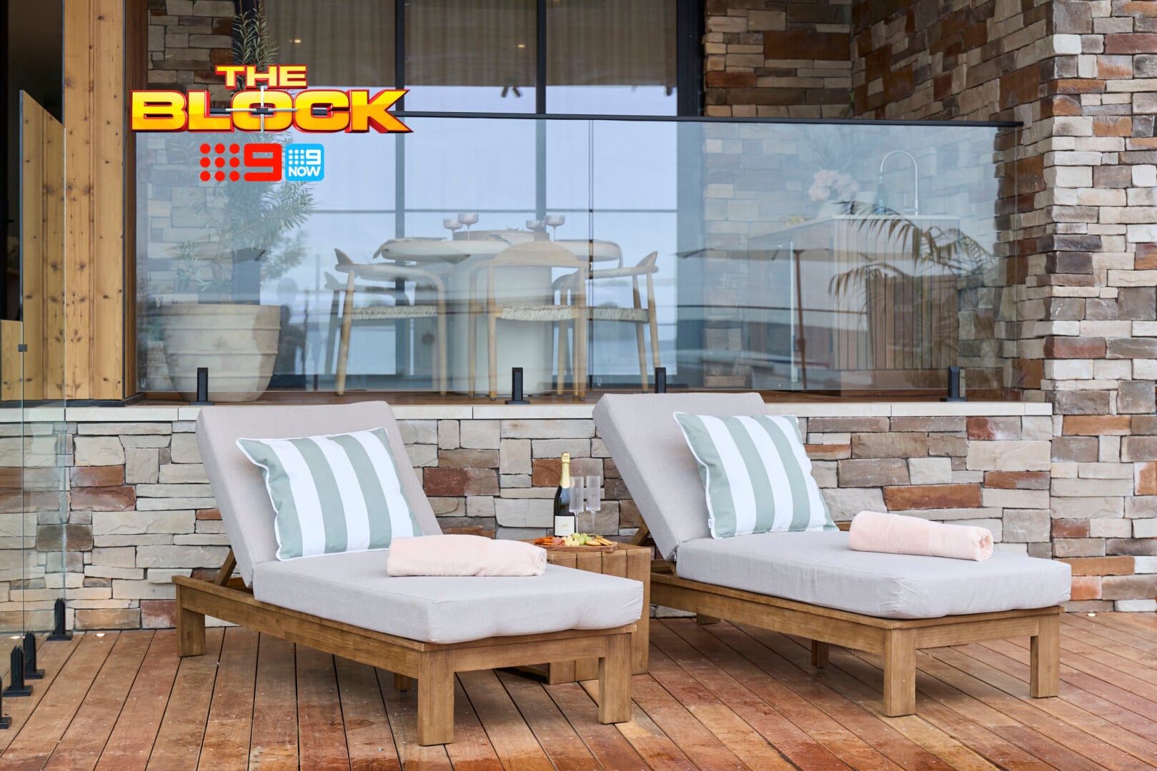
Chantel and Wyatt dedicated too much footprint to the pool zone and not enough to the dining zone. And then, they didn’t furnish the pool area to its full potential. The deck should have been extended further out, with a full outdoor kitchen installed and an eight-seater table and chairs included.
Even with the current footprint, they had room in the pool area for a large dining table and chairs. At least that would allow more than four people to experience the alfresco zone. Table and chairs with a colourful umbrella installed and some more cushions on the bench seat would be a step toward making this zone feel more lively and liveable.
Compared to all the others (and this is coming from someone who enjoys Chantel and Wyatt’s interior), both outdoor areas make this home a bit of a dud for me.
Lisa and Rosco’s Terrace Came Fourth
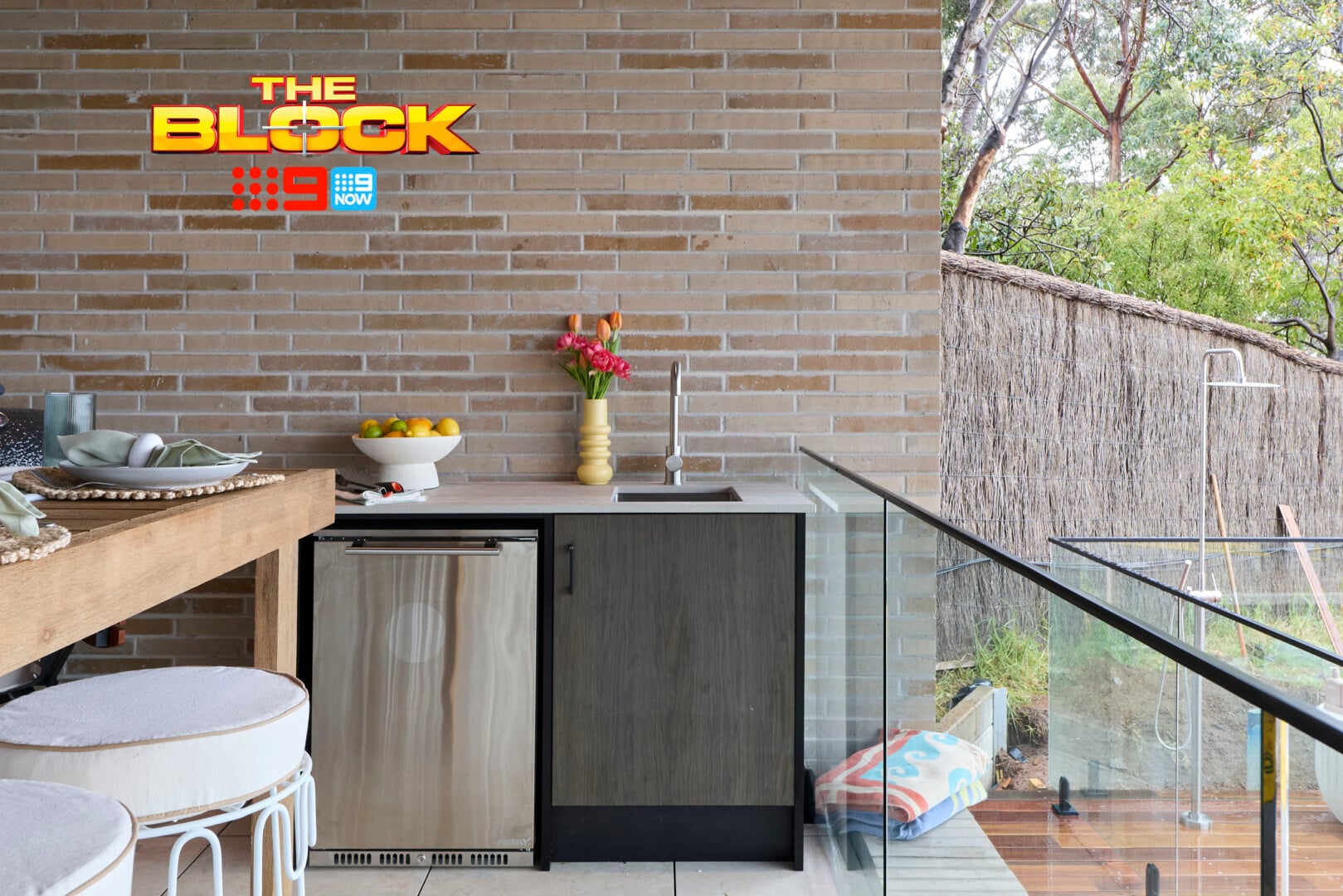
I appreciate that Lisa and Rosco opted for a dark pool to tie into the colour palette inside. Connecting indoors to out is key when I design spaces for clients. But, unfortunately, that’s where the appreciation ends when it comes to their outdoor terrace and pool zone.
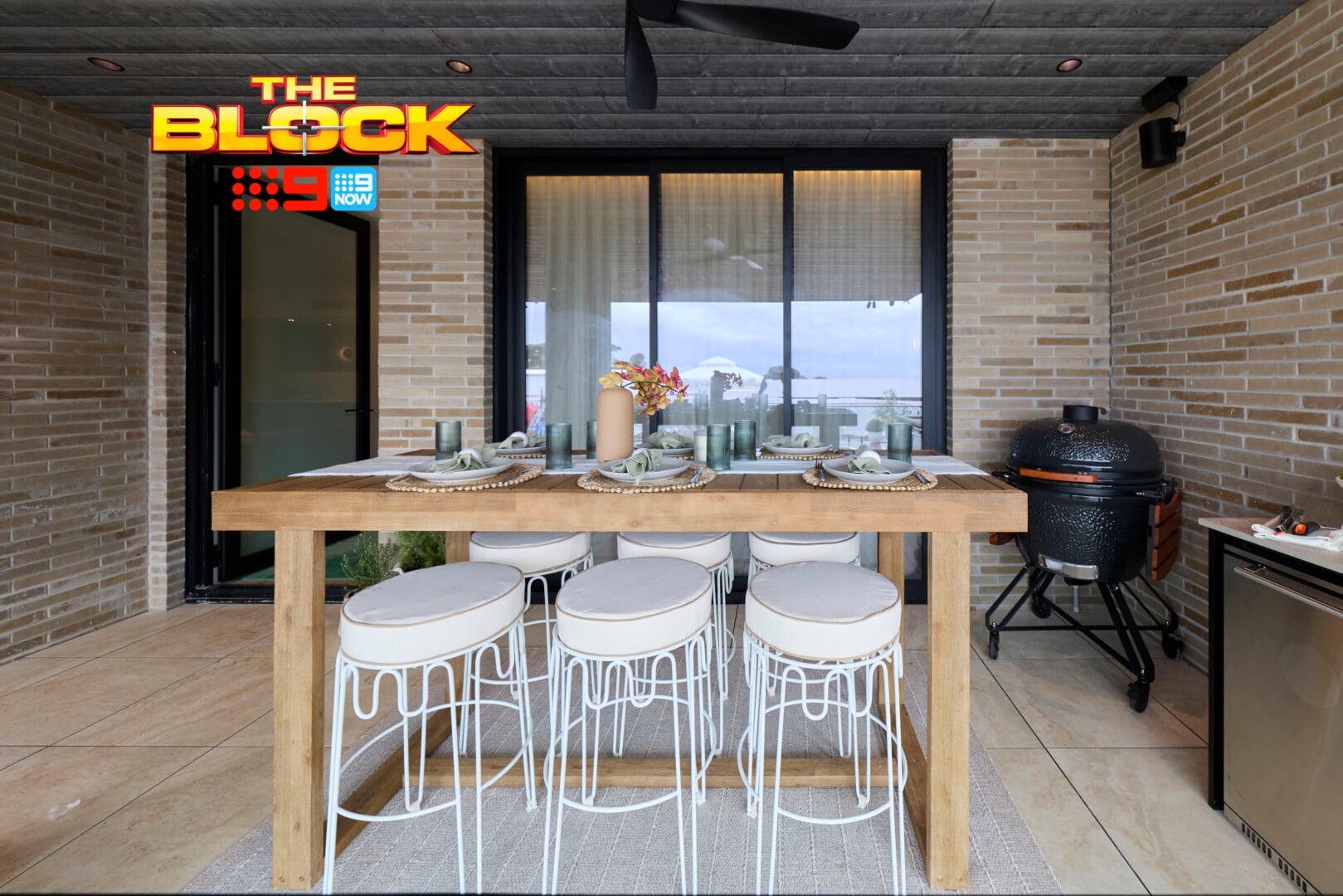
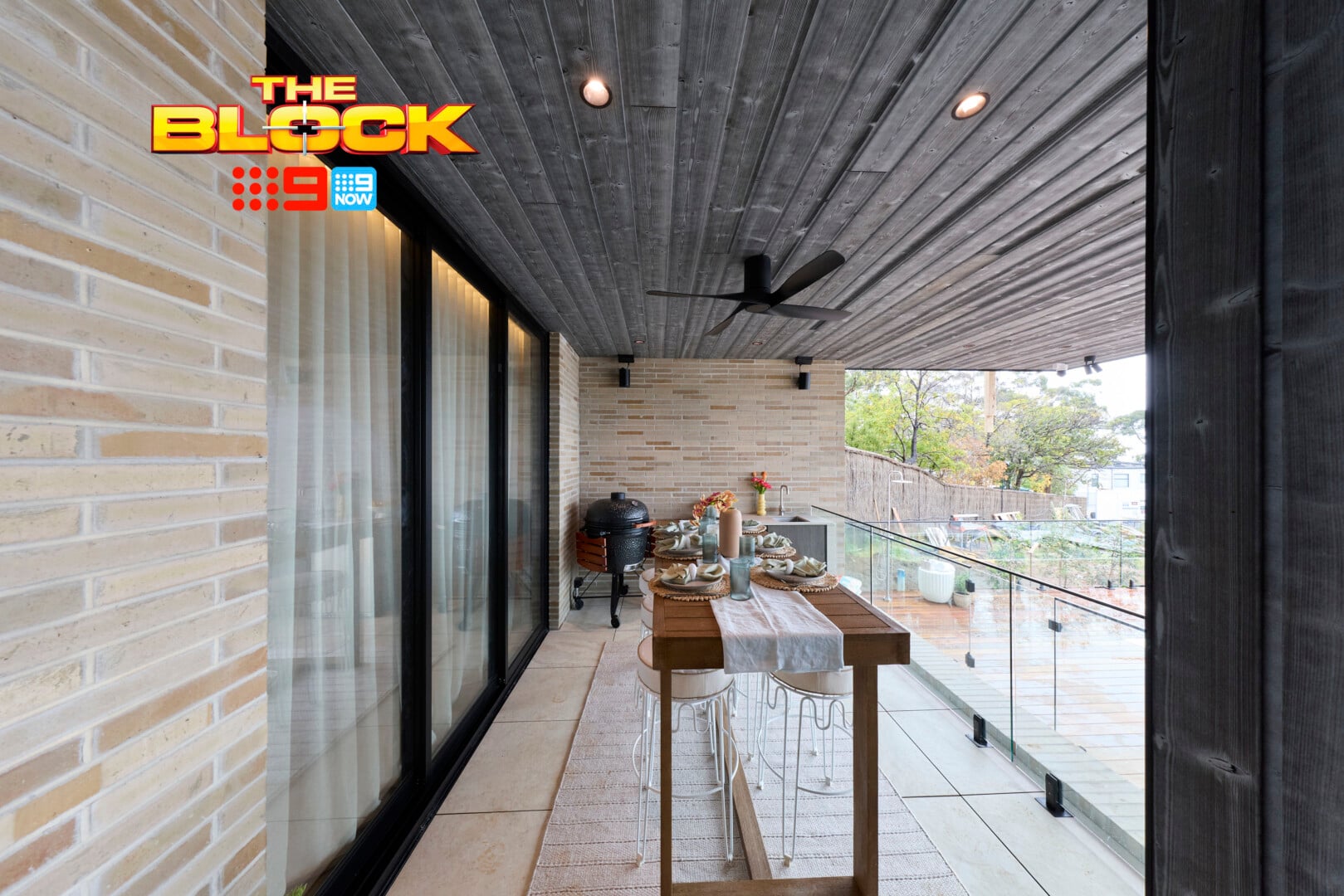
Given that they installed the barbecue upstairs (my preferred option), the downstairs terrace needed to tick a different box. You’ve shown a buyer that upstairs is where you’re eating. Downstairs needs to say lounging, relaxing, drinks. You don’t get any of that when you come downstairs. Instead, you have a cramped, oppressive space with a high table at it.
It would have been far more successful to make the terrace a bar vibe that overlooks the pool. Extend it out, include lots of sofas and armchairs. We don’t need a smoker. I also don’t understand the choice of stools and day bed. The style is great, but it’s so at odds with their interior choices.
The Pool Zone Was Underwhelming
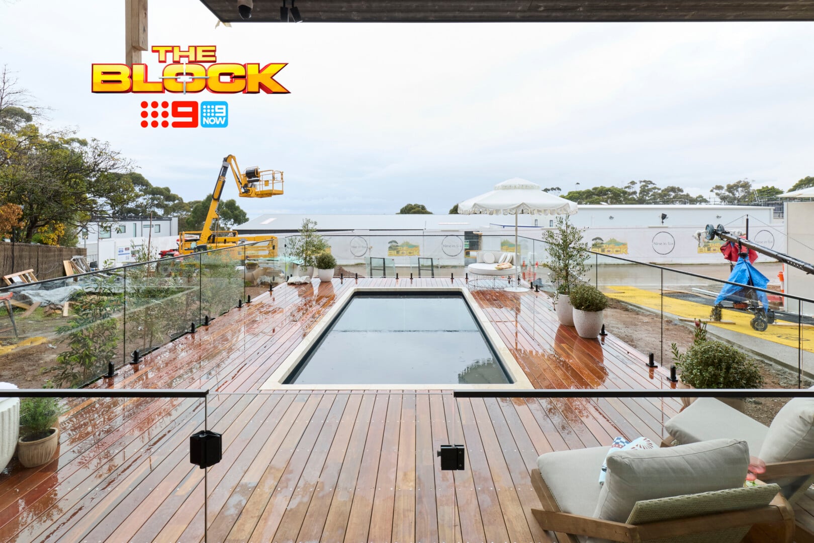
Like I said, I like the concept of the dark pool. It’s at the very least a point of difference from the other homes and not something you see a lot of. Outside of that though, the pool zone is very underwhelming.
They really needed to think about softening with styling. Outdoor zones often feel hard and harsh. We needed a tonne more chairs with cushions. Black scatter cushions on top would have made the pool feel more at home. We need umbrellas, we need side tables with greenery on them, we need some excitement here.
This pool zone is lacking life, lacking the dream, telling no story.
Rick and Tayla’s Terrace Came Last
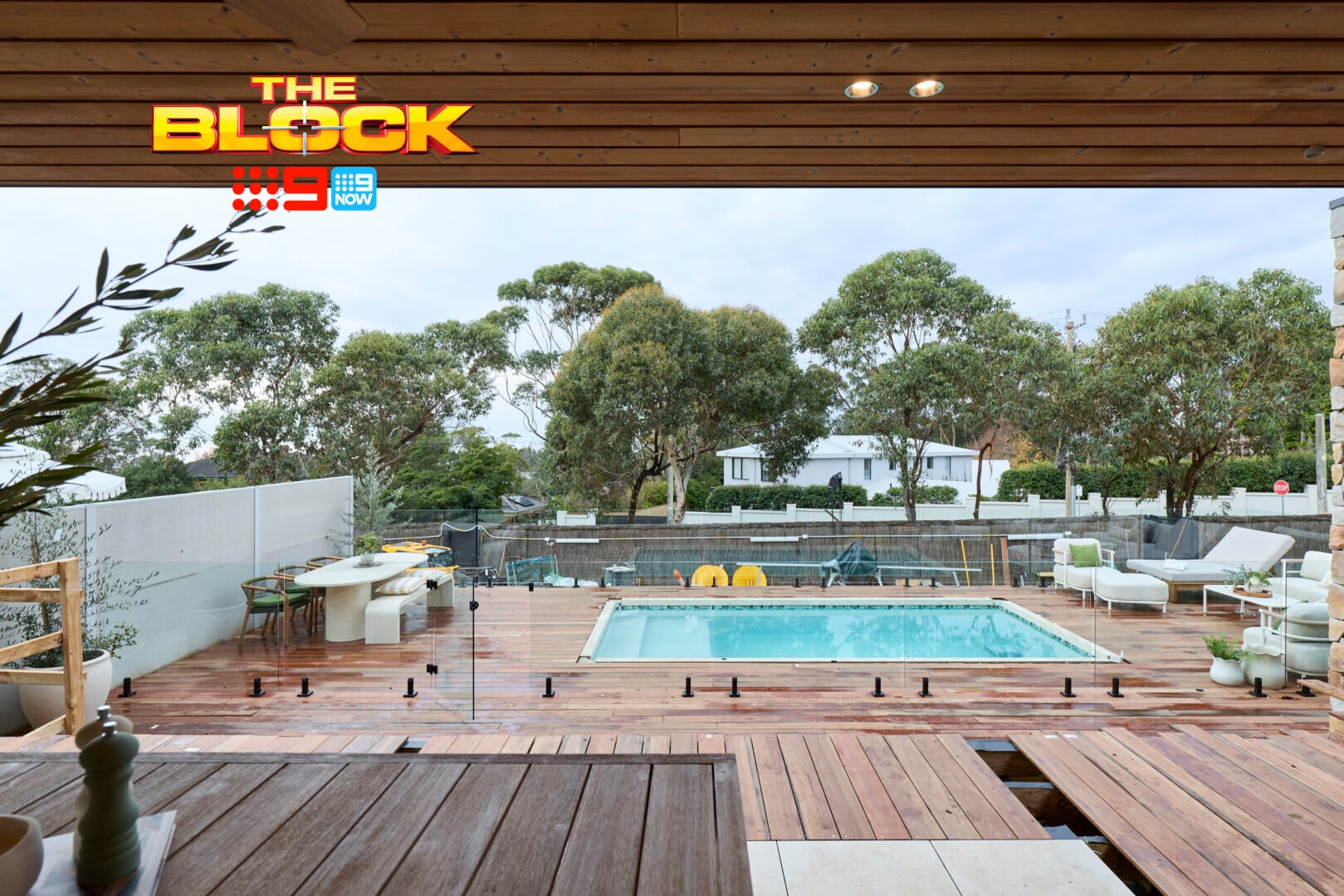
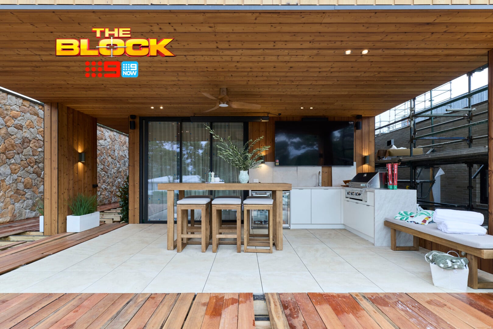
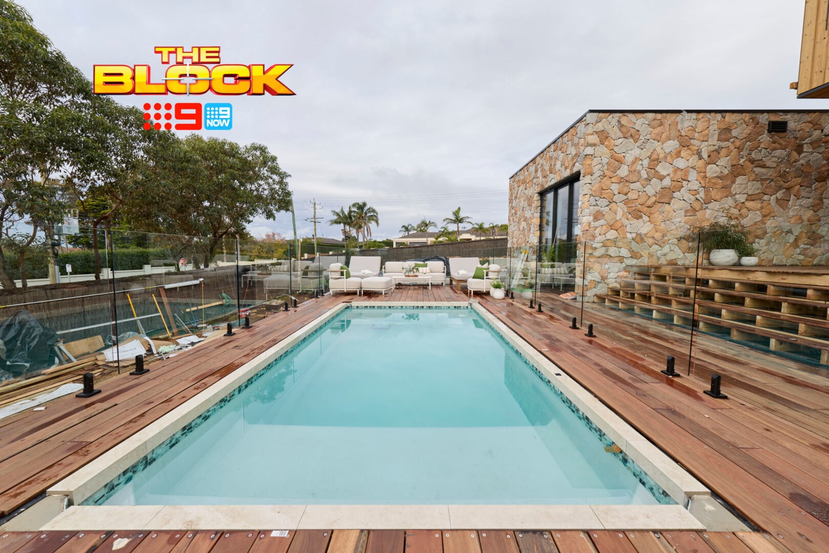
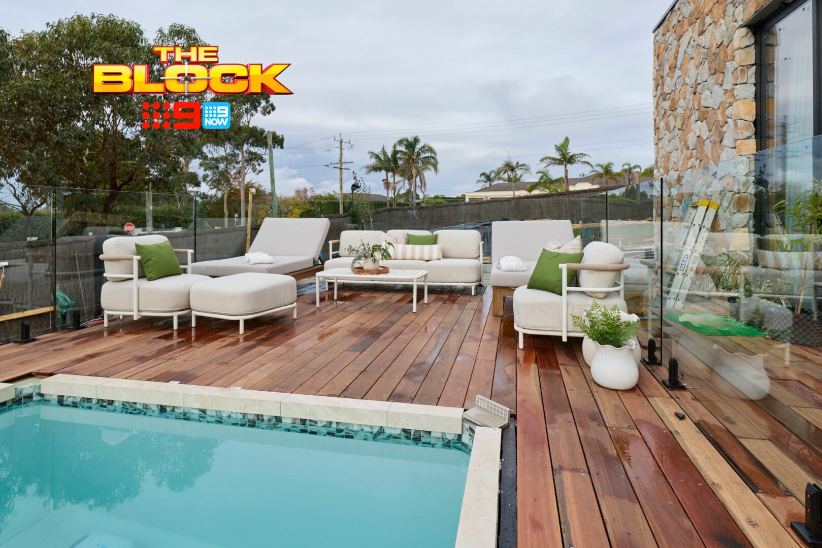
Let me declare: once this outdoor terrace is completed properly it will be the best zone out of the five. I know the entire area is unfinished, and points were deducted accordingly, but it actually appeals more than Courtney and Sev’s. I can see where it was heading, and I love it.
The tiles need to come off the wall. That we can all agree on. But outside of that, the textures in this zone work incredibly well. I like the floor tiles, I enjoy the decking around it, and the colour palette is very appealing.
They do have another barbecue zone upstairs, which can only be a good thing I suppose. Though I do want more low and comfy seating in the terrace area. At present there aren’t enough places to lounge unless you go into the pool.
Shaynna suggested swapping the tables in the terrace and pool around so the bar table is in the pool area, and the dining table up top. I agree with this approach.
The Stairs Down to the Pool Were Everything
I know it’s hard to imagine the end result because the pool area was also unfinished, but I do feel this will be a great space in the end.
I do have to point out how epic the stairs are leading from the terrace down to the pool area. As all the other terraces were revealed I kept wishing that the stairs down to the lower levels were more impressive (not a small set stuck on the side). I’m so glad that Rick and Tayla decided on this because they look so grand.
All the furniture down the end of the pool zone is a weird mistake that needs to be corrected ASAP. It looks like the day after the night before at a resort where the staff are yet to clean up after last night’s shenanigans. But that aside, I feel Rick and Tayla needed a higher score this week.
What did you make of The Block 2026 outdoor terrace and pool reveals? Drop me a comment below or jump over on over to Facebook and Instagram to let me know your thoughts there.