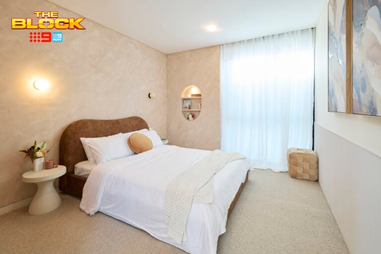
The Block 2026 guest suites reveal has once again left me disappointed. That’s not to say that every room was bad, of course. But overall it’s another set of room that prove why having novices on this show is very rarely ever going to produce a great result.
We’re at the point now where judges are laughing at how bad rooms are, teams are laughing at how bad their work is. And we’re what… meant to expect someone who isn’t a charity to purchase the home for millions of dollars?
I do feel we’re at that tipping point, gang. The point where The Block needs some sort of reboot. I’m available if they’d like to talk through what the changes could be, because someone needs to make some.
What did you think of the guest suites reveal? Drop me a comment at the end of the post or jump over to Facebook and Instagram to let me know your thoughts.
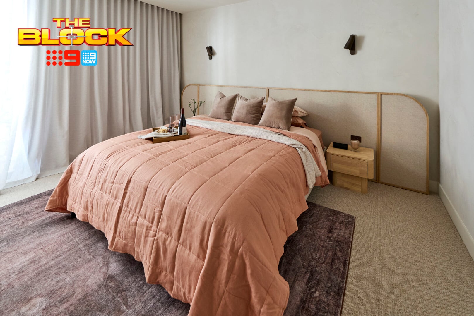
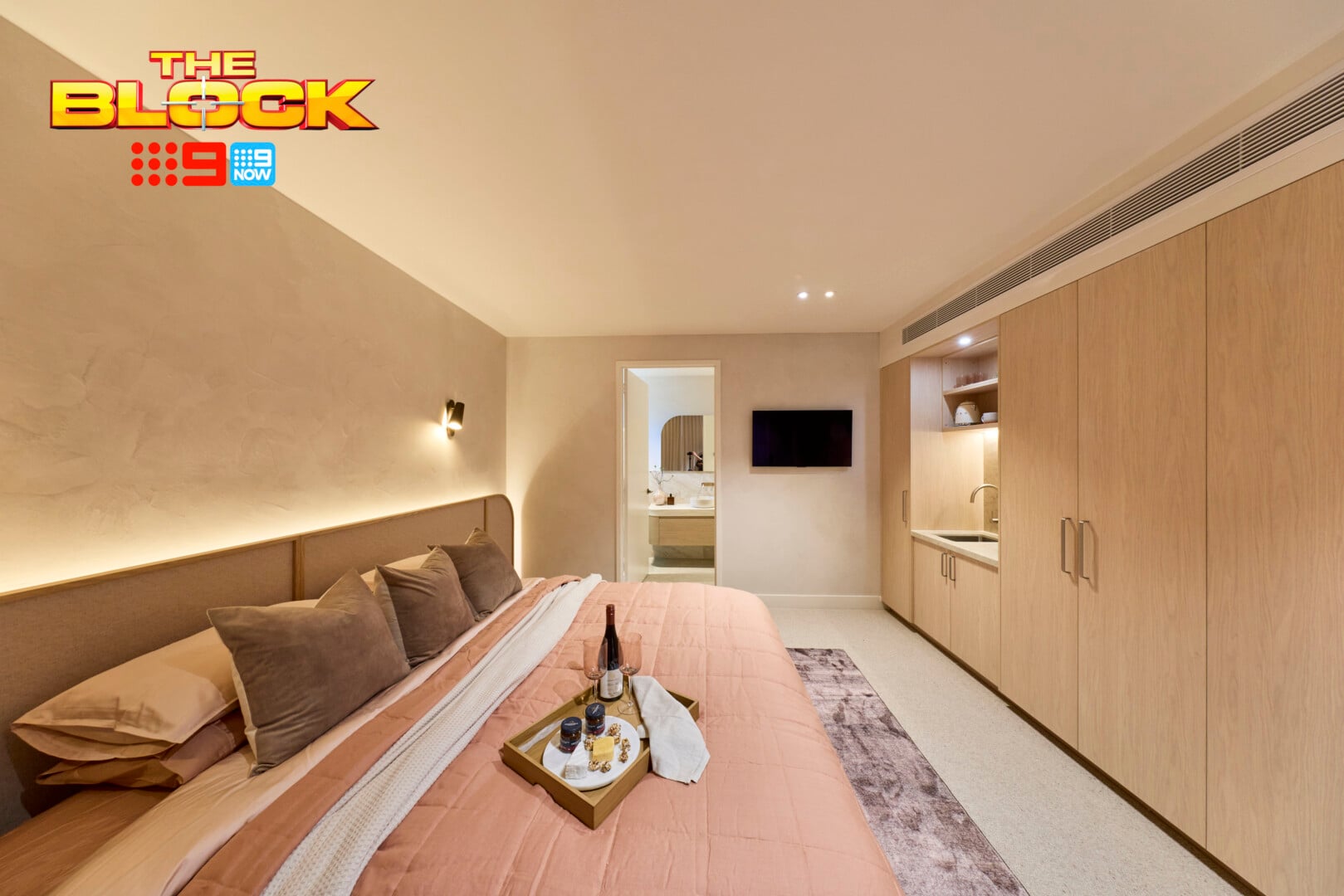
Courtney and Sev’s Guest Suite Came First
I always tend to think that a kitchenette in a guest suite is unnecessary unless it’s an external dwelling separated from the main house. But I won’t hold it against them. To afford a buyer the option to lock their parents in a small room for the weekend where they can’t escape is a luxurious offering indeed. Flowers in the Attic: The Senior Years coming soon to Netflix.
All jokes aside, someone is going to find the function of this all-inclusive suite very appealing. And they mentioned during the reveal that the room has its own private courtyard – so the inmates get to spend some time in the sun.
Real talk now: the wallpapered headboard in this room is a genius idea executed perfectly. I’m obsessed with it, as I am with the wall treatment and the tone of the cabinetry. Those elements all feel rather soft and soothing, evoking luxury without blowing the budget.
The bedding I would have toned down completely. The rug is giving enough colour here to make the space interesting – the quilt cover is too vibrant. A canvas artwork above the bed is needed too. I also hope that TV has a swing mount on it otherwise Nan and Pop need a chiro on speed dial.
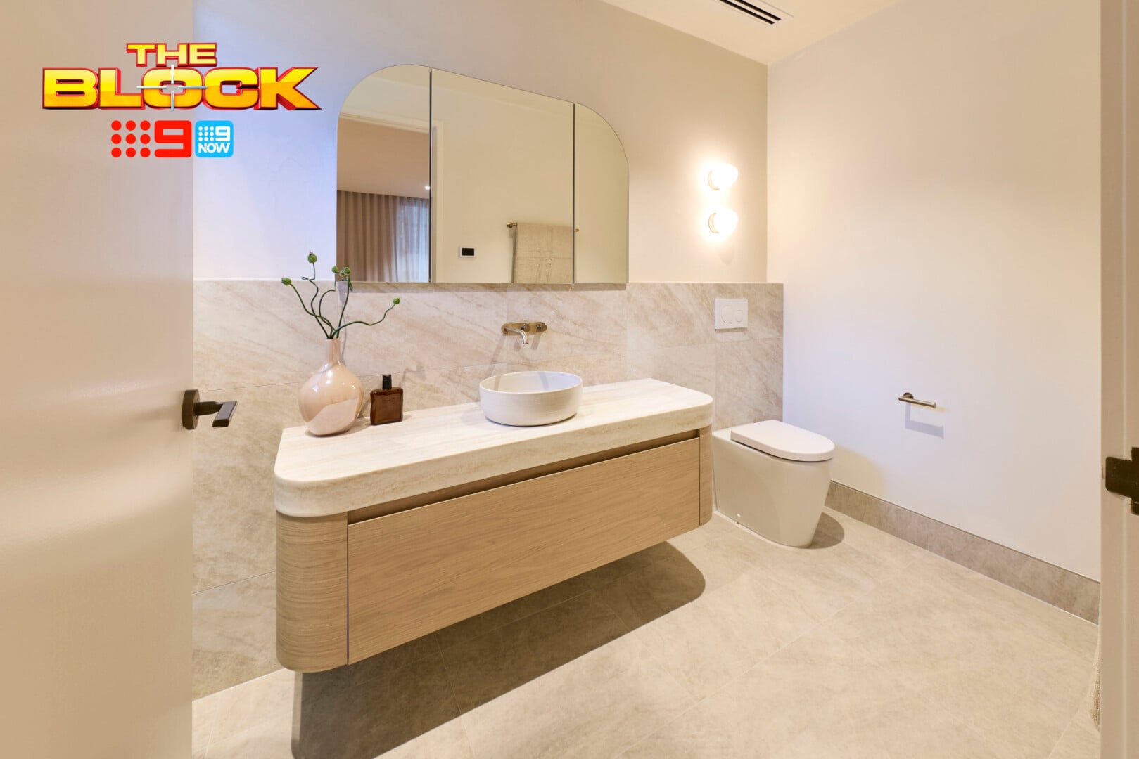
Their Ensuite Was (Almost) Faultless
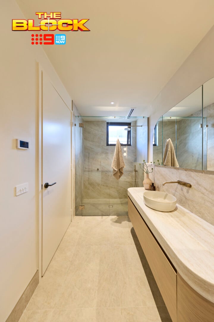
My designer eyes were all over this ensuite, looking for elements I would change. I have to say, there are only a few things to amend because overall this zone is pretty sublime.
The layout is great, the curved profile of the vanity is stellar, the mirrors (unlike in their last bathroom) are placed perfectly, and the use of the one tile throughout works a treat. I also adore the ledge that runs wall to wall from above the toilet to into the shower. These small touches make a big difference.
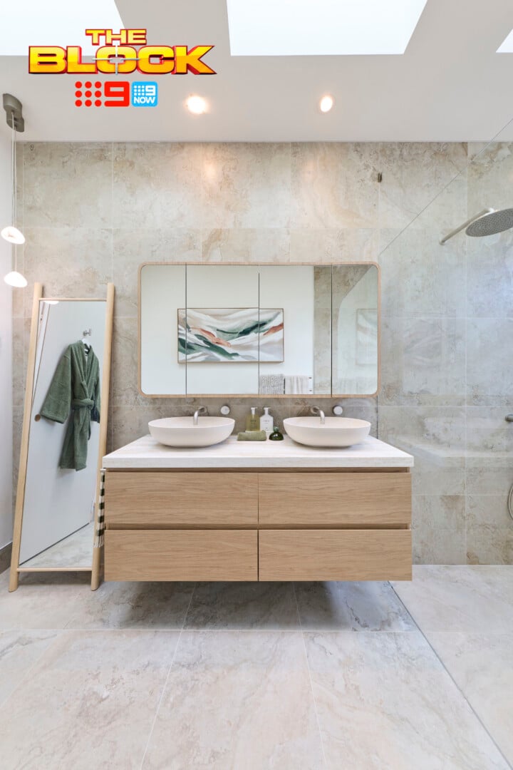
In terms of changes, an LED strip light under the vanity would be appreciated. And perhaps some more lighting in general, as the vanity zone is a little under-lit. You know bowl basins are on my no-go list, so I would swap those out, but that’s a personal gripe and one I can’t deduct points for.
What I will hold agains them though – as I have in all of their bathrooms – is the no hand towels. I never thought I would be this worked up about a lack of hand towels. Won’t somebody please think of the hand towels?
Adam and Jolene’s Guest Suite Tied For Second Place
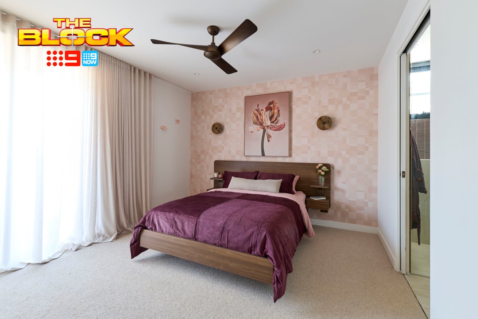
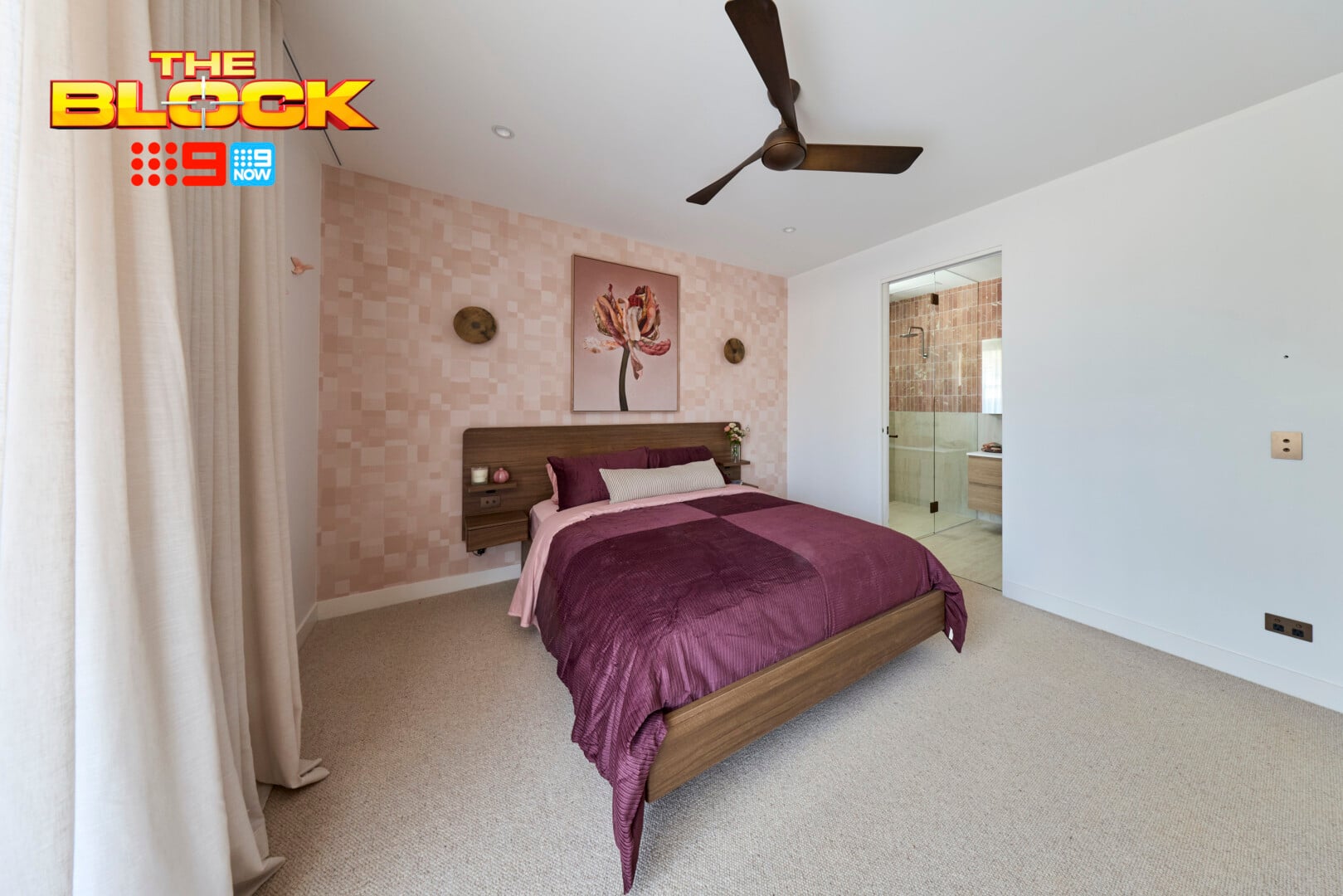
I caught a glimpse of the reveal episode, only to hear Adam use the word ‘booby’ when referring to the wall lights. Note to self: update your ick-list to add grown men using the word booby on national television.
While we’re on the subject, the wall lights against that wallpaper are a terrible combo. Both elements, combined with the bed frame and quilt cover set don’t feel ‘quiet luxury’. It’s all very vibrant and heavy. It almost reads as a teenage girls room if she was into wall-mount bird ornaments from Typo’s 2010 collection (they were big at the time).
Unfortunately, I don’t have a lot of positives to say about this guest suite. The furniture and decor are like the cast of The Odyssey: I’ve seen them do beautiful work individually but together it’s too much.
The art above the bed needs to be landscape in orientation, the curtains need to not pool on the floor, the ceiling fan feels vintage. The list goes on.
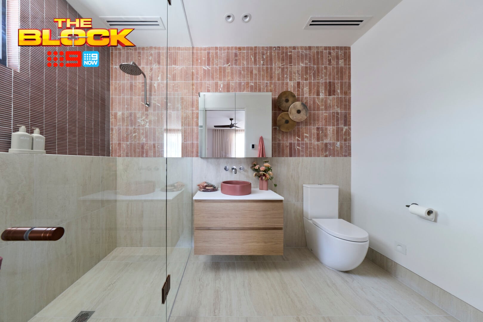
The Ensuite Was Better than the Bedroom
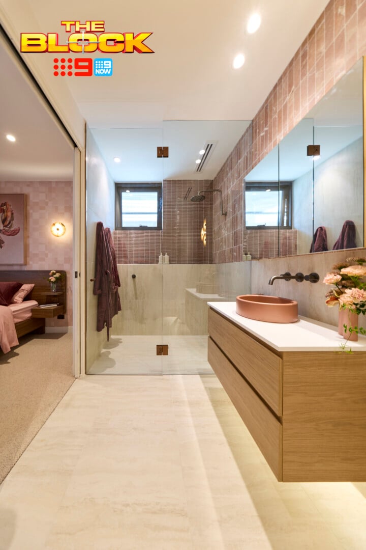
I want to give them credit on the cohesion front. As a duo, the rooms are connected wonderfully. There’s an obvious relationship stylistically, and a flow as you move from one zone to the next. The colour palette is great too, even if it doesn’t meet the ‘quite luxury’ brief, and functionally there aren’t many issues to address.
I can’t say I’m blown away by the visual of the vanity area. It’s pretty generic. You have a stock-standard vanity with two drawers, a coloured bowl basin on top and a shaving cabinet above. All fine, but no divine design detected. I appreciate them wanting to create a moment with the circular wall lights, but they’ve been mounted too close to the mirror.
The big crime in this zone is the feature tile combination. Feature tiles in a bathroom are like martinis; one is great, two is too many. These ones are fighting each other terribly. The finger tiles in the shower zone are the more successful of the two. I would have kept those as the focal point in the room.
Chantel and Wyatt’s Guest Suite Tied for Second
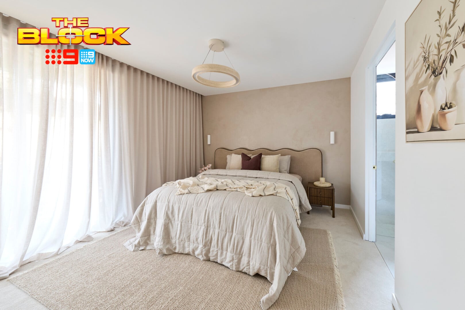
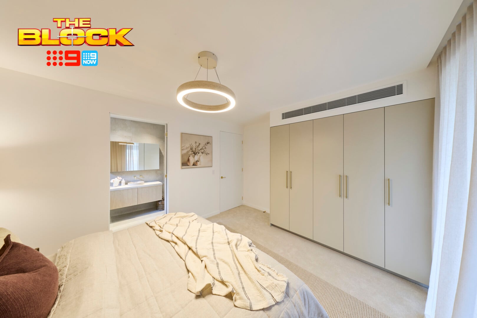
This guest suite is far more successful than Adam and Jolene’s, because it meets the brief and it doesn’t have anywhere near as many design crimes taking place. Chantel and Wyatt delivered a pretty good room this week. The colour palette is delicious, the overall feel is soothing, and the functionality is there.
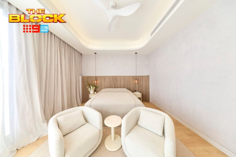
The venetian plaster behind the bed and the profile of that headboard are stunning. I’ve not experienced a pairing this beautiful since the invention of the Oreo McFlurry. I also enjoy the pendant light they installed in the middle of the room, as well as the colour of the robes. There’s a lot to love.
The bedroom wall lights need to be removed and replaced immediately though. The colour against that beautiful venetian plaster is jarring. They also decided not to place switches on the wall so you can operate them from bed, which is just ridiculous. Outside of that (and my want to tuck the bedding in and trim the curtains) the space is great.
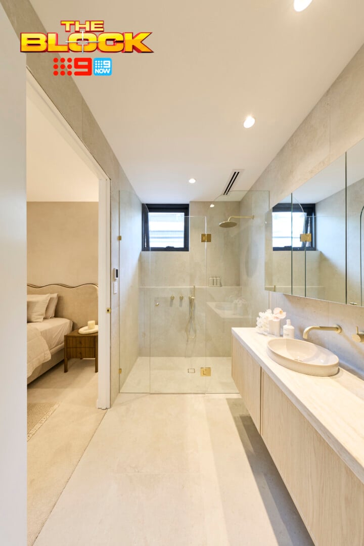
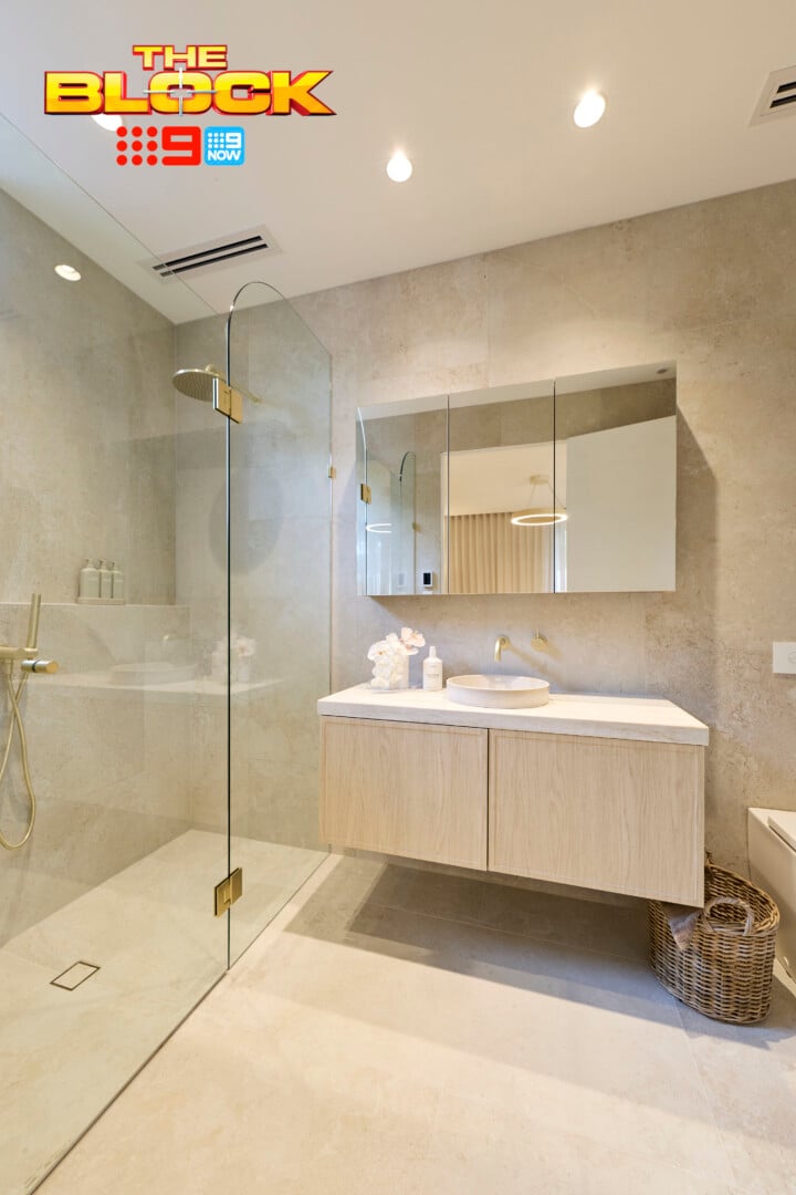
The Ensuite Was Also Visually Pleasing
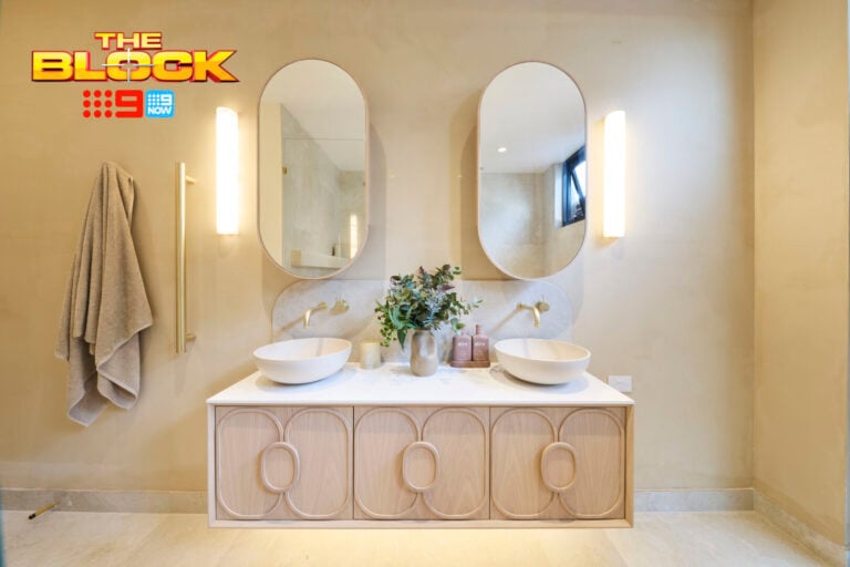
The main gripe the judges had with this ensuite was that the shower was too narrow. I have to agree. The hinge door meant that switches had to be mounted to the left as you walked into the zone, which meant the shower screen had to step in. The answer was simple: a cavity slider door. You’d rather that and a larger shower than the other way around.
Visually it’s lovely. The profile on the vanity front is refined, the slightly recessed basin is elegant, the single tile used throughout keeps the look streamlined, and it all connects perfectly to the other bathrooms in the home. Looks-wise I wouldn’t change a thing.
But, as I always say: functionality comes first. There’s no point having a beautiful looking bathroom if every shower you take involves banging your elbows against glass. Not chic, not luxury.
Lisa and Rosco’s Guest Suite Came Fourth
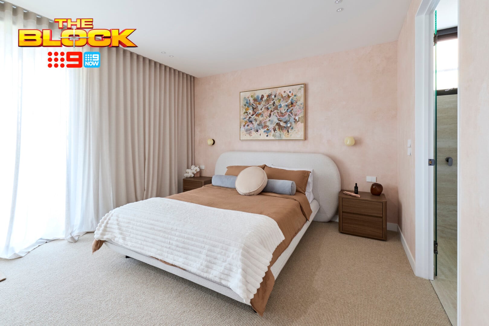
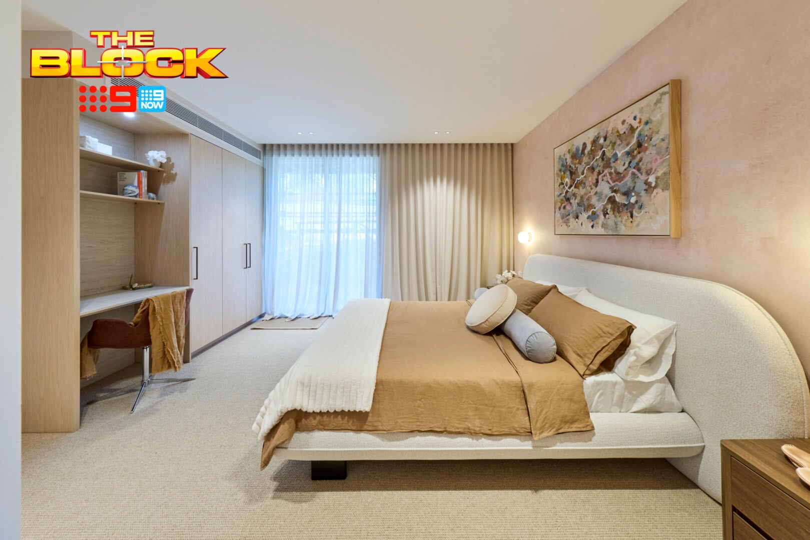
‘Studies are dumb’ said Marty Fox regarding the desk area in Lisa and Rosco’s guest suite, to which I have to strongly disagree. I mean, call me a geriatric millennial, but I love the ability to do admin on my laptop when I’m staying at someone’s house, even for a weekend.
Everyone my age that knows important things like booking tickets, sending important emails etc cannot be done on a phone. No no. You gotta use the big screen for that. Also, everyone needs that dumping ground for your bag, wallet, sunglasses, shopping and more when you walk into the guest room. So I vote this zone very usable indeed.
Outside of that, the room was very underwhelming. And it’s not budget, it’s taste. The colour combination on that bed, against that wall, with those bedside tables is just not working. It feels very dated. That artwork is beautiful, but so lost, on that wall. You’d also need go-go-gadget-arms to reach your bedsides from the bed.
A sad week for these two considering how good their living room was last week.
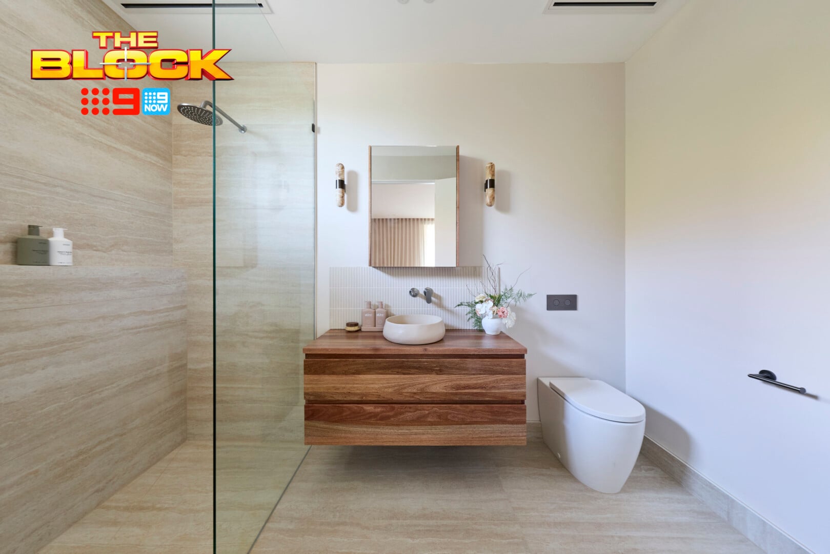
The Ensuite Was Also Somewhat Average
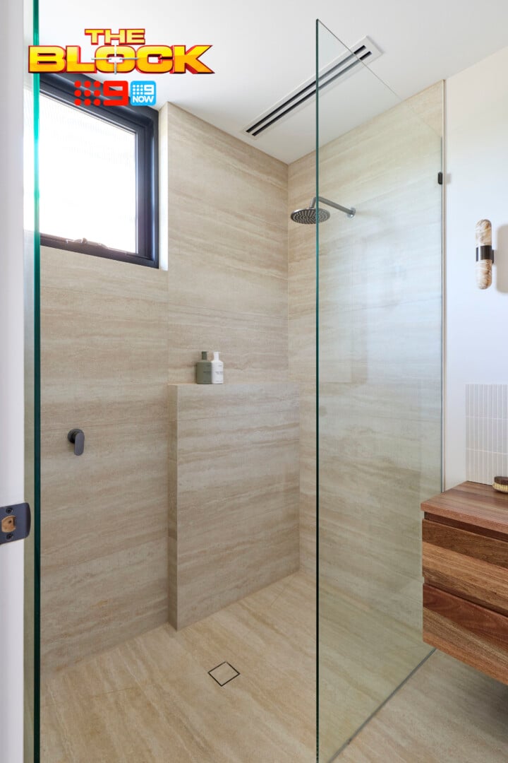
I don’t feel the same level of enthusiasm for Lisa and Rosco’s guest ensuite as the judges did. It’s fine, sure, but it’s not finessed. It doesn’t feel completely harmonious or resolved. There were some choices made that gave it this sense of confusion.
The finger tiles stopping short between the vanity and mirror appear odd. I feel the same way about them as I do about pours at a wine tasting; I’m going to need a lot more. The rectangular mirror above them only highlights the fact that the tiles don’t run across the entire wall. The lights either side of the mirror are the nail in the coffin. The whole zone feels like they ran out of budget.
The nib wall in the shower looks like a mistake. I need it running the full length of that wall, or I need it to run on the adjacent wall under the shower head. What can I say? Joy is not being sparked for me.
Rick and Tayla’s Guest Suite Came Last
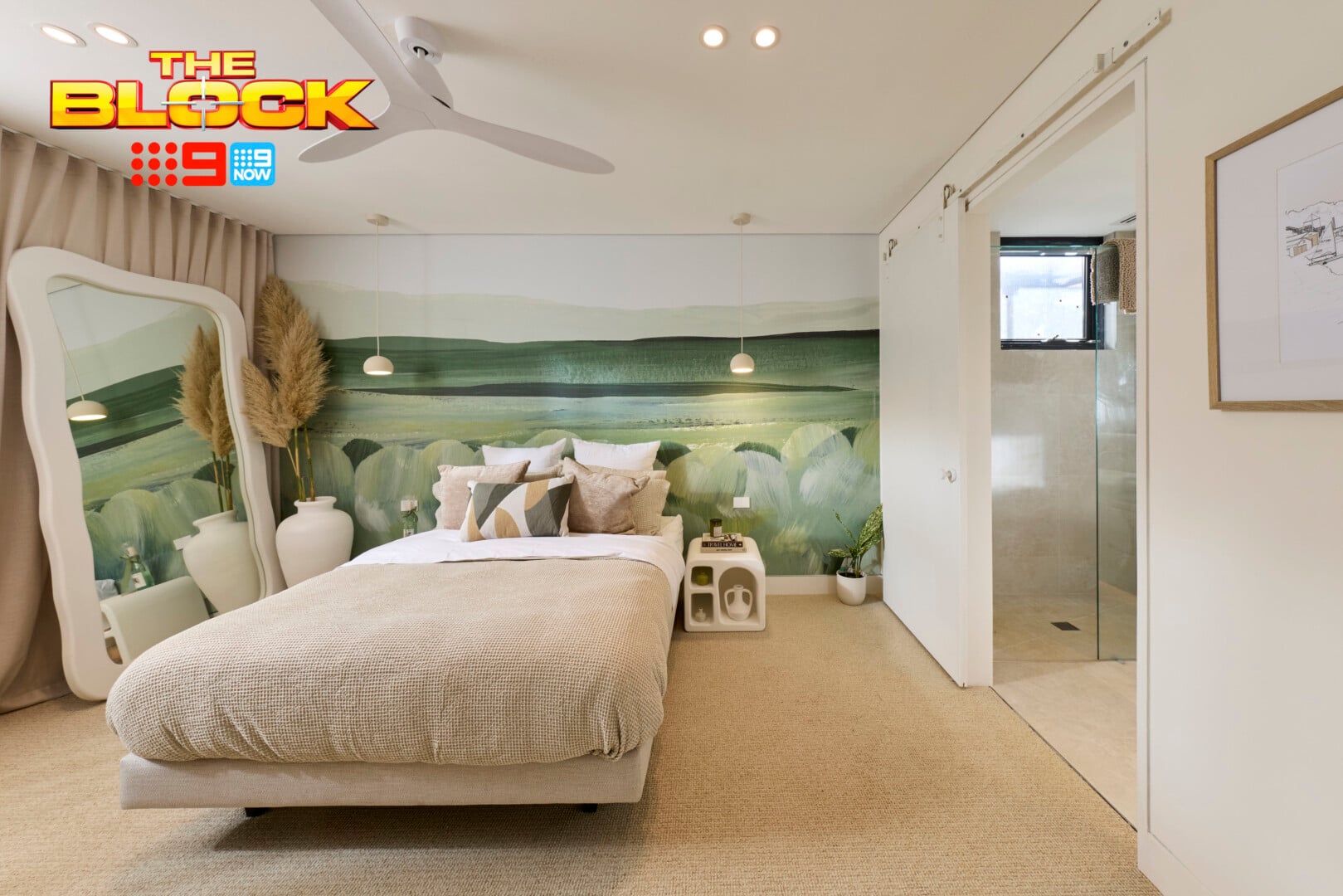
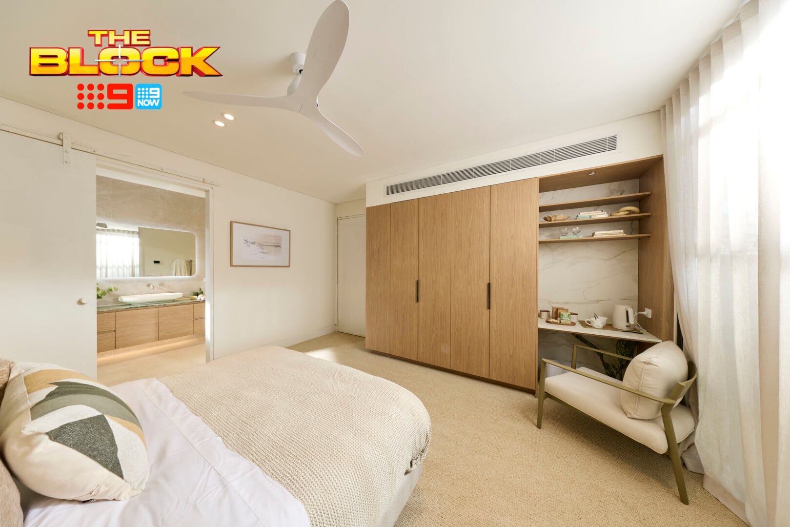
I’d like to declare a ban on pampas grass. Just say no, always and forever. It is the start of a long list of things that don’t work in this bedroom, but I’ll keep it as brief as I can.
The wallpaper, while it would shine in a kids space, has no place in a guest bedroom with a ‘quiet luxury’ brief. The bedsides are giving off the cheapest of chips vibes, while the mirror leaning up against the sheer curtains is criminal.
Outside of the desk zone, which I already mentioned liking the idea of, everything else in this bedroom needs to be replaced. Start with that barn door and don’t stop until the kettle has been donated to charity.
It’s moments like this I really do need a Bex and a lie down. Who wants to buy a property when you’ve witnessed, week after week, a team who laugh at how bad they execute rooms? I said it earlier but it bears repeating: I’m calling for a reboot of The Block. Can we get some people who know what they’re doing?
In the Ensuite, Things Got Marginally Better
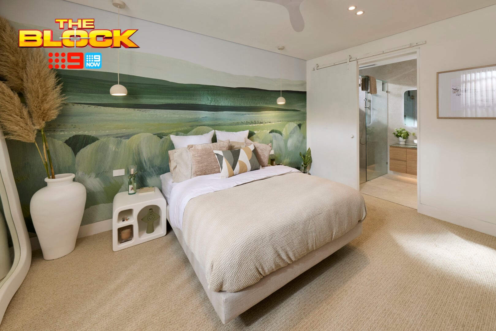
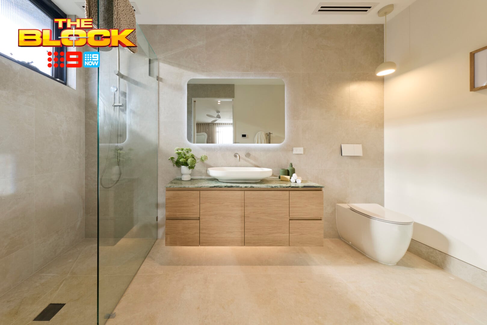
Rick and Tayla seem to do better in wet spaces than they do dry ones. This bathroom, certainly by comparison to the bedroom, is not terrible. At least they installed taps you can use this time. They get points for that I suppose.
I noticed the LED strip light under the floating vanity right away, which is appreciated. But then my eye went to the Law and Order: SVU interrogation light they installed over the toilet and I’m left confused. Unless studies show that perps confess more when sitting on the loo, I need this removed immediately.
I can’t say I’m taken by the green stone on top of the vanity, nor the backlit mirror. Also, where are the towel rails? I don’t see any – for hand or bath towels. Another week, another disappointing room in a home that feels incredibly cheap and disjointed.
What did you make of The Block 2026 guest suites reveals? Drop me a comment below or jump over on over to Facebook and Instagram to let me know your thoughts there.
For more on The Block, or to catch up on episodes you missed, check out Nine Now.