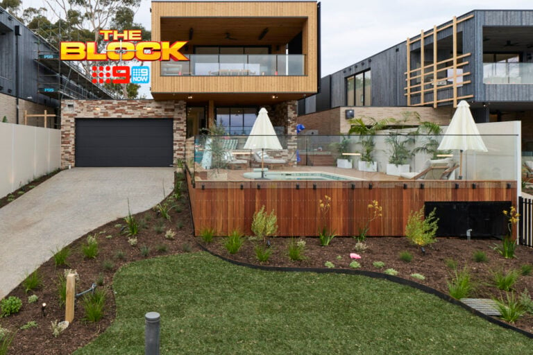
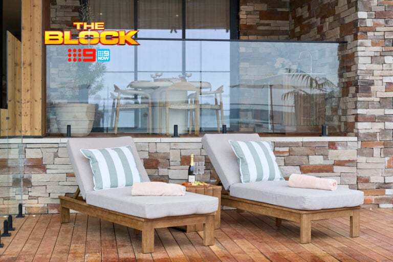
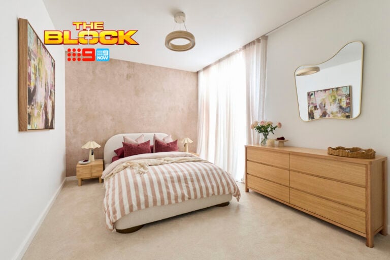
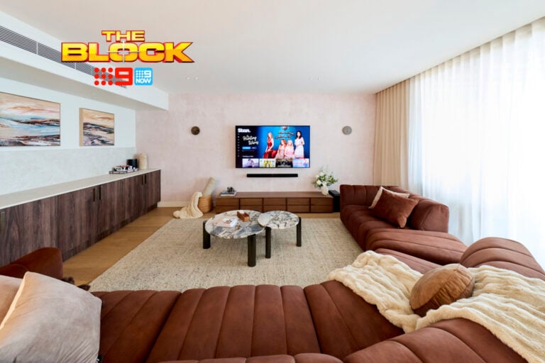
The Block 2026 front yards reveal marks the end of my Honest Block recaps for the season. What a labour of love it has been to drop truth bombs on the room designs each week.
Before the auctions take place I’ll be doing a roundup of the best and worst moments from the season on socials. Give me a follow on Facebook and Instagram if you haven’t already so we can talk it out there.
But let’s not get too ahead of ourselves just yet. We still have five front yards to delve into below, and as usual, I have thoughts. And it must be said: some teams definitely delivered far better than others.
Scroll on as we discuss it all, and as always, drop me a comment at the end of the post to let me know your take.
Rick and Tayla Came First
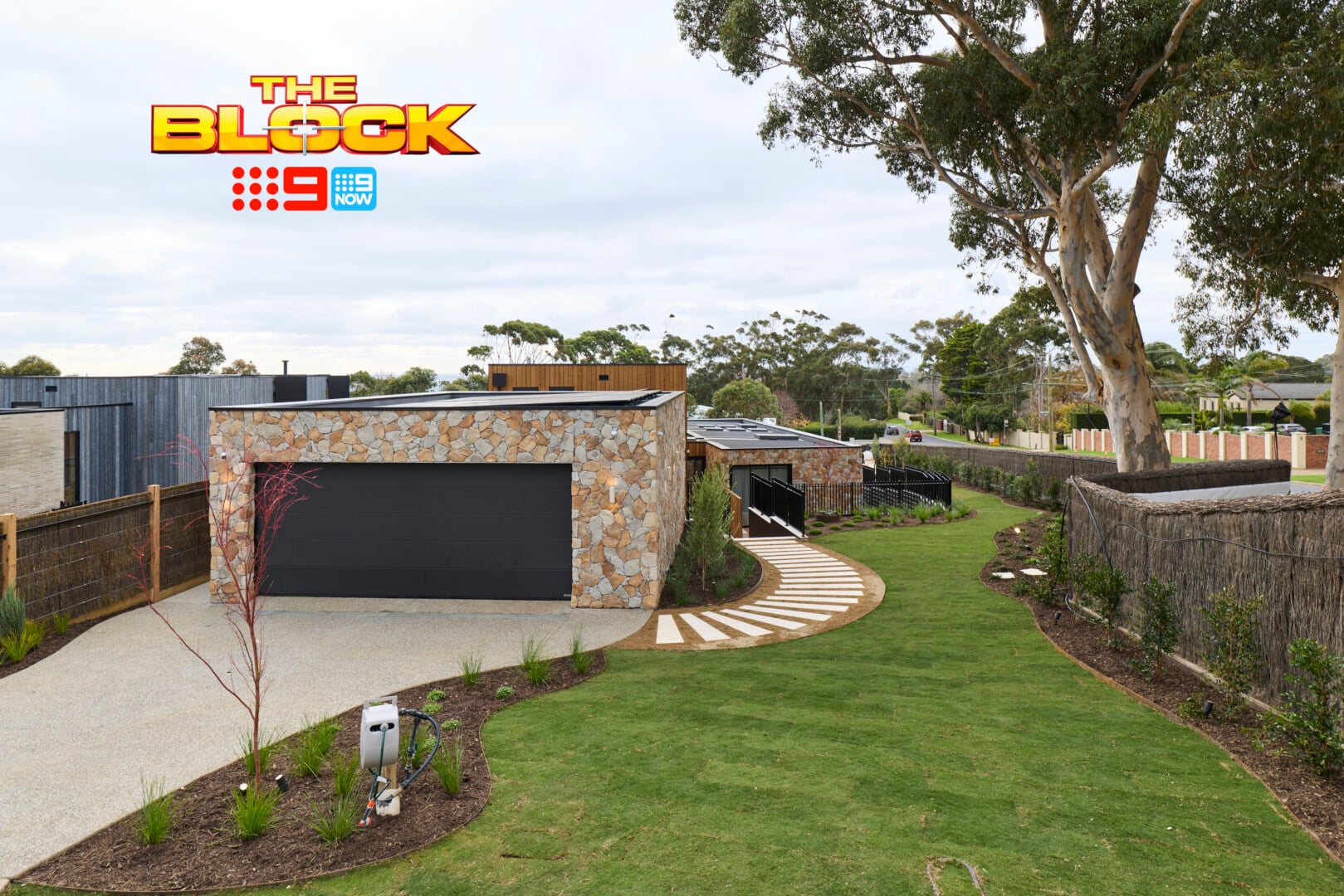
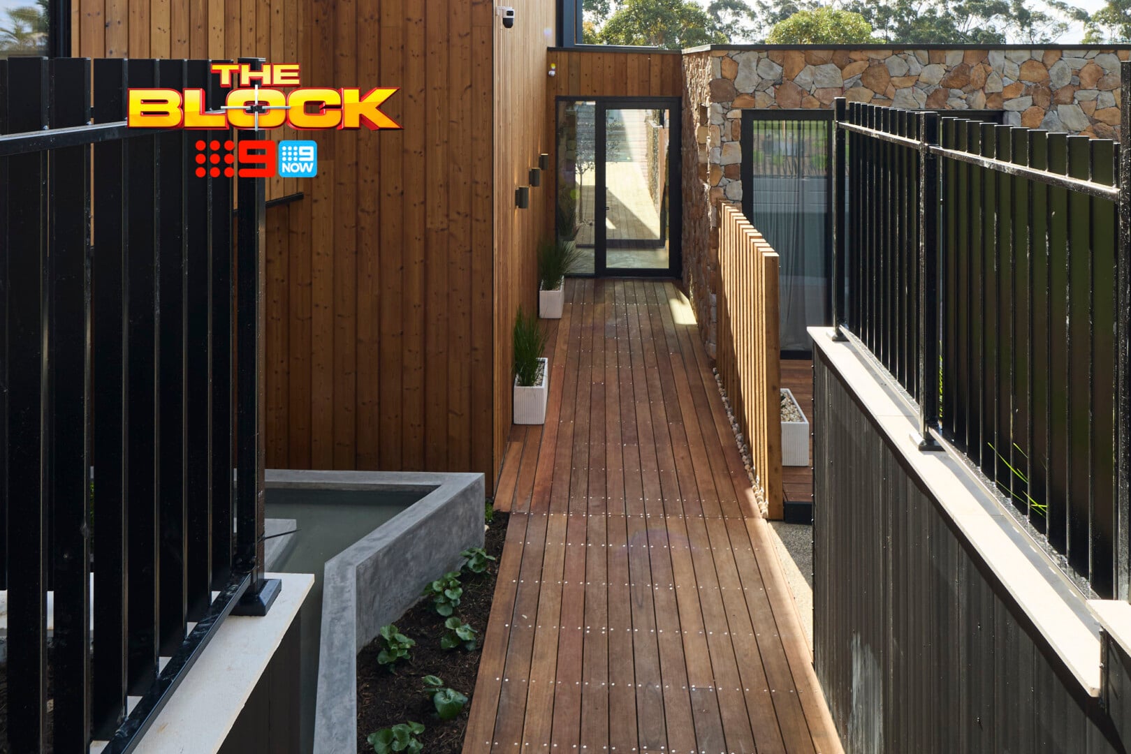
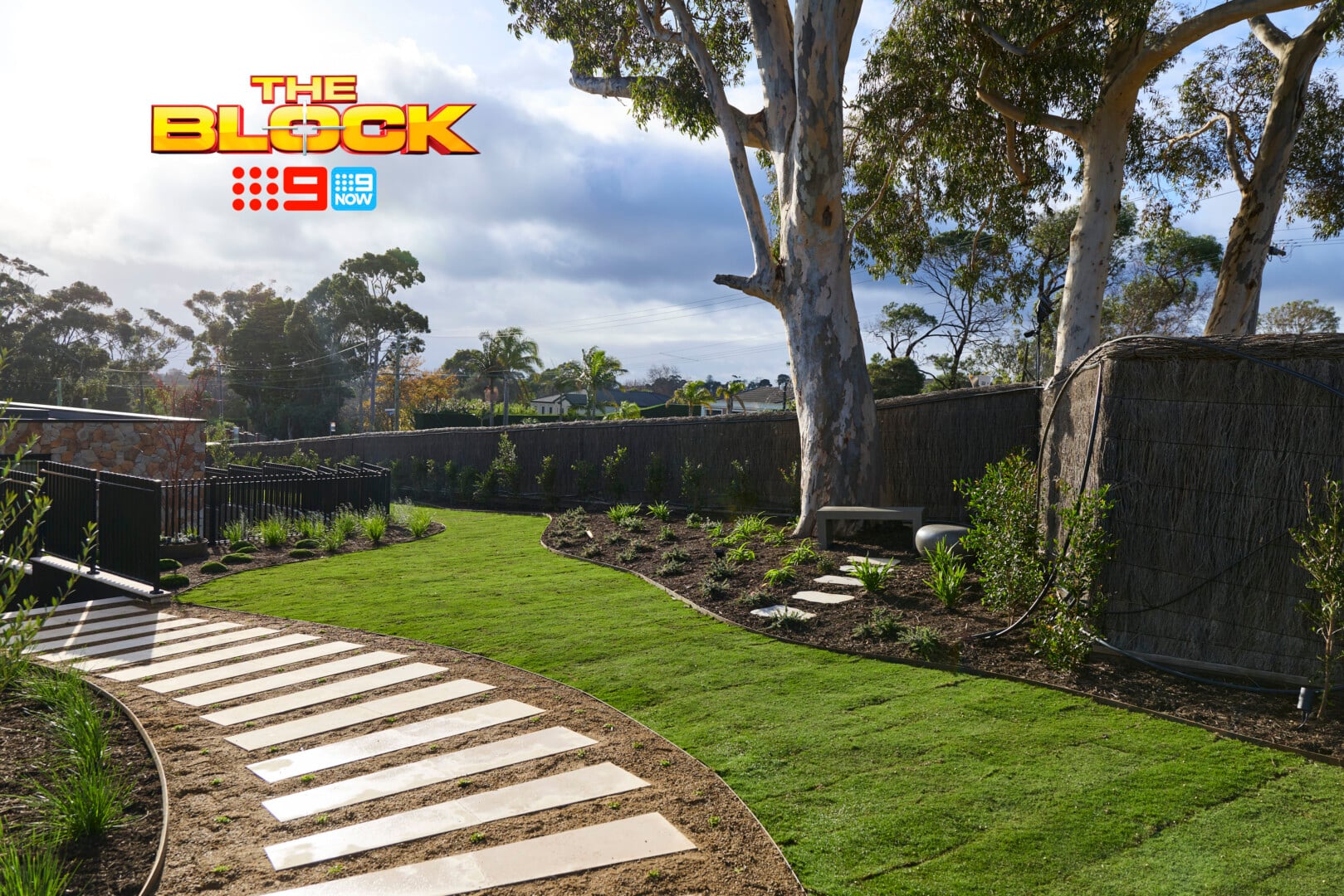
Two words: bloody hell (and I mean that in the best way possible). I had a feeling based on my love of their backyard last week that Rick and Tayla were going to deliver a stellar front yard. And boy was I right.
There’s a seamless continuation from front to back at play here. And a real effortlessness present. For me those are always the best designs (inside and out); the feeling that it all came together easily and isn’t trying too hard. I felt that in their backyard – all the heroes had room to breath. I feel that again here.
The curved path leading to the decking is a moment, and they’ve allowed all that grass to be the supporting player. There’s no need to over-engineer a space like this, but that doesn’t mean it’s boring. Small moments reveal themselves the closer you get to the front door.
Everything in This Front Yard Feels Seamless
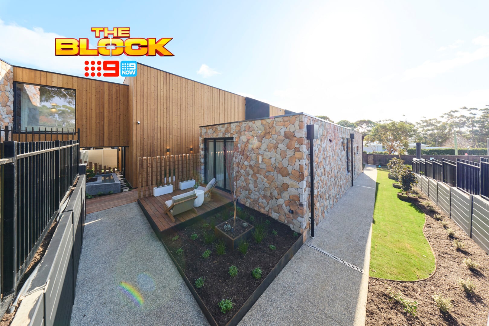
The water feature to the left as you move toward the door, with the seating area to the right, is perfection. The small garden beside it is lovely. And the stone playing alongside the timber is very sublime from a textural perspective.
That little steppingstone path toward the seat below the tree charming beyond words too. The vision of me sitting there with a morning coffee as I get shat on by birds is dreamy. I joke, I joke! I really do like that seating moment. It feels so delightfully simple. Please just tell the birds to hold off until I’ve had my mug of Jarra.
I am feeling so incredibly positive about this space, gang. What a way to end the season for Rick and Tayla.
Except the one thing that irks me (there had to be something) is the hose reel sitting right there as you turn into the driveway. Not a designer first impression, let’s be honest. Remove that and pop on a front fence and m ready to roll around these hills like Maria in The Sound of Music intro.
Adam and Jolene Came Second
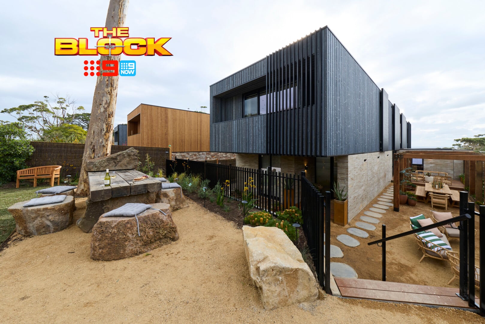
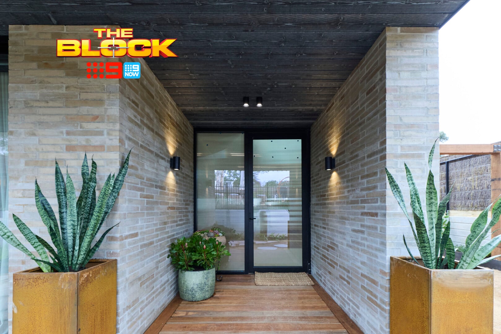
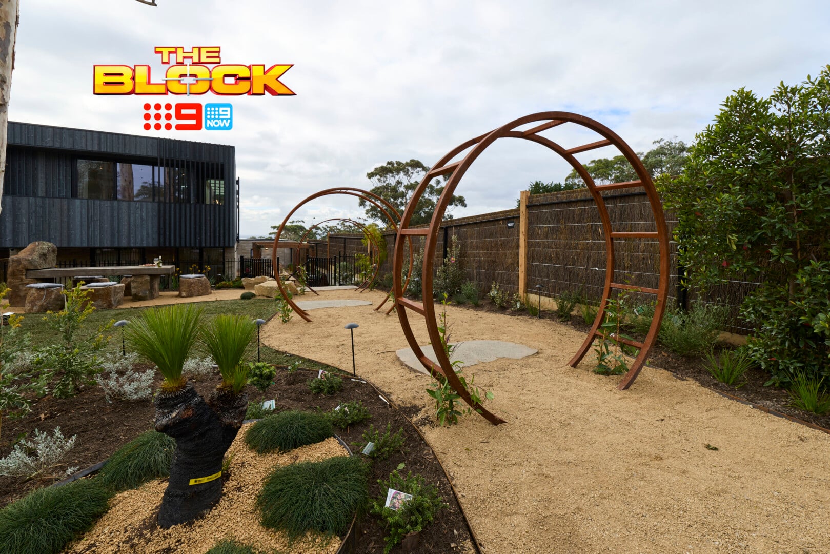
I have to ask the question: how many outdoor seating zones does one yard need? There’s five of them in Adam and Jolene’s front and side yard alone. I think we can all agree, that’s overkill.
I appreciate the nature-conscious, more rustic vibe they were going for here, but I have issues with it. The balance is off. You want to include the rock and the sand, for sure, but it needs to be balanced out with materials that feels a little cleaner for this style of home. The facade feels so contemporary but everything else fights with it.
Too many of the areas look unfinished, unpolished, underdone. The rather uncomfortable rock and timber dining area they created I can get on-board with (not for me, but I give them their creative freedom). But against all the other harsh elements, it gets completely lost.
The Side Area Is The Worst Part
Adam and Jolene’s front yard doesn’t feel connected to the internal design. If you arrived at this home and saw this style of yard, you’d be anticipating a scheme inside that’s far more industrial, rustic, and earthy than what they’ve delivered. One rustic dining table internally isn’t enough to create cohesion.
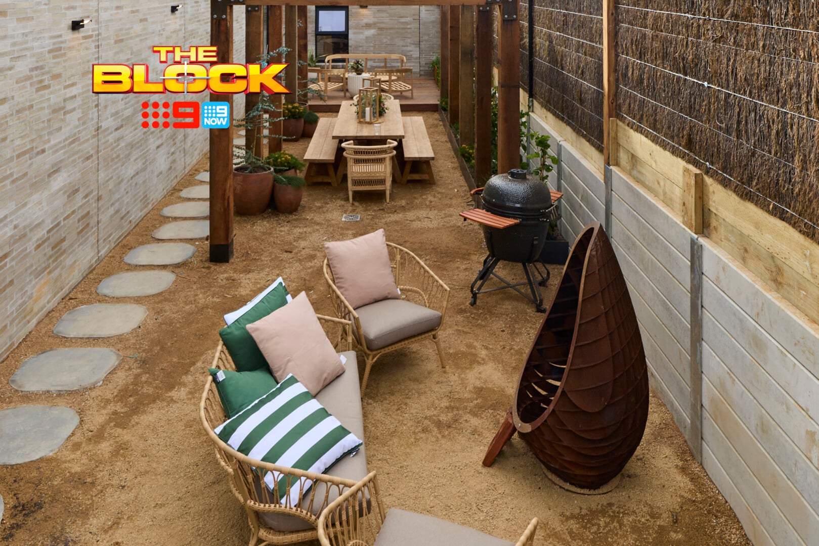
I also take issue with the entire side yard design. I’m surprised we didn’t see more commentary on it. Fire pit design aside, this area looks like the smoko area in the parking lot of an outback pub.
The small barbecue I don’t understand, the cushions I don’t understand, and the furniture; it looks like a Bunnings special. Now, I love me a Bunnings special (don’t come at me Bunnings), but it does not look elevated enough for a home at this price point.
And then there’s the mud. Can we just for a moment envision the mud sludge paddle pop this entire zone will become when it rains. We need way more grass or decking here. I’m really surprised this yard came in second given how successful Chantel and Wyatt’s was.
Chantel and Wyatt Tied for Third Place
Chantel and Wyatt’s front yard has a lot going for it, and sets itself apart from the two zones we just saw. I enjoy many components. But before we go any further I need to touch on the facade. Because Houston, we have a problem.
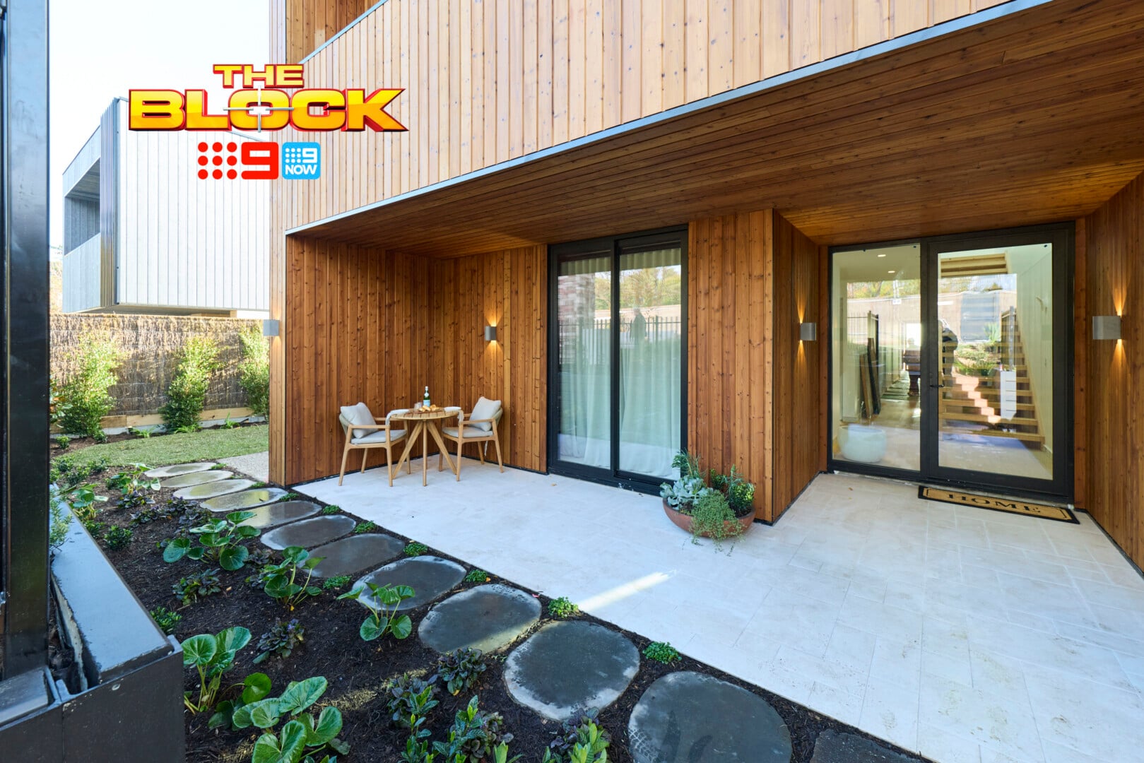
I’m overwhelmed by all that timber cladding. It’s lovely in small doses, but there’s too much of it here. I would have appreciated another material paired with it to help reduce the intensity. Perhaps the timber could have been on the inset walls, with some render on the outer parts? I don’t have all the answers but it doesn’t work as is.
I find the round garden charming, and the path they’ve put down is also rather sweet. But I have to judge consistently, so it pains me to declare that the mud sludge vibes will be present here too, only worse. In wet weather those white tiles are going to get annihilated by dirt. I’d be driven mad.
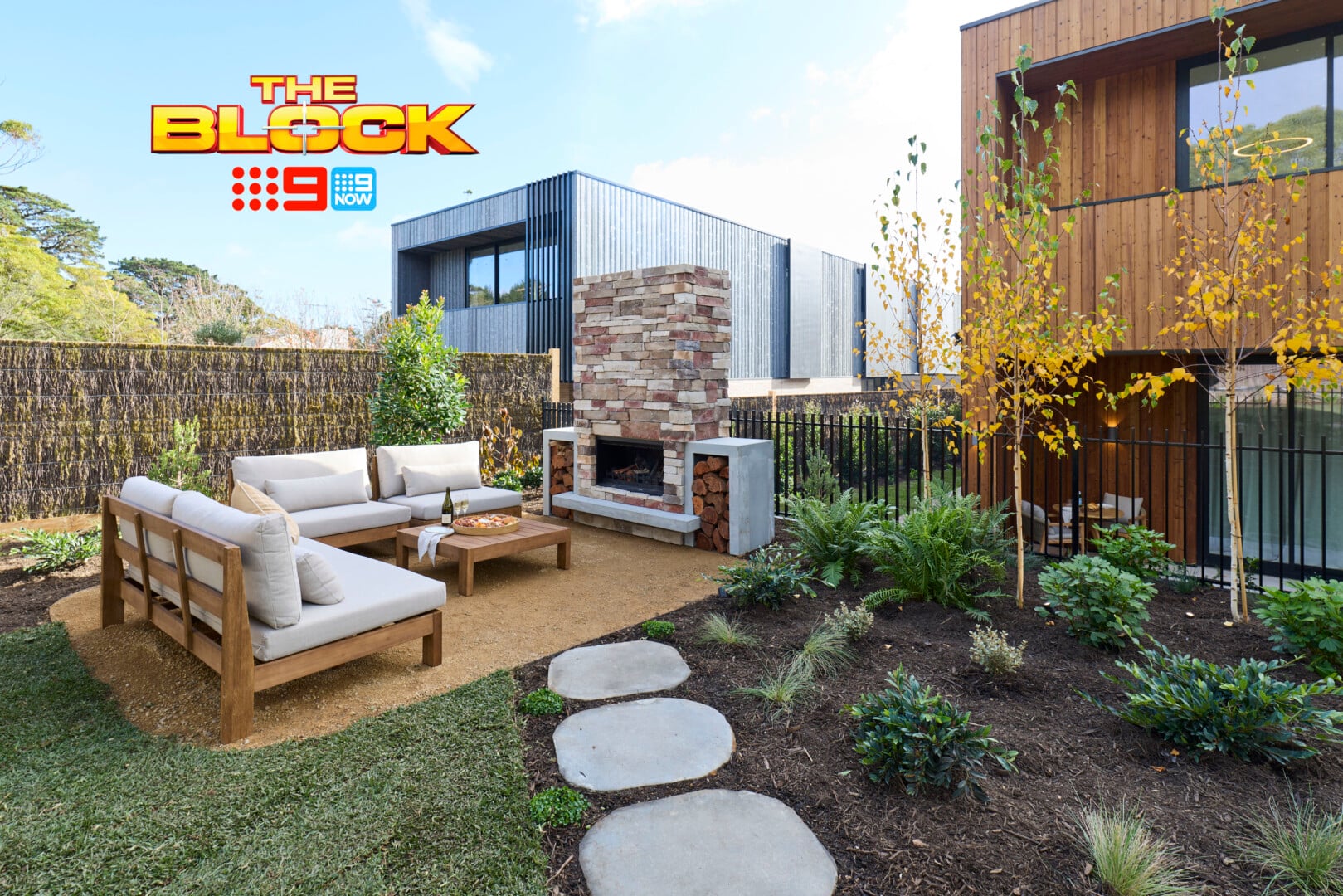
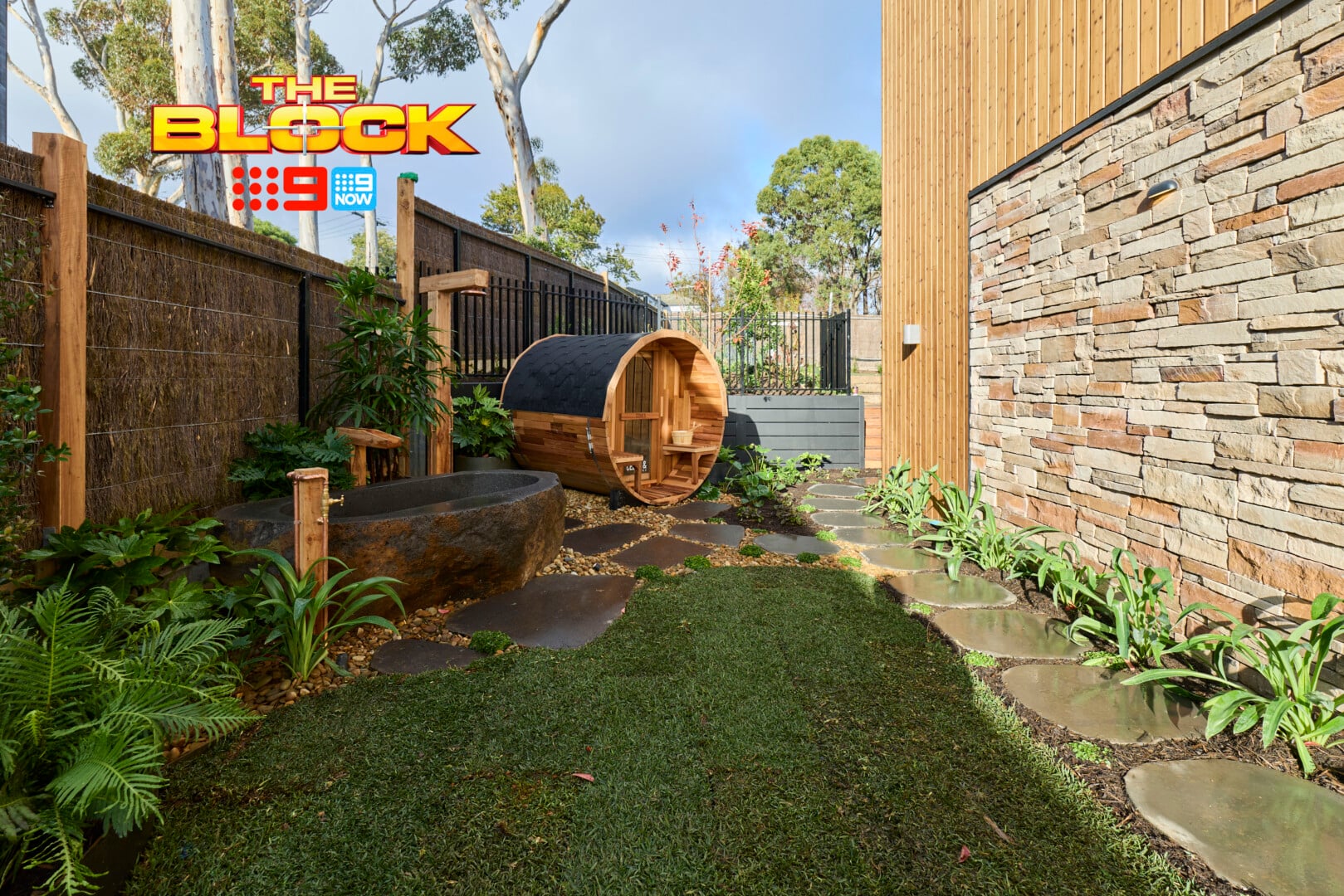
The Fireplace and Sauna Zones Were Stunners
An external sauna is not for me, and this one feels a little Bilbo Baggins, but if you’re into outdoor saunas and baths it doesn’t get better than this. What a sense of luxury to have this lush outdoor area to relax and unwind it. It feels like you’re going somewhere else entirely, but it can be accessed so easily from the house. I’m impressed.
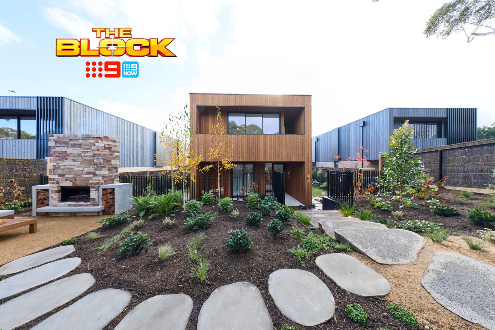
The fireplace area is also a stunner, and to be fair it really was much-needed. If you consider what they did in the terrace and backyard (a touch underwhelming when it came to features), they were wise to include this zone to retreat to.
Though I do wonder… could the fireplace have been oriented so it ran along the fence? At the moment (and I can’t be sure) it looks like it’s blocking what could be a great sight line/view down the back of the house and out to the water? I could be wrong, but a different layout could have improved things.
All in all a pretty successful zone from these two.
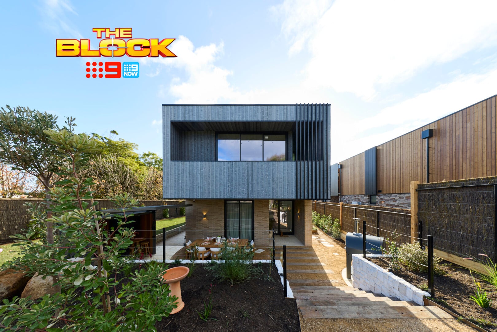
Lisa and Rosco Tied for Third
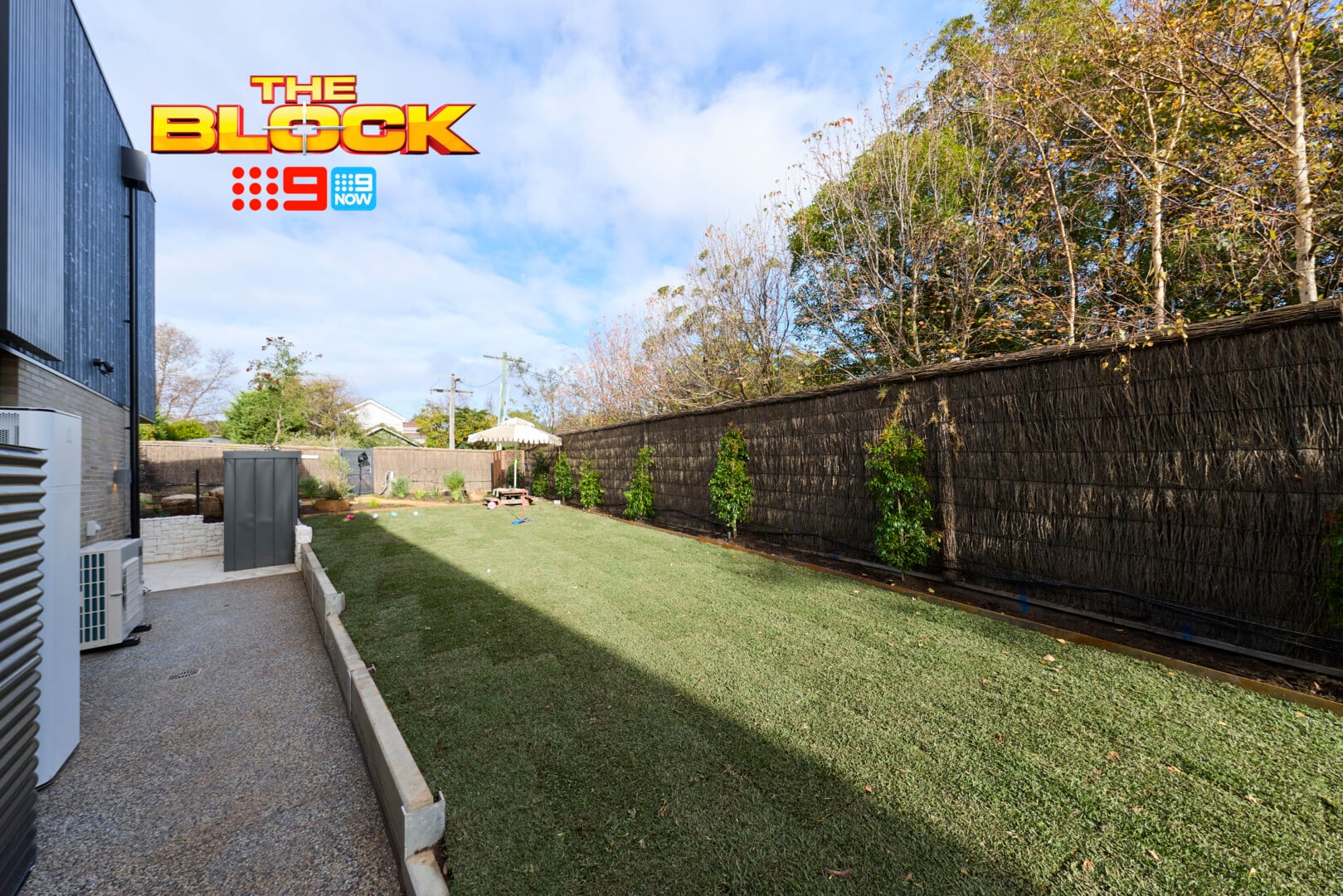
If we focus on Lisa and Rosco’s facade first, I have point out how dominant and severe that upper level appears. I know, they didn’t choose it, but boy is it a bit of monster to take in.
It already protrudes past the lower level. To cover it in that dark cladding makes it appear so aggressive. It feels like a cloud hanging over the entire yard. If there were some vines growing up or cascading down it, it could look incredible. Bare like this, not so much.
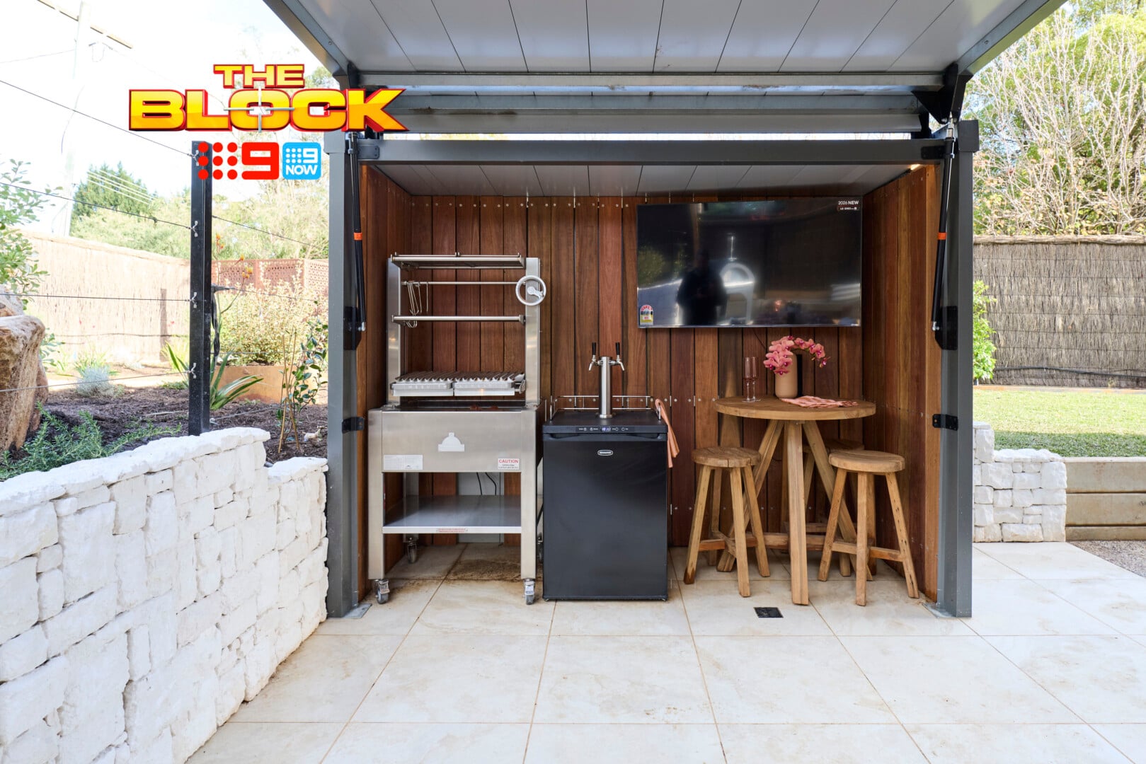
The shed is a hard no from me. It and the contents belongs in Adam and Jolene’s smoko area. I cannot approve of it. It doesn’t look right in that location – even when closed – and open it’s a bit of a mess. Why do the high table and stools need to live in there? The more I look at it the more confused I become.
The Amount of Grass is Appreciated
Lisa and Rosco’s front yard gave a little of what Rick and Tayla delivered in terms of letting grass give hero moments the room to shine. That was appreciated, even if they weren’t as successful in their execution.
They also gave a nod to the rustic vibe that Adam and Jolene delivered, but they did that a lot better. So third place makes sense for Lisa and Rosco this week. I just would have moved A&J further down the scoreboard.
All in all, Lisa and Rosco have a great home and I reckon they’ll do well at auction (if Block auctions actually do well anymore!?)
Courtney and Sev Came Last
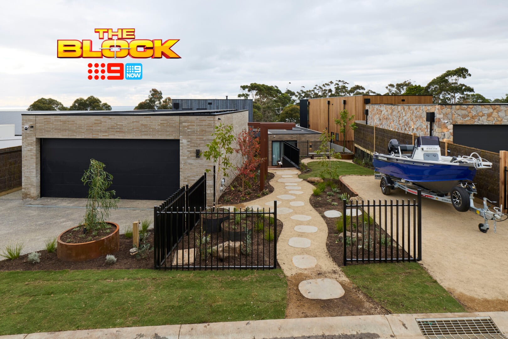
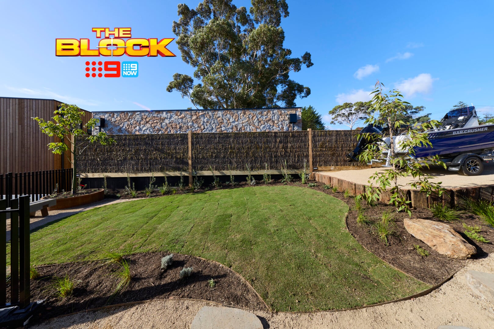
The judges described this yard as “meh” and I don’t disagree. There’s a feeling that no area was fully resolved.
The black fence around the entry path is strange. It should either continue across both driveways or not be there at all. As present it serves no purpose. The angled patch of grass above feels unresolved too. It’s not large enough to serve as a play zone for kids, so it’s just kinda there…running down toward a bench seat.
I know it’s just me, but I still take issue with the sand and pavers that everyone seemed to use this week. I always envision myself using the home when designing. Here, I’m visiting as a guest, parked in the driveway… making my way down in the rain with my suitcase.
I’m either dragging mud on the suitcase, on my shoes, or both. Imagine how hard wheels would be on that sand. And that’s if I make it into the house at all. I first have to cascade down the staircase of doom with no handrail. You know I always say it: function comes first. This feels like a tough front yard to navigate.
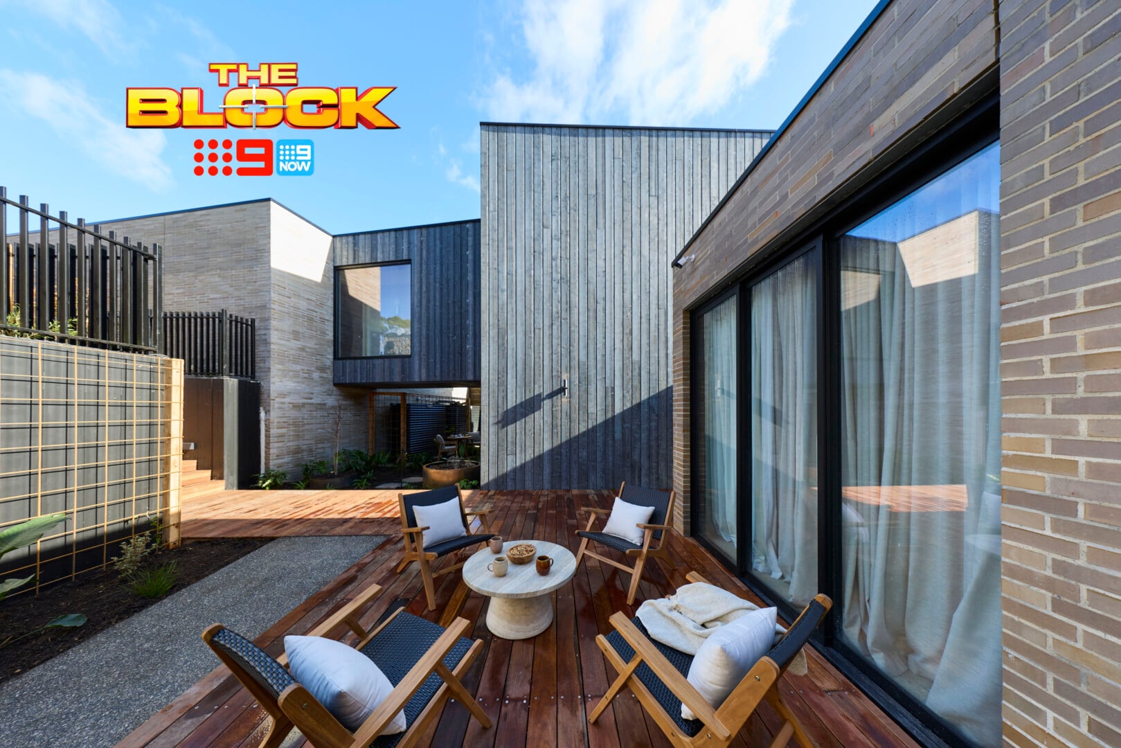
The Facade Was Successful Though
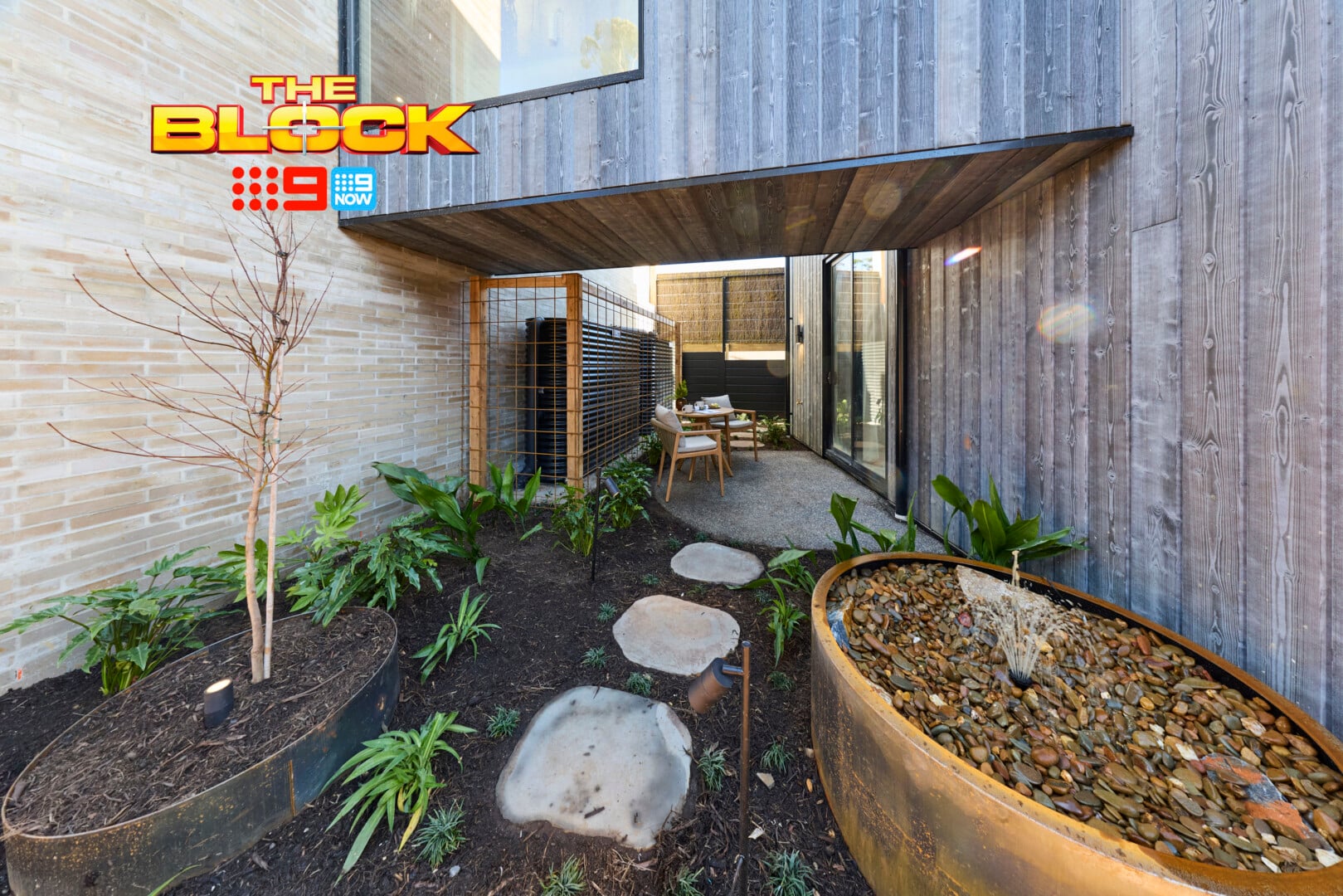
The combination of materials on Courtney and Sev’s facade is by far the most successful. There’s variety present without it being busy, and all the elements play really nicely together. Nothing feels jarring or aggressive, but instead just calm and curated.
It’s clear they ran out of time or money though. The zones feel unfinished. The seating area with the water tank behind it; who wants to sit in that small cave-like spot with a water tank to look at? Then there’s the other seating area above, which lacks finesse.
We needed more plants, more softness, and more thought in this front yard. That said, I still think it looks better than Adam and Jolene’s.
What did you make of The Block 2026 front yards reveal? Drop me a comment below or jump over on over to Facebook and Instagram to let me know your thoughts there.