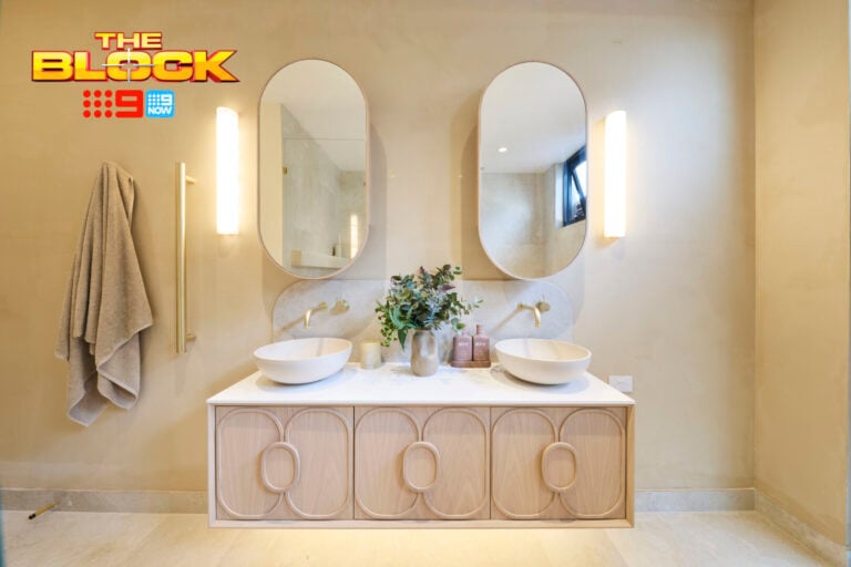
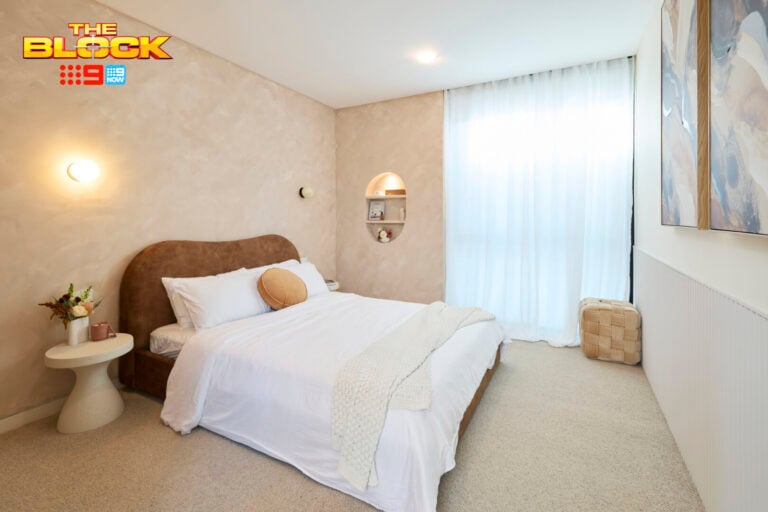
The Block 2026 had its annual sponsorship gala Sunday night. Or as we know it: kitchen reveals.
Now, I totally understand that a series like this runs on product placement, but it was so excessive this week that I thought I’d sat on the remote and switched over to TVSN. Gasping over kitchen appliances aside, this week provided a lot for us to talk about when it came to kitchen design.
Scroll on as I drop my designer truth bombs on this week’s Block kitchen reveals, and as always, drop me a comment at the end of the post or jump over to Facebook and Instagram to let me know your thoughts.
Adam and Jolene’s Kitchen Came First
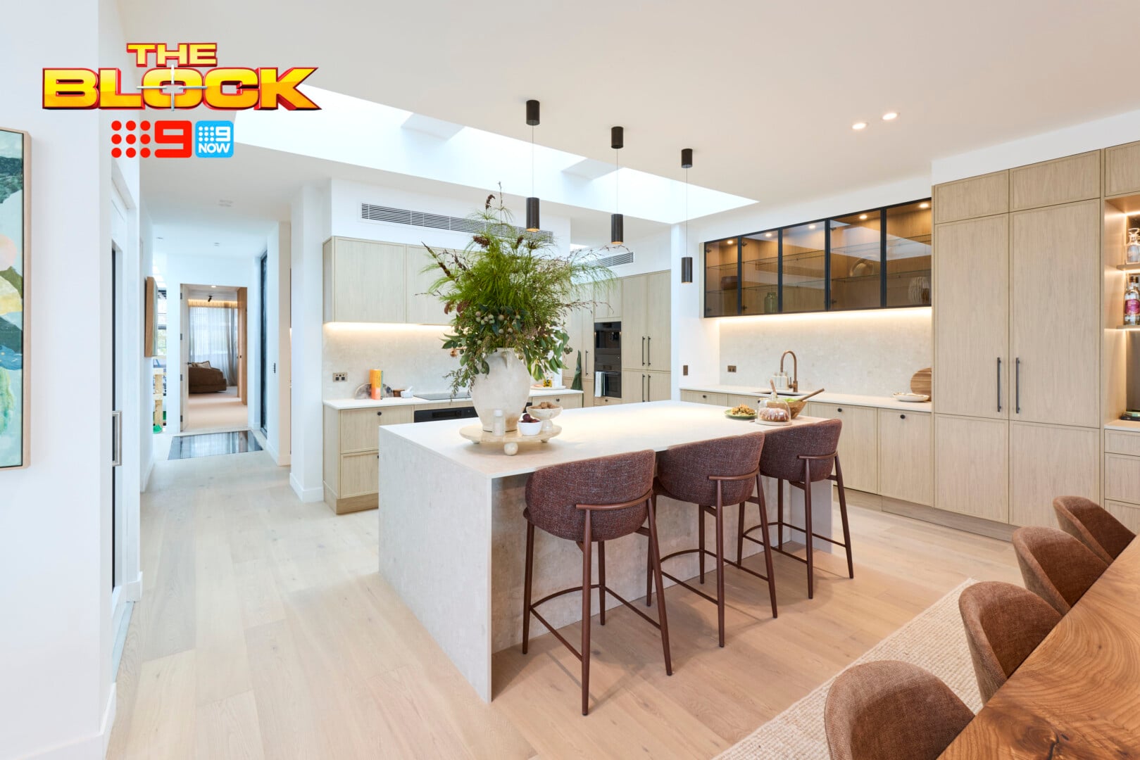
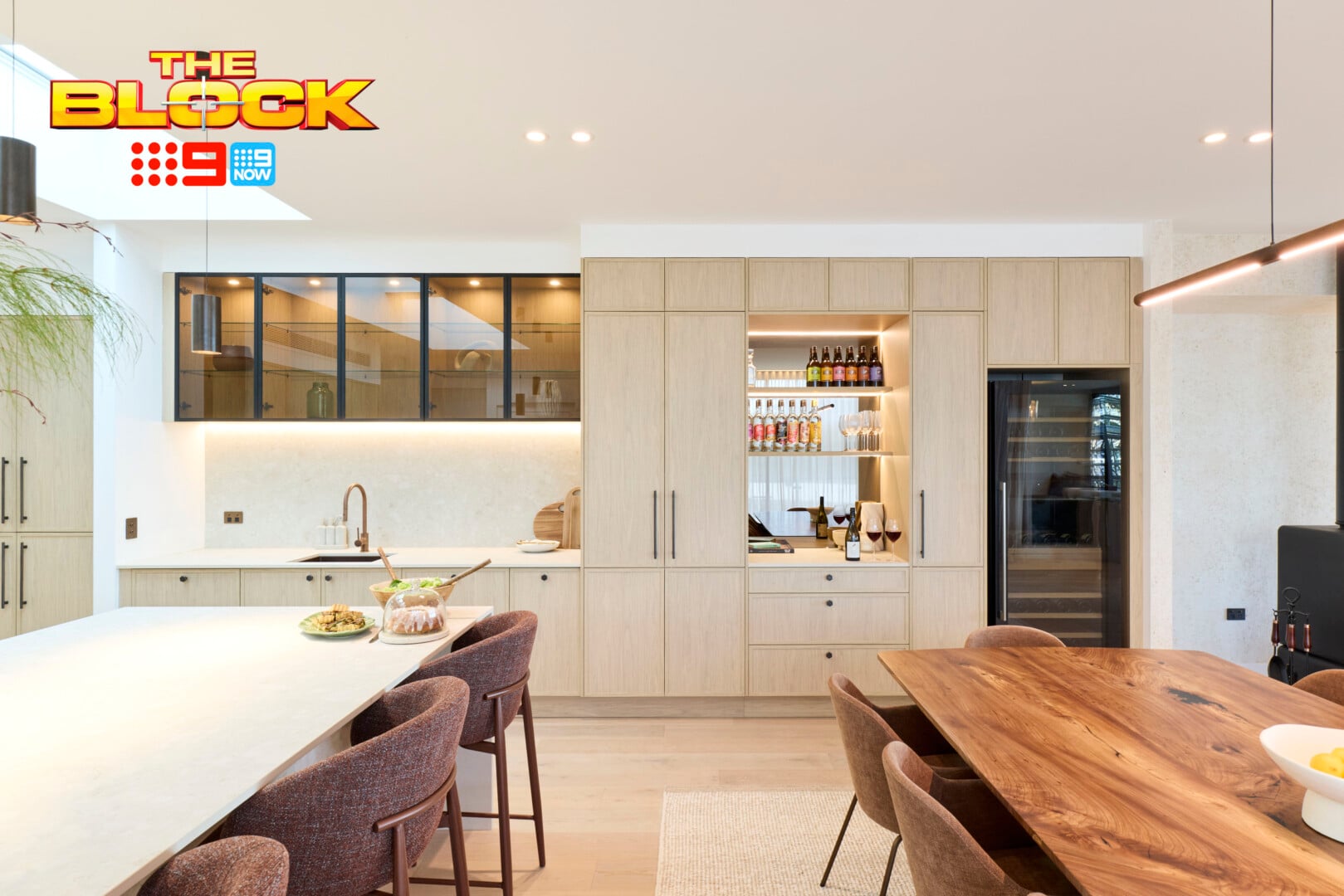
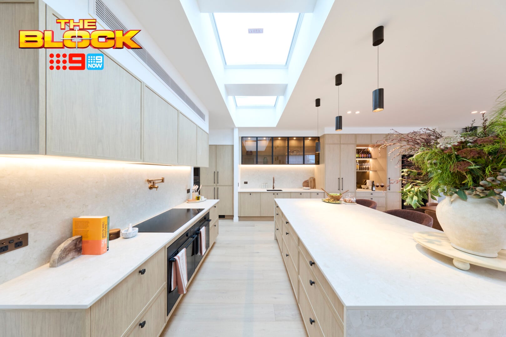
Adam and Jolene were the only team to have their kitchen island facing the dining/living room, and it’s always my preferred orientation. I’m also all for a sink in a kitchen island (it’s a hill I’ll die on and you won’t change my mind) but I understand that the island oriented this way makes it smaller than the others, so a sink against the wall instead makes sense.
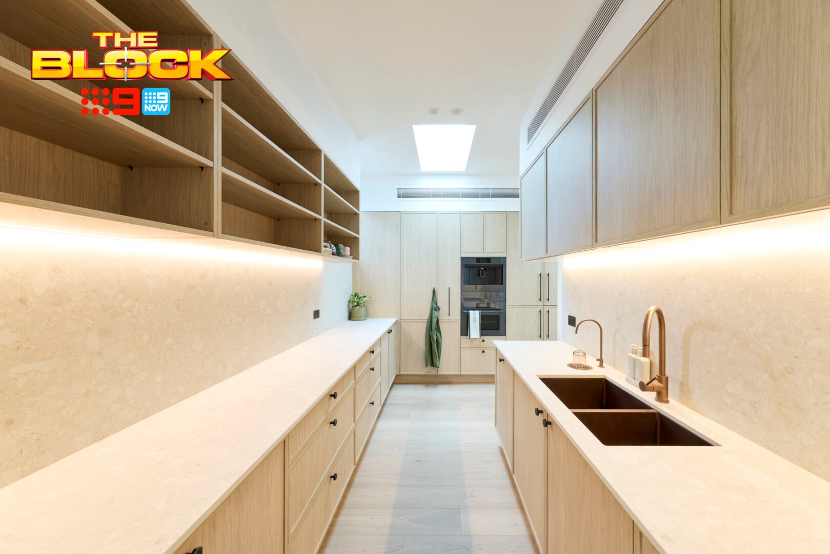
It’s the fridge in the butler’s that I’m having a hard time with. It screams ‘door-swing concussion’ as someone comes around the corner. Having it here doesn’t feel convenient, either. Going back and forth to it when cooking isn’t the best solution functionally. It needed to be placed elsewhere.
The pendant lights over the island are a huge no for me too. They pull down individually from the ceiling like a heat lamp in a restaurant kitchen. My OCD could never cope with the three of them sitting even mildly askew. The nights I would spend in bed thinking about the uneven suspension; pass me the melatonin!
That said, don’t let my mental health issues get in the way of your love for these inclusions.
This Kitchen and Butler’s Pantry Are Winners
Adam and Jolene deserved first place this week, no doubt about it. I’ve not seen a more deserving win on primetime since Kirby won The Traitors Australia (sorry Rhys – you played too passive a game).
Not only were the majority of functional considerations there and the orientation great, but the visual is really impressive. They made fantastic material choices that have the whole zone feeling (here comes the most overused term of the season) ‘quiet luxury’.
I also enjoy the appliance choices and placement. In other kitchens (which we’ll get to), they stand out like me at a country music festival, but in this kitchen and butler’s pantry they don’t come across as jarring at all.
Can I also take a moment to express my love for the cabinetry fronts? That super-slim door trim is my favourite right now and I’ve tried to convince many a client to select it for their kitchen design.
Chef’s kiss for their zones this week (just not under those pull-down hospitality pendant lights).
Lisa and Rosco’s Kitchen Came Second
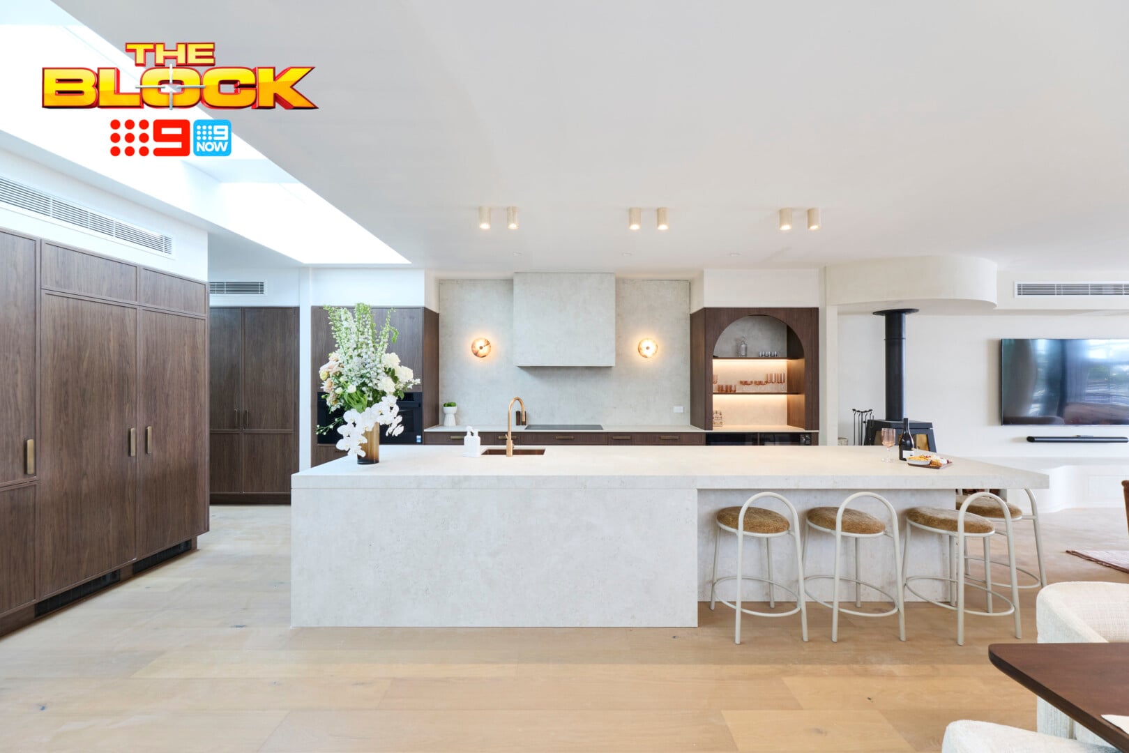
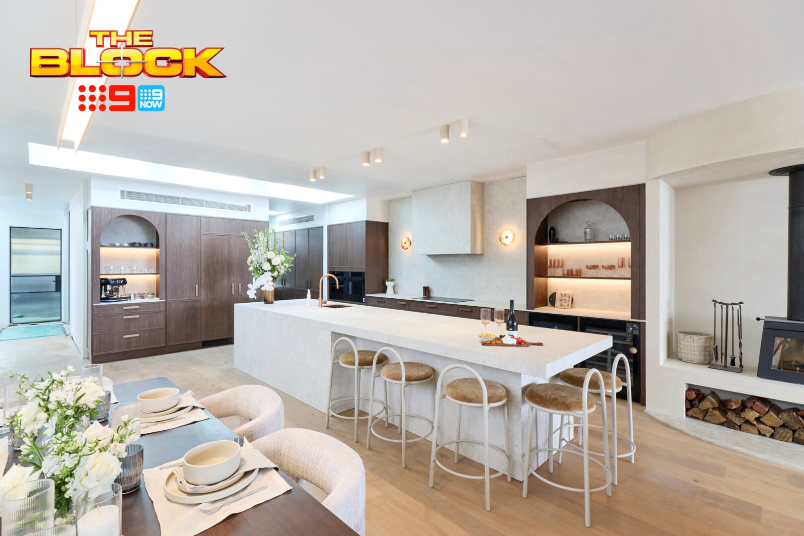
A client of mine once said that round lights either side of the rangehood make the zone look like a face and now I can’t un-see it. But here I rather enjoy the mug looking back at me. The wall sconces are a nice feature, made all the better by the simple ceiling-mounts which don’t compete for attention.
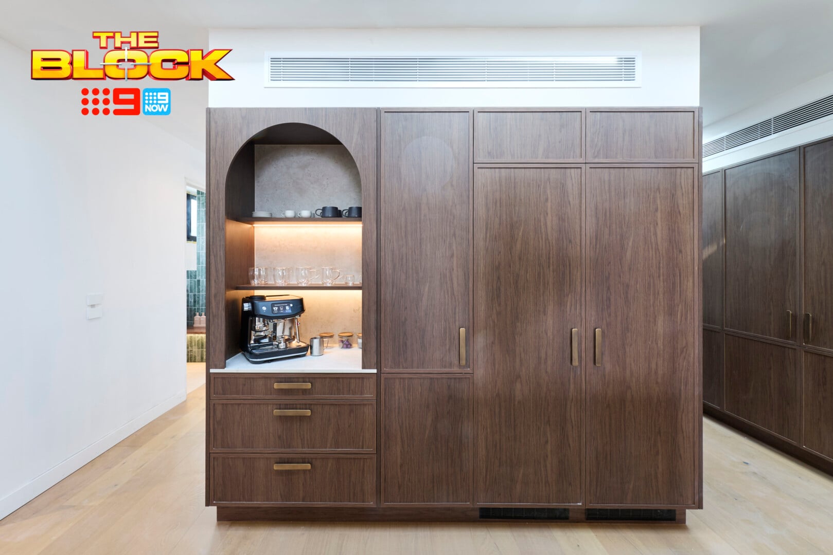
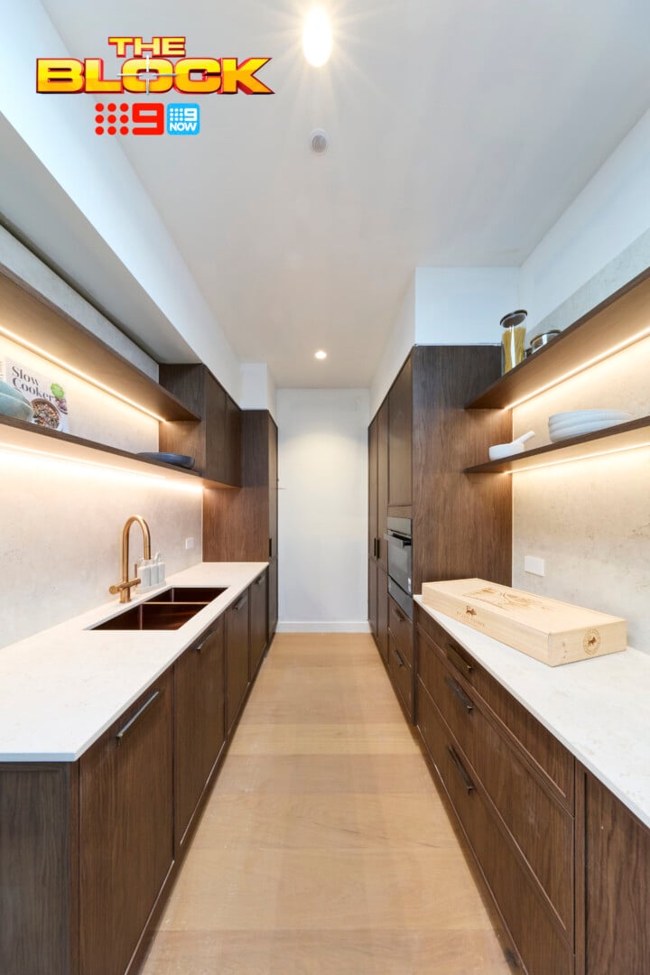
Though walnut joinery might not be everyone’s favourite (and I don’t think the photos here do it justice) I appreciate that one team took the colour palette in a moodier direction. It very much ties into what they’re doing in other rooms – and you know I love cohesion between spaces! Like a velcro couple, rooms should always be speaking to one another.
I don’t love the island being oriented that way as it makes the dining room feel like it’s in no-man’s land; hovering between kitchen and living, not quite grounded. It’s certainly not going to kill the sale though.
There Are a Few Design Tweaks I’d Make
Lisa and Rosco did a solid job, really. I would make a few small changes though if I were designing this space.
Firstly, the cabinet door profile, with the dark walnut tone, is doing a lot of work visually. It needs a minimal/delicate handle paired with it as the one they selected feels a bit dominant. It’s giving brutal when it needs to be beautiful.
The ovens in the doorway to the butler’s pantry are also a miss for me. Nobody wants to be attempting to get something out of the oven with someone trying to squeeze past them. A better location for these should have been explored.
I do enjoy the sink in the island here though, installed down one end away from the seating zone.
Courtney and Sev’s Kitchen Came Third
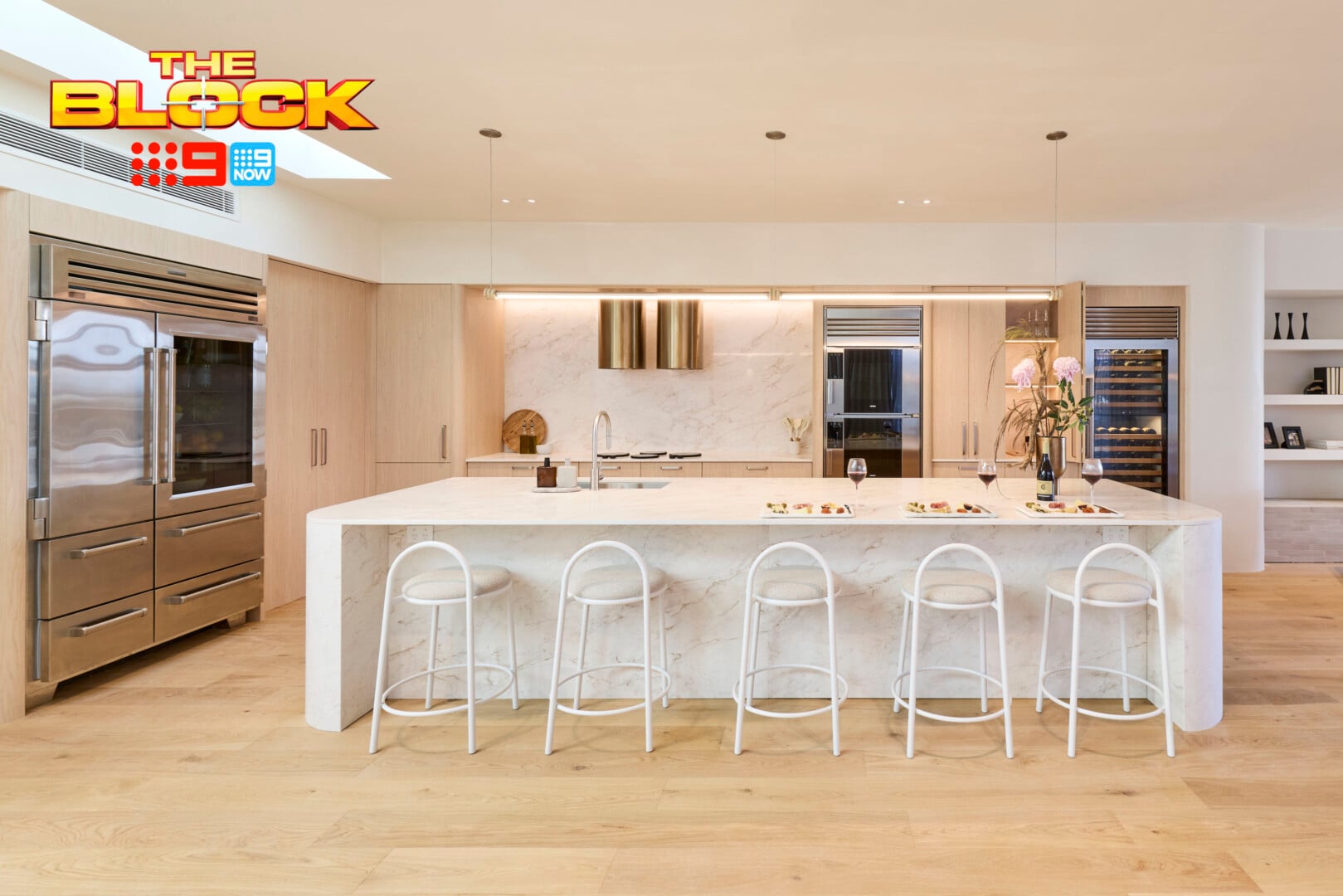
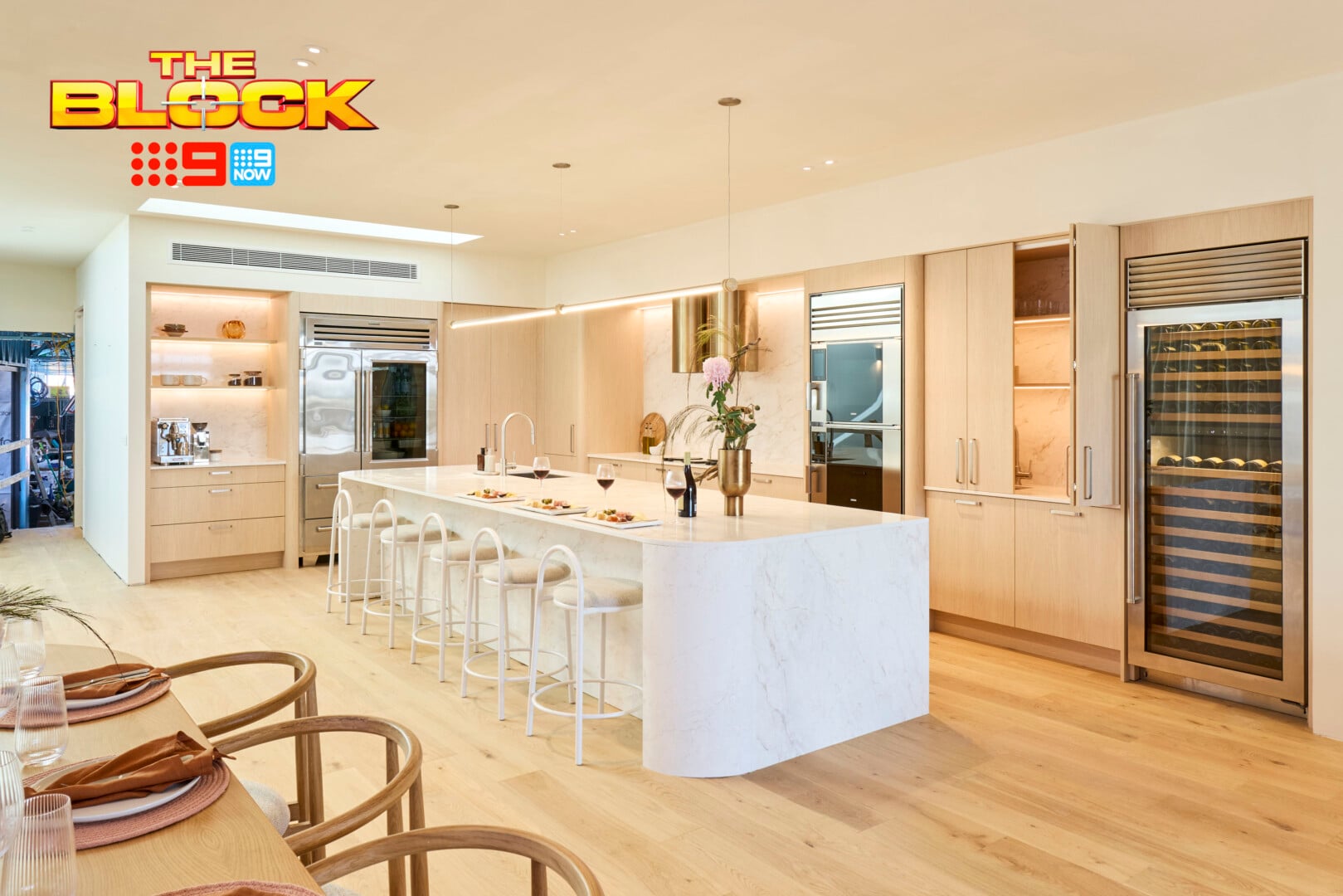
This applies all the spaces, but it looks particularly obvious in this one: do we really need this much footprint in a home dedicated to the kitchen? It feels excessive, especially considering some of the dining tables seat six people with the the alfresco much the same.
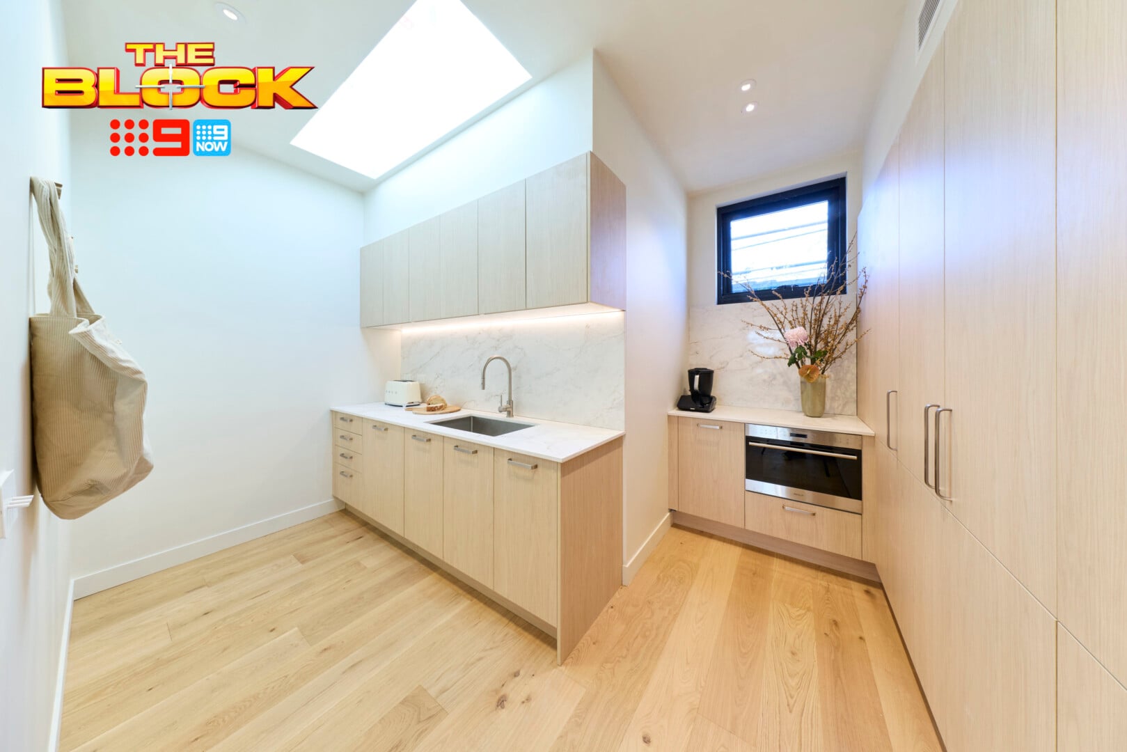
The other main beef I have with this kitchen is the appliances. They are so out of place in this room. I feel like Gordon Ramsay is about to come out of the butler’s and abuse someone for leaving out-of-date food in the fridge. They’re great for a restaurant but not a residential setting.
The material choices are clearly evoking calm but the appliances really get in the way. I appreciate the cabinetry, the stone, the curved island profile and the simple handles in this kitchen. Sadly though, the beauty of them is overshadowed by the bulky, glossy stainless steel appliances.
We Have Door Issues in Both Zones
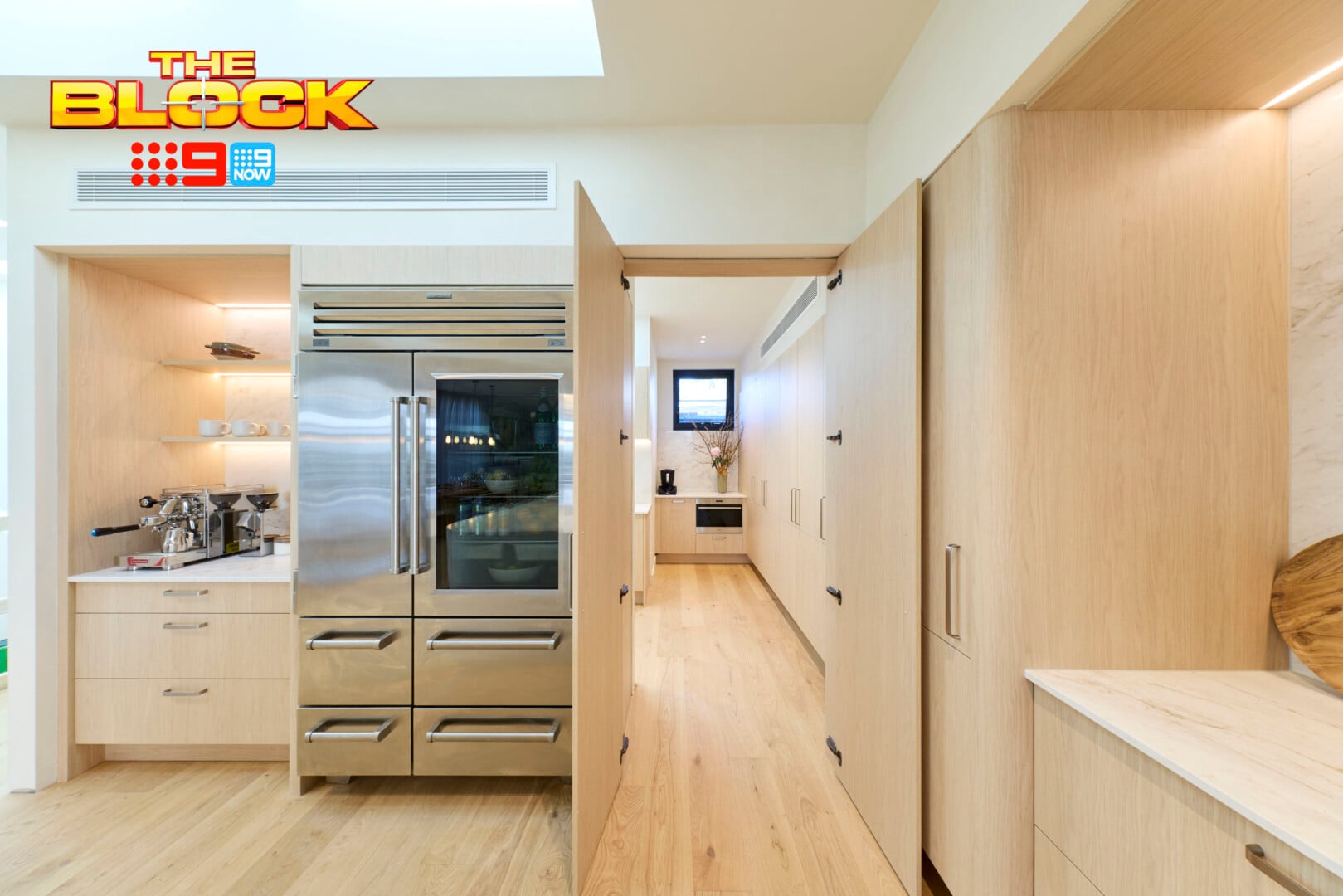
Courtney and Sev installed hinge doors leading to the butler’s pantry, which I’m baffled by. They don’t look good and they don’t function well. In fact, they would make working in this kitchen a thousand times harder. So why are they there?
In the kitchen, the appliance cupboard doors were also a bit of a fail. They open, sure, but they needed to recess back so you could use the internal space completely unobstructed. To be fair, given you have a butler’s pantry to conceal mess away, I wouldn’t have installed doors on that appliance cupboard at all.
Outside of the appliance issues raised earlier, I do like this look and feel of this kitchen. But you know what I always say: boomerang pillows have no place on a bed. Sorry, wrong context. What do I also always say? Function comes first. Every design choice should make life at home easier, not harder.
Rick and Tayla’s Kitchen Came Fourth
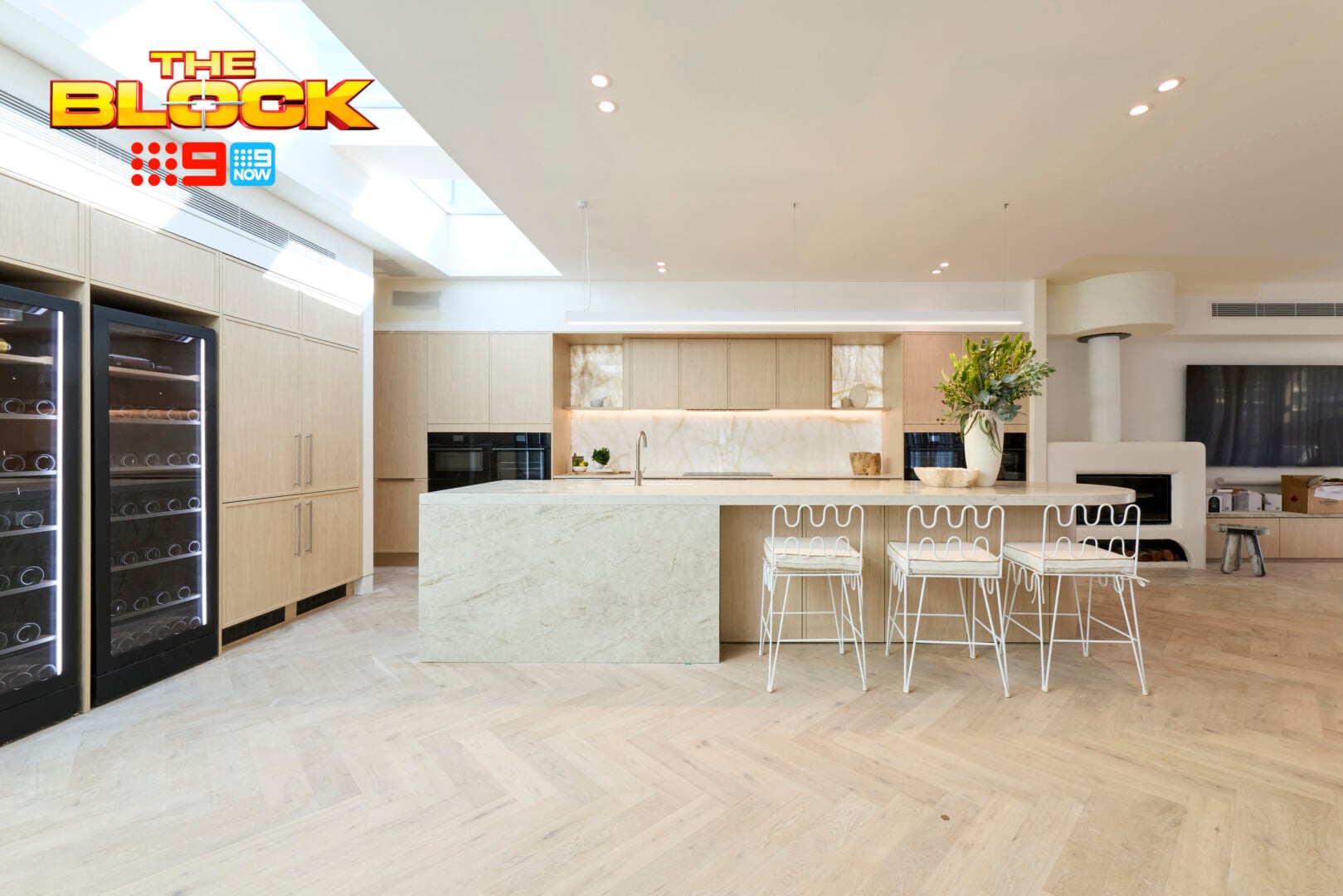
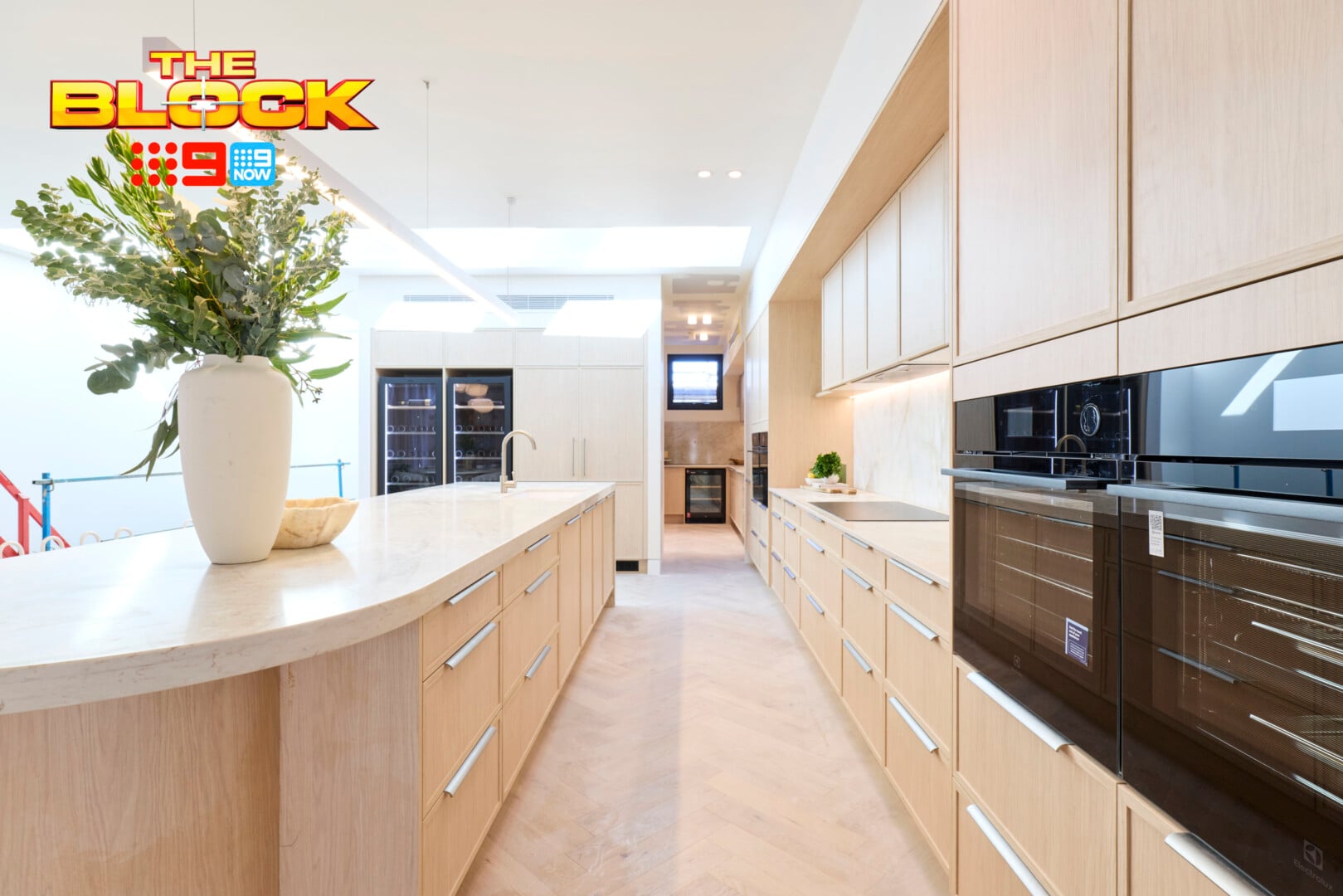
I say this as a guy who hasn’t met a Sauv Blanc or Shiraz that he hasn’t been fond of; who needs three full height wine fridges in their kitchen and wait for it – a fourth under-counter wine fridge in their butler’s pantry? The one in the butler’s I can understand (sometimes you need to go hide with a glass of wine where the kids can’t find you) but the kitchen ones are complete overkill.
It’s not Rick and Tayla’s fault, but I wish there was more colour variation this week too. Three light oak kitchens has me a little bored; it’s all very same-same. The walnut cabinets were a nice alternative, but I’d have appreciated some mid-toned timbers too.
This kitchen is fine overall but I have to say (don’t hate me Cosentino) the light-up splashback is all kinds of no for me. It feels gimmicky and doesn’t present as refined or harmonious. It’s fine for a bar, but not in your home. That’s my opinion and I welcome your thoughts.
In The Butler’s Pantry, Things Were Successful
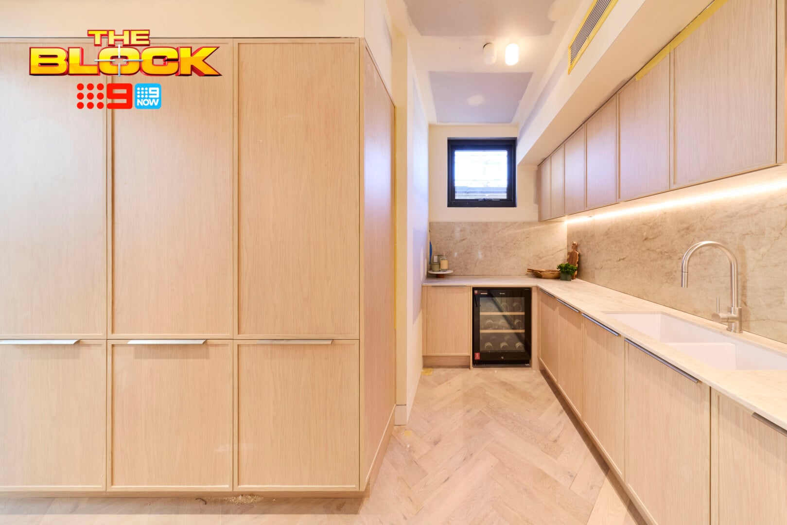
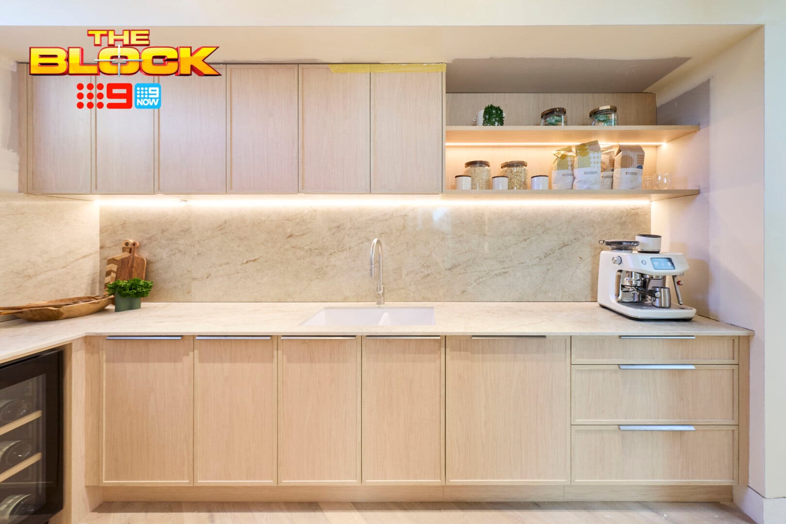
I quite enjoy the look and feel of the butler’s pantry, even if it isn’t delivering anything particularly mind-blowingly new on the design front. They’ve certainly given the future buyer a tonne of storage, which I’m sure will be appreciated.
The main change I would make, like in Lisa and Rosco’s kitchen, is the cabinet handles. They’re quite large and dominant, taking away from the beauty of the door profile.
Other than that, no major beefs with Rick and Tayla this week, which is a welcome change after the guest suite that was unveiled last week.
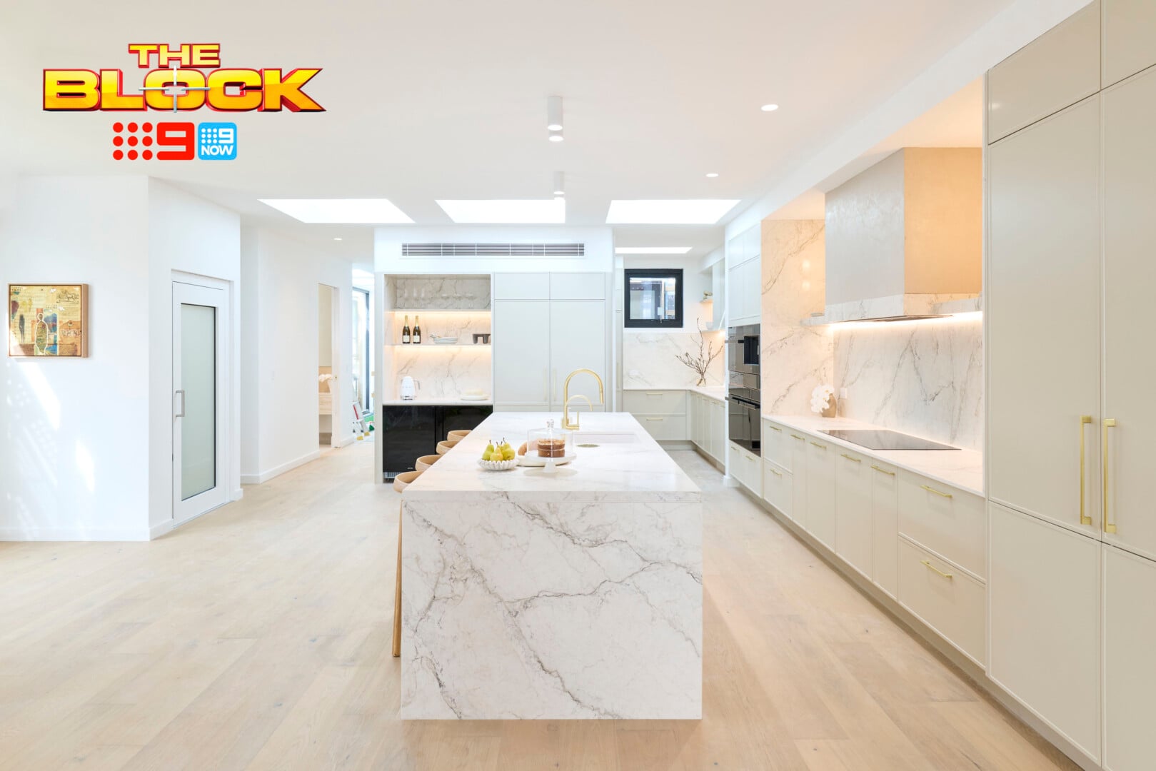
Chantel and Wyatt’s Kitchen Came Last
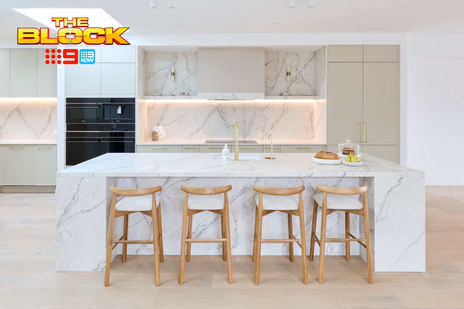
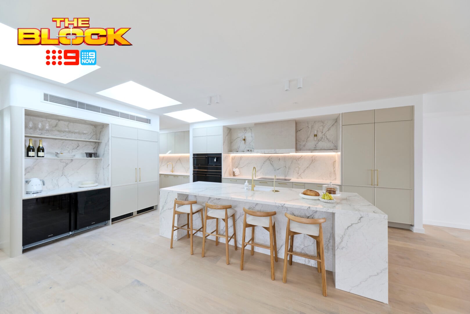
The judges again commented that Chantel and Wyatt’s room was bland and safe. And look, I don’t disagree with them. I just don’t believe it’s going to have an impact on the saleability of the home. People love bland. The success of Ellen DeGeneres proves it. I actually still stand by my conviction that their home will go for top dollar, bland or not.
I do feel this is a nice kitchen. The cabinetry colour, stone choices and hardware are all lovely and connect perfectly to what they’ve been doing in other rooms of the home. The excitement dial just needs to be turned up. It’s reading a touch diazepam at present when it desperately needs a no-doz.
A feature light over the island would have made a huge difference. As it stands there’s no focal point in the space. Well, there is, actually: the black appliances. If you don’t give a room a positive focal point a negative one will take its place. That is the issue here; my eye is not being taken anywhere.
The Butler’s Pantry Had an Issue That Plagued a Few Teams
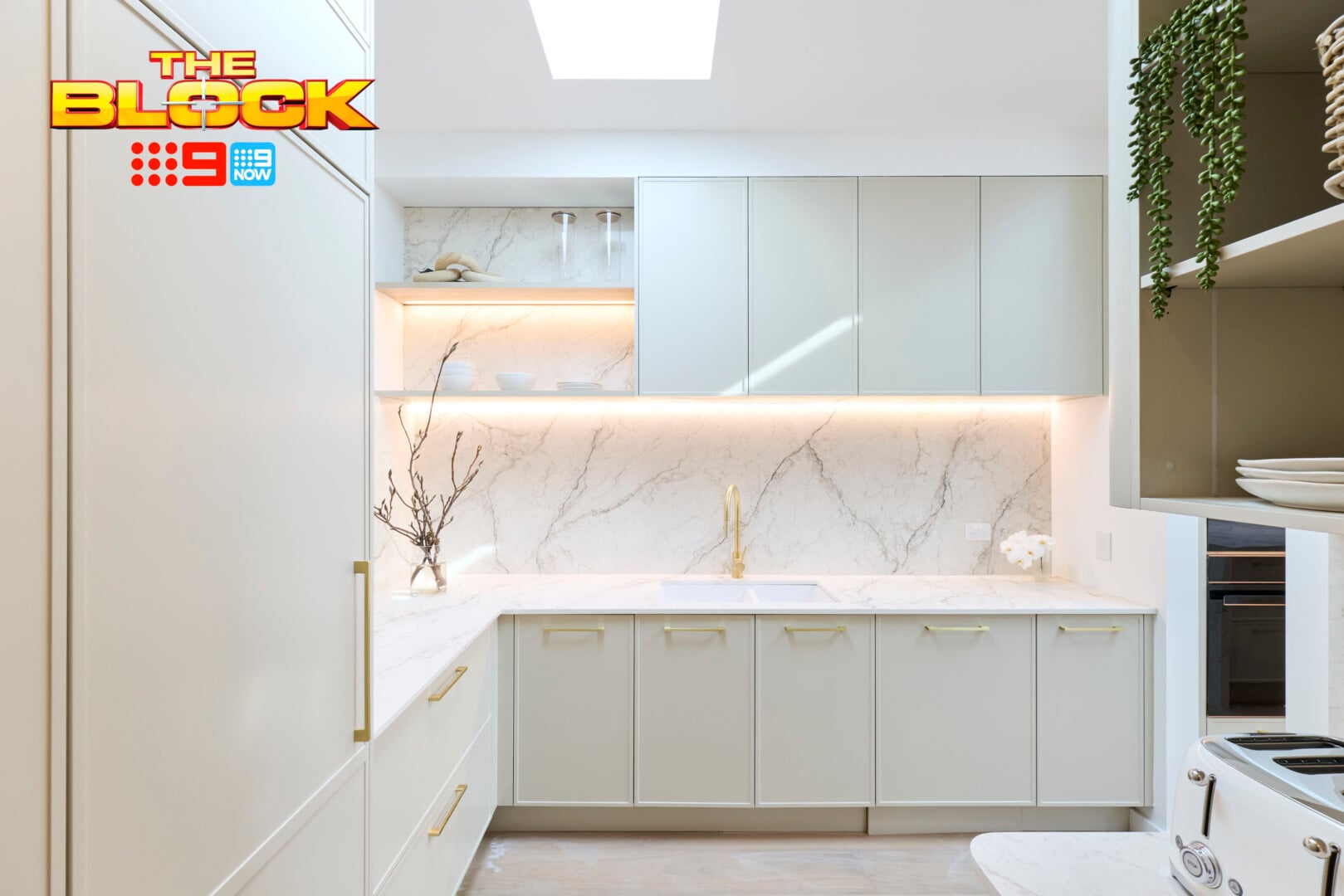
The judges mentioned the sink placement in the butler’s pantry – and a few teams made this mistake. Placing it inside the door, in full view when you’re in the kitchen, was a big blunder. The whole point of a butler’s is to conceal your clean-up. Having dishes sit around the sink in full view is messier than competing against Joanna Wietrzyk.
This is made especially worse by having no door on the pantry. If you’re going to have visible mess, you need a cavity slider on your butler’s. Otherwise, place your sink around the corner completely out of view.
What did you make of The Block 2026 kitchens reveal? Drop me a comment below or jump over on over to Facebook and Instagram to let me know your thoughts there.
For more on The Block, or to catch up on episodes you missed, check out Nine Now.