Oh my Lord.
What a dramatic night it was on The Block Triple Threat, as the kitchens were revealed and the judges did their walk through.
Want to know more about The Block? Read our ultimate guide to every season!
Shaynna Blaze, you are rocking my world right now. I am living for your brutal honesty and your openness this week. It was such a high-drama reveal, don’t you think? One of the best yet in terms of the feedback but one of the worst weeks in terms of quality spaces.
Now, I don’t know who was supplying kitchens for the teams this week, and perhaps they were restricted for choice, but newsflash: not all kitchens have to be a white marble and blonde timber wonderland. What was the go with that? They all looked far too similar.
Let’s get on with taking a look at each space. I’m dying to know what you thought of them!
Josh and Charlotte
As soon as Charlotte described the space as simple I was concerned. These guys have been subdued all the way through the competition in terms of their aesthetic, so I was a little worried they were going to create a snoozy kitchen.
It wasn’t entirely boring, but there wasn’t much going on. I’m with Neale on this one; there just wasn’t much here that made you want to jump in and start cooking. And if a kitchen doesn’t give you that feeling, what’s the point? The elements were all there, sure, but it needed to be taken a step further if it was to truly be a wow-factor kitchen.
I also hated the stuck on wooden benchtop section. I didn’t like the material they used and I think the space is too small to carry it.
Tim and Anastasia
The window was definitely a genius move on Tim and Anastasia’s part. I want to be serving cocktails from that window pronto (or should I say, taking them from someone else serving them).
I wasn’t keen on the tight corner though. I’m no architect, but I would have made that tight corner a walk-in pantry. The nook was not successful in my eyes despite Shaynna loving it. Also didn’t like the shelves with the plants on them. It all just felt a bit cramped. The mirrors behind the plants weren’t wowing me either.
I have to be honest and say that the more I looked at it, the less I liked it. The bench that sat against the window was the best part of the space and the rest of it fell kinda flat after you saw that.
Ayden and Jess
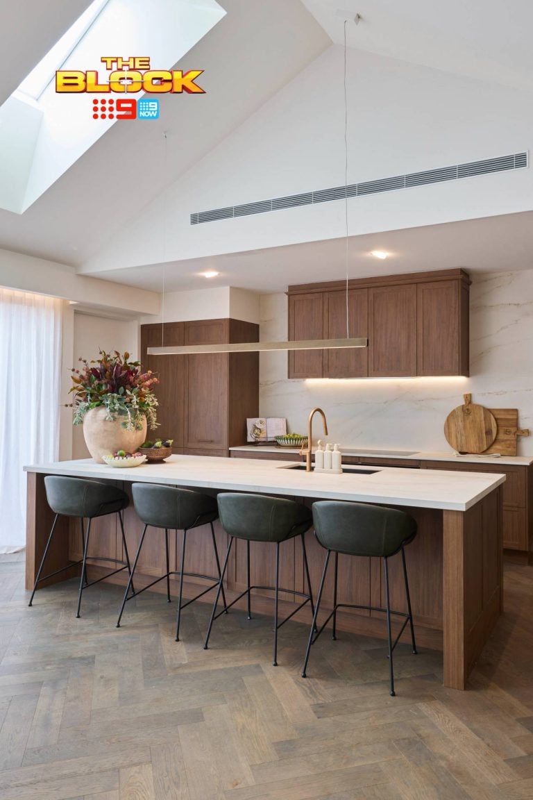
Well… I don’t know. I just don’t feel anything for this space. I can’t help but compare these kitchens to the ones I saw last season on Glasshouse and none of them measure up. The giant wall of timber panelling in this kitchen space was too much. It needed to be broken up with something. Some art perhaps. This kitchen had a bit of a quaint country feel too it, so at least they had some sort of concept. But a country kitchen in Prahan – I don’t think that’s ideal.
I will say, when the doors are open in this space it will improve the look and feel of it. But it did feel a little tight on that side of the bench. That’s not to say that I think the kitchen was in the wrong spot. I like it where it is and I think a potential buyer will too.
The butler’s pantry was lovely.
Darren and Dea
I have to say; I hated the posts as you walked into this kitchen. Your eyes go straight to them. Once you’re past them though, there were some nice moments to take in. Namely the benchtop, which I was a fan of, and some of the styling (loved the pears in the giant bowl). The pendants weren’t half bad either.
That aside, I’m not much of a fan of this space. They went with the same wood panelling as Ayden and Jess (is there a wood panelling supplier or something?) and it felt a bit overbearing.
The butler’s pantry was an epic fail and the splashback tiles did feel cheap and wrong. I didn’t like them in their bathroom and I felt the same about them here.
>>> This entire reveal – all four rooms – flatlined for me! What are your thoughts? Drop me a comment below and let’s chat about it!


I went to the preview and yes Jess and Ayden deserved the win. However, I really like Tim and Anna’s kitchen. I was shocked how different it looked on tv than when I was standing in the space. Lovely friendly couple as well. But Josh is indeed the block stud. Yum.
Hi….goal post’s in D and d’s kitchen epic fail….should have left the kitchen where it was on the plan….between dining and living area’s. Disliked tim and anastasia’s kitchen…should have not built a butler’s kitchen…the space was too small for it…would have been better to leave the dividing wall completely out of it…josh and char should have left the wooden bench off the main bench…besides that i liked the simplicity of their kitchen….Jess and aiden’s kitchen definitely had a country feel…the bench and fridge area looked modern and the oven area looked country style with the glass see through cabinets and the way the rangehood was mounted….the two styles did not match…i think the placement of their kitchen will flow quite well to the alfresco when completed