
Can I confess? I’ve seen a lot of art mistakes in people’s homes over the years.
Before I studied and worked as an interior designer, I too made some of these rookie blunders, so I’m coming at this from a non-judgemental point of view. We’re all in this together – and I get why these fumbles occur.
To get you choosing art you like but art that’ll also work on your walls, I want to list out the most-common art mistakes I see below. By the end of this post you’ll know which errors to avoid, and the solutions to embrace.
The best part: all the art you see in this post is from the team at Olive et Oriel, who I love sourcing art from for my design projects. I’ll link you to some of my faves as we move through too.
This post is produced in partnership with Olive et Oriel wall art.
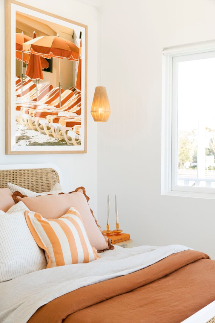
Mistake 1: Waiting to Fall in Love With Art
Somewhere along the way, the myth spread that in order to buy art it had to speak to you. You couldn’t possibly buy art unless you fell in love with it. Well, I’m here to tell you, that’s not true.
Art doesn’t have to mean something, anything more than your sofa has to mean something, or your dining chairs have to mean something. Every item – including art – is a piece of the puzzle that comes together to create a great room.
So, don’t wait months (or even years) to lock in art for your home because you haven’t found a piece you’re emotional over. Liking artwork is enough, I promise you.
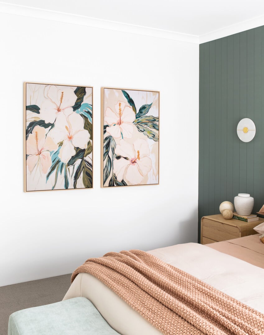
Mistake 2: A Tiny Artwork on a Big Wall
It’s one of the biggest crimes I see when it comes to art for the home: a tiny artwork hung on a giant wall, sitting all alone with mountains of space around it.
This looks terrible from a scale perspective. You want an artwork to feel in proportion to the wall it’s on, feeling in-keeping size-wise to the furniture around it.
This sometimes happens because of budget; perhaps you can’t afford extra large wall art takes up the entire wall. If that’s the case, you’re better off hanging a gallery wall of smaller frames together than you are just leaving one small painting/print on a massive wall. Because honestly, it looks so odd.
Or, why not try applying one of these wallpapers, which can help resolve a blank wall with smaller artworks on it.
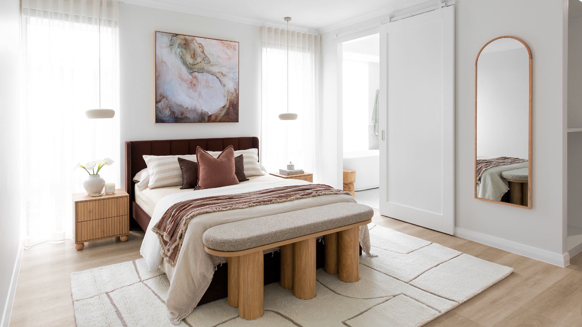
Mistake 3. Hanging Unframed Canvas Prints
I love canvas prints, don’t get me wrong, but this comes with some fine print. Namely, the canvas art in question needs to be framed. Truthfully, most canvas prints that sit on walls unframed look cheap. There, I said it.
Now you know me, I’m all about mixing price points; we love affordability from a spending perspective, but we don’t want anything in your home to look cheap. To avoid this when it comes to artwork, framing is always a must.
The bedroom above is a great example of this rule at play. See how the framed artwork connects to all the timber furniture in the room? It’s such a good way to create cohesion in a space.
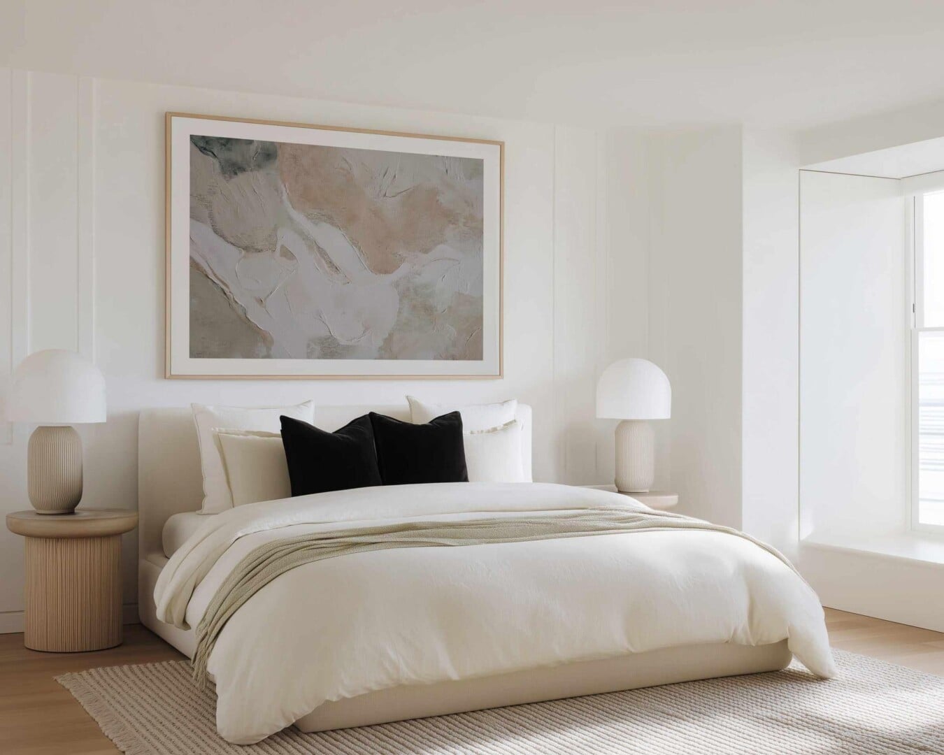
Mistake 4. Hanging Art Too-Low Above Furniture
This is an art mistake I do see a lot, particularly above sofas, beds, consoles and sideboards.
You don’t want to throw yourself onto your sofa and hit a frame. Couch surfing should not be a contact sport. Give a good 30cm gap between the bottom of your artwork and the top of your sofa and you’ll be right.
With beds, you can leave a 15 to 20cm gap from the bottom of your art to the top of the headboard. You want the two pieces to be close enough that there is a relationship, but they’re not touching. Think friends, not partners.
With consoles and sideboards, the decorative elements like flowers or ornaments can cover the artworks a little, so there’s a sense of overlap. Here, you want to avoid hanging the art too high.
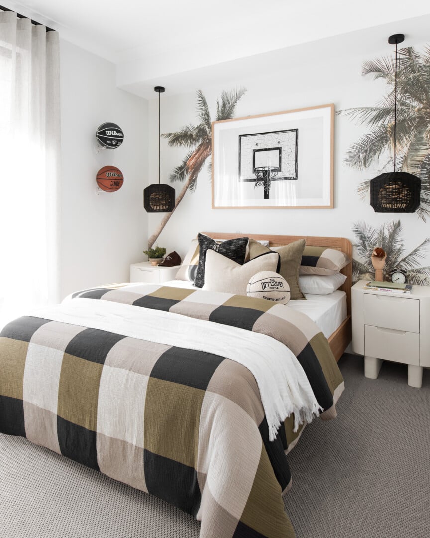
Mistake 5: Portrait-Orientation Art Above a Bed or Sofa
Bed and sofas are wide, horizontal planes; that’s how I think of them anyway. So when it comes time to hang art above them, you want it to extend almost the full width of the furniture in question (stepping in a little on either side).
Now, that could either be two squares sitting side by side in a pair. Or, one piece in a landscape orientation (horizontal) running almost the full width of the furniture.
You never want one portrait-orientation (vertical) artwork above a bed or sofa with mountains of room either side of it. This always looks like a mistake, so it’s best avoided.
If you have windows either side of the bed, a square will work well here too.
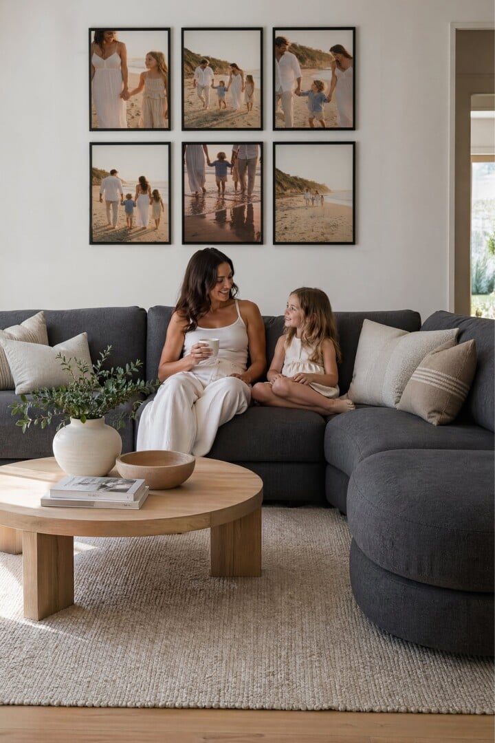
Mistake 6: Gallery Walls with No Consistency
Gallery walls are the sorts of things that are either marvellous or messy. There never tends to be an in-between. That’s because people are often not honing in on one consistent feel across the prints in question.
It really is the number one element to get right; a consistent colour palette across the artworks or photos. If you get that locked in as a starting point everything else will fall into place.
You want to avoid loads of colourful photos or artworks in small frames covering the entire wall. It’s visually chaotic and makes the zone feel cluttered.
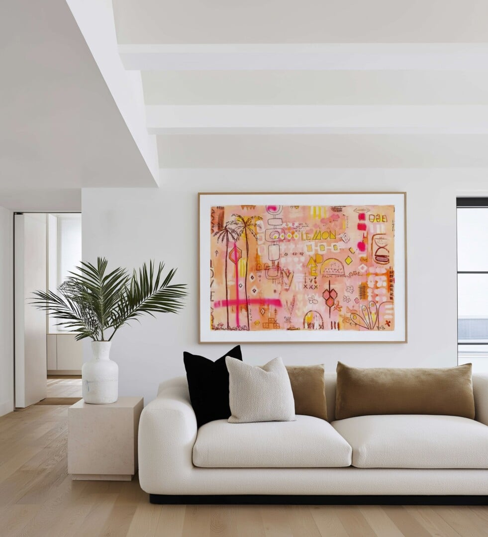
Mistake 7: Not Letting the Art be the Focal Point
Art is the best way to create a focal point in your room. You know, the wow-moment your eye is drawn to the moment you step foot in the space. But in order for your eye to go to it, you need the other design elements in the room to support it, not compete with it.
For example, an eye-catching artwork is great, but not with an equally loud rug. Let one be the star, and the other be the supporting player. You don’t want to invest in a gorgeous big piece of art and have it stifled by other decor in the room.
If there’s already a bolder element in the space choose art that feels more muted, quieter.
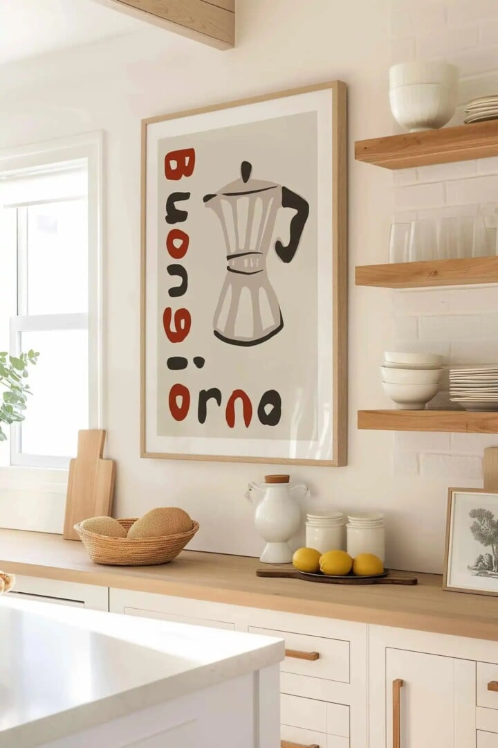
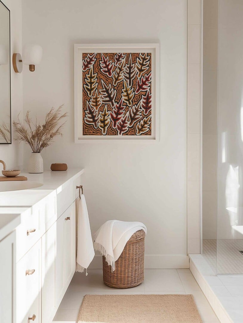
Mistake 8: Not Having Art in Your Kitchen, Laundry or Bathroom
Hanging art in a kitchen, laundry or bathroom is one of my favourite things to do.
In a bathroom or powder room, the quirkier the better. This is your chance to give guests a laugh or thought-provoking moment when they’re using the loo.
In the laundry, art can make it a space that you actually want to go to. Why can’t a laundry be a design destination? Give it artwork and some styling to take it to the next level and make washing your smalls more fun. The same goes for your kitchen or butler’s pantry.
Don’t just leave art for living spaces and bedrooms. Put it in unexpected places for a divine element of surprise.
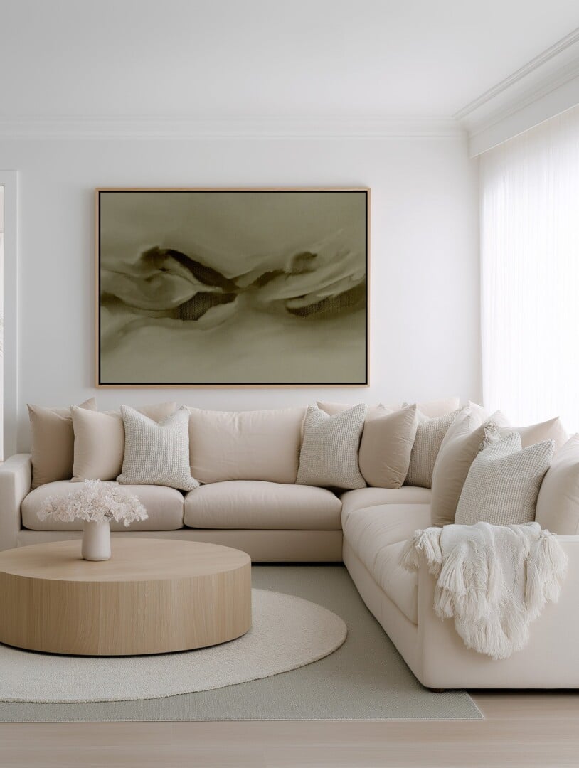
Mistake 9: Acrylic Art in Bright Rooms
Clients often ask me if they should buy their artwork in acrylic and frame, or canvas and frame. And really, it comes down to the room the art is going in.
If you have a really bright room that’s flooded with sun and light, an acrylic-front artwork can sometimes reflect the light so much that you’ll barely be able to see the art behind it. In this case, I always suggest canvas.
Whereas if the room is not flooded with sun and light, you can go for acrylic. In fact, acrylic in a darker room looks better because it can reflect the light a little. Hallways are a good example of this; glass always looks great there.
The best bit: Olive et Oriel’s framed art uses acrylic, not glass. Glass shatters and casts tinted colour on art, where-as acrylic glazing for picture framing is developed to be crystal clear.
Mistake 10: Not Personalising Your Prints
As I said earlier, you don’t have to love an artwork to buy it, but you also don’t want to copy everyone else so your art looks like a lifeless Instagram image.
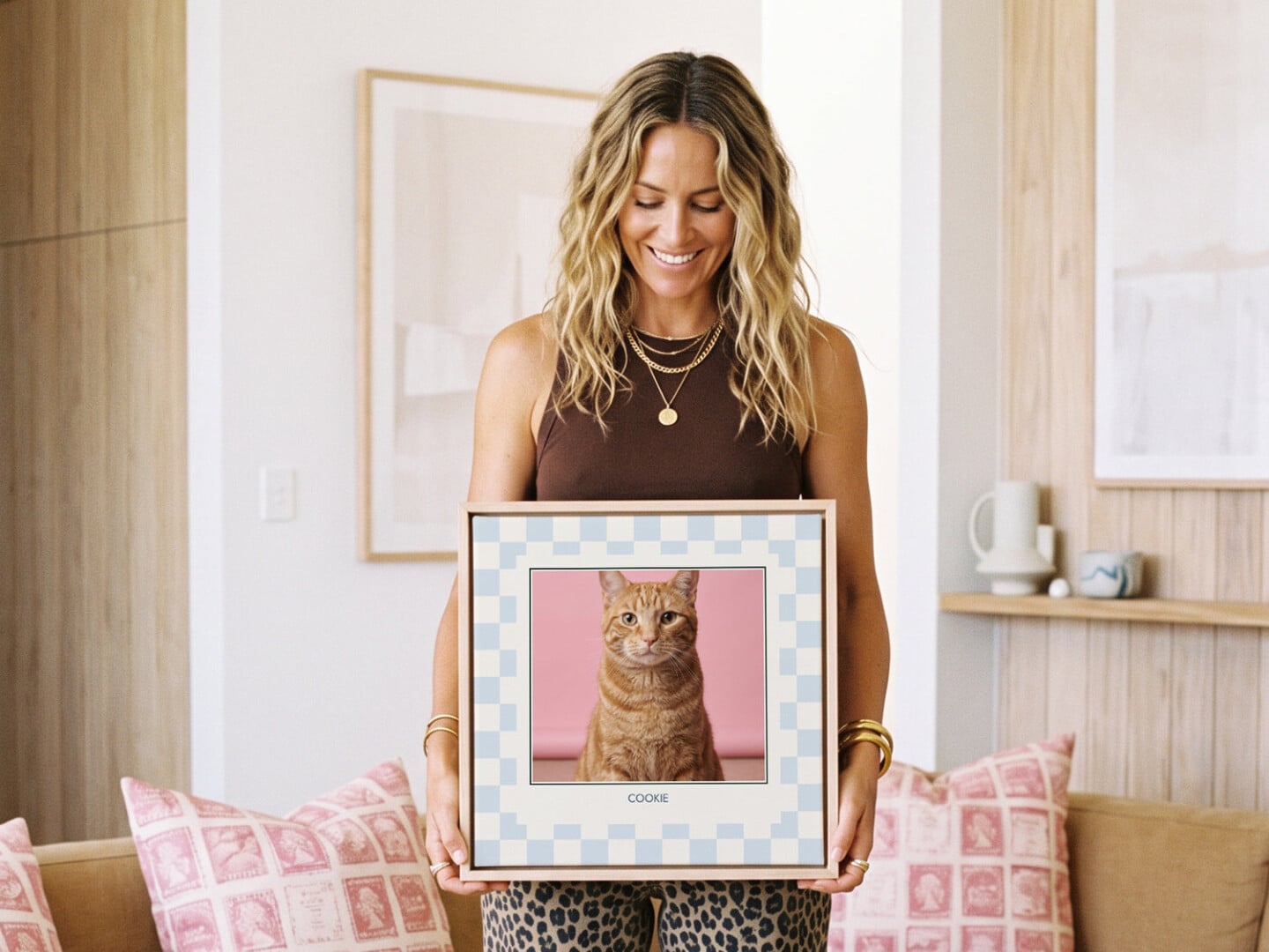
Personalisation is everything. And that’s the beauty of Olive et Oriel’s personalised art service.
You simply upload your photo (of your child, your pet, a memory) and then choose the design you’d like it to be printed in. It’s a great way to have an artwork on your wall, that speaks to you personally, that nobody else will have. I love this concept.
Got any questions about choosing art for the home that you need help with? Drop a comment below and ask away.


