Sunday just gone, House Rules unveiled its NSW whole house reveal (you can see it here) and I have to say, I was really disappointed – both when the episode aired and when the styled photos hit my inbox. The feeling sat with me all week and led to me writing this post.
I don’t want to gripe, but I do want to be honest – from a design perspective – and say that I think the rooms in Steve and Tiana’s house were probably the worst I’ve seen on a show in this genre. I was pretty baffled by the fact that nobody on the show pointed out how many design mistakes were made, too.
I understand that the contestants are not qualified designers. But if you let them run loose with a ‘black, white and red all over’ brief and the results are dire, it brings down the credibility of the show if you don’t call them out on it, don’t you think?
That’s my little rant over and done with (we cannot veer into negative territory, of course), but I did want to show you some images of red rooms that rock – and share some ideas on how you can make red work in your home if you happen to love the colour.
How to Rock the Black, White and Red all over Room
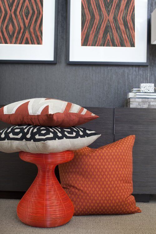
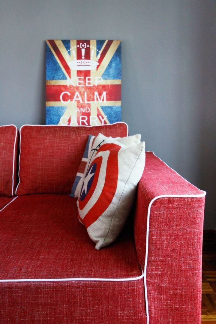
Firstly, explore a range of reds. On the House Rules episode, it was the one shade of vivid red all over. This was one of the major issues. If they had of introduced some maroons, magentas, burnt oranges and other colours, it wouldn’t have looked so aggressive.
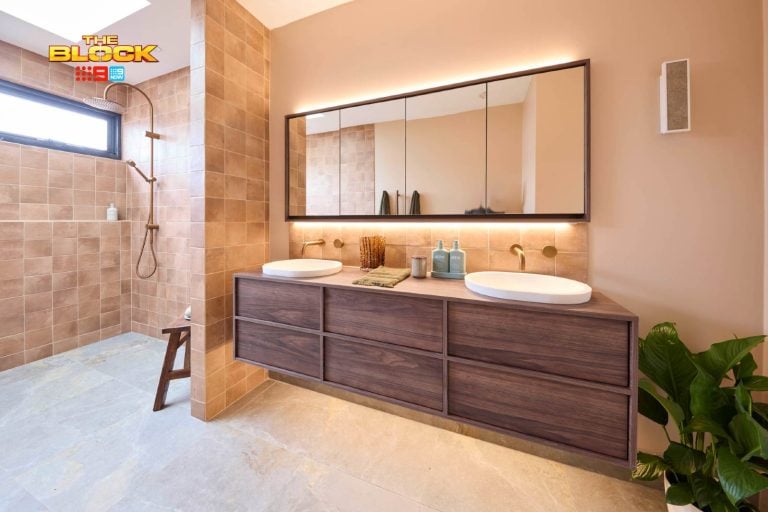
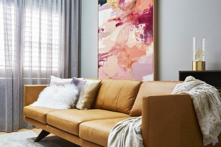
Next, ground with grey. Another issue the teams had is that they tried to use white as their main, grounding colour. That works in many situations but not when you’re using a colour as strong as red in mass doses. A grey wall immediately tones down the extremity of the red. Have a look at the walls in this post and you’ll see just what I mean!
Then, don’t forget about complementary colours. Blue is a really good one to introduce into a room that’s using red in large amounts. The photo at the top of this post will show you the gorgeous deep teal colourway I’m talking about. Bring in moments like this and the room won’t feel so warm.
Lastly, less really is more. I know, you’re meant to go with what the client loves, but I honestly don’t believe Steve and Tiana will keep the home as it is. They won’t be able to live with it. Design briefs are all about reading between the lines. The teams should have used pops of red as accent colours and it would have made them home owners just as happy.
>>> What are your thoughts on the House Rules ep? Do you think I’m being too hard on the show? I’d love to also hear about what you think of red in the comments below – do you use it?




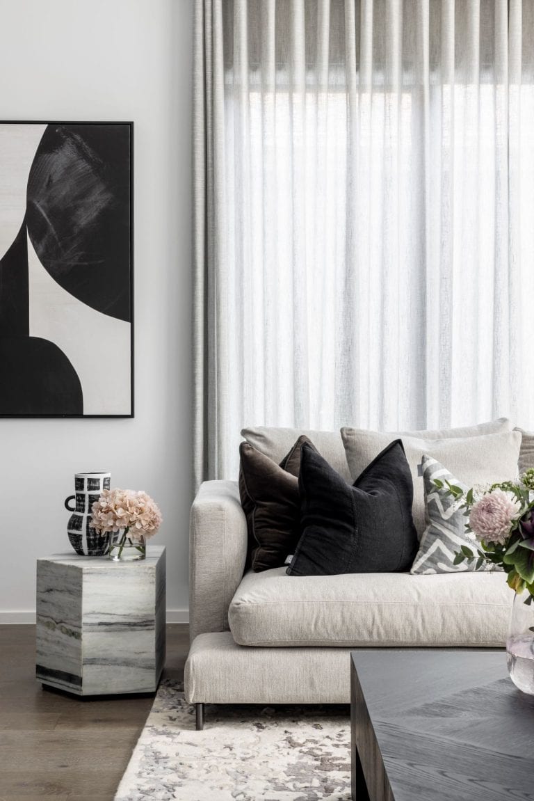

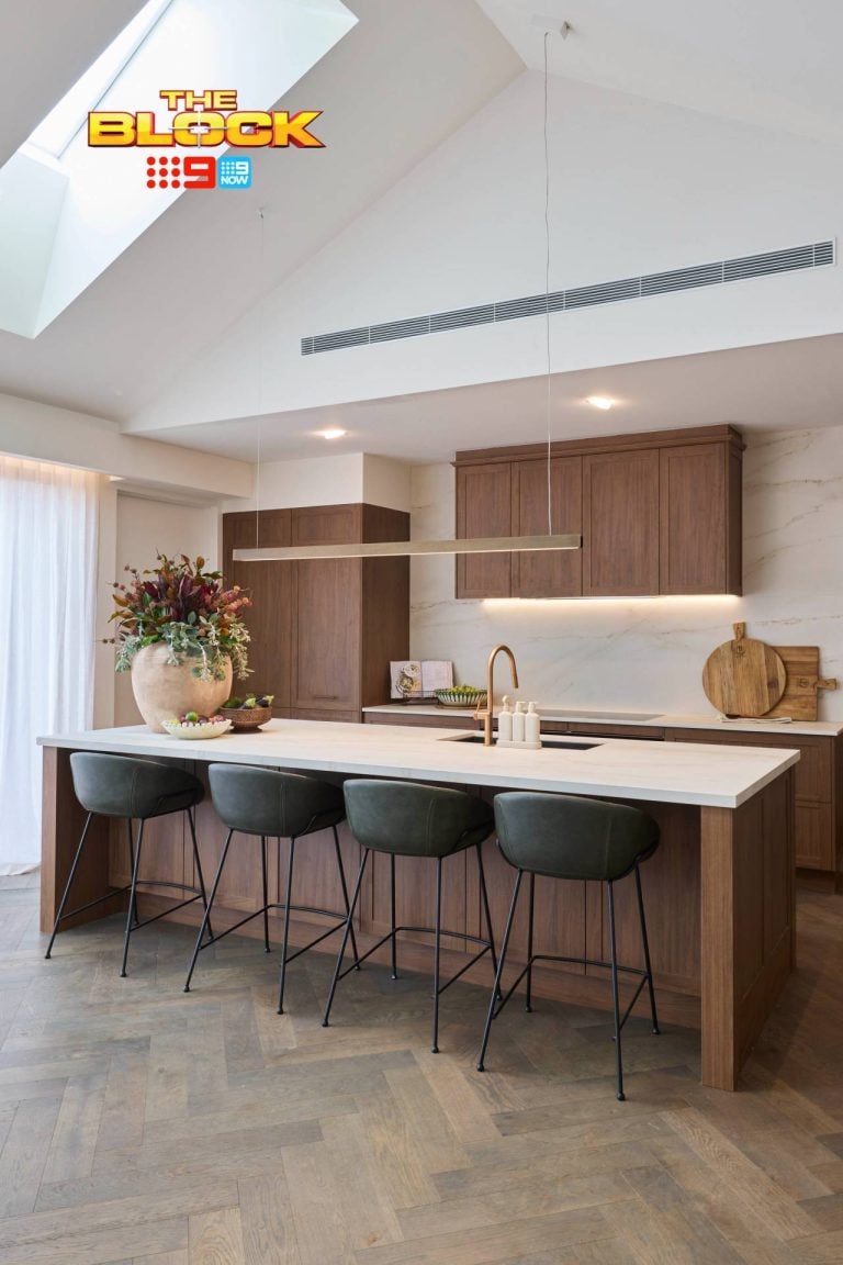
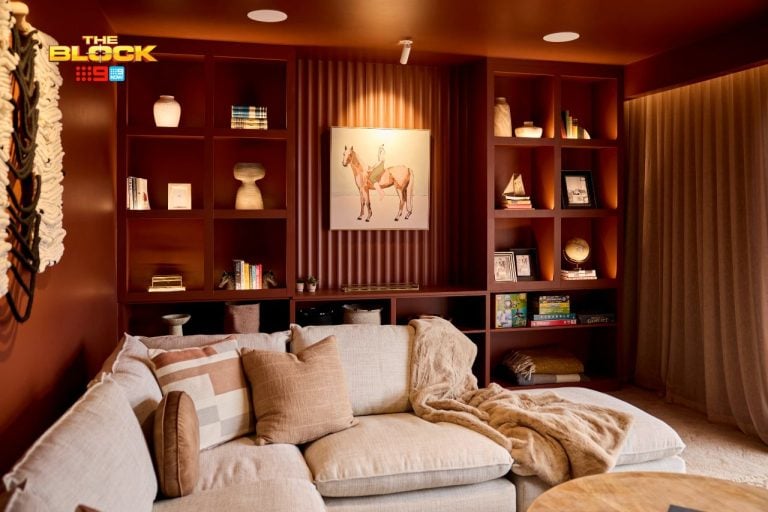
I feel using red as the main colour in the interior design is pretty difficult and hard to control. It may create a sense of stress if unproperly used with little consideration. But those pictures look really good ! Whoever designed that did a really great job !
I personally prefer red with caramel and jewel tones. Think Morocco…
Spot on Chris…you’ve summed it up just right!