The Block is almost over, people. I’m half devastated not to be recapping it every Monday morning and looking at all of the gorgeous imagery from the reveals, and half relived to have a small breather until the show returns for more in 2016.
On a sitenote; it’s almost 2016. Seriously. I’m shocked at how fast the year has gone. But I am pretty excited that my book is landing in stores in January. So there’s that. And Christmas is almost here!
This week, I was so glad to see the naughty chair return. I feel like it was almost put there just to make me laugh. I gave the teams hell during living room week because they all had the awkward naughty chair in the corner of their spaces, and to have it return was a real treat. I still wish they had of brought in SuperNanny for this reveal.
Want to know more about The Block? Read our ultimate guide to every season!
Let’s take a look at this week’s reveals and what was and wasn’t working. Remember to click on hyperlinks below if there’s a product you love and wish to purchase.
Dean and Shay’s Winning Living Room
So much goodness going on in this room that I’m not sure where to start.
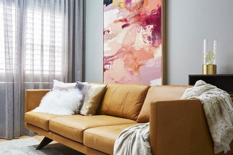
Firstly, the composition and colour palette is amazing. I love that the space is bright and colourful, but keeping the base pieces like the Juno Sofa in neutral tones allows it to feel sophisticated.
You can also look out to the view from all chairs but still watch the tele. Good to see they thought of function, too.
The artwork cluster is making me so excited I almost feel sick. The Bright Pink piece is by far the standout, but I’m also pretty fond of the Monstera Leaf too.
Although I think the naughty chair is odd here, as they were in the other living rooms, I love the concept of those leather magazine holders on the wall – even if Neale wasn’t entirely fond of them.
Total Score: 30
Andy and Whitney’s Second-Place Dining Room
I was a little baffled to see such praise for this room, and to have it come in second place, actually. It’s not that it’s a bad room, of course, I just don’t feel it particularly wows me (or a potential buyer).
I’m not certain the mid-Century influences were right here. I love the Stockholm Flair Pendant that sits above the dining table; it’s a nice commanding moment in the space, but the dining table and chairs that sit beneath it fell flat for me.
The smaller decor elements here were lovely. Neale rightfully pointed out that the rose gold candelabra was amazing, and I also adored the charcoal knit throw. But the larger base pieces felt quite dated. The artwork atop the sideboard, for example, felt like something Freedom was doing a few years ago.
Am I wrong?
Total Score: 29.5
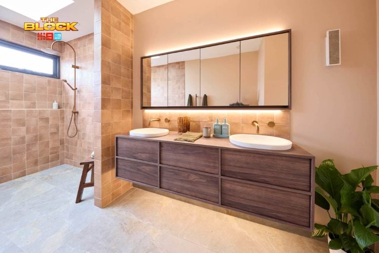
Suzi and Vonny’s Third-Place Master Bedroom
I really, really like this room. It’s actually better than any other room Suzi and Vonny have completed in their own apartment.
The timber wall gets a huge thumbs up. The entire scheme, actually, reminds me of the Nordic Elk trend I covered on the blog earlier in the year; very textural and warm but subdued in colour to really evoke a sense of comfort. I think they nailed it.
The Stockholm Bedside Tables are beautiful against that wall, and although the bedside lamps are nothing new in terms of their look, I think they feel right at home in the space. The styling on top of that gorgeous dark tray was also lovely.
Total Score: 29
Luke and Ebony’s Fourth-Place Kitchen
Now, you know I love these guys, and have said in previous weeks that they really are the comeback kids this season. So you know it pains me to say negative things about them. But I have to here; this room isn’t doing it for me.
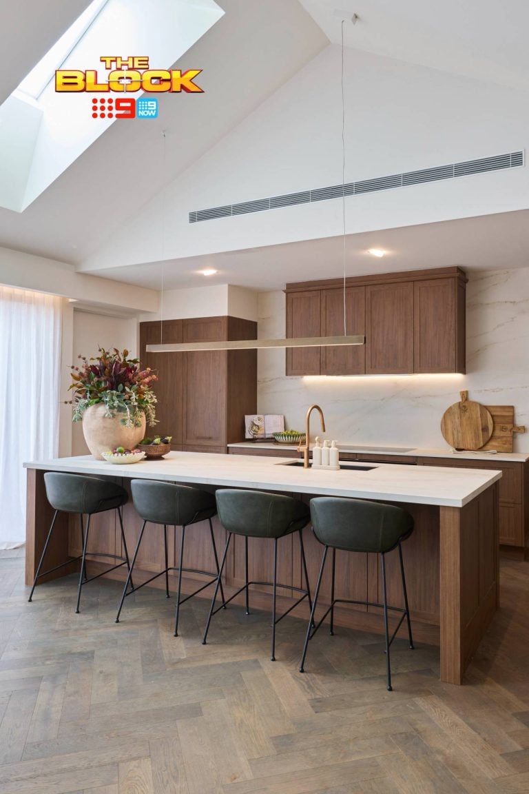
The first thing that stands out as a fail is the ceiling. I understand that they wanted to make a moment of the interesting shapes and lines, but to me it just looks as if they’re highlighting an awkward moment in the space. It’s not something you want to lead the eye to.
I also think the layout is wrong. The fridge is miles away from the sink, and the oven is also too far away from the centre of the kitchen. You’d get quite the workout in this space with all the running back and forth. The sink should have been built into the island and the oven should have been installed where the sink was.
I will give them one thing: those Deja Vu stools are utterly amazing.
Total Score: 28
Kingi and Caro’s Last-Place Study and Powder Room
The study for me has the biggest issues out of all of Kingi and Caro’s spaces this week – and the wallpaper is the reason.
Laying it across both walls like that in what is a tight space just makes the room look smaller and the pattern is way too chaotic. In small doses in a child’s room it would look lovely, but in an office like this it’s too visually disruptive. I’d never sit there all day. Hello headache.
The decor in the office was nice, though. The yellow plant bag and the black table lamp were two of my favourite moments.
The powder room was pretty divine though and I loved the mixing of all those textures. It made for a very welcoming space.
Total Score: 27.5
>>> Which is your fave space this week and why? I’d love to hear from you in the comments below.


