I was sure that Jo Frost from SuperNanny was a guest this week on The Block. Almost every team had set up a naughty chair in their living room. I checked, and there was no record of Jo in sight, which can only mean the Blockheads were eager to create a nook in the rooms best vantage point. Still, a lot of the naughty chairs felt awkward to me.
As you know, I only watch the reveal eps and have no idea what craziness goes down during the week. I can only handle so much drama in my life and my current fixation with Celebrity Apprentice is more than filling that void (how good is it?). For me, The Block is all about assessing the design and discussing what worked and what didn’t.
Want to know more about The Block? Read our ultimate guide to every season!
And on that note, let’s take a look at this week’s Blocktagon living room reveals!
Luke and Ebony’s Living Room
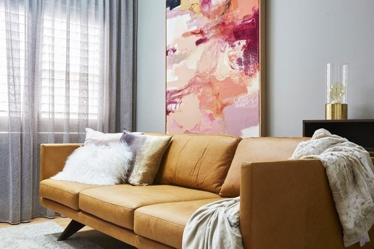
I was pretty impressed with Luke and Ebony this week. Naughty chair aside (which I think looks super awkward in the space), the room kinda rocked! I thought the colour palette was great and tied in nicely with the other rooms they’ve transformed so far. In fact, they should use this room as a basis for going back and correcting mistakes in their previous spaces. There was definitely a lot of punchy, visual moments and I liked the indoor plants too.
I agree with Darren’s suggestion of flipping the entire room though; it makes no sense to have two armchairs pointed away from the view. In trying to sell this apartment to a potential buyer, you’d want to demonstrate how amazing it would be to sit on the sofa and look out over the city. The art was bang on-point, too (I’m obsessed with it).
Total Score: 23.5
Artwork | Navy Cushions | Coffee Table
Whitney and Andy’s Living Room
I’ve been rooting for these guys ever since I saw their amazing bedroom a few weeks back – and I thought this room was another success. The orientation was fantastic and I love the colour story here; so light, so bright and so airy. The mural on the wall, for me, was not necessary though. It’s not big enough to create a real wow moment and I think they would have been better off placing a large piece of art on the wall instead. For a potential buyer, a mural like that could be the deal breaker for the room.
As with Luke and Ebony, I thought the naughty chair was an odd move. I get the intent behind it, but when you see it in the space above, it does feel like the spot the kids park great Aunt Dorris in for a nap. Love the grey sofa but I think it is slightly too large for the space.
Total Score: 23
Pom Pom Throw | Cushion | Floor Rug
Kingi and Caro’s Living Room
These guys have been the front runners in the competition and with good reason; their spaces all feel quite well resolved and they’ve carried the same design scheme across each room. They’ve done well to make each space feel unique though. In this living room, I loved the coffee table, the sliding door, the flooring and the colour story. That industrial TV unit is possibly the best product I’ve seen this season; isn’t it amazing?
The downside, as the judges rightly pointed out, was that shocking yellow sofa. It is such an eyesore in that shade. I think a cream sofa would have made the space feel less weighed down. The layout was also a fail.
Total Score: 20
Candle | Marble Coasters | Black Tassel Throw
Suzi and Vonny’s Living Room
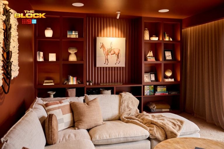
I’ve not liked most of Suzi and Vonny’s rooms this season because the gentleman’s club aesthetic is just not for me. That said, this room felt less dark and gloomy than their others, and definitely felt less ‘themed’. I think the cream tones and soft textures have really helped the space feel casual but still sophisticated.
The judges made a fair call about the apartment being too focussed around alcohol. You’d almost expect to sit down and find a bottle of scotch tucked behind a cushion. Some shelving would have worked well where the bar was. Do people even want a bar in their living room? I love me a Savvy B after work but I don’t want to feel like I’m relaxing in a nightclub.
Again with the naughty chair in the corner. Very odd.
Total Score: 18
Copper Candle | Side Table | Whiskey Glass
Shay and Dean’s Living Room
What happened with these guys this week? I didn’t see what prevented them from finishing off the room, but it is a shame because it shows such promise. The colour story is what impresses me most here, so it would have been good to see them carry that out.
I think you have to be careful when you place two armchairs side by side like this, because here it makes the room feel quite stuffy, like it’s a panel on a talkshow. Love the coffee table, but I think it’s too small for the space. In terms of shape, two round and tiered tables would have looked great.
On a sidenote, can I say that I think we’re ready to move on from lilies as a decorate flower?
Total Score: 12
Wire Bowl | Pendant Light | Grey Armchair
>>> Which was your fave room from this week’s reveals? Jump into the comments below and let me know what you loved and loathed!



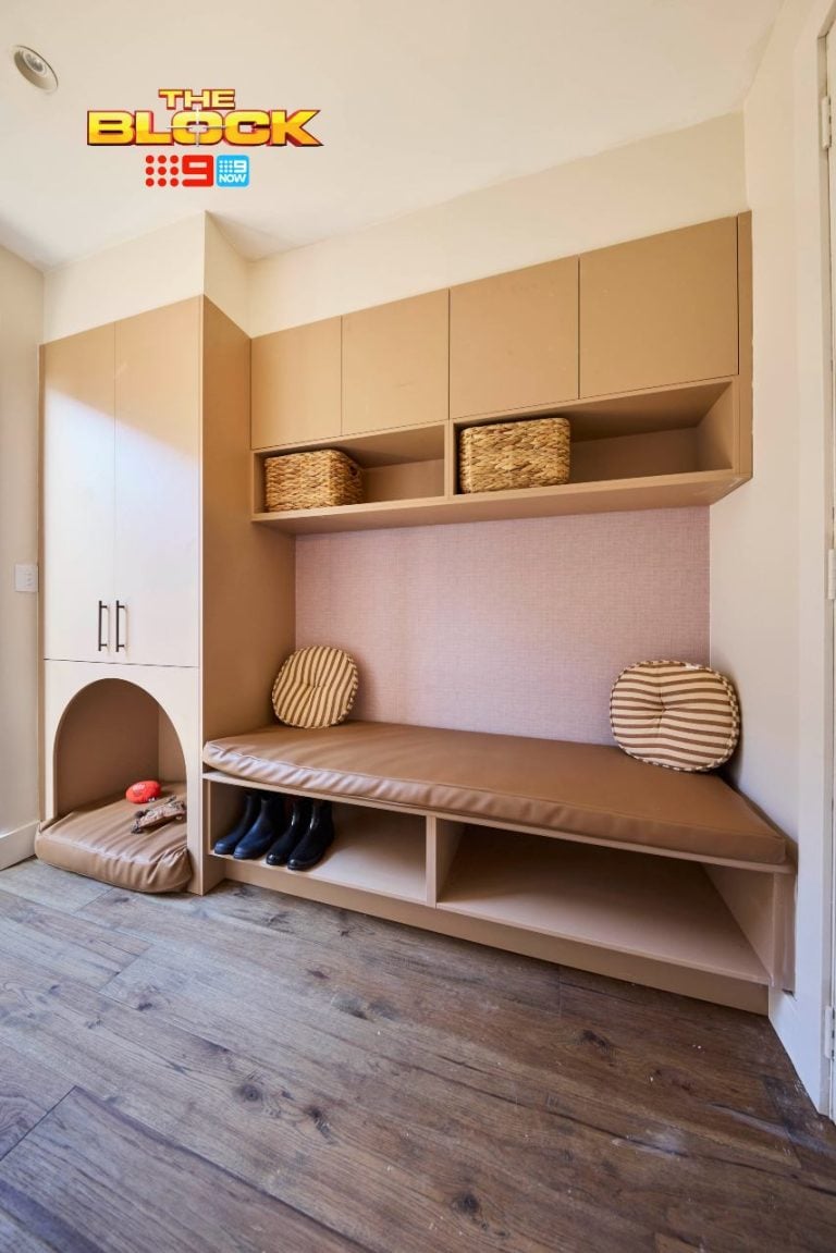
I would’ve put shelving in the nook’s myself – perfect for a bookshelf! My fave was Whitney and Andy – and that ugly bar in the girl’s apartment – eww!
I’m with you Alison – shelving would have looked so good. And the girls room lol… not good.
The nooks were created by the building being extended out a metre or so and was something they all had to deal with. Im not sure there was anything else they could do with it. What would you have done? Luke and Ebony’s was my favourite this week followed by Whitney and Andy. The girls are ruining their apartment with tacky ideas. Shay and Dean swapped their living and kitchen and so their living was at the other side while the builders had to work on the other end 1st. That’s what held them up. Looking forward to seeing it finished.