The Block 2018 living rooms have just been revealed, along with their adjoining dining rooms. And gang… I’m a bit underwhelmed. In fact, I fear that with each weekly reveal I’m getting grumpier and grumpier. It’s not cute. My frown lines are deepening so much I need a trip to the dermy for a ‘freshen up’.
Am I the only one feeling a bit blah this week? I need a Centrum or some Horny Goat Weed to pep me up. The rooms just aren’t designed enough, that’s my main issue. We have a series of white shells with furniture plonked in them. And with so many of the spaces being rather large this time around, this was a week where the under-designing of a room stood out even more.
I don’t feel like concepts have been developed for these spaces. They don’t seem very well thought out. It’s as though decisions were being made on the fly, with no real commitment to a scheme or overarching idea. I guess with time constraints on a show like The Block, that’s probably exactly what happened. Perhaps the issue is with me, not the contestants.
I feel like this season is a slow realisation for me: I’m expecting too much from The Block. The issue is that past seasons have delivered some really jaw-dropping moments. And outside of Bianca and Carla’s bathroom this season, we don’t have a lot to gasp over.
Let’s delve further into each room below, because there are so many lessons to be learned. And remember to enter to win a $100 Block Shop voucher further down.


Hans and Courtney’s Space was Confusing
A big white room has never felt so barren! This space from Hans and Courtney needed to be successfully zoned. It also needed mood. It needed character. And it needed a few focal points. I usually say a room needs one focal point, but a space this massive needs at least two. It needed two big wow moments so when you walk in your eye is drawn to something.
But when you walk into this living and dining room… there’s nothing. Nowhere for your eye to go. We don’t have a massive wall of wallpaper or coloured paint. We don’t have a large pendant to draw your eye. And we don’t even have an epic piece of art to get lost in. We just have a really large white room with random pieces of furniture in it.
What’s worse:
The three zones have no sense of cohesion and flow. The tribal living room with the brown leather sofa bears no resemblance to the sitting zone in the middle of the space. There are literally no design elements that tie them together. They are two utterly different schemes.
I personally love the look and feel of the middle sitting room. The sofas are gorgeous, the nest of coffee tables is beautiful. And that blue Kate McKinnon rug is to-die-for. They should have taken the look and feel of this living room and rolled it out across all three zones.
The dining zone on the end also delivers nothing exciting. The pop-up bar does not make up for lack of styling. I’m a bit baffled by the praise. I also would have put the dining table and chairs in the middle of the space. There’s no need for two living spaces so close to one another. Changing the configuration would have helped things here.
Why are there also no cushions on the gorgeous grey sofas? The finishing touches here are very weak to say the least. And the white walls are killing me.


Hayden and Sara were a little Deja Vu
I love me a dusty pink, navy blue and white colour story. As an interior stylist it is absolutely my jam and I’ve rolled it out across client homes before. It’s a winner. It has all those soft and divine feminine touches to it, but it also feels a little masculine.
Add in the gold like Hayden and Sara have here, and you make the space feel a bit luxe and elegant. So from a colour and style perspective, I’m on board. I’m dishing some praise their way. It’s a very approachable design (and that’s also my jam – design you can understand!).
Here’s the bad news:
This room is very Julia and Sasha circa 2016. I hate to say it (I don’t really), but this is a little deja vu for me. It’s the black dining table with the blue velvet chairs and the pendant lights above it. They are also divine pieces, but we’ve seen this done far too many times. And although I believe Hayden and Sara had the best of intentions, it comes across as lazy design. Nothing innovative to see here. And trust me, we come to The Block for new design moments. We want to see new trends, something wacky that breeds debate and discussion.
Think Shannon and Simon when they did that amazing master bedroom feature wall. Years later it still sticks in my mind. As does the cloth wallpaper Darren and Dea used in their bedroom a few yeas back. Julia and Sasha’s living and dining room is another space I remember fondly, which is why this room screams ‘been there, done that’.
It too, just like Hans and Courtney’s, lacks mood and character. It’s a white shell with furniture in it. This has become a common theme this year and it’s super disappointing.
The thing is…
I love the fireplace. That moment in itself shows that Hayden and Sara have something in them. That moody grey could have been spread around the room. Give us some charm and texture and grit.
And lastly, I also absolutely cannot with the Luna Park wallpaper situation. I have no words.


Norm and Jess Deserved Last Place
Hey, I just call it as I see it. Don’t hate the player, hate the game! Truly though, Jess and Norm’s living and dining space was the worst version of random furniture plonked in a white room. Except they took the notion of ‘pared back’ to the extreme by avoiding rugs altogether. And if the room didn’t feel hard enough, they threw down a chunk of marble in the middle of the floor. And then suspended a fireplace above it.
It’s so unfortunate
I genuinely feel a bit let down. Because as I always say most weeks, the individual pieces here are lovely. They just didn’t get utilised properly. That dining table, for example, is a stunner. I love the black wood grain. The artwork is spectacular too. And the dining chairs, with their stitch detail around the edge is all sorts of designer joy and rapture. But really, let’s be honest, this room is quite unsuccessful.
There’s little to no styling here either. Crumpled cushions on a sofa, nothing on top of the coffee table, a few small pieces on the entertainment unit. This is an unfinished space. And I just feel altogether uncomfortable ripping into it so much. But I do feel a little enraged about the really obvious things (like rugs) being missed here. This season is also making me so tired of white sheer curtains.
Lastly, the scrotum pendant lights above the dining table have gotta go too. Old man scrotum droop is not an image you want in your mind while you’re eating dinner. Especially if meatballs are on the menu!


Kerrie and Spence were Onto a Good Thing
I can fully appreciate the direction Kerrie and Spence were going in with their living and dining room. It’s nice when you can look at a room and understand it in seconds. Even if you don’t like the style, you understand the direction. That’s an important thing when it comes to designing a room. You want it to make sense. And in a week where so many of the spaces made no sense, this was a refreshing change.
My main letdown in this room…
They didn’t take the concept all the way to the finish line. They could have fully committed here and made this room an absolute show-stopper. You know what I’m about to say, don’t you? I’ve refrained from going on about it for most of this post but I can’t hold it in anymore, so here goes: Where is the wallpaper?
This room would have been a knockout if a darker cloth wallpaper was used. A black wall would have made the treatment on the white ceiling pop even more. But sadly, with a white wall, the coffered ceiling kinda fizzles. There’s nothing for it to contrast against. And so you just have this big sea of white with – you guessed it – furniture popped against it.
This room has a really rich, moody palette to it. And the furniture and decor Kerrie and Spence selected completely taps into that vibe. So why shy away from going all the way? They’re totally virgins on prom night right now. And the other unfortunate thing is that this room is another one with no focal point. Where does the eye go when you walk in? Nowhere. There’s no punch or sizzle. I need some punch and sizzle!
Lets discuss some of the gorg moments though
Because let’s face it, there were many. For example, love the rug. Totally keeps the living zone feeling moody and sophisticated. The grey armchairs are also successful. They have presence in the space and feel strong. And the brown leather sofas tap into the dapper feeling in the living zone, so they get my vote too. What doesn’t is the shutters. An odd choice in such a masculine, high-end style room.


Bianca and Carla: I Thought I Knew You!
It pains me not to like a room from my front-runner faves. As I stated last week, I think B&C are hands-down the best duo in the competition this year. I also think, due to their cohesive design aesthetic across the entire home, they’ll clean up come auction day. And yes, this week I once again knew this room was theirs right away. That said, I wasn’t very keen on it.
It just feels a bit like I’ve walked into Freedom Furniture. And no gang, that is not me throwing shade at Freedom. I love me some Freedom. I shop at Freedom. But I also love me a room that feels layered and rich and interesting. Not like it all came from the same furniture catalogue. And this space feels a bit pedestrian for me (even a bit dated).
It’s not what I’ve come to expect from my girls
Maybe Bianca and Carla cursed themselves (and me) by being so bloody amazing the first few weeks of the show. My standard for them is probably higher than the other teams, which I know is a bit unfair.
The artwork I am here for. That’s clearly the wow moment of the week. And hey – at least this room has a focal point! I am also really fond of the buffet underneath it. It’s the most designer moment in the space and it certainly stands out and has presence. The pendant light I am also smitten with. These girls have an eye for interesting lighting and they’re not afraid to try new things. So kudos in that regard.
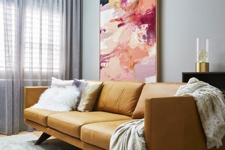
The sofas are a bit OK. Nothing to write home about. A modular would have been nice here. And could it be in a material that’s not leather? The tan leather sofa movement has had its day. And I am fast becoming tired of the marble coffee tables. There, I said it. Never thought I’d see the day I said I was getting over marble, but they’re just so overused in shows like this.

WIN A $100 BLOCK SHOP VOUCHER
Every Sunday night I’ll be giving you the chance to win a $100 voucher for The Block Shop. The winner will be announced in next week’s Block recap (right here on the blog), where you can then enter again to win. Repeat each week until the end of the season. How exciting!
LAST WEEK’S WINNER: Candace Jarrett
TO ENTER TO WIN THIS WEEK’S VOUCHER:
Simply pop a comment below telling me what you thought of The Block 2018 living and dining rooms. It’s that easy!
Comp open to Aus residents only. Comp closes 7pm Sunday September 16.
This post contains affiliate links, meaning, at no additional cost to you, I will earn a commission (and you will help support TLC Interiors) if you click through and make a purchase.


Love your view point and humor Chris.
Season 14 is only being broadcast in SA now
The rooms are just bland with a few nice pieces here and there. The decor this season is just so boring and under whelming. There is no vava voom, no personality, no character, no love or hate moment like some one said. The rooms reminds me of two youngsters that just got married and who’s parents gave them a few nice pieces which they just plonk down. 100% Agree with you on Courtney & Hans space, nothing jells , lay out all wrong. Courtney should have kept to her aesthetic and brought in some over sized pots, Asian decor pieces, ginger jars, Asian wall paper etc .to fill that bland vast space. I am seriously starting to doubt the judges ability to judge. One week week the finishing and workmanship are the downfall of contestants although their decor is stunning according to them. The next week a team loses because of that even if they like their styling & decor . They just so inconsistent. This seasons decor of the teams is a total let down, or is it the inconsistency of the judges and restrictions of the producers that let them down and confused the hell out of them.
Oh wow I didn’t realise there was such a delay with broadcasting!
I’ve found this whole reveal to be quite unforgettable. They’re all nice, some with obvious highlights and some with some weirdly obvious glaring faults. But none that really stand out. On the plus side, there was no terrazzo!!
Ooops meant forgettable not unforgettable!
It was SO boring! If it was’t for the beautiful glass and high ceilings in the penthouse apartments I’d be completely and utterly bored.
I feel sorry for them, they have such a limited time they can’t actually do any really decent custom built in storage etc. I wish they’d take that into consideration with spaces this large and, at the very least, give them 2 weeks! There’s enough drama on the block to keep people hanging out for an extra week….especially if the rooms are worth waiting for…these were definitely not.
I feel the living rooms were a lot like the rest of the apartments. Very unexciting. These are multi-million dollar apartments?? Where is the drama and pizazz (design wise) of previous seasons? Where is the colour, the artwork, the wallpaper?? All very bland and disappointing I’m afraid.
I like the flower arrangement on Bianca and Carla’s Dining room table…. That’s about it for this week.
Linda
I really dont like the tan lounges, like the shapes, not the colour. I liked the girls room the most, but Kerrie’s and Spence’s ceiling won me over, so much work and it looked great. Shame they used a black ceiling fan. I think its really hard to believe the judges words, when the contestants need to tie the rooms together but they are still in a construction zone and hear them say it doesnt make sense, it’s not connected, seems the judges havent any vision for the works in progress. There also wasnt much storage in any of the rooms, I have a hidden winter blanket and pillow box, book cases, and massage chair in my lounge room. Surely in those massive spaces they could have had practical essences hidden. Still love the show, just sharing my thoughts.
Not going to lie…I was pretty underwhelmed with all of them. The spaces aren’t overly innovative and don’t have the warmth you would expect from a living and dining space. There were components of each that I loved individually but once put together with the other items it just didn’t work. I really want to see more! Like you said, where’s the wallpaper?? And no, the Luna Park wall does not count!
Hate the boxy white rooms but I love most of the art works, rugs and dining tables which were the only things to give the rooms style and pizazz.
Sorry, totes have to disagree with you this week re Jess and Norm’s room. I think it is delish! Yes, the placement of the fireplace is very disappointing, because it does make the room not as functional had it been tucked up in the corner or further to the side. But you’ve got to make the best out of a bad situation right?
I cannot get enough of their amazing furniture pieces. The coffee table and the entertainment unit are works of art. The simplicity let’s their beauty really sing! I think the minimalist feel of the room is very contemporary, totally now. It’s all about the raw materials they have used, timber, leather, marble, what more could a millionaire want? Haha! Adding too much to this room wouldn’t let those amazing windows and the view be the focal point.
Sorry we don’t see eye to eye, but this room was the winner for me this week. It broke rules, broke away from the safe, boring, snore-fest “same-same” we’ve been seeing for weeks. Now let’s hope J+N fix that flop of a master room before auction.