It just wouldn’t be The Block without a few dramatic twists and turns on the home stretch! This week saw the teams play nice (well, try to) as they joined forces to create spaces in the final challenge; doing over the mysterious apartment 6. In this post, the first half is revealed – and I’d love to know what you thought of it so far! Here’s my take…
Michael and Carlene
Absolutely obsessed with the art in Michael and Carlene’s space, but I think that’s where the love affair ended. I don’t think the hanging chair worked; its look didn’t mesh with the rest of the room. I also think the colouring here was way too dark. Some lighter blues or yellows would have elevated this bedroom, because the dark bedhead against that rich feature wall really brought the vibe down.
Best Bit: The artwork was dreamy.
Worst Bit: The hanging chair did not suit the space.
Chris and Jenna
What is going on with the blue feature walls this week? Did someone supply a jumbo can of paint and insist it get used? I didn’t like the blue wall in this bedroom either, but I didn’t mind the cement bedhead and the pendants were pretty cute, too. That said, this space was overwhelmingly grey and the floor needed to be broken up with a round rug. The room felt a bit empty, don’t you think?
Best Bit: Pendant lights. Loved them!
Worst Bit: Colour choices. Way too much grey.
Max and Karstan
I know these rooms are meant to be staged and styled, but this space took it too far, with a vibe that felt barren and soulless – like a show home does. I didn’t like this bedroom at all. The circular art on the wall was pretty mind-blowing, I have to say. I would kill to have that in my living room. But that’s as far as it goes. I was glad when Darren said it lacked a layer of finish; I couldn’t agree more.
Best Bit: That art is just beyond!
Worst Bit: The soulless vibe of this space was so disappointing
Darren and Dee
Love, love, looooove the feature tiles in this ensuite. I’d sell my first-born child to get my hands on those. The Orla Kiely towels looked a bit out of place, but that aside, the entire room felt luxe but approachable. The basin area was lovely, with accessories that felt really on-point and appropriate. That niche in the shower was just bliss, too.
Best Bit: It doesn’t get better than those feature tiles.
Worst Bit: The Orla Kiely towels; better in another space.
Shannon and Simon
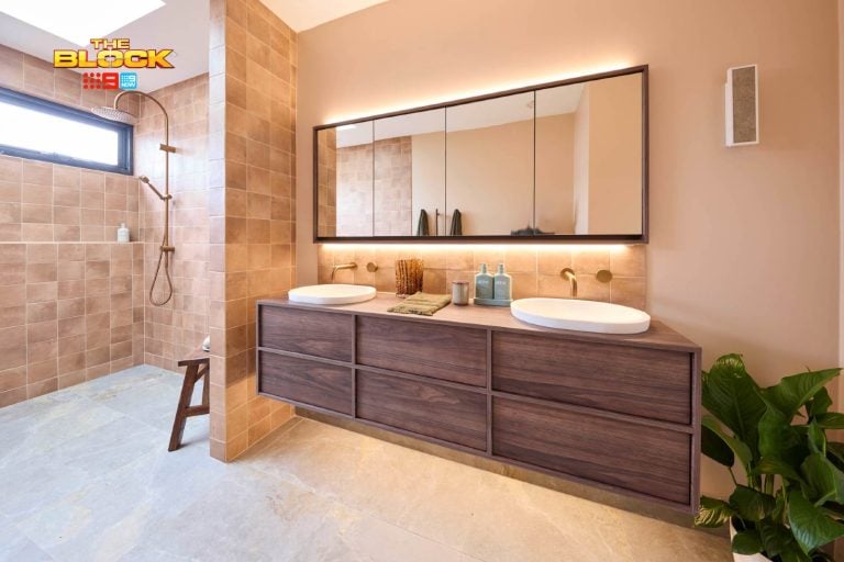
I felt so aligned with S&S at the start of the competition, but as time went on they’ve lost me, and their master bathroom in apartment 6 was the nail in the coffin. Not a fan of the wood panelling, not a fan of the styling and not a fan of the lights in this space (they’re great on their own, but not here). I felt like the textures fought with one another here, too, despite the judges saying that they felt they worked well together.
Best Bit: Hmm, the wall tiles were nice.
Worst Bit: The confusion of textures.
What did you think of the first half of the apartment 6 reveal? Are you a fan or were you left wanting something more? I’d love to hear from you in the comments below!
All snaps in this post come courtesy of jump-in.com.au
Want to know more about The Block? Read our ultimate guide to every season!


