The final rooms of The Block apartment 6 have been revealed, with a mixed review from the judges. Not knowing which teams transformed which spaces kept an air of mystery to their walk-throughs, but it still resulted in critiques I didn’t necessarily agree with. Here’s my take on the rooms this week. I’d love to hear yours in the comments below!
Michael and Carlene
It’s not hard to get wow factor in a laundry/powder room, despite what Carlene declared. She had nothing to worry about though, because this room was a stunner. Except for, I must say, the lighting they chose to put in this space. It felt out of place to me; too grand and a bit of an intrusion. Their styling was a little much, but it was pretty nice all the same.
Best Bit: The tucked-away laundry. As Neale said, luxury.
Worst Bit: The light was one step too far.
Chris and Jenna
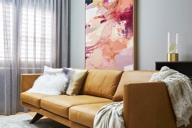
I want to say ‘poor Chris and Jenna’ but they should know better by now. Their colour choices were off; brights set against a stark white backdrop and an eye-catching black TV set. The first rule of styling is that the TV should not be your focal point. There was no merging of colour here. it was very disjointed.
Best Bit: I liked the painting. It was a really wow moment.
Worst Bit: To much black and white. Sterile once again.
Max and Karstan
I love their terrace. The scale of the plants was knockout, leading your eye up to that awesome structure half-way up the wall. Breathtaking was the right way to describe this space. I think they nailed it. I would kill to have a party in this space. The colours are so serene without being boring. And I adored the cacti on the table.
Best Bit: Those three tall plants were the bomb.
Worst Bit: I can’t find anything wrong with this!
Darren and Dee
No to the benchtop. That was my first thought. I also didn’t enjoy the giant pear art in the space. I think it was too juvenile in what’s meant to be a sophisticated, adult space. This room felt like Darren and Dee were trying too hard to impress. There’s not much I did like in the room, come to think of it. Even the accessories were too much.
Best Bit: The under-cupboard lighting was nifty.
Worst Bit: The pendants.
Shannon and Simon
I don’t want to diss the fire pit, because it is clearly amazing. But the rest of the space was an absolute snooze – taken straight off the shop floor and barely styled or thought out. Zero design edge in this area. Not sure if they pumped all their budget into gadgets and gizmos, but it was at the expense of the look and feel of the terrace.
Best Bit: The fire pit. Total knockout.
Worst Bit: Zero styling. Ick.
What did you think of The Block apartment 6 reveal? I’d love to hear from you in the comments below!
Want to know more about The Block? Read our ultimate guide to every season!


