The Block Triple Threat was all about bathrooms this week – except for a few design lessons from Darren Palmer and the usual drama we’ve all come to expect from the show. I don’t get caught up in all of that, as you know, nor am I usually privy to what’s gone on behind the scenes that could impact how the room looks. I just judge them based on what I see, so let’s get stuck in and take a look at the four spaces…
Read more about The Block Triple Threat
Charlotte and Josh
If there was a team that could create a clean, crisp and minimalistic bathroom, it was Josh and Charlotte. They are the team with the simplest aesthetic and I thought it really worked here. The tapeware was a divine moment that gave the space interest but I think they dropped the ball with the pendant choice (this seems to be a common thread on the entire show, come to think of it). The judges were a bit harsh on them actually – and that’s coming from me, who’s been consistently disappointed with their designs.
Tim and Anastasia
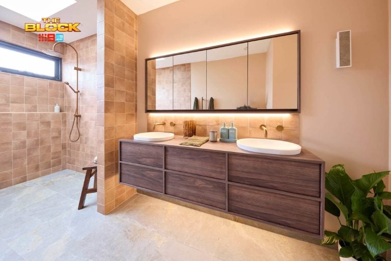
Am I missing something here? This looks like a direct replica of their last bathroom. The use of that timber, like in their last bathroom, made the space feel too hard. A child is going to take their eye out on the corner of it. The colour of that wood also feels not at all serene or calming, which is the mood you want to evoke in a bathroom. There are too many hard lines here. The diamond-shaped tiles further adds to the sharpness. I’m not a fan of this space, guys. #sorrynotsorry
Ayden and Jess
Oh Lord. Oh Lord. What the hell is happening here? Overwhelming was a kind choice of words from Shaynna, because these tiles were out of control. They are lovely tiles but they lost their impact through overuse in the room. The sink was also a bit odd. It feels like they were trying too hard here to impress with so many crazy ideas. They needed to focus on one wow moment in this room. It’s a small space, so you can’t mesh too many design concepts in there – and they did. I would hyperventilate in that toilet, just quietly.
Darren and Dea
I have to say straight off the bat that I’m not a fan of a bath in a wet area like this. It just feels over-the-top and unnecessary. Just because you can do something, it doesn’t mean you should. I would have preferred those gorgeous black tiles in a smaller shower area and let the bath tub sit on its own to create a supporting yet subtle wow moment. I also don’t like when form is prioritised over function and they did that with the short shower screens. It would be Kevin Costner’s Water World in there as soon as you turned on the water.
>>> I actually thought that Josh and Charlotte’s bathroom was the best. Yes it was simple, but sometimes the best designs are. You don’t need bells and whistles in every room and I thought there was such a nice sense of calm in there.
Who do you think should have won?
Want to know more about The Block? Read our ultimate guide to every season!


I totally agree with you, also the minimalist approach works really well, maybe just a plant or something could enliven it a bit. Didn’t really like the vanity top though. A shame with Ayden + Jess as the hexagonal tiles were very cool and could of worked really well if the rest of the materials were less in your face. Also once again I am so over Dea’s over confidence. Also didn’t like the wet room, the bathroom is small and essentially had two showers and a bath all up against each other. Too crammed.
I like that we’re on the same page H! D&D’s bathroom was cramped in all the wrong places and open in others. I didn’t get it. And I really loved those hexagonal tiles. Ayden and Jess just need to understand the concept of less is more lol!