
The Block 2026 main ensuites have been revealed. While there were some successful material choices this week, we witnessed a slew of functionality fails that deemed many of these spaces completely unusable.
We had basins you can’t wash your hands in. We had a tiled sofa in the shower. We had double shower heads too close to one another. And we had mirrors instead of shaving cabinets. It has at least allowed us to examine some common blunders people make when designing their bathrooms, and I’m eager to share my pearls of wisdom with you.
Scroll on as we discuss the highs, lows and those black windows from week four of The Block. And as always, come join me on Facebook or Instagram afterwards to let me know what you thought (or comment at the end of this post).
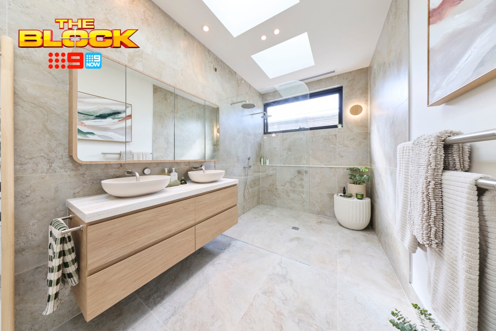
Rick and Tayla’s Ensuite Came First
I have to ask the obvious question. And no, it’s not what elixir of life is Sonia Kruger using to look that good at 60 and where can I get it? It’s why a main ensuite with two unusable basins can take out the win. It seems a pretty big blunder to overlook.
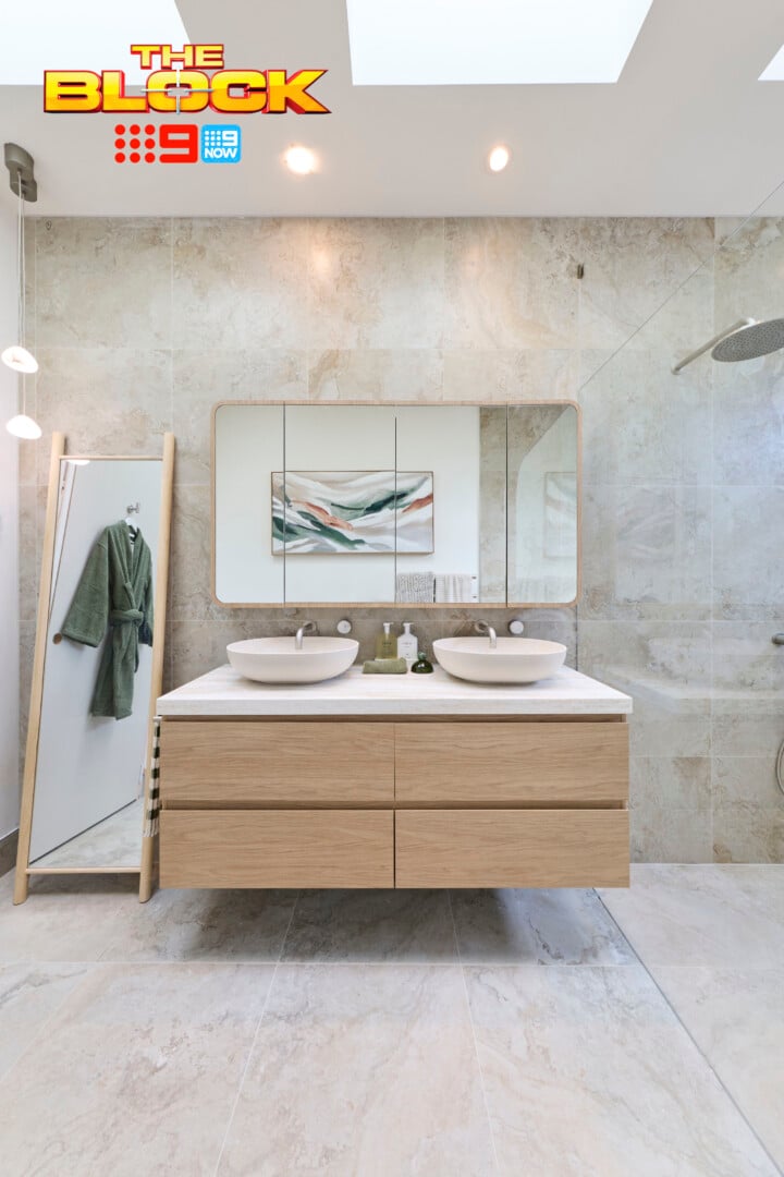
Rick and Tayla got the positioning wrong when planning out their vanity, basin height and tap install. Being novices, this is understandable. But given some of the other spaces revealed this week, I’m standing firm in my truth; first place is not the correct spot for this ensuite.
For me, the bowl basins need to go regardless. I’m adding them to my list of never-ever design moments along with pooling curtains and boomerang pillows (the latter I can allow as long as they’re not on display and don’t have a frilly cover on them).
Outside of that major mistake (and the odd placement of a mirror beside a mirror), there were some great material choices this week. The brushed chrome hardware, vanity-top stone and tiles are all very successful. Running the one tile throughout has created a sense of simplicity, which works nicely.
Let’s Talk Not Tiling Entire Your Entire Bathroom
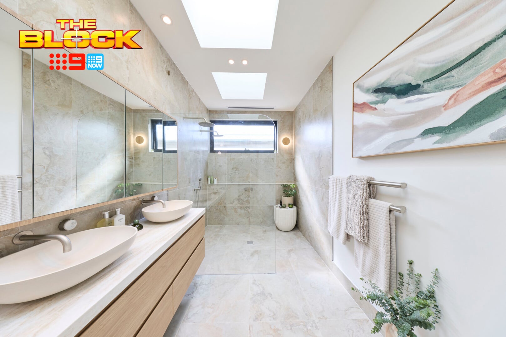
Can I give you permission to not tile your entire bathroom? I said in last week’s recap and I’ll say it again; give a room some negative space. I love leaving a section of plaster wall in a bathroom for an artwork to sit on. It’s also a great way to save on tiling costs and it brings personality to your space.
Outside of their disaster basin, tap and vanity install, it must be acknowledged that Rick and Tayla got functionality mostly right in the other pockets of the room.
We have storage drawers in the vanity (one of my recommended bathroom reno must-do’s). They also included shaving cabinet storage, hand towel hooks, and a larger towel rail. We have a walk-in shower with a ledge (niches are out – ledges are in), and natural light pouring through the skylights above.
I will call out the lack of lighting around the vanity, though. I see two downlights above it and some szechuan dumpling pendants to the left. This isn’t enough to light your face when lathering on Korean skincare products in the hope you can eliminate your fine lines and liver spots. Or is that just me?
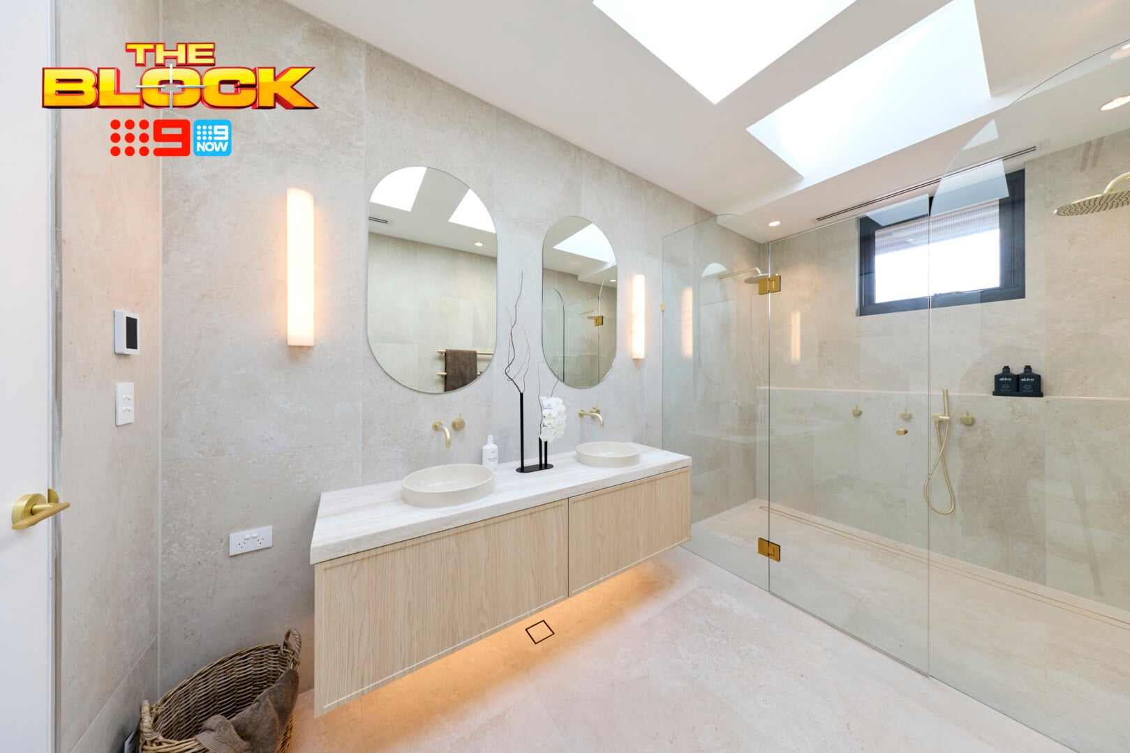
Chantel and Wyatt’s Ensuite Came Second
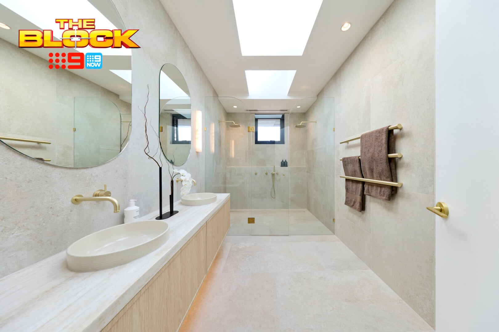
I’d place Chantel and Wyatt’s main ensuite ahead of Rick and Tayla’s. Sure, both teams got one obvious elements wrong (here it’s the lack of shaving cabinets), but overall the material choices and product selections in this bathroom are more harmonious, elevated, and current.
The devil is in the detail. It’s the profile of the vanity drawers that gives the space a little something special. It’s the basins slightly inset in that beautiful neutral finish. It’s the touches of black in the styling that make those dominant black window frames make sense in the space (talk about a vibe killer having a black window in your calm neutral home).
The style of wall lights either side of the mirrors don’t look great in the space, but at least you have some facial illumination. And on the topic of lighting, the LED strip under the floating vanity is a winning addition too. If it turns on automatically when you stumble in mid-way through the night I will lose my mind in the best way possible.
Let’s Talk Double Showers and Views of the Toilet
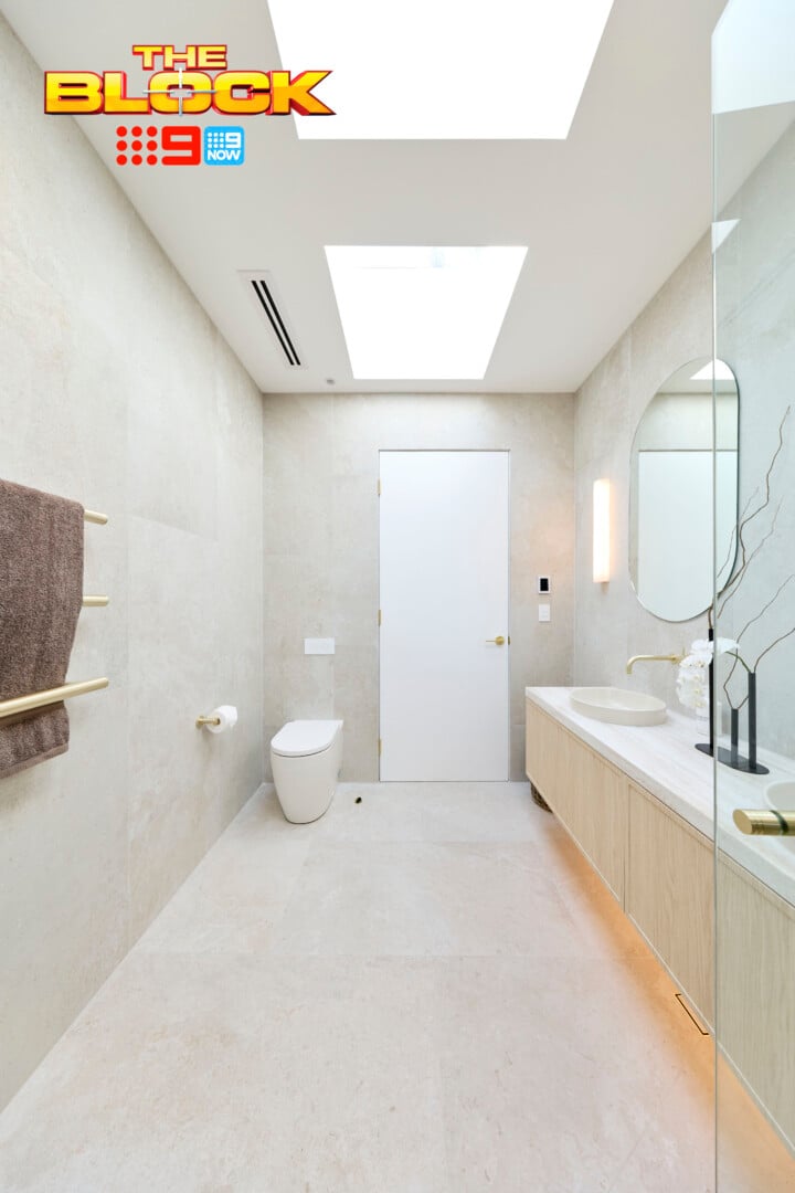
A double shower in a bathroom evokes luxury, for sure. But the clincher is that you need enough room to execute if properly. Chantel and Wyatt got it right, in terms of placing the waterfall shower heads on opposite walls.
Tayla and Rick (scroll up to re-look at theirs) put two heads side by side and it just doesn’t work. There’s not enough space between them. If you and your partner are each under one and become so intertwined that you resemble that Demi Moore creature in The Substance, your shower heads are too close together.
Let’s also think about the view of the loo. A loo-view, as I have decided to call it (it’ll catch on, I’m sure). It’s important to consider all vantage points when designing a bathroom, and in this one the loo-view is pretty boring. Wall lights between the toilet and towel rails would have been great, or leave some plaster wall for an artwork instead.
Other than that, a calm and serene space that does for the first time meet the ‘quiet luxury’ brief.
Courtney and Sev’s Ensuite Came Third
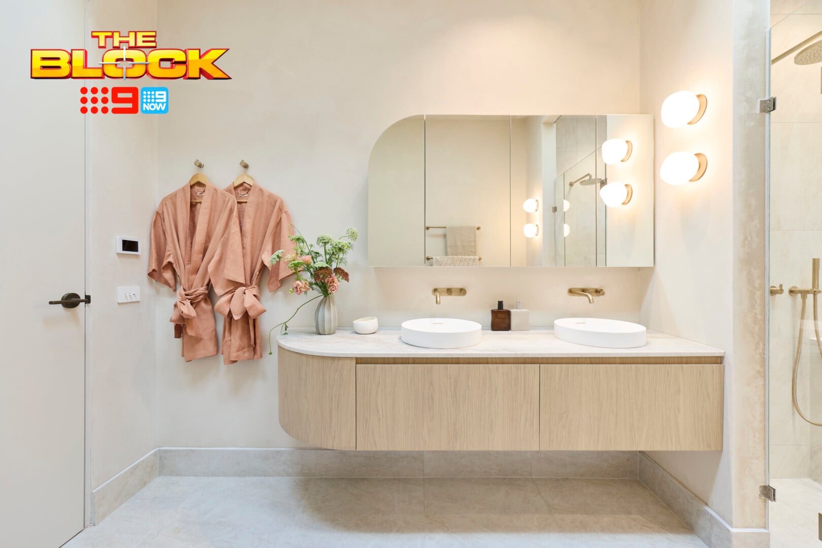
I feel similarly about this main ensuite as I do about the bathroom Courtney and Sev delivered in week two. It’s visually beautiful, but it’s a looks-over-function space, once again. The longer you examine it, and imagine using it, the more the issues present themselves.
Visually, they’ve done rather well. The curved vanity top is sweet, the oak vanity is serene and organic, and the touches of brass deliver on luxe. But look beyond those initial wow moments and you would find using this ensuite a pain in the butt day-to-day.
Firstly, the mirror. No matter which basin you’re standing at, you’ll have a mirror line through your face. If you’re standing on the right, you have two wall lights hitting you in the head – illuminating one side of your face with the other left in darkness. And when you reach for a hand towel, there won’t be one.
I have to assume the mirror on the right doesn’t open, either. I sure hope not, otherwise those wall lights will be more shattered than I was when they rebooted The Real Housewives of New York (Dorinda and Luann STAN here and I won’t apologise for it).
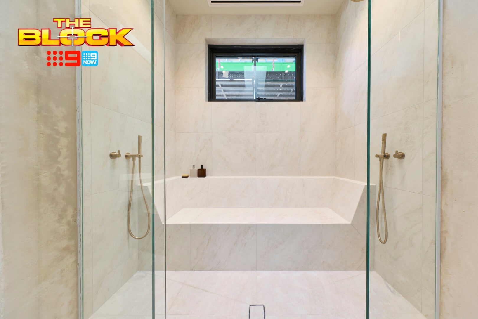
The Shower Zone Needs a Re-Think
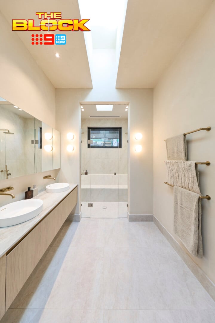
The whole concept of creating a cocooning shower area I love. I said it in the last bathrooms reveal; I want to be Gorilla’s in the Mist. But this one falls short. When you walk into the space, your eye is immediately drawn to a big black window. They’ve really designed a room that calls out this unsightly feature.
Then, when you’re in the shower, you’re on complete display; a contestant on Naked Attraction. The shower screen needs to be reeded glass to truly give this space a sense of separation, of escape. At the moment all you’re doing is walking into your ensuite and seeing your partner down the end sitting on the bench doing the Sharon Stone.
And speaking of the bench, I don’t get it. It’s an oversized tile slab you get to… sit on? Lay out on? I would need major spinal manipulation if I spent more than five minutes lying down on that mass. This is another example of teams on The Block trying to do something new and innovative but it comes across as gimmicky and unusable.
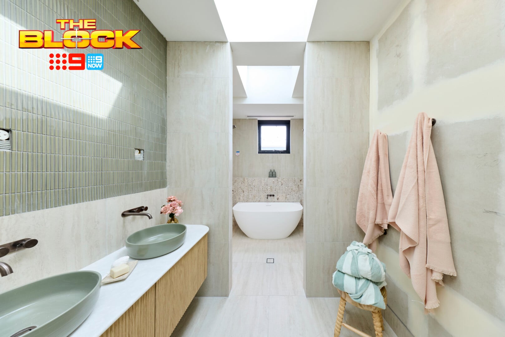
Adam and Jolene’s Ensuite Came Fourth
It’s a little tough to critique an ensuite that’s not finished, but I do want to give Adam and Jolene some credit for their tapware choices as a starting point. The colour of the hardware in this bathroom makes the ugly black window appear more at home in the room. They haven’t asked us to ignore it, they’ve introduced materials that make it less of an eyesore.
Outside of that, I do enjoy the green feature tile. They’re one of two teams to bring feature tiling into their space, so it’s a welcome point of difference. I also see a back-to-wall bath in the shower area, which I love over freestanding. Plus, they’re the only team to include a bath in their ensuite. For us bath takers, this is a huge selling point.
The green basins are a step too far. If you’re aiming for quiet luxury you want colour and pattern to whisper. The green tiles are already doing that. To bring in basins in a similar tone is too much noise. Add in the blush towels and it’s a similar story to their main bedroom last week; too much going on, with a serious edit needed.
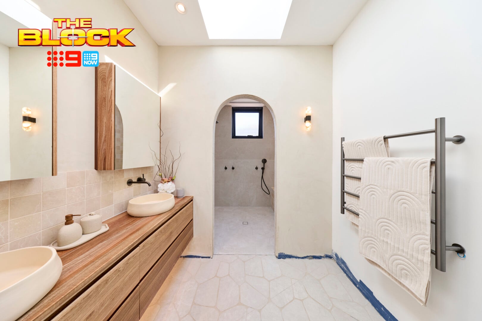
Lisa and Rosco’s Ensuite Came Last
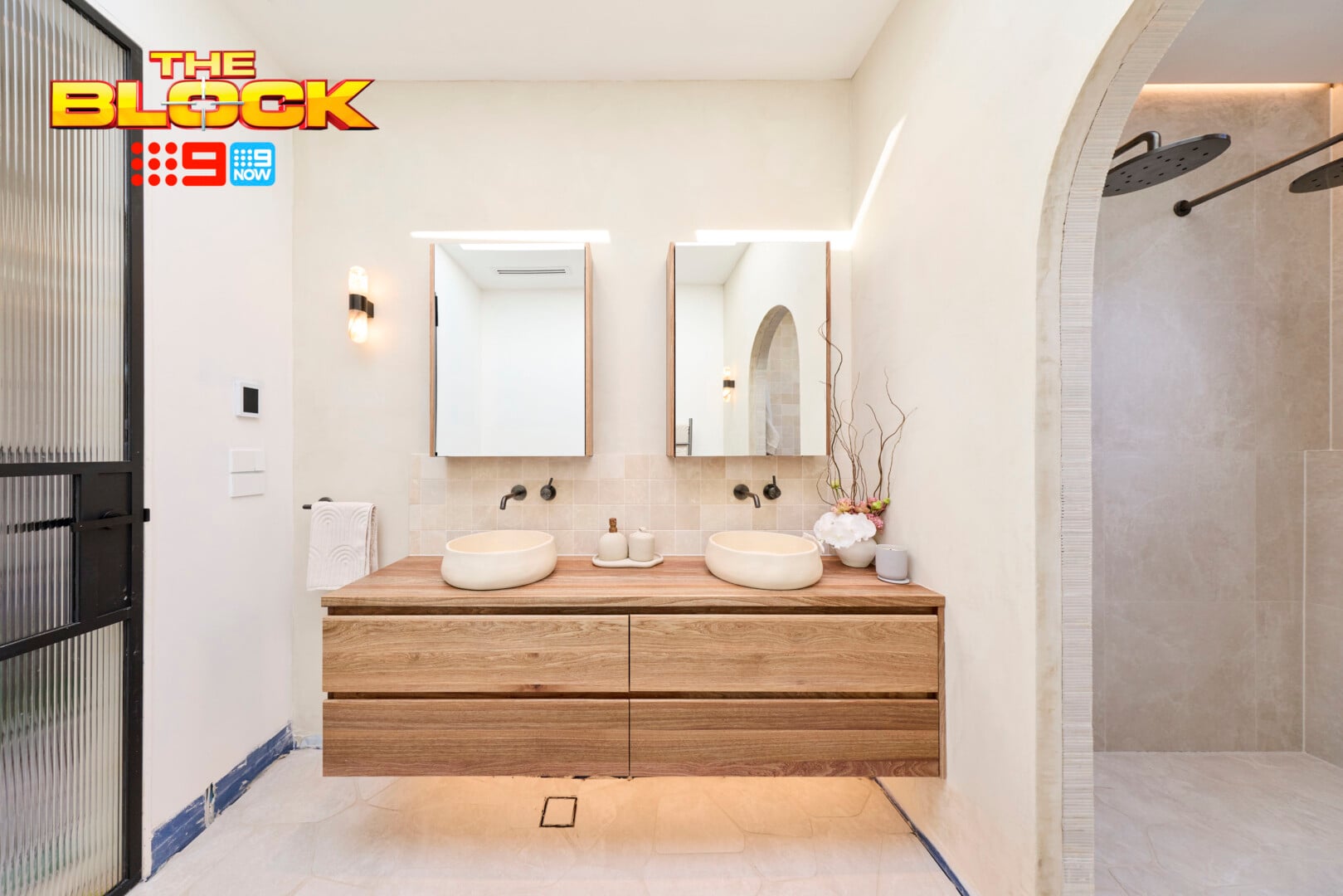
The vanity zone in Lisa and Rosco’s main ensuite feels a little, dare I say it… dated. It’s the combination of that vanity timber, those bowl basins (you know they’re on my list) and the square feature tiles. Stylistically it doesn’t feel very current, and overall it reads a little too warm.
Functionally it ticks all of the boxes, which I appreciate, but it just doesn’t feel very exciting. If I’m dropping millions on a home I don’t want to feel like my main ensuite is one from The Block of seasons’ past.
The one wall light on the left feels like it’s missing its twin, while the wall behind it feels unfinished. I’m not sure if there was painting to be done on it or if that’s the finished product. It’s unfortunately all a bit underwhelming.
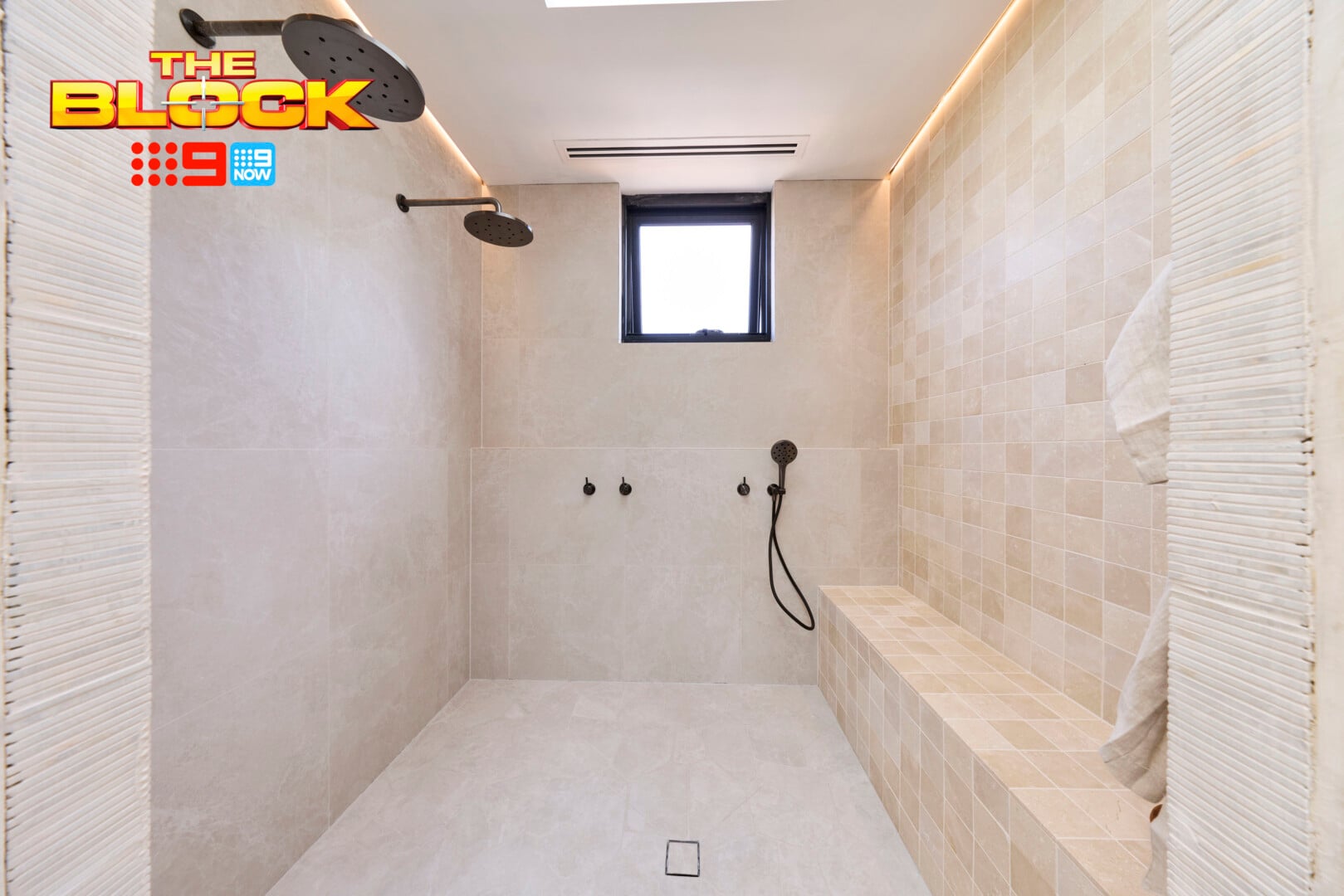
They Made the Same Window Mistake as The Others
The arched doorway into the shower zone almost makes the black window look worse. Not only is it a colour that doesn’t work, the shape also feels more called-out. I understand that the teams didn’t choose the window, but all three of those windows need addressing with some form of covering ASAP.
In Lisa and Rosco’s shower, we have a bench seat that works (hurrah) and a feature tile that also works (hurrah again). Interesting that the feature tile here is the same as the one around the vanity, but in the shower it works so much more because it’s allowed to be the hero. A lesson in letting one thing be the thing!
What I’m not hurrah-ing about though is the need to walk over to the mixer, located almost under the shower head, to turn on the water. I’m cold, I’m wet, I’m regretting dropping millions on this house.
The judges pointed out the chaotic nature of the Flintstones tiles on the floor and I have to agree. It’s very much a yabba-dabba-don’t.
What did you make of The Block 2026 main ensuites reveal? Drop me a comment below and let me know if you have some additional critiques I didn’t capture above.
For more on The Block, or to catch up on episodes you missed, check out Nine Now.

Totally agree with you about all the bathrooms. I think that the bottom 3’s bathrooms resemble what I see at my local Westfield , walking into the sinks/basins & thru a small arch to the loos. While not loving the greens , at least there’s a bit of colour in there.
They really nned to get you on as a guest judge in the next series, or better still, every week!
Shame the black window frames were inflicted on the contestants esp when the judges harp on about the ‘white bright light’ theme. The standard of the work and the functionality and design decisions this season is poor – is it the contestants? the shorter hours available? the ‘quiet luxury’ theme? the understandable fear of the houses not selling? the lack of budget given price increases?
We are building , owner builders so i am a bit daunted by the decisions to make. But i have come to the decision not to use bowls.
Agree with the green bowls, as soon as i saw them..i was no…but love the green tiles.
Again all the rooms are safe.
I dont mind the crazy paving floor but it needed to be the only hero in the room.