
After last week’s disappointing guest bedrooms, I was hoping The Block 2026 family bathrooms reveal was going to give me the sort of joy and rapture I know this series can provide at times. But alas, like watching Ricky Gervais’ Alley Cats, I was left feeling mostly bored, bewildered and unfulfilled (we as a society need to start saying no to Ricky more often).
With two teams not even finishing their bathroom, it’s made for a sad week two of Block judging on my part. But fear not; there’s still a lot to talk about, and I’ve dropped all my truth bombs for you below. I also have a general rant regarding my major concern for this entire season toward the end of the article that I’d like to get your take on too.
Drop me a comment at the end of this post with your thoughts, or hit TLC’s Facebook or Instagram and let me know if you agree with my take or not.
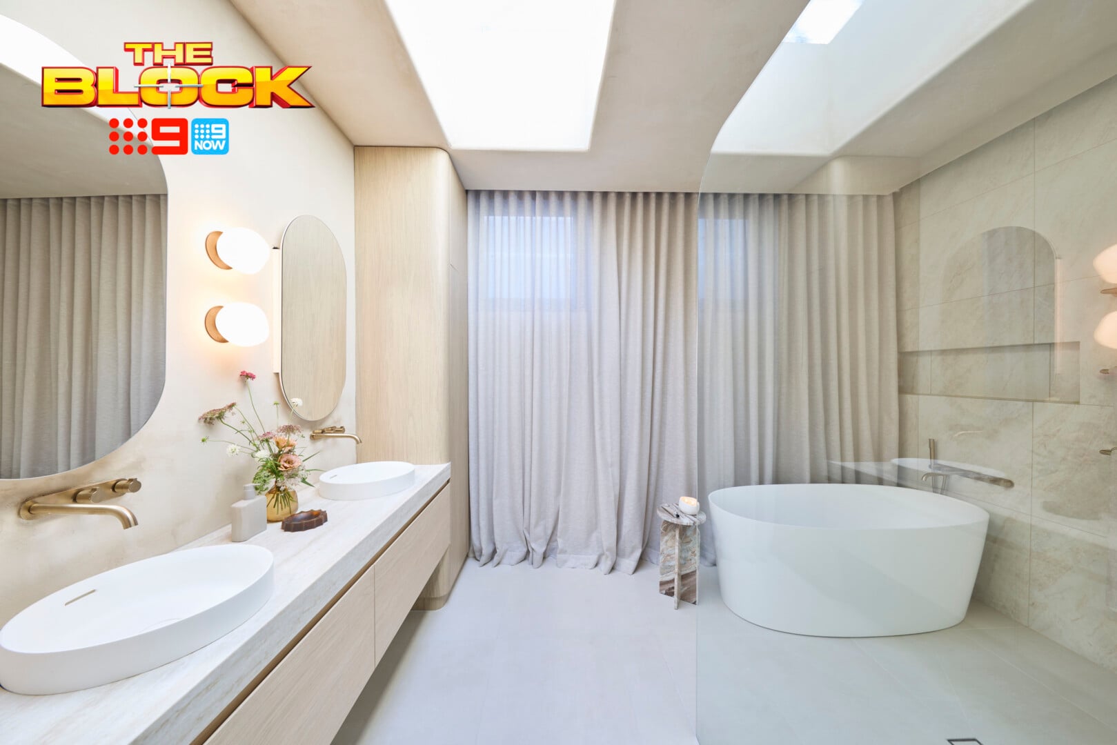
Courtney and Sev’s Family Bathroom Came First
We’ve seen some shocker bathrooms on The Block over the years, but this is not one of them. From a visual perspective (we’ll talk about the functional downfalls further down), it’s pretty delicious and hard to fault.
The colour palette is wonderfully soothing and very considered. The material choices are well-balanced too; the room feels neither too warm or too cool. And the styling – which is often overdone on The Block – is just right. It actually reminds me of Steph and Gian’s bathroom back in 2023; very refined, very effortlessly sophisticated. Loved theirs, love the look of this one.
It’s up there as one of the most impressive-looking bathrooms the series has produced. A big call there, I know. But given this show has revealed salad bowl bathtubs, moss-covered walls, and more brass trim than in Trump’s bunker ballroom, we can all agree that this is a standout space.
We do need to walk about all the practicality issues though…
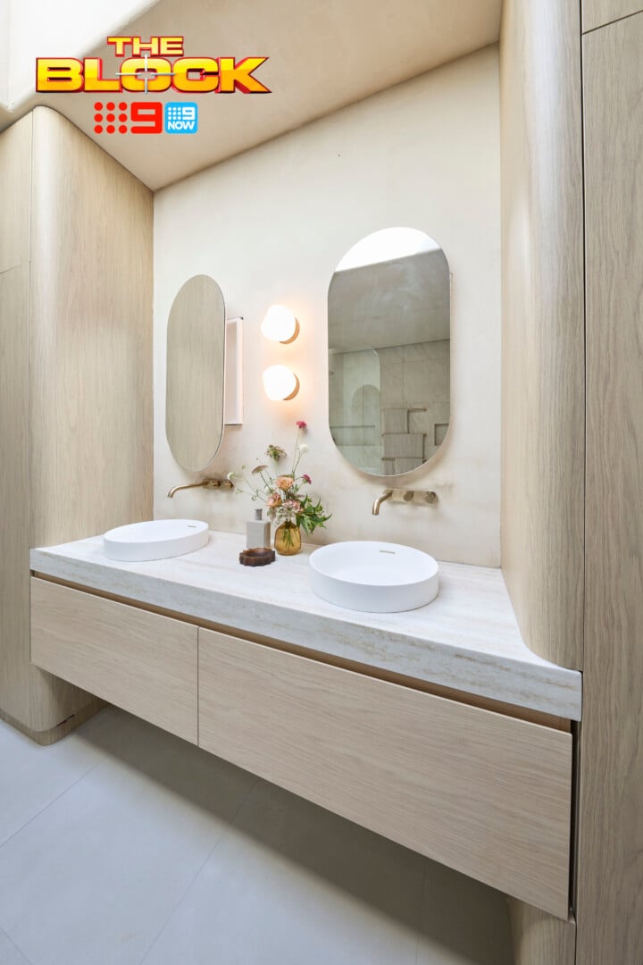
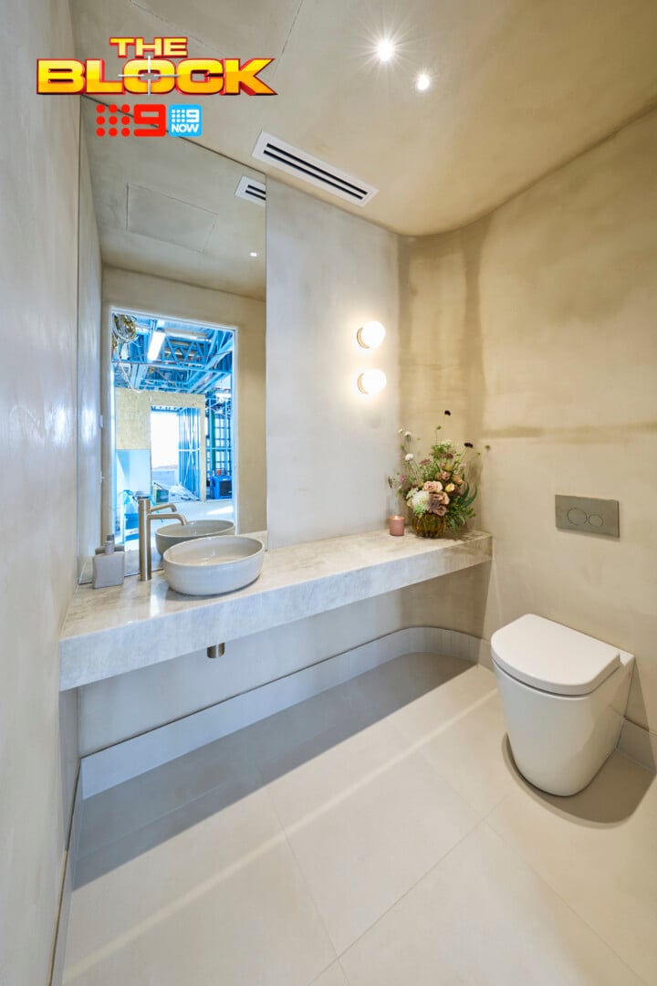
There Were Some Functional Downfalls Here
I’m always a ‘function comes first’ designer. And I’ve often had to sacrifice a stunning idea because it’s just not practical. Here, there were a few of those moments.
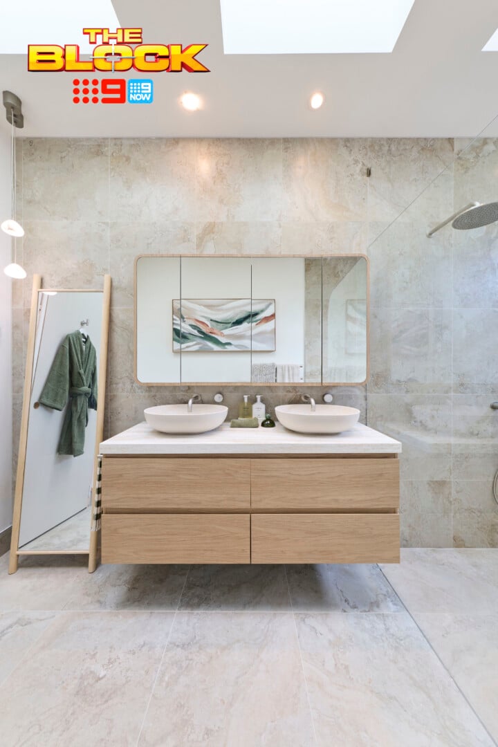
The vanity area is lovely to look at, but no power points in the shaving cabinet was a big miss. Add to that: there are no hand towels, or hooks for them. The usability concerns in this bathroom are beginning to mount. The same goes for their powder room (seen above) – no towels? Seems an obvious error.
I also take issue with the push-to-open cupboard doors either side of the vanity. On a door of that height and weight, the mechanism inside is going to break faster than my willpower during Dry July (it’s red wine, it’s medicinal!). The doors not being opened on camera also leads me to believe something inside isn’t quite right.
The curtains, it goes without saying, are as practical as Pauline Hanson (that’s it, that’s the joke). Imagine trying to mop that floor with that mass of fabric pooling over the tiles. And the splashes of water from kids in the bath; it’s a wet-fabric recipe for disaster I thought the judges would have pointed out.
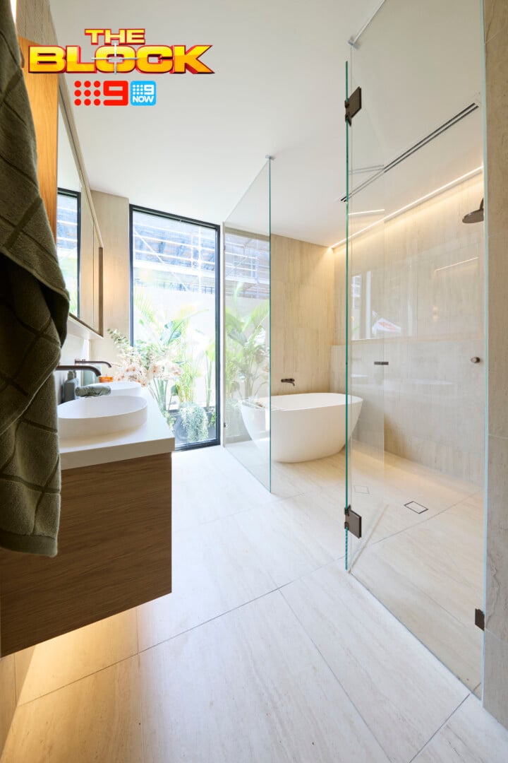
Adam and Jolene’s Family Bathroom Came Second
From a window that didn’t need a curtain to one that desperately does; a blockout roller with a soft sheer over the top would have worked wonders in this bathroom (the sheer just off the floor btw, always and forever!). It would have added a sense of softness that this zone really needs.
If you watched the reveal you’d know that Adam and Jolene made a major blunder in having a powder room right outside this bathroom with no door on it. That’s a level of exposure I wish on nobody. BYO wine when coming over for dinner? Sure. BYO toilet door? I didn’t learn that one at the June Dally-Watkins finishing school for wayward renovators.
Back to the main bathroom, there’s a sense when standing at the vanity that you’ll step back and hit glass, which never feels luxurious. I’d have enclosed the shower, by all means, but left the bath zone open. There’s too much glass in this room, and it gives the vanity area a corridor feel.
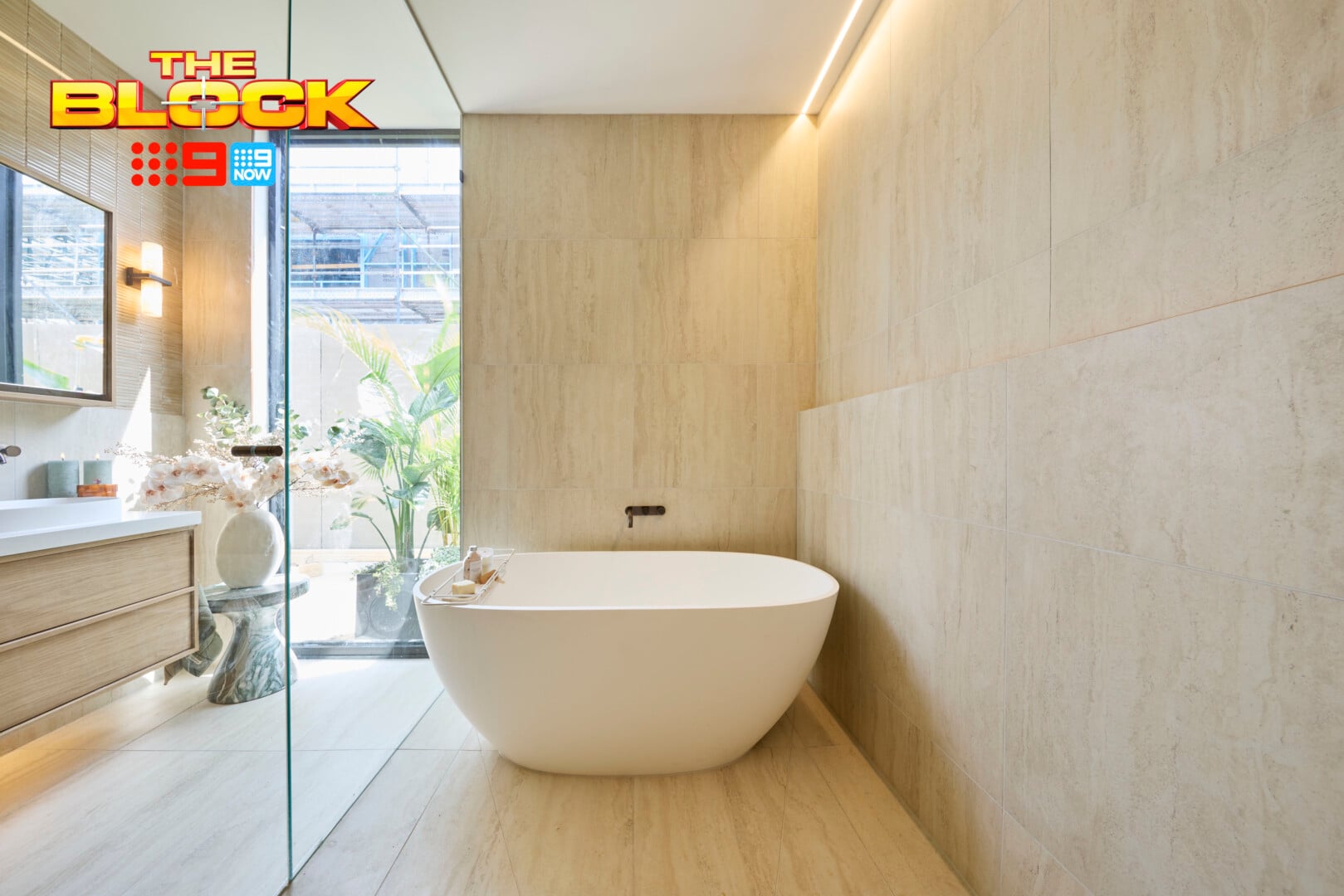
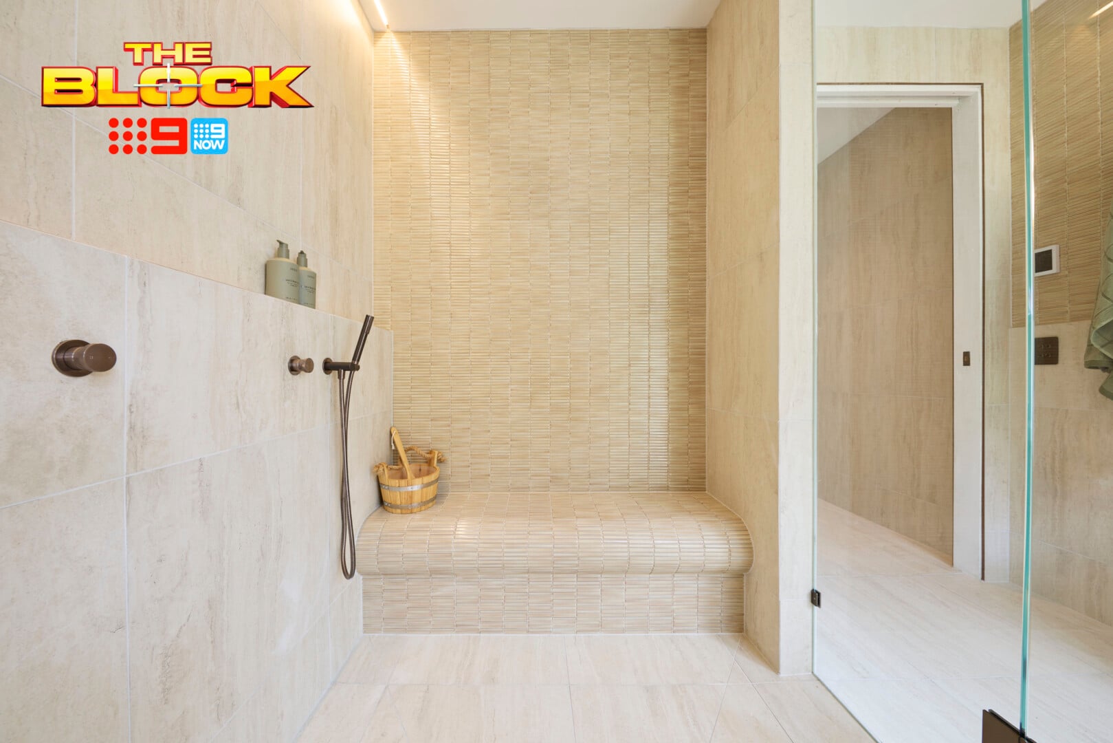
The Shower Seat Is the Moment in This Space
Teams have a tendency to oversize their showers on The Block, leaving them quite open rather than enclosed, which I’ve never fully understood. Who wants to stand in the middle of a giant, cold abyss with no end in sight?
Give me some space, sure, but close me in with four nearby walls. I want a shower so steamy that it’s giving Gorilla’s in the Mist. I want Jane Goodall to wander in and mistake me for Digit the mountain gorilla.
The saving grace of this space is, of course, that stunning shower bench seat. It’s genius, future-proofing bathroom idea and I won’t hear otherwise. Who doesn’t want a bench seat in their shower, especially as we age? If I’m dropping millions on a home, I don’t expect to stand when washing!
That said, if they used less space in their powder room and gave more footprint to the bathroom zone, this shower could have been grander and enclosed, which really is the dream.
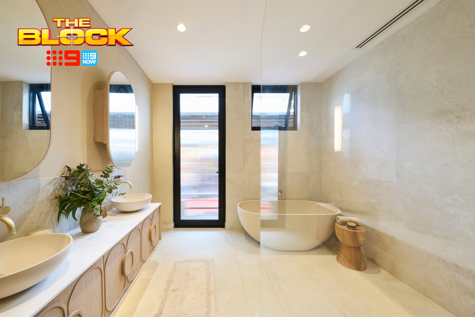
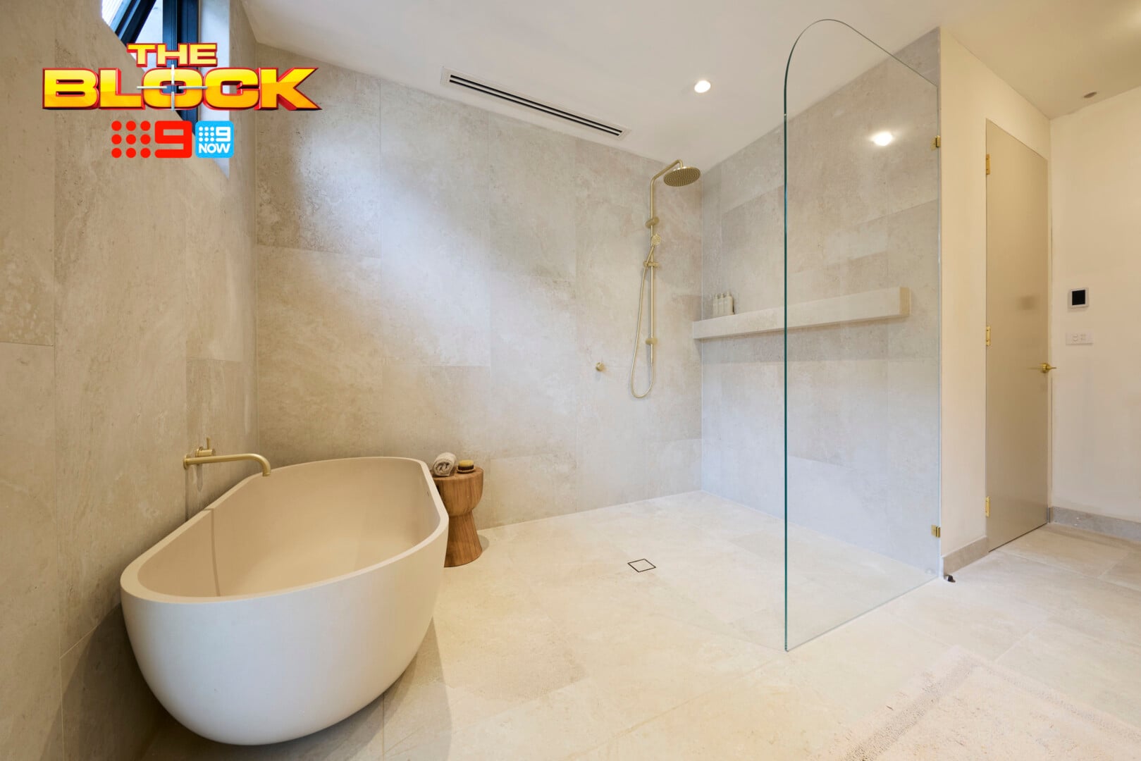
Chantel and Wyatt’s Family Bathroom Came Third
This bathroom got right what the last one got wrong; the bath has been left open rather than blocked in with a glass wall, and the whole space feels far more open and luxurious. I understand there were issues with the finishes in this room, but I feel this was worthy of second placement.
The judges called it boring, but I don’t get that feeling. Plus, didn’t they set the brief? You can’t ask novices to do quiet luxury unless you’ve educated them on what quiet luxury means.
For me, the tile choices are lovely, the lighting selections are divine, and the bath is impressive. Do I want the shower enclosed? Yes. Do I want a soft roman blind over that window and door? Sure. And do we need vertical towel rails on the wall over the bath? We do. But from a material selections perspective, it’s almost as good as Courtney and Sev’s.
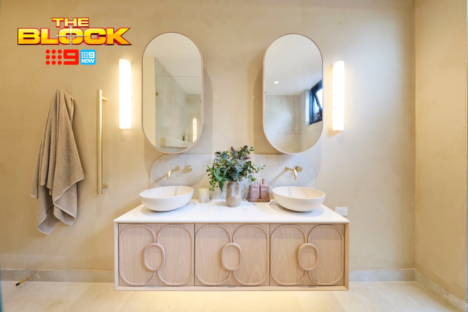
The Room Needs Some Finesse, For Sure
You do get a general sense that this room has been thrown together in a hurry. But again, that is The Block. Play stupid games, win stupid prizes. Material selection was all wonderful, but the install and spatial planning left a bit to be desired.
The vanity above is a prime example. It all feels a touch small for the zone. If that space to the right of it is going to remain completely vacant, why not extend the vanity to give more storage, more vanity-top space, larger mirrors? The light on the left jammed between the towel rail and the shaving cabinet also feels messy.
And those bowl basins. I’m sorry, all makers of bowl basins, but I just don’t enjoy them in bathrooms and I can’t say I ever will. Bathroom basins are best installed inset or sitting slightly above the vanity. Nobody will change my mind on this.
As a final note/question: why a door leading outside? Who gets out of the bath and feels a walk in nature is immediately appropriate? Perhaps an exhibitionist will purchase this one. Though in my experience, those who do let it all hang out are always the one who shouldn’t be. Facts.
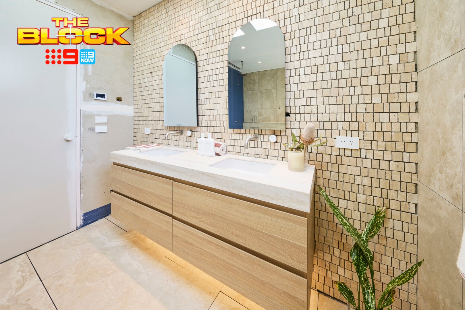
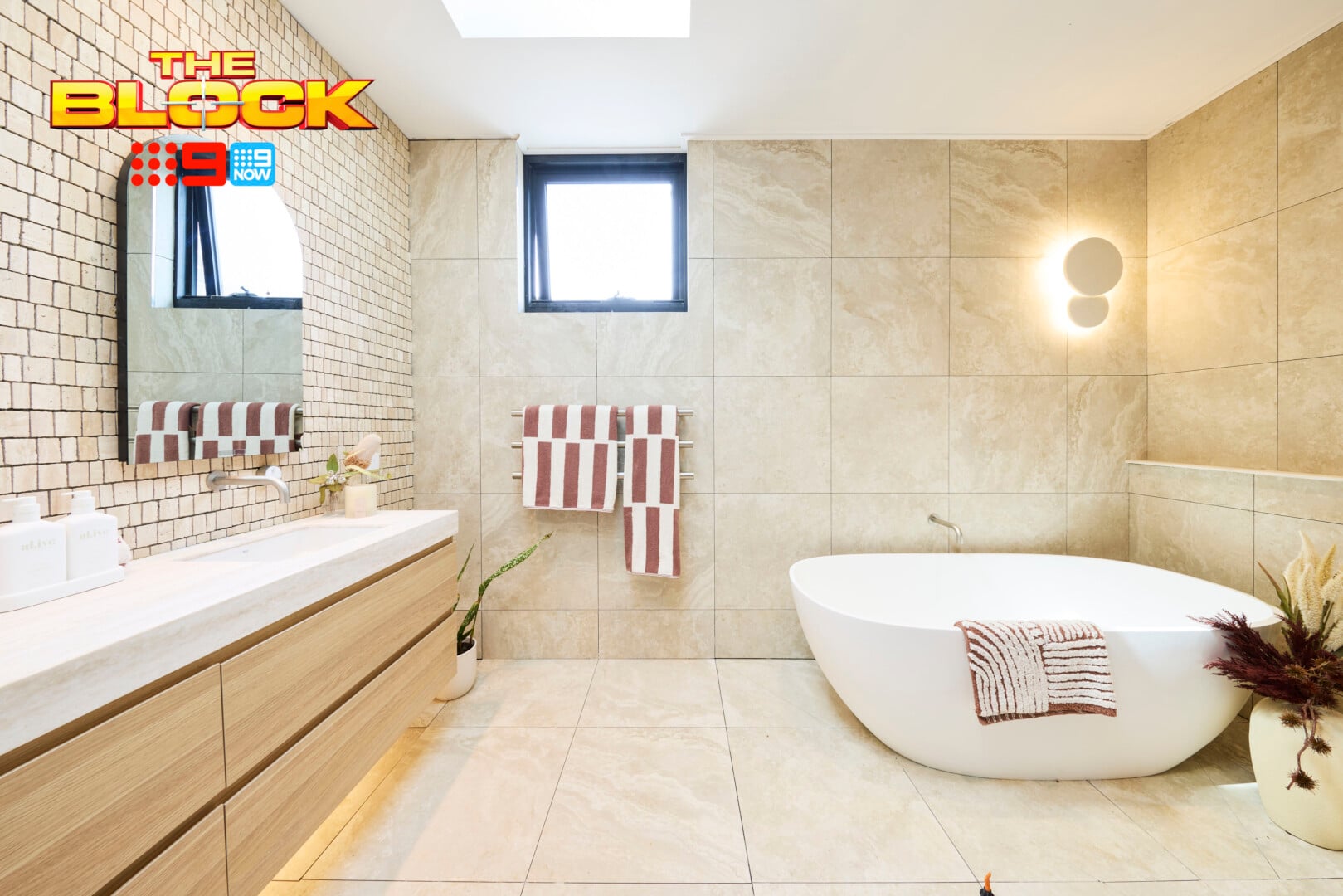
Rick and Tayla’s Family Bathroom Came Fourth
OK, bold statement here, but I have to sit in my truth: those tiles behind the vanity are criminal. I could be interrogated without food for days and then tortured by the military (forced to watch Ed Kavalee’s adverts on repeat), and I still couldn’t be convinced to change my mind. At first glance they look like wallpaper, but the judges confirmed that they are in fact tile.
I’ve often said that there are no bad products, only bad execution, but that theory is really being tested. I could potentially see them on a fireplace surround, maybe. But here, they clash with the other elements in this space terribly. It makes for quite an aggressive-feeling family bathroom. And as the judges pointed out, the zone feels rather generic.
The power points on top of the tile are the finishing touch to push me over the edge. It’s time for a Bex and a lie down. The only positive thing I can say about this room is that the layout is great.
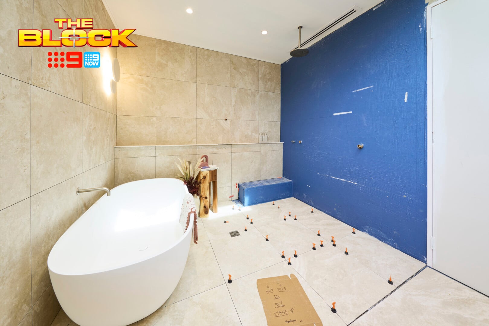
Every Team Gave too Much Space to their Powder Room
Given I don’t have a whole lot more to say about this bathroom, I want to focus on a major blunder I feel all teams made; giving so much footprint to the powder rooms in their homes.
Everyone expects a powder room to be cosy. You’re in there to do one of a few activities. It doesn’t take a lot of room to complete your mission, and all you need is a small basin to wash your hands at. I don’t expect to be able to do pilates in there, nor is it going to be a key selling point in the home (“guests are going to die when they see where they get to pee”).
A successful powder room should be in-keeping with the bathroom beside it, from a material and colour perspective. It should have one standout feature so it has its own personality (a pendant or wall light, for example). But that’s all anyone required expects. There’s no need to over-engineer this at the cost of space in your family bathroom.
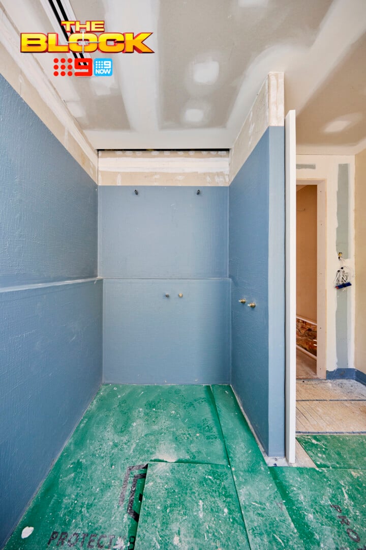
Lisa and Rosco’s Family Bathroom Came Last
As Lisa and Rosco didn’t finish their bathroom, there’s not a whole lot to say about it. I do want to, instead, focus again on the main concern I have for this season.
The ‘quiet luxury’ brief; was this given to them as a directive for every room? Please let me know. I ask because I fear every room is going to be bland and boring from here on in.
I know the interior designer on the show (Sev) will have some tricks up her sleeve, which I’m looking forward to. However, the novices on the show, it seems, have been given no directive on what ‘quiet luxury’ actually means, so where does that leave us as viewers?
I don’t want a beige room reveal every week, with judges telling them that the zones lack personality. I get it; previous seasons have had some dire design choices made. Perhaps, then, if we want to deliver stunning homes that sell, we need people on the show who understand design. Or do a whole session with them – on camera – to educate them and the viewers so we’re all on the same page regarding what’s expected.
That’s my rant and thank you for coming to my Ted Talk.
What are your thoughts on The Block 2026 family bathrooms reveal? Drop me a comment below and sound off.
For more info on The Block and to catch up on episodes you may have missed, jump over to Nine Now.

You mentioned Ted Talk. Could you please provide the link.
I always think you are spot on Chris but let’s be honest, the contestants are novices but are judged as if they were professionals interior designers.
All the bathrooms, bedrooms etc all look the same. Colours are obviously chosen for them as are many features.
The Block has gone down hill and quite frankly boring.
I’m just going to say right now that no family bathroom should ever have curtains, floor length or draping on the floor, it’s just tacky and horrible. Sorry but you asked 🙂
I agree entirely and was really annoyed that the judges made no comment about it. Yet Shayna commented on a dried flower arrangement in another bathroom getting mouldy.
Chris, I hate the curve in Adam & Jolene’s bathroom seat. Can’t believe you love it. Square set would have been more future proof. I also hate that the teams are incorporating so many wall curves & arches. Hate all the beige too. It’s like they’re renovating luxury properties to look like the house my parents bought which was built by Masterton in 1987. Some elements of the past ought to stay in the past.
I feel a bit sorry for the contestants. The houses are already designed (remember demo day?) They are to purchase materials from sponsors and now they have been given the design brief. Basically now all they can do is style (with said sponsors products). If that’s the show then put on interior decorators as contestants and lets see some real skill and learn something. The investment from Channel 9 has gotten too large so now only millionaires can buy these properties, so the limitations on the contestants has had to increase to protect that investment. I think there is scope for 2 shows. One for interior decorating which the Block has now become and one that is affordable housing demo’d and reno’d.
The Block is dying. The layouts are all the same, the styling is now dictated, they have to buy furnishings from the same shops, plus the show gives them less time to actually do the rooms and they can’t always get trades. How boring is it to sit there on a primetime Sunday night and watch only 2 fully completed bathrooms, one underdone and two not finished. And all the same colour palette.
The quiet luxury theme is a joke. I would not in my right mind buy a property designed and built by the Block, defects everywhere, mistakes by professional tradies and stock standard ugly fittings. I’ve had zero inspiration from the Block since Steph and Gian were on. Give me Restoration Australia and Grand Designs any day. No more the Block for me!
Totally agree with you on all these bathrooms- the beige is so bland , it’s becoming the “Millennial Grey” of 2026. Where do I put all my bottles of lotions & potions ? On the floor? Please give me practical bathrooms not too fancy to use.
I really hated that “feature wall” in Rick and Tayla’s bathroom. They looked like shingles that go on a roof.
I predict that their house will not sell.
Wow…i missed reveals, but from the photos its so beige. The curtains are crazy..no way.
Also the windows? Why not sure glass blocks, that would be interesting.
Your dead right about getting some education or teaching session on styles.