
The Block 2026 main bedrooms reveal continued the ‘quiet luxury’ brief the teams were given in episode one. Sadly, while some rooms were definitely quiet, many of them missed the mark when it came to addressing luxury.
Now, we all have a different idea of what luxury means. In my world of design it means quality materials, a sense of harmony, proper spatial planning, and most importantly; that every functional need is met. In a luxury room you want for nothing. I am left wanting, it must be said.
Some rooms were indeed pretty delicious, but overall I’m still feeling underwhelmed by this season’s brief. I’ve not been this let down by a brief since Calvin Klein used Justin Bieber as its ambassador (elder millennial here – it’s Marky Mark or it’s no-one!).
Let’s dive into week three’s main bedrooms reveal below, and as always – drop me a comment at the end of the post, on Facebook here, or on Instagram here to let me know what you thought.
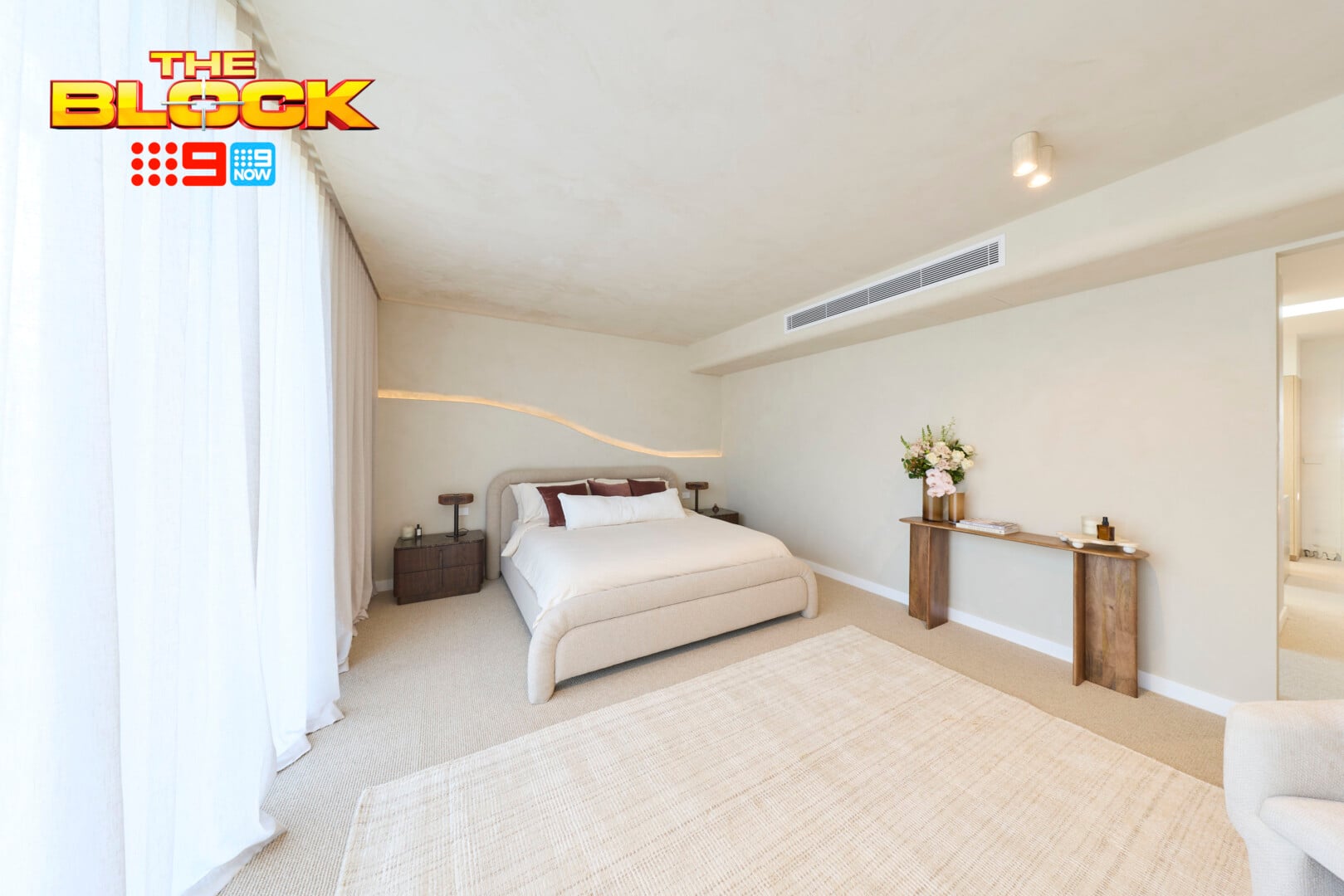
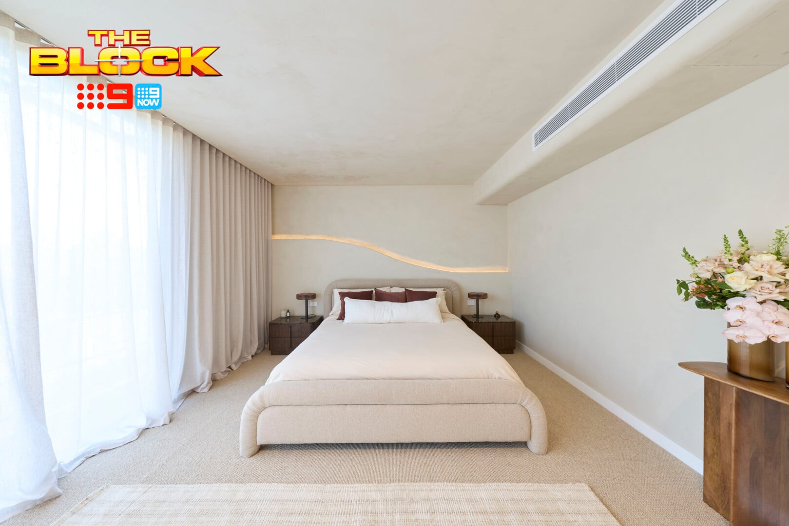
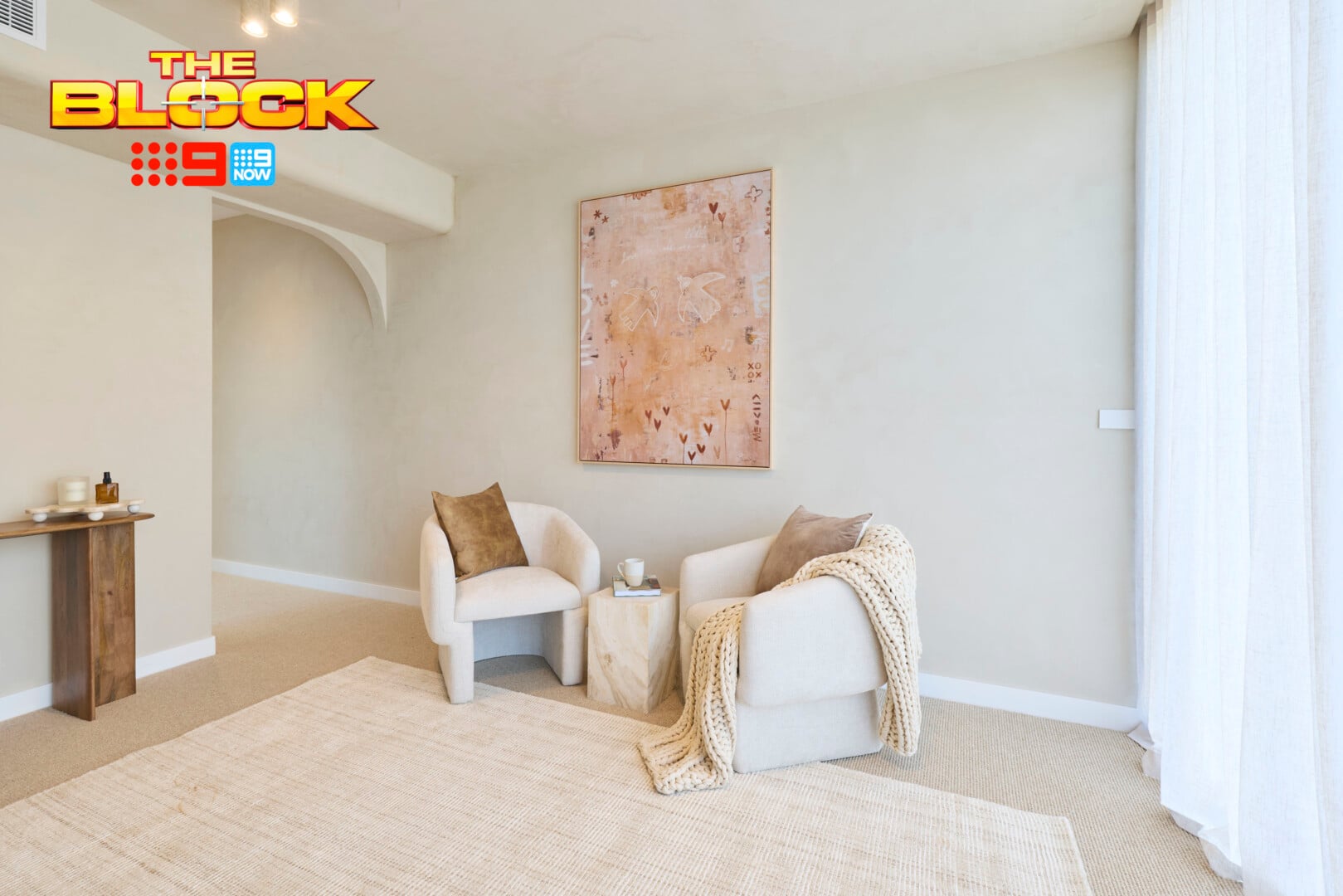
Lisa and Rosco’s Main Bedroom Came First
Given everything else delivered this week, Lisa and Rosco’s main bedroom deserved the win. It’s not without fault, but the overall feel is the best version of quiet luxury of the five.
I’m quite taken by the paint effect on the walls, carried up over the bulkhead and onto the ceiling. It’s created such calm. The wall/light feature they executed behind the bed is actually quite impressive too. It’s one of those moments on The Block where an experiment worked, rather than feeling shoved in for the sake of wanting to be different.
I’m also praising the furniture gods that we have some darker timbers on display. ‘Quiet’ doesn’t mean white, and this space proves it. The lamps on the bedside don’t feel appropriate, though. They’re a little ‘home office’ more than main bedroom. A minimal, spherical light would have worked nicely here.
A reminder: curtains should sit just off the floor or gently kiss it. These ones aren’t merely kissing. They’re going for it like Sharon and Mark after fiddling down at Molly Blooms on Kath & Kim. It’s a PDA I don’t want to see.
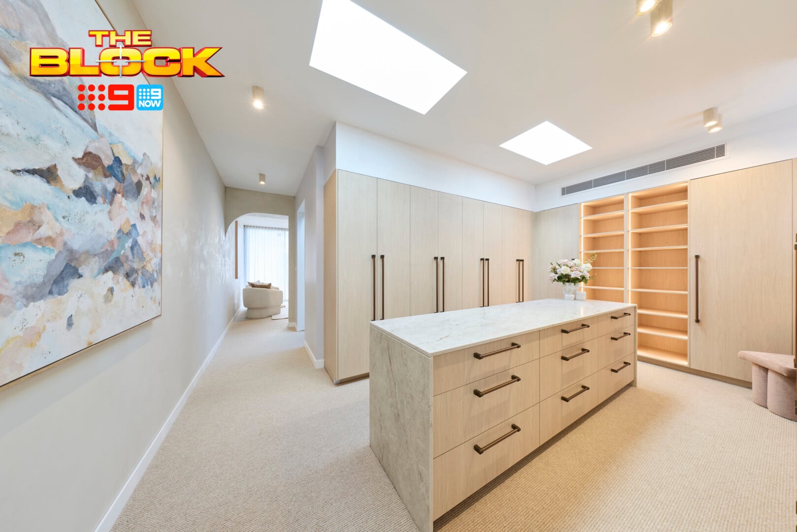
The Walk-in-Robe Was Almost There
We do a lot of walk-in-robe designs for clients and it’s such a personal approach. Some clients want all-drawers, others double hanging, some a huge vanity area, others a bench seat to put shoes on. So, I appreciate that designing for a buyer you don’t know can be challenging.
This robe ticked almost all the boxes though, from a functionality perspective. You know my saying: function comes first. They were pretty successful in that respect. It also presented really well as you move from the entry to the zone down to the bedroom (the arch down the end of the hall was a little unnecessary though, if I’m being picky).
Material choices are pretty stellar. Those handles, the joinery finish and the stone are all beautiful. On the negatives, I’d just hope those shelves are adjustable as you’d want to display larger items like handbags in there too, surely. I would appreciate a chair with a back on it at the vanity zone, and where is my full length mirror?
Chantel and Wyatt’s Main Bedroom Tied for Second
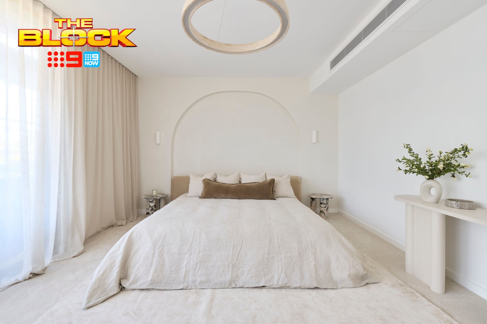
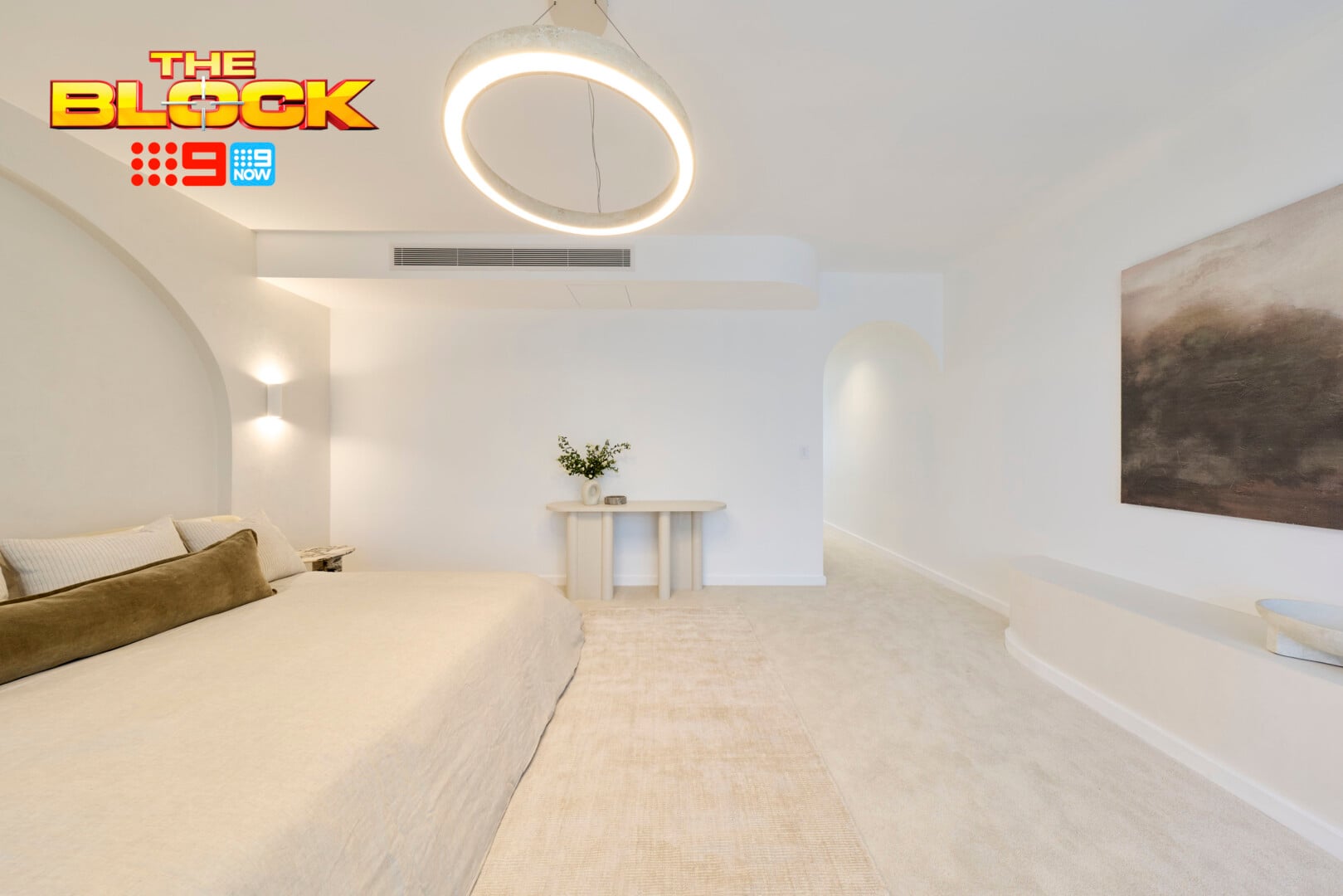
Like Nicole Kidman’s accent in every recent project, this main bedroom needs more work. I see they’ve shot for ‘quiet luxury’ but missed the mark. Quiet, sure. Luxury, not exactly. I appreciate the darker tones coming through – as I did in the winning bedroom – but they aren’t enough to save this space.
The arched recess behind the bed feels unfinished, with wall lights set too high and bedside tables that are in fact, not bedside tables. This is a main bedroom in a multi-million dollar home and I don’t have a drawer? In a guest bedroom I could look past it, but not in the primary suite.
The console table with nothing above it is an issue. The same happened in the winning room. Like Nicole Kidman’s wig in every recent project, it looks unfinished. A mirror would have resolved this wall, reflecting the softness of the curtains across from it.
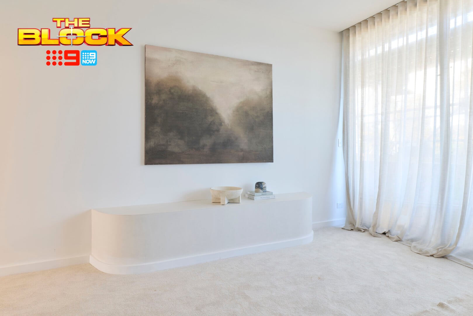
Lastly, a rug the same colour as the carpet is unnecessary, as is that very strange curved platform across from the bed (seen below). The only function I see for this is a Jamie Lee Curtis moment in True Lies. If you know you know.
The Walk-in-Robe Was a Touch Underwhelming
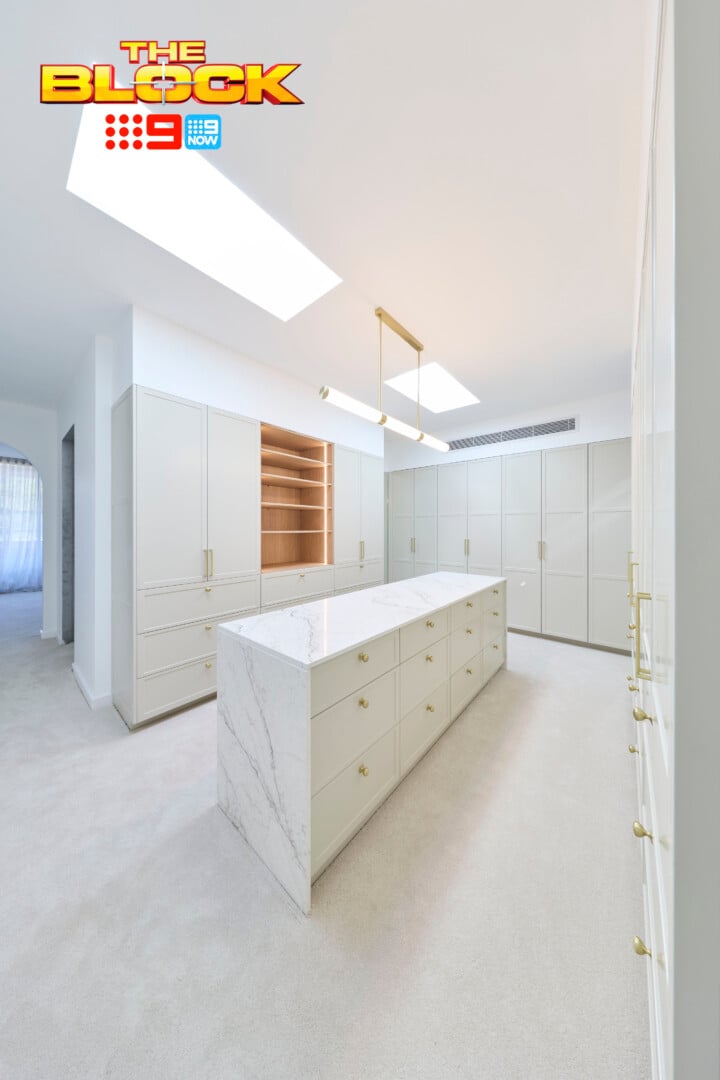
Chantel and Wyatt at least included a full-length mirror in their zone, which seems on obvious miss in the winning WIR. That’s the main functional point I award them. But a robe of this size with no vanity area, no seat, and minimal open shelving; it’s leaving a lot to be desired.
The zone feels visually busy. A lot of doors and drawers, the mass of shaker profiles, and a tonne of brass handles all make this area feel a chaotic, not calm. There’s too much going on. I’d have really appreciate a visual break in each run of joinery. Move the full-length mirror to a more central area, build in a bench seat, or give me a vanity zone.
The material choices are successful, don’t get me wrong, but they haven’t been giving any negative space around them to shine (I wrote about the importance of negative space in a room here). Careful consideration during the design process – and carving out some variation of material – would have helped a lot.
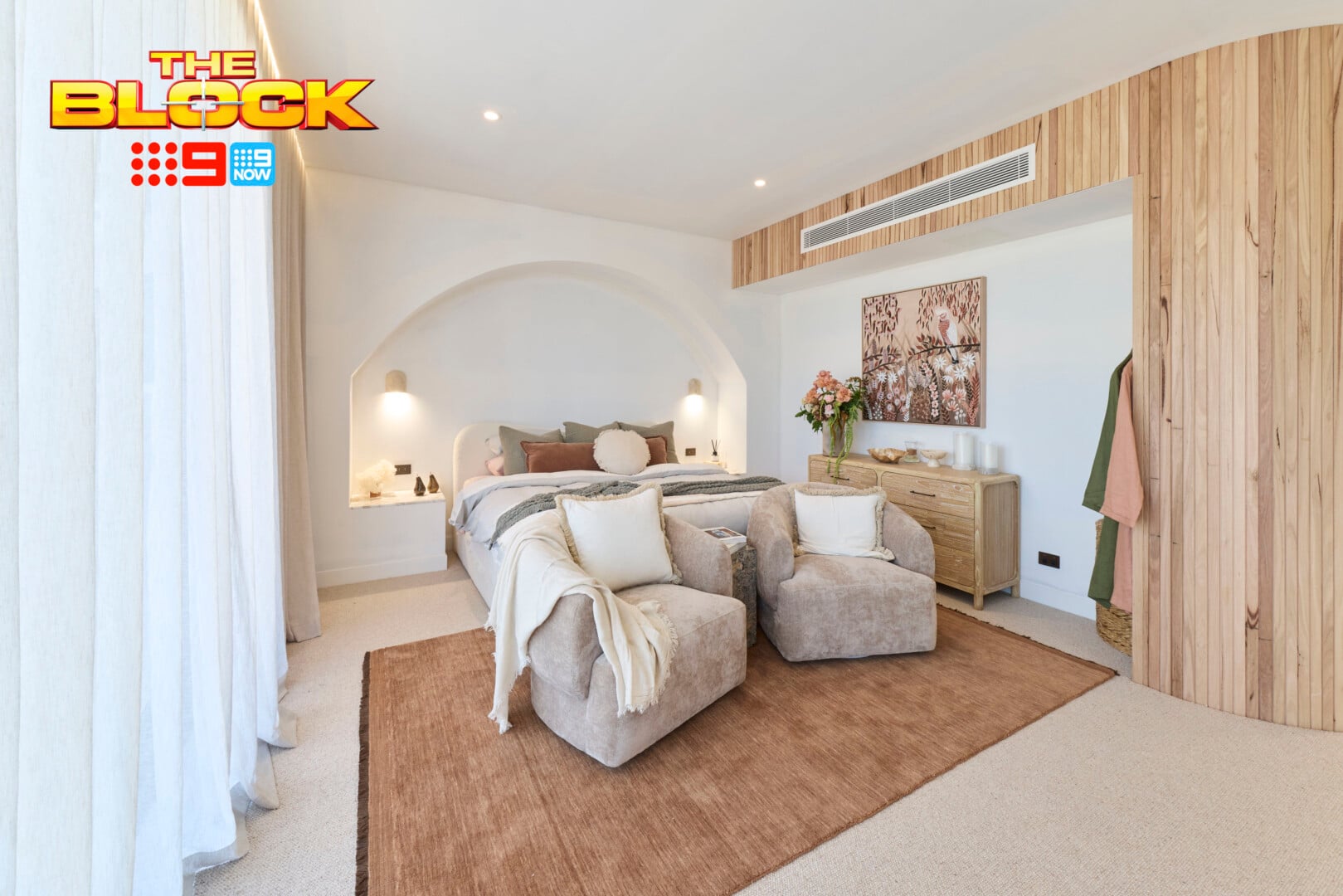
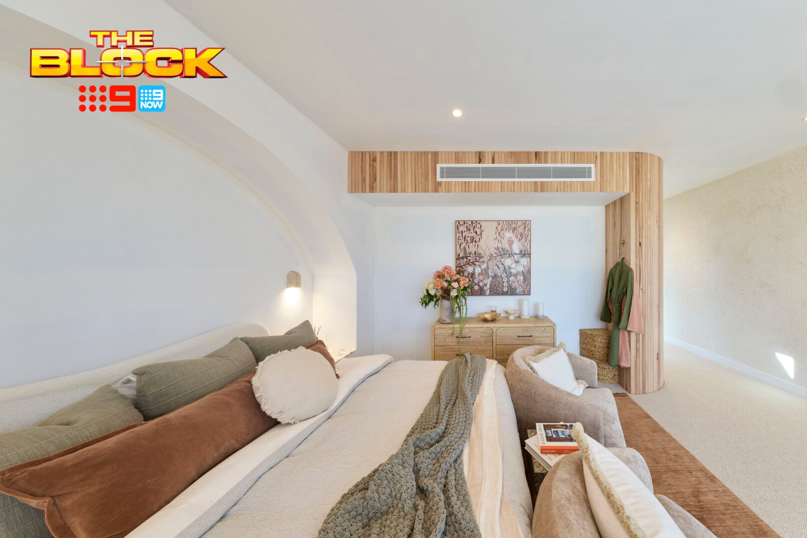
Adam and Jolene’s Main Bedroom Tied for Second
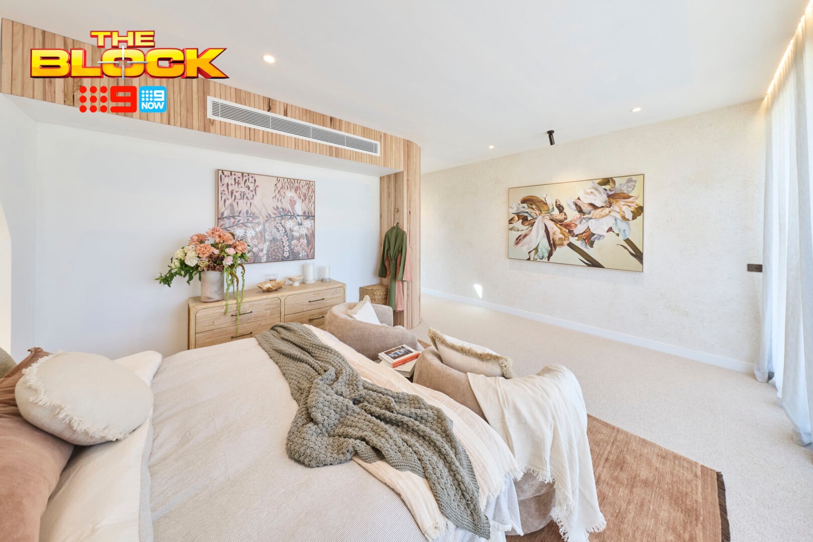
Adam and Jolene’s bedroom has a lot going on, and provides a great opportunity to learn how rooms can go bonkers if you don’t keep an eye on your editing.
There’s simply too many ideas at play in the one room. Too much colour, texture, shape. Some of these ideas are nice, on their own, but together they feel stressful, not soothing. I feel the same way about this room as I do the men on Sister Wives; just choose one option!
The curve wall is a nice idea. But the timber on it, crossing over the bulkhead; it’s a lot. Then more rustic timber comes in with the lowboy. Then more rustic material with the laundry basket (what the!?). Then the artwork is too similar in colour to the panelling. That wall in particular is quite aggressive and needs less things on it. The whole room needs a serious undress.
The cut-out around the bed I admire, but it’s completely lost. You don’t even get time to appreciate it because so many other elements are screaming for your attention. I’d strip out the orange in this room altogether. Just the neutrals and sage green would have been enough to answer the ‘quiet luxury’ brief.
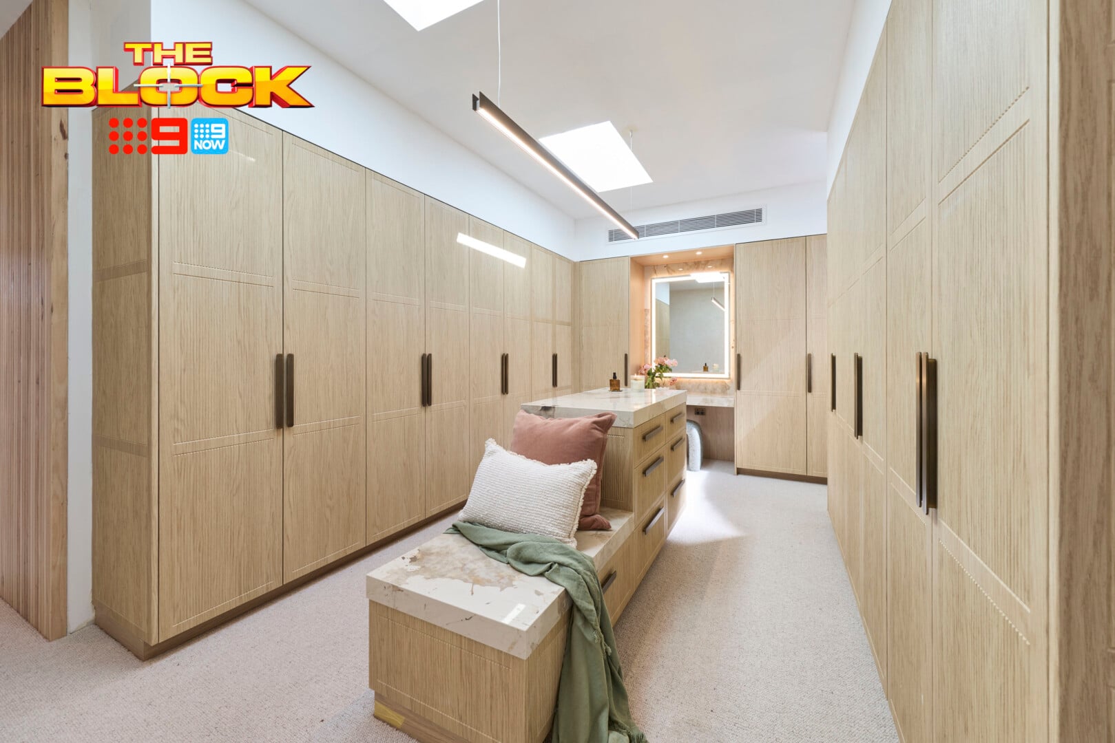
The Walk-in-Robe Needs Some Work
Adam and Jolene’s walk-in-robe got a few things right. The vanity area nicely breaks up all of that tall joinery, with an ample mirror and ottoman included. I also enjoy the material choices. However, I don’t see a full-length mirror unless there’s one on the back of a door, which would be a right nightmare day-to-day.
The central counter also confuses me. Well, the bench seat does, if we can call it that. If it’s a bench seat, it needs a custom seat cushion created for it. No amount of throw blanket drapery is going to distract me from the fact that I have to sit on cold stone to put shoes on.
I would have made that section one consistent countertop height. You have a seat by the vanity if you need it. I can’t say this was a strong week for Adam and Jolene. The bedroom in particular needs a lot of work.
Rick and Tayla’s Main Bedroom Came Fourth
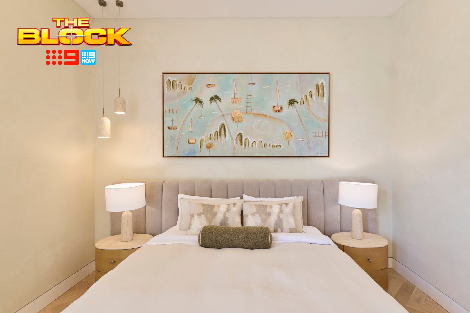
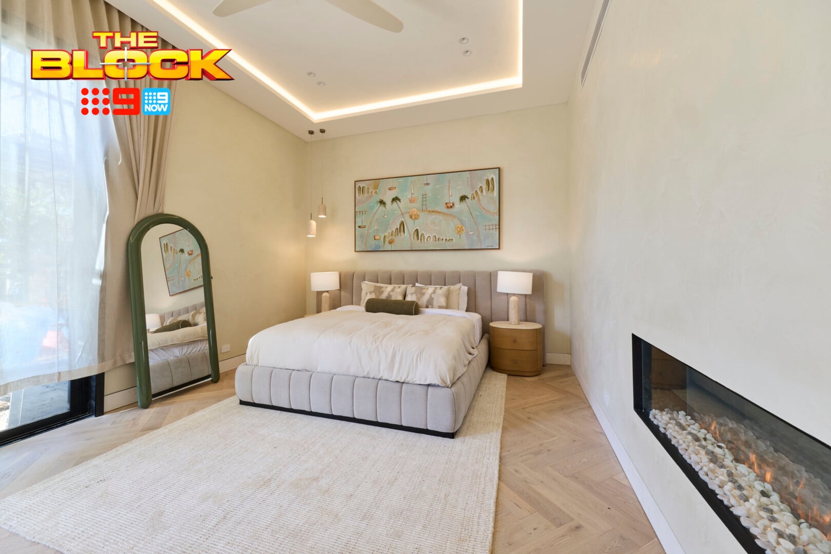
There’s such a sense of confusion in Rick and Tayla’s main bedroom design. It feels like there’s no direction at all. There’s not one consistent theme, nor an over-arching approach to furnishing. It’s just a lot of random things thrown together in a hurry. And honestly, none of it works.
The bed and bedsides are saying ‘traditional’, but the artwork and mirror are saying modern and playful. The wonky table lamps are one thing, but then why do we have pendant lights in the corner as well? Like Robert Irwin hosting the Logies, this is a decision I do not understand.
The short curtains, the rug oriented the wrong way, the fireplace that doesn’t really belong because there’s nothing around it; as I said, just random decisions executed without thought. This is such a disappointing room.
The Walk-in-Robe Was Also Disappointing
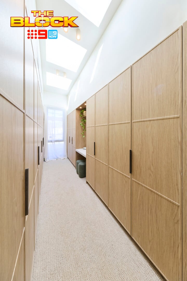
This team, along with Courtney and Sev, definitely drew the short straw when it came to the orientation of their walk-in-robes. The gauntlet feel here is never something you want, but I appreciate they probably found the constraints hard to work within.
There are ways to make a zone like this feel less like that hallway in Willy Wonka where things gradually get smaller. The answer is to not make the walls either side feel too heavy and to give some visual breaks as you move through.
They gave us one visual break with the vanity zone, but it’s not enough. We needed less door fronts, some more open storage. A section on the left with cubes, or a lovely open shelving moment to display things, would give us some variation in texture and still feel functional.
This robe feels oppressive when it should feel open.
Courtney and Sev’s Main Bedroom Came Last
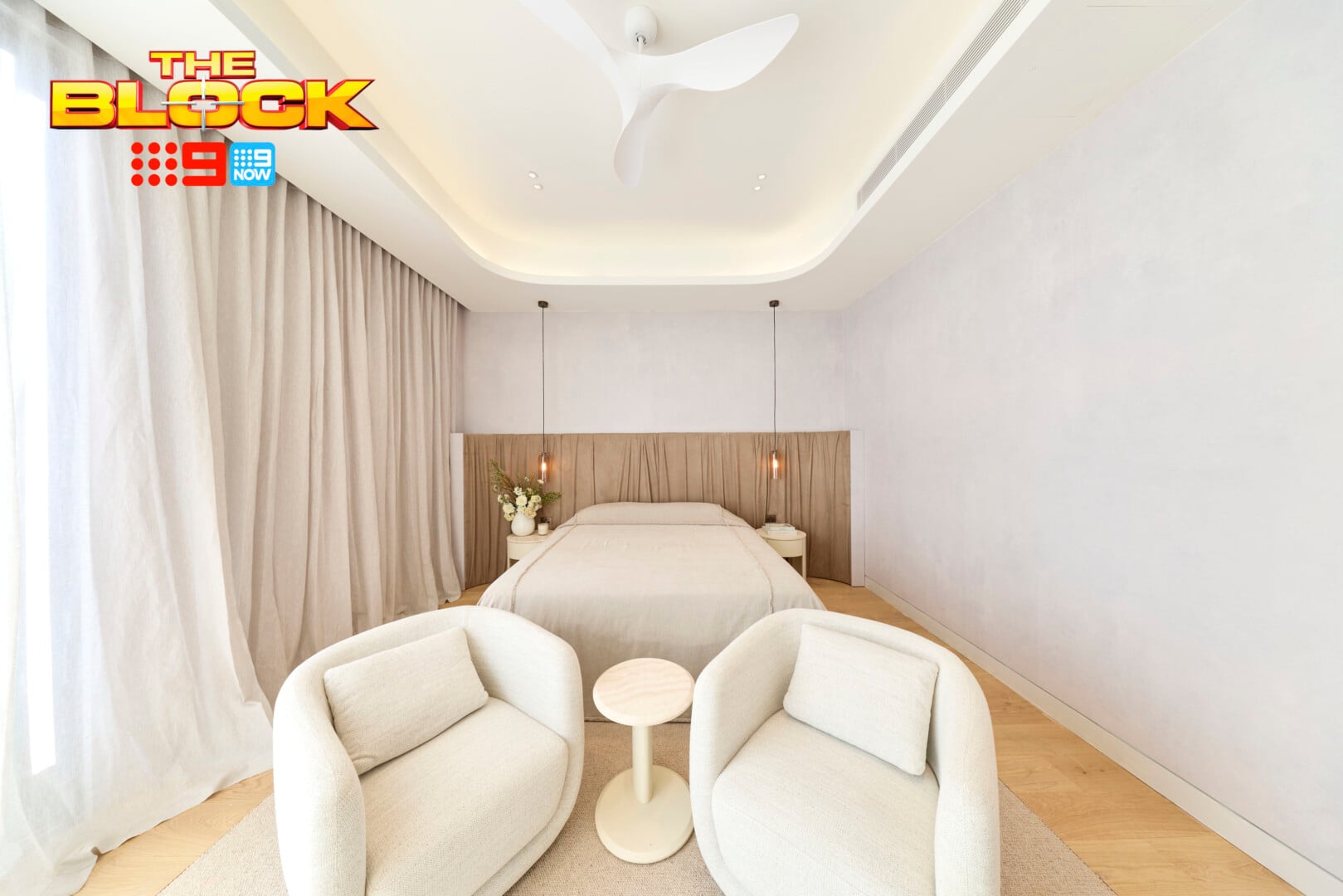
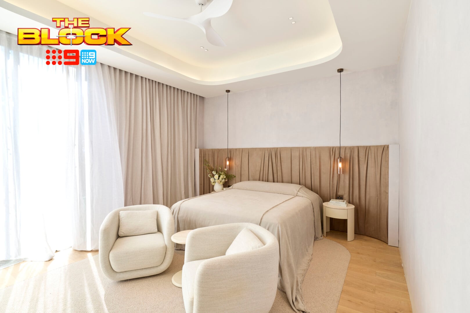
I thought I was harsh for declaring this room a Byron Bay sound bath where someone bangs a gong over your body while aligning your root chakra. But then Shaynna went and called it a place where someone is laid to rest and now I feel like my truth bombs are pretty light-on.
There’s so much drapery in here that it feels like they went wild at Spotlight’s EOFY sale. The netball skirt headboard has made a unfortunate return, too. After hearing Shaynna’s remarks, the only thing I can picture is the headboard parting in the centre, the bed being reversed into the crematorium, and the curtains shutting behind it.
All jokes aside, this is a pretty underwhelming room. They’ve essentially repeated everything from the guest bedroom and just added some curves to it. Those pooling curtains on the floor, once again, are a no. They’d give Roomba the vacuum night terrors. You could never let it loose alone in the room without adult supervision.
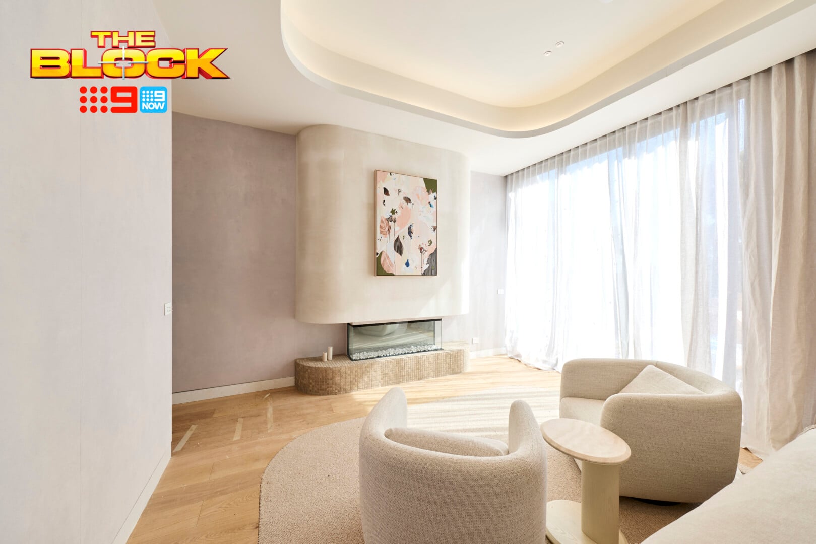
The entire section across from the bed (seen below) is rather unattractive, too. It looks like a plastered-over rangehood sitting on top of a dwarfed fireplace sitting on top of pool tiles. The artwork they choose to put over the top is doing the area no favours either. I’m baffled.
Things Didn’t Get Better in the Walk-in-Robe
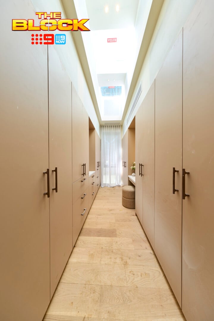
A lot of my comments about Rick and Tayla’s robe apply here, although at least we have an additional section cut out on the left side as you walk down the hallway. That said, I would have moved it closer to the entry into the zone, so the two walls either side didn’t feel like they were closing in on you.
The hard flooring was a bad decision. The zone already feels pokey and imposing. Introducing no softness just makes matters worse. I also take issue with the cabinetry colour. I like caramel but not on my doors. Even if I allow for a personal preference moment there, from a design perspective we need some balance/contrast on the floor. They need carpet in here, stat.
There’s something quite cheap about this scene. I’m keen to see how next week’s ensuites turn out!
What did you make of The Block 2026 main bedrooms reveal? Drop me a comment below and let me know if you have some additional critiques I didn’t capture above.
For more on The Block, or to catch up on episodes you missed, check out Nine Now.

Laughing so hard at your crematorium comment. Even a crematorium has a bit more design details than most of these rooms. Quiet luxury needs something other than beige. At least Adam & Jolene attempted to add some colour to the room.
I don’t bother watching the show, I just read your honest comments about it.
WOW! I don’t know where to start… but I know where to end… AWFUL, just awful! A treasure trove of embarrassment. Every room is bland and boring with no flair, no design creativity, nothing to commend ANY of those boring as bat shit bedrooms. Luxury? None to be seen. So beige on beige is luxury? Not in my universe. The Block continues to be an absolute insult to REAL designers. But those rooms deepened the grave. I can’t even bear to look at such tragic use of time and money. No wonder the houses aren’t selling. You’d need to get a REAL designer in there. Ghastly rooms, every one of them.
I agree with all your comments on the rooms except for that tacky wavy lit feature behind the bedhead in the winning room. I don’t understand it at all or what it is for. It’s not executed very well and is very wonky and rough. There is nothing “luxe” about it at all and looks like it should be in a kids room.