So it was quite a gigantic week this week on The Block as The Blocktagon terrace reveals went down and the couples got the chance to re-do their failed rooms.
It was such a bumper week, in fact, that I’ve had to split out the posts into two seperate articles!
This post will look over the terrace reveals and there’s another post up now on the re-do rooms.
Want to know more about The Block? Read our ultimate guide to every season!
Click here to visit the post on the re-do rooms.
Let’s take a look at this week’s terrace reveals. I agree with the judges this week, although I saw a few issues with almost all of the terraces. I also wasn’t particularly wowed by any of them. Remember last year’s terraces – particularly Dea & Darren’s and Max & Karstan? Now they were breathtaking!
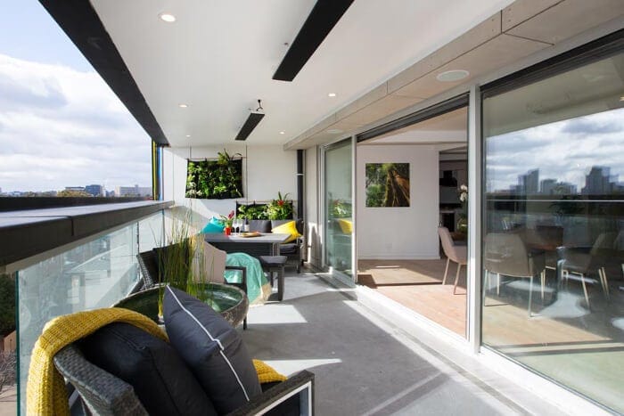
Shay and Dean’s Winning Terrace Reveal
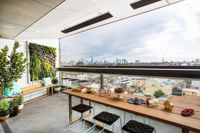
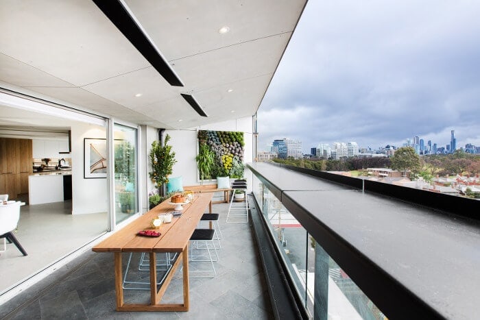
Let me start by saying that I adore the vertical garden. I think in a long, narrow space like this, it’s a genius move. It also links the outdoor area to the kitchen, which featured a vertical garden too.
I love the warm wood tones they used here and I think the aesthetic matches the rest of the house nicely (even if they did, once again, load their table up with too many accessories), and I think the pops of teal are a really nice idea to liven up the subdued palette.
What I didn’t like was their choice to put a long table here. I think with a terrace that’s so close to a dining room (and another table you could easily sit at), it’s unnecessary to have a second spot to dine at. I also don’t think it looks particularly comfortable. I think some lounge chairs would have been a better choice here.
Total Score: 28.5
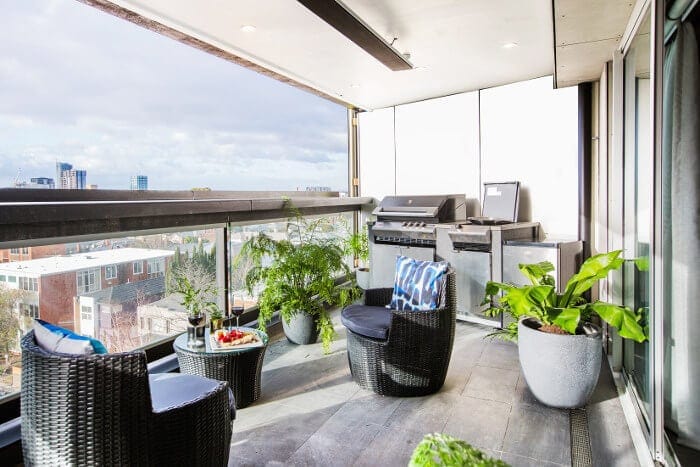
Kingi and Caro’s Second-Place Terrace Reveal
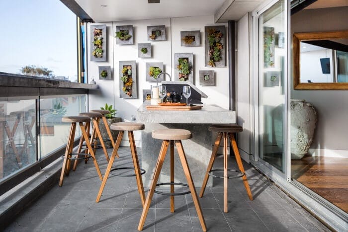
On the whole I quite liked this terrace. I think they did perfectly what Shay and Dean failed to do, and that was to create an area you could chill out and relax in with friends. It was also zoned really nicely and have you two distinct areas to play in.
This space feels informal in all the right ways and the muted colour palette ties in nicely with the base colours they’ve used in the rest of the apartment.
I will say that the end of the terrace that features the lounge seat was a little odd in that the TV was placed above it. What purpose does that serve the people sitting beneath it? I understand you could watch it from the barbeque area, but if that’s the case the TV needed to be miles bigger.
Total Score: 27
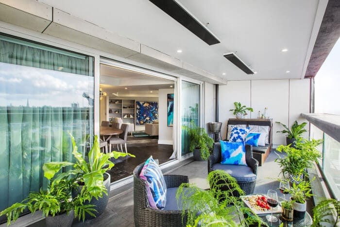
Luke and Ebony’s Third-Place Terrace Reveal
I’ve been loving what Luke and Ebony have been doing the last few weeks. Loved the living room, thought their dining room should have won and loved their re-do room. But this space was muddled, confused and a little whacky.
What I do like is the colour palette. Again, tied in really well to the rest of the house (all the teams are nailing cohesion here), but apart from that I don’t like anything else they’ve done.
I think the duo of chairs looking out beside the barbeque feels old and dated, and doesn’t cater for entertaining with guests whatsoever. I also think the large daybed with the random drinks bucket feels completely cheap and pedestrian. There are also waaaay too many random plants here – just plonked down wherever.
Total Score: 24
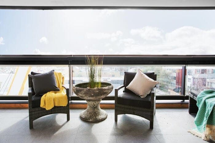
Whitney and Andy’s Third-Place Terrace Reveal
I’m not quite sure how I feel about Andy and Whitney’s terrace. They tied this week with Luke and Ebony although I’d argue that their space is better (but not by much).
It feels a little unfinished and unpolished to me, and I don’t think it ties in well with the rest of the home. They tried to zone off different areas but didn’t do it well. It all feels a bit bare and barren. What’s with the stone water feature plonked between two chairs (and where do you rest your drink after a long day)? Not sure why they’re facing away from the view, either.
I think their vertical garden felt a bit sloppy, too, and I thought their outdoor furniture felt old and dated as well. Sorry guys.
Total Score: 24
Suzi and Vonny’s Last-Place Terrace Reveal
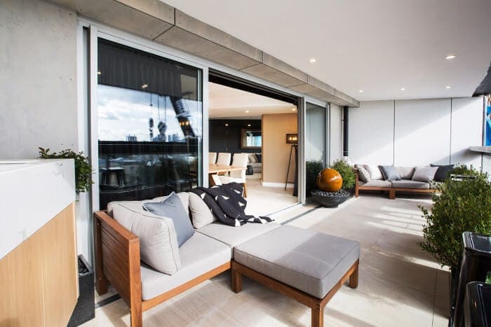
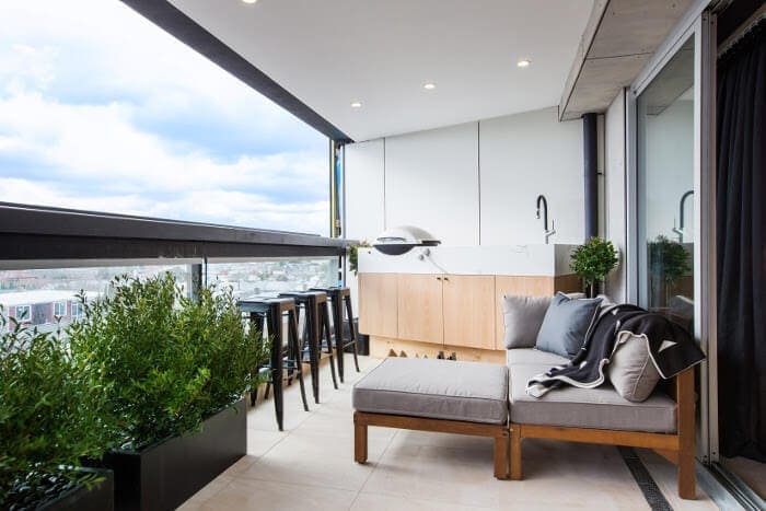
I’m not sure what happened with the barbeque cabinetry here, but it is so high that a snag could roll over the edge of the balcony and kill someone driving below.
This whole space makes me feel a bit sad. The layout is bad, the two zones are miles apart and have nothing linking them together (an outdoor floor rug could have helped here). It just doesn’t feel like a space you want to go out and sit in.
I was also not a fan of the giant orange ball water feature. It feels quite gawdy and old-fashioned to me. They also placed shrubs against the glass, which would mean they’d grow over time and block your view. Some very odd choices were made here.
Total Score: 21
>>> What did you think of this week’s terrace reveals? Drop a comment below and let’s talk it out.
CLICK HERE to visit the re-do rooms post and see before and after shots.



I would like to know the vertical garden system dean and shay used
Hi. Do you know the name of the 3d boxes vertical garden kingi and caro used on their terrace
I think the weird shapes of all these rooms has let down the entire series. No one room in this series that I totally love. Agreed, not nearly as good as last year, but they did have better spaces to work with.
Yeah that’s true Eva. I wonder if viewers are just a bit Blocked out by too many series running back to back.
I agree that this season has not been as good as other seasons, which surprises me because I read that the producers were moving away from tradies towards designers to get more exciting spaces.
Most weeks I have only liked one room and some weeks I haven’t liked any rooms. I particularly hate the cheap, hipster knick knack feel of a lot of the shelving and furniture. Does not scream high end.
I laughed when the girls said that their apartment was so high end that they thought a dr might buy it. Drs are normal people with families, friends and hobbies just like everybody else. They are no more likely than anyone else to want to live in a gentleman’s club with a bar fridge in the living room!
Oh I hear ya Justine – that gentleman’s bar in the living room was such a wacky idea. I have no idea what they were thinking! Overall I ended up like a lot of Luke and Ebony’s space the most I think.
I really liked your reviews and agreed with pretty much all – except I would have placed Andy and Whitney lower just because of the VERY cheap looking accessories. Wouldn’t the planters in Suzi and Vonni’s terrace be subject to the same code as the worktop – they are climbable and thus dangerous – remove them and it would improve the area greatly anyway!
I know right, Fee. Weird that the BBQ was subject to those rules but nothing else?