
The Block 2026 guest bedrooms reveal marks the return of my Honest Block Recaps. I’m stocked up on Bex, have a place to lie down, and I’m ready to drop my weekly truth bombs. The first one, which you’d have to agree with, is that we are off to a pretty dismal start.
In a ‘Should have gone to Specsavers’ moment, I could barely tell some the rooms apart. There was only one that stood out from the crowd. Sadly though, it stood out for all the wrong reasons. We will dissect this in greater detail below.
Let’s get stuck into week one’s guest bedroom reveal recap below. And as always, drop me a comment at the end of the post to let me know if you agree with my take or not.
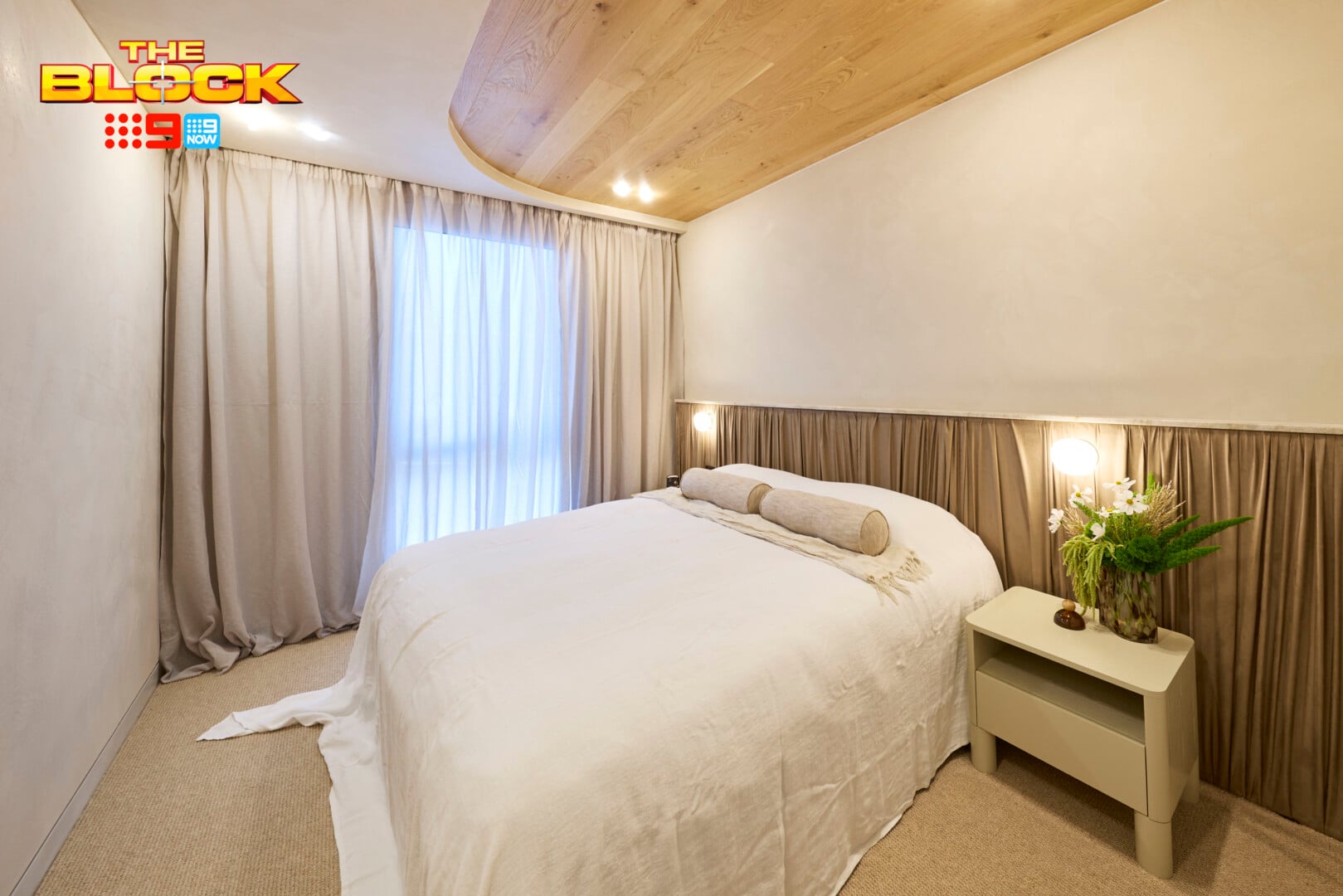
Courtney and Sev’s Guest Bedroom Came First
The love song dedicated I give to this room is Lionel Richie’s Dancing on the Ceiling. As in, why are the floorboards up there and not underfoot? Hard flooring applied to the ceiling in a curved formation is the first design choice I can’t make sense of.
If they wanted it to create a focal point, that I can understand (every room needs one). However, your eyes can’t focus on it because they’re distracted by the room’s second moment of criminal activity: the pleated netball skirt stuck to the wall behind the bed.
Nobody will convince me that this is genius design. It’s bunched in some sections, stretched in others, and the power point over the bedside table (seen below) has created a situation of colossal puckering that would haunt me in my dreams. Imagine how filthy that fabric would get. It’s a no from me.
Lastly, the curtains. You know how I feel about curtains pooling on the floor. Currently working through this with my therapist, but we’re making no progress. Still hate it, refuse to change, can’t be helped.
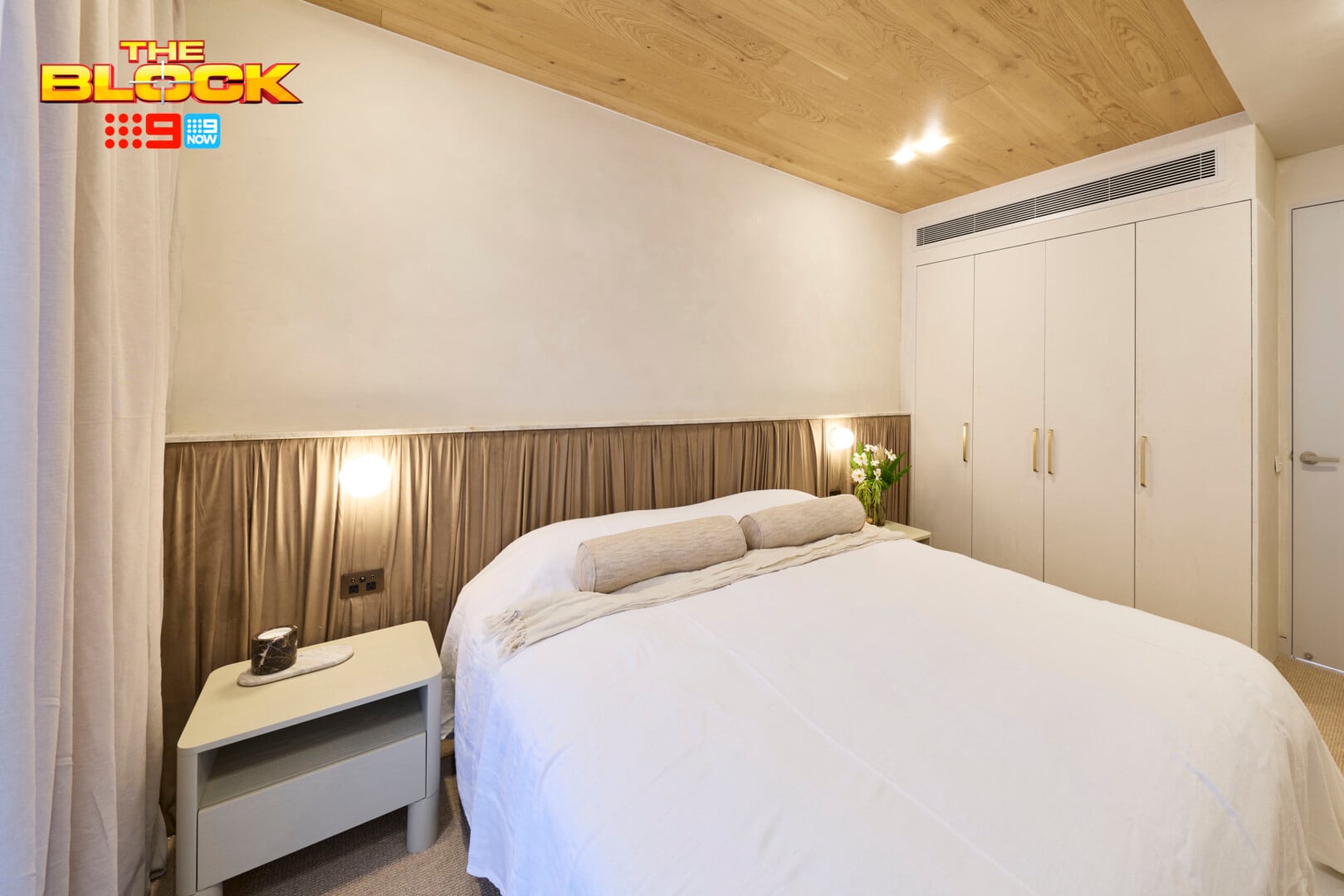
There Are Some Positives In This Room
You know me; I’m all about credit where credit is due, and I do want to give them some props for trying something out of the box. It does require some design bravery to take a gamble like this in week one. A swing and a miss, sure, but you’re always better to go over the top and be asked to pull back than to deliver bland.
The colour palette is rather soothing in this space, and that works well. There’s a nice medley of neutrals at play, which evokes a lovely sense of calm and invites you in. Compared to the other rooms this one did a good job on the colour front.
I also like the effect on the walls. I can’t tell if it’s wallpaper or a limewash-adjacent application, but either way it keeps the walls from feeling flat and lifeless. The restrained bed styling was also smart considering so much was going on elsewhere.
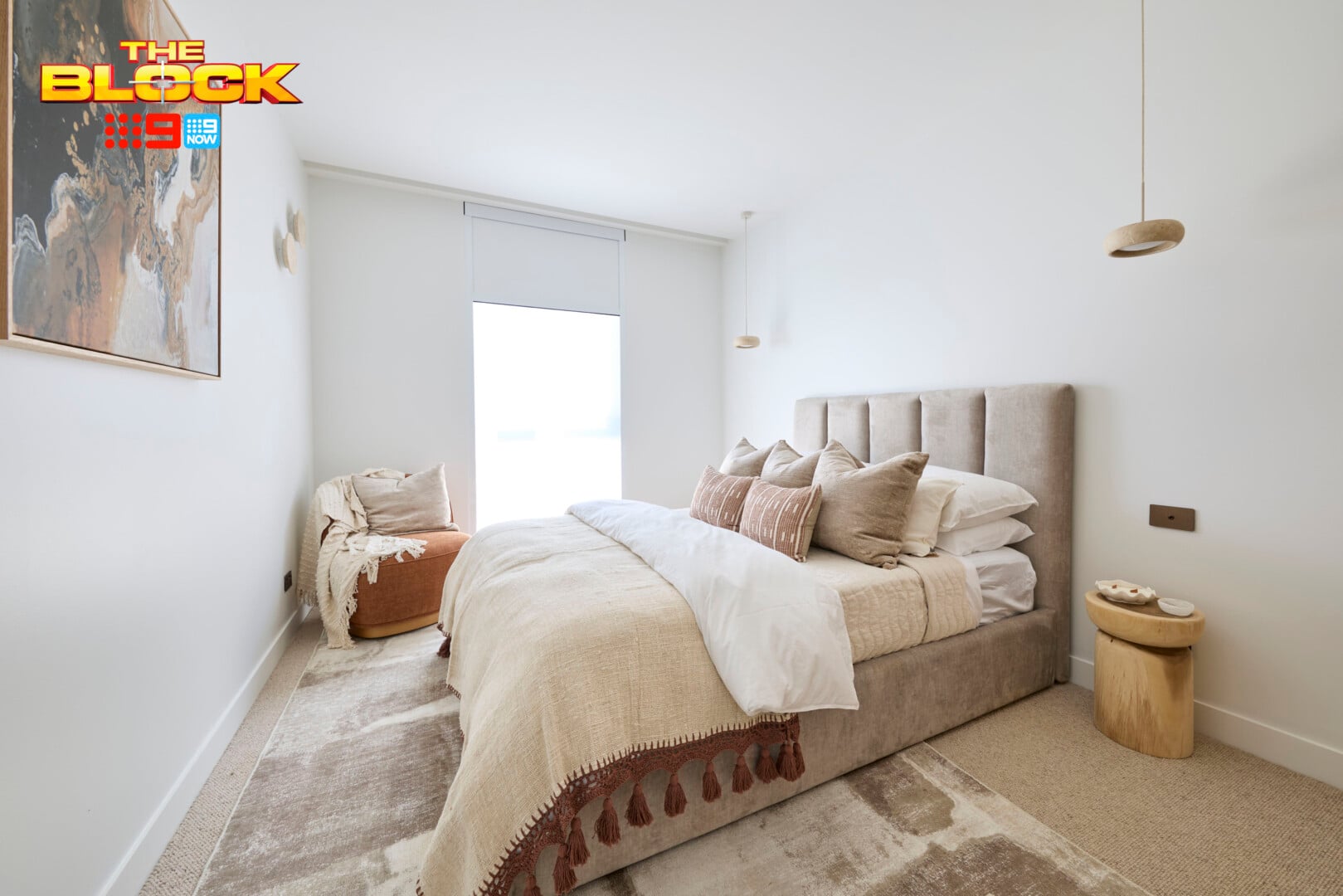
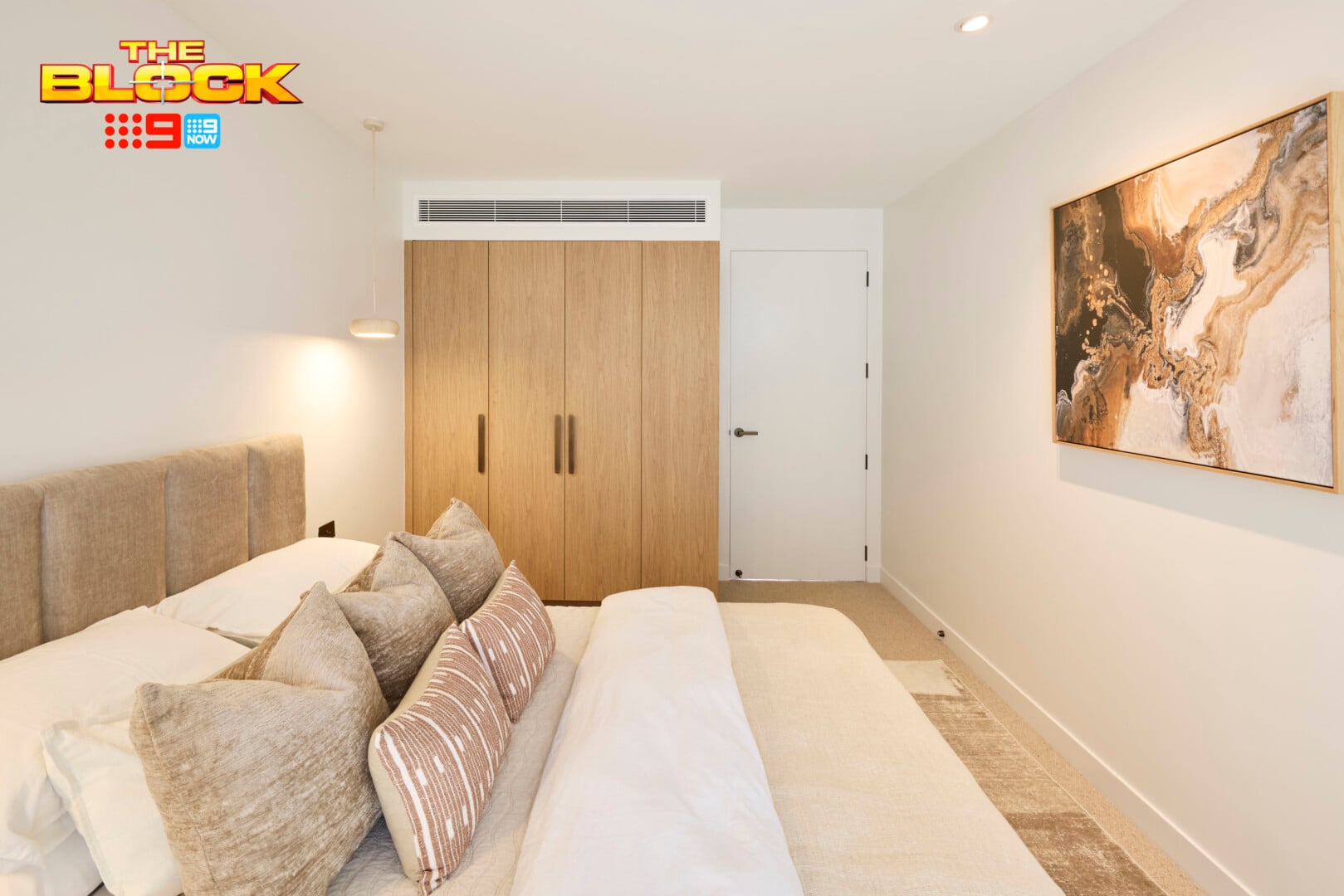
Adam and Joelene’s Guest Bedroom Came Second
I came into this week’s recap tearing the rooms apart for being so boring. Then I discovered that the teams were told to channel ‘Kardashian style luxury’ because that’s apparently what a buyer in Mt Eliza want. Um, hard no. The hardest of no’s. There is not a single thing about the Kardashians that I want put into my home – and I don’t want to meet anyone in Mt Eliza who disagrees.
I wish the teams rebelled and did what they wanted to do regardless of this brief. Because, really, look what we ended up with; rooms with no redeeming features, no standout moments, and not a lot of design. We furnished, but we did not design.
There’s nothing inherently wrong with this room from Adam and Joelene, if you’re into white rooms with no features, but come on; this show has been running since TV went from black and white to colour. Viewers need to feel more inspired than this in 2026 – and a Kardashian brief is not the way to do it.
Let’s Explore the Positives
There are four walls and a door, which is appreciate. OK, I jest. There is more to like in this guest bedroom. The shell of the room is what I have the problem with, mostly, but the pieces themselves are all rather lovely. It’s just a pity they all came together to create a copy-and-paste end result.
The tactility in this space is something I can get on-board with. The bed is well layered with a number of materials that make it feel plush and inviting. I’ve always had a sick love affair with tassels on blankets, so those are doing it for me, plus the pillow count and overall bed styling is divine.
A different wall colour, some art over the bed, some larger pendant lights, dressing the window; all of these elements would have elevated this space tremendously.
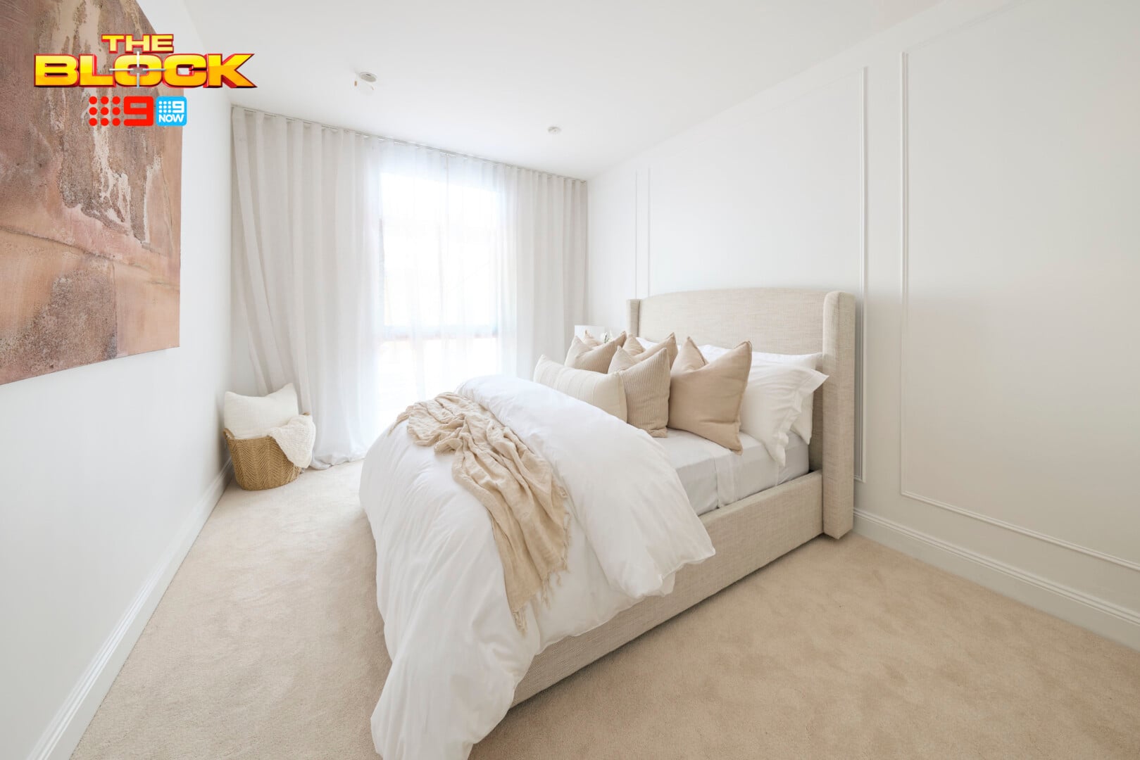
Chantel and Wyatt’s Guest Bedroom Came Third
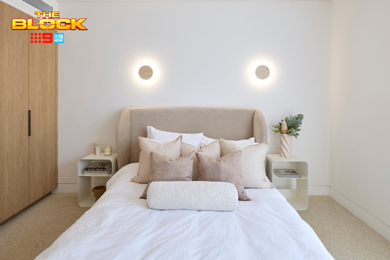
OK now they’re just messing with me. This is where the Bex and lie down comes into play, and I don’t want to do it on that bed (nice items, as always, but I have seen this look at least 1000 times).
Truthfully, this room is so white that I suspect it’ll be the next guest on Karl Stefanovic’s podcast.
I said it about Adam and Joelene’s guest bedroom and I’ll say it about this one: we need more on The Block 2026. We’ve been watching the show since the dawn of time and we’ve come to hunger for more interesting design than this in a week one reveal.
I understand the producers are probably trying to keep a lid on some design disasters turning off potential buyers, but the pendulum has swung too far the other way. Refined luxury does not mean all-white, it does not mean minimal, and it does not mean basic.
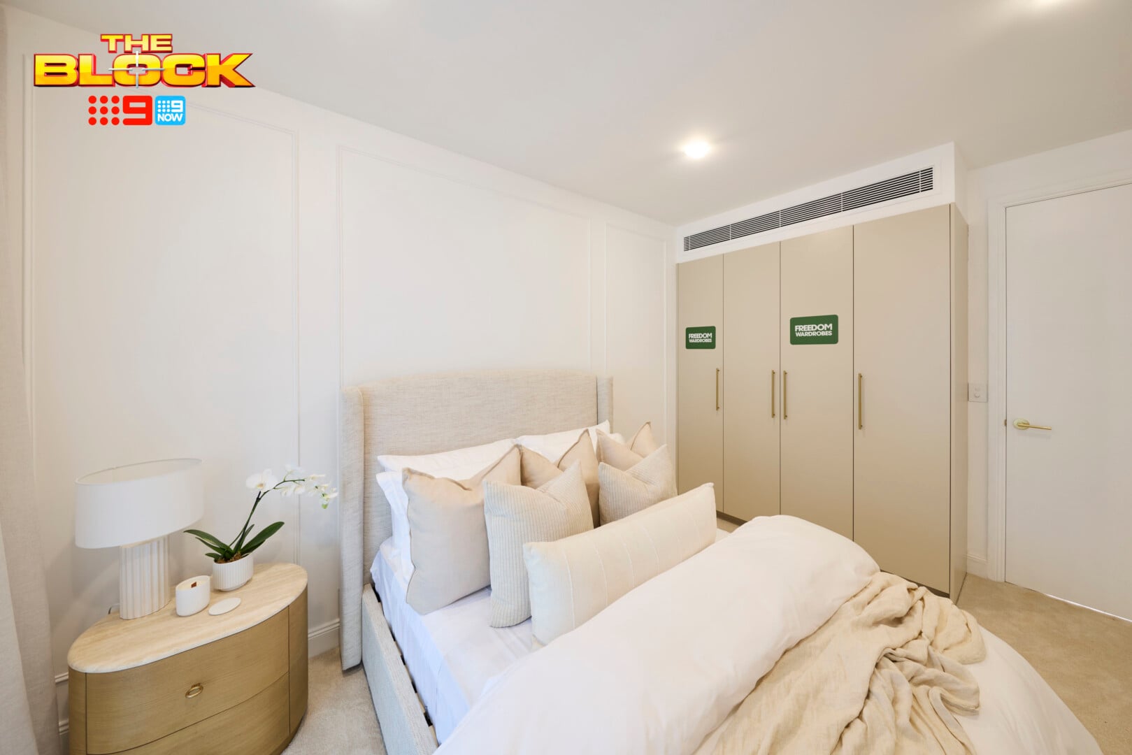
What This Room Needed
When you’re working with a neutral palette, you need to up the other design elements so the room doesn’t feel sterile and undercooked. That means texture, shape and pattern need to be ramped up to do the heavy lifting.
Wallpaper on the wall, or some textured paint would help. Failing that, some wall panelling would have gone a long way. If that was out of reach, an extra-wide headboard with some detail on it would at least draw the eye and give us some visual interest. Pendant or wall lights would have allowed for some shape to enter the zone too, and have them finished in ceramic or similar to deliver on texture.
This room didn’t give any of those things. It looks like a room from a team that ran out of time.
I understand there’s a robe door that opens on the right-side of the bed, but that doesn’t mean the person sleeping on that side gets no bedside table.
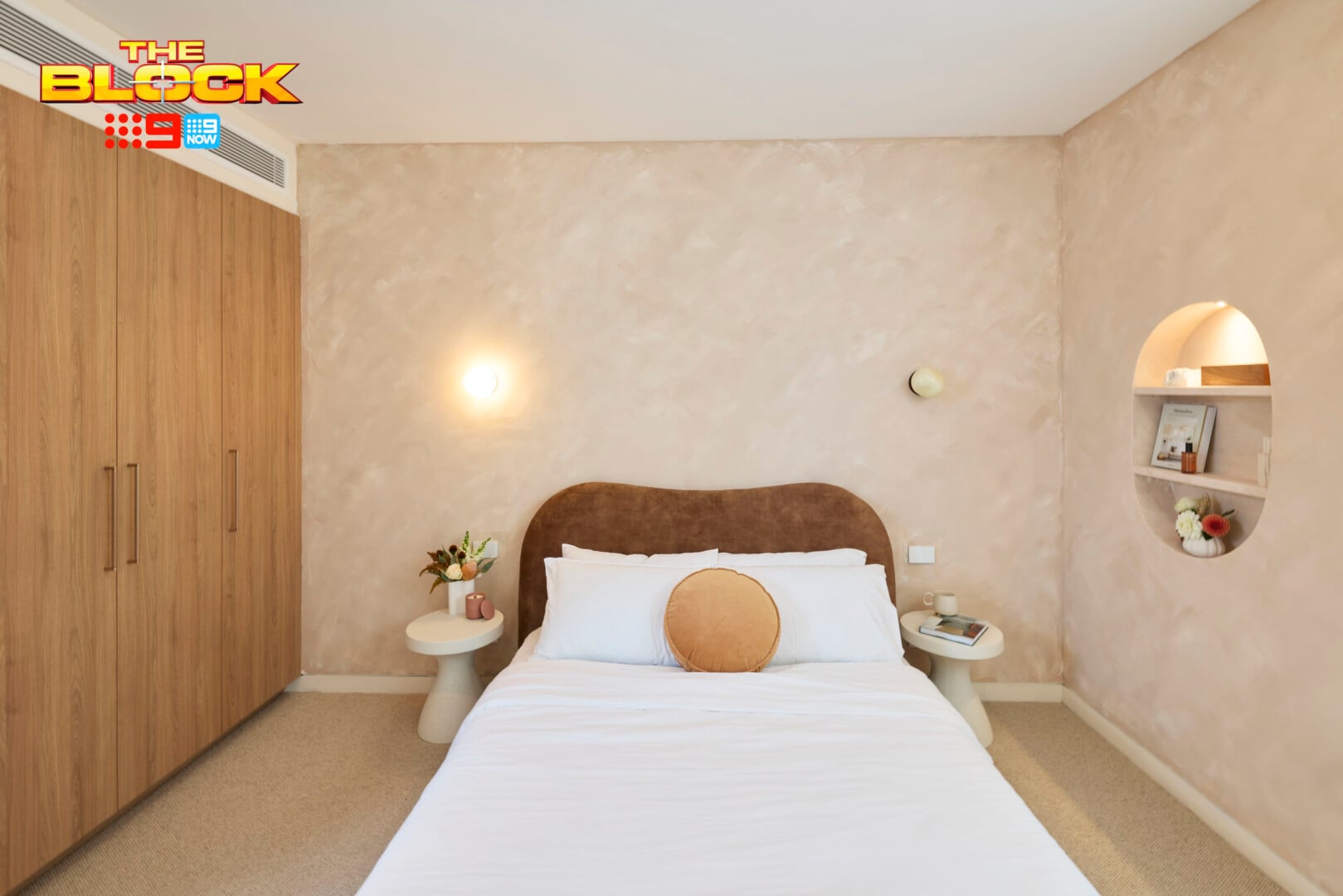
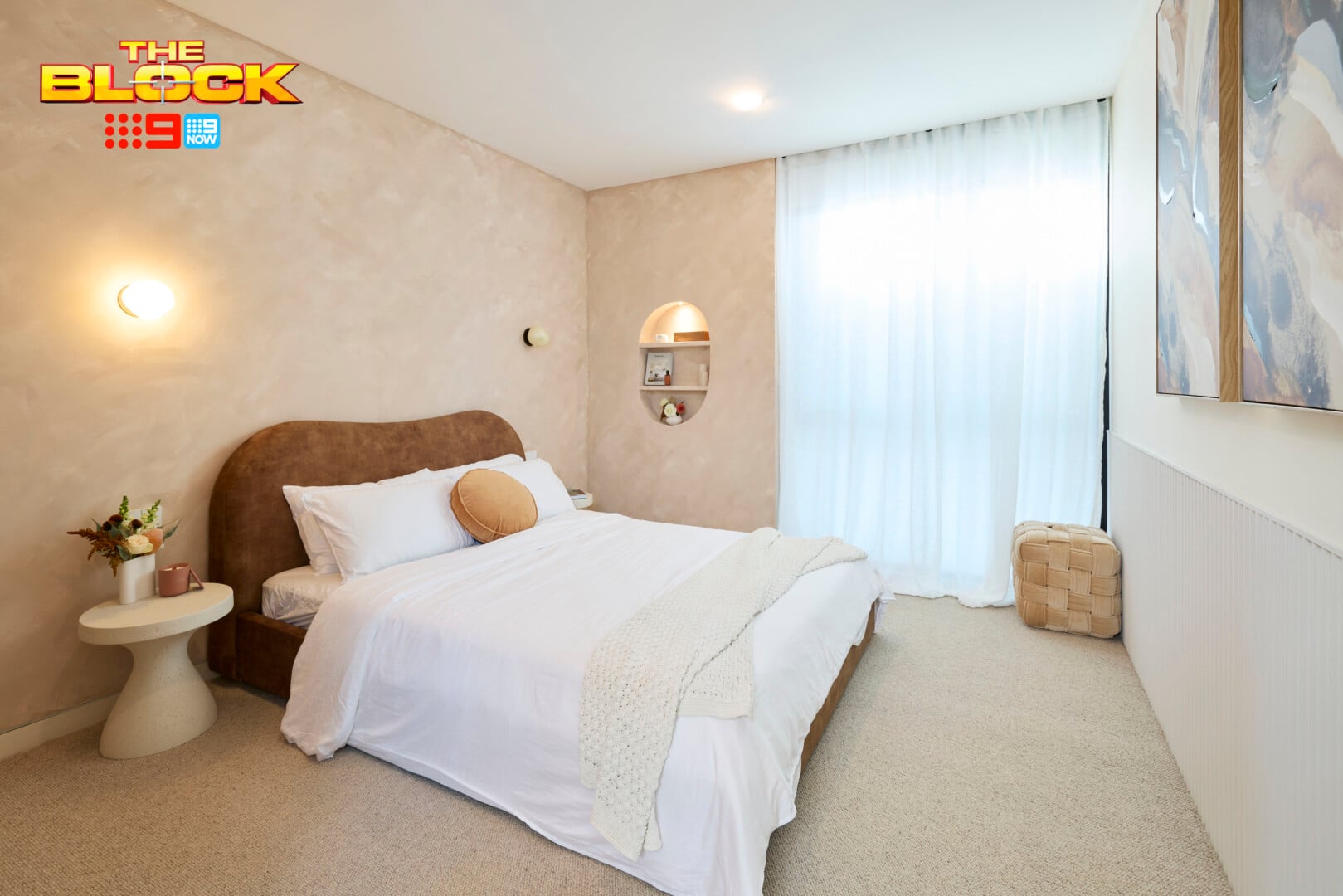
Lisa and Rosco’s Guest Bedroom Came Fourth
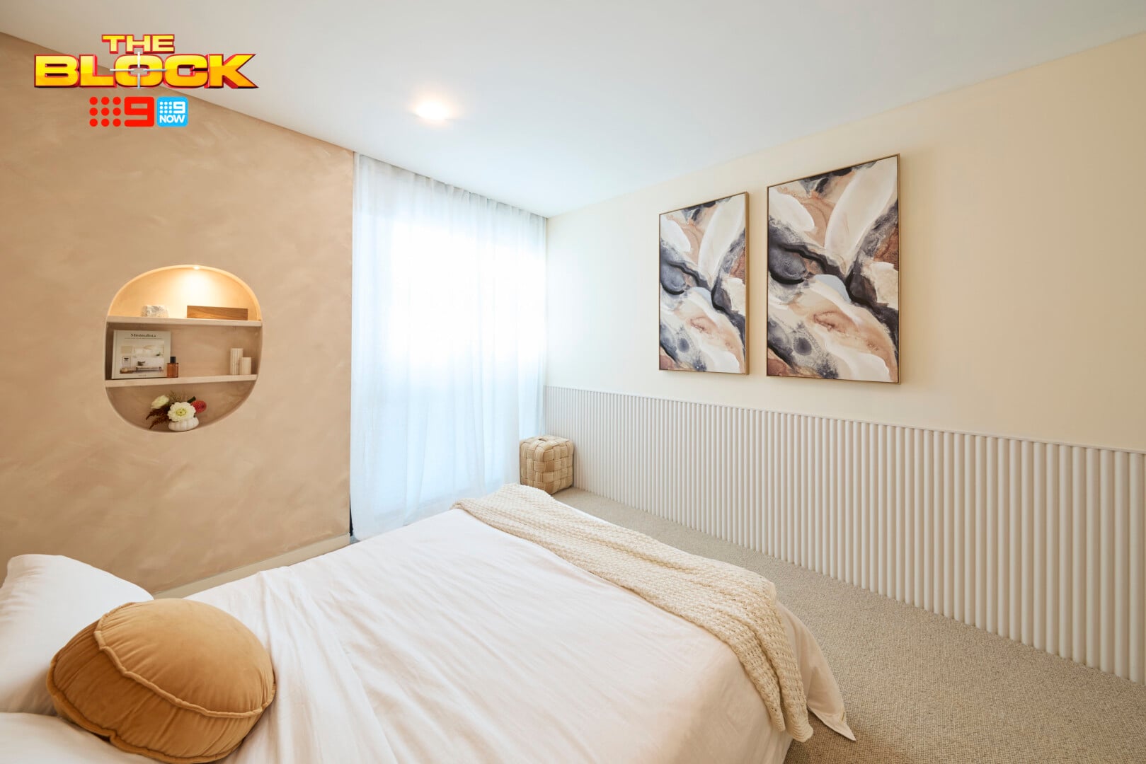
I have to commend Lisa and Rosco for not phoning it in and delivering an all-white space with no visual interest. At least there’s a point of view here, which I appreciate (even if I don’t agree with it).
The main issue with this space is that it feels confused. There are a lot of random choices put together and none of them evoke harmony. There’s a sense of panic in the design; a feeling that one design element wasn’t enough so they threw a few more in hoping it would resolve the space.
The paint effect is one element. That could be the defining moment. But then there’s wall panelling across from the bed, a recess shelf cut into the wall in an oval shape, and wall lights sitting too high on the wall with no artwork to anchor them. It’s as if too many things are happening, and yet not enough.
The room also feels somewhat juvenile, like a tween or teen space.
What Would Help This Room Significantly
Let the paint effect be this room’s moment. There is a power and restraint in not packing in too many bells and whistles. I would place one large artwork over that shelf recess immediately, because it offers nothing to the room as is. Next, I’d bring in a much larger headboard so a slab of sumptuous fabric brought softness to that wall.
Given there is no art above the bed, the shape of it needs to be rather pronounced; a major curve would help. Then, lower your wall lights, remove the panelling on the wall across from the bed, and install a big leaner mirror there. A plant in the corner would give this space a much-needed injection of nature, too.
I just realised I re-designed the entire room. But hey, I’m here to help.
Rick and Tayla’s Guest Bedroom Came Last
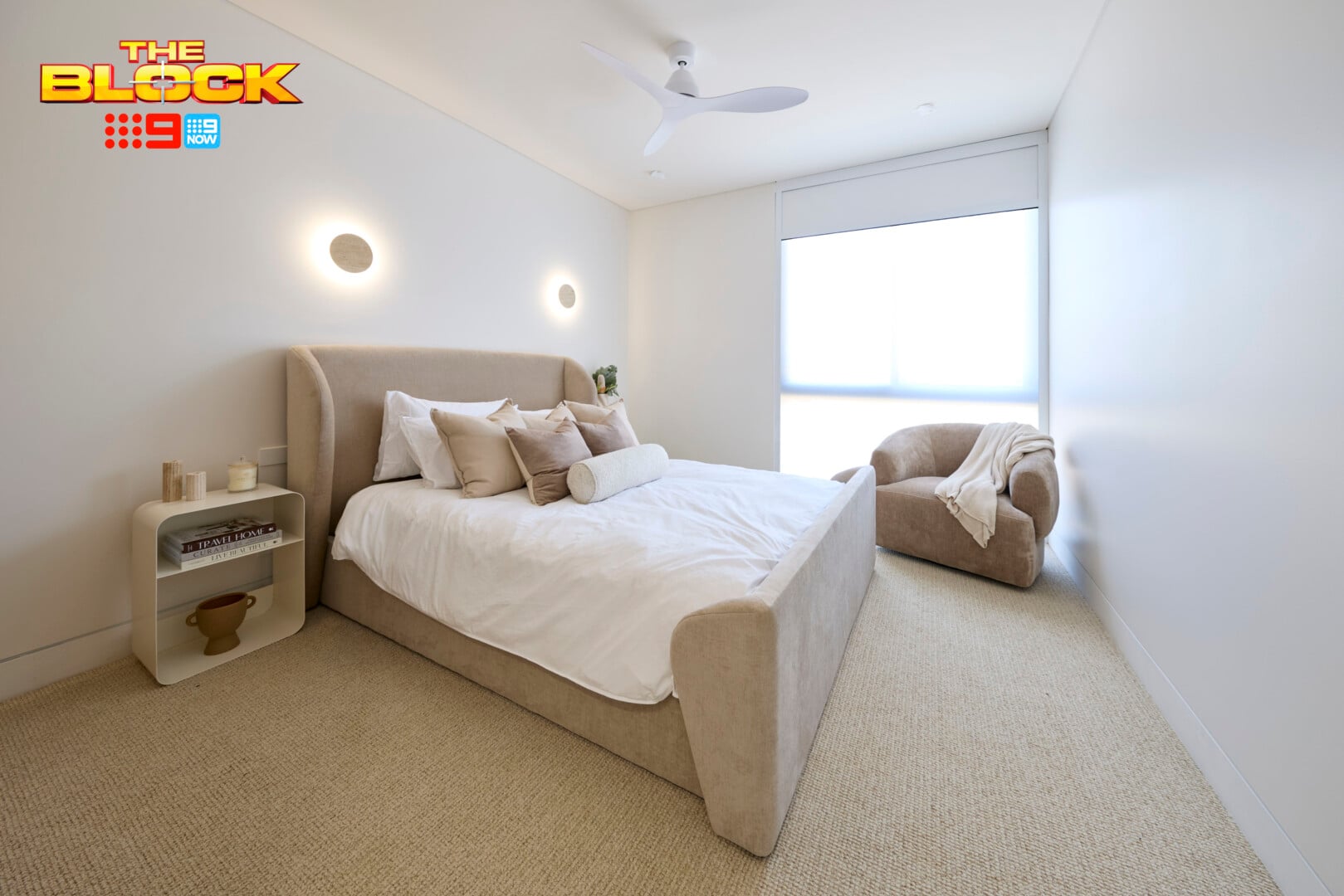
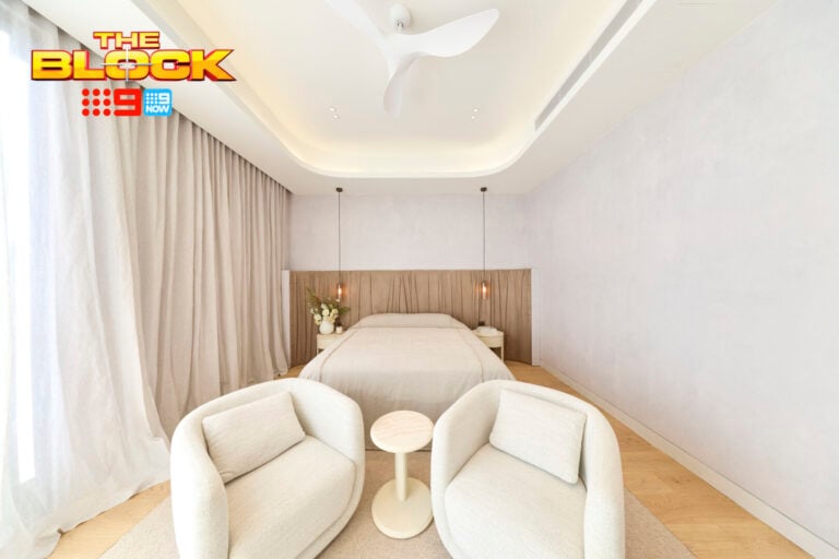
What can I say about this room that wasn’t already said about Chantel and Wyatt’s? All of the same notes apply here.
The room needs a curtain, it needs a wall treatment, it needs an artwork, it needs a mirror, it needs some pattern in the bedding, and it needs wall lights and a bed that properly align.
It does have a fan. Sad that we need to call that out as a moment of difference, but here we are. The room has a ceiling fan! I do enjoy a ceiling fan. It provides a gentle noise at night that helps keep my pleated-skirt headboard nightmares at bay.
What Did You Make of The Block 2026 Guest Bedrooms Reveal?
I’m going to give this week one Block reveal a womp, womp wooooomp. And I have to blame the brief. We had (some) contestants ready to come in go hell for leather on a pre-conceived design, and I want to see that design!
This week rooms were more watered down than pre-mix Aperol Spritz (never again), and I can only hope next week’s reveal gives us a bit more meat to chew on.
Drop me a comment below and let me know your thoughts on this week’s Block reveal.
Need to play catchup on this week’s episodes? Check them out on 9Now.

How dull. Where are the touches of mustard, teal etc. sorry but the show does nothing for me. I would rather just watch Chris’s reviews and the photographs on this blog.
Absolutely right, Chris.
Apart from the netball skirt, I shudder, they are dust collectors. Every room looked almost the same, boring, no redeeming features.