
The Block 2026 rumpus and laundry reveals saw only one team get their washer and dryer location correct, plus it revealed an apparent shortage in sofa designs. We have so much to talk about, and I can’t wait to hear what you thought.
I want to call out an issue that I have with all five rumpus’ as a starting point. Given there are only two living zones in each home, it’s such a shame that more wasn’t made of these downstairs areas.
You have the main living upstairs with a TV in it. Why couldn’t these rumpus rooms be home cinemas with projectors installed? Give me the full cinema experience. Or at the very least, give the room a point of difference so it doesn’t look like the upstairs living room minus the fireplace.
That’s just one of my gripes this week. Scroll on as I drop my designer truth bombs on The Block rumpus and laundry reveals, and as always, drop me a comment at the end of the post or jump over to Facebook and Instagram to let me know your your take.
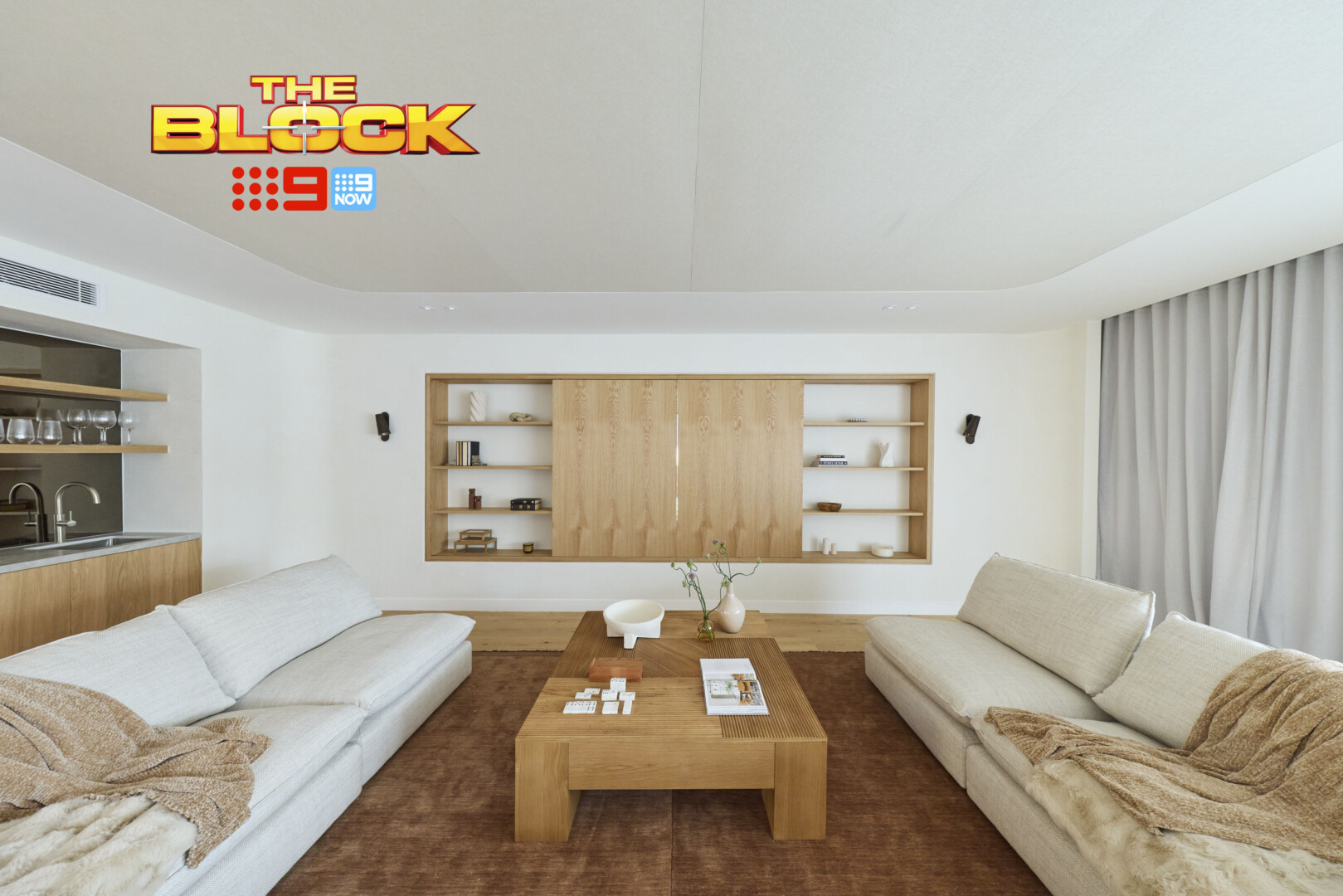
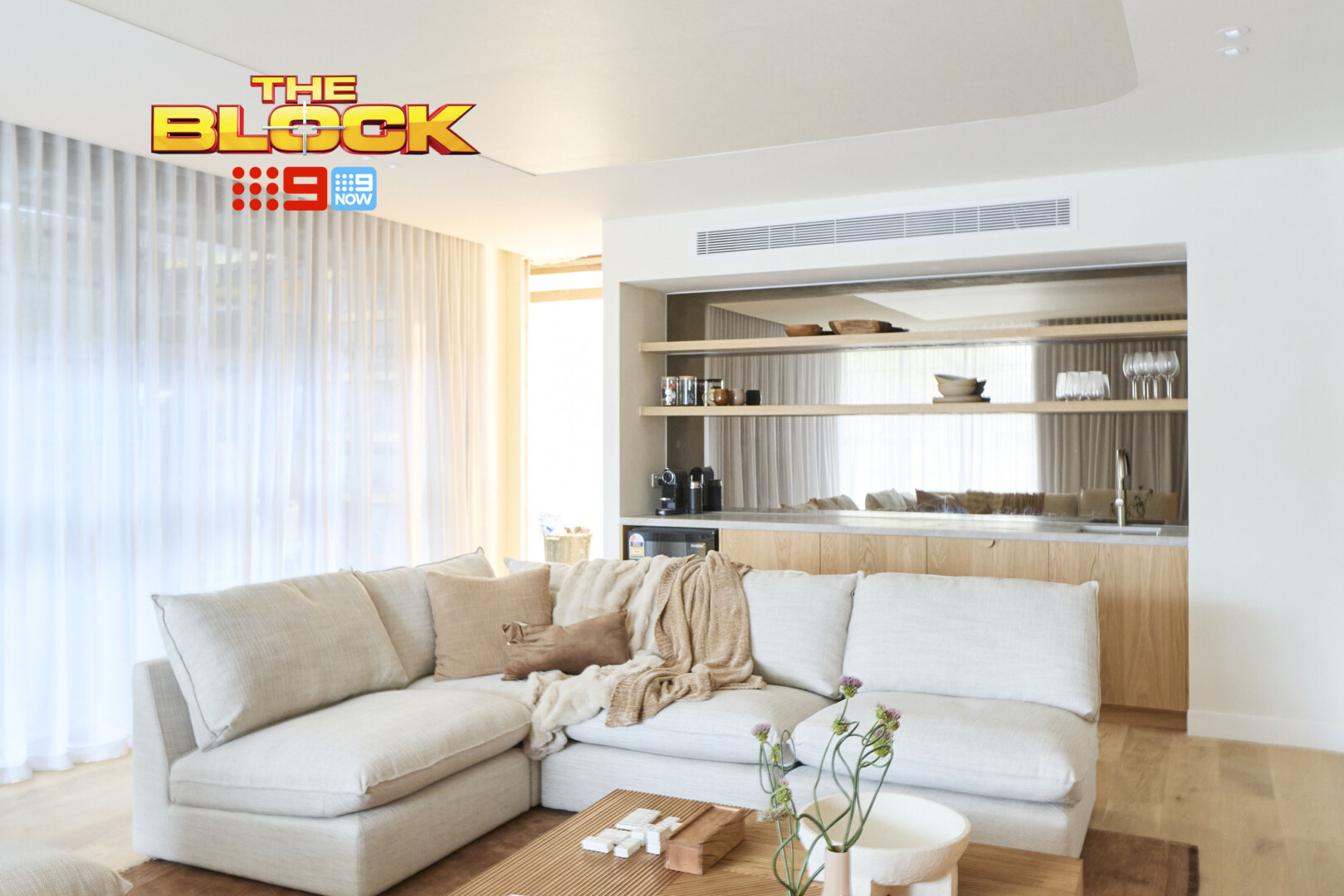
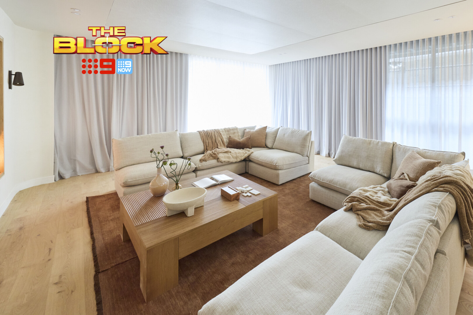
Courtney and Sev’s Rumpus Came First
I do enjoy a few things about Courtney and Sev’s rumpus. The overarching style evokes calm. The Japandi influence is evident, which I appreciate, and there’s a sense of comfort present.
It could have been taken further though. The room looks a little under-cooked. A wall treatment in a beige tone (French wash or similar) would have added depth to the space, and then the all-white feeling would have been removed. As it stands the room appears unfinished. But I do like where it’s heading.
Functionally I like that there’s a kitchenette. It allows the room to be used for a lot of different purposes. That said, small things like a lack of side tables around the sofa further the unfinished feel. You’re not putting drinks on that coffee table once you’re sat down, so we definitely need some slide-over side tables.
Given there’s no other black elements in the room, the wall lights either side of the TV are an odd choice too. I could go on, but I think we can agree that 29.5 as an overall judges score is generous. There are too many details that jump out as misses the more you examine the room (let’s not even talk about the pooling curtains).
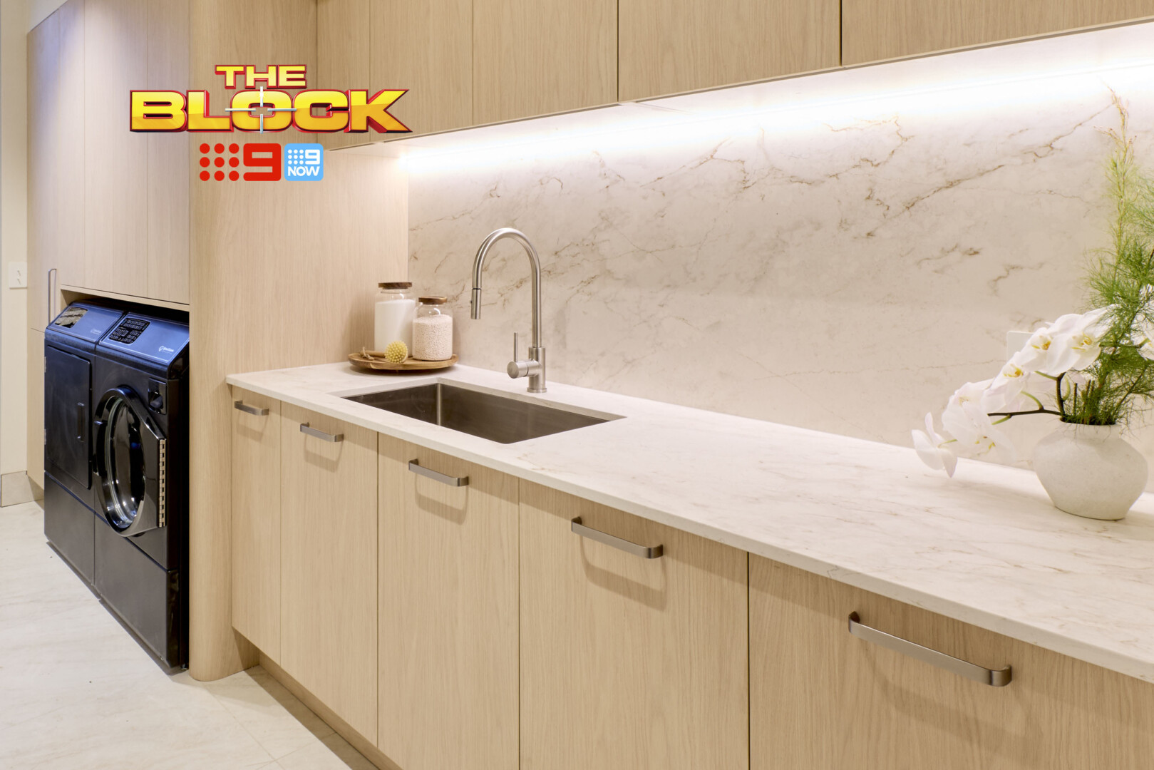
In the Laundry, Things Were Pretty Good
The finishes in the laundry I’m fully on-board with. Love the stone countertop running up the splashback, love the LED strip light under the upper cabinetry, and I enjoy the joinery finish (the light oak tone feels calm and contemporary). Tapware is a yes, styling is a yes. The handles are a little off, but I’ll overlook it.
The only thing that stands out as visually jarring is the black washer and dryer. It’s not like me to ever suggest white appliances, but here they would have felt more harmonious. Your eye goes straight to them, and to be fair they’re not particularly sexy.
I’ll also say, as I often do about features in what’s meant to be a multi-million dollar home; I don’t expect to bend down if I’m paying that kinda money for a property. Nope, bending is off the table. Don’t want to bend down to an oven, don’t want to bend down to a front-load washer. I want every appliance in the laundry raised and I won’t hear otherwise.

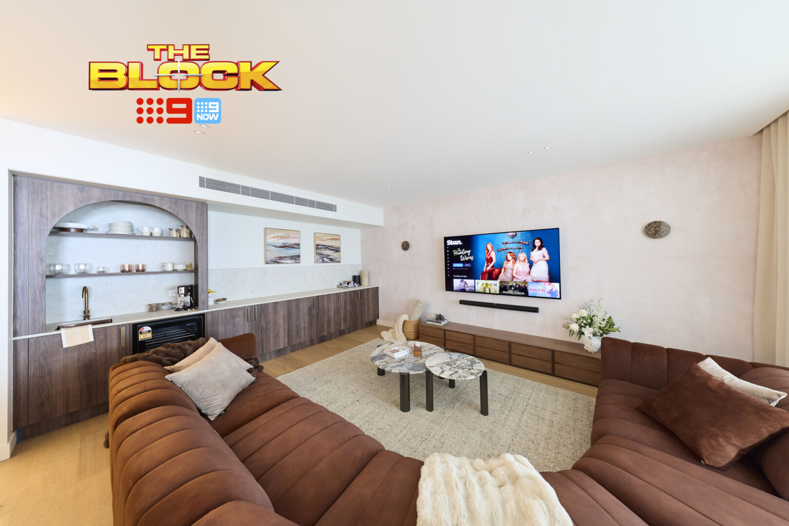
Lisa and Rosco’s Rumpus Came Second
I’m left a little confused by Lisa and Rosco’s rumpus, so please indulge me while I unpack everything.
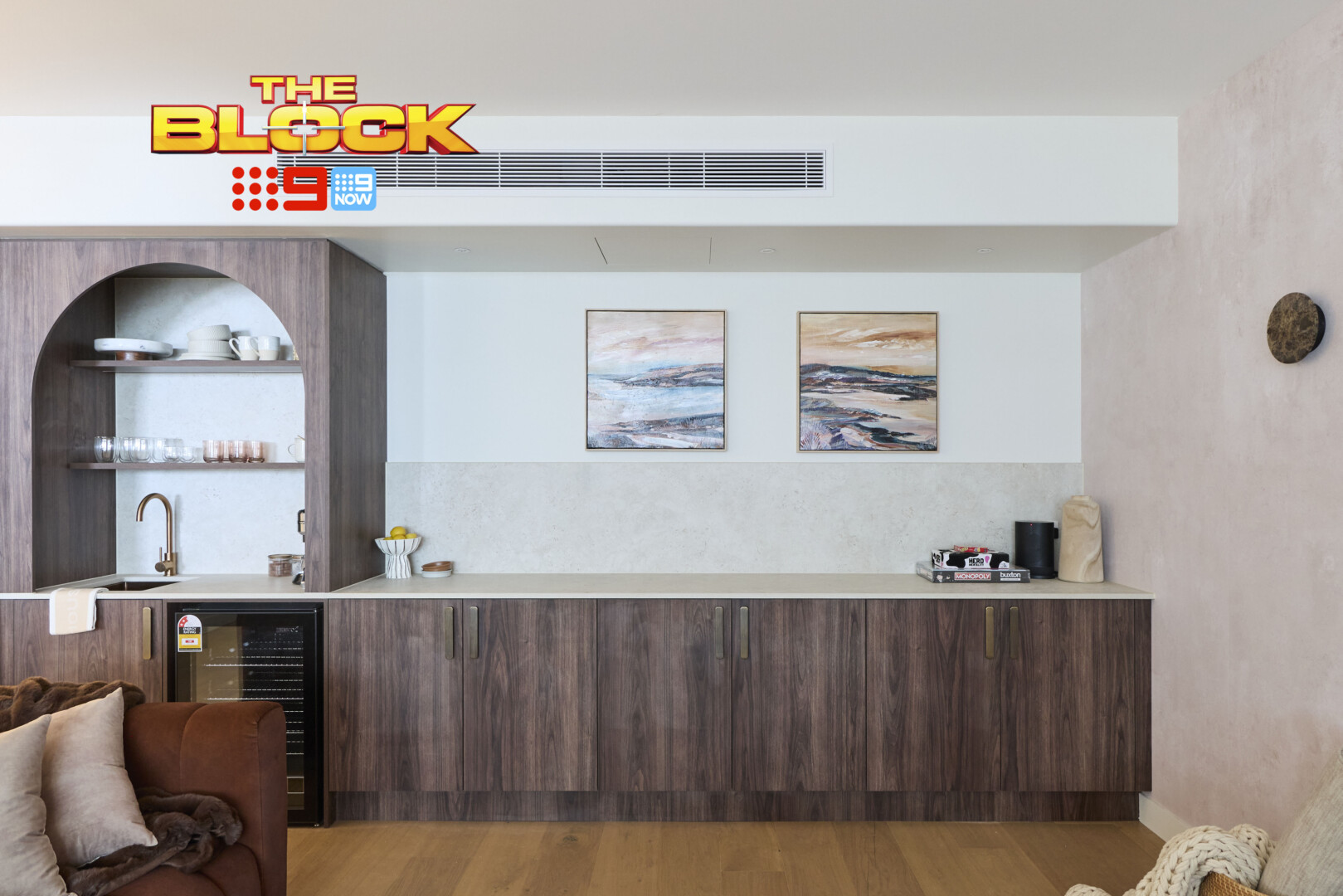
The sofa looks more oriented toward the cabinetry. It’s as though the TV would have made more sense on the wall where the artworks are. They’ve created a long run of countertop with splashback and two small artworks above, but I’m not sure what this area is designed to be used for.
The TV installed on the wall looks unresolved. The wall lights – spaced that far apart – are lost in the room. The entertainment unit it too low for the height of the TV, and the tone of the wallpaper doesn’t work. It’s all very visually chaotic, and the arch is a step too far given everything else that’s going on in there.
I’ve liked a lot of Lisa and Rosco’s rooms – and they have been rather successful. But this is the first time in weeks I feel they’ve gone off the rails. There’s very little here that feels good.
The Laundry Was Better Than the Rumpus
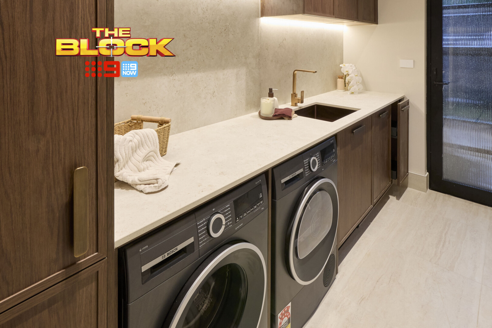
See, this is a room where the black appliances work well. The entire colour palette is dark and moody, and so the washer and dryer feel right at home. They’re not raised off the floor (I’m deducting points for that as you know), but at least we have a harmonious room.
The basin is too small for a laundry of this size in this home, it must be said. It’s something you’d see in a small apartment, not a multi-million dollar property. The tap is also underwhelming. The style of tap in Courtney and Sev’s laundry – with the pull-out mechanism – is a superior choice. The tap and basin combo here isn’t cutting it.
I said the same in their kitchen, but I’ll say it again as they’ve carried them over to the laundry; those handles are too bulky for the delicate nature of the cabinetry profile.
This is not a good week in my eyes for Lisa and Rosco.
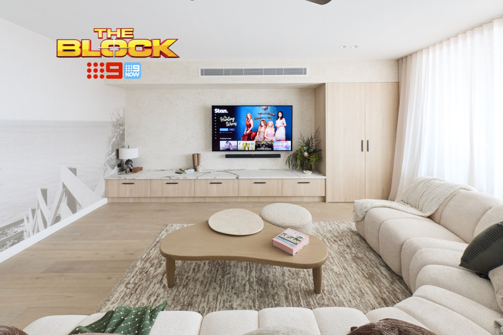
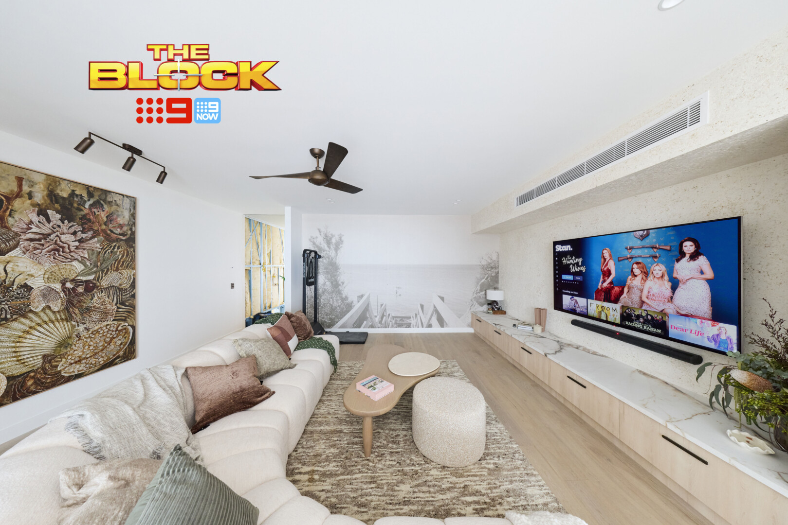
Adam and Jolene’s Rumpus Came Third
Can I say straight off the bat that I adore that artwork behind the sofa? It, alongside the rug and cushions, is creating a delightful style family that’s making me smile. Outside of that, Adam and Jolene’s rumpus is OK. Not great, just OK. All the elements are fine, but they’re not evoking any wow-factor. Jaws will not be dropping upon entry.
Can I also make a sidebar point? Those sofas. Those curved sofas. I’ve seen so many of them on The Block that I now, truthfully, would never put one in a client’s home.
There’s a point at which a great product can become so overused it becomes ‘that sofa from The Block’. I don’t say that to put down any suppliers who give product to show, I am just sitting in my truth. We’ve reached a saturation point with those sofas.
The main issue I have with this rumpus is the product-placement gym equipment in the corner of the room. The random nature of sponsored products has reached a new high. Next thing you know we’ll see a lawnmower mounted on the wall in a kids room.
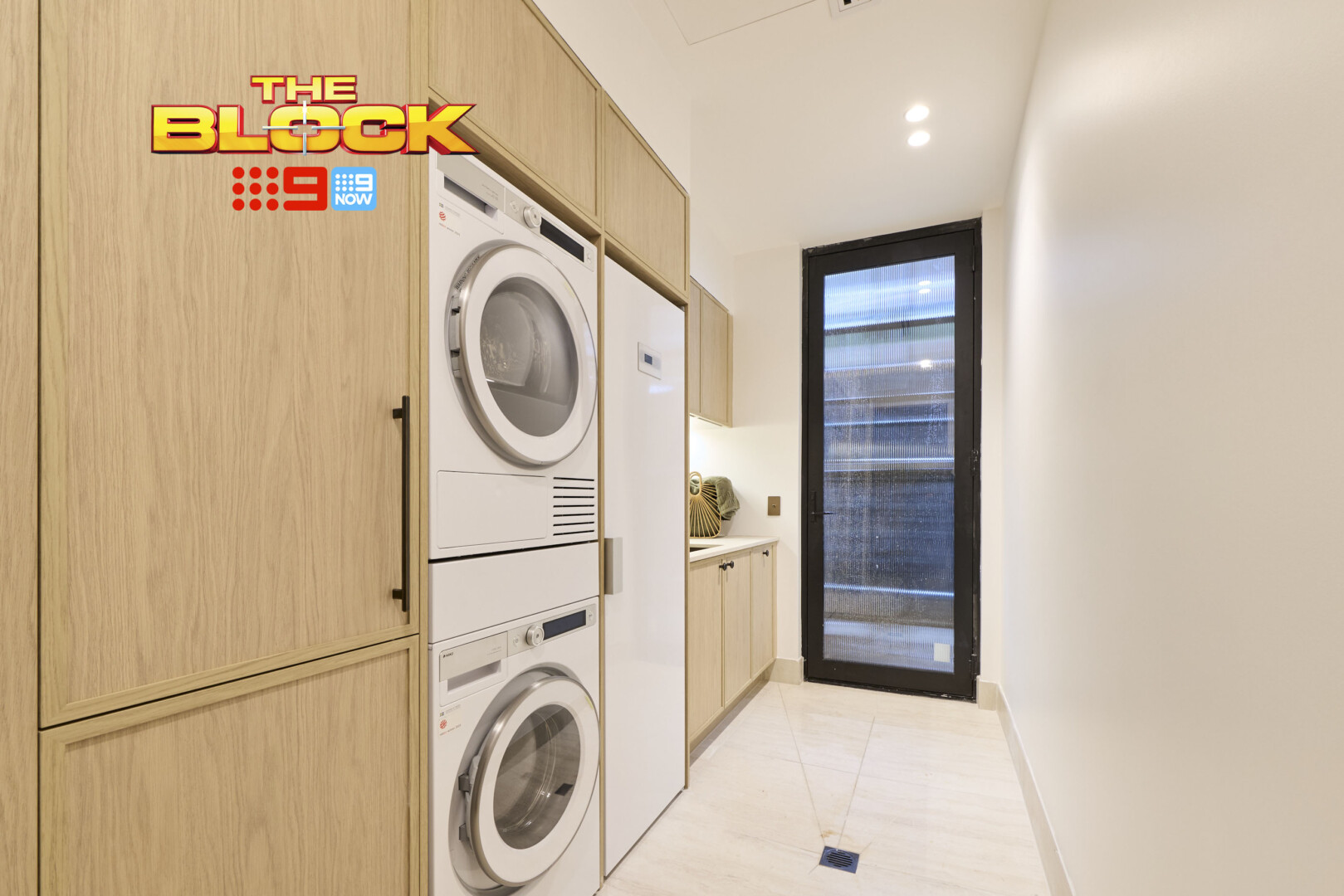
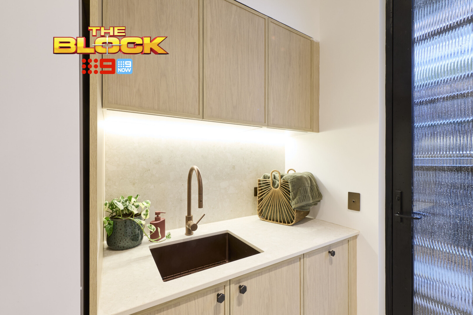
The Laundry Was Pretty Successful
This recap is becoming a focus on appliance colours, I know, but it is worth exploring. And in Adam and Jolene’s laundry, I would have gone with darker colours in the washing machine and dryer. Give that they have dark tones in their basin, tapware and cabinetry handles, it would have looked more cohesive for the appliances to follow the same approach.
We have our first vertically-stacked wash and dryer combo which I am delighted over. I would have preferred both sat up high, but I will take not having to bend down to at least one of them. A good decision indeed.
Much of this laundry in terms of look and feel carried across their style approach from the kitchen. I thought that was incredibly successful, so I feel the same way about the elements here; love the cabinet colour and profile, enjoy the handles, adore the stone. I don’t have many complaints.
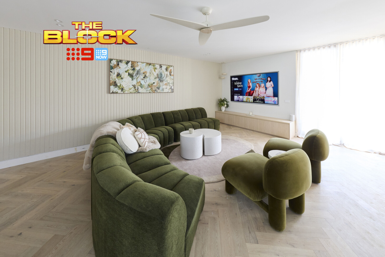
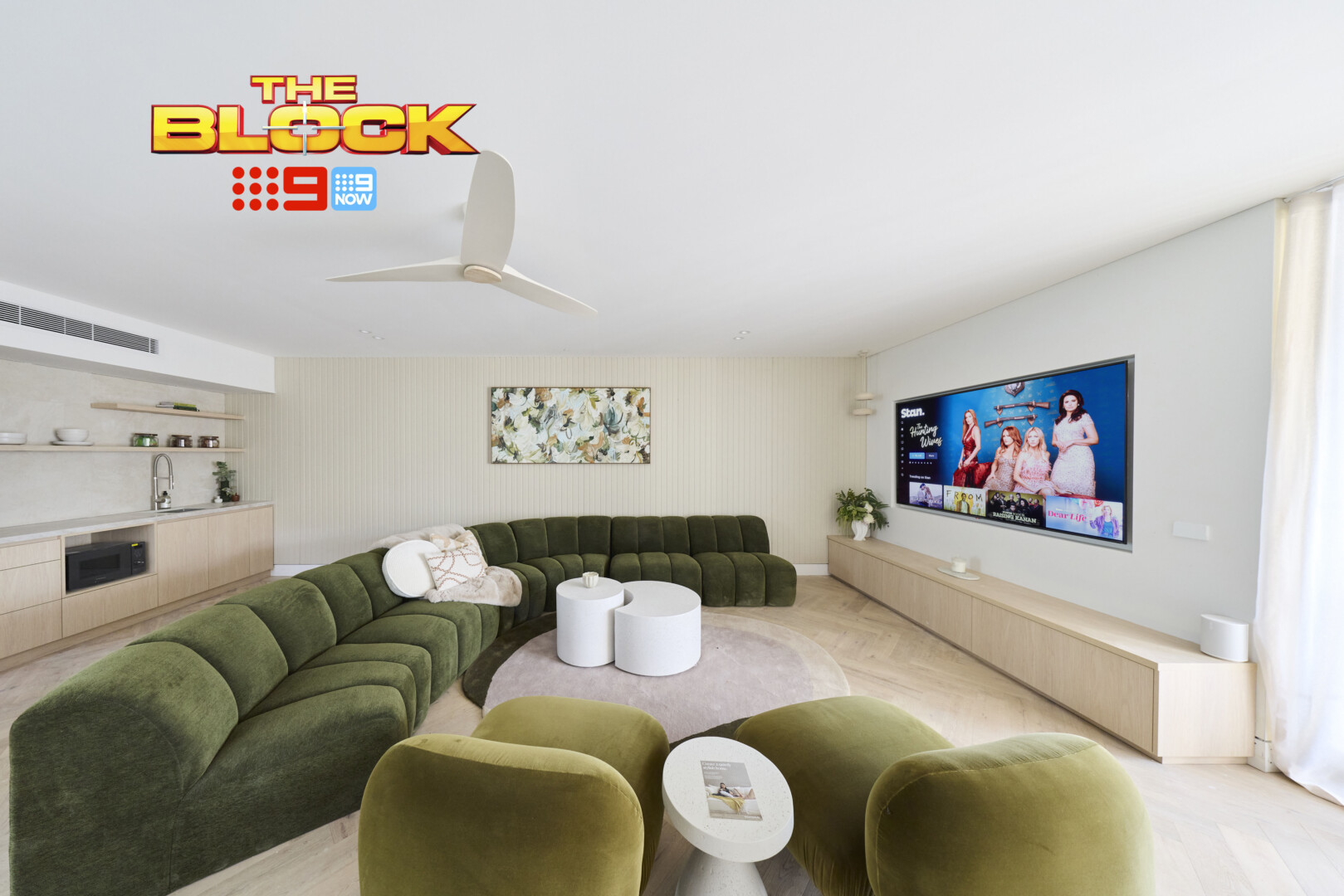
Rick and Tayla’s Rumpus Came Fourth
See what I mean about the curved sofas? This is the third team so far that’s used the exact same one in a different colour. And plenty of them did the same upstairs. But enough whinging from me, I have some positive things to say!
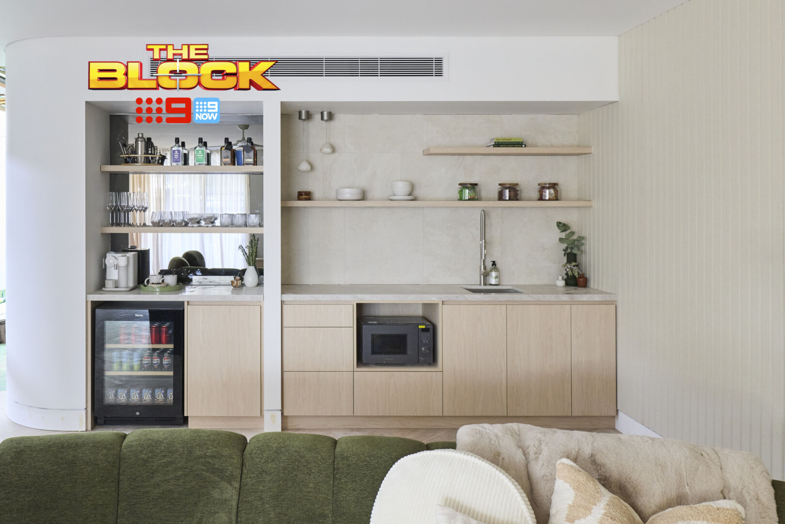
I have to declare that – despite the layout not being right in this room – I tend to enjoy it the most. The colour palette is successful, the sense of gathering around to chat is lovely, the wall panelling adds interest without overwhelm. And get ready for this (I know I’ve been hard on this team): that kitchenette is the best of the lot!
Love the stone choice, love the cabinetry. We have a bar zone, a coffee station, a sink, a microwave. The curved wall as you enter the space is sublime. Sure, I’m moving the furniture around to face the larger wall in the room, but outside of that I really do want to give Rick and Tayla their flowers for this one.
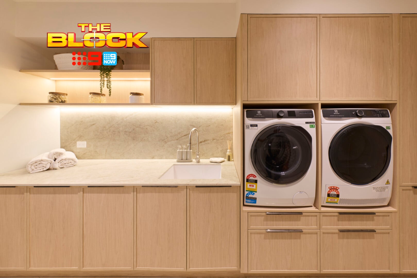
The Laundry Was Heaven on Earth
Yahooooooooooo!!! We have a laundry with a raised washer and dryer! Cue the celebratory music. Have the street parade come through. Press go on the fireworks. Get Kylie back in the harness and have her fly over from the MCG to sing ‘Love at First Sight’.
My prayers have finally been answered, and not by the team I was expecting. But credit where credit is due, of course. We definitely needed Rick and Tayla higher up on the scoreboard this week.
There’s so much to love and appreciate about this laundry design. The colour palette, materials, and layout are all pretty on-point. I would have moved the sink over to the left if I was designing this space, as it seems a bit squashed to the right, but that’s not a huge dealbreaker. Outside of that small change, I’m really impressed.
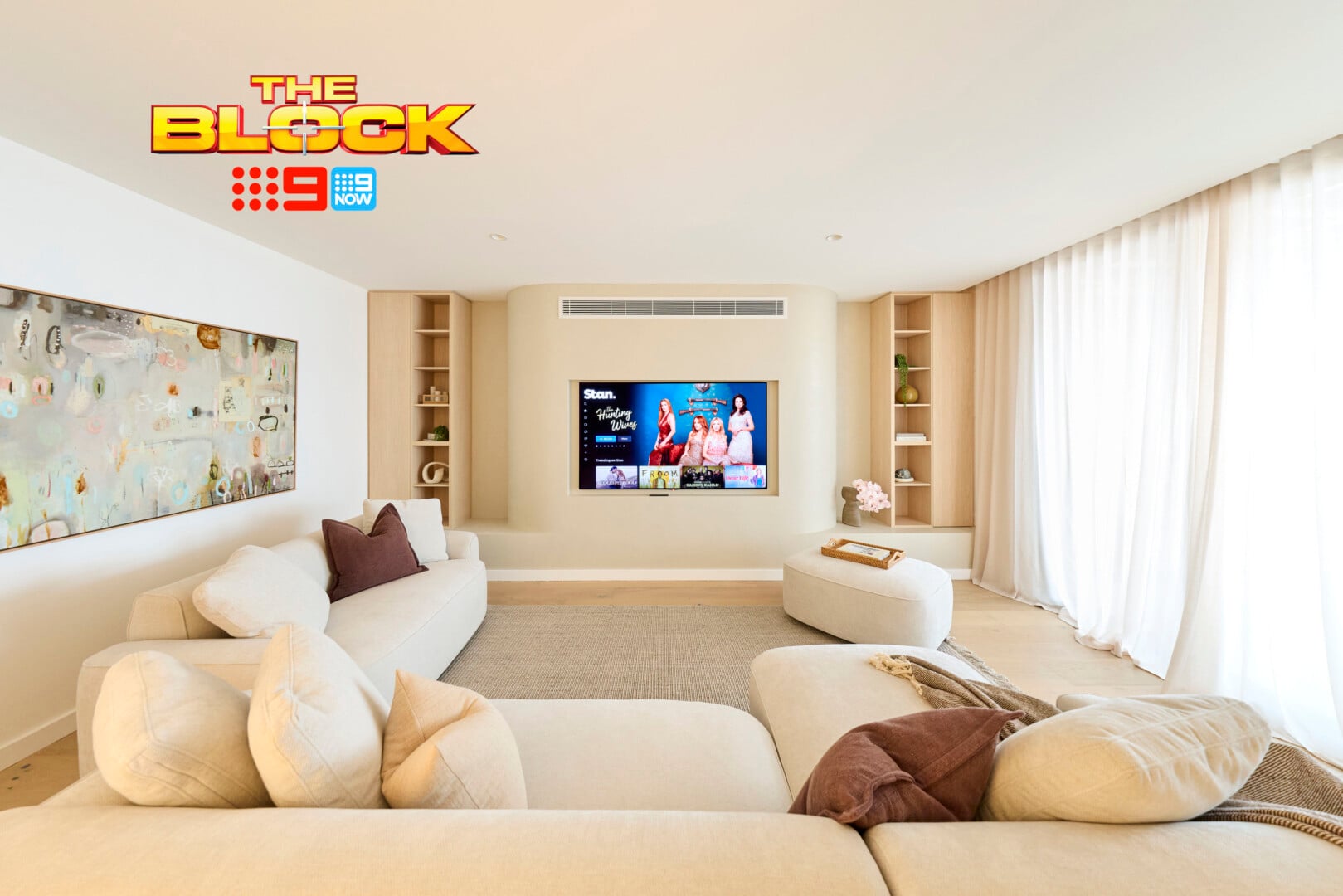
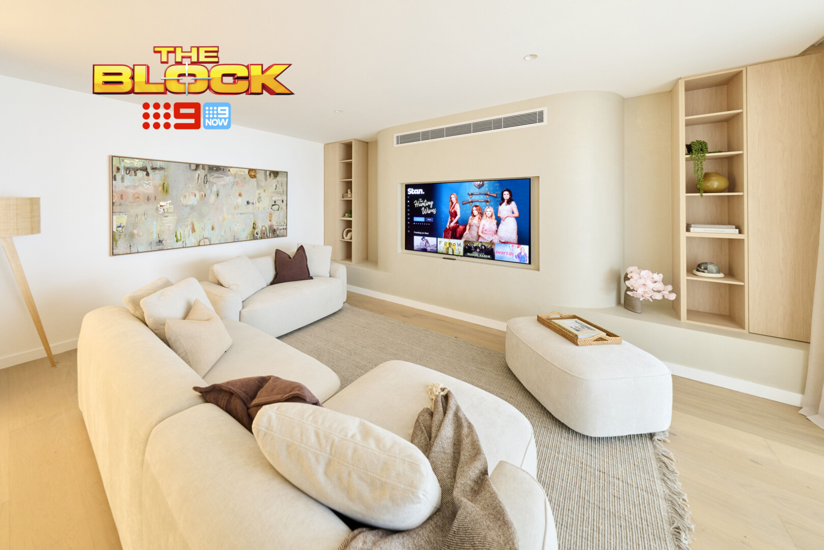
Chantel and Wyatt’s Rumpus Came Last
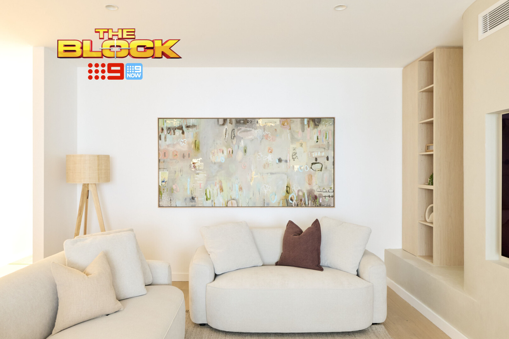
The judges have been sleeping on these guys for weeks and they’re still doing it. I’ll give them the lack of door on the room. That was not ideal. I’ll give them the lack of kitchenette given that the other teams all delivered one. I’ll also give them the lack of side tables, coffee tables, and the all-white feel in here.
OK so maybe I’ve just convinced myself that this room isn’t great!? At least they haven’t got that curved sofa in the space! I also feel they’ve done a lot to the TV wall and yet nothing at all. They’ve put a lot of work into it, and designed it, but it doesn’t deliver anything functional nor does it look particularly impressive. It feels over-designed, in fact.
I feel the same way about this room as I do about Adam and Jolene’s in that it’s fine, but it’s not impressive. A buyer will neither be delighted nor put-off. It’s not exactly the goal you want when designing a room, but that’s the truth of the matter. A change in all of the furniture would have resulted in a better looking and feeling rumpus.
The artwork on the wall below I do thoroughly enjoy though.
The Laundry Design Was Pretty Solid
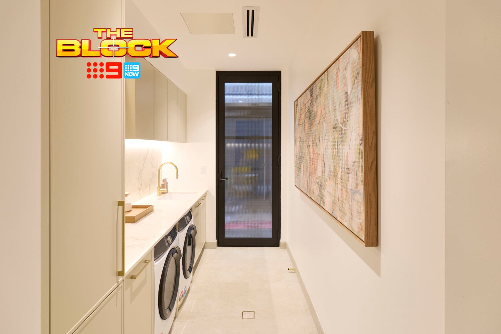
Let’s start with Chantel and Wyatt’s appliance colours, as it seems to be the theme this week. Here, this washer and dryer combo works incredibly well. The white ties into the stone and cabinetry perfectly, while the smaller black details make the external door feel at home in the space. It’s actually the most cohesive appliance set of the lot.
That said, they are below the counter. And look, this location is not going to bother thousands. I personally feel though, that when you design a room like a laundry, kitchen or bathroom, that future proofing is important. Build once, build well. And having appliances higher up means that while you might not need it now, your 80-year-old self will appreciate it.
I also enjoy the artwork in this laundry. We need to hang more wall art in laundries – you heard it here first. I would have also appreciated a Roman blind, roller blind or some other window covering on all of the external laundry doors this week, but perhaps I’m asking too much (it’s been known to happen).
What did you make of The Block 2026 rumpus and laundry reveal? Drop me a comment below or jump over on over to Facebook and Instagram to let me know your thoughts there.
For more on The Block, or to catch up on episodes you missed, check out Nine Now.

Thank you Chris for your insightful and professional comments which I eagerly await each week.
I learn more from them than watching the reveals on a Sunday night.
I think I’m jaded, they all look boringly the same – doesn’t anyone have any imagination. Just blah, this season is just so bland!